
TradingEdge Weekly for Oct 13 - Reversal signals, signs of panic, a favorable calendar, hard hit Staples

Key points:
- A reversal buy signal for stocks
- A couple more indicators show that investors have panicked
- A volatility reversal buy signal for stocks
- Traders are paying a little bit less for put protection
- Another bonus is seasonality
- Consumer Staples have been a bust in 2023
- More signs that long-term internal momentum in Staples is among the worst in 70 years
- That internal damage is evident across the three most defensive sectors
- Small Caps are showing a historic level of underperformance relative to Large Caps through early October
- Natural gas broke out of a base
- Hedge funds appear to be heavily exposed to the dollar
A reversal buy signal for stocks
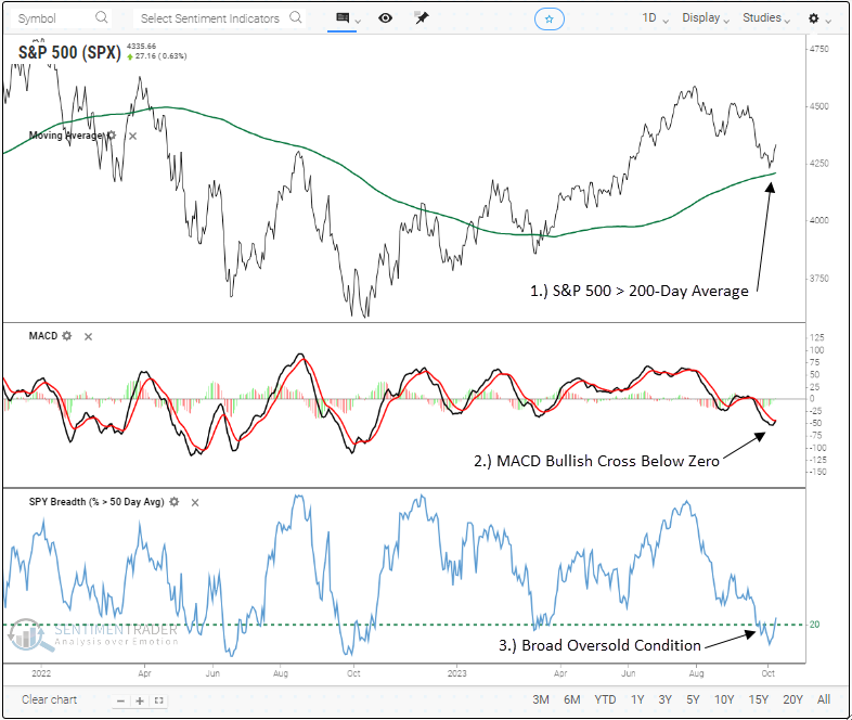
The MACD for the S&P 500 generated a buy signal within the context of an oversold market in an uptrend. Dean showed that similar trend-following momentum signals produced excellent results across all time horizons. When an alert occurs as the S&P 500 is entering a bullish seasonal window, results were even better.
The Moving Average Convergence/Divergence (MACD), a popular trend-following momentum indicator created by Gerald Appel, triggered a buy signal for the S&P 500 on Monday. Before the latest alert, fewer than 20% of S&P 500 stocks closed above their 50-day average, indicating a broad oversold condition. This oversold setup coincided with the S&P 500 trading above its 200-day moving average.
The previous signal occurred in March 2023, leading to a 10% gain over the following six months.
When a MACD buy signal occurs within the context of an oversold condition in an uptrend, the S&P 500 displayed excellent returns, win rates, and z-scores across all time horizons. A month later, the world's most benchmarked index was higher 82% of the time, with a median gain that was significantly better than the median gain over the study period.
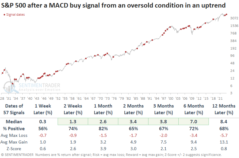
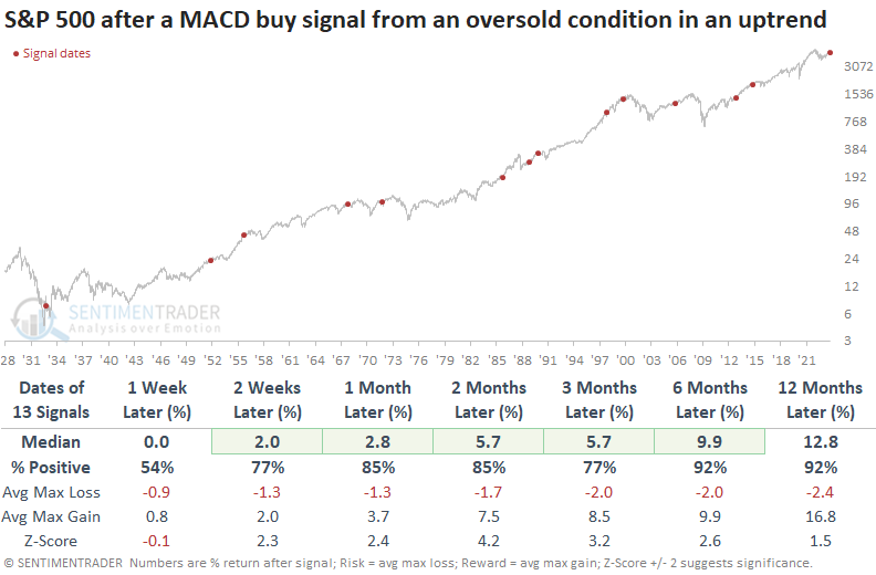
Whenever a MACD buy signal emerges in either October or November, S&P 500 performance is nothing short of phenomenal, consistently surpassing instances that occurred at any time. Over the subsequent six to twelve months, the S&P 500 recorded gains at some point every time.
A couple more indicators show recovery from a panic
Jay highlighted two more indicators that suggest that investors have panicked and why that may be a good thing.
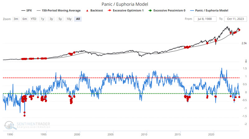
Our Panic/Euphoria Model is based on the Citi Panic / Euphoria model published in Barron's magazine. It does not reflect those published values; instead, it is our interpretation of the model inputs and construction and differs modestly from the published figures. The inputs are the same, but its performance as a contrary indicator is improved over the published values.
It is composed of the following primary inputs: NYSE short interest, margin debt, Nasdaq vs NYSE volume, Investor's Intelligence survey, AAII survey, retail money market funds, put/call ratios, commodities prices, and retail gasoline prices. Low values, particularly below zero, suggest investors have panicked.
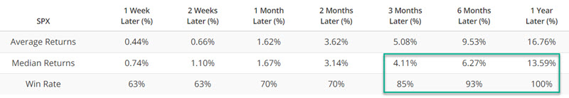
The chart below highlights all dates when our Panic/Euphoria Model was below -0.15 while the S&P 500 Index was above its 200-day moving average (i.e., a pullback in an uptrend). Results from 1-week to 6-months are mixed, but 12-month returns have been quite consistent and suggest that investors give the bullish case the benefit of the doubt.
Our S&P High Beta / S&P High-Quality Relative Ratio Rank indicator shows where the ratio is relative to its range over the past four months. A sharp decline in the S&P High Beta / S&P High-Quality Relative Ratio Rank indicator can signal a "flight to safety" as investors abandon volatile stocks for the perceived safety of higher-quality stocks. Extreme readings can highlight an important increase in investor bearish, which in turn can serve as a bullish signal for stocks.
The chart below highlights all dates when the 20-day moving average for the S&P High Beta / S&P High-Quality Relative Ratio Rank indicator was below 4.0. The most recent signal occurred on 2023-10-10.
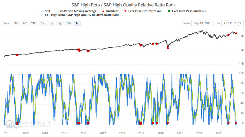
A year after these signals, the S&P 500 was higher every time, averaging more than +16%.
Volatility reversal also points to higher stock prices
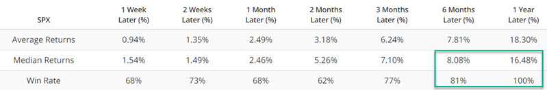
Dean pointed out that the Volatility Index (VIX) reversed from the upper end of its 84-day range, triggering a buy signal for stocks. Similar shifts in volatility preceded a rally in the S&P 500 with above-average returns across several horizons, especially when they triggered in October or during long-term uptrends.
Over the course of a typical stock market correction, volatility surges, sentiment indicators reflect pessimism and price-based measures become oversold. As the corrective phase wanes, the pendulum shifts from bearish characteristics to bullish attributes, providing a more favorable risk/reward entry point for traders that use a signal-driven approach to raise or lower market exposure.
One measure of expected volatility, the CBOE Volatility Index (VIX), increased to the highest level in the previous 84 trading sessions. Subsequently, it reversed lower, triggering a buy signal for the S&P 500.
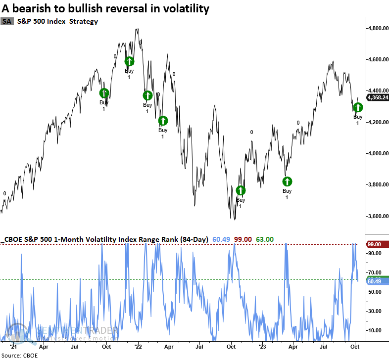
When the 84-day range rank of the Volatility Index (VIX) cycles from 100% to less than 63% and index momentum is positive, the shift in the fear gauge tends to mark a bearish to a bullish turning point for the S&P 500. Returns, win rates, and z-score were excellent over medium and long-term horizons.
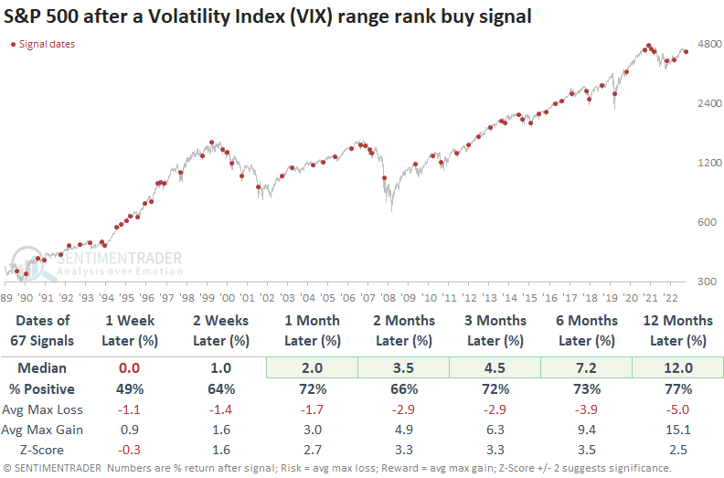
By narrowing our analysis to precedents in October, the onset of a seasonal stock market tailwind, we find that returns and win rates improve upon the already bullish outcomes. In cases where a volatility signal coincided with the S&P 500 trading above its 200-day moving average, returns, win rates, and z-scores maintained a bullish bias.
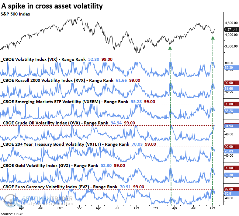
Expected volatility for several asset classes surged over the prior 84 trading sessions, similar to the drawdown period in March 2023.
Traders are paying a little bit less for put protection
The Put/Call Premium Ratio just crossed a critical level. Jay noted that historical results are noteworthy, and the latest reading falls squarely on the favorable side of the stock market ledger.
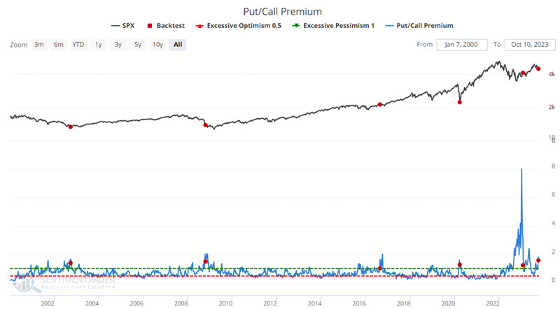
Our Put/Call Premium ratio indicator measures the ratio of total put premiums paid each week relative to total call premiums. It directly reflects how much options traders are paying for one relative to the other. That makes it an effective measure of real money, real-time, and leveraged sentiment. When it rises to an extreme, it is a highly reliable gauge of option-trader panic.
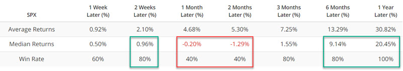
The chart below highlights those rare dates when the Put/Call Premium ratio crossed below 1.59 for the first time in 26 weeks, meaning premiums reached an extreme and then started to reverse. The S&P tended to rally soon after, fall back over the next 1-2 months, then rally strongly.
For those traders willing to take a more aggressive approach, the Nasdaq 100 Index has generated even more extreme results.
Jay also shared an annotated chart (courtesy of @ShortBear) that displays the CTA Position in U.S. Equities. The critical thing to note is the tendency for lows in this indicator to coincide with significant market bottoms.
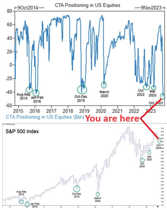
Commodity trading advisor activity tends to be trend-following in nature. The longer a trend lasts and the further it goes, the more likely CTAs en masse are to be long or short in line with the prevailing trend. Given that, it should not be surprising that, as a group, they tend to be significantly long at the top and significantly short at the bottom.
Another bonus is seasonality
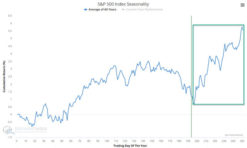
Jay further noted that the S&P 500 is entering arguably the most favorable seasonal time of the year. Historical odds favor the stock market during this period, BUT DO NOT guarantee anything on a year-to-year basis.
The chart below displays the annual seasonal trend for the S&P 500 Index. The obvious thing to note is the period highlighted in the green box. This period extends from the close of Trading Day of Year #197 through the end of the calendar year. For 2023, this period extends from the close today through 2023-12-31.
The chart below displays the growth of $1 invested in the S&P 500 Index each year only from the close of TDY #197 through the close of the last trading day of the year. Before 1953, the stock market was open on Saturday, so there were roughly an additional 52 trading days each year. For our purposes, we will start our test in October 1953.
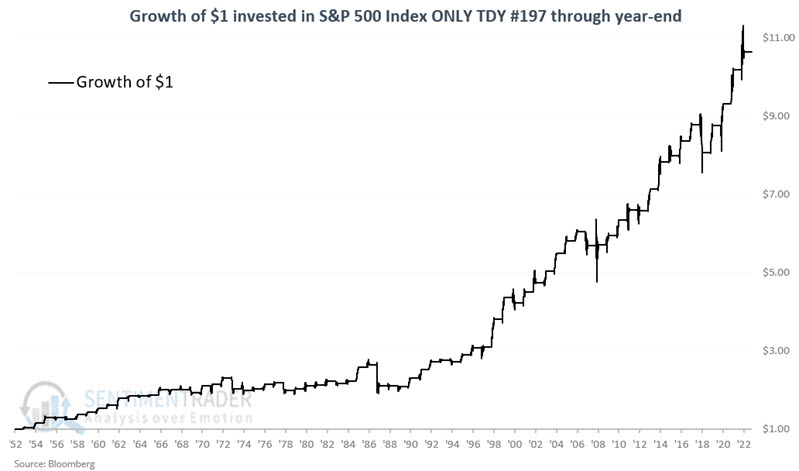
Just eyeballing the chart above gives good news and bad news. The good news is that the long-term trend from lower left to upper right is well established. The bad news is that there are plenty of downdrafts along the way.
During these windows, the S&P 500 rose 70% of the time with a median gain of +6.6% versus a median loss of -3.9% during the down years. More notably, it gained more than +10% during 12 years while losing more than -10% only twice.
Consumer Staples have been a bust
Jay showed that the consumer staples sector has been a bust so far in 2023, but numerous breadth indicators are firing off signals that have historically signaled capitulation.
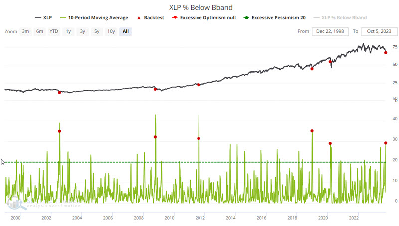
The Consumer Staples Select Sector SPDR Fund (ticker XLP) is the most heavily traded ETF that tracks the consumer staples sector. This indicator shows the percentage of XLP constituent stocks currently trading below their lower Bollinger Band.
The chart below highlights those dates when the 10-day average for the XLP % Below BBand indicator crossed above 29%, and the table summarizes subsequent XLP performance. From 3-12 months later, XLP returns were consistently positive.
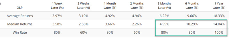
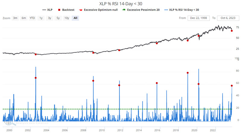
We can see similar behavior in the percentage of XLP constituent stocks showing a 14-day RSI below 30% (i.e., heavily oversold). The chart below highlights those dates when the 10-day average for the XLP % RSI 14-Day < 30 indicator crossed above 57% for the first time in three months.
It is important to note that both the 2008 and 2020 signals were early and that the sector continued to fall hard for a period of time. Still, in each case twelve month returns showed a strong gain. This type of history is one reason why we view the current situation as a "open your mind and eyes to the possibility of a buying" opportunity and not necessarily a "buy immediately with both hands" situation.
Jay also highlighted readings in the XLP Advance/Decline Line and percentage of stocks at 4-, 12-, and 52-week lows. All showed a consistent tendency to see rising prices ahead.
As always, seasonality is not a roadmap of what will happen. It is merely an average of what has happened in the past. And for XLP, that has tended to be up and to the right. The fund has a positive bias that runs from Trading Day of the Year (TDY) #188 through the end of the year.
The chart below displays the growth of $1 invested in the S&P 500 Consumer Sector Staples index (which is the index that ticker XLP is designed to track) only from the close of TDY #188 through the end of the year each year since 1953.
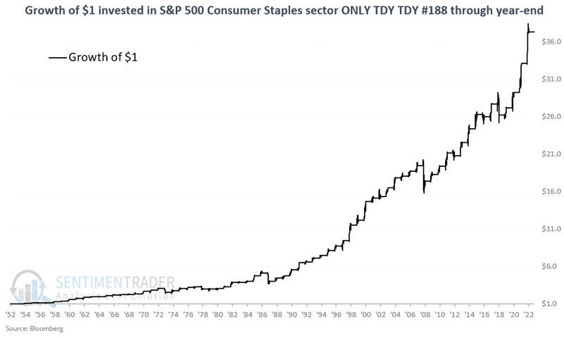
The sector showed a positive return during 89% of the years. It sported a gain larger than +9% during 16 years while suffering a loss larger than -9% only 3 times.
Long-term deterioration in Staples nears historic proportions
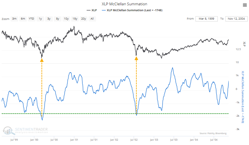
Selling pressure in some defensive stocks has been curiously strong not only in Utilities but also in Consumer Staples. The McClellan Summation Index for Staples neared -1700 for one of the few times in 25 years.
The only two distinct occurrences were during the last two significant bear markets.
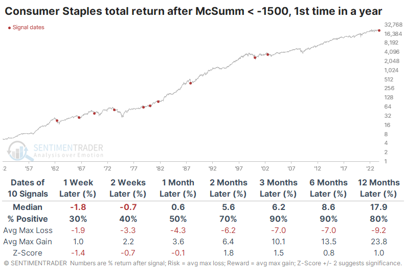
The Backtest Engine shows impressive returns after even lesser extremes. The sector gained every time over the next two months, averaging about 7%. A year later, those gains averaged more than 20%.
We get slightly different results if we use a different data source. This source shows that a reading below -1500 ranks in the bottom 1.5% of all days in the past 70 years.
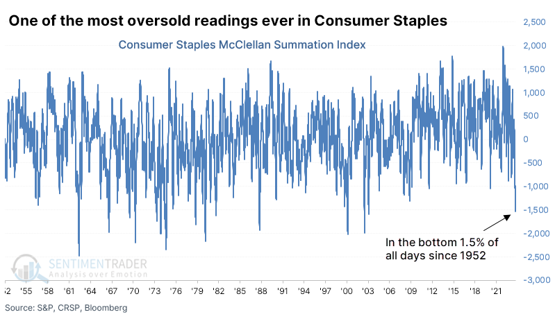
The difference in data sets is primarily due to a slight difference in the number of stocks in the sector that advanced or declined daily. Minor differences in daily figures can have an outsized impact on longer-term cumulative indicators like the Summation Index. Regardless, even lesser extremes than we see now have preceded some further short-term weakness but medium- to long-term strength in the sector.
Options traders tend to be trend-followers, buying protective puts after an investment declines and buying speculative calls after it has rallied. We're seeing that behavior lately in Consumer Staples stocks, with one of the highest ratios of puts traded to calls in a decade.
At the opposite end of the spectrum, corporate insiders at Staples companies have been busy buying shares while pulling back on selling. That has pushed the Insider Buy/Sell Ratio to one of the highest levels in over a decade.
Bulls don't want to see extreme selling pressure among insiders, but it's relatively inconsistent as a predictor (insiders sell for all kinds of reasons). Insider buying, however, tends to be one of the more consistent bullish indicators among all that we follow (insiders mostly buy for only one reason).
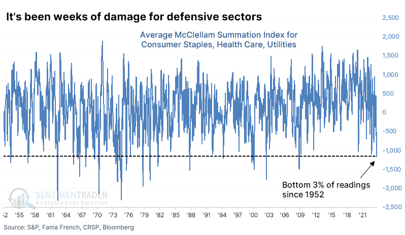
It's not just Staples - other defensive sectors have eroded
So, there has been significant internal damage in the Consumer Staples sector. It hasn't been limited to Staples, though - other defensive sectors like Health Care and Utilities have also been hit hard.
It isn't quite that extreme for Health Care, but it's getting there. Among the most defensive sectors, Utilities have the least negative Summation Index. That's partly because the decline there was more of a quick plunge, and shorter-term indicators were showing historical extremes.
If we average the McClellan Summation Indexes for the three defensive sectors, we can see that it has declined to one of the lowest levels in 70 years. It's now in the bottom 3% of all days since 1952.
The table below shows each time the average Summation Index declined below -1150 for the first time in at least a year and the forward total return in the Defensive factor afterward. There were a couple of double-digit declines within the first month as oversold got more oversold, but over the next 2-6 months, there were mostly gains or small losses. Signals in 1969 and 1973 led to losses over the next year, but those were the only two.
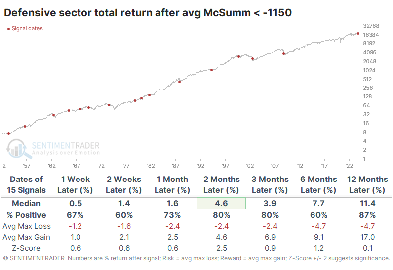
The risk/reward for Defensive stocks was mostly positive but not especially impressive. That's not unusual for a lower-volatility investment though we'd prefer to see it more skewed to the reward side. Across time frames, the return was better than random but only excessively so over the next two months.
Relative to the S&P 500, it tended to outperform across medium- and long-term time frames. It got more impressive as time wore on, with only two signals failing to outperform over the next year.
A historically bad year for Small Caps (relatively)
Small stocks continue to lag, and the consensus is building that this is signaling recession ahead. We've looked at the spread between small and large stocks several times in recent months, almost always suggesting that underperformance by smaller stocks would most likely continue, but also that it doesn't necessarily mean much for the rest of the market.
This is one of the worst years in nearly a hundred for Small Cap stocks relative to Large Caps, based on their total returns through Trading Day of the Year (TDY) #193. With Small Caps underperforming by more than -13%, the spread is the 8th-worst out of the last 95 years.
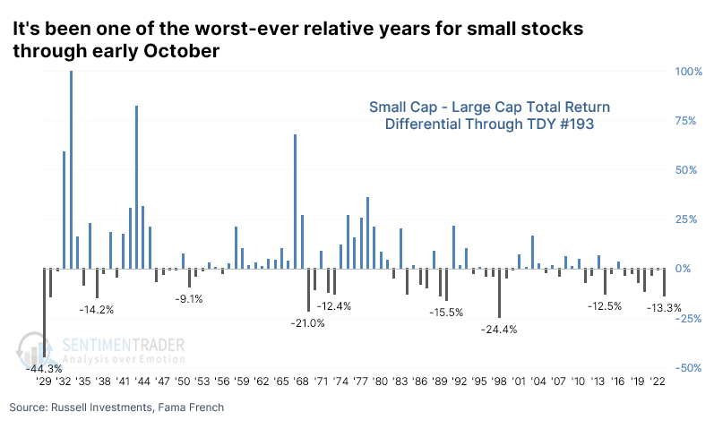
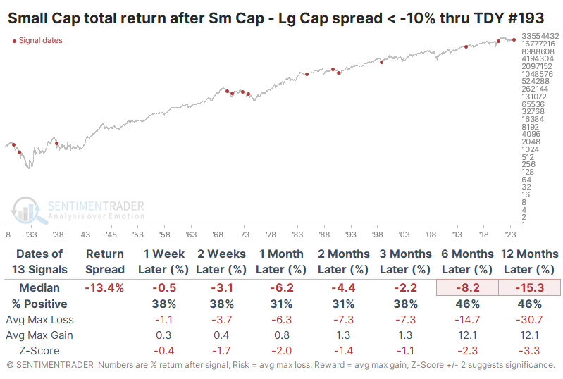
For small stocks, this was a bad sign. They tended to show weak absolute returns in the months ahead, even including dividends. Over the next two to three months, their consistency, returns, and risk/reward skew were particularly woeful. The only positive takeaway for bulls is that the last three signals all bucked the long-term trend.
It wasn't such a bad sign for larger stocks, especially during the last 50 years. Nothing was spared during the 1930s, but outside of that, there was only one signal that preceded a double-digit decline.
The relative ratio between the two shows that smaller stocks had a strong tendency to continue to underperform. Even up to a year later, small stocks outperformed only 23% of the time, though once again the worst signals were concentrated in earlier decades.
It was a much different story during those years when Small Caps outperformed Large Caps by +10% or more, which happened about twice as frequently as Small Caps underperforming. After these signals, smaller stocks showed a tendency to continue their outperformance. Over the next 6-12 months, they beat larger stocks more than three-quarters of the time.
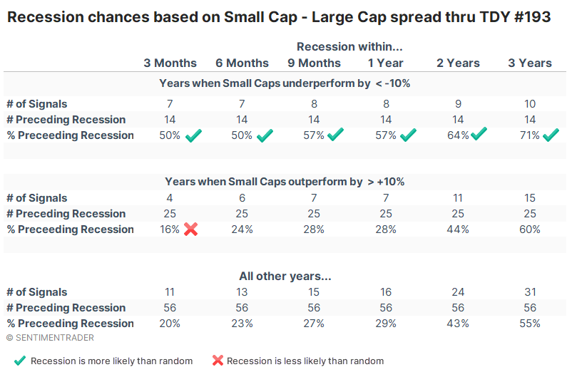
Across all time frames, a recession was more likely to happen if Small Caps underperformed. When they lagged Large Caps by more than -10%, then the U.S. was in recession within a year 57% of the time. If Small Caps had outperformed by more than +10%, then that probability fell to only 28%. That wasn't much different than any other year at 29%, but it was about half as likely as when smaller stocks underperformed as they have this year.
Natural gas breakout
Natural gas futures closed at a 6-month high but not a 9-month high, completing a base breakout. Dean showed that similar breakouts after a 1-year low led to an 80% win rate over the subsequent three months.
When assets experience a significant drawdown phase, they often go through a healing process. The market tends to move sideways for a while before eventually shifting upward to usher in a new bull market. Justin Mamas called this process the sentiment cycle.
Last week, natural gas closed at a new 6-month high but not a 9-month high, completing a base breakout pattern after a significant drawdown period. Despite the rally from the April low, the 1-year rolling return remains at a level suggesting bullish annualized returns.
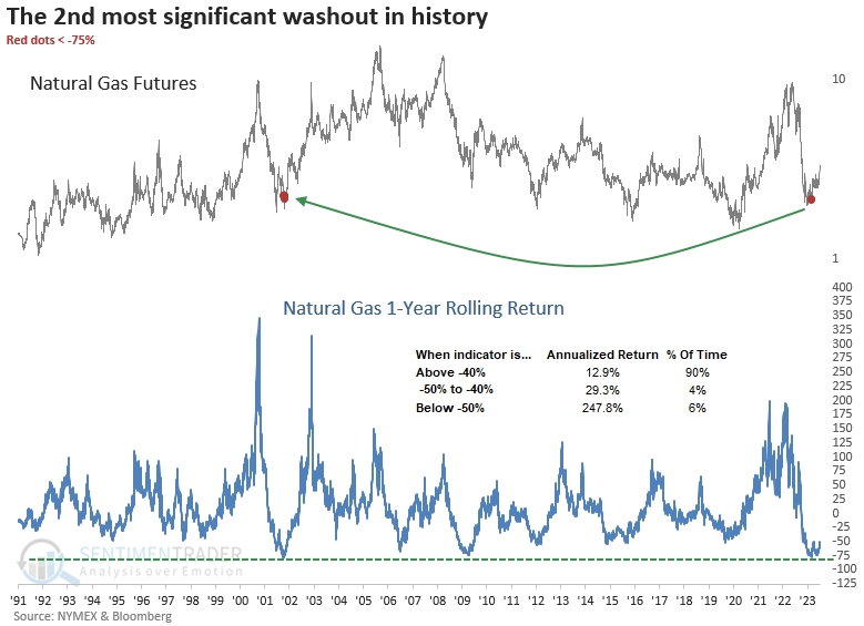
When natural gas completes a base breakout pattern after a 1-year low, returns are somewhat uninspiring in the first month, suggesting some backing and filling could occur. After the pause, performance picked up, with the commodity rallying 80% of the time over the subsequent three months. The six-month outlook should act as a reminder that nothing comes easy when it comes to natural gas.
The max median gain exceeded the max median loss in 8 out of 10 precedents, with some showing significant risk/reward profiles.
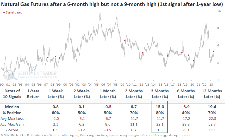
Surprisingly, the returns and win rates of various natural gas stocks appeared lackluster. Therefore, it might be wiser to consider an allocation to the physical commodity itself, a task made accessible through an ETF like UNG.
Hedge funds appear heavily exposed to the dollar
Jay showed that hedge funds were recently heavy buyers of the U.S. Dollar and extremes in U.S. Dollar sentiment often have a ripple effect across the commodities markets. Overall results tend to skew negative - with gold as a notable outlier.
Our Hedge Fund Exposure - Dollar indicator is based on a composite of hedge fund tracking indexes. It compares this index of hedge fund exposure against returns in the U.S. dollar to see how much exposure hedge funds appear to have to the currency. It recently spiked to a high level, suggesting that funds are heavily exposed to movements in the dollar.
U.S. Dollar performance results after similar extremes are essentially a mixed bag of average results. But commodities market fluctuations often depend upon movements in - and traders' perceptions about - the dollar.
To test a broad measure of commodities as an asset class, we will use the Bloomberg Commodity Spot Index (BCOMSP). The chart below highlights those dates when the above indicator crossed above 0.80 for the first time in 14 days, and the table summarizes subsequent BCOMSP performance.
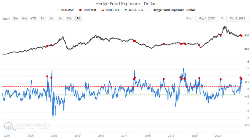

Note that the 2007 and 2020 signals were ultimately followed by sharply higher commodity prices six and twelve months later. However, Median Returns were negative for all time frames, and Win Rates were below 50%. Weakness was especially notable during two weeks and 1-month after signals.
With war breaking out in the Middle East, much focus is again on oil and gas. Wars can exacerbate situations and volatility. That said, fear typically gets inflated more than anything else as traders buy into the "inevitable disruption of oil flow" narrative. Could this time be different? Absolutely. But for now, we will let historical results stand on their own.
The chart below highlights those dates when the above indicator crossed above 0.80 for the first time in 14 days, and the table summarizes subsequent crude oil futures performance.
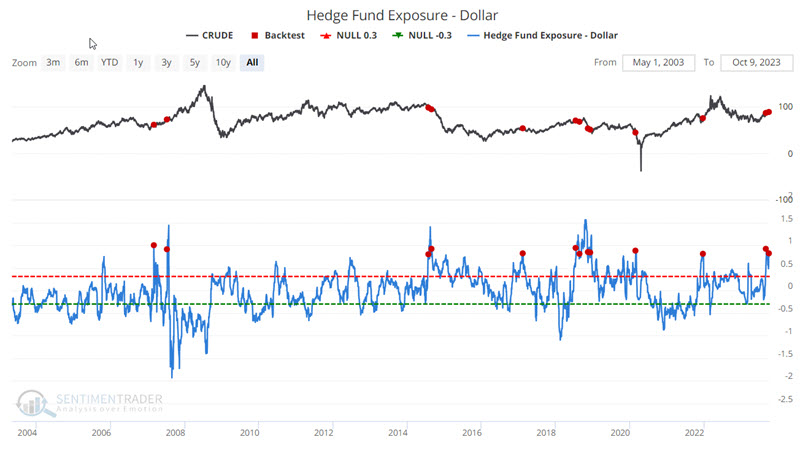
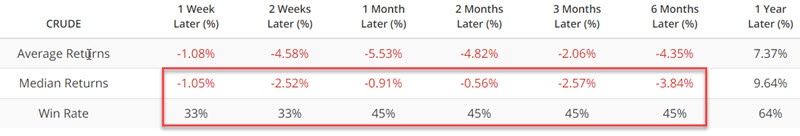
Once again, some spectacular six and twelve-month gains ensued (most notably after 2007 and 2020 signals). However, overall results skewed negatively during the six months after a signal. The same comments apply to unleaded gas, silver, and copper. Gold was an outlier, showing positive returns 91% of the time six months later.
About TradingEdge Weekly...
The goal of TradingEdge Weekly is to summarize some of the research published to SentimenTrader over the past week. Sometimes there is a lot to digest, and this summary highlights the highest conviction or most compelling ideas we discussed. This is NOT the published research; rather, it pulls out some of the most relevant parts. It includes links to the published research for convenience, and if you don't subscribe to those products, it will present the options for access.