
TradingEdge Weekly for May 9 - A big push off the lows, record breadth, sector strength

Key points:
- Consumer confidence continues to erode
- The Zweig method of assessing breadth has been persistently strong
- Breadth for 3 major indices hit record highs
- The S&P 500 enjoyed a strong 10-day price surge
- That has raised the prospects of a V-shaped bottom as the index retraced 50% of its decline
- The PMI survey may not mean what investors think
- More indicators are giving bullish implications
- Cyclical sectors are dominating the relative strength lists
- Some sectors are showing seasonal strength (or weakness)
Confidence continues to crater
Low readings regarding consumer confidence invariably trigger a great deal of handwringing. Jay showed that several consumer confidence indicators are presently at an extreme - and typically favorable - level.
The University of Michigan Consumer Sentiment Index is a consumer confidence index published monthly by the University of Michigan. It gives a very accurate indication of the national economy's future course, with low levels of confidence typically occurring during recessions.
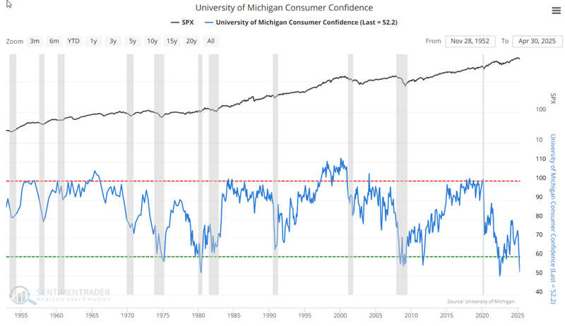
Like most other sentiment surveys, this is a coincidental indicator. When times are good, consumers are happy; when times are bad, they are less optimistic. At the extremes, the survey is a decent contrary indicator.
The latest U of M Consumer Confidence reading stands at 52.2. The chart above shows that this is on the low end of historical readings. We can identify five previous instances when the index dropped below 58.
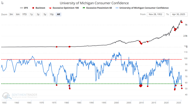
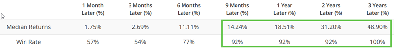 Results are a far cry from what the "masses" were expecting at the time of the signal, given the abnormally low level of consumer confidence.
A monthly survey from the Conference Board shows the net percentage of consumers expecting stocks to decrease. As the chart below shows, this indicator has also reached an extreme level of investor bearishness towards stocks. The chart below highlights those months when the indicator crossed below 44 for the first time in six months.
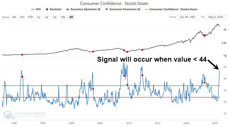
One more time, we see the overly bearish crowd typically being confounded and taken by surprise by a market rally when they were expecting a decline, once again, with the notable exception of the continued decline following the late 2008 signal.
A persistent thrust
The Zweig breadth thrust indicator has maintained a value above 58% for eight consecutive sessions. Dean noted that sustained breadth imbalances of similar duration preceded solid S&P 500 gains over the next year.
The Zweig breadth thrust indicator has remained above 58% for eight consecutive sessions. This persistent strength in advancing issues hasn't been this pronounced since January 2023, when stock indexes last emerged from a bear market.
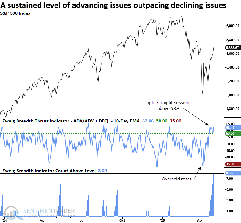
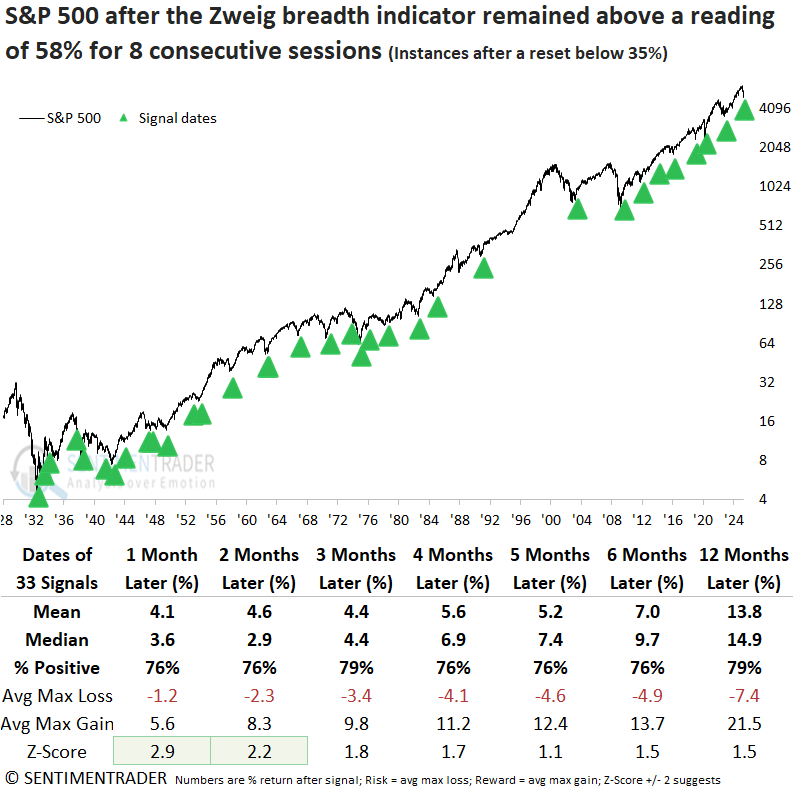
The Zweig breadth thrust indicator utilizes NYSE issues. To identify instances similar to now, I required the indicator to fall below 35% (a meaningful oversold condition) before a new signal could occur again.
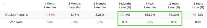
An elevated Zweig Breadth Indicator, such as now, has historically signaled persistent buying pressure, often leading to solid and steady gains in the S&P 500 over the next year. Not once since 1982 has the signal produced a loss across any three-to-six or twelve-month timeframe, an extraordinary achievement.
When the S&P 500 declined between 10% and 20%, similar to the current environment, two notable precedents emerge: 1937 and 1973. Both occurred during bear market rallies. However, the index rallied for another month in each case, gaining 3.8% and 2.5%, respectively.
Record breadth
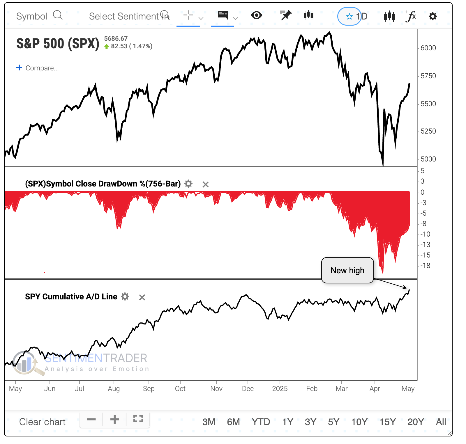
Despite chaotic headlines, conflicting macroeconomic variables, and a sizable drawdown in many stocks, breadth is at an all-time high.
In this case, we refer to a cumulative advance/decline line. That is simply each day's net number of advancing minus declining stocks, which is added to the previous day's total. If more stocks rose than fell, the number will increase.
Among the first, the Cumulative Advance/Decline Line for the Dow Industrials hit a new record high last week, despite the index itself being mired in a correction, more than 10% below its prior high. In over 60 years, it's happened only a handful of times. What's most notable among them is their consistency, with no significant losses across any time frame.
It's more impressive when a broader index does so, especially when that index has the most assets riding on it than any other equity index in the world. The S&P 500's Cumulative Advance/Decline Line also reached a new high last week.
Since 1928, there have been only four other times the index was more than 9% below a 3-year high while its A/D Line made a new multi-year high. For what it's worth, the S&P suffered some short-term weakness after three of the four signals, though all resolved higher over the year.
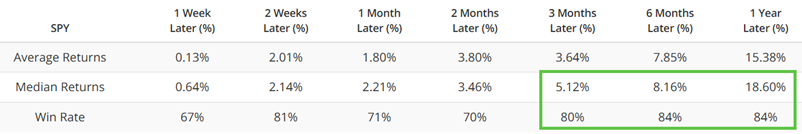
We have to relax the parameters to generate a larger sample size, so the table below looks for new highs in breadth when the S&P was at least 5% from its most recent peak.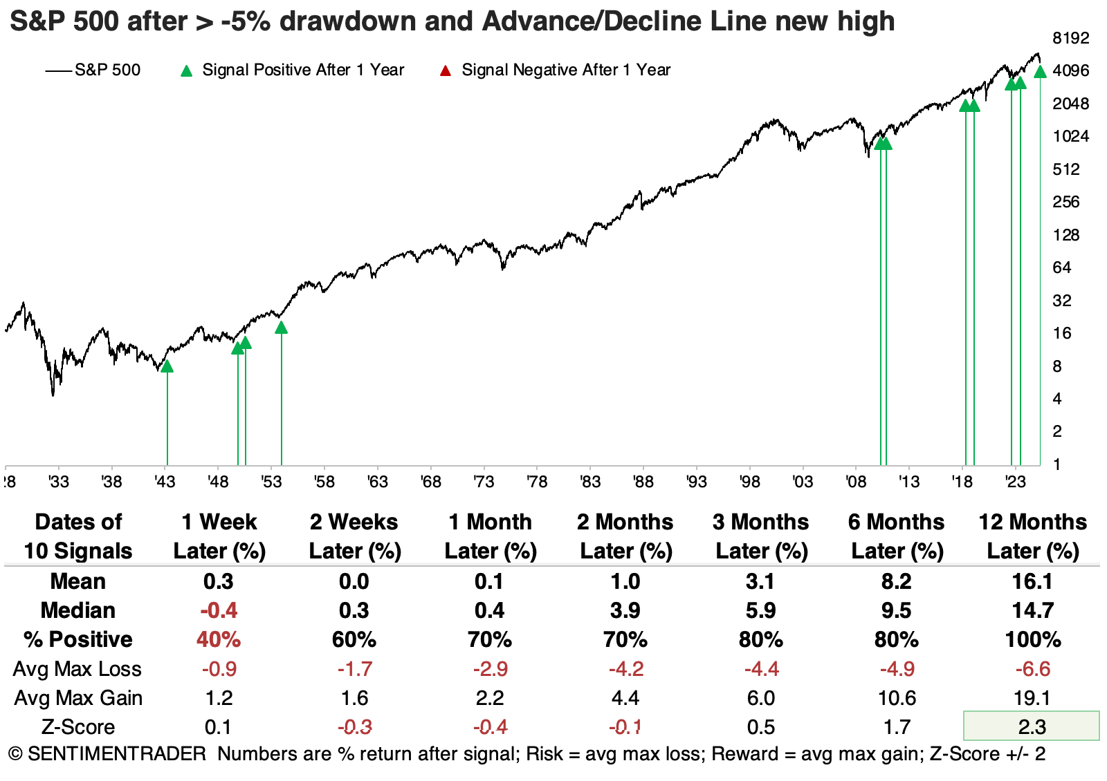
Not to be outdone, and probably to the surprise of many, the Cumulative Advance/Decline Line for the big tech-infused Nasdaq 100 also recorded a new high. When the NDX's A/D Line reached a new high while the index was at least 5% off its high, its future returns were excellent across most time frames, with a 100% win rate a year later. Only 3 signals suffered more than a -10% drawdown within the following year, while 14 signals enjoyed a drawup of more than +10%.
Price surge
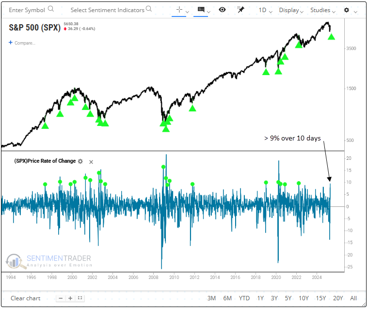
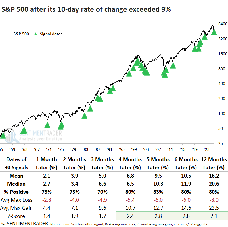
Over the last ten trading sessions, the S&P 500 surged by more than 9%. Dean showed that similar price momentum thrusts saw the S&P 500 rally, especially after the 1929-42 secular bear.
Similar to breadth thrusts, when price velocity increases over a brief period, it tends to persist over longer horizons, albeit at a slower pace. A TCTM Composite Thrust Model component triggered an alert when the S&P 500 advanced 9% over ten trading sessions.
Significant bursts in price momentum over ten days resulted in upside follow-through for the world's most benchmarked index, although it was not overwhelmingly positive. The uninspiring results were primarily due to precedents during the 1929-42 secular bear market.
Signals following the 1929-1942 period delivered strong returns and consistent performance across multiple time horizons, often exceeding random expectations. Still, the 2022 example serves as a cautionary note that sharp rallies, such as the recent one, can occur within a bear market.
A V-shaped bottom and impressive retracement
Stocks have rallied hard since bottoming in April, and V-shaped bottoms have occurred often since the global financial crisis. Nobody wants to miss another, so the natural inclination is to wonder, "Is that it?"
What we're looking at are times when the S&P 500 declined to a 9-month low, suffered at least a 10% decline over 18 trading days to get to that low and rebounded at least 10% over the following 18 days without violating the low. The S&P's returns following these patterns were unimpressive, especially on shorter time frames, and especially especially during the Great Depression.
However, the more of a decline that is retraced and the quicker it occurs, the more bullish it is for future returns. That should be a good sign now, as the S&P 500 has clawed back more than half of its losses.
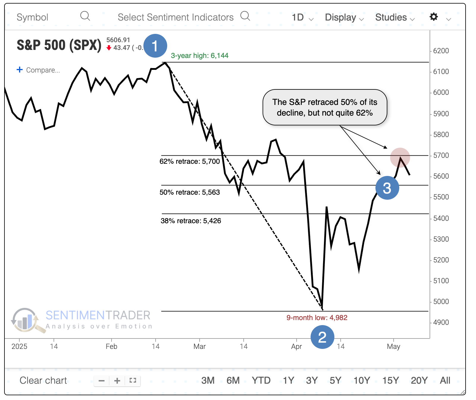
It was a good sign when the index declined at least 15% from a three-year high to a nine-month low and recovered at least half of that decline within 18 sessions, except during the Great Depression. The other four instances never lost more than 5% from the signal date through the following year.
If we relax the parameters by looking at 10% declines (instead of 15%), we get a few more instances. These were mostly successful, but it added a failure in 2000 as the internet bubble was popping. Again, all the successful signals never saw more than a 5% drawdown within a year. Both failures lost more than 5% within the first two months.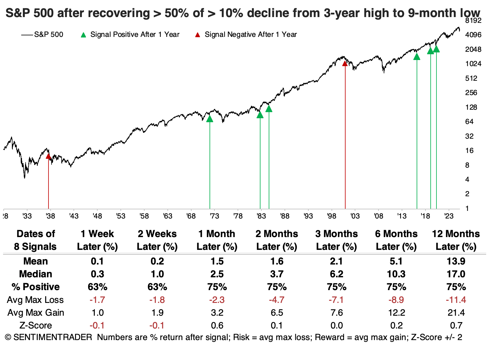
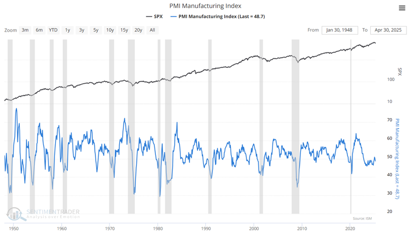
PMI permutations
The PMI Index (ISM Purchasing Manager's Index) is a measure of economic strength. Jay showed that PMI has declined in each of the last three months, generating the typical amount of hand-wringing and recession warnings.
Note that troughs in the index tend to occur during economic recessions, which are highlighted in gray. As a result, most people automatically associate low and/or declining PMI readings with recession.
 The is based on data compiled from monthly replies to questions asked of purchasing and supply executives in over 400 industrial companies. For each of the indicators measured (New Orders, Backlog of Orders, New Export Orders, Imports, Production, Supplier Deliveries, Inventories, Customers Inventories, Employment, and Prices), this report shows the percentage reporting each response, the net difference between the number of responses in the positive economic direction and the negative economic direction and the diffusion index.
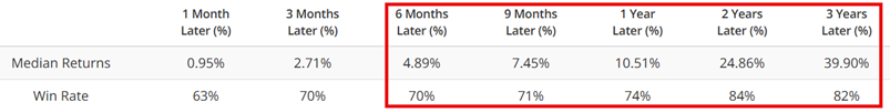
To understand the contrarian nature of PMI results, let's start with all readings below 50. The chart below highlights every month when PMI ended the month with a reading below 50.
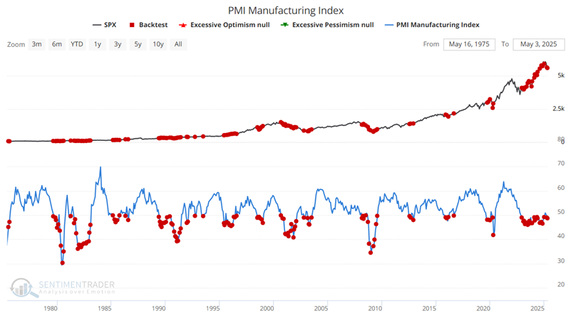
By comparison, the chart below highlights every month when the PMI ended the month with a reading above 50.
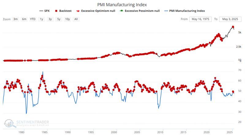
On one hand, the Win Rate for 1-month and 3-month periods is fractionally higher than following PMI readings below 50. On the other hand, every other value is lower than the table above for PMI readings below 50.
A couple more positive indicators
Jay noted that the number of favorable indicator signals continues to pile up.
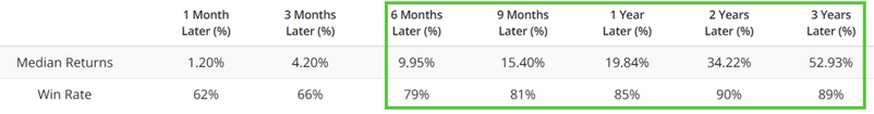
The Industry % Indexes in Bear Market indicator shows the percentage of 23 industries that are trading more than 20% below their 52-week highs. The chart below highlights all dates when this indicator crossed above 10%.
On some occasions, this event was followed by a deeper bear market (notably in 2007-2008 and 2022). However, history has shown that this often highlights decent buying opportunities within a shorter-term pullback.
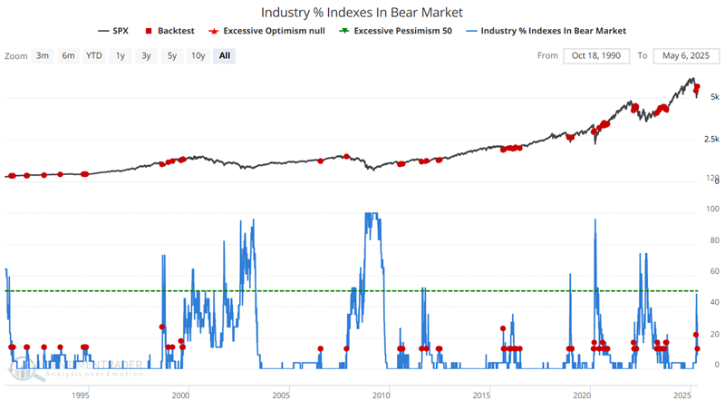
Note the exceptionally high Win Rates for six, nine months, and one year after a signal.
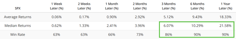
Jay also showed that the % S&P 1500 RSI 14-day < 30 indicator notes the number of S&P 1500 constituents with a 14-day RSI value below 30% on any trading day. Large values tend to highlight oversold situations for the broader market.
The 20-day moving average for this indicator crossed below 10%. We once again see good reliability three to twelve months after a signal.
Cyclical strength
Most stocks hitting relative highs are concentrated in cyclical sectors. Dean noted that over 42% of technology sector stocks registered a 1-month relative high, leading all sectors.
In a bull market, almost everything advances, but to beat the market, you have to own what's rising more than the market. With that in mind, the table below highlights a clear trend in relative highs, pointing to offensive sectors like technology, which led all groups in relative breakouts on Wednesday.
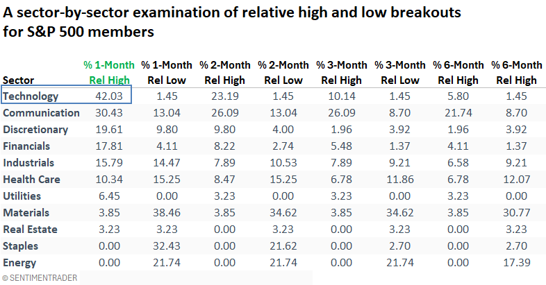
Software and semiconductor companies dominated the technology stocks list, registering a 1-month relative high compared to the S&P 500.
Investors may want to prioritize exposure to software stocks, as their trend and relative trend scores look more favorable. According to our website's trend score tool, the Expanded Software ETF (IGV) holds a relative trend score of 7 against the S&P 500, while the Semiconductor ETF (SMH) lags with a score of just 1.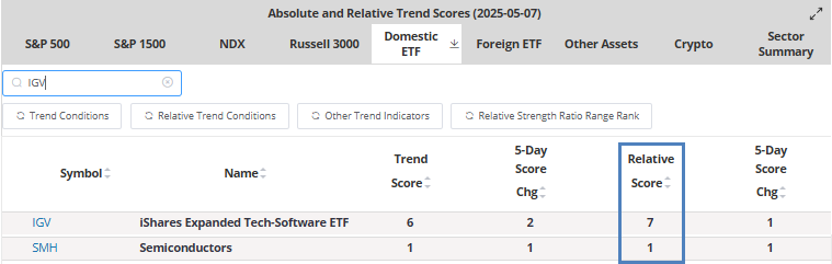
IGV maintains a relative trend score of 8 versus SMH, suggesting a favorable relative strength backdrop. Additionally, over the past month, software has recorded a relative high against semiconductors on five occasions.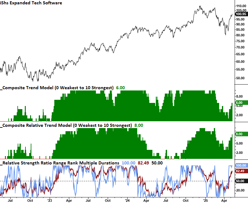
Dean continued with an analysis of the communications, discretionary, financial, and industrials sectors.
Seasonally strong - and soft - sectors
Jay suggested that seasonality can be especially helpful in deciding when and where to allocate capital. The health care sector and natural gas are entering favorable seasonal periods, while others are entering unfavorable periods.
The Annual Seasonal Trend chart below for The Health Care Select Sector SPDR Fund (XLV) shows a favorable period that extends from the close of Trading Day of the Year (TDY) #87 through TDY #144. For 2025, this period extends from the close on 2025-05-08 through 2025-07-31.
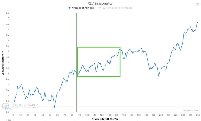
The chart below displays the hypothetical growth of $1 invested in XLV only during this period, every year since 1999.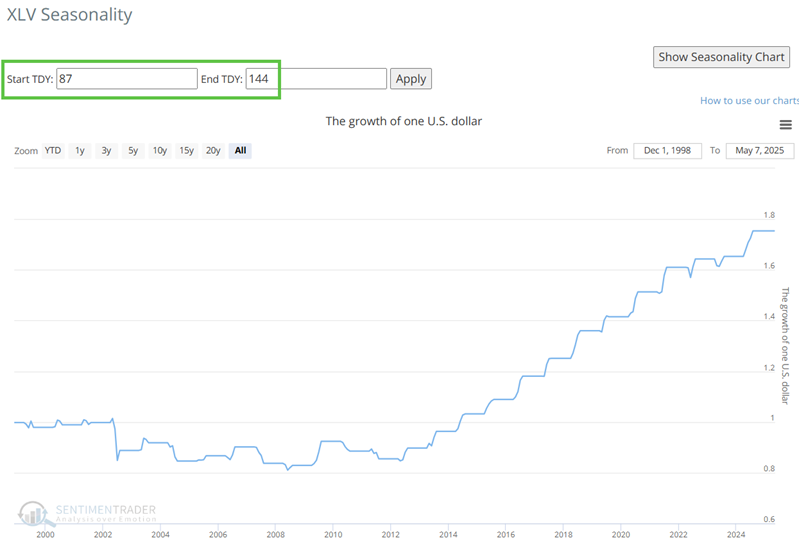
Natural gas, via the UNG fund, has a positive period that extends from the close on 2025-05-13 through 2025-06-18.
On the unfavorable side, the Annual Seasonal Trend chart below for the Global X Copper Miners ETF (COPX) shows an unfavorable period that extends from the close of Trading Day of the Year (TDY) #82 through TDY #123. For 2025, this period began at the close on 2025-05-01 and extends through 2025-07-01.
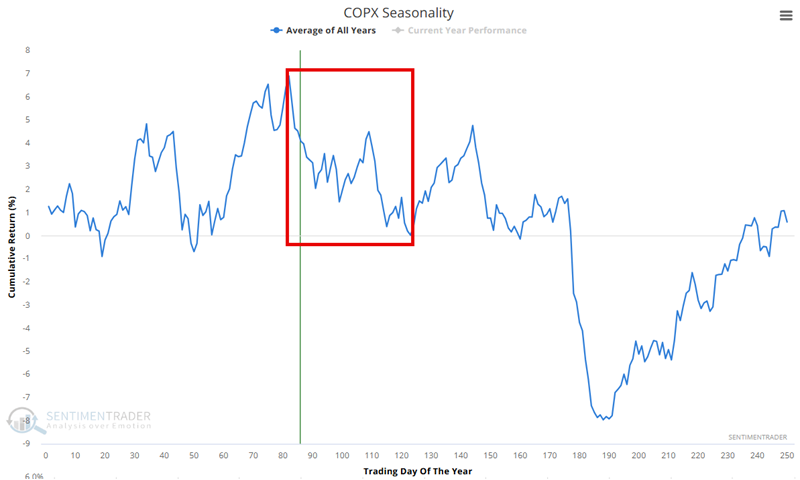
The chart below displays the hypothetical growth of $1 invested in COPX only during this period, every year since 2010.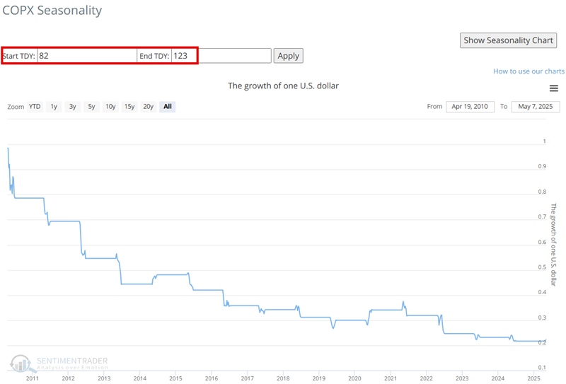
Jay showed similar analyses for homebuilders (ITB), Japan (EWJ), and transports (IYT).
About TradingEdge Weekly...
The goal of TradingEdge Weekly is to summarize some of the research published to SentimenTrader over the past week. Sometimes there is a lot to digest, and this summary highlights the highest conviction or most compelling ideas we discussed. This is NOT the published research; rather, it pulls out some of the most relevant parts. It includes links to the published research for convenience, and if you don't subscribe to those products, it will present the options for access.