
TradingEdge Weekly for May 30 - Risk-on behavior, high correlations, inflation expectations

Key points:
- Sentiment surveys are bouncing back
- The S&P 500's price pattern since the February peak has 15 close analogs
- Inflation expectations are still uncomfortably high
- A long-term approach to the Aggregate Signal Model
- Several sectors are seeing elevated correlation among their component stocks
- Nuclear stocks went nuclear
Surveys are bouncing back
The Advisor and Investor Model recovered from one of the most pessimistic conditions in history. Dean showed that similar shifts in sentiment saw the S&P 500 rise 93% of the time over the next six and twelve months.
The Advisor and Investor Model, a sentiment composite that aggregates several widely followed surveys, fell to an extreme low of just 1% during the depths of the Liberation Day Meltdown. Such an extreme level of pessimism has occurred in less than 2% of instances since 1970. Over the last six weeks, the model has staged a recovery, recently rising above 50%.
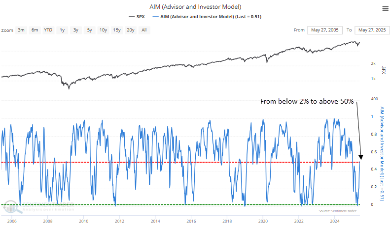
Each time the Advisor and Investor Model transitioned from below 2% to above 50%, it often marked a shift in sentiment that aligned with rising risk appetite, supporting further gains in stocks over longer timeframes. In all but one instance, the S&P 500 was higher six and twelve months later.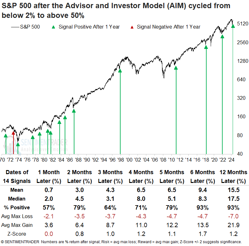
A year later, the S&P 500 declined more than 10% only three times. In contrast, it posted rallies of over 10% in 13 cases, suggesting a favorable risk/reward scenario.
Technology and consumer discretionary were the top-performing sectors one year later, each outperforming the S&P 500 in six of the seven intervals. Using our relative range rank data for S&P 500 stocks found on the website's trend score page, offensive sectors, such as technology, industrials, communication services, and consumer discretionary, hold the largest share of stocks, with relative ratios hovering near the upper end of their ranges, indicating relative strength.
This looks just like...
Stocks took a beating, then roared back. Both were of a magnitude and speed rarely seen over nearly 100 years.
During the S&P 500's history, there have been 15 periods closely correlated to this pattern. Each instance's correlation was at least +0.8 on a scale of -1.0 to +1.0. Perhaps due to the increasing speed of market movements, half the cases have been triggered in the last 30 years. The chart below shows the S&P's current path since its peak, along with the average and individual paths of its highest-correlated analogs.
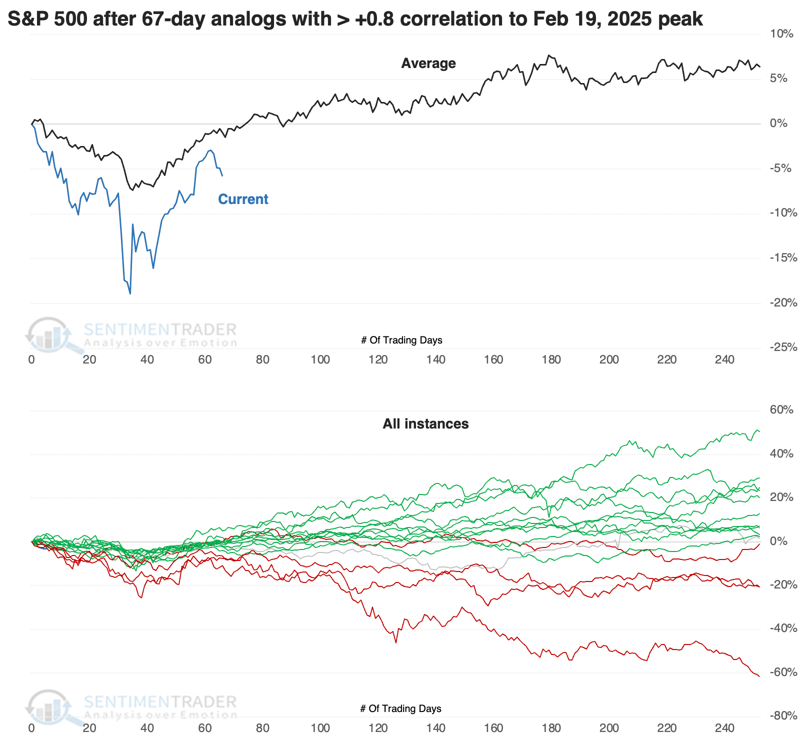
It's somewhat troubling that the two closest matches in speed and magnitude of the decline and rally were 2022 and 2001. The S&P's analog fits both almost perfectly, and both peaked right about now.
It's been 67 days since the peak, so the table below shows forward returns from where the pattern ends. Very short-term returns were poor, but quickly turned around after that...most of the time.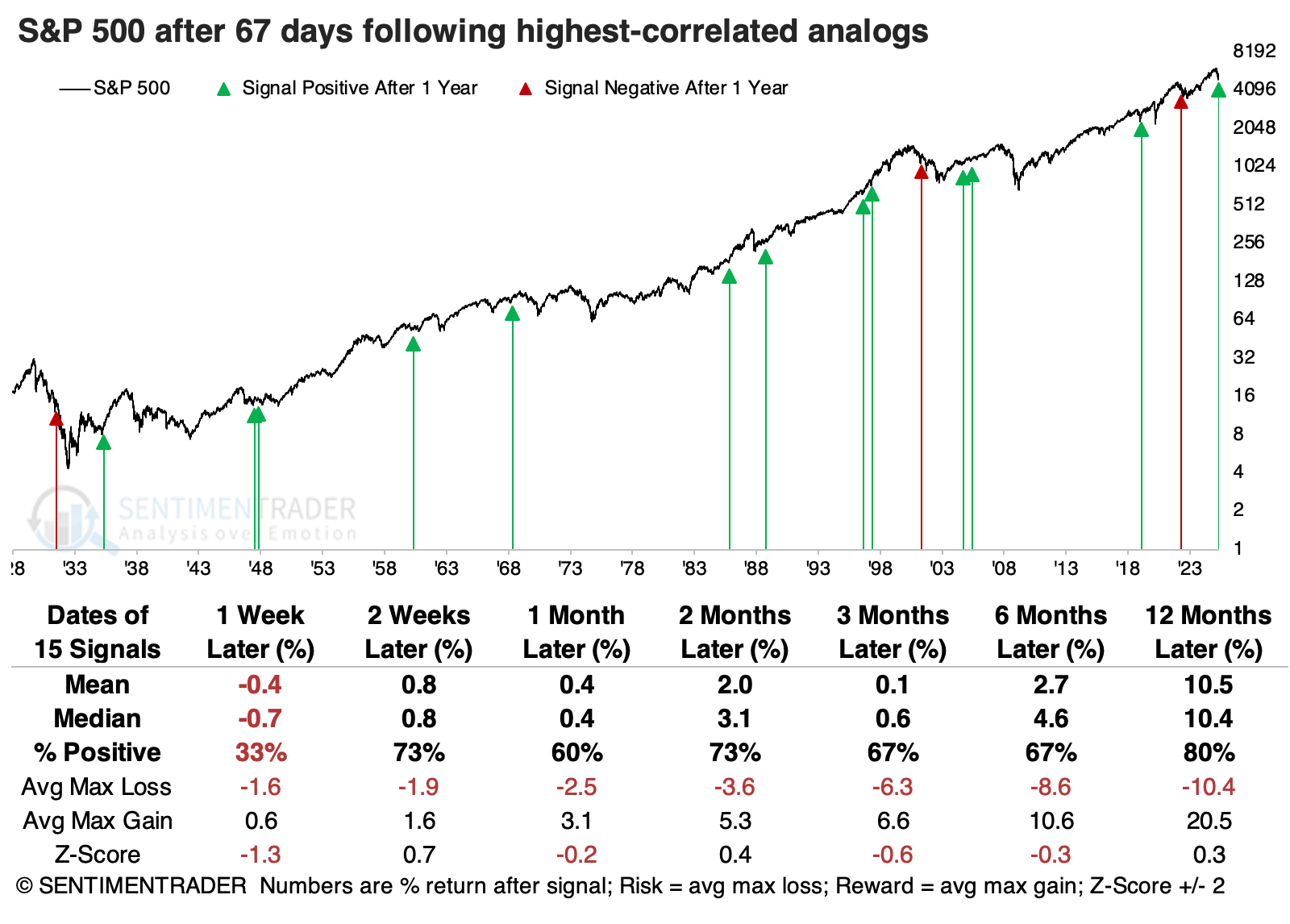
The table of risk versus reward across time frames highlights that the two instances with the worst performance over the following two weeks also preceded the worst risk/reward over the following year. The worst markets saw almost no upside over the next two weeks, and drawdowns of at least -4.5%.
Despite the recent rally, but because of the sharp decline preceding it, price behavior is starting to reflect the Discouragement phase of a Typical Sentiment Cycle more closely. These are times when the price action looked like confusing times for investors, which typically means either increasingly choppy conditions or times of upheaval when investors had a hard time committing either way.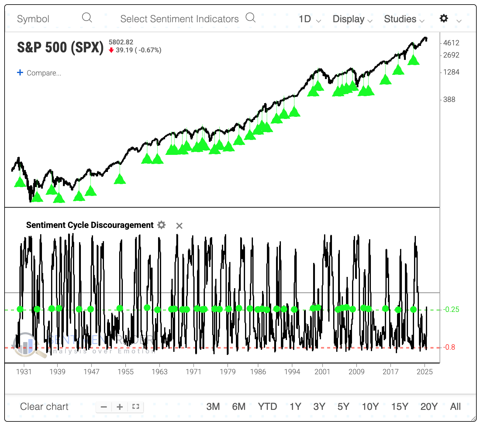
Overall, the S&P's returns were inconclusive after similar behavior. Over the past 40 years, a very high positive correlation existed between the S&P 500's drawdown over the following two weeks and its absolute return over the following year. This means that the bigger the short-term drawdown, the less likely the index would recover to show a large positive long-term return.
Inflation expectations
Recent high readings in the University of Michigan Inflation Expectation index seem to suggest a risk of higher inflation in the year ahead. Jay noted that a decline in expectations in the months ahead would be a welcome sign.
The University of Michigan Inflation Expectation index (UMIE) tracks a survey of investors' expectations for the rate of change in inflation in the year ahead. According to that survey, investors at that time were expecting inflation to rise 5.0% in the year ahead.
In the chart below, we see the history of UMIE versus actual 12-month CPI inflation. It shows the UMIE at the end of each month starting in 1978 minus the actual 12-month change in CPI over the next 12 months.
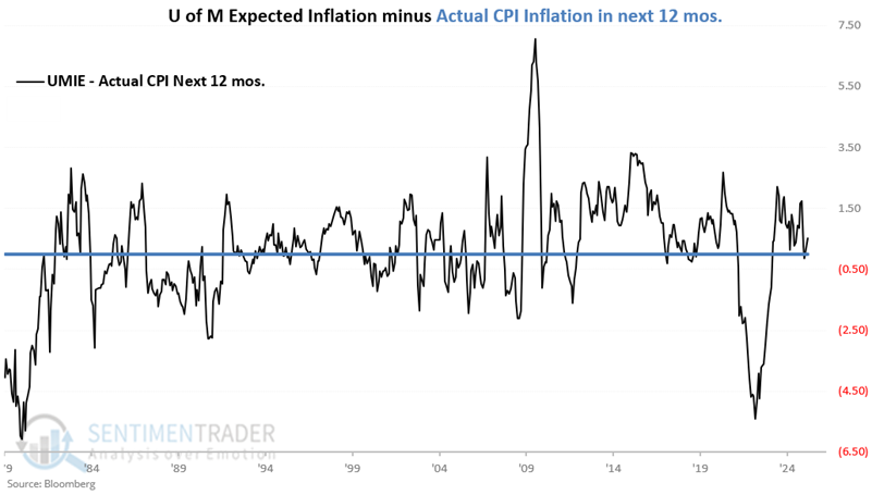
While surveys of "expectations" are often seen as contrary indicators, a closer look at the data reveals that higher expected inflation is more often followed by above-average inflation and vice versa.
The table below summarizes CPI performance following UMIE month-end readings of 4.6% or higher.
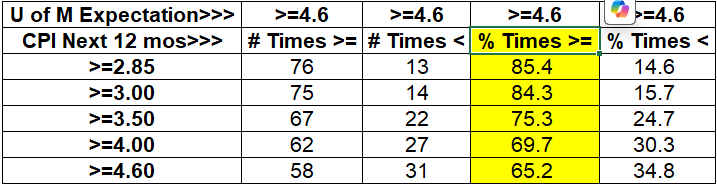
There have been 89 months that ended with the UMIE projecting inflation of 4.6% or higher over the next 12 months and 85% of the time, CPI inflation in the next year was above average (i.e., > 2.85%); 14.6% of the time, CPI inflation was below average.
Based on this historical data, the current UMIE of 5.0% suggests that we should be wary of a resurgence of inflation in the year ahead.
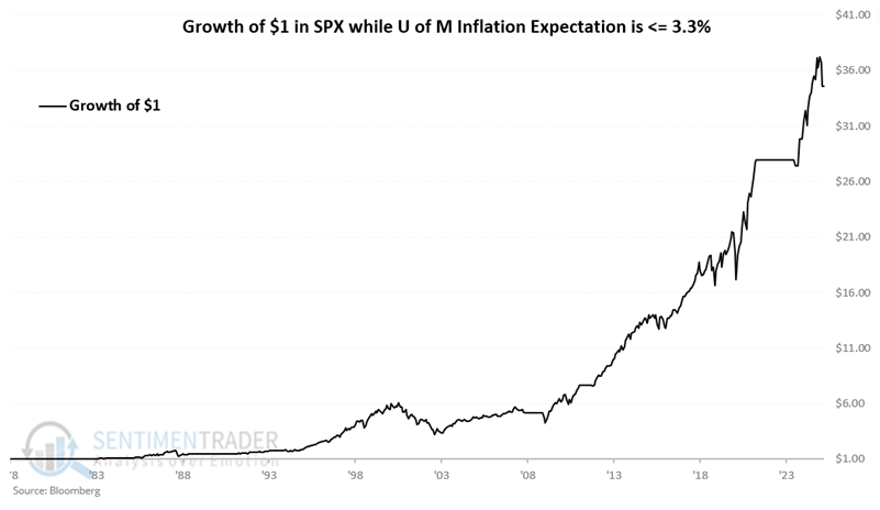
Can the UMIE be used as a stock market indicator? Our research suggests that UMIE readings of 3.3% or lower are a favorable sign for stock prices in the year ahead. On the other hand, readings above 3.3% have tended to be less meaningful as a predictor of future stock market movement.
The chart below displays the hypothetical growth of $1 in the S&P 500 index only during those months when the UMIE ended the previous month at or below 3.30% since 1978. The cumulative growth was +3,359.2%.
Conversely, the chart below displays the hypothetical growth of $1 in the S&P 500 index only during those months when the UMIE ended the previous month above 3.30% since 1978. The cumulative growth was +85.0%.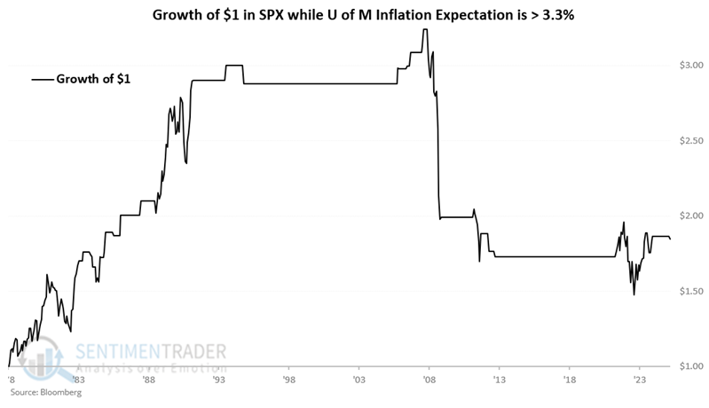
The most recent reading was an uncomfortable 5.0%. Is this a reason to panic and sell? Or to load up on inflation hedges? Not necessarily. A new report is coming out in a matter of days. But the data above does suggest that concerns of high inflation can be, um, a concern.
The Aggregate Signal Model
Our Aggregate Signal Model gives favorable and unfavorable signals for the stock market based on all of our Trading/Models. Jay noted it can be used as weight of the evidence or as a mechanical trading system.
Our Aggregate Signal Model (ASM) is an aggregate buy/sell signal based on all our buy/sell signals.
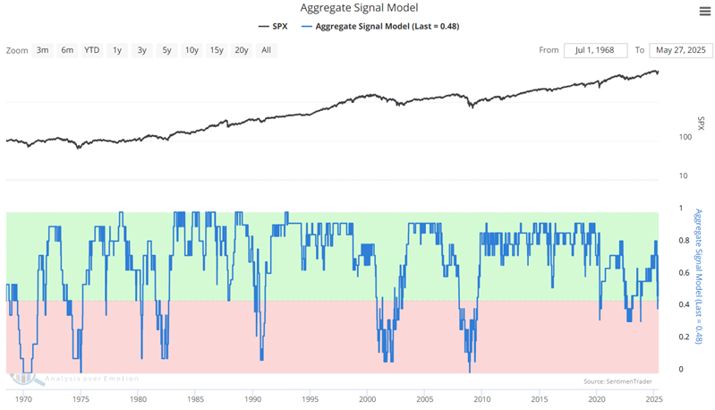
In the simplest form of this model, the idea is to be 100% long when the model reading is > 45% (0.45). The basic approach to evaluating the ASM is to consider it to be favorable when it is above 0.45 and unfavorable when it is below 0.45.
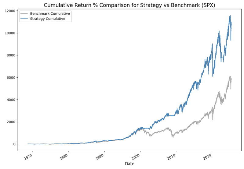
This strategy has made 34 round-turn trades since 1968, with a Win Rate of 61.76%, and was in the market 83% of the time. The most important thing to note is that the average win was 39.28%, and the average loss was only -2.58%. The chart below shows the hypothetical equity curve for the strategy (blue line) versus buy-and-hold (grey line). The strategy registered a hypothetical gain of 10,818% versus 5,817% for buy-and-hold.
The approach Jay took in Part 2 is geared toward investors who would prefer to put their money in the market and leave it there, but who do not want to simply ride out every bear market and would be willing to occasionally "play some defense." So the test here will assume that:
- A buy signal is triggered when ASM crosses above 0.545
- A sell signal is triggered when ASM crosses below 0.21
By definition, because the trigger levels are wider, there will be fewer signals. The hypothetical buy and sell signals since 1968 are highlighted in the chart below. There are few signals, and none since the buy signal in 2009.
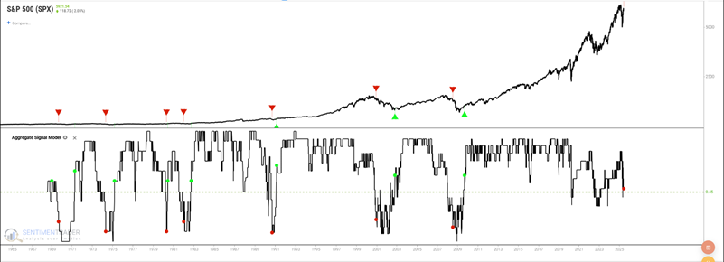
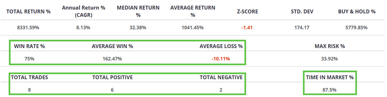
This strategy has made only eight round-turn trades since 1968, with a Win Rate of 75%, and was in the market 87.5% of the time. The average winning trade gained 162%, and the average loss was -10%.
High correlations
Jay showed that our Component Correlation indicator recently detected herding activity in Material, Energy, Technology, and Consumer Discretionary.
Our component correlation indicators measure the degree of correlation in price action among members of a given index. During times of panic, investors tend to buy or sell "everything" together, no matter their individual merits, so correlation rises. The higher it goes, the more we see groupthink, which tends to happen at times of extreme pessimism, and is thus usually a positive for that sector in the future.
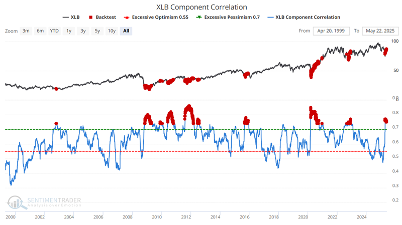
The Materials Select Sector SPDR Fund (XLB) tracks the S&P 500 Materials sector. The chart below highlights all dates when the XLB Component Correlation indicator was above 0.74. Average returns were excellent from two months and beyond, and significantly better than when correlations were low.
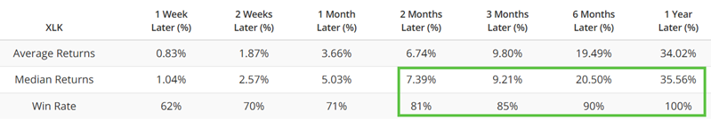
The Technology Select Sector SPDR Fund (XLK) tracks the S&P 500 Technology sector. The chart below highlights all dates when the XLK Component Correlation indicator was above 0.74. Over the following year, XLK averaged a return of +35%.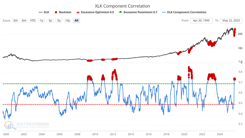
Jay also looked at correlations among energy and consumer discretionary stocks, both showing similar extremes.
Nuclear stocks go nuclear
Stocks within the nuclear energy sector surged on the back of favorable news for the industry. Dean noted that trend scores for stocks within the nuclear ecosystem saw notable improvement last week.
Last week, the Trump administration announced several executive orders aimed at supporting the nuclear energy sector, providing an additional catalyst for an industry that was experiencing a resurgence driven by the AI arms race. The stocks within the nuclear ecosystem exploded to the upside and are following through again today.
As shown in the table below, most breakouts are concentrated among uranium miners and nuclear technology firms, with limited participation from nuclear power plant operators.
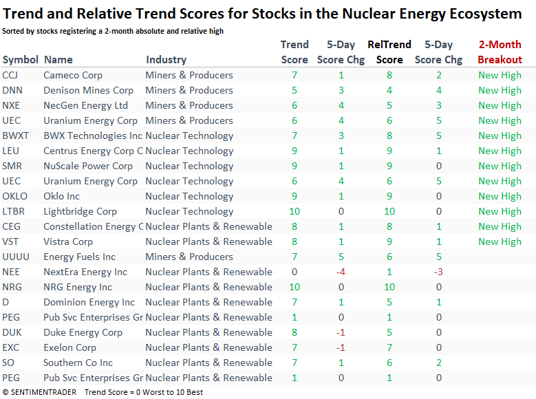
Except for Necgen Energy (NXE), the other uranium miners triggered trend score net change signals. With notable improvement in trend and relative trend scores, the group could be shifting into a more constructive uptrend phase.
Cameco (CCJ), the top uranium miner by market cap, has rallied sharply since triggering a trend score net change signal and is on the cusp of a trend score buy signal should the trend composite rise one more point.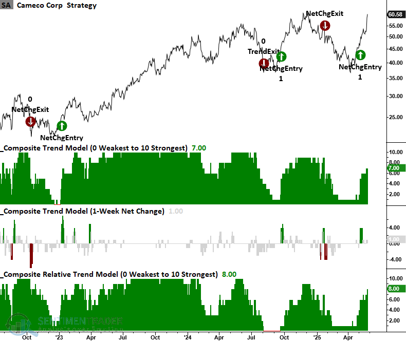
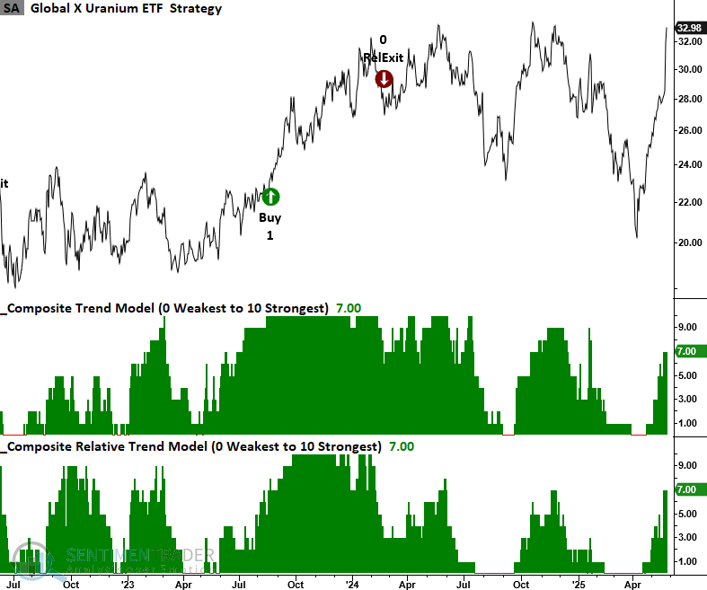
The most accessible and risk-averse way to participate in the nuclear sector would be through an ETF allocation.
The Global X Uranium ETF (URA) provides investors with exposure to a diverse range of companies involved in uranium mining and the production of nuclear components. Trend scores for this ETF have almost reached the threshold level for a signal.
Although the Sprott Uranium Miners ETF has shown improvement, its scores still lag behind those of the Global X ETF. It's essential to examine the underlying holdings of any ETF, as individual weightings can significantly influence performance.
Dean looked in-depth at several other related stocks and ETFs.
About TradingEdge Weekly...
The goal of TradingEdge Weekly is to summarize some of the research published to SentimenTrader over the past week. Sometimes there is a lot to digest, and this summary highlights the highest conviction or most compelling ideas we discussed. This is NOT the published research; rather, it pulls out some of the most relevant parts. It includes links to the published research for convenience, and if you don't subscribe to those products, it will present the options for access.