
TradingEdge Weekly for May 3 - Volatility and inflation picking up, losing a winning streak, high-yield reversal

Key points:
- The most benchmarked index in the world ended a 5-month winning streak
- The S&P 500 triggered a Bollinger Band bounce signal
- Its recovery from oversold conditions was impressive but not enough to classify as a classic breadth thrust
- Volatility is picking up, with the VIX showing a golden cross
- An inflation gauge is picking up
- International stocks are facing a couple of bleak seasonal months
- Brazilian stocks are facing some similar headwinds
- High-yield bonds suffered heavy selling pressure then reversed
- A tailwind for gold based on its relationship to the dollar
Maybe not the end of a good thing
The S&P 500 Index registered a five-month winning streak at the end of March 2024, which ended at the end of April 2024. Jay showed that history suggests a strong probability of more action to the upside in the months ahead.
A five-month winning streak tends to be bullish for stocks, but now the latest streak is over. On the face of it, this sounds like a bad thing. But if we take a closer look, history suggests something else.
We will run the following test using monthly closing price data for the S&P 500 going back to 1920. A signal occurs when the S&P 500 closes a month lower after registering five or more consecutive higher monthly closes. After a signal, we will buy and hold the S&P 500 for six months. The chart below (using a log scale) displays the hypothetical growth of $1 invested in the S&P 500 Index for six months following each new signal.
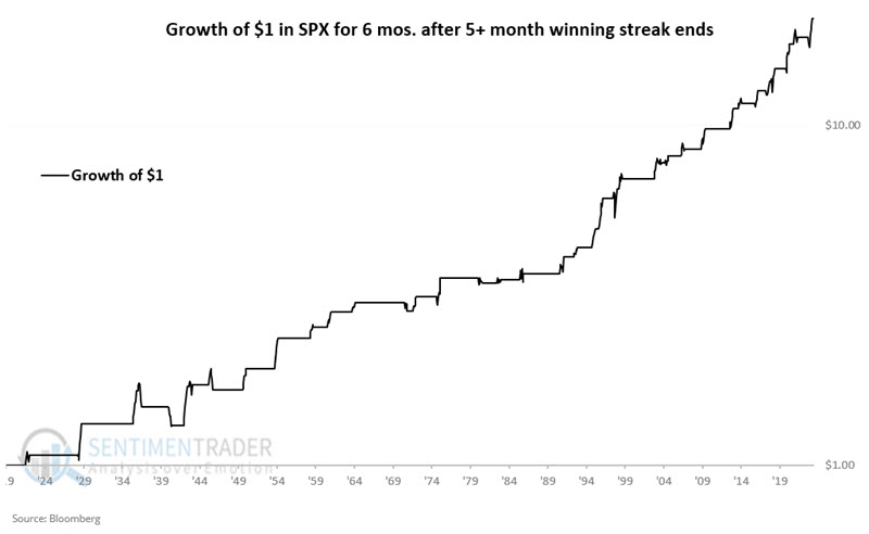
Like anything in the market, it is imperfect and not indicative of a sure thing. However, investing is a game of probabilities, and the equity curve's "lower left to upper right" nature is evident.
The signals enjoyed an 84% win rate with an average gain about twice as large as the average loss. Notably, six-month moves of 10% or more skew 16-to-2 to the favorable side.
Bollinger Band bounce
After five consecutive sessions of closing below its lower Bollinger Band, the S&P 500 staged a reversal. Dean showed that similar Bollinger Band signals preceded favorable returns and win rates for the S&P 500.
A component in the TCTM Washout Model triggered a new alert after the S&P 500 closed below its lower Bollinger Band for five consecutive sessions and subsequently reversed higher, exceeding the midpoint or indicator average.
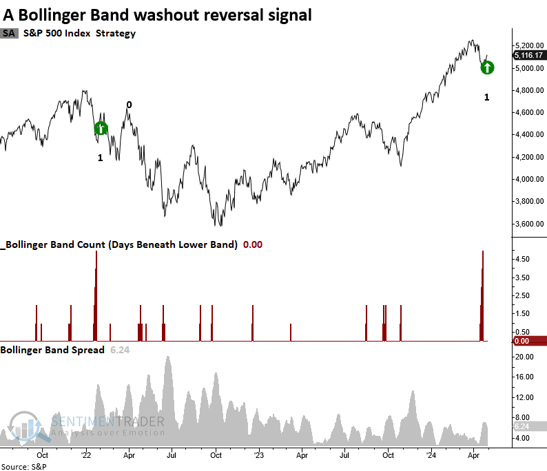
The Bollinger Band model has generated a signal 35 other times since 1930. Similar alerts resulted in an upward bias in the S&P 500, especially over the following two months.
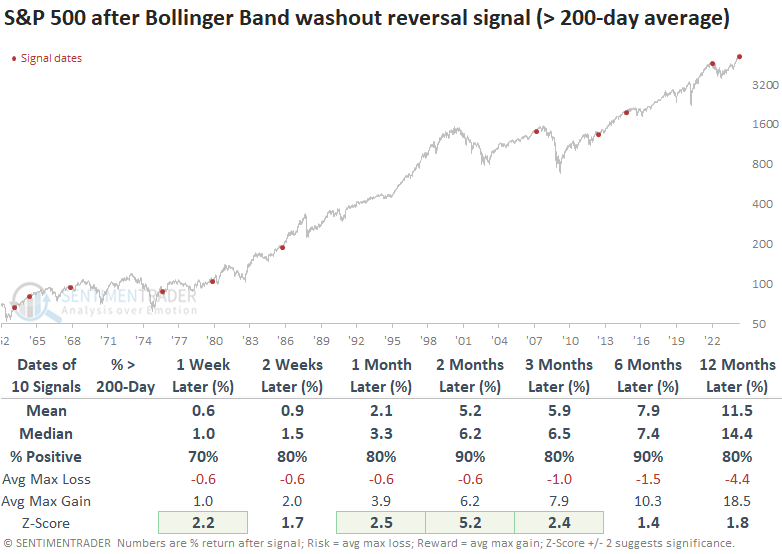
The latest signal occurred with the S&P 500 only 2.63% below its high. Suppose we isolate all precedents that occurred less than 10% below a 5-year high. In that case, win rates improve in 5 out of 7 horizons, while returns are slightly less favorable. Precedents that occurred with the S&P 500 above its 200-day average, like now, produced outstanding returns and win rates, with several horizons exhibiting significance compared to the study period.
The Bollinger Band model's versatility extends beyond the S&P 500. It has proven effective across other indexes, and the Nasdaq Composite has also generated an alert. Over the following six months, the Nasdaq Composite was higher 89% of the time, with the prior loss occurring during the 1980-82 bear market.
An almost thrust
Almost exactly four years ago, stocks were booming off the pandemic panic low. Even though it was evident that there was overwhelming buying interest, many technicians didn't want to believe it. The biggest stumbling block is that various indicators didn't meet the "official" conditions for a buying thrust.
Even if we relax the rules, the most recent market action has also missed the usual definition of a thrust - overwhelming buying interest. The NYSE Zweig Breadth Thrust is a 10-day exponential moving average of the Up Issues Ratio. Within ten sessions, it should cycle from below 40% to above 61.5%.
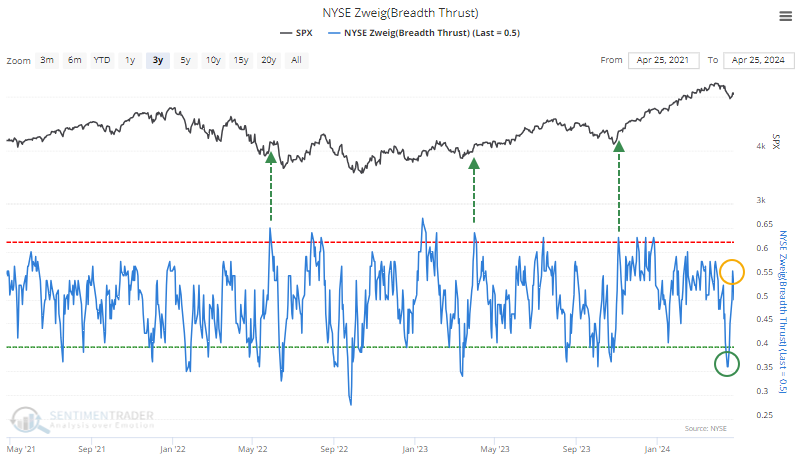
Even though the indicator did drop enough to trigger the first condition, it hasn't rebounded nearly enough to trigger the second. On the other hand, its initial rebound off its low was very fast and very large. The indicator rose by more than 20% within a week.
Over the past 60 years when the indicator rose at least 20% from below 36% within a week, mid- to long-term returns were well above a random return, but there were too many false signals for comfort.
This has been one of the few examples of a mini-thrust when the S&P held above its 200-day moving average. The few other times this was triggered with the S&P above its average, the index continued higher each time up to two months later. Two of those, however, led to significant peaks and extended drawdowns.
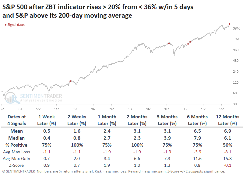
Looking at it another way, there were a few more instances when the S&P 500 was trading within 10% of its high at the time of the signal (even if it was below its 200-day moving average). Again, the next couple of months were almost universally positive, though two (maybe three, depending on your tolerance) failed.
Volatility is picking up
For the first time in over a year and a half, the VIX "fear gauge" is firmly in an uptrend. This ends a historically prolonged stretch of calm conditions over short-, medium- and long-term time frames, as its 50-day moving average has crossed above its 200-day average.
It got close last fall but didn't quite make it. When it was triggered in 2018, there was a massive volatility spike, and the VIX more than doubled within a week. In late 2021, it triggered after the VIX already made a short-term spike, and volatility swung wildly for months afterward.
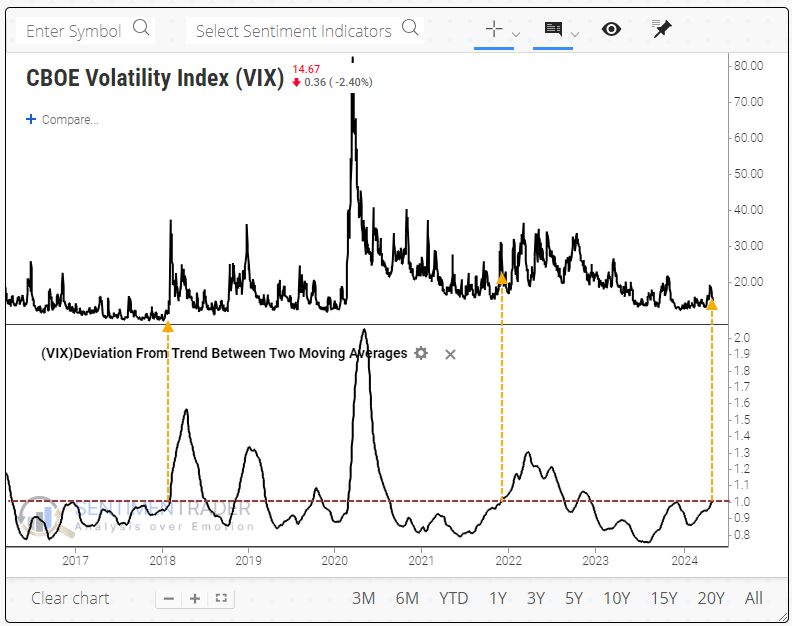
The end of the most recent streak of the VIX's 50-day average being below its 200-day average was tied for the 4th-longest since 1986.
When the VIX had its first gold cross in more than 200 sessions, the S&P 500 showed inconsistent returns across most time frames, but three months later, it was higher only twice out of seven attempts.
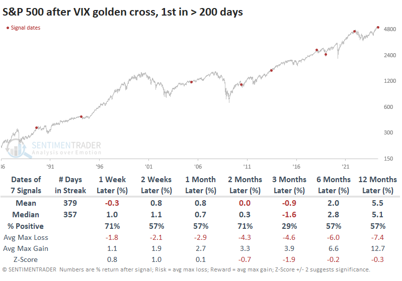
Even though its returns over the next few months were mostly negative, the losses weren't too bothersome. A table of maximum gains and losses across time frames shows that there was only one signal when these golden crosses preceded more than a double-digit drawdown within the next six months.
The trouble for volatility traders is that stock declines don't necessarily translate to increases in volatility. There was only one signal in 2018 when the VIX doubled within the next year, which happened almost immediately.
Among sectors and factors, energy stocks tended to enjoy the best returns, along with defensive stocks, which makes sense. Small-cap stocks did not have a good time.
An inflation gauge is picking up
The ISM Prices Paid Index cycled from less than 45 to greater than 60. Dean noted that after similar shifts, the S&P 500 exhibited a 94% win rate over the following six months.
The Institute for Supply Management released its manufacturing survey on Wednesday. And while the overall index and the new orders component ticked down, the prices paid index continued to expand. The surge in the prices paid survey propelled the index beyond 60, marking a significant shift from its historically low position of less than 40.
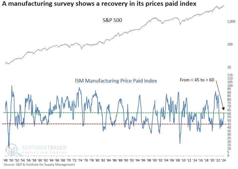
Whenever the ISM Prices Paid Index shifted from below 45 to above 60, the rebound in prices paid by manufacturing managers often aligned with an economic resurgence, bolstering the S&P 500. Over the subsequent six months, the world's most benchmarked index rose in all but one scenario. That precedent occurred within the depths of a significant drawdown, which is not the case now.
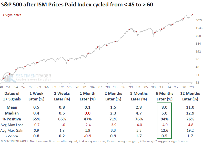
Sectors that tend to outperform in the early stages of an economic recovery, like Discretionary and Technology, exceeded the returns of the S&P 500 and other groups over the favorable six-month horizon.
Suppose you were curious about the point at which the ISM Prices Paid Index reached an unfavorable threshold for stock returns. In that case, a reading above 85 produces negative annualized returns from the S&P 500.
A bleak window for international stocks
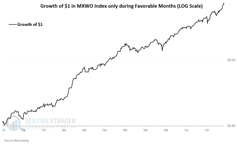
Jay noted that world stock indexes have long demonstrated a consistent annual seasonal pattern. History suggests that the May/June period falls into the "unfavorable" category.
We will use the MXWO Index, which represents the MSCI World Index using monthly closing price data starting on 1969-12-31. January through April, July, November and December will be considered favorable, while May and June, August, September and October will be unfavorable.
The chart below (log scale) displays the hypothetical growth of $1 invested in the MXWO Index only during the favorable months listed above, starting in 1970. The cumulative gain through 2024-04-26 is +6,022.1%.
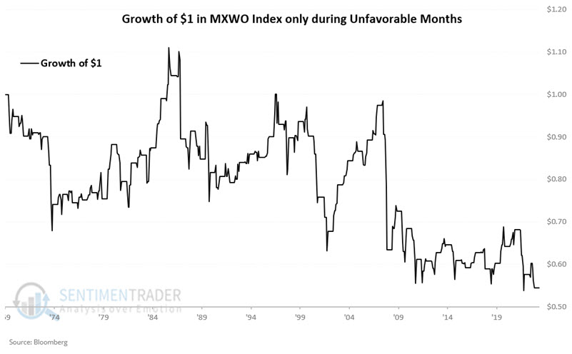
The chart below displays the hypothetical growth of $1 invested in the MXWO Index only during the unfavorable months listed above, starting in 1970. The cumulative decline through 2024-04-26 is -45.5%. There are no guarantees on a year-by-year basis, but during only May and June, the cumulative return was -17.0%.
The iShares MSCI ACWI ETF (ticker ACWI) has a 0.9986 correlation coefficient with the MXWO Index, making it an ideal trading candidate for traders.
Brazilian swings
The iShares MSCI Brazil ETF (EWZ) seasonality in the next two months is unfavorable - EXCEPT for one brief period when it is favorable. Jay suggested this two-way tension suggests potential trading opportunities (long and short) for active traders.
The chart below highlights the annual seasonal trend for ticker EWZ.
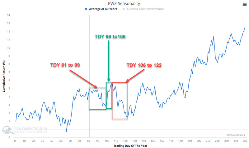
Note that two periods - from Trading Day of the Year (TDY) #81 through #99 and TDY #106 to #122 - are unfavorable. The period between TDY #99 and #106 is favorable. For 2024, these periods are (from the close on the dates below):
#81 through #99: 2024-04-26 through 2024-05-22
#99 through #106: 2024-05-22 through 2024-06-03
#106 through #122: 2024-06-03 through 2024-06-26
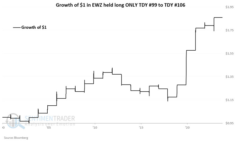
Let's first look at EWZ's performance during the favorable TDY #99 to TDY #106 period. The chart below displays the hypothetical growth of $1 invested in EWZ only during this period since its inception in 2001. The cumulative gain is +86.0%.
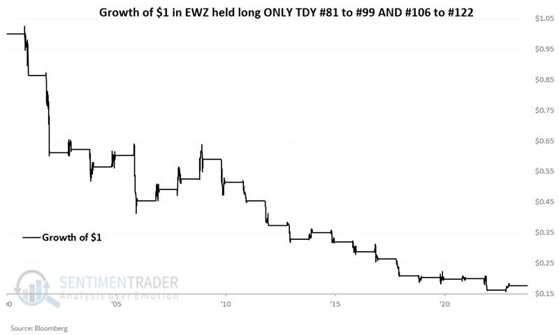
Let's consider EWZ's performance during the two unfavorable periods combined. The chart below displays the hypothetical growth of $1 invested in EWZ only during both unfavorable periods every year since inception in 2001. The cumulative loss from holding EWZ only during these two periods each year is -82.4%.
Jay also touched on the copper/gold ratio and its potential impacts on EWZ. Its latest move suggest a bullish outlook, so the negative seasonal windows may not have as much impact as they otherwise would.
High-yield recovery
The mini-freakout that gave investors paroxysms in the first half of April wasn't limited to the stock market. Its close cousin in the bond market, high-yield debt, also gave holders reason to reach for the anti-anxiety medication.
Earlier in the month, selling pressure was heavy enough to push the McClellan Oscillator to an exceptionally oversold reading, which has since recovered to near neutral. The handful of other times it has cycled like this, more of a recovery was in store, though there was a failure in 2022.
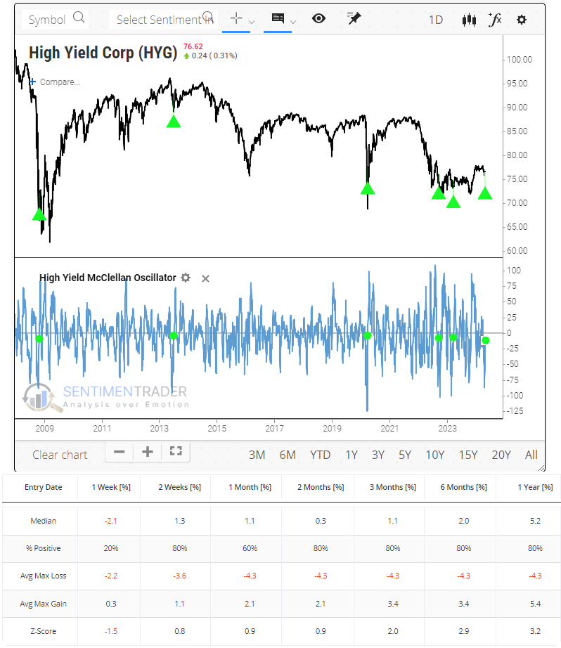
The plunge in the Oscillator means that the McClellan Summation Index also fell, and it has now fully cycled from one of the highest readings in 16 years all the way back to zero. Both times the indicator cycled like this, HYG ultimately rolled over into a rough patch. But that was not before 6-8 months of further recovery.
We see similar behavior in the percentage of bonds that recovered to a 52-week high. That spiked to a historic level of more than 20% of the high-yield bond market in mid-December and just recently fell back to par. Again, there are only a couple of precedents, both preceding months of further recovery.
Gold and the dollar
Gold and the U.S. Dollar tend to move in an inverse fashion. Jay showed that Gold appears to perform much better when it is outperforming the U.S. Dollar. The current trend of this "weight of the evidence" indicator remains favorable for gold.
We will use weekly gold and U.S. Dollar (USD) futures data for testing. Note that the correlation coefficient for the two series is -0.28, meaning they tend to have an inverse relationship.
To objectively designate a trend to the ratio, we will add a 5-week exponential moving average and a 30-week exponential moving average. Next, we subtract the 30-week EMA value from the 5-week EMA value, as shown in the chart below.
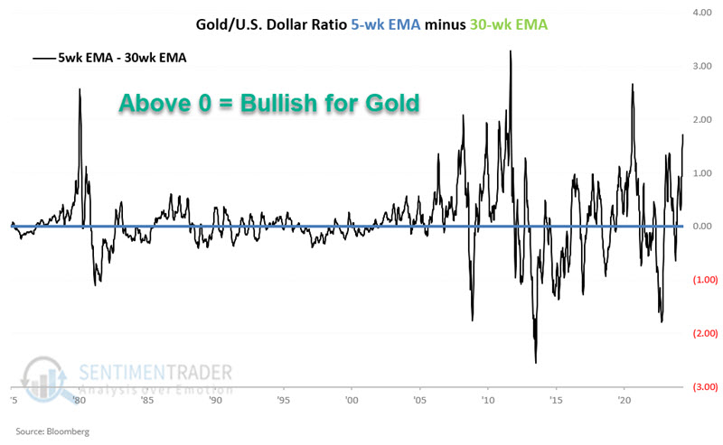
When the value in the chart above is greater than 0 (i.e., when the 5-week EMA is greater than the 30-week EMA), the Gold/USD Ratio is designated as "favorable" for gold. When the value in the chart above is less than 0, the Gold/USD Ratio is defined as "unfavorable" for gold.
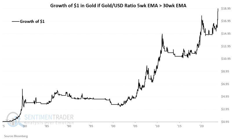
The chart below displays the hypothetical growth of $1 invested in gold only when the value in the chart above is greater than 0. $1 invested in this manner grew to $18.49, or +1,749.4%.
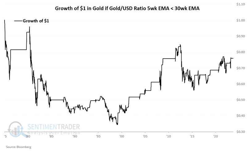
On the other hand, the chart below displays the hypothetical growth of $1 invested in gold only when the value in the chart above is less than 0. $1 invested in this manner shrank to $0.76, or -24.0%.
The most straightforward alternative for non-futures traders is a gold ETF such as the SPDR Gold Shares Trust (ticker GLD), which started trading in 2004. The black line in the chart below displays the hypothetical growth of $1 invested in GLD only when the Gold/USD indicator above is "favorable." The blue line in the chart below displays the hypothetical growth of $1 invested in GLD only when the Gold/USD indicator above is "unfavorable."
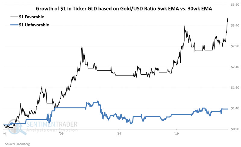
Since November 2004, GLD has gained +249.5% when the indicator was "favorable" and just +38.4% when the indicator was "unfavorable."
About TradingEdge Weekly...
The goal of TradingEdge Weekly is to summarize some of the research published to SentimenTrader over the past week. Sometimes there is a lot to digest, and this summary highlights the highest conviction or most compelling ideas we discussed. This is NOT the published research; rather, it pulls out some of the most relevant parts. It includes links to the published research for convenience, and if you don't subscribe to those products, it will present the options for access.