
TradingEdge Weekly for May 12 - Small caps fall, growth stocks rally, Staples momentum, gold headwinds

Key points:
- Everything looks weak relative to the S&P 500
- Small stocks recently fell to a new low relative to large stocks
- Growth stocks are breaking out relative to value
- Consumers Staples triggered a momentum buy signal
- Tech stock options are "cheap"
- Good (and bad) signs for Financials
- Good (and bad) for gold miners, too
- Gold is facing a bit of a seasonal headwind for a while
- There has been a jump in overbought stocks in India
- Chinese tech stocks are back to bust mode
- Optimism is high on sugar and cocoa
Everything looks weak relative to the S&P 500
Not a single S&P 500 equal-weighted sector maintains a positive relative trend score versus the S&P 500. Dean showed that after similar relative trend profiles, the S&P 500 showed an upward bias, with the EW Index outperforming.
Fewer and fewer stocks and sectors are outperforming the S&P 500. However, narrowing market leadership doesn't always spell doom and gloom for the world's most benchmarked index. Sometimes, investors crowd into the relative safety of meg-cap names or rotate amongst sectors in times of uncertainty.
That's relevant now because not a single S&P 500 equal-weighted sector has maintained a positive relative trend score versus the S&P 500 Index.
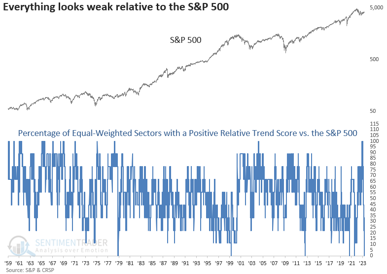
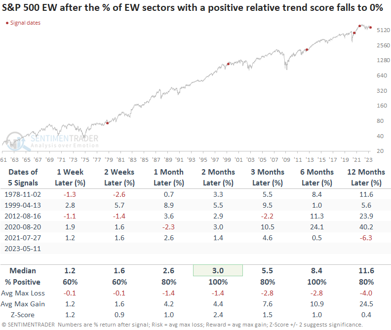
When the percentage of equal-weighted sectors with a positive relative trend score versus the S&P 500 falls to 0%, the S&P 500 had a positive return at some point over the next six months in every case. And the max loss over that same period was -6%.
When applying the signals to the equal-weighted S&P 500 Index, returns and win rates are excellent across all time frames. And, once again, drawdowns were minimal.
Based on the difference between the two index weighting methodologies, one could make a solid case for owning the equal-weighted S&P 500 ETF (RSP) instead of the cap-weighted ETF (SPY).
When Dean raised the threshold from 0% to 15% to capture a larger sample size, the study still shows a bullish upward bias. However, it picks up a few untimely precedents, like 1973, 1974, 1998, and 2018. So, in those cases, the narrowing in market leadership foreshadowed a drawdown phase.
Small stocks have been relatively weak
It's been a tough few years for small stocks relative to their bigger brothers. Now, the ratio between the total return in Small Cap stocks recently fell to a multi-year low relative to Large Cap stocks.
This isn't a new phenomenon. For most of the last 40 years, smaller stocks have suffered (relatively). Before the early 1980s, it was the opposite. While the ratio went through some downturns, the overall trend from 1928-1982 favored smaller stocks over large ones. Since then, larger stocks have mostly outperformed.
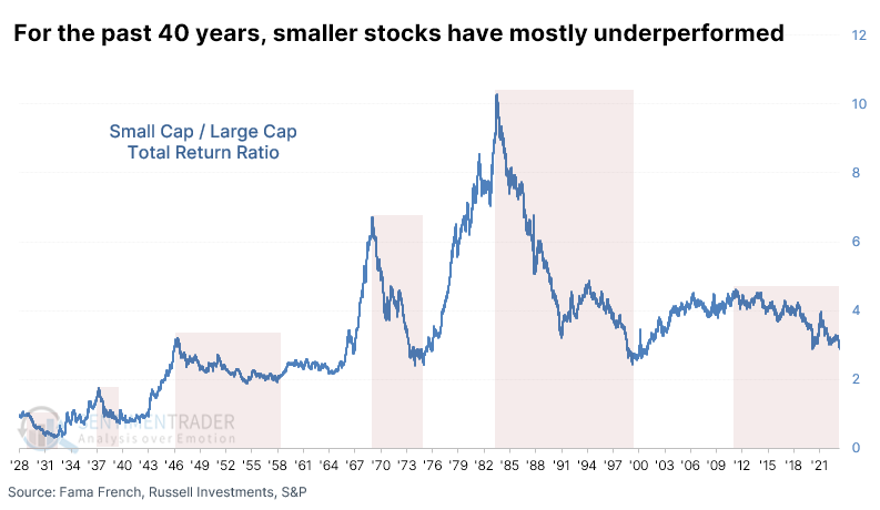
When small stocks hit a new relative low, it's assumed to be a bad sign for stocks overall. Small Cap stocks are considered a bellwether for the domestic economy and investors' risk appetite.
But if we use this as a sell signal for the most benchmarked equity index in the world, it wasn't very good. Over the next two months, there was essentially only a single date (2007) when it worked. It was also essentially the only successful sell signal up to a year later, though a few signals went on to losses afterward.

For Small Cap stocks, it proved to be a non-worry, at least for a while. Two months later, the total return on Small Caps was positive after 15 of 17 signals, though over the next year, they suffered four declines greater than -20%.
Large Cap stocks held up significantly better. Across most time frames, their total return outpaced that of Small Caps, with less risk and greater potential reward. Over the next year, there was only a single loss greater than -5%.
Growth stocks are breaking out (relatively)
Dean showed that the growth-to-value relative ratio registered its first 9-month high after a 24-month low. After similar breakouts, growth showed a slight performance and win rate edge over value across most time frames.
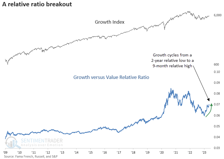
Growth stocks tend to rise steadily over time when the growth-to-value ratio records its first 9-month high after a 24-month low. Except for an untimely signal ahead of the 1987 crash, most unfavorable precedents occurred before the peak in interest rates in 1981. While win rates look similar to the growth, value returns show a flat outlook over the next three months. A year later, the median return outperformed the growth index.
When we compare the two styles, growth shows a slight edge over value for up to six months later. A year later, it was a coin toss between the two groups. However, growth struggled over the 12-month horizon during the inflation-driven secular bear market period from 1966 to 82.
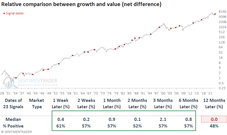
Suppose we assume we're still in a bear market. In that case, signals that occurred in that environment showed a slightly more favorable outlook for growth over value.
Consumer Staples are showing good momentum
Dean showed that the S&P 500 Consumer Staples sector triggered a price momentum buy signal. After similar alerts, the group was higher 93% of the time over the next year.
For only the 16th time in the post-WWII era, the traditionally defensive sector registered a deviation from trend buy signal. The system measures the 4-week moving average for the sector relative to the 40-week average. An alert occurs when the ratio between the two averages cycles from less than 0.93 to greater than 1.04.
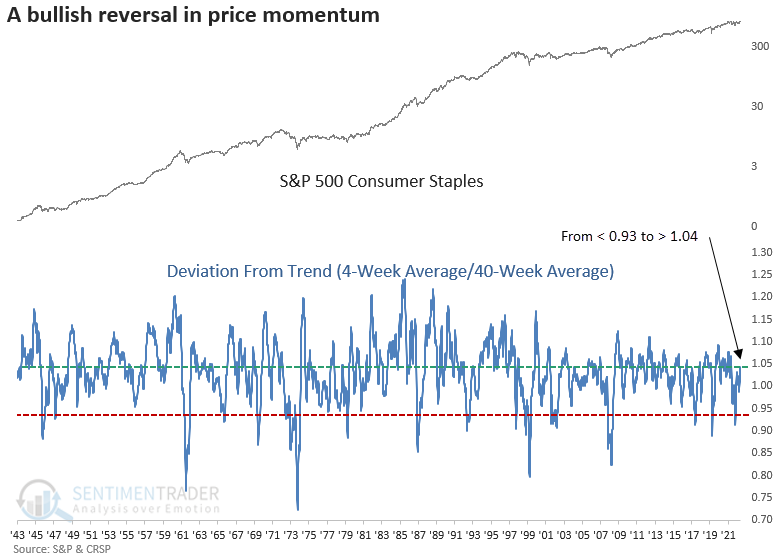
When the ratio between the short and long-term moving average for the Consumer Staples sector cycles from < 0.93 to > 1.04, the traditionally defensive group shows solid returns and win rates across almost all time frames, especially a year later. Typically, the signals occur after significant drawdown periods for the broad market.
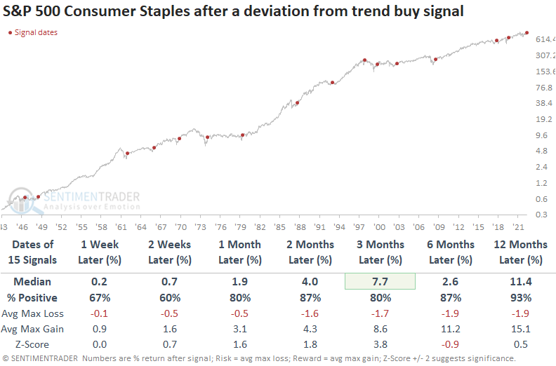
When applying the signals to the S&P 500, returns and win rates look solid. The Consumer Staples momentum signal typically coincides with bullish broad market price action found in the early stages of a new bull market. 1947 and 2000 were exceptions. After these signals, Consumer Staples underperformed the S&P 500 across most time horizons.
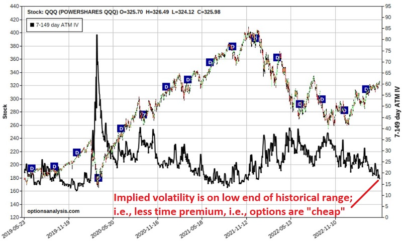
Tech options are "cheap"
Jay showed that the Nasdaq 100 Index has been the leading U.S. index so far in 2023. Using options can offer traders an inexpensive way to speculate on a continuation rally - or a sharp reversal.
Some traders are looking for a continuation to the recent upside for big tech stocks, while others believe the rally is narrow regarding stock participation and that a sell-off is due. A calendar spread using options on QQQ can allow both camps to express their opinion for a relatively low dollar cost. This strategy can also take advantage of a low-volatility environment, as option implied volatility (the black line below) is towards the low end of the historical range. This tells us that QQQ options are "cheap" (i.e., there is a relatively low amount of time premium built into the price of the options).
Jay outlined to example trades that can take advantage of this. The one below is for those who think the rally could continue. The example trades below are not intended as "recommended" trades, only as examples of how to use the strategy based on your outlook for QQQ.
For our bullish calendar spread example, we will assume the following trade is entered:
- Buy 1 QQQ Sep15 2023 373 call @ $1.78
- Sell 1 QQQ Jul21 2023 373 call @ $0.27
The figure and chart below display the particulars and the risk curves (the expected $ P/L at a given price for QQQ as of four dates leading up to July 21st options expiration), respectively.
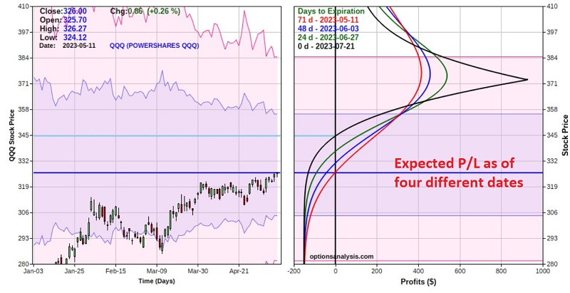
The cost to enter a 1-lot - and the maximum risk - is $151. The maximum profit potential is $934. However, note that this would only occur if QQQ closed exactly at $373 a share on July 21st. The lower breakeven price is $345.13 at July 21st expiration. In the meantime, there is immediate profit potential if QQQ rallies sooner than later.
For those who think a bearish outcome is more likely, Jay outlined a bearish put spread that could take advantage of such a move, given the low-volatility environment.
In a low-volatility environment, a calendar spread can allow a trader to express a bullish or bearish market opinion - and enjoy significant profit potential - for a relatively low cost. It is beneficial when a trader has a strong opinion about price direction but is hesitant to commit the capital required to buy (or sell short) shares of the underlying stock or ETF.
Good and bad signs for Financials
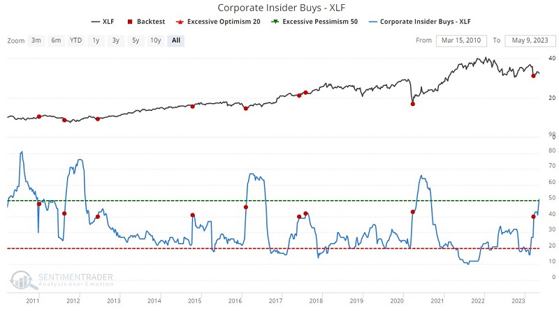
The financial sector has been roiled in recent months by a series of bank failures. Jay noted that several critical indicators suggest that the fear is getting overdone and that a buying opportunity is at hand, though other indicators suggest that more patience is in order.
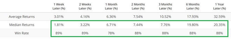
First, the good news: corporate insiders in the financial sector appear to be using the recent dip as a buying opportunity by adding to their positions via open market purchases. The chart and table below display XLF action following those times when Corporate Insider Buys - XLF indicator crossed above 39.9.
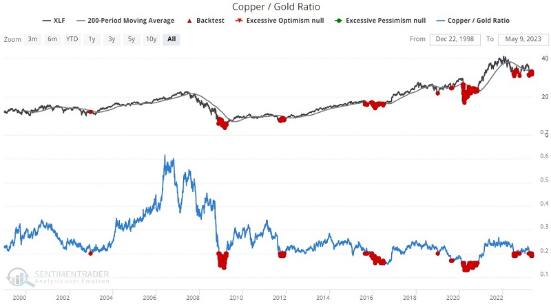
While not typically applied to individual sectors, the ratio between copper and gold has given interesting signals for Financials. The chart and table below display XLF action following all dates when the copper/gold ratio was below 0.20, AND ticker XLF was trading below its 200-day moving average.
If we look specifically at the banking sector, we find that sentiment is beginning to reach a bearish extreme. The 50-day average of our KRE Optix indicator has dropped below 30.1, which preceded positive returns after each of the other times it triggered.
Now let's look at some lingering warning signs.
It should not be surprising that the number of XLF constituents making new 52-week lows has increased. The bad news is that this weakness often presages further interim weakness. Also, when our Bond Risk Levels indicator has fallen to a low level, financial stocks have tended to perform quite poorly. Lastly, the annual seasonal trend for ticker XLF is a cause for concern, as the June through October period tends to show little upside bias.
The net result of the information above is something of a mixed bag. Several indicators are highly favorable, while others suggest continued caution. Aggressive investors might consider establishing a position in hopes of a strong rebound. Less aggressive investors should open their minds to the possibility of buying but might consider waiting for some sign of an actual reversal in the recent bearish action.
Good and bad for gold miners, too
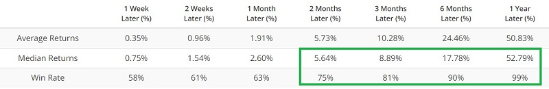
Jay further noted that for gold miners, while all the momentum is to the upside, several sentiment and breadth indicators are suggesting that caution may be in order.
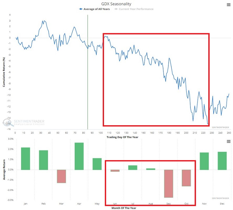
The chart below displays the annual seasonal trend for ticker GDX. The cause for concern is obvious, as the June through October period tends to show significant weakness.
Sentiment has also been getting quite extended. The chart below highlights with a red dot all dates when the 50-day average for GDX Optix was above 60, and the GDX closing price was below its 150-day moving average.
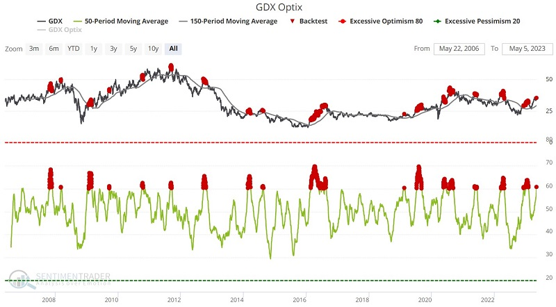
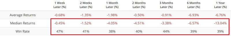
Jay outlined other indicators that also tended to show a negative bias after similar readings to what we're seeing now, including a shorter sentiment average, fund flows, and the percentage of miners in a correction.
But there is one two-part scenario that might suggest that investors can watch for that would suggest that this might be a favorable exception for the indicators above:
- The first part will be if GLD does close above resistance levels and perhaps sees the current resistance level turn into a support level.
- The second sign could come when the 200-day average of the GDX Breadth (% > 200 Day Avg) indicator crosses above 48, just above where it is now.
Jay further noted that gold is entering a slightly unfavorable seasonal period.
The period of weakness extends from Trading Day of Year (TDY) #90 through TDY #117. For 2023, this period extends from the close on 2023-05-09 through the close on 2023-06-15. The chart below displays the hypothetical $ +/- achieved by holding a long position in gold futures only during these windows each year since 1975.
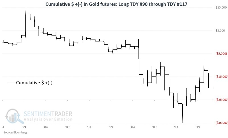
Gold rallied 46% of the time during the windows, but the average loss was quite a bit larger than the average gain. The contract lost more than -$3,000 during seven of the years, while gaining more than +$3,000 only four times.
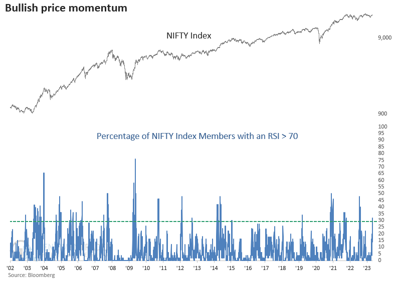
A jump in overbought stocks in India
Dean noted that the percentage of NIFTY Index members with an RSI > 70 surged above 30%. Similar momentum surges preceded excellent returns and win rates for the local currency NIFTY Index.
The Relative Strength Index (RSI), developed by J. Welles Wilder Jr., measures price momentum for stocks, indexes, and other assets. The common mistake traders make is associating a reading above 70 with a bearish overbought condition. In actuality, it's more bullish than bearish.
On Monday, the percentage of NIFTY Index members with an RSI > 70 surged above 30%, triggering a buy signal for the India-based Index.
When the percentage of NIFTY Index members with an RSI > 70 exceeds 30%, the India-based Index shows extremely bullish results over the next month. Two weeks later, the alert had only one loss over a 20-year period. Please keep in mind that the NIFTY Index is priced in local currency, not USD.
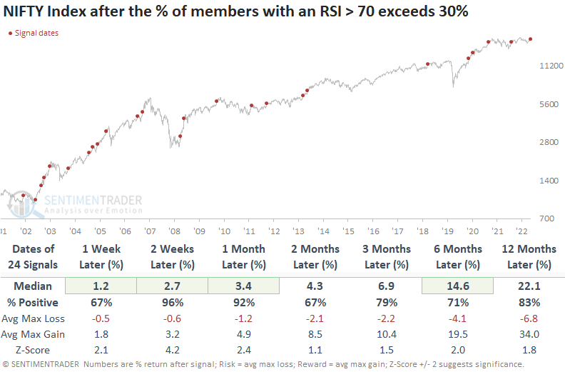
Over the next month, the signal had only one loss greater than -5%. And across all time frames, the median max gain was significantly better than the median max loss. While history is limited, the signal was also quite effective for the INDA exchange-traded fund.
Chinese tech is back to bust mode
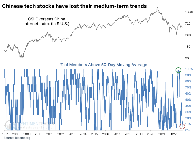
Chinese technology stocks went from bust to boom and back to bust again.
A storm of geopolitical controversy hounded the Chinese tech sector for much of 2022, and the stocks suffered one of their largest declines ever. They rebounded for a while, then plunged anew last October, once again triggering compelling extremes and earning the reliable buy signal of being uninvestable.
A furious rally into last December made the media and major investment banks jump on the recovery bandwagon, which is always a worry. When we looked at the recovery at the time, the few precedents appeared bullish in the short-term, bearish in the medium-term, and bullish again in the very long-term.
So far, it has mostly played out that way, but the decline has gone deeper than we might have reasonably suspected. Since late January, the stocks haven't enjoyed much respite from the selling pressure. At the time, nearly every one of the stocks was above its 50-day moving average, but by late last month, that fell to fewer than 7%.
Similar cycles have not typically been kind to the CSI Overseas China Internet Index, the index behind the popular KWEB fund in the U.S. The fund struggled to rebound consistently over the next 2-3 months and suffered a double-digit median loss over the next year.
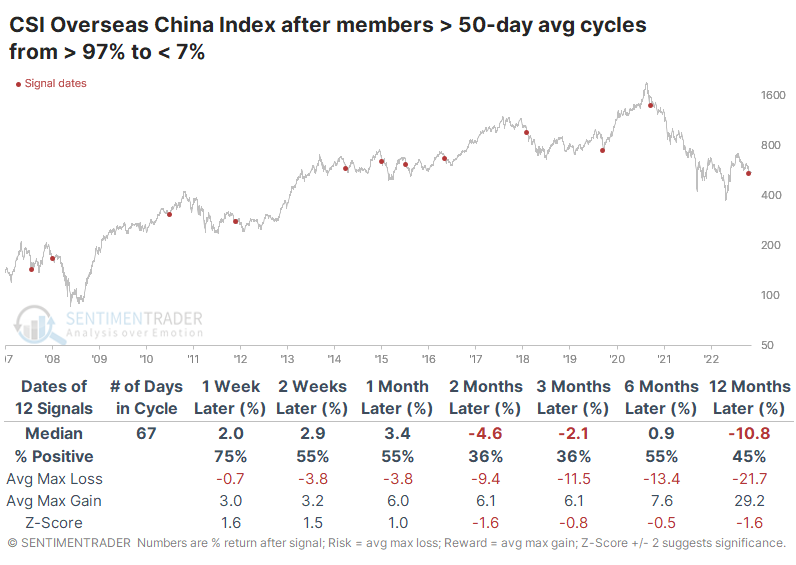
We can see a similar situation with longer-term trends. By late January, more than 95% of the stocks had recovered above their 200-day moving average; a couple of weeks ago, that fell to fewer than 33% of stocks holding above their average. The few times the sector underwent similar cycles, it rebounded over the next month each time, then saw great six-month returns twice and a horrid loss once.
The stocks have suffered bad selling pressure, but it hasn't reached the extreme that would suggest a high likelihood of an imminent rebound. The biggest trouble is that we're mostly flying blind here as far as historical precedents go because the only somewhat similar historical periods are 2008-09 and 2011-12. The most compelling thing we've seen with the sector is the long-term (2-3 year) implications of the kind of selling pressure witnessed last year, and the current volatility is the likely price a long-term investor would have to pay to stick with a potential recovery from an "uninvestable" asset.
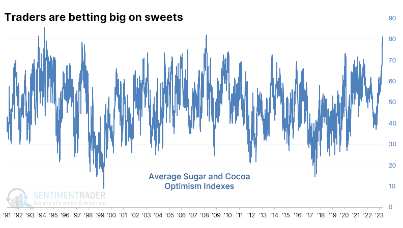
A couple of sweet commodities
If you pull up the Market Sentiment Overview, two markets stand out, both commodities. Only cocoa and sugar have an Optimism Index (Optix) in the optimistic zone. When we average the Optix of the two markets, it just recorded its 3rd-highest reading in more than 30 years. It has since settled back but remains above 70% on average.
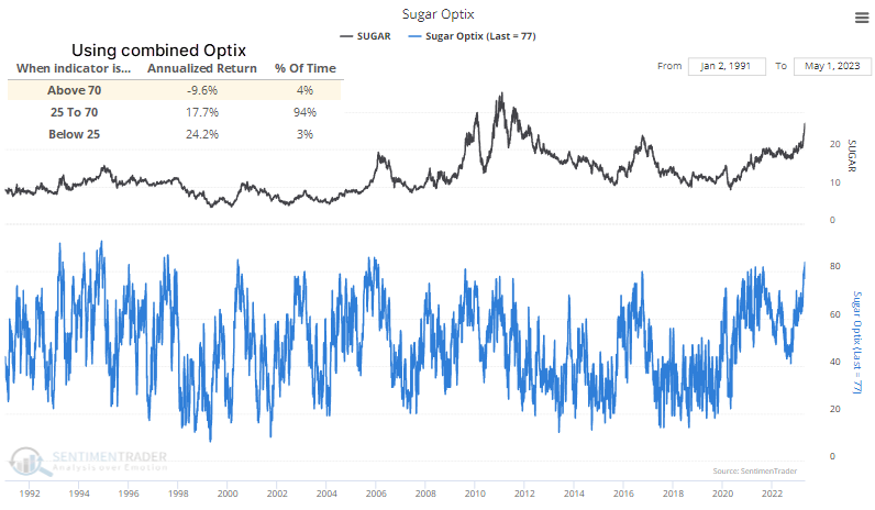
The chart below shows the annualized return in sugar futures when the combined Optix of sugar and cocoa exceeds 70%. It has not been good, as the contract has tended to see some sudden drops from periods of extreme optimism in "sweet" contracts. Cocoa futures also tended to show very poor annualized returns after extreme optimism in these contracts.
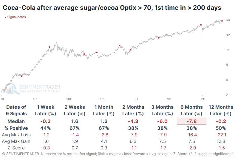
It might be interesting to look at returns in a couple of stocks where cocoa and sugar can be expense inputs. For a stock like Coca-Cola, it tended to be a potential negative influence. Over the next six months, the stock showed gains only three times out of nine signals, and three losses were double-digits.
About TradingEdge Weekly...
The goal of TradingEdge Weekly is to summarize some of the research published to SentimenTrader over the past week. Sometimes there is a lot to digest, and this summary highlights the highest conviction or most compelling ideas we discussed. This is NOT the published research; rather, it pulls out some of the most relevant parts. It includes links to the published research for convenience, and if you don't subscribe to those products, it will present the options for access.