
TradingEdge Weekly for Mar 28 - Revisions decline, 200-day behavior, dollar seasonals

Key points:
- The VIX shows receding fear relative to its recent range
- A few other indicators are giving bullish implications, like the Panic/Euphoria Model
- One concern is the S&P 500's recent behavior around its widely watched 200-day moving average
- Earnings revisions are heading down
- The average S&P stock is now in a relative uptrend...but not against Germany
- The Nifty 50 triggered some breadth thrusts
- Energy and utilities have tended to do well in the spring
- The dollar is heading for seasonal headwinds
Fear receding
A swing trading system based on the CBOE Volatility Index (VIX) triggered a bullish alert. Dean showed that volatility reversals in an uptrend yielded solid returns and consistency for the S&P 500 over all time frames.
Following a surge in the VIX, a swing trading system triggered a new signal when the volatility index's 84-day range rank reversed lower after rising to the top end of its range. The previous alert occurred in August 2024, leading to an 8.2% gain in the S&P 500 over the subsequent two months.
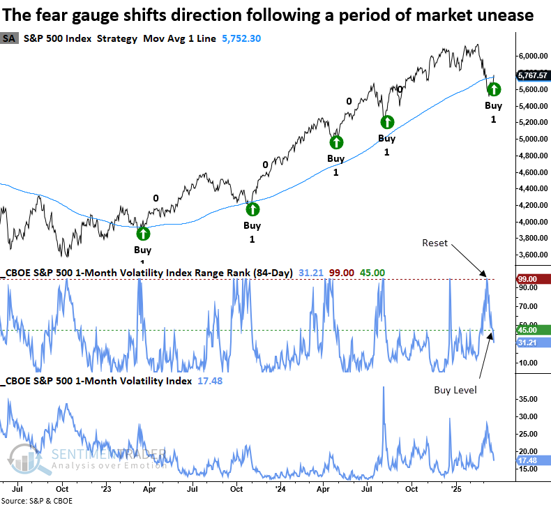
Whenever the S&P 500 Volatility Index's 84-day range rank cycled from above 99% to less than 45%, with the S&P 500 above its 200-day average and exhibiting positive price momentum, the world's most benchmarked index displayed excellent returns and consistency over short, medium, and long-term horizons.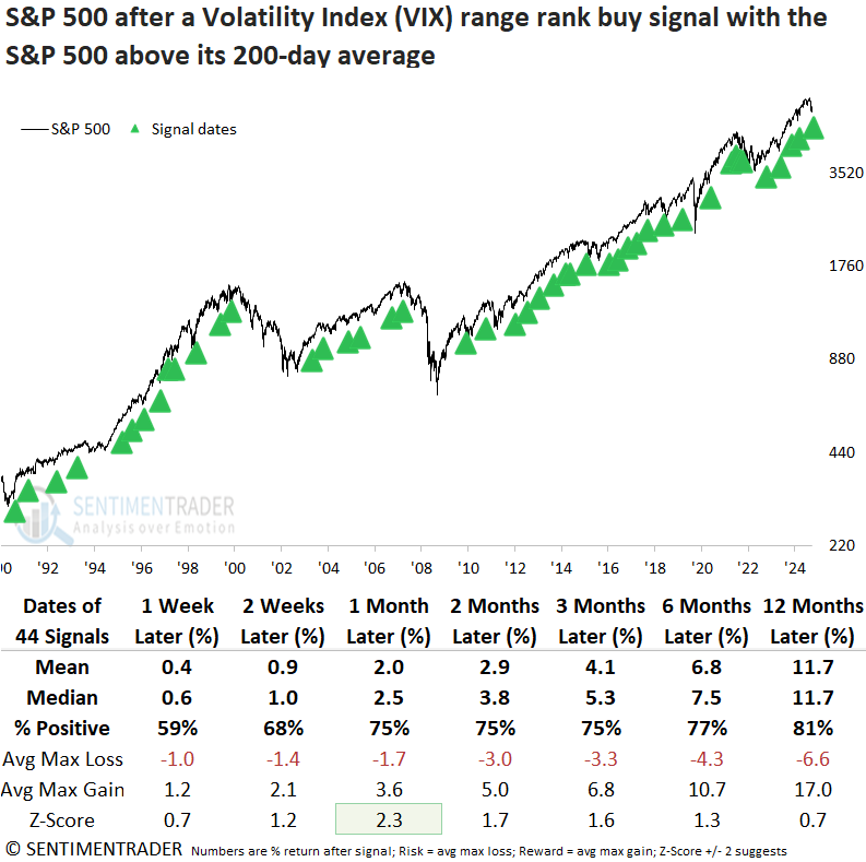
Over the favorable one-month period, the S&P 500 experienced a maximum loss exceeding 5% in five instances (11% of cases), reinforcing that once volatility subsides in an uptrend, the likelihood of a significant near-term drawdown decreases.
A few more positives
Jay highlighted a few other indicators that seem to be saying the same thing. He looked at IPOs relative to SPX, OEX Open Interest, the Panic/Euphoria Model, and two Technology indicators.
During the recent stock market pullback, investors essentially stampeded to the bearish side of the street. As a contrarian indicator, this is typically a favorable sign. One way to quantify this is with our Panic/Euphoria Model.
It comprises the following primary inputs: NYSE short interest, margin debt, Nasdaq vs NYSE volume, Investor's Intelligence survey, AAII survey, retail money market funds, put/call ratios, commodities prices, and retail gasoline prices. The higher the model, the more investors are in a euphoric mood, with lower expected stock returns going forward. Low values, particularly below zero, suggest investors have panicked, and higher forward returns are expected.
The chart below highlights those dates when our Panic/Euphoria Model crossed below -0.27 for the first time in three months.
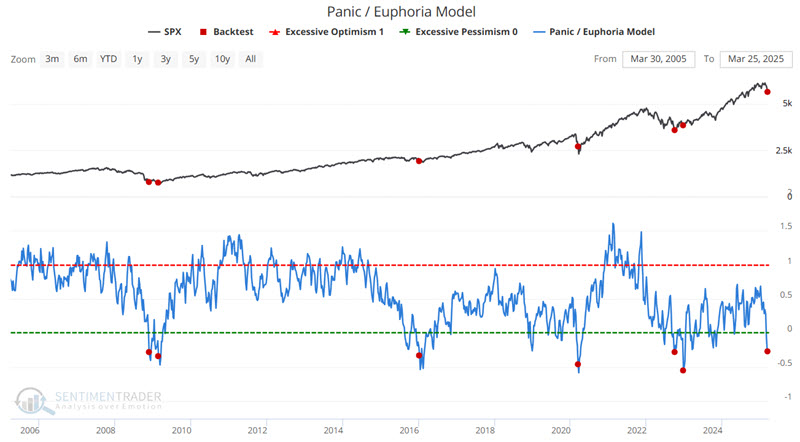
While the sample size is small, the precedents were consistent in their positive returns from 2-12 months following each signal.
About that 200-day average, though...
Since the S&P 500 fell into a correction, its path has mostly followed the "good" precedents that didn't fall into bear markets. It's also good that there was some evidence of deep pessimism and a rush back into stocks with overwhelming force.
The rally early this week allowed the S&P to reclaim its widely-watched 200-day moving average, as well. Nothing but good things there, as the index's annualized return is astronomically better when above its average than when below.
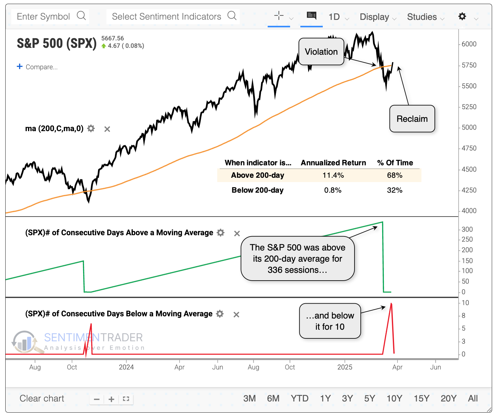
We can see from the above chart that the S&P 500 had been above its 200-day moving average for more than 300 sessions, then below it for only 10 before rising above it once again.
This seems like bull market behavior - a long, uninterrupted uptrend, then a drop that immediately attracted dip-buyers. The instances we're looking at are any time the S&P went more than 200 sessions above its 200-day average, then dropped below it for between 5 and 15 sessions before reclaiming it.
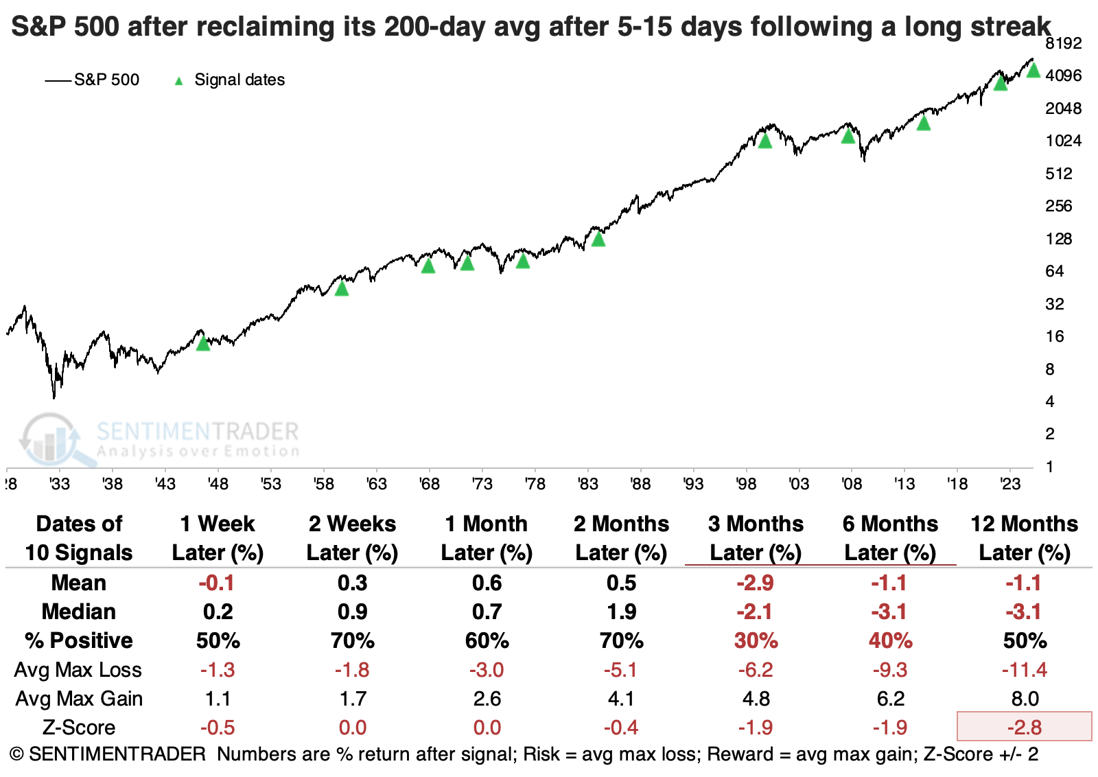
A drawdown analysis shows a negative skew, with more -10% drawdowns than +10% drawups. Only four of the ten signals showed more reward than risk over the following year.
The instances that tended to hold up the best tended to see follow-through buying in the days ahead, pushing further ahead of its 200-day average. Those that didn't manage much of a bounce, and that quickly fell back below the 200-day, tended to see more of a struggle in the months ahead.
Earnings may be heading lower
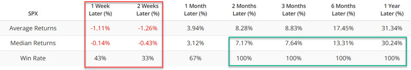
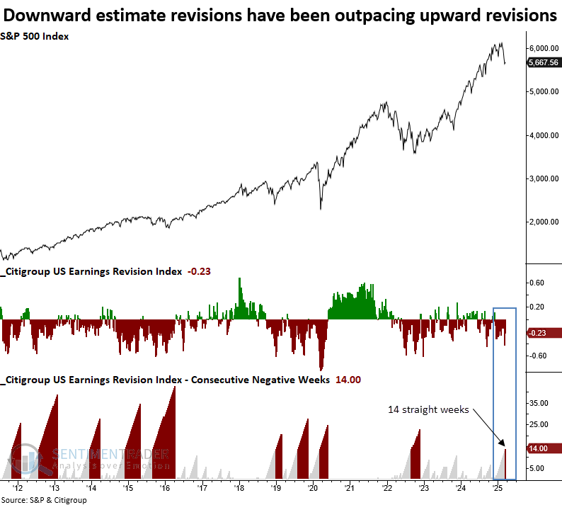
The Citigroup US Earnings Revision Index has fallen for 14 consecutive weeks. Dean showed that similar streaks preceded an unfavorable outlook for the S&P 500 over the subsequent month.
Wall Street analysts have been busy revising earnings estimates downward. Over the last 14 weeks, the Citigroup US Earnings Revision Index, which measures the net number of upward revisions minus downward revisions, has fallen every week, the longest streak since the depths of the 2022 bear market.
Whenever the Citigroup Estimate Revisions Index declined for 14 consecutive weeks, the S&P 500 struggled over the subsequent month, displaying unfavorable returns and consistency. At some point over this same time frame, the large-cap index declined in 9 out of 13 cases.
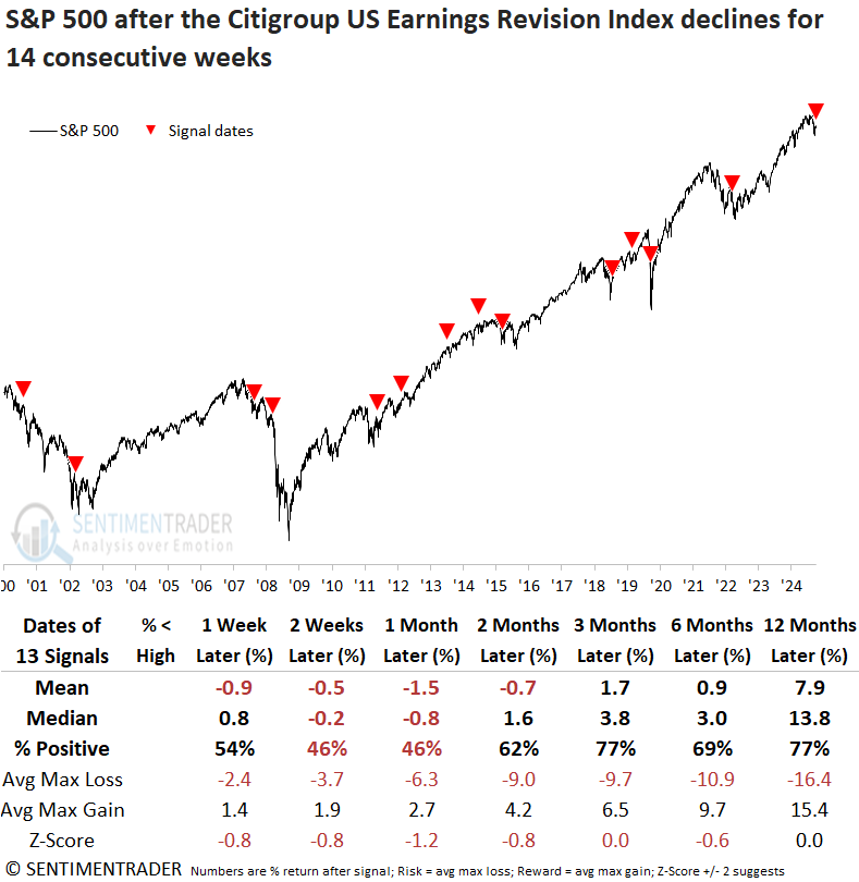
Across all time horizons, the average max loss was more significant than the maximum gain. In four of seven time frames, the median loss surpassed the median gain, signaling a poor risk/reward profile.
Although the sample size is smaller, isolating instances when the S&P 500 was less than 10% below its high, like now, shows a significantly improved medium- and long-term outlook, with the index rising 100% of the time over the following six and twelve months. Still, equities could see choppy conditions in the near term, a common characteristic of markets consolidating near lows.
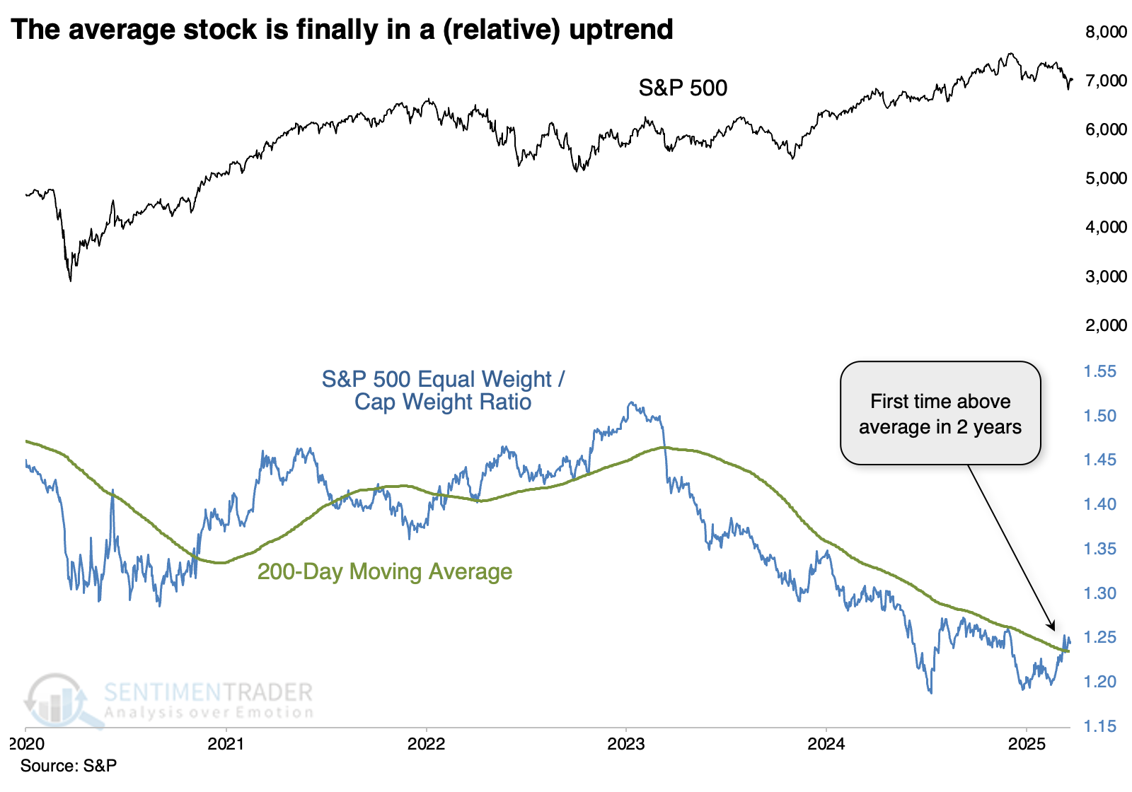
The average stock is in a relative uptrend
Several times in recent months, we've discussed the idea of the average stock over the ones that had dominated an index like the S&P 500.
That index is capitalization-weighted. The equal-weighted version of the index has finally staged a notable turnaround, and the ratio between the two versions climbed above its long-term average for the first time in over two years.
There have only been a handful of times in nearly 70 years when the ratio had gone more than a year below its 200-day average, then reclaimed it. And except for the instance in 1991, the equal-weight version of the index had trouble holding onto its relative momentum.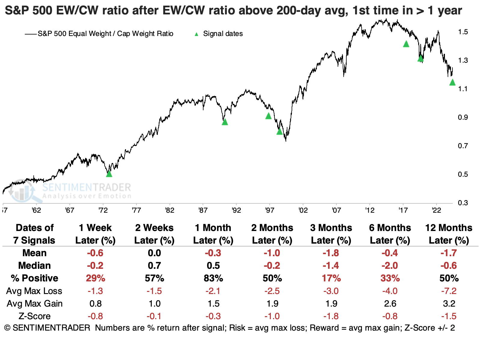
That's not to say the equal-weight index necessarily suffered losses; its absolute returns were mostly positive. But because we were looking at relative returns, the cap-weight version of the index tended to perform better than the equal-weight one.
Even though the equal-weight version of the S&P 500 has been handily outperforming the cap-weight version of the same index, it has not been even remotely close to the German DAX (also a cap-weighted index).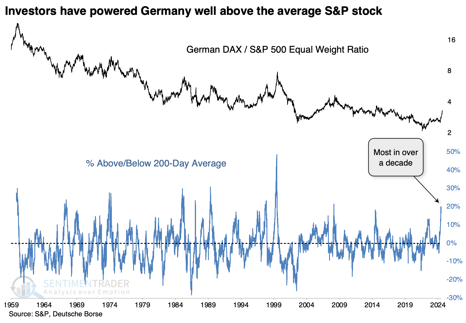
It has been difficult for the ratio to continue its relative outperformance. The ratio most often gave back some ground right away, then oscillated in the weeks ahead. But over the following months, any gains tended to evaporate. Over the following year, the DAX outperformed the average S&P 500 stock only once.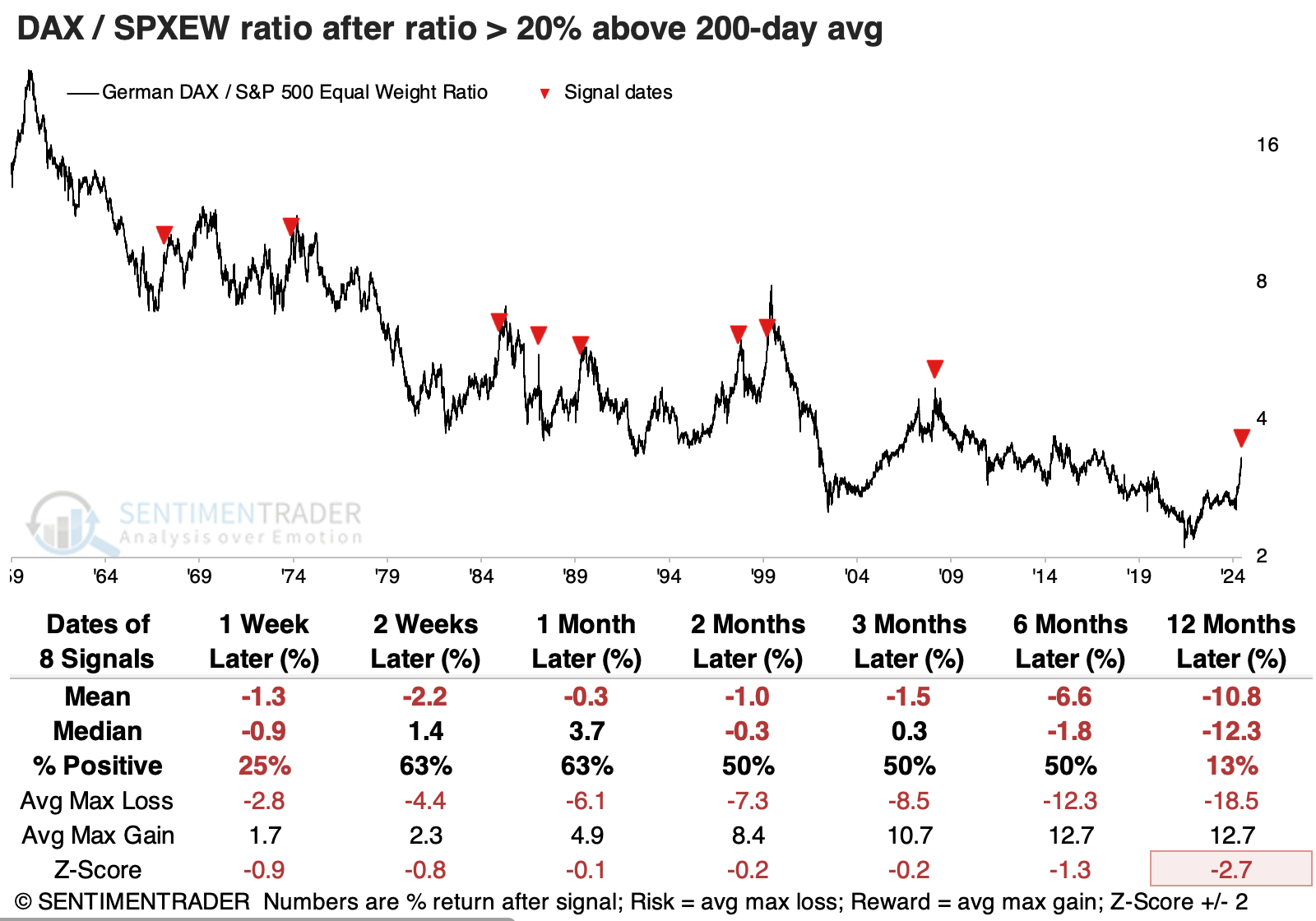
The tech team has just created a remarkable digest of custom breadth indicators for international markets (and crypto). Among the many indicators now available, we can see that over the past quarter, or 63 trading days, more than 95% of developed markets have outperformed the S&P 500. Similar thrusts for these markets have typically occurred near the beginning or middle of uptrends for the MSCI World Index.
Nifty 50 is nifty
Several market breadth indicators for the Nifty 50 Index surged, signaling broad participation. Dean noted that similar thrusts yielded a favorable outlook for India's benchmark index over a medium-term horizon.
Following a peak in September 2024 and a subsequent 15% decline, several indicators measuring Nifty members' participation saw a significant uptick last week, triggering breadth thrusts.The percentage of Nifty Index members registering a 4-week high surged to 60%, the highest reading since December 2023.
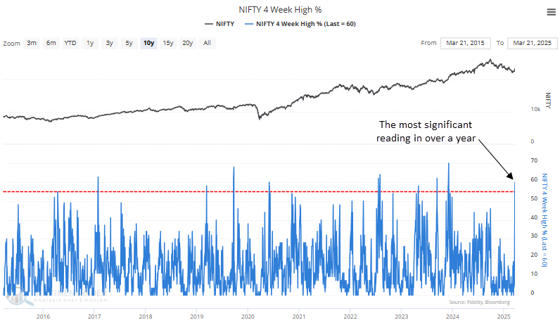
Running an optimization to identify the ideal holding period for the Nifty Index when the percentage of members reaching a 4-week high exceeded 55%, the test returned 25 days. In this case, 23 of the 30 instances were profitable. Furthermore, the average win exceeded the average loss by a ratio of over 2 to 1, a favorable risk/reward scenario.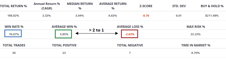
An analysis of prior occurrences over multiple time horizons reveals that broad participation among Nifty index members has typically led to sustained momentum. More recent cases have been even stronger, with the Nifty gaining in 16 of 17 instances since 2011.
The percentage of Nifty Index members that closed above their respective upper Bollinger Band surged to 38%, the highest point since December 2023.
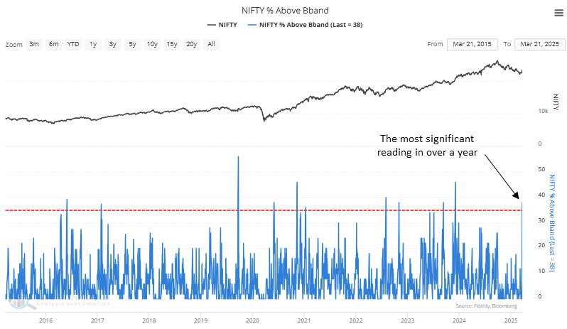
Testing the ideal holding period for the Nifty Index under conditions where over 35% of members closed above their upper Bollinger Band, an optimized strategy identified 26 days as the best duration. This approach was profitable in 25 of 32 instances, achieving a 78% success rate.
Spring sectors
The energy and utilities sectors have a history of performing well during the early spring. Jay suggested that seasonality is not a roadmap, so traders should look for price trend confirmation.
The chart below displays the annual seasonal trend for the Energy Select Sector SPDR Fund ETF (XLE). The period highlighted in the green box extends from Trading Day of the Year (TDY) #56 through TDY #83. For 2025, this period extends from the close on 2025-03-25 through 2025-05-02.
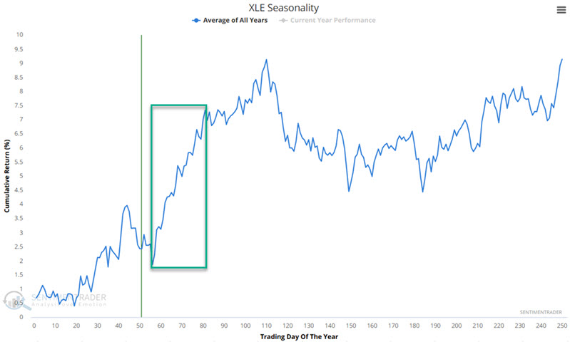
The chart below displays the hypothetical growth of $1 invested in the S&P 500 Energy Sector Index (which XLE tracks) from TDY #56 through TDY #83 every year since 1953.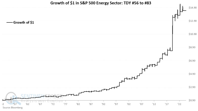
A 75% win rate equates to three out of every four years, which shows a gain during this period. Of particular interest is that moves of 8% or more skewed to the positive by a factor of 10-to-1. Regarding price action, during this favorable period, traders should look for XLE to hold above its 34-day exponential moving average as confirmation of an uptrend.
The annual seasonal trend for the Utilities Select Sector SPDR Fund ETF (XLU) shows a favorable period from Trading Day of the Year (TDY) #56 through TDY #83. For 2025, this period extends from the close on 2025-03-25 through 2025-05-02. The chart below displays the hypothetical growth of $1 invested in the S&P 500 Utilities Sector Index (which XLU tracks) from TDY #56 through TDY #83 every year since 1953.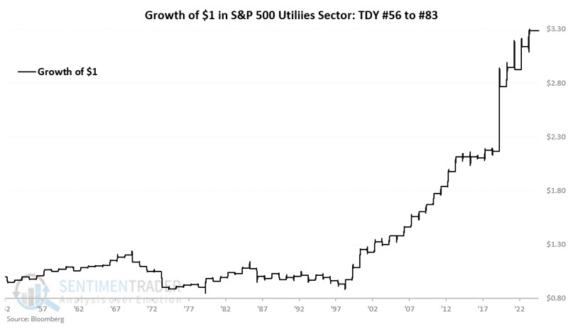
Results were not favorable before 1998. Since then, this period has shown a much higher percentage of gains over the last 26 years. The largest loss during this period in the last 26 years is -2.2%.
Potential dollar doldrums
Jay also noted that the U.S. Dollar will soon be entering an unfavorable seasonal period.
Following an extended advance, the dollar topped out in September 2022 and fell hard into early 2023. It has been trading in a sideways range ever since, most recently falling hard since early 2025.
As detailed in previous TradingEdge reports, 2025 is Year 1 of a new 8-year cycle. During previous Years 1, the U.S. Dollar has shown significant weakness during the March through December months.
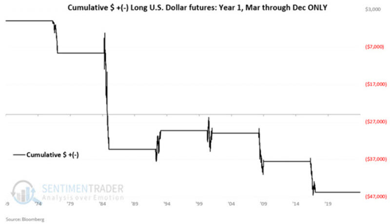
The chart below displays the annual seasonal trend for U.S. Dollar futures. At the close of 2025-03-25, the dollar will enter a period of typical weakness.
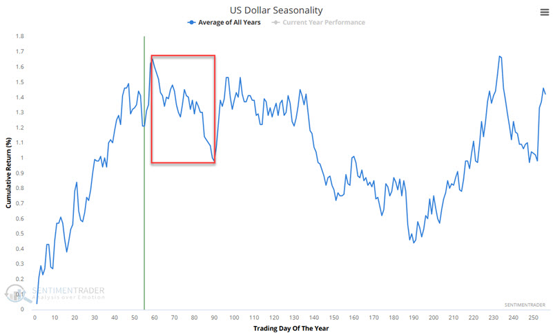 This period has shown more strength in recent years, but the long-term trend is unfavorable. When combined with the 8-year cycle information above, traders should be alert for an opportunity to play the short side of the dollar.
Foreign currencies, in general, trade inversely to the U.S. Dollar. The chart below displays the Australian dollar's annual seasonal trend. At the close of 2025-03-24, the Aussie will enter a period of typical strength.
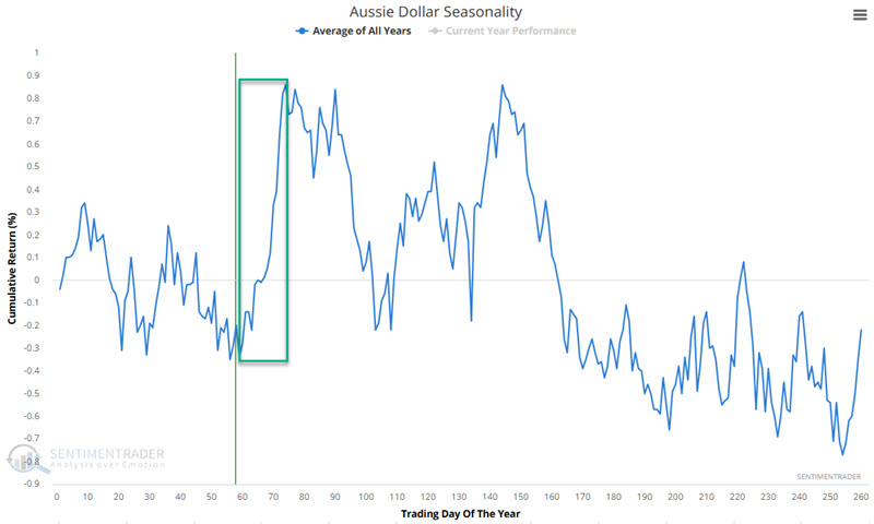
The chart below displays the hypothetical growth of $1 invested in the Aussie only during the Trading Day of the Year (TDY) #59 through TDY #74 period since 1985.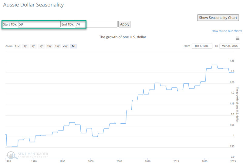
Jay performed a similar analysis for the British pound and Canadian dollar, both showing similar patterns.
About TradingEdge Weekly...
The goal of TradingEdge Weekly is to summarize some of the research published to SentimenTrader over the past week. Sometimes there is a lot to digest, and this summary highlights the highest conviction or most compelling ideas we discussed. This is NOT the published research; rather, it pulls out some of the most relevant parts. It includes links to the published research for convenience, and if you don't subscribe to those products, it will present the options for access.