
TradingEdge Weekly for Jun 16 - Returning optimism, recovering industries, new highs, volatility drops

Key points:
- The world's most benchmarked index has broken out, a very good sign for future returns
- More indicators are tilting to the bullish side of the ledger
- Newsletter writers are turning quite a bit more bullish
- Investors are definitely in risk-on mode
- The higher risk tolerance pushed the S&P 500 well into overbought territory
- Cyclical industries are showing impressive recoveries
- The VIX "fear gauge" has fallen to a 2-year low
- The seasonal pattern for the VIX, and its similarity to other 6-month periods, suggests a pickup in volatility
- A brief seasonal headache for the S&P 500
- Some good signs for the Utilities sector
- Keeping an eye on seasonal tendencies in natural gas
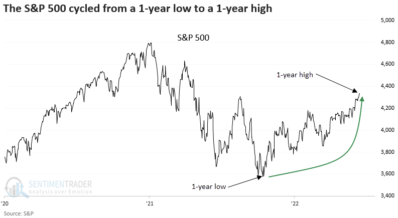
New highs...but with a participation problem
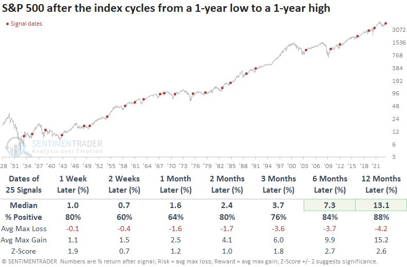
The most benchmarked index in the world has broken out. Dean showed that the S&P 500 cycled from a 1-year low to a 1-year high and similar breakouts preceded excellent returns over the next year. The percentage of stocks within the index also reaching 1-year highs is low, but concern is unwarranted.
On Monday, the S&P 500 closed at a new 1-year high. The breakout represents the first instance after a 1-year low, which is a critical piece of context. Price pattern reversals of this duration tend to mark a transition from a bear market to a bull market.
When the most benchmarked index in the world cycles from a 1-year low to a 1-year high, S&P 500 returns, win rates, and z-scores are excellent across most time horizons. Since 1948, the large-cap index had only one loss over the next six and twelve months. Only two signals preceded a drawdown of more than -10% within the next six months.
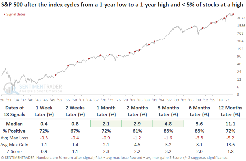
The new 1-year high in the S&P 500 occurred with fewer than 5% of index members registering a 1-year high. Let's add that condition to the original study to see if a participation problem impacts the outlook for the S&P 500.
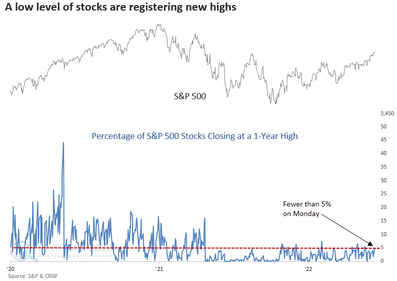
Historically, a lack of participation from individual stocks had a limited impact on the outlook for the S&P 500. Three and six months later, the S&P 500 was higher 83% of the time, and several time frames showed a significant z-score. Over the next six months, the S&P 500 had only one max loss that exceeded -10%.
More indicators are tilting bullish
Jay noted that more indicators are lining up on the bullish side of the ledger. Bullish behavior within the consumer discretionary sector is generally considered favorable for the overall market, and insiders are buying. A measure of industry performance flashed a favorable signal, and Gamma Exposure just crossed one favorable level and appears headed for another. To view a recent TV appearance where Jay discussed related topics, click here.
A subtle shift in the actions of corporate insiders in the consumer discretionary sector - a short-term pickup in buying combined with a continued low level of selling - just flashed what has historically been a favorable signal. Our Backtest Engine shows that when this happened in the past, discretionary stocks rallied 100% of the time over the next few months, which also argues for a higher S&P 500.
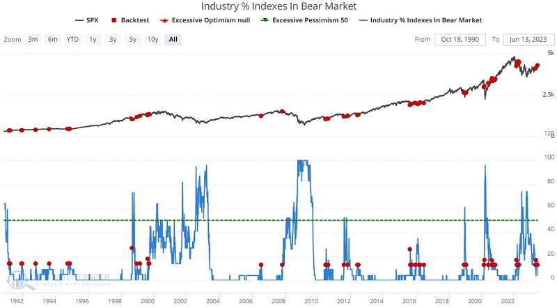
Our Industry % Indexes in Correction indicator shows the percentage of 23 industries that are trading more than 10% below their 52-week highs. A low number is best in a perfect world, as that would suggest widespread bullish trends among industry groups. Still, in an interesting twist, a rise from a low level often coincides with ordinary pullbacks in an uptrend. That is what we just saw recently.
The red dots in the chart below highlight when this indicator's daily reading crossed above 10%. Intuitively, this would seem like a bad thing - i.e., like something you would see near or shortly after a market top. And sometimes it is (note bad signals in late 2007 and early 2022). But overall, historical results have been favorable, as most crosses above 10% occurred during a normal pullback within a more significant uptrend.
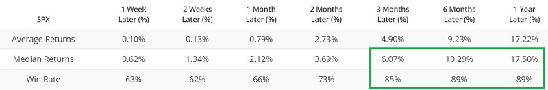
Gamma exposure refers to the sensitivity of existing options contracts to changes in the underlying price of the S&P 500. A raw gamma exposure value of 6 billion implies that if the price moves +/-1%, 6 billion shares will come to market to push price in the opposite of the prevailing direction. The Gamma Exposure / Market Cap Ratio indicator expresses the raw gamma exposure value as a percentage of total stock market capitalization.
The red dots in the chart below highlight those dates when the 50-day average of the Gamma Exposure / Market Cap Ratio indicator crossed above 0.05. The table summarizes the subsequent S&P 500 Index performance.
The signal in April of 2022 was wrong. Because of recency bias, the first thought of many traders will be to wonder if "maybe it doesn't work anymore?" By itself, the most recent signal above may or may not be meaningful. As part of a confluence of indicators lining up on the favorable side of the ledger, it would seem to add weight.
Newsletter writers are turning a lot more bullish
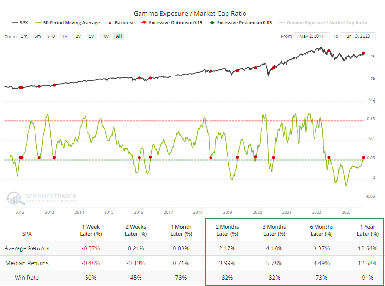
The Investors Intelligence Bull-Bear spread cycled from less than 0% to greater than 30%.
Dean showed that similar shifts in sentiment caused a brief setback, but it eventually resulted in excellent results for the S&P 500. The spread cycled liked this for only the 21st time since 1971.
When the Investor's Intelligence bull-bear spread shifts from less than 0% to greater than 30%, the S&P 500 struggles during the first few weeks. Over the past three decades, 10 out of 12 precedents have exhibited losses at some point within that time frame. However, the index was higher a year later in all but one case.
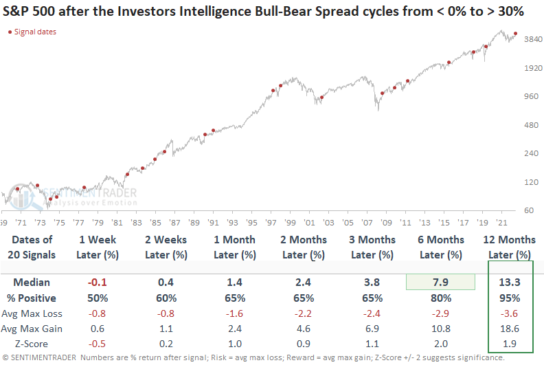
During the inflationary 1970s, there was a higher prevalence of medium-term max losses surpassing -10%. Such occurrences have been absent for over 40 years.
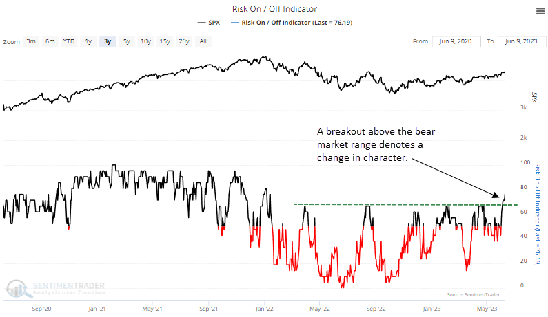
Risk-on sentiment has returned
Dean showed that the Sentimentrader Risk-On/Risk-Off indicator cycled from less than 20% to greater than 75%. Similar reversals in the composite preceded solid returns and win rates across all horizons.
With more members signaling risk-on conditions, the composite cycled from 0% in June 2022 to more than 75% at last Friday's close. Similar to other indicators like the % showing excess optimism or the Volatility Index (VIX), the Risk-On/Risk-Off composite has shifted to a level more indicative of bull markets.
When the Sentimentrader Risk-On/Risk-Off indicator cycles from less than 20% to greater than 75%, S&P 500 returns, win rates, and z-scores look excellent across most time frames. However, one must remember that a handful of signals triggered near peaks in significant drawdown periods.
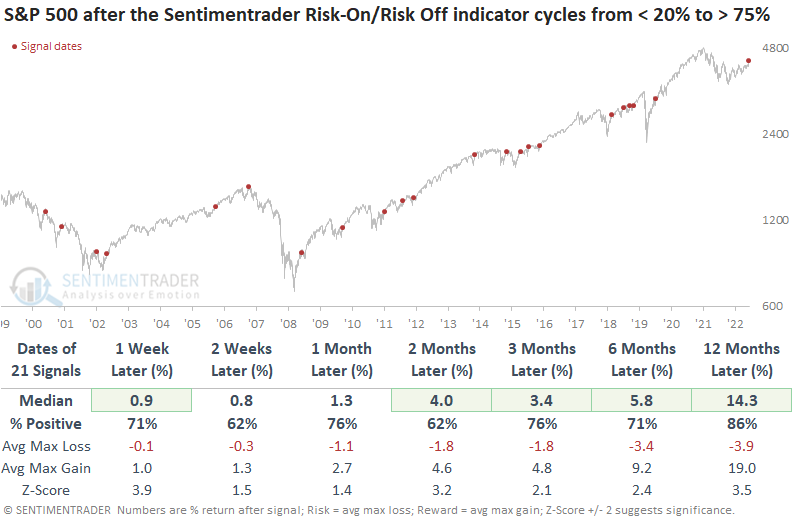
The max loss over the next two months shows benign drawdowns since the low in 2009. Before that point, the shift in risk-on conditions was susceptible to a whipsaw signal.
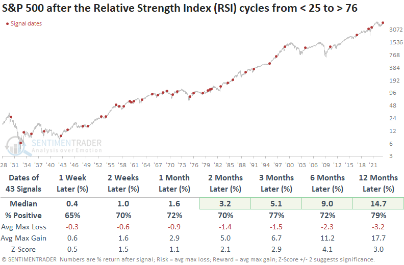
Higher risk tolerance pushed the S&P into overbought territory
The Relative Strength Index (RSI) for the S&P 500 surged above 76, and Dean showed that momentum of this nature tends to fuel additional gains in the S&P 500. When the RSI cycled from < 25 to > 76, like now, results were even more bullish.
According to conventional wisdom, purchasing stocks or assets that are oversold and selling those that are overbought is advisable. But an RSI overbought condition can be a favorable setup as it denotes positive momentum.
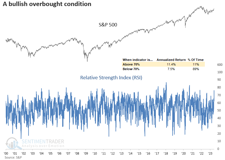
The Relative Strength Index has risen above 76, a total of 226 times since 1928. Positive momentum like now tends to lead to further gains across all time horizons. And from two to twelve months later, the signal showed significance. The last instance of the indicator surpassing 76 during a bear market dates back to 1969.
Returns, win rates, and z-scores are better when the RSI for the S&P 500 cycles from below 25 to above 76, as compared to all instances when the indicator surpassed 76. Over the next two months, the signal shows a gain at some point in 40 out of 43 cases.
Price momentum is surging in other indexes as well. The RSI for the Nasdaq Composite Index exceeded 78 on Thursday after falling below 30 in 2022. Returns, win rates, and z-scores were excellent after similar behavior.
More recoveries in cyclical industries
Dean noted that the percentage of cyclical sub-industry groups with a positive 1-year return cycled from < 20% to > 80%, and similar recoveries in cyclical industries led to solid gains over the next year.
With the calendar aligning with last year's plunge in stocks to the June 2022 low, which marked the internal bottom for several groups, long-term price momentum measures like rolling returns are reversing upward by a meaningful amount. Although Technology stands as the undisputed market leader, it's important to recognize the improvements in other cyclical groups.
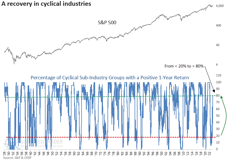
The cyclical sub-industry composite is comprised of 31 groups covering autos, housing, travel, banking, construction, transportation, semiconductors, and several others.
A resurgence in cyclical sub-industry groups heralds positive returns and win rates for the S&P 500 across various timeframes. This indicator faced challenges during the bear market of 1937-1942; from 1948 onwards, it consistently delivered flawless results a year later.
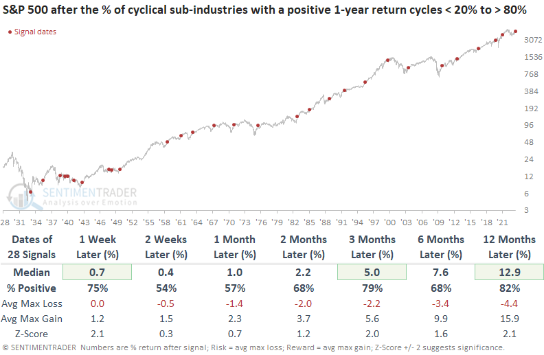
During the next three months, the S&P 500 encountered just three instances of maximum losses exceeding -10%, with the last of these events happening in 1975.
While positive, the results are less robust across short to medium-term time frames for precedents when the ISM Manufacturing PMI survey indicated contraction, as it does presently. However, a year later, the S&P 500 was higher in every case.
Stocks are expensive relative to the volatility being priced in
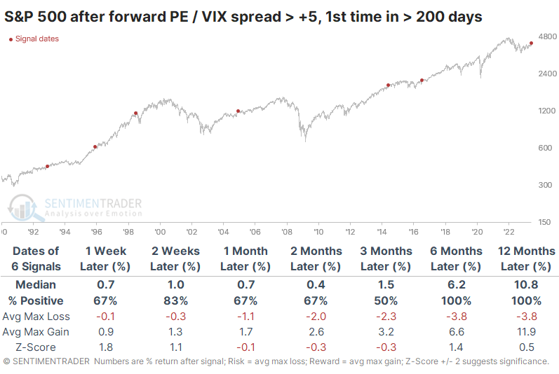
Over the past few weeks, stocks have become more expensive, and volatility has been crushed. As a result, investors are willing to the most to take the most apparent risk since the 2021 market peak. The forward price/earnings ratio for the S&P 500 has recently pushed higher while the VIX gauge of implied future volatility has tanked. The spread between the two measures now exceeds five points for the first time since the opening session of 2022.
The Backtest Engine shows that when the spread is above five points, average returns in the S&P 500 going forward were quite a bit below a random return and were especially poor up to three months later.
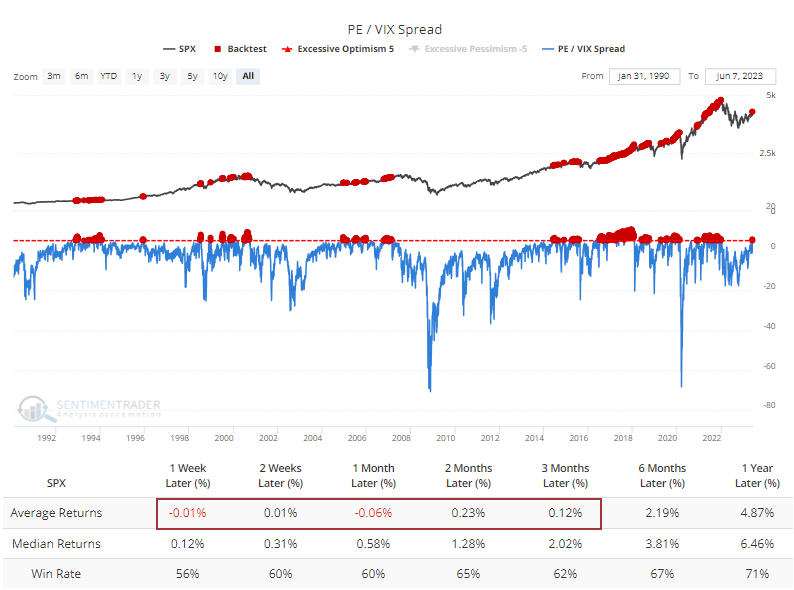
If we take a signal-based approach, the implications change somewhat. The table below shows future returns in the S&P after the spread exceeded five points for the first time in at least 200 sessions. Up to three months later, stocks didn't do so well, with three moderate gains and three losses, but 6-12 months later, the S&P rallied every time.
While stock returns and volatility tend to have an inverse relationship, it's not set in stone. We can see that in the table below. It shows how the VIX performed after extremes in the PE/VIX spread. The VIX spiked every time over the next three months, even though the S&P sported a gain half the time.
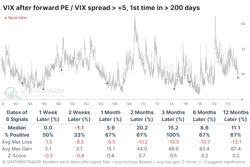
The table of max gains and losses across time frames shows particularly egregious differences between three and six months. Over those time frames, the VIX averaged a maximum decline of less than -11% while spiking an average of 49% and 83%, respectively.
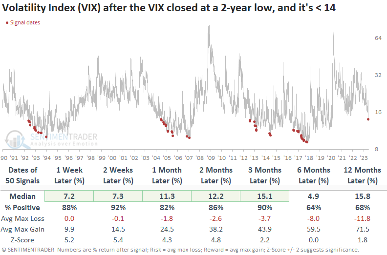
Dean further added that the VIX not only dropped below 14, but it also fell to a 2-year low. After similar behavior, a week later, the S&P 500 tended to take a breather. However, the results are nothing short of spectacular over the next six months. And the signal has never happened in a bear market. For the VIX itself, though, the signals tended to strongly favor a rebound in volatility expectations over the next three months.
More reasons why volatility may pick up
According to Bloomberg calculations, the annual seasonal pattern in the VIX "fear gauge" since 1990 has been pretty close to what we've witnessed this year, though this year has been more exaggerated. The VIX has typically troughed between now and early July, rising into October.
The six months to start this year have mainly shown a trend toward lower implied volatility, and there aren't too many years that have followed a similar pattern closely. The chart below shows an average of those half-dozen years, all with a correlation above +0.50 (on a scale of -1.0 to +1.0) to what the VIX has done in 2023. On average, volatility formed a yearly low sometime around now.
To generate a broader sample size, let's remove the seasonal aspect. Then we get 20 precedents since 1990 when the VIX performed as it has over the past six months. All of these 6-month periods showed a correlation greater than +0.60. Once again, volatility tended to trough right about now.
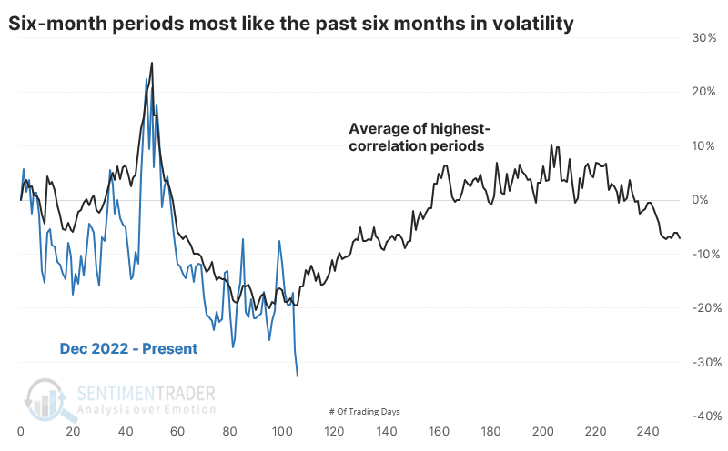
Looking at returns in the VIX following these analogs, the most consistent time frame to see a VIX spike was over the next three months. On average, the VIX jumped by more than half at some point.
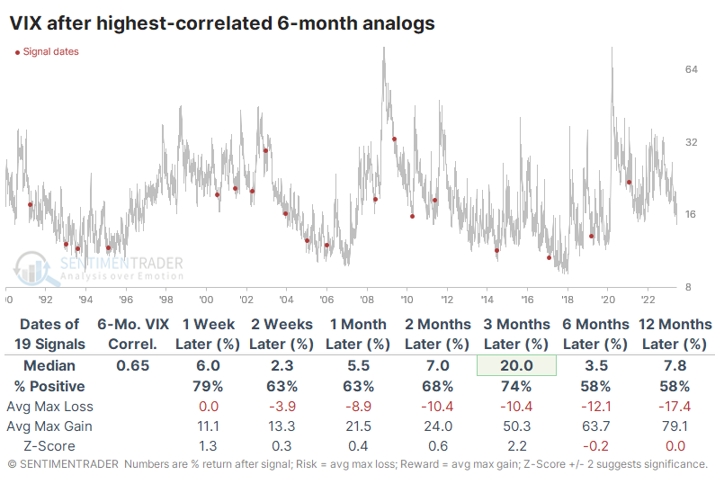
Just because the VIX rises doesn't mean stocks fall, but that was usually the case. The S&P 500 sported poor returns over the next few months. Only one year showed a double-digit gain three months later, while four years suffered a double-digit loss. It wasn't a total wipeout in general, and using it as a signal to sell stocks was hit-and-miss, at best.
Not surprisingly, defensive sectors tended to hold up the best during these periods. Consumer Staples and Utilities showed the most robust three-month returns, with Small Caps and Growth stocks having trouble.
A brief seasonal headache for stocks
Jay showed that the stock market has entered a period that has witnessed weakness more often than not.
The period between Trading Day of the Year (TDY) #109 and TDY #123 has tended to exhibit weakness for the S&P 500. For 2023, this period extends from the close on 2023-06-08 through 2023-06-28.
The chart below displays the growth of $1 invested in the S&P 500 Index only from the close of TDY #109 through the close of TDY #123 every year starting in 1960.
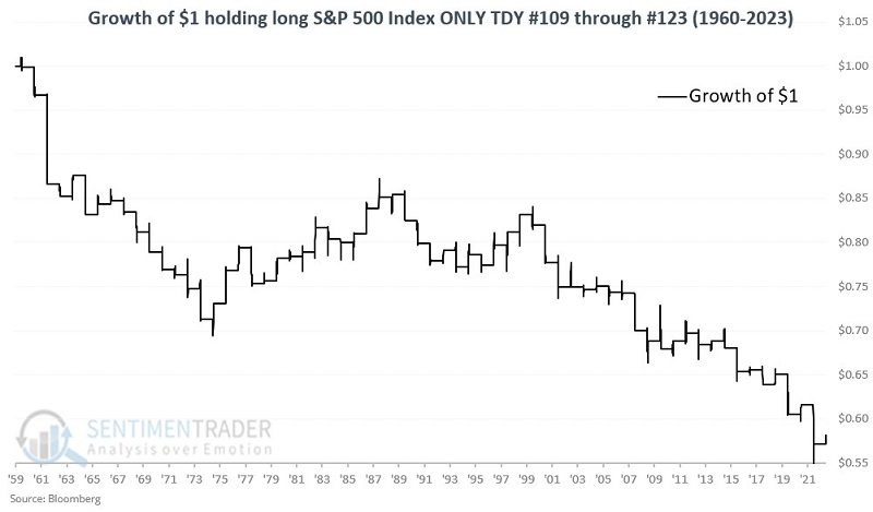
The long-term bias for weakness is unmistakable, but there is no way to predict from year-to-year how the market will perform during this period. The market has been down more often than up during this period and the down years have, on average, been more negative than the up years were positive. The S&P 500 has gained more than 5% only once during this period but has lost -5% or more seven times.
The calendar suggests Utilities might outperform
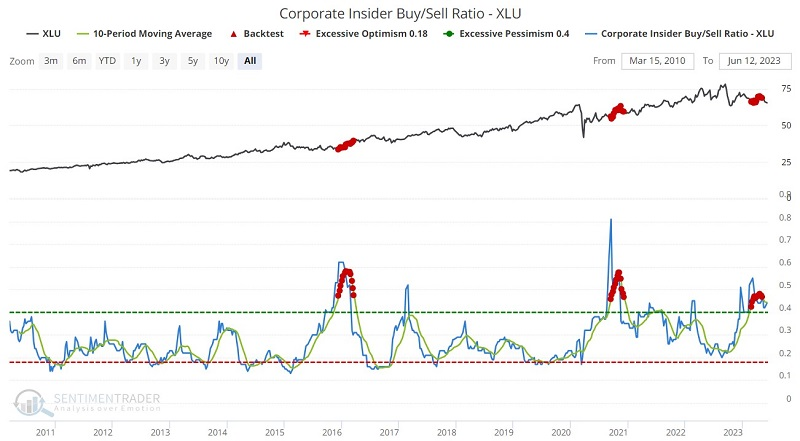
Seasonality is posing a slight headwind for the broader market, but a slight tailwind for the utility sector. Jay noted that Utility sector insiders recently engaged in a round of significant accumulation and the sector recently completed a washout in terms of stocks making new highs.
The chart displays the annual seasonal trend for the Utilities Select Sector SPDR fund (XLU). It shows a less negative pattern that the one for the S&P 500.
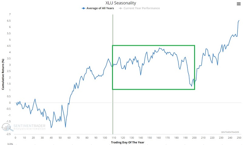
While results can vary significantly from year to year, the key thing to note is that during the same timeframe marked above for SPX, XLU has performed significantly better than the overall market.
The chart below displays the growth of $1 in the S&P 500 Utility sector index and the S&P 500 Index using total return data if held only from the close on Trading Day of the Year (TDY) #109 through TDY #197 every year since 1988.
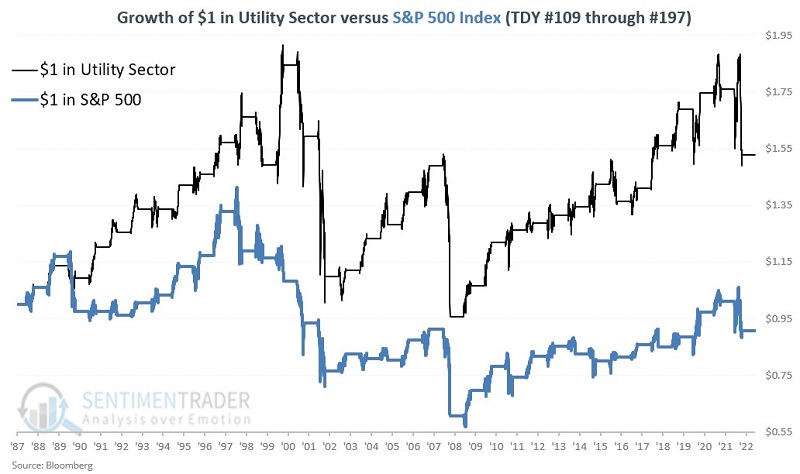
The utility sector showed a cumulative gain of +52.9%, while the S&P 500 Index showed a net loss of -9.3%.
It is generally acknowledged that corporate insiders know more about the prospects for their own companies than anyone else. When insiders within a given sector start accumulating shares meaningfully, it signals that they expect better days ahead.
Utility insiders recently engaged in a rare period of heavy accumulation. The red dots in the chart below highlight all weeks when the 10-week average of our Corporate Insider Buy/Sell Ratio - XLU was above 0.45. The most recent cluster of signals lasted from late February through early May.
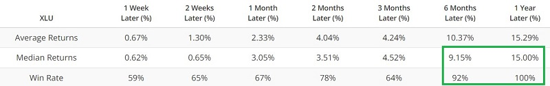
Another reason to look optimistically at the utility sector is that it appears to have recently completed a bearish cycle in terms of breadth. Previous instances have tended to be followed by above-average results. Our XLU New High % indicator shows the percentage of stocks in XLU currently trading at a new 52-week high. When the 100-day average for XLU New High % crossed below 0.75%, XLU rallied over the next year every time with a median return of nearly +19%.
Also, Utility stocks are susceptible to changes in interest rates. As a result, when bond trader sentiment gets overdone to the bearish side, it can be a positive factor for utilities. When a 10-day average of our 10-Year Treasury Optimism Index was below 7.5%, XLU demonstrated excellent returns from one to twelve months later.
Keeping an eye on natural gas
Jay showed that history suggests holding off a while longer before testing the long side of the volatile natural gas market.
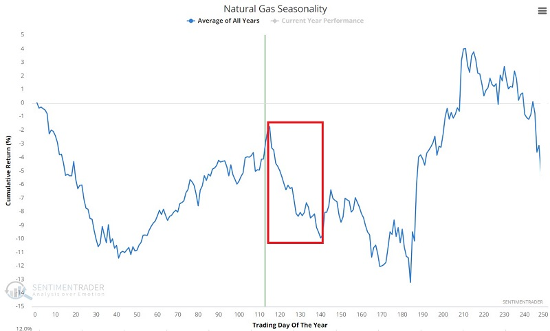
Natural gas is a highly volatile market. Typically when a market is this beaten down and appears to be forming a base, it makes sense to begin looking at trading the long side in anticipation of a reversal of fortune. But history suggests waiting a while longer before testing the long side of natural gas.
The chart below displays the annual seasonal trend for natural gas futures. An unfavorable period extends from the close of Trading Day of Year (TDY) #115 through TDY #140. For 2023, this period extends from the close on 2023-06-14 through 2023-07-25.
The chart below displays the hypothetical cumulative $ +(-) from holding a long position in natural gas futures only from the close of TDY #115 through TDY #140 since 1990.
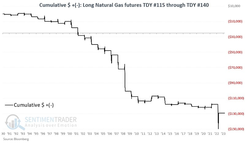
During these windows, natty rallied only 15% of the time, with a larger average loss than average gain. It lost more than -$5,000 eleven times while gaining more than +$5,000 only once.
About TradingEdge Weekly...
The goal of TradingEdge Weekly is to summarize some of the research published to SentimenTrader over the past week. Sometimes there is a lot to digest, and this summary highlights the highest conviction or most compelling ideas we discussed. This is NOT the published research; rather, it pulls out some of the most relevant parts. It includes links to the published research for convenience, and if you don't subscribe to those products, it will present the options for access.