
TradingEdge Weekly for Jun 14 - Easy returns, missing relative strength, corn headwind

Key points:
- Returns have been very "easy" for investors
- Technical warnings on the Nasdaq are historically high
- More industries are falling to six-month lows
- The S&P 500 broke out about 150 days ago, so we look at the closest analogs
- Stocks are historically calm and uncorrelated
- It's hard to find a sector showing relative strength
- Some funds are facing weak summer seasonals
- Gold and silver plunged on the same day
- Corn is about to face a heavy seasonal headwind
- Natural gas is heading toward a seasonal weak spot
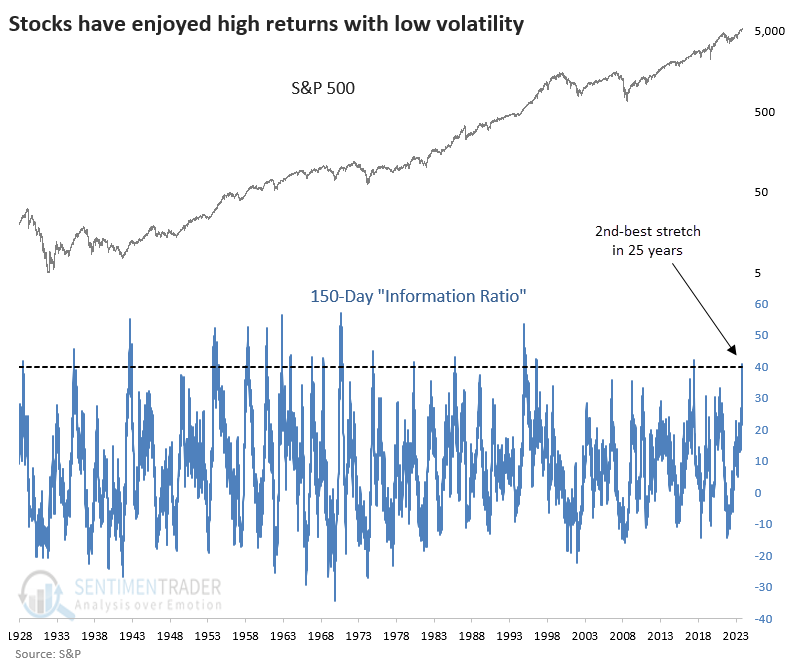
Returns have come very easy for stock investors
As a reflection of just how rosy things have been since the October 2023 low, the S&P's "information ratio" has soared to its 2nd-highest level in 25 years. "Information ratio" is in quotes because that's not exactly what we're looking at, but it's close enough to the concept.
We're investigating the index's returns versus the volatility required to enjoy those returns. Over the past 150 sessions, the S&P 500 has returned more than 40 times the standard deviation of its daily changes. The only time in 25 years it reached this extreme was in January 2018.
Right now, the information ratio is at one of the highest levels in history. The spike in 2018 was the only similar one in 25 years and did not end well for stocks (for a while).
The table below shows whenever the information ratio exceeded 40 for the first time in at least two years. Overall, the returns weren't too bad, especially over the next year when the S&P 500 sported a positive return all but twice.
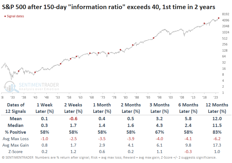
Positive returns in the table above were heavily concentrated in earlier decades. The outlook changes significantly if we filter the table to only include the past 50 years. Up to three months later, the S&P's upside was nonexistent except for 1995, one of the most remarkable "creeper" uptrends in the index's history.
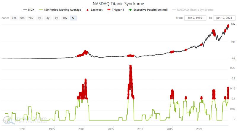
Titanic warnings
The NASDAQ Titanic Syndrome indicator may be flashing an early warning sign. Jay suggested the current condition is not an actual trading signal or immediate call to action but rather an alert.
The indicator highlights a technical market condition when stocks have recently been at a high, and then there is a sudden jump in new 52-week lows versus highs on the Nasdaq.
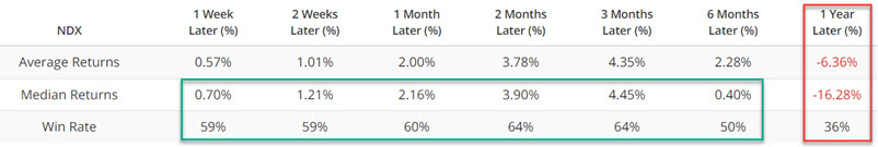
The chart below highlights with a red dot each day when the 150-day moving average for the Nasdaq Titanic Syndrome indicator was 0.10 or higher. While the Nasdaq 100 held up okay up to a few months later on average, most of the gains were given back within the year.
High-yield corporate bonds trade with a higher correlation to stocks than to treasury bonds. So, what tends to be unfavorable for stock prices is also typically adverse for high-yield bonds.
The chart below shows the same test using iShares iBoxx $ High Yield Corporate Bond ETF (ticker HYG).
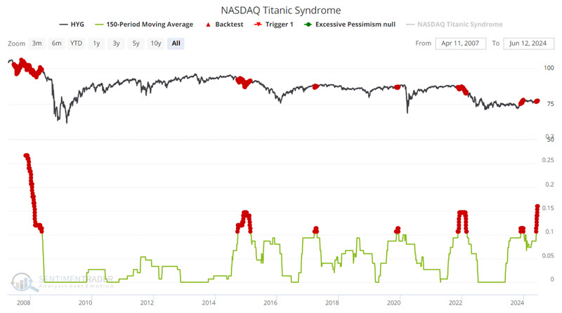
A 0% historical Win Rate over the next year does not guarantee that high-yield bonds will be lower twelve months from now. But these results suggest being wary of overstaying one's welcome in the high-yield bond sector.
Jay also noted that when they were in uptrends, the dollar and commodities showed a strong tendency to rally after these Titanic warnings on the Nasdaq.
More industries falling to 6-month lows
Over 73% of sub-industry groups closed within 5% of a 6-month relative low. Dean noted that similar relative trend conditions suggest the S&P 500 could struggle over the next month.
Much like S&P 500 sectors, S&P 1500 sub-industry groups are demonstrating unfavorable relative trend profiles against the world's most benchmarked index. On Thursday, 73% of sub-industry groups closed within 5% of a 6-month relative low versus the S&P 500, marking only the third occurrence since 1990.
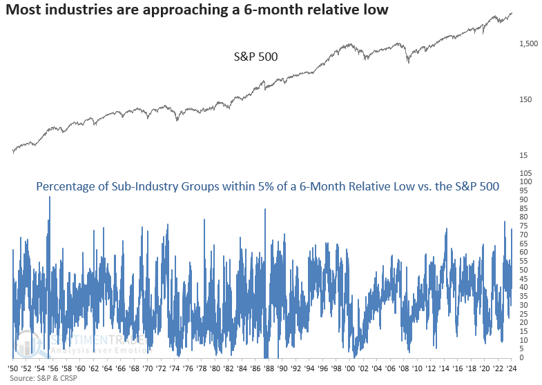
As we've emphasized multiple times over the last month, breadth and relative performance indicators are diverging from the cap-weighted S&P 500, largely due to the significant influence of a small number of heavily weighted stocks.
Whenever more than 70% of S&P 1500 sub-industry groups fall within 5% of a 6-month relative low against the S&P 500, the world's most benchmarked index tended to struggle over the subsequent month. From a long-term perspective, returns and win rates were okay.
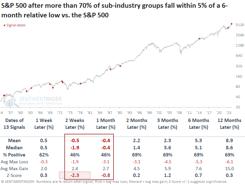
The S&P 500 Equal-Weighted Index shows a similar trajectory, pointing to possible near-term challenges before an advantageous period. From one to twelve months later, the S&P 500 Equal-Weighted Index outperformed the S&P 500.
Years most like the past one
It's been a year since the most benchmarked index in the world told investors that something had changed. It wasn't until June 2023 that investors had their first tangible evidence that price was following through.
The Correlation Pattern Match tool allows users to look for other times with similar price structures. By using the tool to find other 252-day (one trading year) price patterns most similar to the past year, we can see how those panned out going forward. When you run the tool, the blue highlighted sections show other time periods with a high correlation.
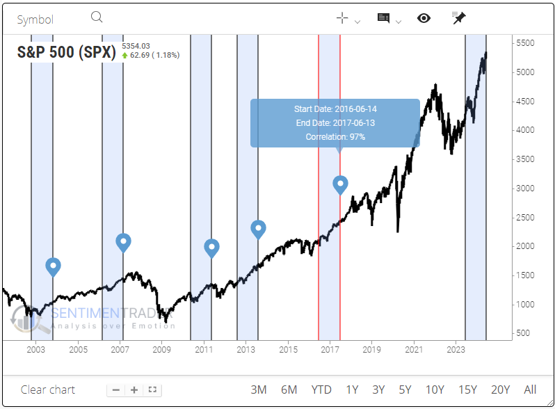
The tool also allows users to backtest those periods to see future returns. We're using the S&P 500 for this test, and the Multi-Timeframe Results show some weakness in the short term but decent strength after that. One-year returns weren't very impressive.
One thing to consider is seasonality. The table below shows the signals triggered during the summer months. These showed very weak returns up to a month later, then improved. Even though longer-term returns were mostly positive, the average return was relatively weak. They were especially weak if using mean returns instead of median.
We can compare that to the non-summer months. Again, short-term returns were pretty terrible. But here, over the next 2-6 months, returns were significantly stronger and more likely to be positive.
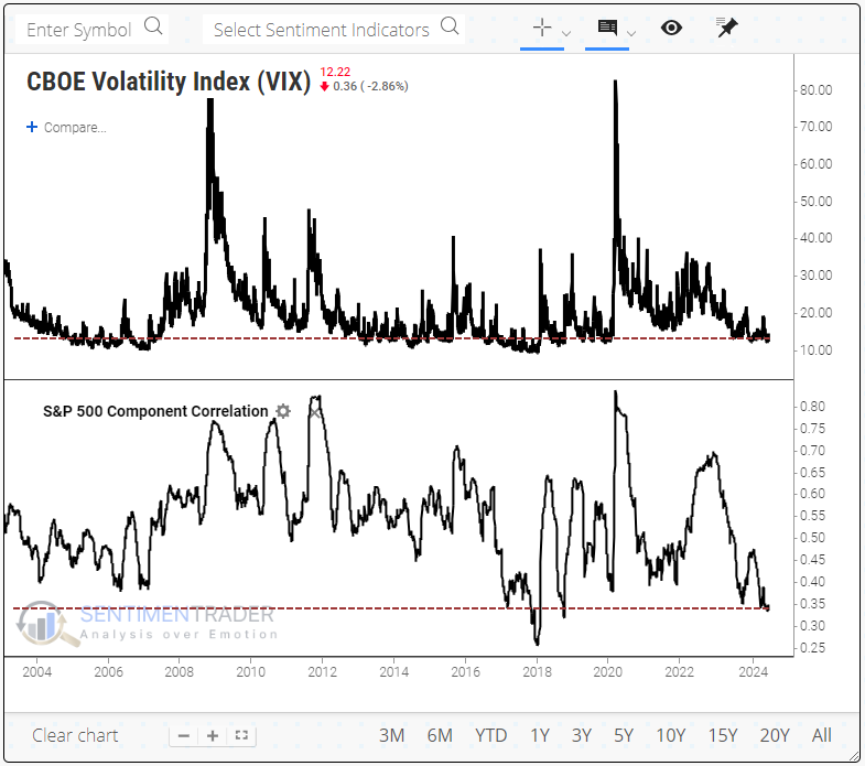
Stocks are very calm and uncorrelated
We all know volatility is low. It has been so since November, except for a few weeks in April. As both a cause and effect of the low volatility, investors have gotten quite comfortable trading stocks on their own merits.
There is a strong relationship between the VIX "fear gauge" and the correlation among stocks in the S&P 500. So, it's not a great surprise that we're seeing one of the lowest correlations among stocks in 20 years, along with the low VIX.
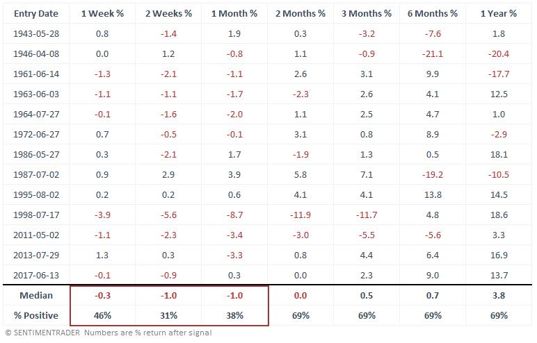
There haven't been too many periods in the past ~40 years when the VIX was below 13, and the correlation among S&P 500 stocks was under 0.35. The table below shows times when these conditions persisted for at least two weeks.
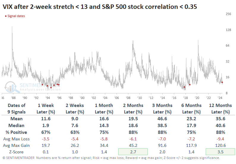
The conditions did not persist for much longer. The VIX showed a powerful tendency to rise after the other signals. On average, it doubled at some point within the next 3-6 months. After the recent signals, the VIX was at least 50% higher three months later.
Even though volatility expectations rose among options traders, it didn't necessarily (or even usually) mean that stocks dropped. Quite the opposite, as low volatility conditions tend to reflect positive conditions for stocks, except for the last signal that saw stocks plunge into year-end.
Few sectors are showing relative strength
Only 2 out of 20 cap and equal-weighted sectors display a positive relative trend score versus the S&P 500. Dean noted that similar periods with narrow-sector leadership resulted in bullish outcomes over the next six and twelve months.
While analyzing relative trend scores this weekend using the composite indicator methodology frequently featured in research notes, Dean observed that only two out of the twenty cap and equal-weighted sectors maintained a positive relative trend score compared to the S&P 500.
This rare phenomenon has occurred for the third time since the bear market low in 2022. Before this period, it triggered in 1984 and again in 2000.
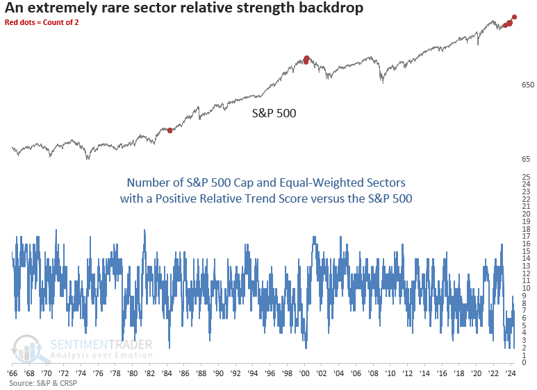
Whenever the number of cap and equal-weighted sectors with a positive relative trend score versus the S&P 500 dropped to four or fewer, the world's most benchmarked index displayed positive returns and favorable win rates, especially over the subsequent six and twelve months.
It's not uncommon for episodes of narrow-sector leadership to occur in clusters. Other than 2021, the S&P 500 generally brushed them off, potentially highlighting periods of sector rotation.
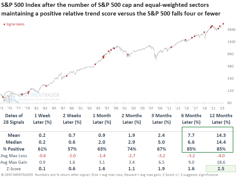
When I apply the signals to the S&P 500 equal-weighted index, which eliminates the influence of mega-cap stocks on index performance by weighing each member equally, the outlook maintains a bullish upward bias over the following year, notwithstanding the 2021 period.
Some weak summer seasonals
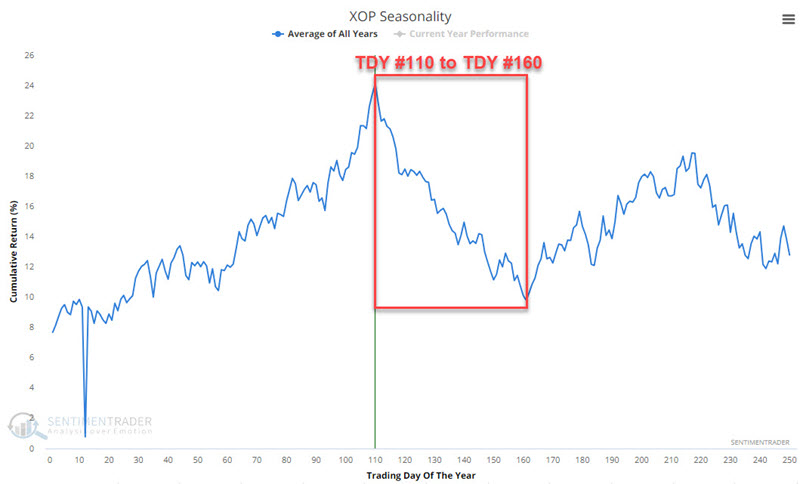
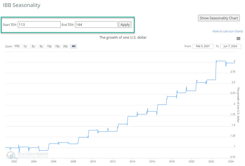
Several market sectors are entering significant seasonal periods. Jay showed that ETFs entering unfavorable periods include XLB, XLE, XLF, XLI, XME, and XOP. One potential exception is in the biotech sector, represented by the ticker IBB.
Please note that seasonal weakness is not the same as a sell signal. By itself, seasonality is a condition, not a signal. The real message for the sectors highlighted below is more one of an investor/trader may:
- Consider lightening up any existing positions in these sectors
- Carefully consider if it is worth buying/holding these sectors at this time
- Consider a short position (or a put option position) to take advantage of potential price weakness
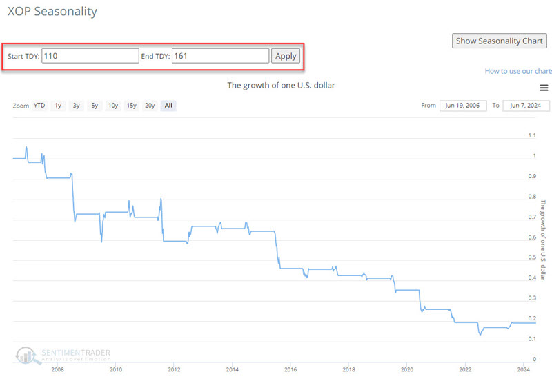
The sectors include XLB, XLE, XLF, XLI, XME, and XOP. The chart below displays that XME tends to show weakness from Trading Day of Year (TDY) #110 through TDY #160. For 2024, this period extends from the close of 2024-06-07 to 2024-08-20.
The charts below show the hypothetical growth of $1 invested in XOP only during this period since XOP started trading.
The chart below displays that IBB tends to show strength from Trading Day of Year (TDY) #113 through TDY #144. For 2024, this period extends from the close on 2024-06-12 and 2024-07-29.
The charts below show the hypothetical growth of $1 invested in IBB only during this period since IBB started trading.
Not so precious metals
Gold and silver futures plunged 3% and 6%, respectively, within 15 days of closing at a 3-year high. Dean noted that similar precedents suggest a consolidation for gold and an unfavorable outlook for silver.
The inverse relationship between the dollar index and precious metals was evident following the release of the latest payroll numbers. With the dollar index surging by 0.75%, bolstered by stronger-than-expected employment data, gold and silver experienced significant declines, dropping over 3% and 6%, respectively.
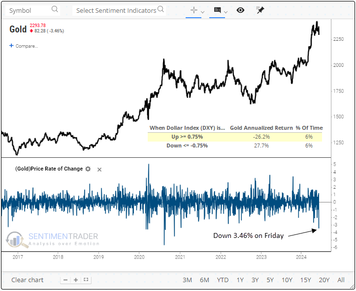
Following a 3% or more decline in 15 days or fewer from closing at a 3-year high, context similar to now, Gold futures tended to bounce back over the next week, displaying a 66% win rate. However, the relief rally was short-lived, as the precious metal showed a coin toss over the subsequent one-and-two-month horizons.
Similar to gold, silver displays a negative correlation to the dollar index. When the dollar rises by 0.75% or more in a single session, silver produces an annualized return of -24.4%. In contrast, when the dollar falls by -0.75%, annualized returns jump to 23.2%.
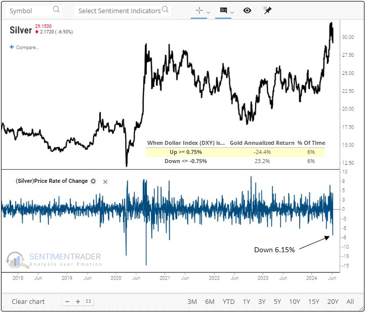
Whenever silver drops by 6% or more within 15 days of reaching a 3-year high, it has historically shown a negative median return in 4 out of 5 horizons over the following three months.
Whenever gold and silver declined by over 3% and 6%, respectively, in the same session, and gold was trading within 15 days of a 3-year high, the outlook for the metal deteriorated meaningfully over the subsequent one to six months, displaying a negative median return in all time frames. The bottom line is that when gold and silver decline significantly in unison near a peak, the market message suggests gold could be in the penalty box for more than a few months.
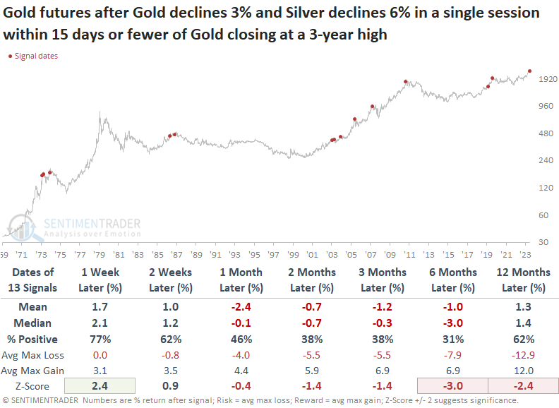
The outlook for silver appears bleak after both precious metals declined by a substantial amount in unison near a three-year high. That was especially the case over the subsequent two months, which shows the metal falling 85% of the time.
Corn popped
Jay showed that corn is soon to enter its most challenging time of year, and if history holds, traders should be looking for an opportunity to play the short side.
Is corn in an uptrend or a downtrend? To some extent, that is in the eye of the beholder. Regardless of how one sees the trend, there is reason for caution on the long side in the months ahead.
As always, an annual seasonal chart is simply an average of what has happened in the past and is NOT a roadmap to what will happen this time. That said, note in the annual seasonal chart below that corn futures are entering a period of seasonal weakness that extends from the close of trading day of the year (TDY) #115 through TDY #155. For 2024, this period extends from the close on 2024-06-14 through 2024-08-13.
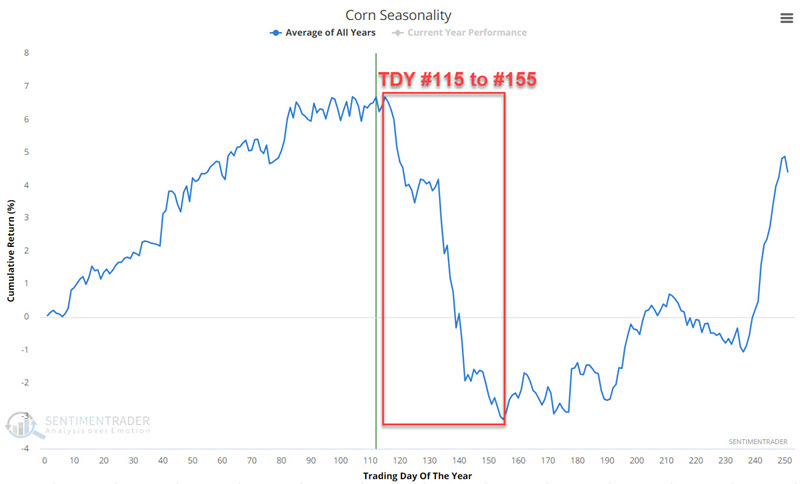
How challenging has this period been? The chart below displays the hypothetical cumulative $ +(-) achieved by holding a long position in corn futures during the TDY #115 through #155 period since 1974.
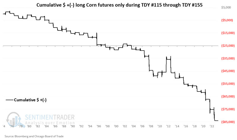
A 27% Win Rate reminds us that a price decline during this period is no sure thing. Nevertheless, the overall results skew heavily negative. Note that if we look solely at periods that saw a move of $3,000 or more in contract value, only one showed a gain, and thirteen witnessed a loss.
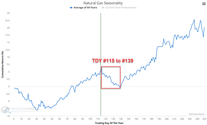
Gas leak
Natural gas bottomed in February 2024 and has been trending higher. Jay suggested that even so, traders should be careful about falling in love with the long side of natural gas, and history suggests watching closely for an opportunity to play the short side.
An annual seasonal chart is simply an average of what has happened in the past and is NOT a roadmap to what will happen this time. That said, note in the annual seasonal chart below that natural gas futures are entering a period of seasonal weakness that extends from the close of the trading day of the year (TDY) #115 through TDY #139. For 2024, this period extends from the close on 2024-06-11 through 2024-07-16.
How challenging has this period been? The chart below displays the hypothetical cumulative $ +(-) achieved by holding a long position in natural gas futures during the TDY #115 through #139 period since 1990. Notice anything?
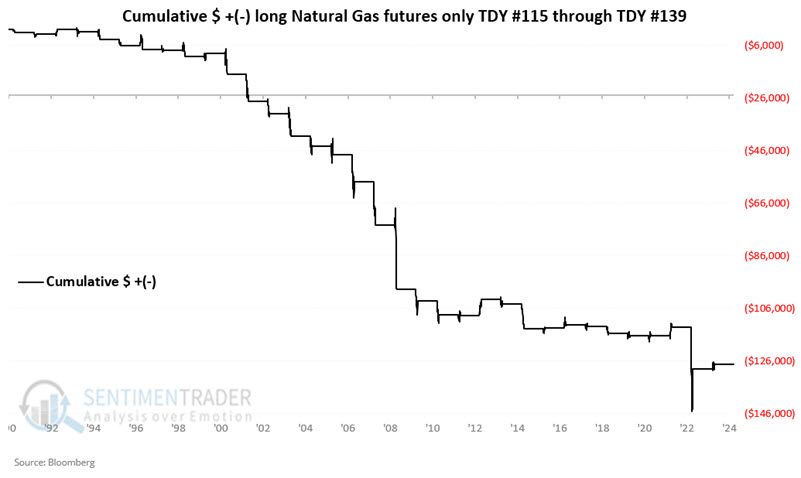
These windows showed a gain only 21% of the time, and the average loss was more than twice the average gain. Also, the contract lost more than -$3,000 during thirteen years while gaining more than +$3,000 only twice.
The United States Natural Gas Fund LP ETF (ticker UNG) is designed to track the price of natural gas futures. It should be no surprise that UNG results are just as ugly as those for future contracts.
Jay also looked at a couple of technical indicators that can help spot momentum divergences during these potential weak seasonal periods.
About TradingEdge Weekly...
The goal of TradingEdge Weekly is to summarize some of the research published to SentimenTrader over the past week. Sometimes there is a lot to digest, and this summary highlights the highest conviction or most compelling ideas we discussed. This is NOT the published research; rather, it pulls out some of the most relevant parts. It includes links to the published research for convenience, and if you don't subscribe to those products, it will present the options for access.