
TradingEdge Weekly for Jul 4 - Cyclical sector breakouts, continuation signals, July for stocks and silver

Key points:
- Cyclical sectors have been leading the breakout to record highs
- The S&P 500's golden cross is a good sign
- Some indicators are firing continuation signals
- A look at July seasonality in post-election years
- Korean stocks have stormed back with a historic rally
- Silver tends to shine in July
Cyclical sector breakout
More evidence is emerging that, despite whatever economics (and economists) suggest, investors are betting on growth. On Friday, three of the most cyclical sectors hit record highs: technology, industrials, and financials.
Remarkably, only one other sector - communications - also hit a new high, thanks to its reconstituted constituents. Outside of the three noted above, the median drawdown across all other sectors was -8.7%.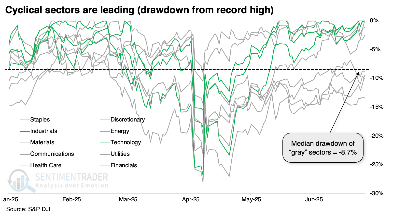
This time is different than virtually all others because it's never happened with such a heavy drawdown across other sectors. But we can look at other times when those three sectors led and see what happened. The table below shows those times. It includes all unique dates when technology, industrials, and financials hit a record high, and at the same time, only one other sector at most did so, and the average drawdown among the other seven sectors was at least -1%.
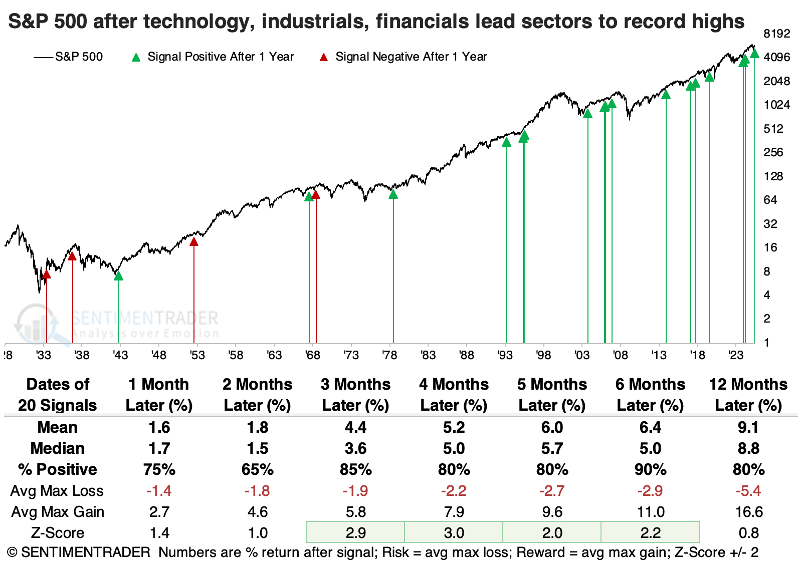
The S&P 500 performed exceptionally well in the months ahead, with a sweet spot being intermediate time frames. Six months later, the S&P was higher 18 out of 20 times, and the two losses were small and subsequently erased. The risk/reward ratio was excellent across time frames.
Each of the three sectors performed well after leading to new highs. Relative to the S&P 500, financials were the clear winner. Both technology and industrials lagged over shorter time frames, while financials outpaced the broader market on all time frames, and consistently on longer ones.
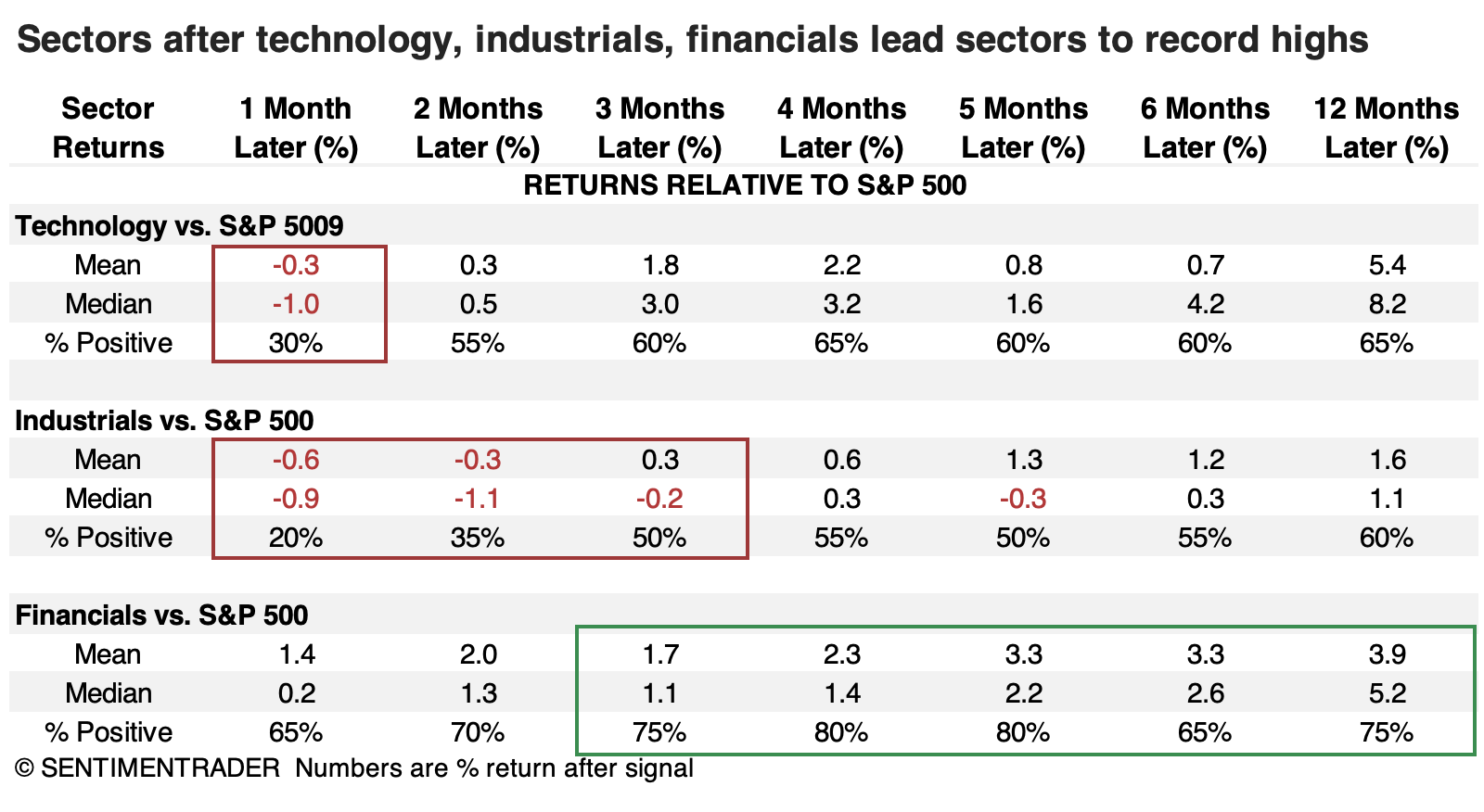 Returns across all sectors were pretty good. The biggest laggard was health care, which held up under shorter time frames but never really went much of anywhere after that, while other sectors tended to build on their gains.
A golden trend
A "Golden Cross" in the stock market occurs when the 50-day average for the S&P 500 crosses above the 200-day average for that index. Jay noted that the latest signal occurred this week.
The chart displays the S&P 500 Index since 1970 with the 50-day average in blue and the 200-day average in green. A Golden Cross "buy" signal occurs when the blue line crosses above the green line, and a Golden Cross "sell" signal occurs when the blue line crosses below the green line.
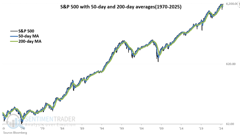
Note that since 1978, the last 23 signals have seen the S&P 500 show a nine-month gain after a signal. From 1920 through 1977, results were more mixed (23 wins versus 14 losses).
Let's use the following rules:
- If the 50-day average for the S&P 500 crosses above the 200-day moving average, we will buy the S&P 500 Index and set a counter to 189 days
- Each day, we subtract one from the counter. If the 50-day average drops below the 200-day average AND THEN moves back above the 200-day average BEFORE the counter reaches 0, we will reset the counter to 189 days and continue to hold the S&P 500 Index for another 189 days
- We will sell the S&P 500 Index (and hold a flat position) when the counter reaches 0
The chart below displays the hypothetical growth of $1 invested in the S&P 500 Index using the rules above from 1970 through 2025. Note that results have been much more consistent in the last 50+ years than they were previously.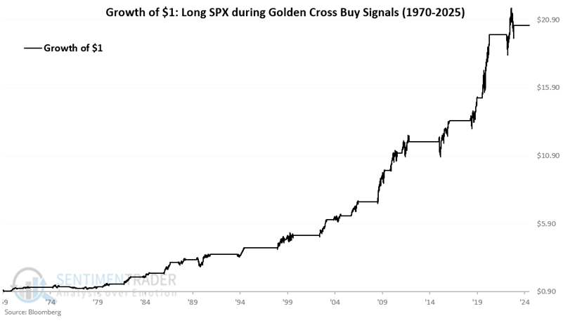
These "trades" showed a profit 74% of the time, with a median gain of +13% versus median loss of -10%. But the S&P gained more than +15% sixteen times, compared to losing more than -15% only three times.
Continuation signals
Jay suggested that continuation signals can put an investor's mind at ease. One of those is the Nasdaq High/Low Ratio, which recently rebounded from a pullback.
Not every indicator signal is intended to be a standalone trading system. Likewise, not every indicator signal is designed to "pick a bottom." One useful alternate category is referred to as the "continuation" signal. These signals can occur frequently or infrequently and tend to signal that an ongoing bull market is still intact.
The chart below highlights those dates when the 50-day average of the NASDAQ High/Low Ratio crossed above 0.56 and the Nasdaq 100 Index is above its 200-day moving average. This scenario essentially marks a situation when breadth is rebounding from a period of short to intermediate term weakness while price action is in an objective uptrend.
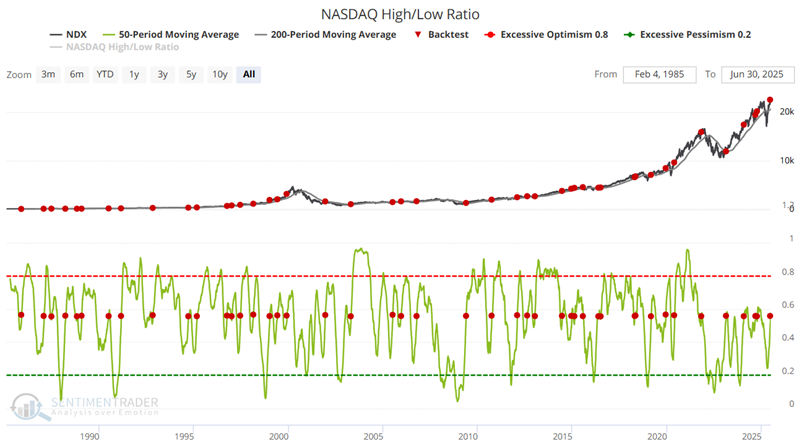
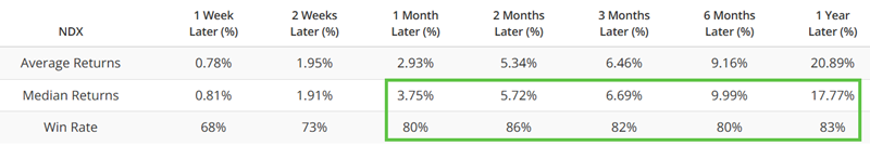
The key point in the table above is the 80%+ Win Rate for 1 Month to 1 Year. This suggests good reliability as a weight of the evidence indicator.
Jay also highlgihted a signal from the Aggregate Signal Model. When those triggered in the past, the S&P 500 showed a 1-week Win Rate of 92% and 1-year Win Rate of 91%.
Post-election Julys
Jay noted the Dow Jones Industrial Average and the S&P 500 performance during July in Post-Election years. The Dow sports a higher win rate (and ten straight wins), but the S&P has outperformed overall.
The chart below displays the cumulative growth of $1 invested in the Dow and SPX (price only data) ONLY during July of the Post-Election years since 1925.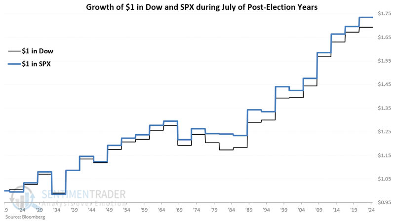
The Dow rose 80% of the time, compared to 68% for the S&P 500. But the cumulative return was actually greater for the S&P thanks to a slightly higher average return.
Korean comeback
Some of the better-performing markets have been overseas - Asia specifically, and South Korea particularly. Over a 50-day span, the Kospi jumped by more than a third for one of the few times in four decades.
The last four times the market rallied so hard coincided with major bottoming action. Prior to that, two instances proved to be false dawns, so its record is not perfect.
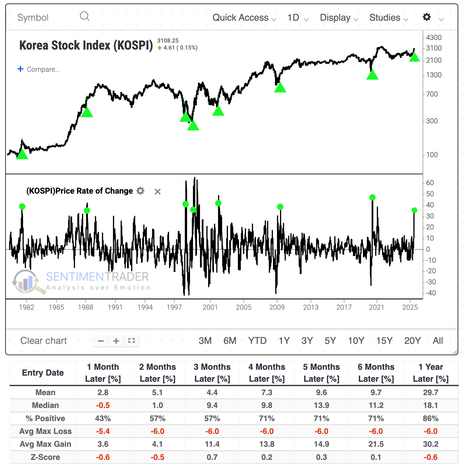
Taking a slightly different tack to generate a larger sample size, when the Kospi's 50-day rate of change cycles from below zero to above +30%, the Nasdaq 100 suffered only a single outright failure. Within the following six months, the NDX suffered a -10% drawdown only twice, while enjoying more than +10% upside after 11 of 13 signals.
The index's jump has been driven by more stocks above their 200-day moving average. The Kospi's annualized return was an impressive +33.7% when at least 70% of its stocks were trading above their 200-day moving average.
The sustained internal recovery in so many KOSPI stocks pushed its McClellan Summation Index above zero after its longest-ever stretch of being subdued in negative territory. Its annualized return when above zero was +18.0% compared to only +6.6% when below zero. The only two similar situations, when the Summation Index jumped into positive territory after a sustained period below zero (or mostly so), preceded exceptional multi-year bull markets.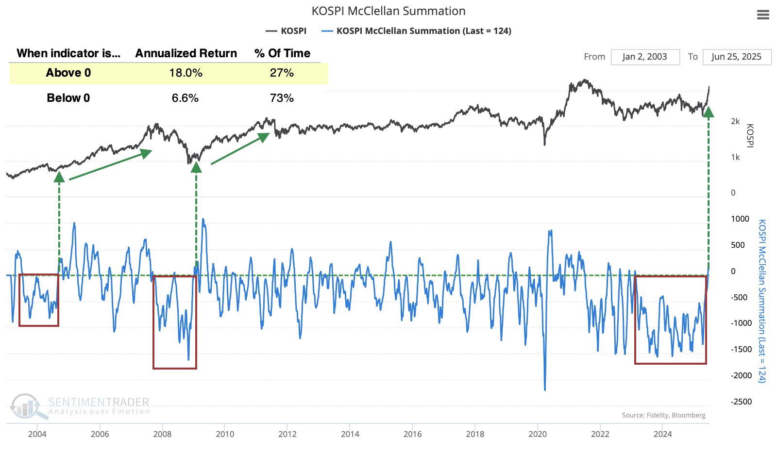
There was also a notable jump in 52-week new highs among the stocks. That index has very rarely seen so much participation at new highs, and the last time was not an auspicious one to jump on the bandwagon, as it triggered near the peak of the 2021 bull market. The other instances occurred during the sustained run in the mid-2000s and preceded further upside.
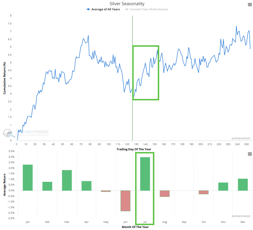
Silver in July
Jay showed that July has been the best month of the year for silver.
The chart below displays the annual seasonal trend for silver. In the bottom clip, note that July has been the best-performing month for silver.
The chart below displays the hypothetical cumulative $ +(-) achieved by holding a long position in silver futures only during July.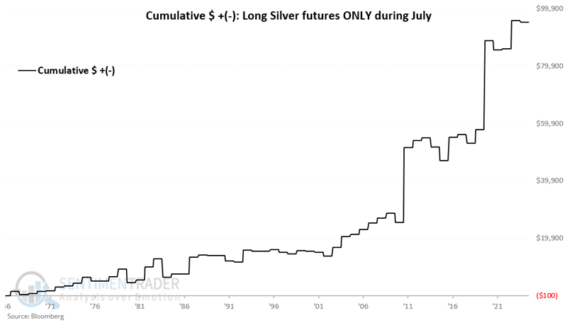
The month was positive 64% of the time, with an average gain well ahead of the average loss. The contract gained more than +$5,000 five times while losing more than -$5,000 only once.
About TradingEdge Weekly...
The goal of TradingEdge Weekly is to summarize some of the research published to SentimenTrader over the past week. Sometimes there is a lot to digest, and this summary highlights the highest conviction or most compelling ideas we discussed. This is NOT the published research; rather, it pulls out some of the most relevant parts. It includes links to the published research for convenience, and if you don't subscribe to those products, it will present the options for access.