
TradingEdge Weekly for Jul 26 - Big losses and high optimism, relative gold sentiment, surging small caps

Key points:
- The S&P 500 quickly erased its premium over the 50-day moving average
- Cyclical stocks are recovering
- Some of them suffered what had been one of the largest daily losses in years
- Risk-on behavior has been persistent
- Using the surge in small caps as a trading signal
- Economic warning signs from employment data continue to trigger
- Regional banks jumped
- Germany and the UK are facing some headwinds
- What the plunging copper/gold ratio has meant for assets
- Optimism on gold is extreme relative to corn
- A bitcoin trend-following buy signal
A quick selling cycle
The S&P 500 cycled from 5% above its 50-day average to below the average in only six sessions. Dean showed that similar reversals displayed excellent returns and consistency for the S&P 500 over the ensuing six months.
V-tops tend to be sharp and swift, a phenomenon similar to the recent price action in the S&P 500. Over the last six sessions, the world's most benchmarked index cycled from 5% above its 50-day moving average to below it, with the index only six days removed from a multi-year high, creating a V-shaped top.
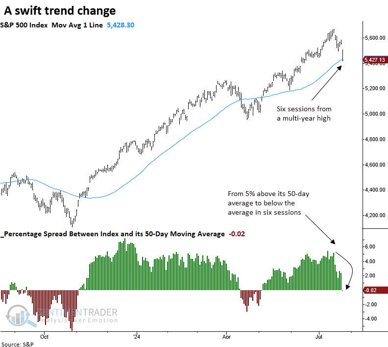
While the sample size is small, whenever the S&P 500 cycled from 5% above its 50-day moving average to below it in six sessions or fewer, with the index only six days from a multi-year high, the world's most benchmarked index displayed outstanding returns and consistency.
Over the following six months, the S&P 500 never experienced a loss, indicating that V-shaped reversals during a long-term uptrend rarely coincide with major peaks. Instead, they often signal a brief panic among investors concerned about forfeiting significant gains.
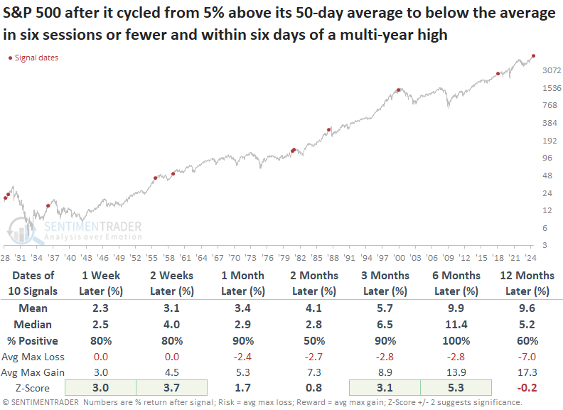
Over the subsequent six months, the maximum gain surpassed the maximum loss in nine out of ten precedents. In all but one case, in December 1980, the S&P 500 closed at a new high, and except for 2018, it typically achieved the high within a few months.
Cyclical recovery
The average distance below a high for a basket of cyclical groups climbed within 2.5% of a 52-week high. Dean showed that comparable participation trends preceded a 100% win rate for the S&P 500 over the following year.
The purpose of this model is not to provide a timely market signal but rather to validate a transition from a bearish to a bullish trend.
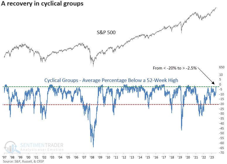
The composite includes industries from a broad spectrum of the economy, encompassing automobiles, transportation, housing, consumer goods, banking and credit, manufacturing, and small businesses.
When the average distance from a 52-week high for a composite of cyclical groups transitioned from below -20% to above -2.5%, the S&P 500 demonstrated remarkable returns and consistency, achieving a perfect win rate a year later.
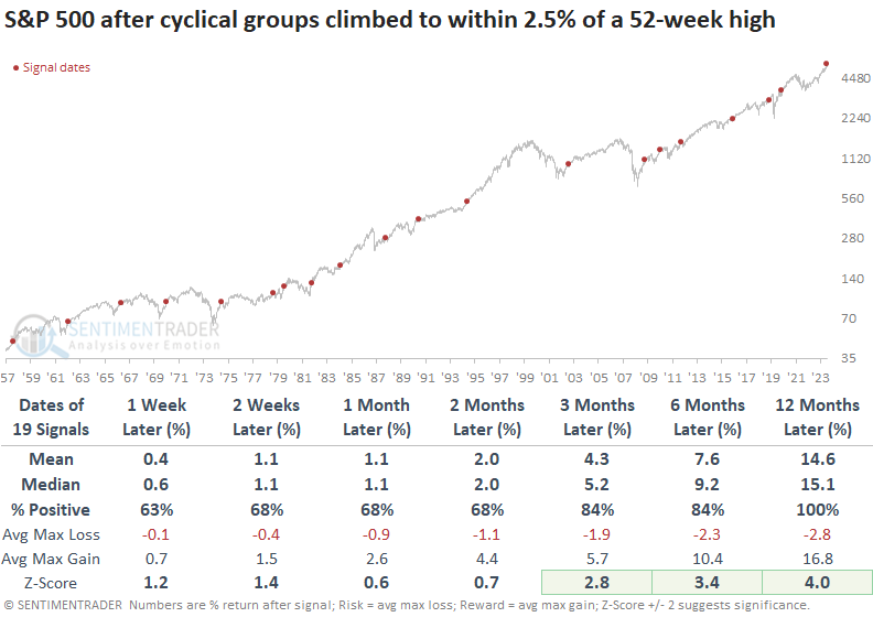
Following similar precedents, cyclical sectors like Consumer Discretionary, Financials, and Industrials outperformed the S&P 500 over the subsequent year.
Technology, which is still exhibiting a positive relative trend versus the S&P 500 despite a 7% drawdown as of last Friday, typically outperformed over the ensuing three months but underperformed from six to twelve months later.
A big down day, but...
Investors had become complacent, then got what happens at some point every time - a slap that reminds them that markets move in both directions.
The S&P 500, the world's most benchmarked index, suffered its worst loss in more than 50 sessions. The relatively large decline came during a period of exceptionally high optimism. Even including the day of the 1% loss, Dumb Money Confidence was still above 80%.
Much of the wreckage was focused on some of the previously big winners, so the one-day drop in the Nasdaq was significantly worse. It was the largest one-day drop in well over a year.
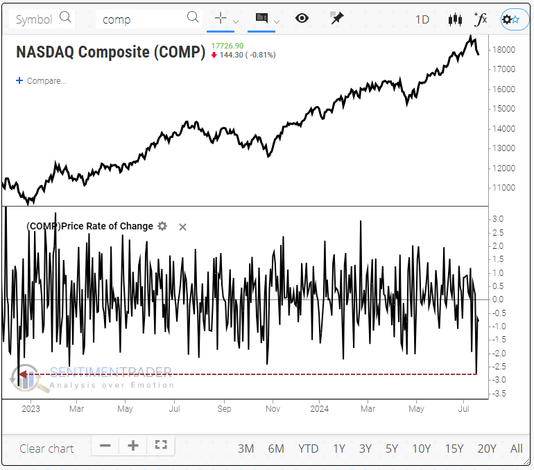
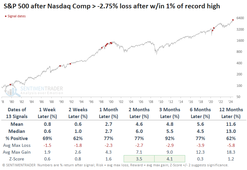
A few times, the Nasdaq Composite suffered its worst loss in at least a year when hovering within a spitting distance of a record high. The last time was over 30 years ago, and there have been only five precedents since the index's inception. Four of those saw the index decline further over the next 2-4 weeks, though only one ended up preceding meaningful and sustained losses.
The sample size above is tiny, so if we relax the parameters to look for any loss as large as Wednesday's when the Composite had been within 1% of a record close, then the forward returns improve in the short term. Unfortunately, this also introduces several poor longer-term precedents, as large daily swings are evident at some market peaks.
Again, for the S&P 500, these big Nasdaq declines proved to be good medium-term entry points. The S&P rose over the next three months every time but once, and that "once" was a minuscule loss.
That's why investors have been so risk-on
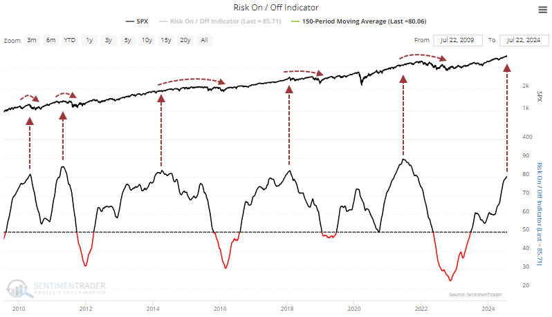
Investors have been held a risk-on attitude for weeks. Months, actually. According to the Risk On / Off Indicator, most of the 21 core indicators have been in risk-on mode for 180 days. That's approaching the 2021 streak for persistence.
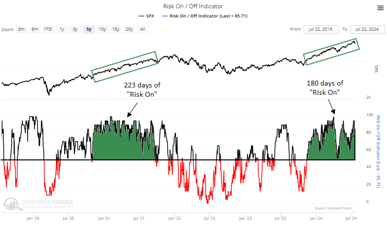
That 2021 stretch was one of the longest since we started calculating this measure in 2000, nearly 25 years ago.
More troubling is just how risk-on the risk-on behavior has been. It has averaged more than 80% over the past 150 days. Other times it got this high since the financial crisis, any further short-term gains were eventually erased.
According to the Backtest Engine, the S&P's returns in the months ahead were mixed. Over the next three months, it rose 44% of the time. But we can see how shorter-term gains tended to ease longer-term.
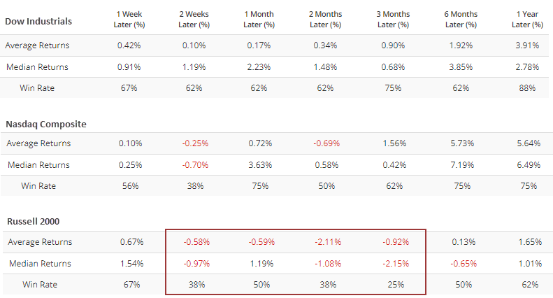
The Backtest Engine lets us see how other indexes and funds performed after these signals. Among the major equity indexes, the small-cap Russell 2000 fared the worst.
Using version 2.0 of the Engine, we can also see how major sectors performed after these extended periods of risk-on behavior. We shouldn't be too surprised that defensive stocks like health care, staples, and utilities tended to hold up better than most.
A time for smaller stocks
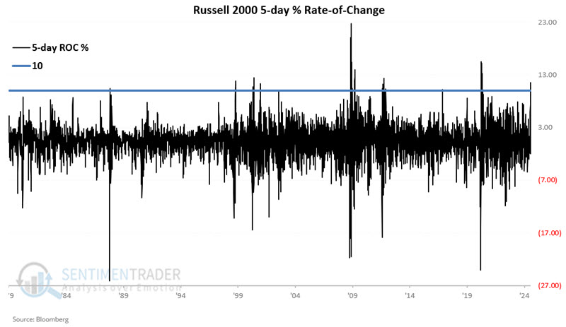
Small caps have underperformed large caps for several years, but Jay noted a recent thrust in the Russell 2000 Index suggests better times ahead for small-caps.
The chart below displays the 5-day percentage rate-of-change for the Russell 2000 (ticker RUT) since 1979. The blue line represents the +10% level. At the far right, we see that on 2024-07-16, the RUT 5-day change crossed above +10%.
The table below displays RUT performance following each +10% reading since 1979, including overlapping signals.
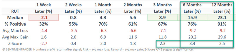
For illustrative purposes, let's look at the results as a trading system:
- If the RUT 5-day rate of change crosses above +10% or more, buy and hold RUT for 12 months
- If a new cross above +10% occurs within 12 months of a previous signal, extend the holding period another 12 months
- Sell RUT 12 months after the most recent signal
The chart below displays the hypothetical growth of $1 invested in the Russell 2000 Index using the rules above from 1979 into July 2024 on a logarithmic scale. There are some significant drawdowns and periods of volatility along the way. Nevertheless, the equity curve's overall "lower left to upper right" trend is unmistakable.
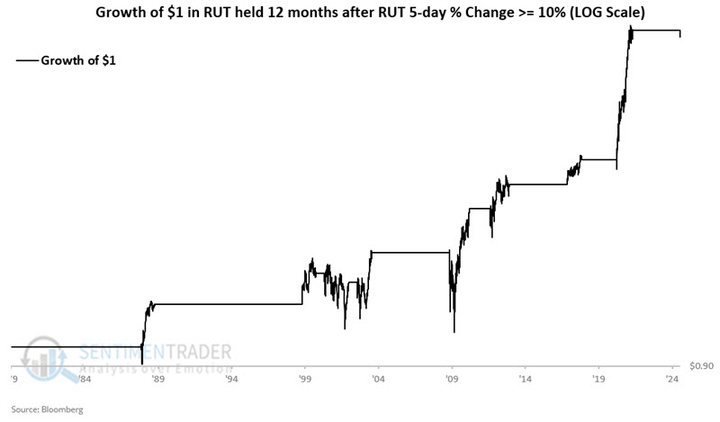
Seven of the eight completed signals showed a gain. The average return for all signals was +27.2%, and the median was +16.7%. The only loss was a -5.0% decline between May 2000 and December 2001. So far, RUT is down -1.8% since the 2024-07-16 signal.
More economic clouds
Employment trends can foreshadow economic trends, and economic recession is a primary driver of bear markets. Jay noted that a key employment indicator has flashed a new warning sign.
Continued claims are the number of people who have already filed an initial claim and have experienced a week of unemployment and then filed a continued claim to claim benefits for that week of unemployment. We like to look at the 4-week average as updated each week here on the St. Louis Federal Reserve website.
The chart below adds a 78-week exponential moving average (blue line) to the data series. This attempts to designate the long-term trend as "rising" or "falling." When the black line is below the blue line, we designate this data series as "falling" which should be favorable for stocks as it indicates a lower threat of economic recession.
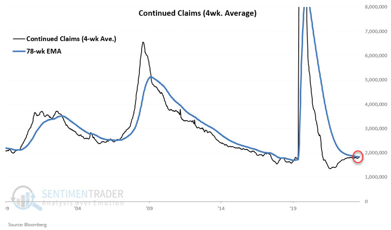
The sharp uptrends starting in 2000, 2007, and 2019 all presaged significant stock market declines. Also, note at the far right in the chart above that the most recent data reported has pushed the 4-week average of Continued Claims back above its 78-week EMA.
The chart below displays the hypothetical growth of $1 invested in the S&P 500 Index only during those periods when the 4-week average of Continued Claims is in a downtrend (i.e., below its 78-week EMA) since 1967-02-24. The cumulative hypothetical gain is +3,770%.
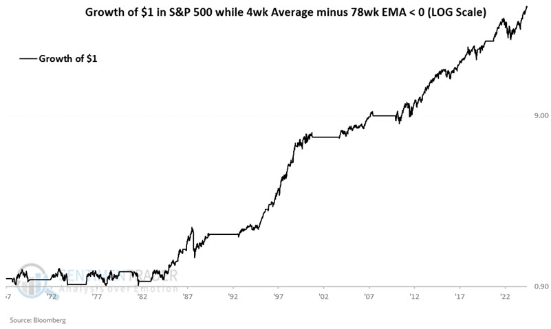
Note that this indicator was not very useful as a bull market indicator into the mid-1980s but has been quite consistently useful ever since.
And what about when the indicator was unfavorable, i.e., in an uptrend? The chart below displays the hypothetical growth of $1 invested in the S&P 500 Index only during periods when the 4-week average of Continued Claims has been in an uptrend (i.e., above its 78-week EMA) since 1967-02-24.
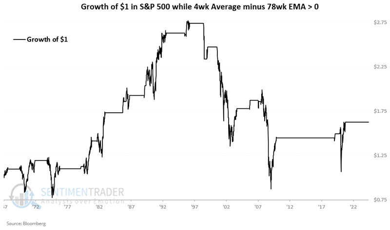
Overall performance is markedly less favorable (+63% versus +3,770%), but technically, the stock market gained ground overall. The proper way to look at the recent crossover into an uptrend is that a favorable factor has been removed from the equation, and not necessarily that the market is doomed to fall simply because continued claims have picked up.
To illustrate the relative merits of paying attention to this indicator, Jay analyzed results in a trading system fashion. 21 periods showed a gain, and only 4 showed a loss (84% Win Rate).
Regional bank bump
Regional bank stocks spiked higher by over 25% in a month. Jay showed that in the process, several potential warning signs have emerged.
It is difficult to argue that price action is anything other than favorable at the moment. With that important caveat in mind, let us turn our attention to some potential warning signs that are arising.
The chart below highlights all dates when the 10-day average of our KRE Optix indicator crossed above 80. The most recent signal occurred on 2024-07-19.
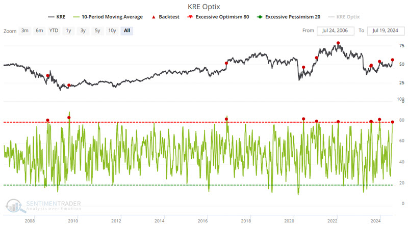
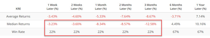
The critical thing to note is the 22% Win Rate for each time from through three months after a signal.
Jay also looked at banks' reaction to extremes in the copper/gold ratio, and that banks are entering a mostly negative seasonal window.
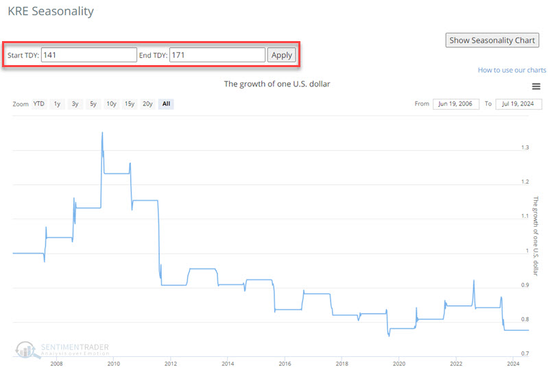
KRE bucked the generally unfavorable tendency in recent months to spike sharply higher. But again, we are looking at potential storm clouds on the horizon. For 2024, the next seasonal downturn period extends from the close on 2024-07-24 through 2024-09-05. The chart below displays the cumulative growth of $1 invested in KRE only during this period since KRE started trading in 2007.
High optimism combined with poor seasonality tilts the weight of the evidence toward risk rather than reward.
Overseas headwinds
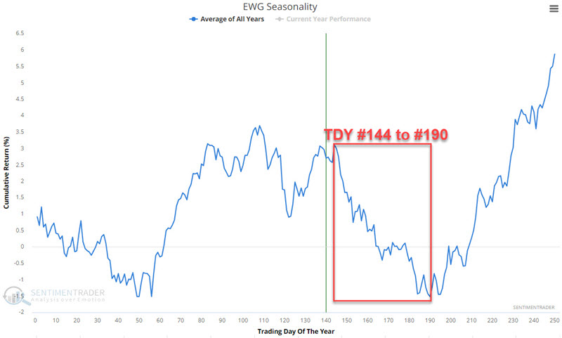
Jay also noted that the German and United Kingdom stock markets are soon entering their weakest seasonal period of the year. They do so as price action for both is weakening.
In the Annual Seasonal Trend chart below for iShares MSCI Germany ETF (ticker EWG), we see an unfavorable period that extends from the close of Trading Day of the Year (TDY) #144 through TDY #190. For 2024, this period extends from the close on 2024-07-29 through 2024-10-02.
The chart below displays the hypothetical growth of $1 invested in EWG only during this period every year since 1996.
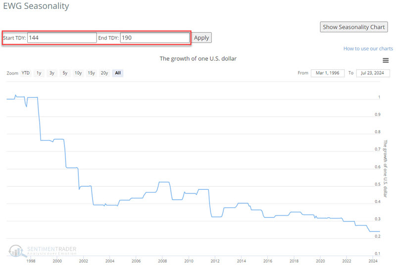
Wins from losses on a year-to-year basis are roughly a coinflip (46% Win Rate) but the Median loss has been -11.9% versus +5.4% for winners and gains and losses over 10% have skewed 8 to 1 to the losing side.
EWG topped out in mid-May and has dipped below its 50-day moving average. As long as it holds below the 50-day average, the potential for further weakness based on seasonality is real.
The EWU fund, focused on the UK, is in a similar position.
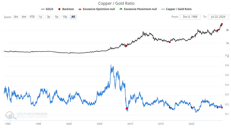
Copper falls hard relative to gold
The Copper/Gold Ratio essentially compares the price of the leading industrial metal to the price of the leading precious metal. Jay suggested that this ratio has widespread influence across the financial markets and it recently crossed below a critical level.
He highlighted the performance of various securities or assets following previous dips in the Copper/Gold Ratio. The chart and table below display previous signals and subsequent performance for the United States Oil Fund LP ETF (ticker USO) following the first cross below 0.18 in six months.
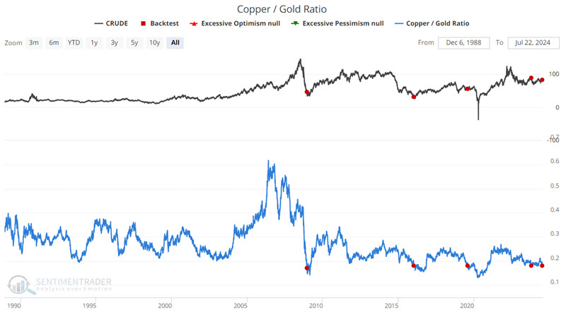
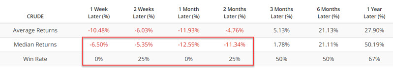
Each time, oil dipped in the weeks and months ahead. The same can be said for unleaded and natural gas. Crude and unleaded have tended to show immediate weakness in the near term, while natural gas has shown significant weakness two to six months after a signal.
The energy sector in the stock market has also tended to experience near-term weakness, including the XLE and XOP funds.
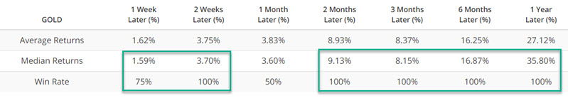
The dollar has rarely made much upside headway in the twelve months following a signal, so precious metals have tended to perform well. The chart and table below display previous signals and subsequent performance for Gold futures following the first cross below 0.18 in six months.
Gold has also far outpaced corn
Gold has returned more than 16% so far in 2024. Over the past month, corn has taken an opposite path and is staring at a 13% loss for the year. Commodity traders tend to strongly favor trend-following strategies, so it's no wonder that optimism on gold is historically high.
At the same time, they've pretty much given up on corn prices for the year, with the Optimism Index falling below 20 again.
When optimism on gold outpaces optimism on corn by 55% or more, as it just did, it roughly coincided with peaks in the ratio of gold to corn.
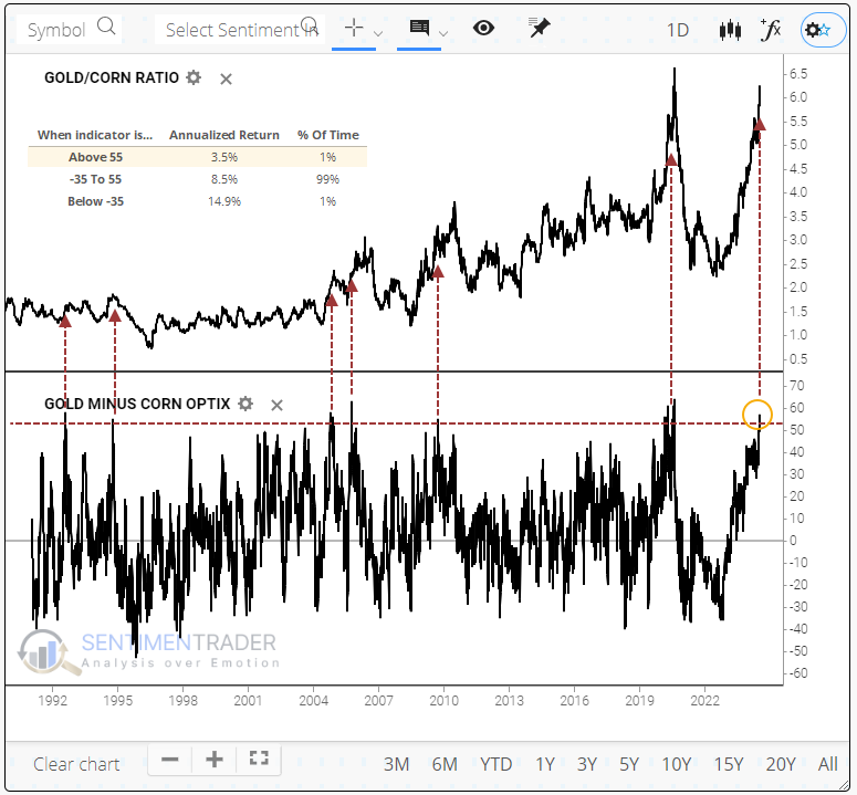
Looking at each commodity, it's not like gold was terrible. It suffered modest losses a few times and double-digit gains a few times.
The main driver of the ratio was corn. These extremes tended to occur near major troughs in the grain, though "near" didn't necessarily mean "now." Four of the five times, it slid over the next two months or so before bottoming. When it did bottom, though - whoa boy, what a ride.
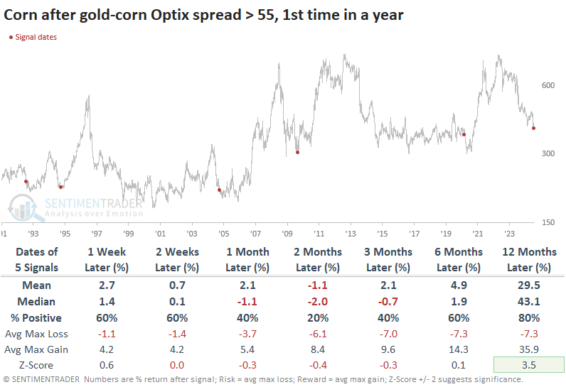
A long-term table of maximum gains and losses shows that three of the five times, the risk/reward was poor in corn up to three months later. But in the following months and years, the risk had been squeezed out, and it was nothing but upside, going into the triple digits four out of five times.
Bitcoin buy signal
A swing trading system that uses short-term trend-following indicators triggered a buy signal for Bitcoin. Dean noted that following similar composite thrusts, Bitcoin rallied 89% of the time over the subsequent two weeks.
A swing trading system that utilizes a composite comprised of short-term trend-following indicators triggered a buy signal when the week-over-week change shifted upward by ten points, suggesting favorable odds for a bull flag breakout.
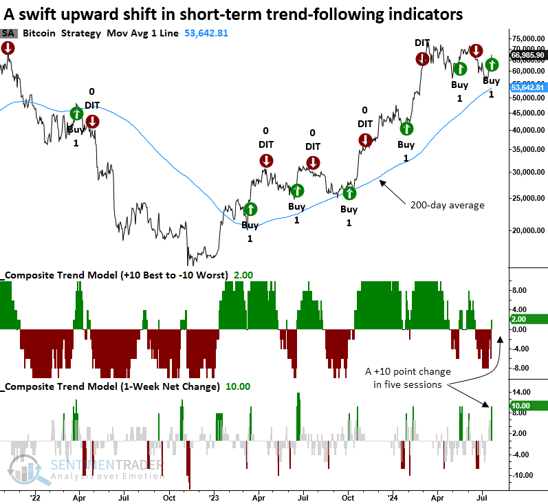
Whenever the composite trend model shifted upward by eight points or more in five days, and Bitcoin was trading above its 200-day average, the bullish price momentum in the cryptocurrency was likely to persist, with the asset rising 89% of the time over the following two weeks.
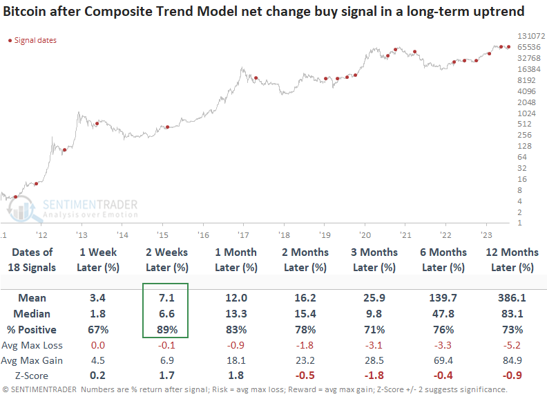
Over two weeks, the maximum gain exceeded the maximum loss in 14 out of 18 instances. Furthermore, the maximum loss never exceeded -10%.
Periods when Bitcoin exhibited a bullish upward shift in a composite trend model generally coincided with a favorable backdrop for the S&P 500. Over the following month, the world's most benchmarked index rallied 89% of the time.
About TradingEdge Weekly...
The goal of TradingEdge Weekly is to summarize some of the research published to SentimenTrader over the past week. Sometimes there is a lot to digest, and this summary highlights the highest conviction or most compelling ideas we discussed. This is NOT the published research; rather, it pulls out some of the most relevant parts. It includes links to the published research for convenience, and if you don't subscribe to those products, it will present the options for access.