
TradingEdge Weekly for Jul 14 - More signs of strong sector recoveries, high optimism, improving macro conditions

Key points:
- Macro conditions are improving, with the Macro Index Model doubling from its low
- More indicators are showing a bullish bias
- The S&P 500 has suffered a pullback for months
- The lack of a pullback has levitated sentiment for weeks in extreme territory
- Leading indicators show a global upswing and a buy signal
- Discretionary stocks are showing medium- and long-term recoveries
- Cyclical stocks in general are recovering strongly
- Investors in Big Tech are ignoring real rates
- There are positive signs for high-yield bonds, including a current seasonal stretch
- A couple of seasonal crosscurrents in gold
- Looking at the impact of improving macro conditions on commodities
- A tough stretch for beans
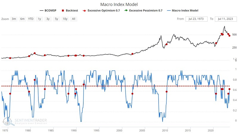
Macro conditions are improving
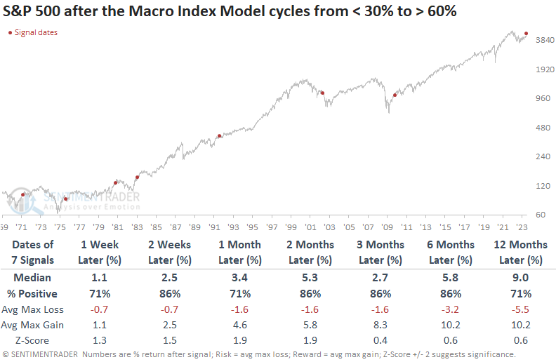
It might not seem so from media headlines, but macro conditions are improving. Dean showed that the Macro Index Model cycled from less than 30% to greater than 60% and after similar recoveries, the S&P 500 was higher 86% of the time over the next six months.
In February, the Macro Index Model, a composite consisting of 11 diverse economic indicators, experienced an unprecedented surge. The substantial jump marked a pivotal moment, as the composite has maintained an upward trajectory over the past five months. After the latest update last week, the composite has now swung from under 30% to over 60%.
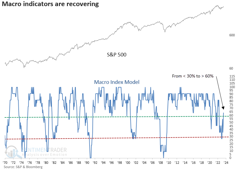
When the Macro Index Model cycles from below 30% to above 60%, the S&P 500 tends to rally, benefiting from the positive economic conditions that serve as a tailwind for the market. As with most macroeconomic signals, the sample size is small.
From a sector perspective, Consumer Discretionary, Financials, and Industrials tend to outperform. Opting for cyclical groups over defensive ones should be favored, and ETF investors might find equal-weighted indexes to be a more suitable alternative to cap-weighted indexes.
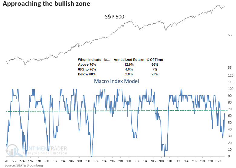
With 7 out of 11 components positive, the Macro Index Model is on the brink of entering the bullish zone. By adding one more member to the positive side of the ledger, the model would cross the significant 70% threshold, known for delivering annualized returns greater than 12% for the S&P 500.
More indicators show a bullish bias
Jay highlighted several indicators that recently triggered signals with above-average historical returns.
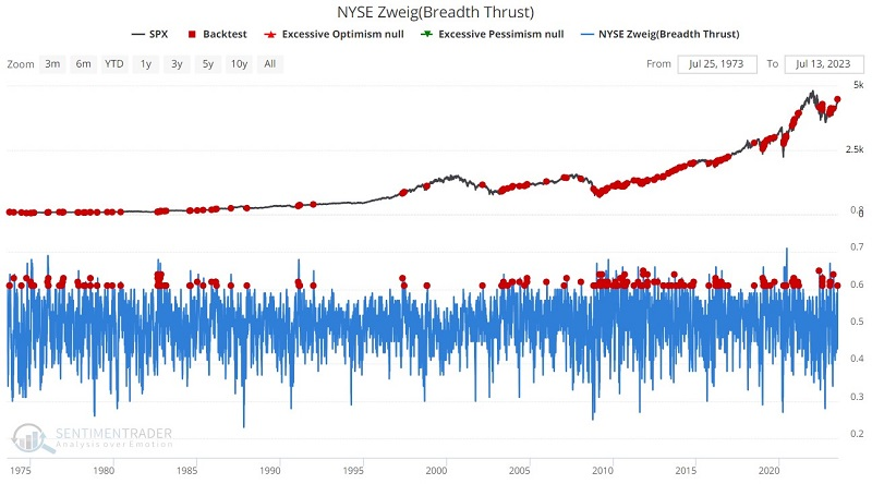
The Breadth Thrust Indicator is a technical indicator used to identify market momentum. It is computed by calculating the number of advancing issues on an exchange, divided by the total number of issues (advancing + declining) on it, and generating a 10-day exponential moving average of this percentage.
A "classic" Zweig Breadth Thrust The indicator signals the start of a potential new bull market when it moves from below 40% (indicating an oversold market) to above 61.5% (indicating an overbought market) within any 10-day period. However, even if we apply a less stringent rule - i.e., any cross above 61.5% by the EMA - the signals tend to be favorable.
The chart below denotes a red dot every time this percentage's 10-day exponential moving average crossed above 61.5% regardless of how low it went since the last cross above 61.5%. The most recent signal occurred on 2023-07-12. S&P 500 returns from 3-12 months later were particularly positive, with rare and mostly minor losses.
The S&P High Beta / S&P High-Quality Relative Ratio Rank indicator chart shows where the ratio is relative to its range over the past four months. When the relative ratio is high, investors are showing risk-on behavior. It recently crossed above 85, a high level that tended to precede gains in the S&P.
Like the previous indicator, the Risk Appetite Index measures risk-on, risk-off behavior. As the index rises, it means that investors are becoming more risk-seeking. That, too, recently triggered a high (risk-seeking) threshold, which historically preceded gains an abnormally large percentage of the time.
No pullbacks for months
Investors have become a lot more confident over the past couple of months, and it's no wonder why. The most benchmarked index in the world has barely taken a step back for months, with no pullbacks larger than 5%, or even 3%, since March.
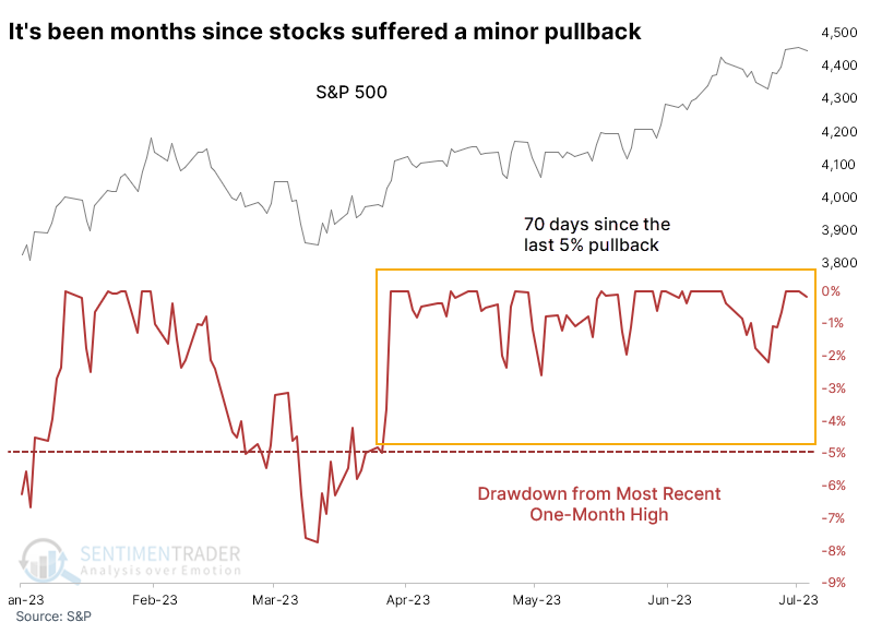
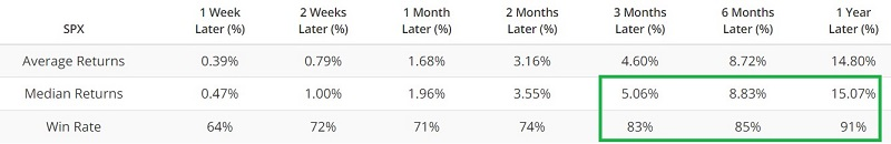
For these purposes, a "pullback" means we are looking at the maximum decline in the S&P 500 from its most recent 20-day high. The current streak of 68 days since the last 3% pullback ranks in the top 7% of all streaks since 1928.
This low-volatility behavior often signals extreme confidence when stocks are trading at multi-year or all-time highs. But that doesn't apply now because the index has traded at a one-year but not multi-year high.
Because of the tiny sample size, we have to be more cautious of a conclusion, but at least they were pretty consistent in their message. The S&P had a compelling record of rising after this behavior, with relatively limited risk compared to potential reward in the months ahead. The only one that showed more risk than reward occurred in 2011.
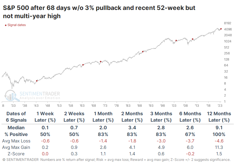
The lack of a 3% pullback is a tough hurdle to cross, but the sample size doesn't increase too much, even if we expand it to a 5% pullback. There were still only ten precedents since 1928, with essentially the same conclusion. Over the next 6-12 months, only a single signal witnessed a loss, though that loss was fairly significant.
The lack of pullbacks has helped to levitate sentiment
Bull markets need investors to become increasingly bullish to sustain themselves. If investors aren't feeling optimistic, they're not going to shift funds from their money market hidey-hole, and they're not going to bid up the prices of stocks.
That's why it becomes difficult for stocks to hold gains when sentiment gets overly optimistic. When it gets stretched and then reverses, it can be more of an issue. That's what we're facing right now.
After surging into overly optimistic territory, Dumb Money Confidence has begun to reverse as trend-following traders become less convinced that a further rally is imminent. At the same time, Smart Money Confidence is rising from an exceptionally low level. Falling Dumb Money and rising Smart Money means that the spread between the two models is narrowing after blowing out to the most stretched level in over two years. The scale in the chart below is inverted to better align with market extremes.
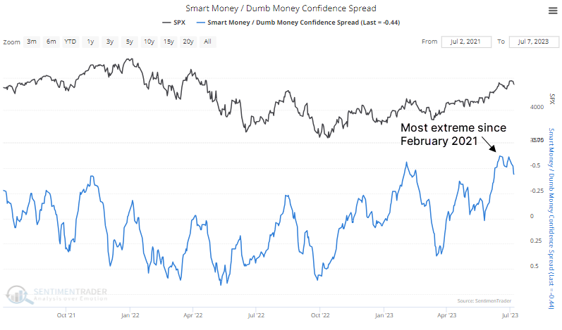
We've been compiling this data since December 1998. What has become clear over those 24+ years is that during ongoing bear markets, investors don't have a chance to become too optimistic - at least not for long - before sellers see their opportunity to offload shares to suckers.
During the 2001-02 and 2007-08 bear markets, the Smart Money / Dumb Money Confidence spread never went beyond two weeks in extreme territory before sellers emerged and stocks tanked. This time, the spread went more than three weeks in extreme territory.
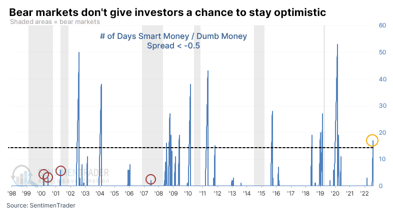
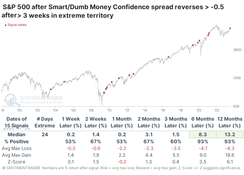
The table below shows those times when the spread exceeded an extreme threshold and stayed there for more than three weeks, then reversed out of it.
There are a few things that stand out:
- Persistent optimism like this doesn't happen during protracted bear markets
- It can happen right before large corrections
- The first reading following a bear market typically leads to only a short-term pullback
Even though most of the study period is dominated by rising prices, the S&P 500's returns over the six to twelve months following these signals were well above random. There was only a single loss in either time frame, and they were minimal. As noted, the first period of protracted extreme sentiment following a bear market has preceded very good long-term returns, with double-digit gains a year later.
Leading indicators show a global upswing
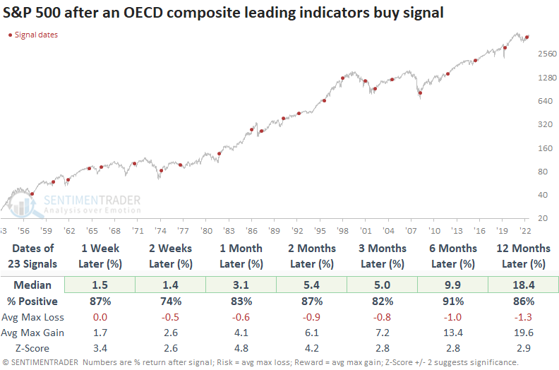
A diffusion index for the OECD composite leading indicators triggered a buy signal. Dean noted that similar reversals in the OECD CLI preceded excellent returns for the S&P 500.
The Organization for Economic Cooperation and Development (OECD) compiles a composite of leading indicators for countries worldwide. By aggregating these individual country indicators into a diffusion index, it becomes possible to detect a revival in economic trends, which typically creates favorable conditions for the stock market.
The OECD CLI Diffusion Index, which tracks the proportion of CLIs rising month-over-month, declined to 0% in 2022 but has now reversed higher, triggering a buy signal when it exceeded 60%.
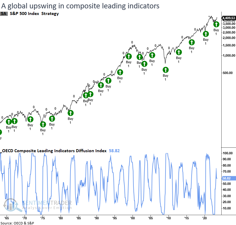
Whenever the diffusion index for the OECD CLIs climbs above 60% after falling below 40%, the S&P 500 displays remarkable returns, win rates, and z-scores across all time frames. Six months later, the S&P 500 was higher in all but two precedents. The only notable whipsaw occurred in 2001 when several other economic indicators yielded optimistic signals that ultimately proved unsuccessful.
From a sector perspective, Technology is a clear-cut winner, which aligns with current relative strength trends. Favorable factors include cyclical stocks, small-caps, and value, all of which outperform their counterparts in terms of performance.
Discretionary stocks join the recovery party
The percentage of Consumer Discretionary stocks with a rising 200-day average increased above 88%. Dean showed that when long and medium-term uptrends confirm each other, the sector was higher every time a year later.
On Tuesday, the percentage of S&P 500 Consumer Discretionary stocks with a rising 200-day average increased above 88%, reaching the highest level since November 2021. Annualized returns are excellent when a high level of Discretionary stocks are in a long-term uptrend like now.
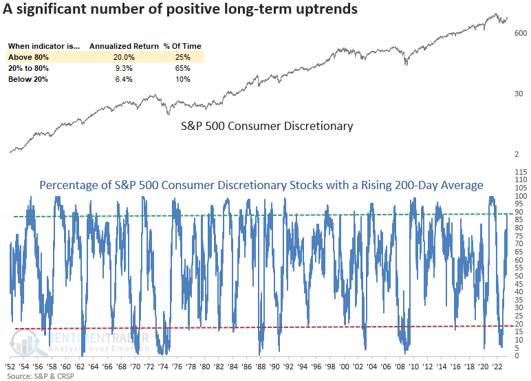
The Consumer Discretionary sector maintains the second-highest level of stocks with a rising 200-day average. Amazon and Tesla represent 2 out of 53 stocks in the sector, so there are plenty of other opportunities.
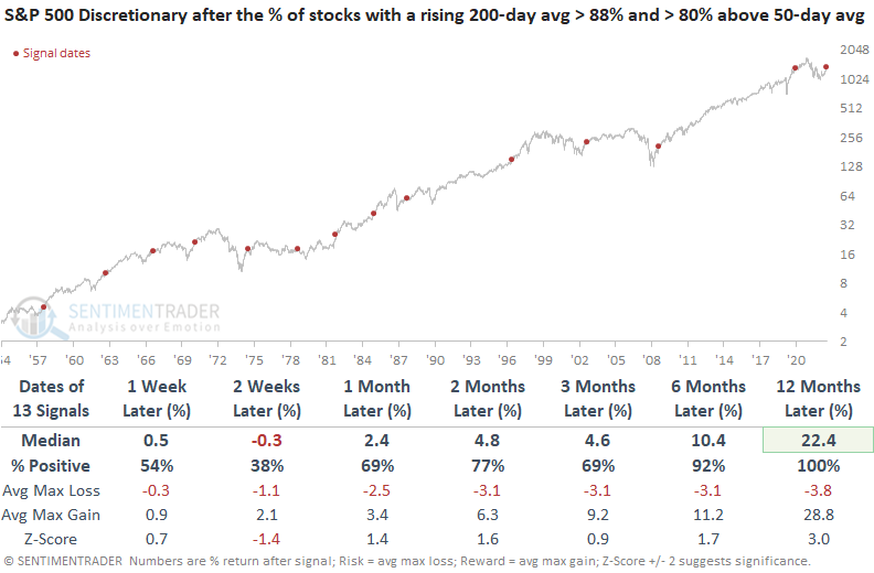
Historically, when the percentage of S&P 500 Consumer Discretionary sector stocks with a rising 200-day average exceeds 88%, the sector was higher a year later in all but one precedent. Sometimes long-term breadth indicators increase to a high level as medium-term breadth measures deteriorate due to the duration difference in the calculation.
That's not the case this time, however, as more than 80% of the stocks are also above their 50-day moving average. A year later, there were no losses, and the risk/reward was heavily skewed to the upside.
Cyclical stocks, in general, continue to recover
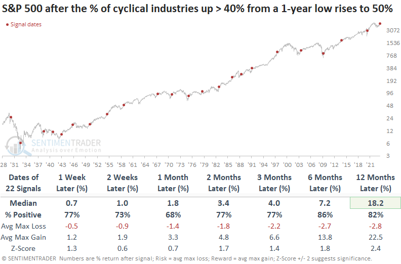
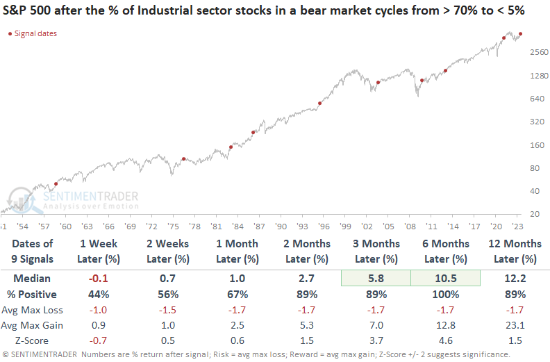
Dean noted that the percentage of cyclical industries that have risen by more than 40% from their 1-year lows reached 50%. After similar recoveries, the S&P 500 was higher a year later every time since 1945. Also, industrial stocks in a bear market have cycled from greater than 70% to less than 5%.
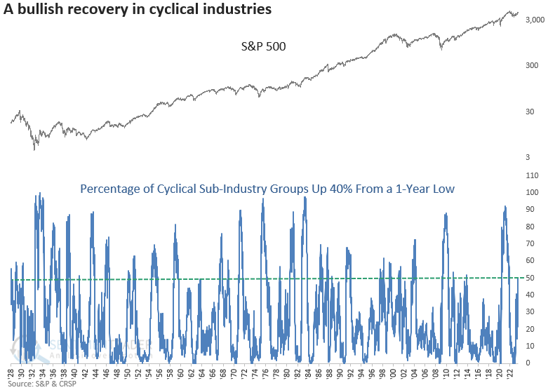
When 50% or more sub-industry groups increase by greater than 40% from their 1-year lows, the bullish price momentum continued. A year later, the S&P 500 was higher 82% of the time, with the last unprofitable signal coming in 1945. A year later, the max loss exceeded -10% in only 4 out of 22 cases, with all but one coming before 1942.
And only three signals occurred in a bear market, all prior to 1942.
The percentage of Industrial sector stocks in a bear market cycled from greater than 70% to less than 5% for only the 10th time since 1958. Annualized returns were solid when fewer than 20% of stocks are in a bear market.
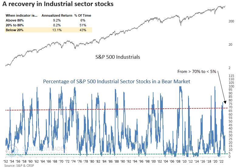
The favorable price momentum in the Industrials sector will likely continue for the foreseeable future. A year later, the sector was higher in all but one case, and that negative precedent was reasonably benign. When applied to the S&P 500, the outlook for the broad market also looks bullish, with no losses over the next six-months.
Big Tech investors ignore real rates
Thanks to a surge in big tech stocks, one of the increasingly popular charts floating around lately is their valuation, which has decoupled from the trend in the real rate on 10-year Treasury notes. Because most Technology stocks lose money, their valuations are often closely tied to real interest rates.
Even though real rates have jumped since April, tech valuations have grown. The chart below shows real rates inverted to better show the correlation between the two data series.
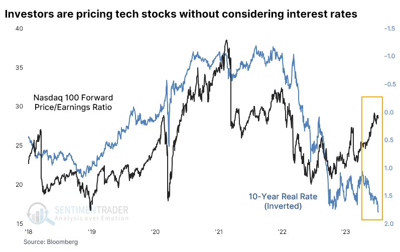
Over the past 20 years, the two series have had a negative correlation. When real rates rise, investors devalue the shares of money-losing companies. That's not happening now. The forward price/earnings ratio on Nasdaq 100 stocks and the real rate on 10-year Treasuries are both in the top 5% of their ranges over the past year.
With a nod to the dangers of relying on minuscule sample sizes, the table below shows future returns in the Nasdaq 100 after the first of those red dots in a year. This first triggered a month ago, so we're already a ways in. And while short-term returns were iffy, medium- to long-term returns in the NDX were mostly good.
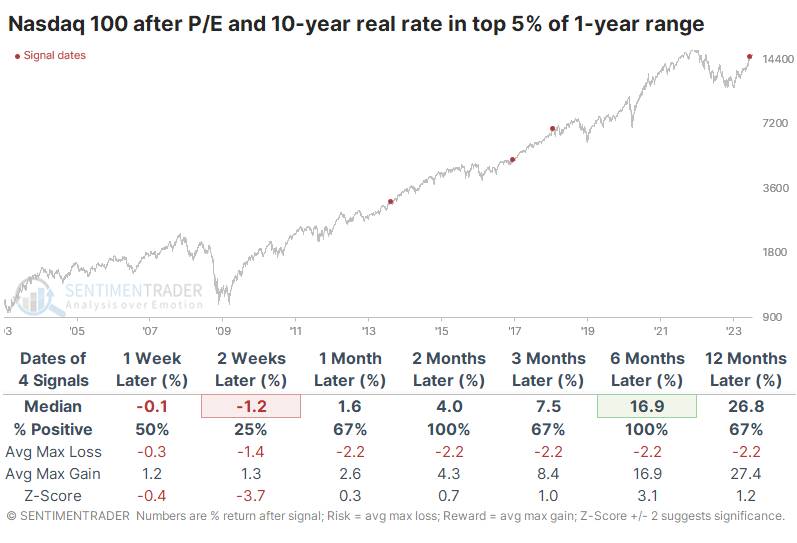
The table of maximum gains and losses across each time frame shows that none of the three precedents showed a loss greater than -7.7% at any point within the next six months, while all of them gained at least +8.3% during the same time frame.
A positive seasonal stretch for high-yield bonds
Jay noted that Dean recently posted a favorable piece regarding high-yield bonds. The current favorable seasonal period for high-yield bonds dovetails with that nicely.
A positive annual seasonal trend for the iShares iBoxx $ High Yield Corporate Bond ETF (ticker HYG) extends from the close on Trading Day of the Year (TDY) #124 through TDY #148. For 2023, this period extends from the close on 2023-06-29 through 2023-08-08.
One of the largest and longest-running high-yield bond funds in the Vanguard High-Yield Corporate Fund (ticker VWEHX), which started trading in 1980. The chart below displays the growth of $1 invested in VWEHX only during the TDY #123 through TDY #148 period every year since 1980.
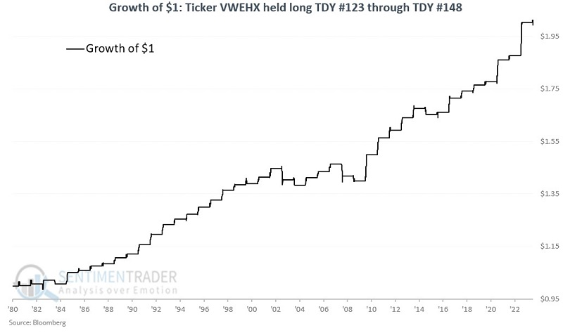
These seasonal stretches showed a gain during 86% of years, with an average gain larger than the average loss. Remarkably, the fund gained more than +2% during 18% years, while losing more than -2% only 2 times.
Complicating this approach is the fact that you must open a Vanguard account to trade the fund and must wait 30 days to get back in once you sell out. These limitations may compel some traders to trade an ETF such as HYG.
The chart below displays the growth of $1 invested in VWEHX only during the TDY #123 through TDY #148 period every year since 2007.
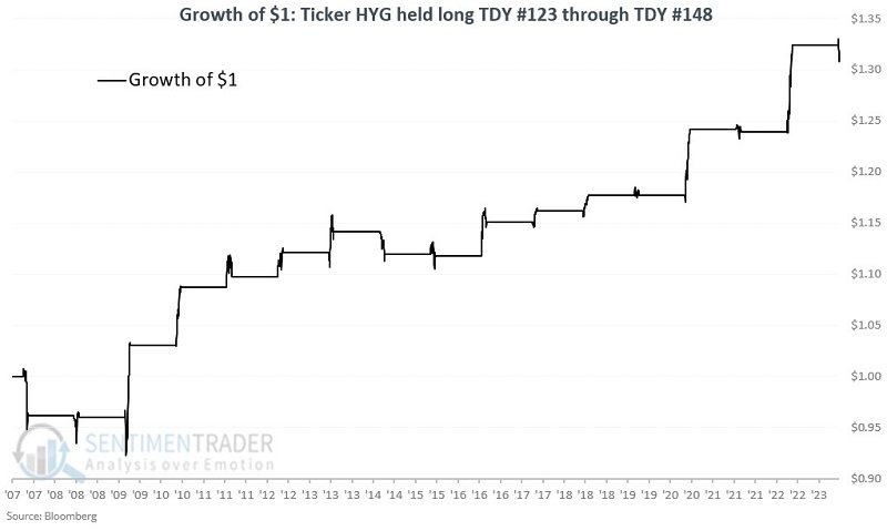
While less consistent and with less history, the fund showed a gain during 67% of its years, but with an average gain that far surpassed the average loss. It enjoyed a gain larger than +2% during 6 years, while suffering more than a -2% loss...never.
Crosscurrents in gold
Jay noted that gold has entered a favorable time of year, but another cycle may take the edge off.
The chart below displays the annual seasonal trend for gold futures. The green box highlights the period that extends from the close on Trading Day of Year #134 through TDY #203. For 2023 this period extends from the close on 2023-07-10 through the close on 2023-10-13.
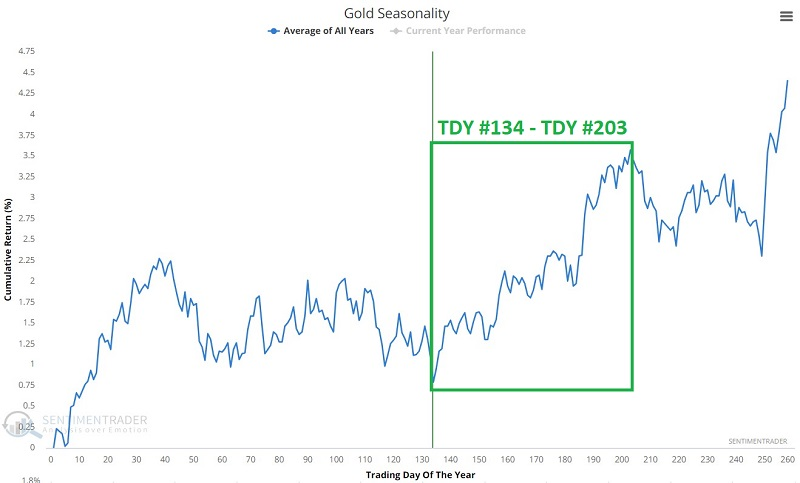
Since 1975, these windows showed a gain 63% of the time, with the average gain well above the average loss, and much more likely to show a large gain than a large loss.
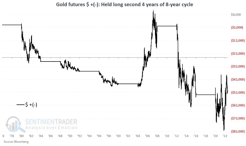
But longer-term, gold has historically operated on something of an 8-year cycle. Starting with 1977, it has generally been favorable for four years and then unfavorable for four years. We are currently in an unfavorable four-year period through the end of 2024.
Starting in 1977, gold has gained +$230,006 during favorable four-year periods and lost -$50,233 during the unfavorable four-year periods. The chart below displays the cumulative $ +(-) for gold futures held long only during the unfavorable four-year periods.
If we combine the two seasonal tendencies, during positive annual windows during the positive four-year cycles, gold gained 83% of the time, and returned more than +$5,000 nine times, while never suffering more than a -$5,000 loss.
But we won't enter that environment for another year+. The following four-year periods are deemed "unfavorable":
- 1981-1984
- 1989-1992
- 1997-2000
- 2005-2008
- 2013-2016
- 2021-2024
Now let's look at the annual TDY #134 through TDY #203 periods only during these unfavorable four-year periods. The chart displays the cumulative $ +(-) for gold futures.
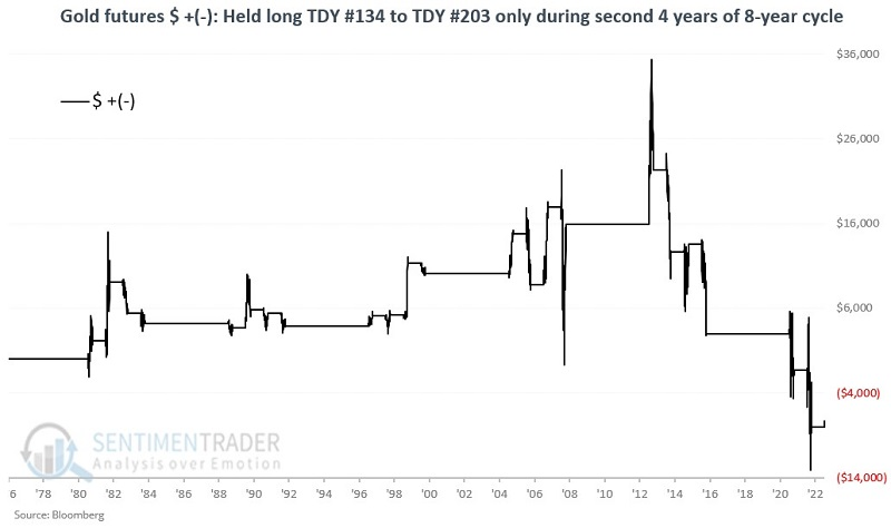
The yellow metal sported a gain only 45% of the time, with an average loss about equal to the average gain, and an equal probability of witnessing a $5,000 gain or -$5,000 loss. Gold bugs could have more confidence in a price breakout if we were in a different part of the four-year cycle.
Improving macro conditions and the impact on commodities
Jay showed that our Macro Index Model continues to improve. One little-understood relationship is that between macroeconomic factors and commodities.
Our Macro Index Model (MIM) combines 11 diverse economic indicators to determine the state of the U.S. economy right now. The good news is that - despite the steady drumbeat of economic gloom and doom among many market pundits - the index has improved considerably in recent months.
Let's turn to the Bloomberg Commodity Spot Index (BCOMSP) to create a test. With this data, we can test back to 1970, when our Macro Index Model data series begins. When the MIM crossed below 0.40, the commodity index struggled, with an average return of -2.8% over the next year.
Now let's look at those times when the MIM crossed above 0.50. After these signals, the one-year return improved to +13.1%.
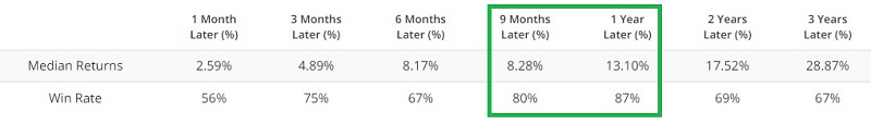
MIM has repeatedly bounced around below 0.40 and back above 0.50 in the last year. The latest signal was a cross back above 0.50 on 2023-07-03. Before attempting to draw conclusions, let's broaden our test a bit.
We will use the following rules to decide when to hold - or avoid - commodities as an asset class:
- Buy BCOMSP when the Macro Index Model crosses above 0.50
- Sell BCOMSP when the Macro Index Model crosses below 0.40
During bullish periods commodities gained +3,143%; during bearish periods commodities returned -28%. Quite a difference. The chart below displays the growth of $1 invested in commodities only during bullish periods since 1970 on a logarithmic scale.
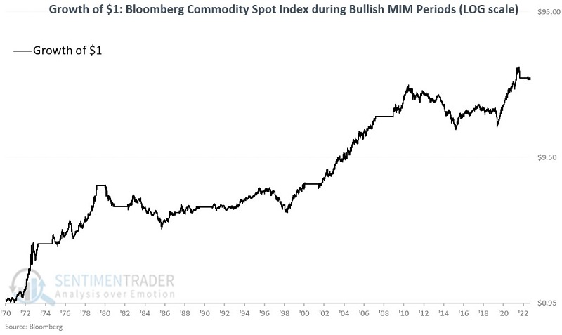
The commodity index sported a gain during 67% of the periods, averaging an incredible +112% return. It gained more than +30% during five signals.
The good news is that overall commodities performed well during bullish periods and accumulated substantial gains. The bad news is that these results were not achieved without significant drawdowns and volatility along the way.
During bearish signals from the MIM, the commodity index showed a gain only 11% of the time. Out of 9 signals, 8 were losers. Jay also looked at seasonality and price trends to help narrow down when it might make sense for investors to take advantage of this signal from the MIM.
A tough stretch for beans
Due to the nature of the planting cycle, soybeans are a highly cyclical market, and Jay showed that they are entering their weakest seasonal period of the year.
The chart below displays the annual seasonal trend for soybean futures.
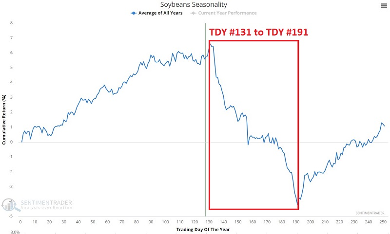
Identifying the weakest time of year is not difficult. The red box highlights the period that extends from the close on Trading Day of Year #131 through TDY #191. For 2023 this period extends from the close on 2023-07-12 through the close on 2023-10-09.
The chart below displays the hypothetical cumulative $ +(-) from holding a long position in soybean futures only during this unfavorable period every year since 1937.
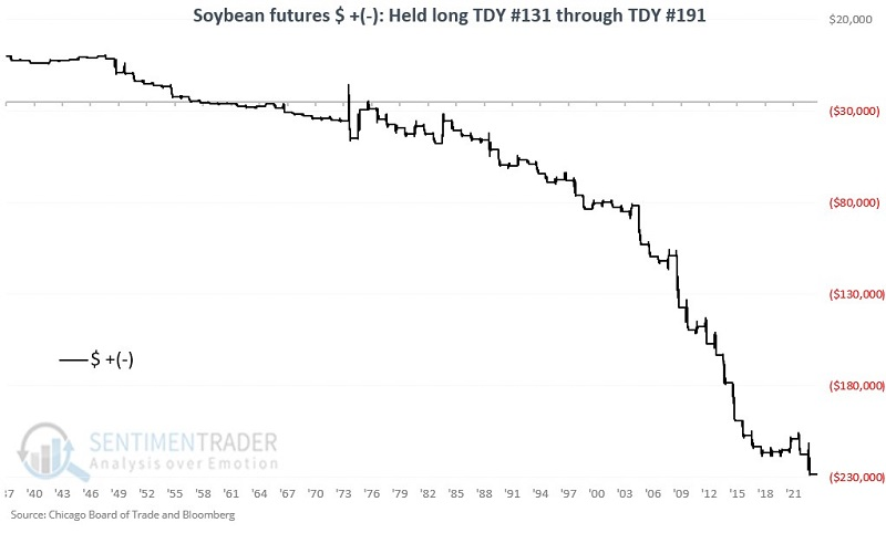
These windows showed a gain only 26% of the time, with an average loss almost double the average gain. The contract lost more than -$5,000 during 21 years while gaining more than +$5,000 only 3 times.
The trading reality is that in any given year, anything can happen. In 1974 soybean futures rallied over $15,600, and in 1983 the gain was almost $12,000. Seasonality tells a trader where to look for trading opportunities and in which direction to lean. Beyond that, there are no guarantees.
About TradingEdge Weekly...
The goal of TradingEdge Weekly is to summarize some of the research published to SentimenTrader over the past week. Sometimes there is a lot to digest, and this summary highlights the highest conviction or most compelling ideas we discussed. This is NOT the published research; rather, it pulls out some of the most relevant parts. It includes links to the published research for convenience, and if you don't subscribe to those products, it will present the options for access.