
TradingEdge Weekly for Jul 11 - Cyclical recoveries, trend persistence, metal warnings

Key points:
- More than 80% of cyclical sub-industry groups have a positive one-year return
- The number of technology stocks in a bear market has drastically recovered
- The S&P 500 skated above its upper Bollinger Band for over a week
- The S&P has also signaled a compelling change in long-term trend
- More indicators are firing continuation signals
- Stocks are nearing a "sell" signal...apparently (and without confirmation)
- Some indicators are flashing warning signs for metals
- Picking seasonal spots in housing, junk bonds, and oil
Cyclical success
The percentage of cyclical sub-industry groups with a positive one-year return increased above 80%. Dean showed that favorable price momentum in economically sensitive groups supports a bullish market outlook.
When the percentage of cyclical groups with a positive one-year return cycled from below 20% to above 80%, it indicated that most economically sensitive industries exhibit favorable long-term price momentum. As illustrated in the chart below, when at least 80% of cyclical groups show positive momentum, the S&P 500 has historically produced an annualized return of 17%, more than twice the return achieved when fewer groups participate.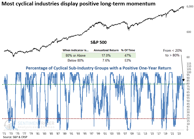
The cyclical sub-industry composite comprises 31 groups, covering autos, housing, travel, banking, construction, transportation, semiconductors, and several other industries.
Each time the proportion of cyclical sub-industry groups with a positive one-year return swung from fewer than 20% to more than 80%, the world's most benchmarked index rallied over the following year in 86% of cases. Since 1941, the S&P 500 has posted gains every year.
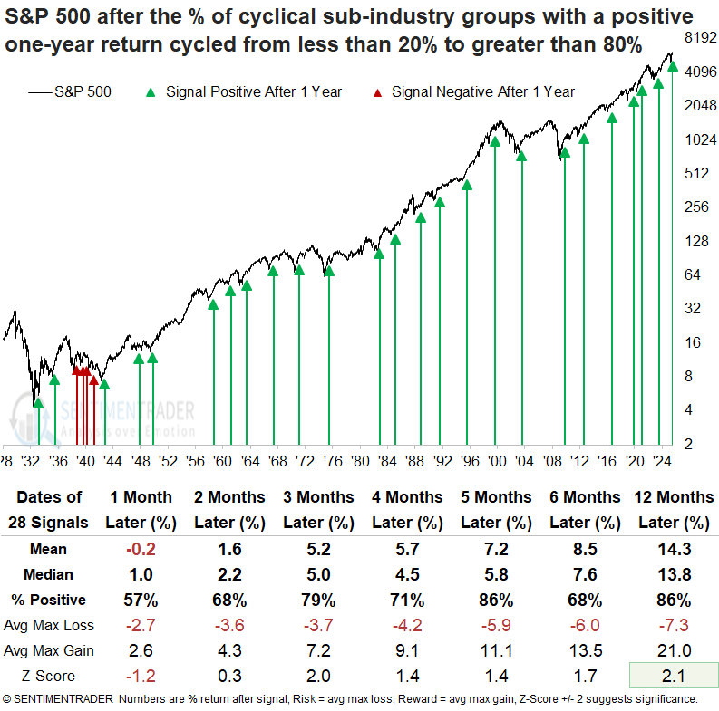
Over the following year, the S&P 500 experienced declines of more than 10% on eight occasions, while it rose by more than 10% in 21 instances.
As the S&P 500 notched its fourth record high in five sessions last Thursday, a notable skew in new highs among its constituents favored cyclical sectors, indicating broad participation from economically sensitive stocks, a hallmark of sustainable uptrends.
Tech recovery
The percentage of S&P 500 Technology stocks in a bear market recovered from an extreme reading. Dean noted that following comparable turnarounds, the tech sector posted gains a year later every time.
During the depths of the Liberation Day meltdown, the S&P 500 Technology sector experienced severe internal damage, with 91% of its constituents falling into a bear market, defined as a decline of 20% or more from a 252-day high. However, in the months since, the proportion of stocks in a bear market has sharply reversed, collapsing below 36%, a critical level that signals a favorable backdrop for the group.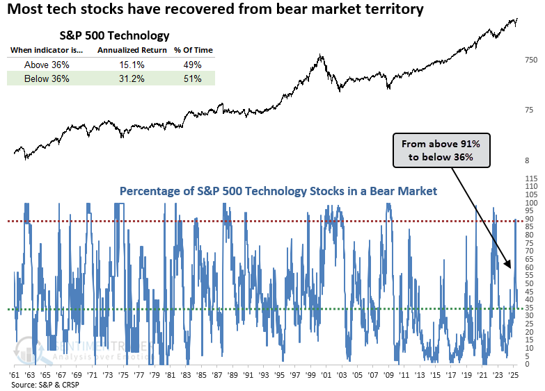
Whenever the percentage of S&P 500 Technology sector stocks in a bear market transitioned from above 90% to below 36%, the sector displayed remarkable consistency and outsized returns. A year later, the group was higher in every case except 1991.
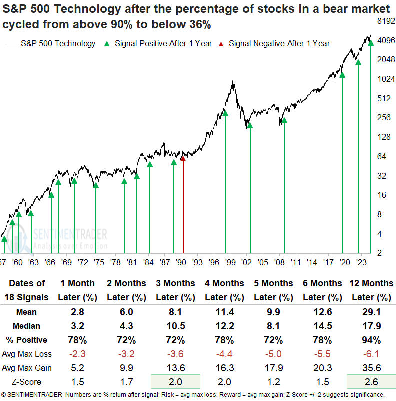
Over the following year, the S&P 500 Technology sector experienced declines of more than 10% on four occasions, while it rose by more than 10% in 17 instances, indicating a favorable risk/reward scenario. Technology outperformed the S&P 500 in every measured period except the two-month span.
Although the sample size is small, when a signal occurred within 2% of an all-time high, the tech sector was higher 100% of the time, five, six, and twelve months later.
Skating above the Band
A measure of trend and volatility, Bollinger Bands can give useful signals in various ways-mean reversion, trend-following, or some mix of the two.
The indicator is getting some attention now because the world's most benchmarked equity index has poked above its upper BBand almost every day for over a week, all while trading at record highs.
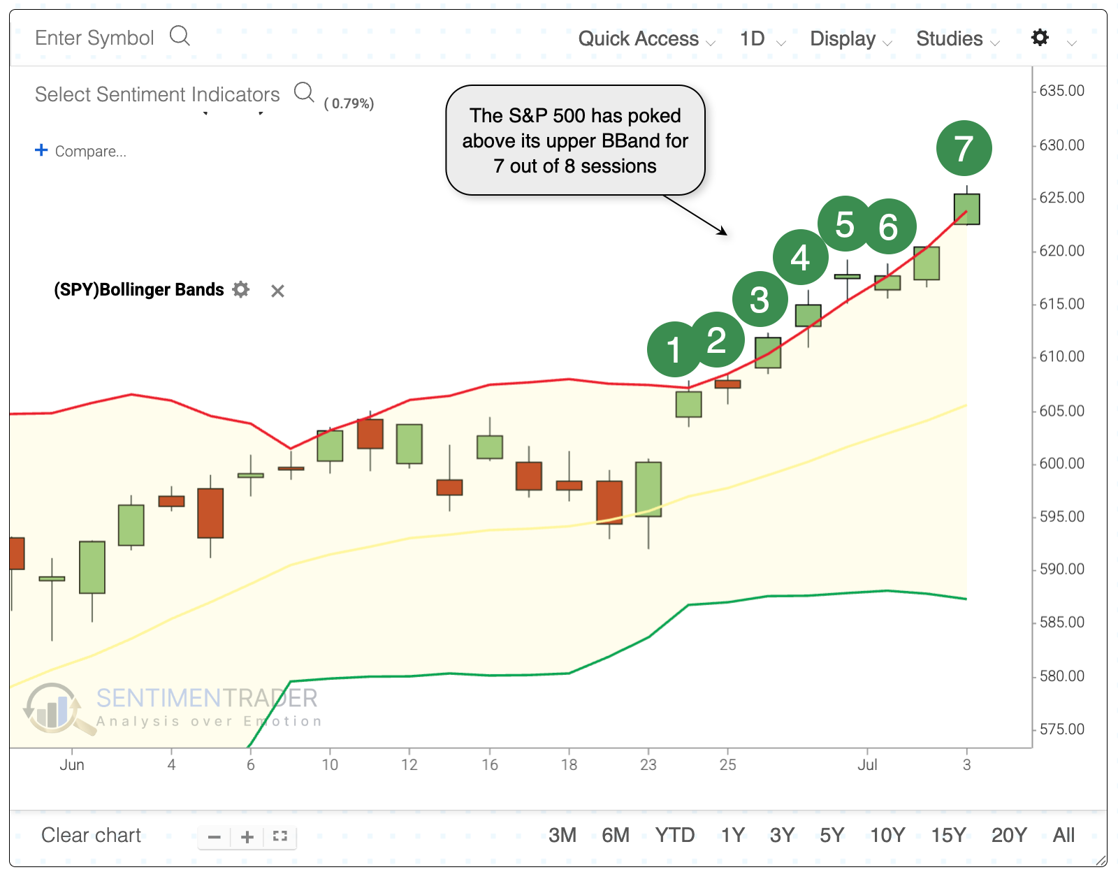
We have about 60 years of reliable intraday data for the S&P 500, so we can go back that far and see how traders reacted after similar behavior. Overall, the S&P did okay in the following days. It rose more often than not, but average returns were below average, and the risk/reward was unimpressive. Since 1997, every signal showed a loss over the following week, with most of those building on the losses in the couple of weeks after.
From a longer-term point of view, the next two months showed the weakest returns. The S&P sported a positive return only 45% of the time, with an average return significantly below random.
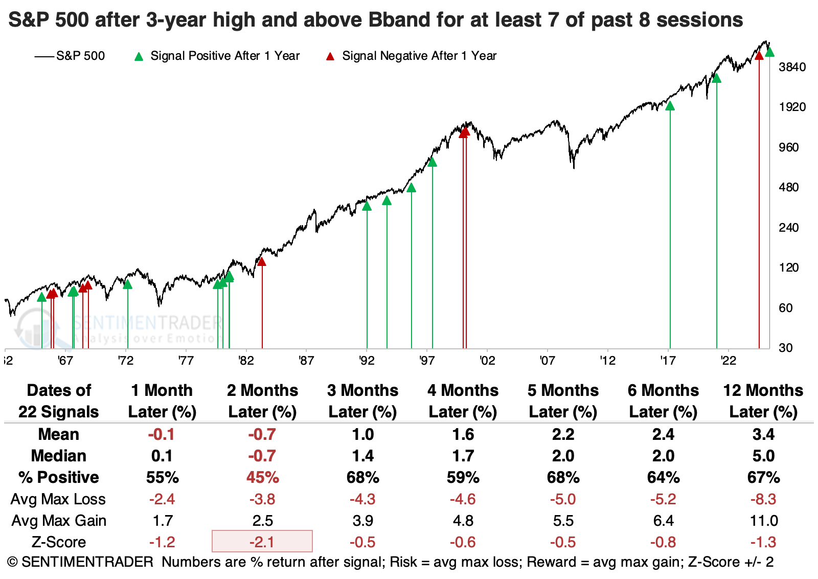
Two months later, the Russell 2000 showed a median return of +4.8%, compared to -0.7% for the S&P 500. Five months later, the Nasdaq Composite enjoyed a positive return 80% of the time, compared to 68% for the S&P.
We can see this bias among factors, with small-caps enjoying the strongest and most consistent returns across most time frames, concentrated on the more intermediate ones from 2-5 months.
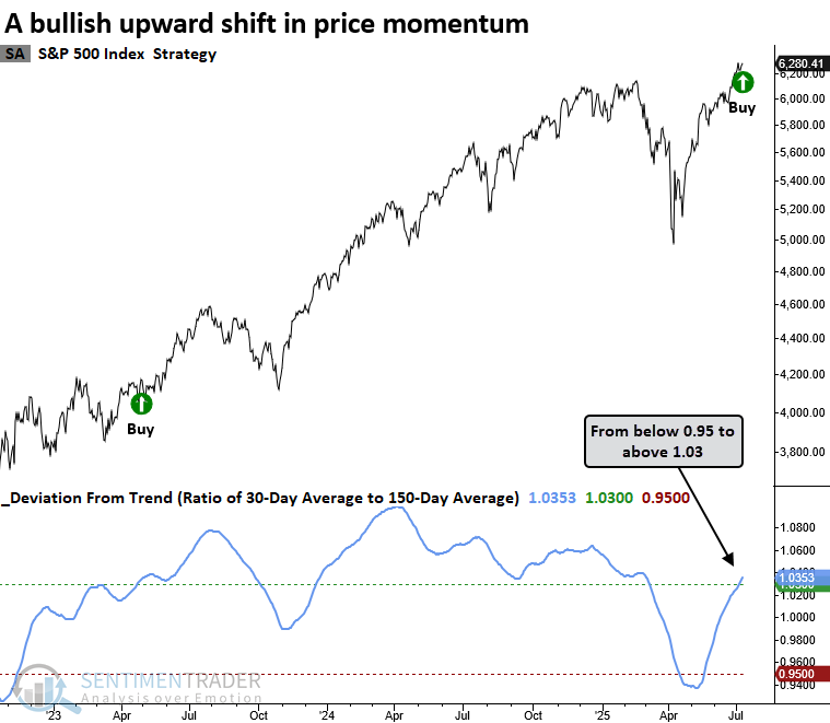
Big deviation from trend
The S&P 500 generated a deviation-from-trend signal, indicating bullish price action. Dean showed that similar shifts in momentum suggest the cyclical upswing in the S&P 500 will persist over the next year.
The deviation-from-trend indicator identifies momentum shifts by tracking the ratio of the 30-day to 150-day average. A signal occurs when the ratio cycles from below 0.95 to above 1.03, and the index registers a 42-day high.
An upward shift in price momentum, as signaled by the deviation-from-trend indicator, often marked a favorable period for the S&P 500 over the following year, with the index displaying a median gain of 14%.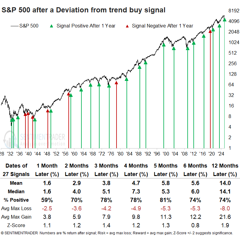
Over the following year, the S&P 500 experienced a decline of more than 10% on six occasions, while it rose by more than 10% in 22 instances, indicating a favorable risk/reward scenario.
More continuation signals
Jay suggested that our Smart Money/Dumb Money and Microcap / S&P 500 Relative Ratio Rank indicators recently flashed "continuation" signals.
The Smart Money Confidence and Dumb Money Confidence indices are a unique innovation that allows subscribers to see at one quick glance what the "good" market timers are doing with their money compared to what "bad" market timers are doing.
The chart below highlights all dates when:
- The S&P 500 Index is above its 200-day moving average
- The 200-day moving average is rising
- The Smart Money/Dumb Money Confidence Spread crosses below -0.50
The chart below highlights all signal dates, including overlaps.
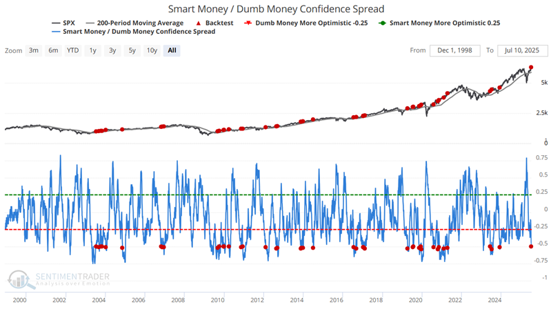
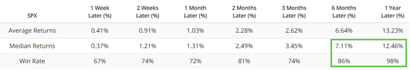
Buying and holding the S&P 500 for one full year after a signal and ignoring any intervening signals showed a lower-left to upper-right nature of returns, and the tendency to miss significant declines (2008, 2015-2016, 2018, 2022).
The Microcap / S&P 500 Relative Ratio Rank chart shows where the ratio is relative to its range over the past four months. When the relative ratio is high, investors are showing risk-on behavior. When the ratio drops to a low level, they exhibit risk-off behavior.
The chart below highlights all dates when:
- The S&P 500 Index is above its 200-day moving average
- The Microcap / S&P 500 Relative Ratio Rank crosses above 90%
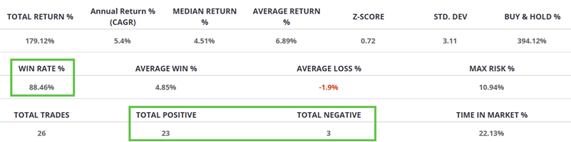
Using a systematic approach, we will buy and hold the S&P 500 for two months after a signal and ignore any intervening signals. The chart below shows the trading signals. With 23 winners versus 3 losers, it showed consistent continuation of the S&P's trend.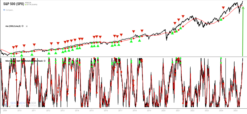
A sell signal (?) for stocks
Stocks are on the cusp of a major sell signal. Apparently.
Per Bloomberg: "Market watchers use a variety of momentum indicators to call short- and medium-term turning points. Hartnett, for example, says that when more than 88% of country stock indexes tracked by MSCI are above their 50- and 200-day moving averages, it's time to sell, and when more than 88% are trading below, it's a buy. Currently 82% of them are above those moving averages, he says."
From the Global Index Breadth page, we see that as of last week, 84% of markets were above their 50-day moving average and the same percentage above their 200-day moving average. That's a bit below the "sell" threshold, but getting close.
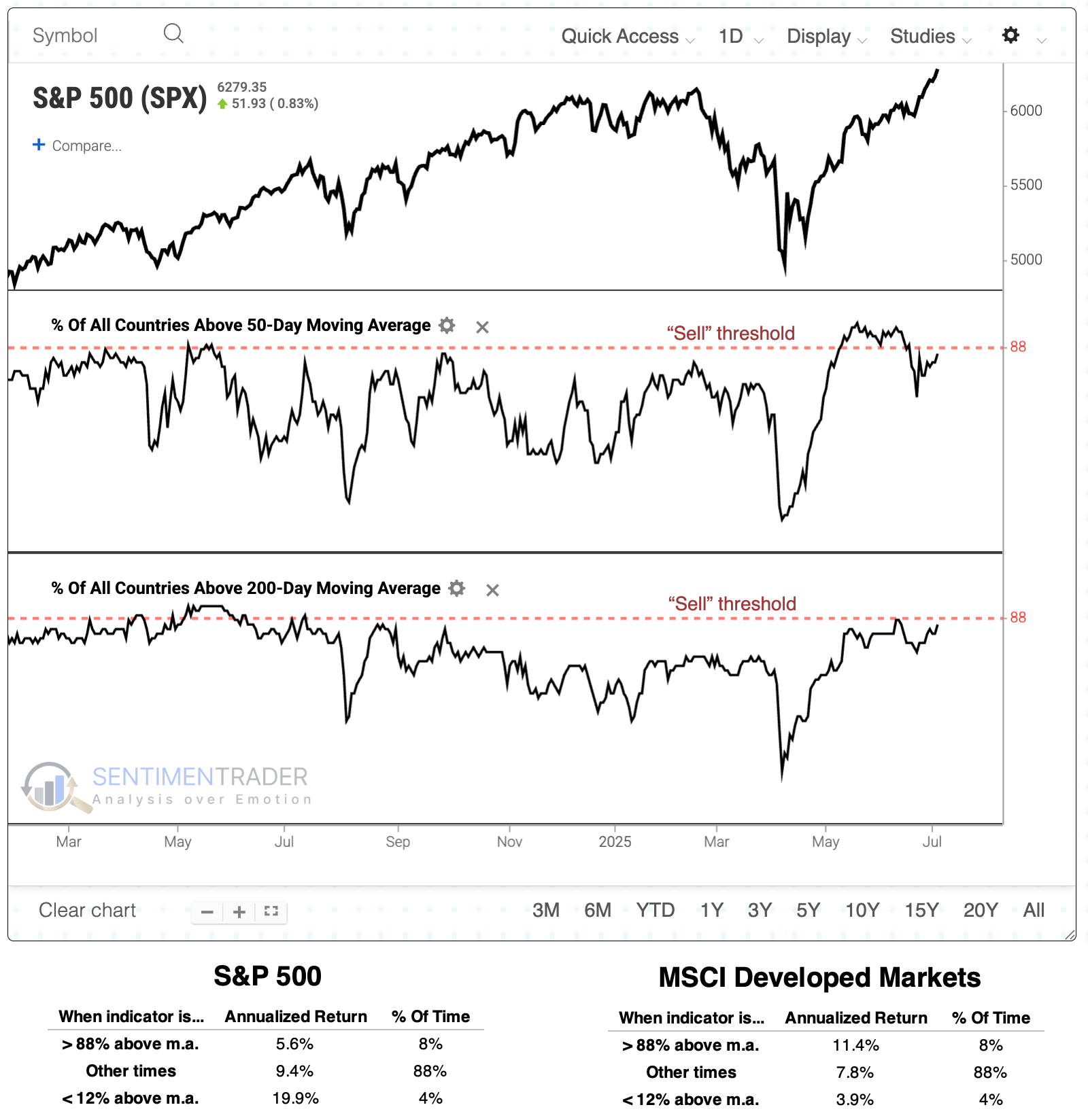
From the threshold analysis above, we can see that when more than 88% of countries are above their 50- and 200-day moving averages, the S&P 500 has returned an annualized +5.6%. That's not horrible, but it's well below the other regimes. Conversely, the MSCI Developed Markets index showed its best annualized returns when above the "sell" threshold.
The table below takes a signal-based approach. It shows returns in the S&P 500 when more than 88% of countries rose above both their 50- and 200-day moving averages for the first time in at least six months. This would ostensibly be the "sell" signal mentioned in the article. Over the next 6-12 months, the S&P suffered only 5 losses out of 28 signals, with average returns well above random.
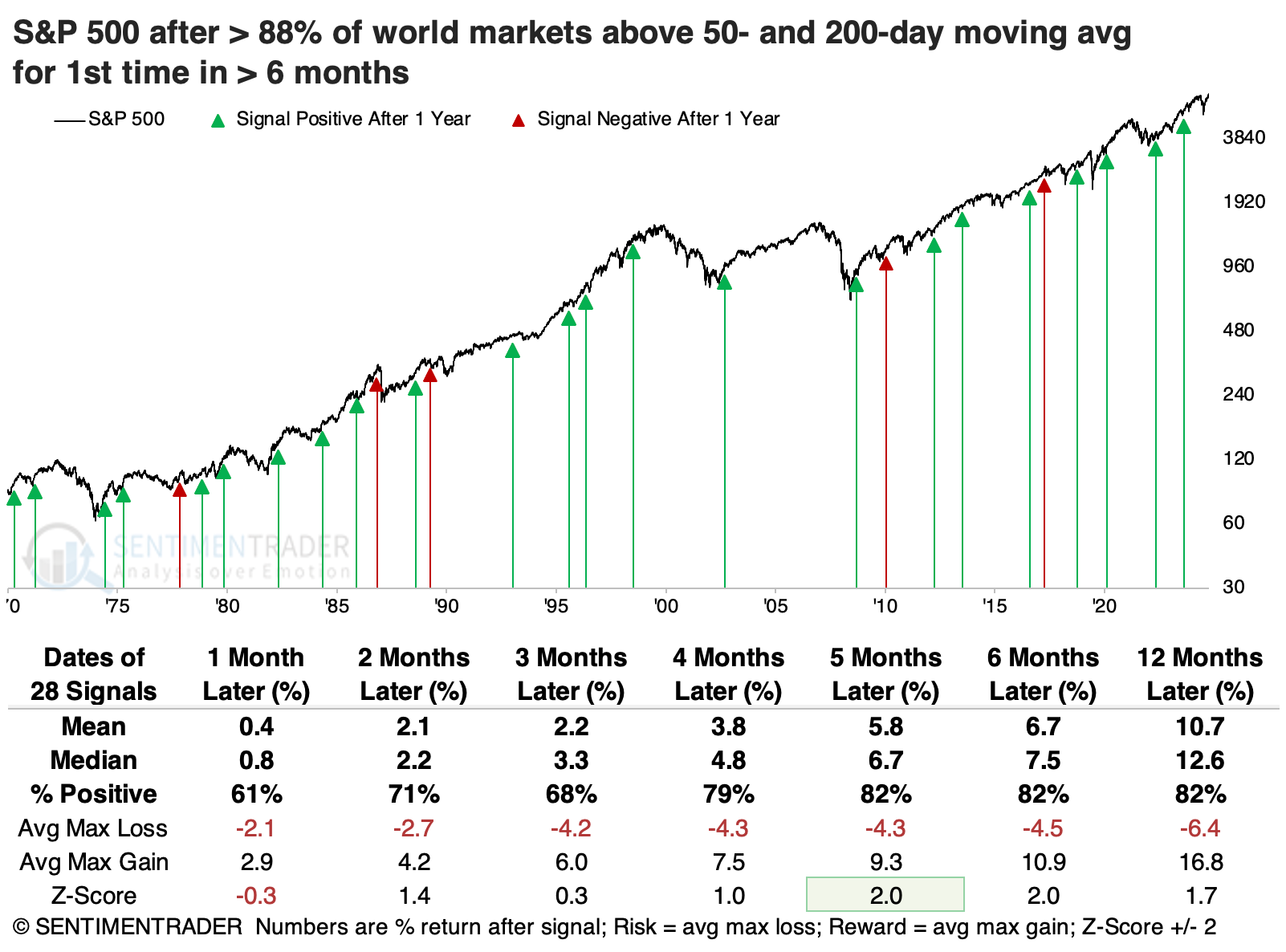
The MSCI Developed Markets Index's returns were similar. Across time frames, its average returns, win rate, and risk/reward skew were roughly comparable to those of the S&P 500.
The "sell" signal is still hypothetical because it hasn't happened yet. Instead, we can look at current conditions and see if it may mean anything for future returns. There wasn't much to note about the returns, suggesting no compelling longer-term reason to adjust exposure, given how many countries are currently above their moving averages. It's the same story for the MSCI Developed Markets Index, though there was a modest bump in longer-term returns under current conditions.
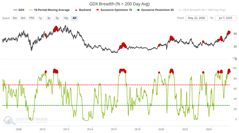
Metal warnings
Metals markets and gold stocks have been strong performers in the past year, but Jay noted some warning signs have finally begun to flash.
The chart below highlights all dates when the 10-day average of the percentage of GDX components trading above their 200-day moving average was at 94% or above. The fund was higher only 29% of the time over the following six months.
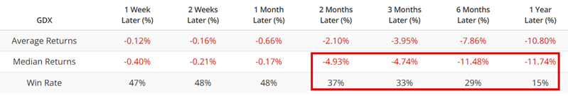
He also touched on the percentage of GDX components in bear markets, and when the Optix crossed below its current level. Both indicators showed consistent negative returns in the fund.
The ABRDN Physical Platinum Shares ETF (PPLT) recently enjoyed an explosive advance.
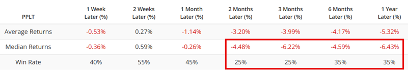
Historically, trying to fade this type of "rocket launch" advance in the metals market is fraught with peril, as these types of advances can run much further than one would rationally expect. Still, in the interest of objectivity, the chart below highlights all dates when the 10-day moving average of the PPLT Optix indicator crossed below 77.7%. Over the following two months, PPLT sported a positive return only a quarter of the time.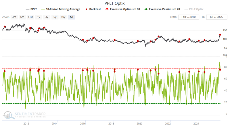
Seasonally strong (and soft) spots
Jay noted that the housing and real estate sectors are in or are nearing favorable seasonal periods; the same is true for high-yield and investment-grade corporate bonds. Meanwhile, the potential for trouble looms in the energy sector.
The Annual Seasonal Trend chart below for the SPDR S&P Homebuilders ETF (XHB) shows a favorable period that extends from the close of Trading Day of the Year (TDY) #129 through TDY #179. For 2025, this period extends from the close on 2025-07-10 through 2025-09-19.
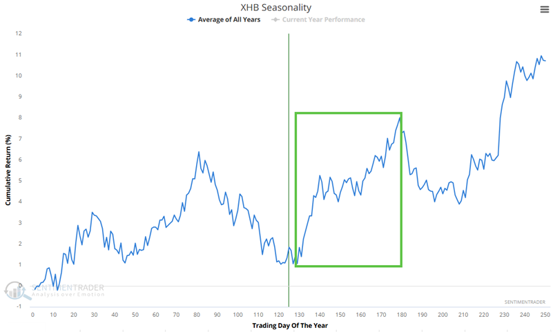
The chart below displays the hypothetical growth of $1 invested in XLB only during this period, every year since 2006. Currently, XHB's price action agrees with the favorable seasonal trend. As long as price and seasonality agree, traders can look to play the long side of this sector during the favorable seasonal window.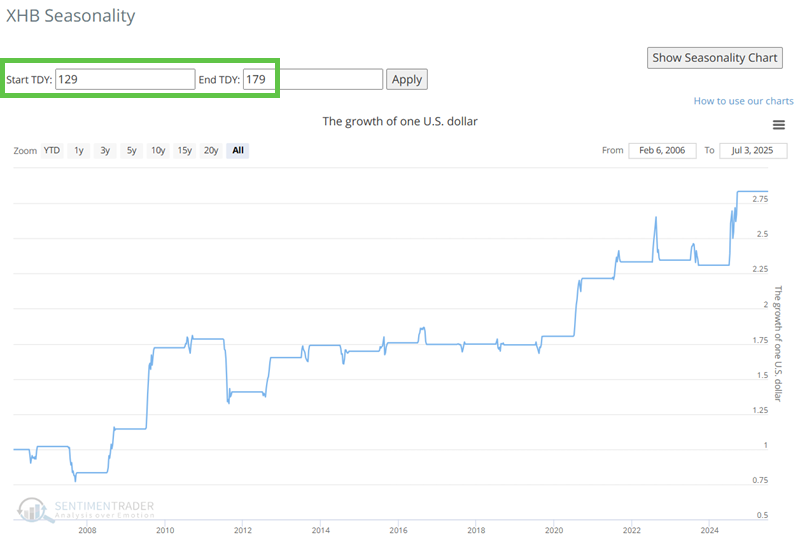
The Annual Seasonal Trend chart below for the SPDR Bloomberg High Yield Bond ETF (JNK) shows a short favorable seasonal window in the weeks ahead. This period extends from the close of Trading Day of the Year (TDY) #127 through TDY #145. For 2025, this period extends from the close on 2025-07-08 through 2025-08-01.
The chart below displays the hypothetical growth of $1 invested in JNK only during this period, every year since 2008.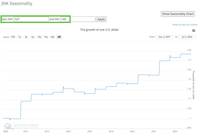
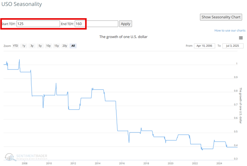
The Annual Seasonal Trend chart below for the United States Oil Fund LP ETF (ticker USO) shows an unfavorable period that extends from the close of Trading Day of the Year (TDY) #125 through TDY #160. For 2025, this period extends from the close on 2025-07-03 through 2025-08-22.
The chart below displays the hypothetical growth of $1 invested in USO only during this period, every year since 2006.
About TradingEdge Weekly...
The goal of TradingEdge Weekly is to summarize some of the research published to SentimenTrader over the past week. Sometimes there is a lot to digest, and this summary highlights the highest conviction or most compelling ideas we discussed. This is NOT the published research; rather, it pulls out some of the most relevant parts. It includes links to the published research for convenience, and if you don't subscribe to those products, it will present the options for access.