
TradingEdge Weekly for Jan 3 - Poor participation, post-election seasonality, energy snapback

Key points:
- Many fewer S&P 500 members are above their 200-day moving average than should be
- Taking a granular look at post-election seasonality in stocks
- Energy stocks have reversed from an oversold breadth condition
- Despite a seasonal tailwind, the index has seen rare heavy selling on consecutive days
- The U.S. dollar has had a tendency to rise to start a new year, but a long-term cycle looms on the horizon
- Metals, too, have tended to see a beginning-of-year rally
Lagging stocks, heavy selling
The dichotomy between the S&P 500 index and its members continues to grow.
Despite the S&P 500 being more than 7% above its 200-day moving average, fewer than 60% of its members were above their own 200-day average by any amount. This is a historical anomaly dating back nearly 100 years.
Using regression analysis, we can estimate that when the S&P is 7% or more above its 200-day average, at least 70% of its member stocks should also be above their 200-day average. The current environment, circled in red, is well below average. The dates worse than the current ones are mostly in 1999-2000.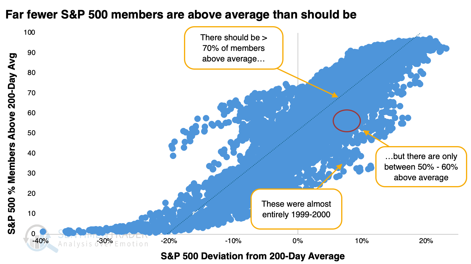 On Christmas Eve, the S&P was about 9% above its moving average, but only 59% of its member stocks were above their averages. The regression suggests that 75% of members should have been above their average, so we were seeing a deficit of -16%.
We can see from the chart that when the spread is below zero, meaning fewer stocks are above their 200-day average than should be, the S&P 500's forward annualized return is about half what it is when the spread is above zero. And when the spread is below -10%, where it is now, the annualized return falls further to -1.4%.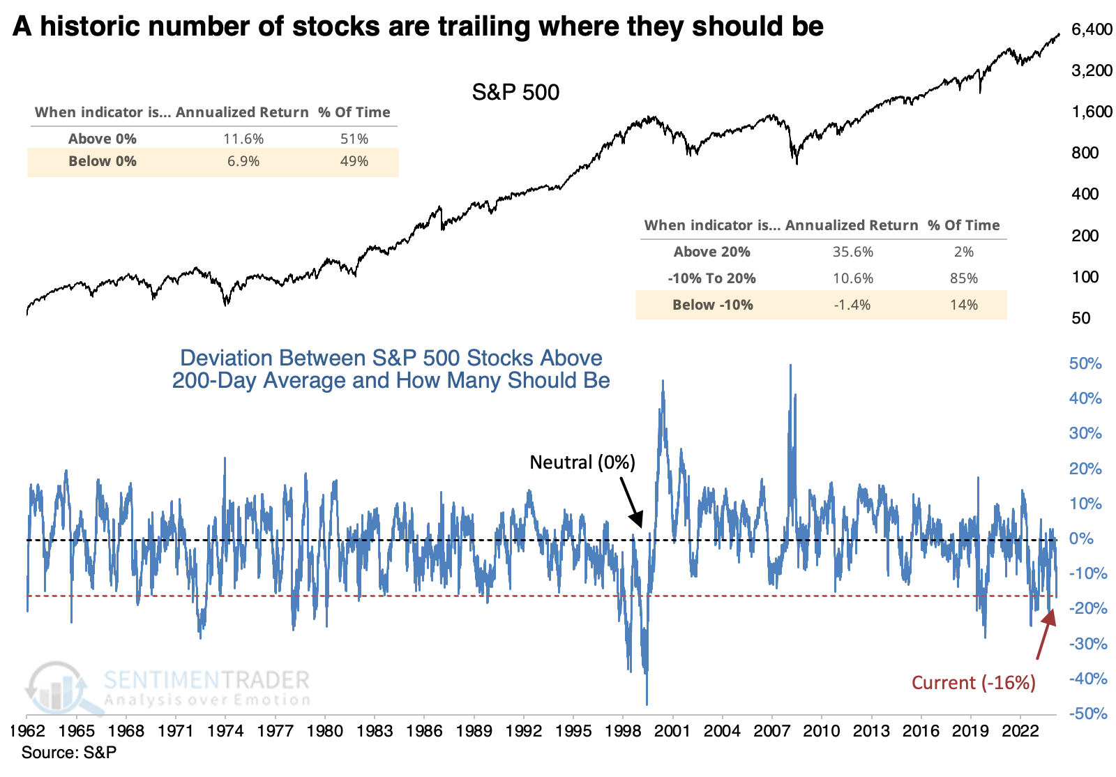
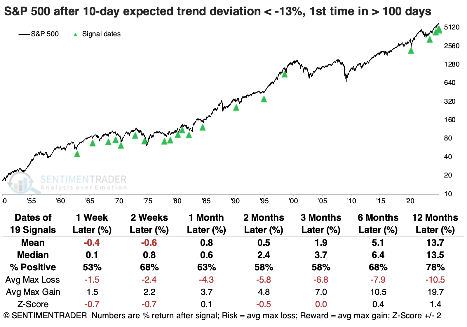
To smooth out some of the volatility, the table below shows the S&P's returns when a 10-day moving average of the spread falls below -13% for the first time in at least the past 100 sessions.
Overall, the S&P's median returns were about in line with random, the win rate was a little bit worse than average, and the risk/reward ratio was mostly positive but weak. On the plus side, the signals over the past 40 years mainly preceded positive returns, with the few losses being moderate and quickly erased.
 Over the past couple of sessions, stocks suffered unexpected losses. Well, "unexpected" in terms of seasonality - due to lower volumes and a generally positive outlook this time of year, it's not often that stocks suffer stiff losses near year-end.
The Santa Rally period is defined as the last five trading sessions of a year and the first two sessions of the new one. This is the first time since 2019 and only the ninth time since 1928 that the S&P 500 slid more than -1% on any two days during this seasonal period. The S&P rebounded every time but once in the weeks ahead, with the exception being during the global financial crisis.
If we ignore the seasonal aspect and look at consecutive -1% losses while the S&P 500 was within 3.5% of a record high, the S&P rebounded over the following three months seven out of eight times. Unfortunately, many of those gave back those gains and then some. One of those signals was triggered in late December 2021, which looks quite similar to the current price pattern.
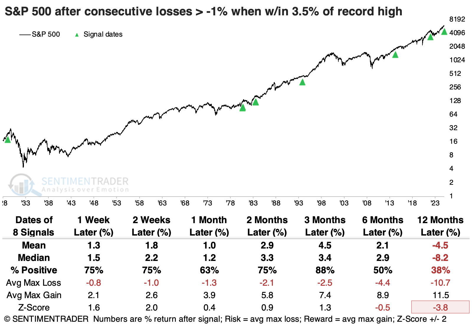
If we expand the pullback amount to within 4% of a high, the sample size doubles. Only two of these suffered meaningful losses over the next few months, alleviating some of the concerns from the table above.
Post-election blues (for some months)
Post-U.S. presidential election years have a bad reputation. But Jay showed that since 1901, they have shown a gain 58% of the time.
For testing post-election year stock market performance, we will use month-end price data for the Dow Jones Industrial Average from 1901 through 1919 and the S&P 500 Index from 1920 to the present day.
Post-election years occur every four years starting in 1901 (1901, 1905, 1909, 1913, etc.). Nine of the last ten post-election years have seen the S&P 500 show a gain; in fact, seven of those years witnessed a gain of at least +19%.
The table below displays performance data for each month only during post-election years starting in 1901. The top 6 performing months are highlighted in green.
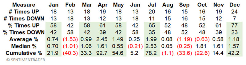
From here, we designate:
- Favorable (post-election year) months as January, March, April, May, July, and December
- Unfavorable (post-election year) months as February, June, August, September, October, and November
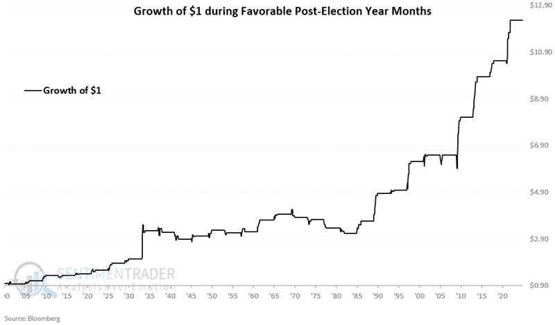
The chart below displays the hypothetical growth of $1 invested only during the favorable months of each post-election year.
The chart below displays the hypothetical growth of $1 invested only during the unfavorable months of each post-election year.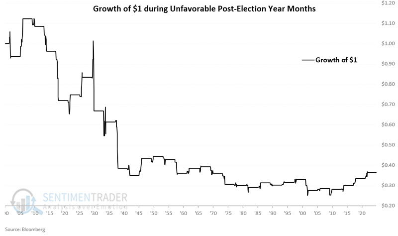
Favorable months showed a gain during 71% of post-election years. Unfavorable months showed a gain only 45% of the time and registered a net loss of -63.5%.
Energy reversal
A breadth composite for the S&P 500 energy sector swiftly reversed from an oversold condition. Dean showed that similar shifts in a broad measure of breadth indicators tended to produce a mean-reversion rally.
A couple of weeks ago, Dean highlighted that a breadth composite for the energy sector had reached an oversold status. Although not a traditional thrust signal, when the composite cycles from below -15% to above 22% in ten or fewer trading sessions, it often signals an easing in selling pressure, creating a favorable setup. The chart below depicts all instances when the breadth composite reversed.
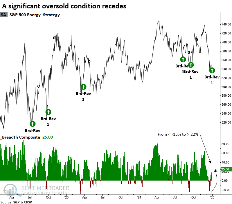
Whenever the breadth composite cycled from below -15% to above 22% in ten sessions or fewer, with the sector below its 200-day average as the S&P 500 resided above its 200-day average, the group displayed a solid tendency to mean-revert higher, rising 75% of the time over the subsequent month. Six and twelve months later, the sector rallied 80% of the time.
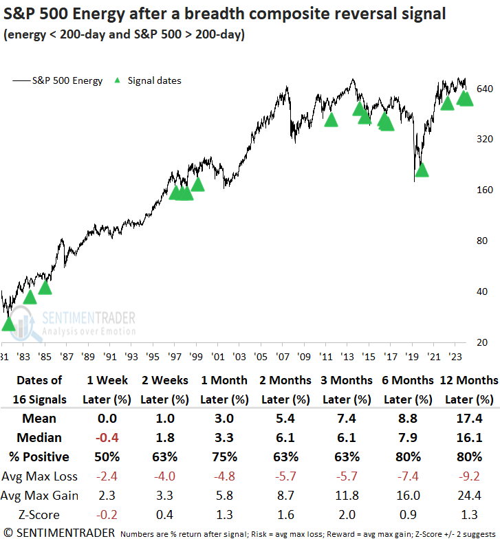
The optimal window for relative performance was found one to two months later, with the energy sector surpassing the S&P 500 in 63% of cases across both intervals.
The median return for the S&P 500 Energy sector outpaced the S&P 500 from two to eight weeks later, although consistency fell short of the broader benchmark index. Whatever troubled the energy sector before these breadth reversal scenarios appears to have been an isolated event for the group.
A jolly dollar
The U.S. Dollar has been strong, and Jay noted that January and February 2025 look favorable on a seasonal basis. After that, investors may have good reason to be wary.
As 2025 dawns, the chart suggests the potential for continued strength during January and February.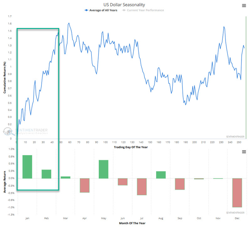 While investors are encouraged to follow major trends, some cyclical concerns exist after February 2025.
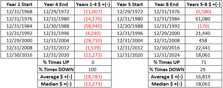
The eight-year cycle is about to begin again. 1969 through 1972 were labeled Years 1 through 4, and then 1973 through 1976 were labeled Years 5 through 8. The cycle then restarted in 1977 as Year 1.
The latest cycle ends at the close on 2024-12-31 as Year 8, and the next cycle begins in January 2025 as Year 1. The table below displays the hypothetical $ gain/loss for U.S. Dollar futures during each half (Years 1 through 4 and separately Years 5 through 8) of the eight-year cycle since 1970.
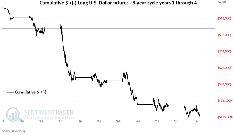
The chart below displays the hypothetical $ gain/loss for U.S. Dollar futures only during Years 1 through 4 in the table above. Note that 2025 through 2028 is the next "Year 1 through 4" in this sequence.
Years #1 include 1977, 1985, 1993, 2001, 2009, 2017 and 2025. The table below displays the cumulative hypothetical $ gain/loss from holding a long position in U.S. Dollar futures only during these years, with returns broken out by month.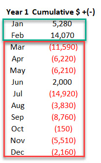
The obvious thing to note is the strength during January and February and the weakness during the rest of the year. It is worth noting that the sample size is only six years. Still, the contrast is compelling.
Jolly metals, too
Jay further showed that several metals markets have a history of showing strength early in the year even though they tend to have a negative correlation to the dollar.
The chart below displays the annual seasonal trend for silver futures. The first 33 trading days of the year tend to show strength.
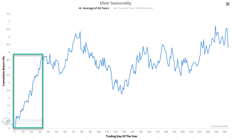
January seemingly offers a straight-line advance. However, this is where it is critical to note that seasonality is NOT a roadmap but merely an average of previous years. The chart below displays the cumulative hypothetical results for holding a long position in silver futures only during the first 33 trading days of the year every year since 1970.
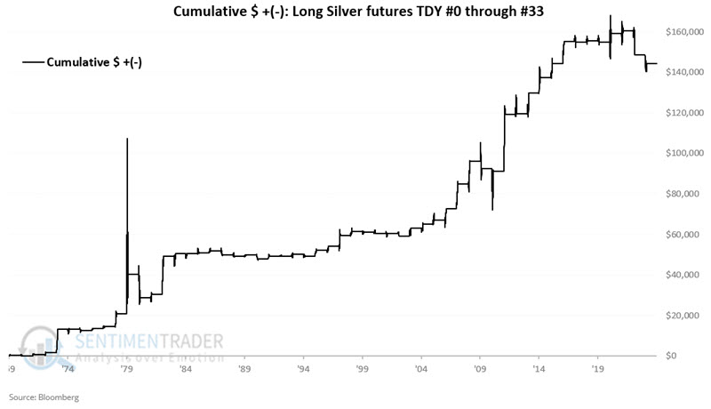
Overall, the results have been favorable. However, the real thing to pay attention to is the potential risk. Historically, this period has shown a loss in one out of every three years. Even more sobering is that silver has lost big during this period in the two most recent years (over-$11,000 in 2023 and-$4,000 in 2024).
Platinum tends to be strong, too. The chart below displays the annual seasonal trend for platinum futures. The first 36 trading days of the year (i.e., starting at the close on the last trading day of December) tend to show strength.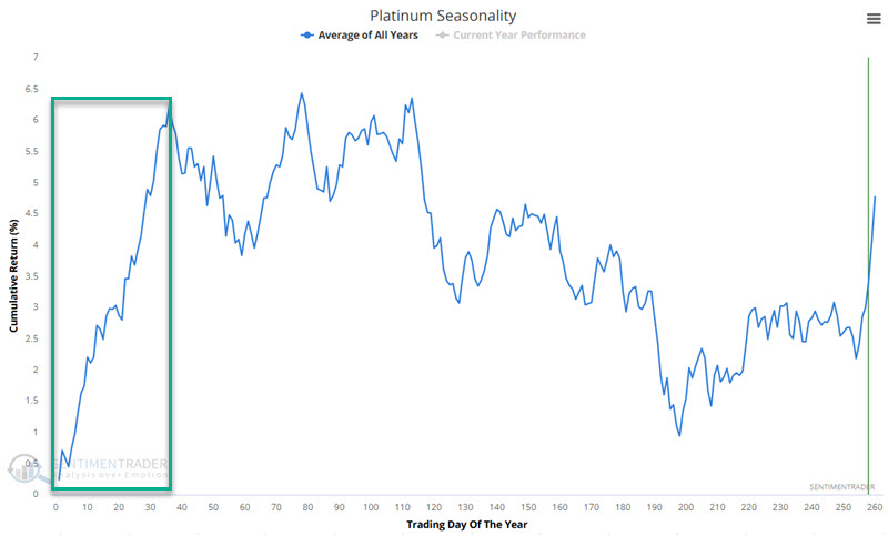 The chart below displays the cumulative hypothetical results for holding a long position in platinum futures only during the first 36 trading days of the year every year since 1987. Hereto, platinum has experienced losses during the last two years during this supposedly favorable period.
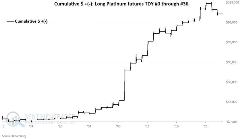
These periods showed a gain 71% of the time, with an average gain that was nearly three times the average loss. The contract gained more than +$5,000 seven times, while losing more than -$5,000 only once.
Copper is another metal that has shown a historical tendency for strength at the beginning of the year.
About TradingEdge Weekly...
The goal of TradingEdge Weekly is to summarize some of the research published to SentimenTrader over the past week. Sometimes there is a lot to digest, and this summary highlights the highest conviction or most compelling ideas we discussed. This is NOT the published research; rather, it pulls out some of the most relevant parts. It includes links to the published research for convenience, and if you don't subscribe to those products, it will present the options for access.