
TradingEdge Weekly for Jan 17 - Market tailwinds, spiky staples signals, yield surge

Key points:
- The impact of the first 5 days of the year
- Why a rising rate of change in real M2 should be a good sign for stocks
- Bond market risk is low, which has been good for stocks
- Small-cap stocks quickly fell into a correction
- Consumer staples stocks got hit hard, triggering a number of "spiky" oversold conditions
- Staples also tend to be the best-performing sector following yield curve un-inversions
- Financials enjoyed a historically quick reversal, hinting at a false breakdown
- The rise in Treasury yields has been unyielding
- Using seasonality and trend for bond futures
A good first 5 days (barely)
The S&P 500 closed higher over the first five trading days of 2025. Jay showed that the stock market has tended to perform better - and much more consistently - when the first five trading days of the year show a gain of any size.
The "First Five Trading Days of the Year" as a market bellwether was developed and popularized by the late great Yale Hirsch, Founder of The Stock Traders Almanac. The theory is simple: The potential for gains through the rest of the calendar year is greater if the S&P 500 shows a net gain over the first five trading days of the new year than if it shows a loss.
The test that follows uses the following rules (which are likely just slightly different than Yale Hirsch's original version):
- If the first five trading days of the year show a gain for the S&P 500 Index, we will buy and hold the index through the first five trading days of the following year
- If the first five trading days of the year show a loss for the S&P 500 Index, we will hold no position in the index through the first five trading days of the following year
The +0.62%% gain for the S&P 500 over the first five trading days of 2025 triggered a buy signal at the close on 2025-01-08. The signal will remain in effect through the first five trading days of 2026 (through 2026-01-08).
The chart below displays the hypothetical growth of $1 invested in the S&P 500 only during favorable periods using the rules defined above.
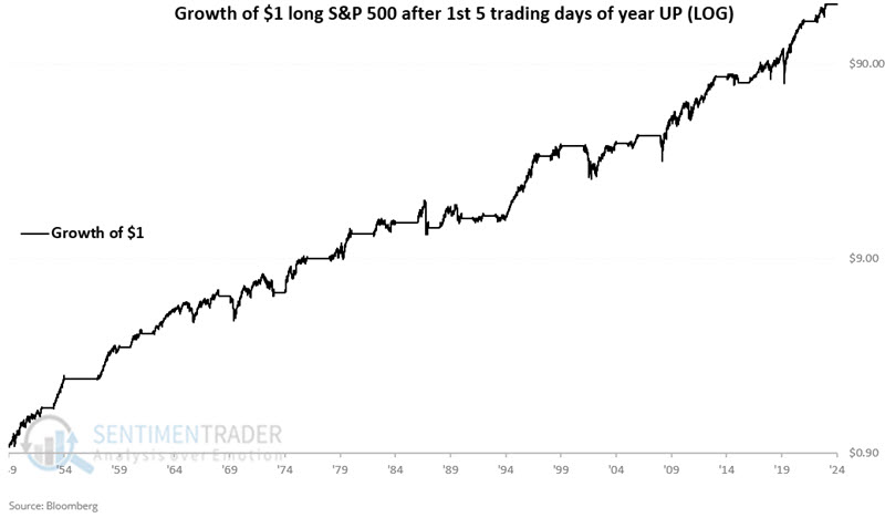
These years showed a 79% Win Rate versus an at-any-time win rate of 68% and 22 years had gains of +15% or more, versus only 2 losses of -15% or more.
It is important to note that an unfavorable first five days of the year has not tended to be bearish for stocks but rather much less bullish than if the first five days show a gain. The chart below displays the hypothetical growth of $1 invested in the S&P 500 only during unfavorable periods using the rules above.
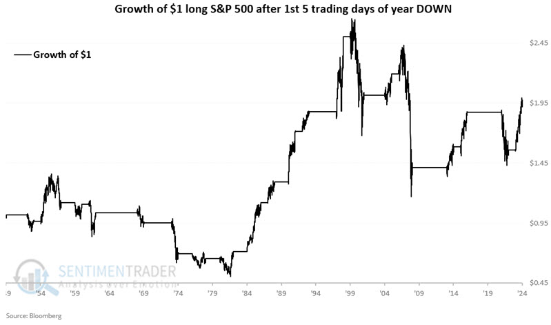
These periods sported a gain 52% of the time, with a median gain of +19.7% versus a median loss of -10.2%.
M2 growth is favorable
It is said that "money moves the market". Jay noted that real M2 offers a useful way to track the trend in the size of the money supply and highlighted a way to use this information as a stock market indicator.
M2 is the U.S. Federal Reserve's estimate of the total money supply, including all the cash people have on hand, plus all the money deposited in checking accounts, savings accounts, and other short-term saving vehicles such as certificates of deposit (CDs). Retirement account balances and time deposits above $100,000 are omitted from M2. For our purposes, we will use "Real M2", which is M2 deflated by inflation.
The most relevant question regarding the money supply is, "How fast is it growing or shrinking?" To answer this question, we look at the 12-month percentage rate of change in Real M2. This series is reflected in the chart below.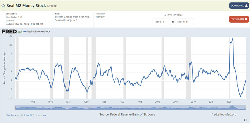
The M2-related data for the previous month typically comes out sometime late in the current month. We interpret the data at the end of the current month using the latest available values.
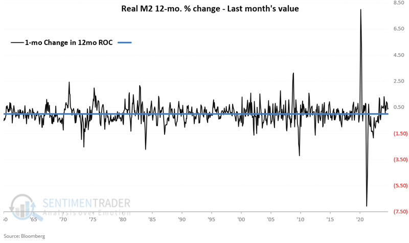
On the last day of the current month, we can compare the latest value for Real M2 Money Stock to the value of 12 months ago to arrive at the 12-month rate-of-change, as detailed above. From there, we compare the 12-month rate-of-change for this month to the 12-month rate of change calculated last month to see if there has been an increase or a decrease.
If the rate of change is increasing, we consider the next month as favorable for stocks, If not, we consider the next month as unfavorable.
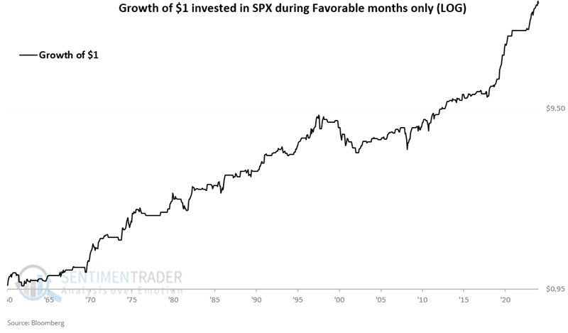
The chart below displays the hypothetical growth of $1 invested in SPX only during favorable months, starting 1960-12-31. $1 invested only during favorable months grew to $36.51.
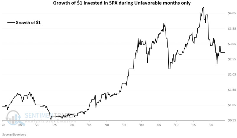
Now, let's look at unfavorable months. The chart below displays the hypothetical growth of $1 invested in SPX only during unfavorable months, starting 1960-12-31. $1 invested only during favorable months only grew to $2.77.
The latest data show that this indicator is still favorable for stocks.
Low bond risk is good for...stocks
There is inarguably a relationship between stocks and bonds. Jay showed that our Bond Risk Levels indicator recently crossed above a level that has typically been followed by stock market strength.
The chart below displays the 50-day moving average for the Bond Risk Levels indicator and the S&P 500 Index. It highlights with a red dot those times when the 50-day moving average for Bond-Risk Levels crossed above 2.4 while the S&P 500 was above its 200-day moving average. The most recent signal occurred on 2025-01-08.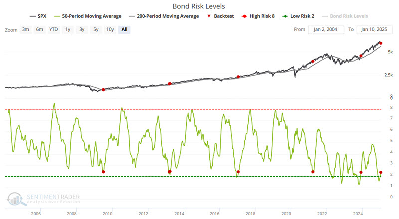
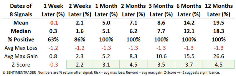
While it's meant as a bond market indicator, it has proved effective for stocks, with improving sentiment in bonds powering gains in the S&P 500 across every time frame from 1-12 months later.
A small-cap correction
Small stocks were supposed to be the biggest beneficiaries during the new administration. And yet, the small-cap Russell 2000 is the first of the major indices to fall into correction territory.
It has not been a great sign for the index. The last three times it cycled from a multi-year high to correction territory preceded more weakness in the months ahead.
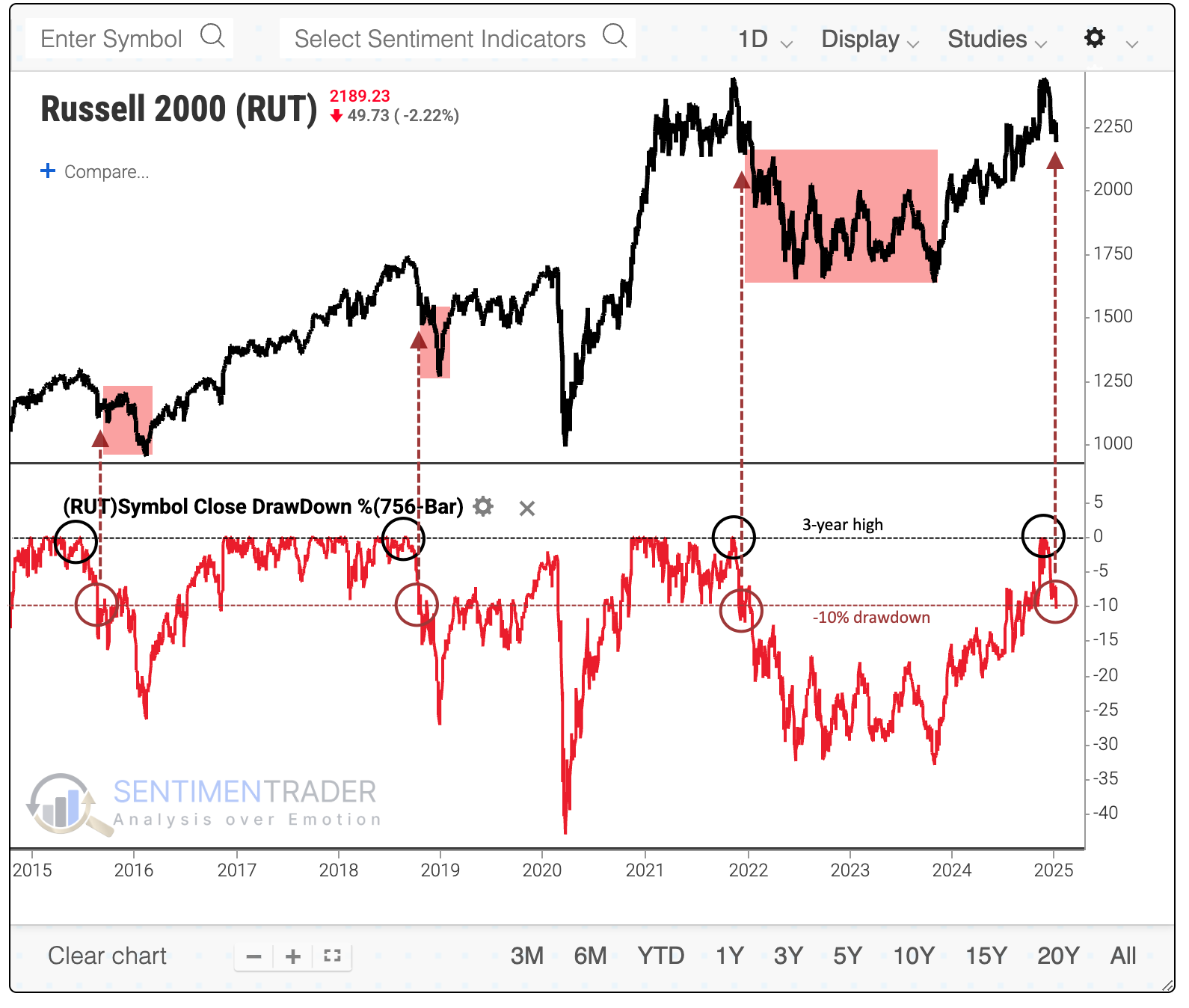
After all new-high-to-correction cycles since the Russell 2000's inception in 1978, its returns afterward were well below average, with some hefty losses and a smattering of large rebounds.
The current one has been a quick reversal, cycling from a new high to a -10% pullback in only 30 trading days. Quick reversals have been a bit of a worse sign over the medium term but a better sign in the longer term.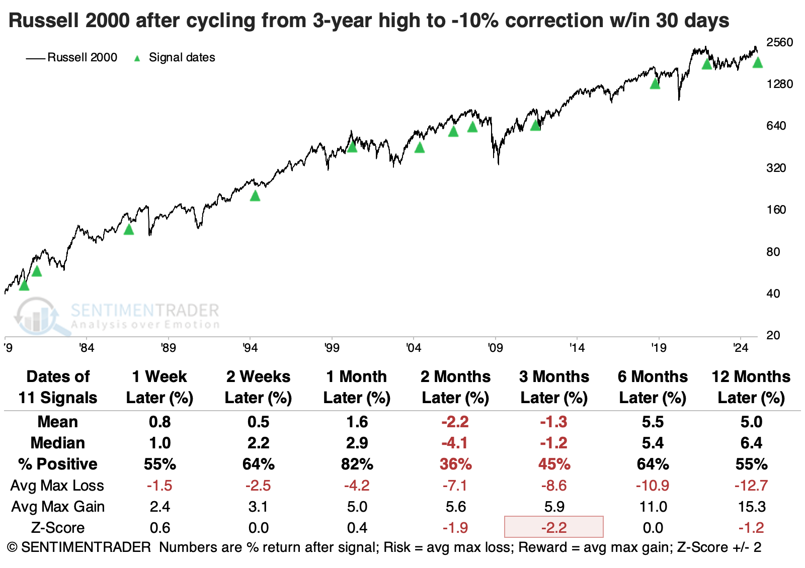
It might be notable that the average stock in the index isn't faring terribly, with more than 40% of stocks in the Russell 2000 still holding above their 200-day moving average.
The table below shows the new-high-to-correction cycles in the small-cap index, but it is filtered for those signals with the most stocks above their 200-day moving averages. Returns still weren't great, but the Russell 2000 mostly avoided the worst losses. Over the following year, the index only suffered one double-digit loss versus six double-digit gains.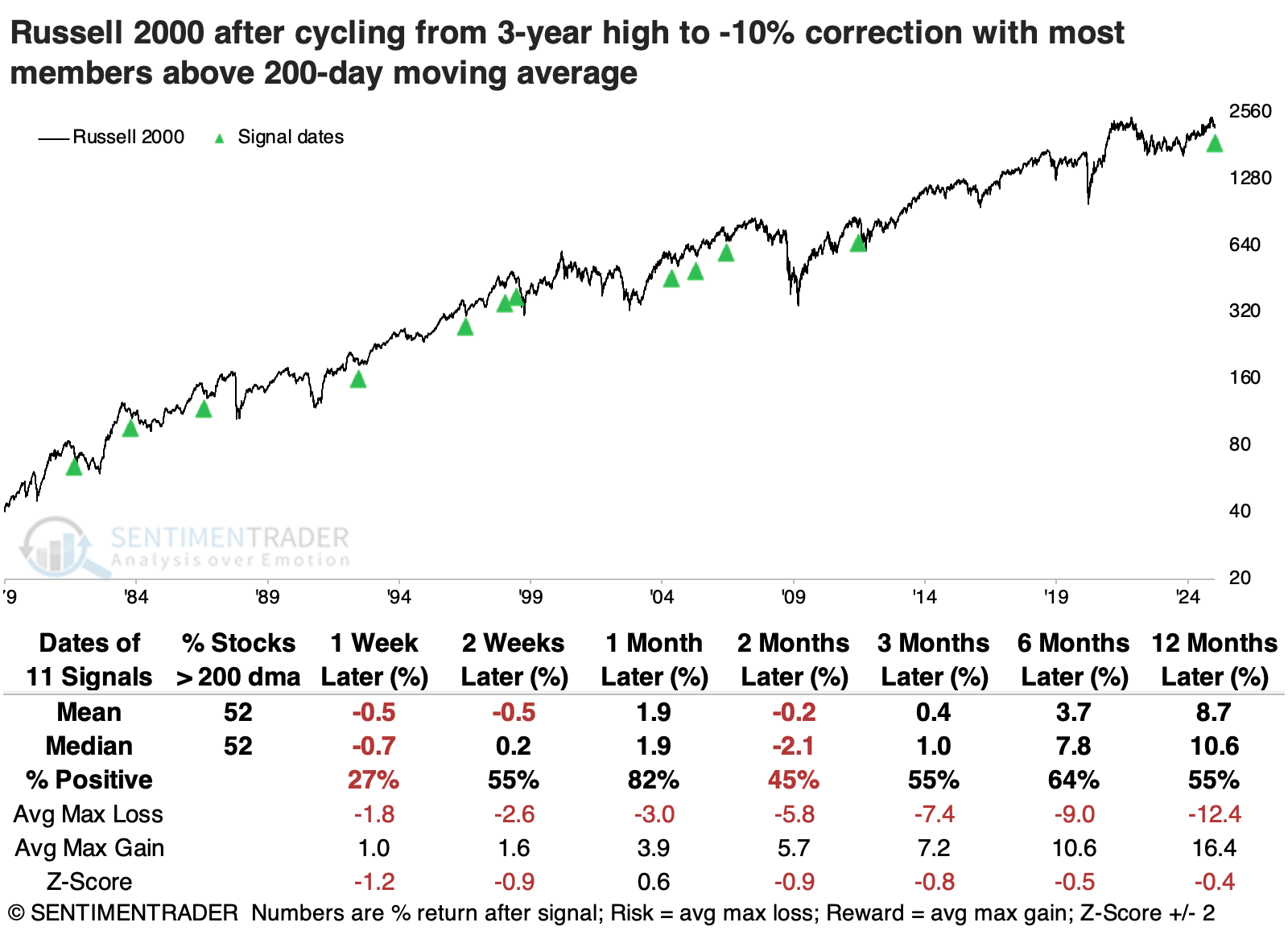
Compare those returns to correction cycles that had the fewest stocks above their 200-day averages on the day the Russell fell into a correction. After these signals, there were three double-digit losses a year later and only one double-digit gain. So, the current correction may not be quite so ominous a signal as it has been lately.
Staples have been unstable
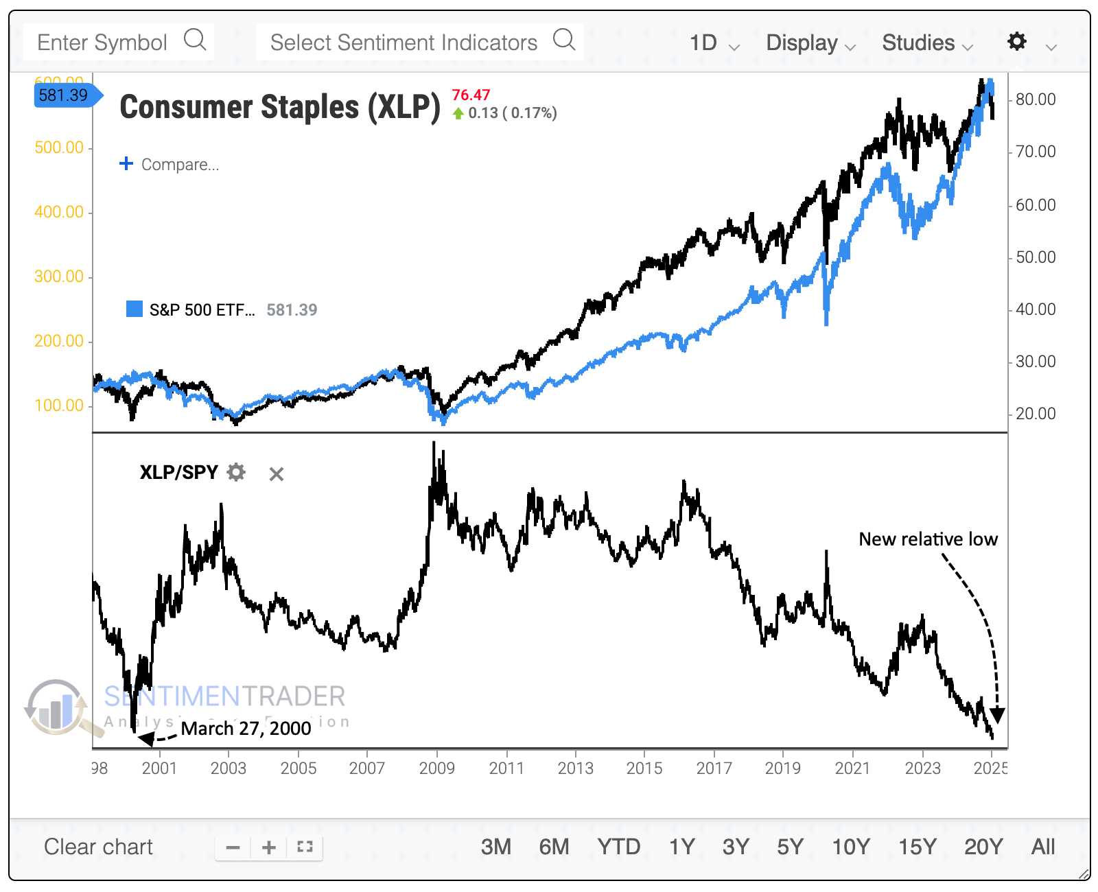
While major indexes (other than the small-cap Russell 2000) have held up relatively well in recent weeks, select pockets have not. One of those is the consumer staples sector.
These losses are disturbing for investors who might have gravitated to defensive sectors, assuming they'd hold up better if stocks were heading into a correction. Instead, the ratio between XLP (SPDR Consumer Staples) and SPY recently hit a record low, exceeding the prior low from March 27, 2000.
The selling pressure triggered several extremes in indicators that get "spiky" when investors panic. For example, there has been a sudden and severe oversold reading in:
- The percentage of staples stocks trading above their 200-day moving averages
- The percentage of them below their lower Bollinger Bands
- The percentage of them hitting a 52-week low
- The percentage of them technically oversold
- The Panic Breadth Composite, which aggregates a number of these indicators into one measure
It's pretty rare to see extremes in these indicators trigger all at once. The chart below shows how many of these "spiky" oversold types of indicators triggered on the same day.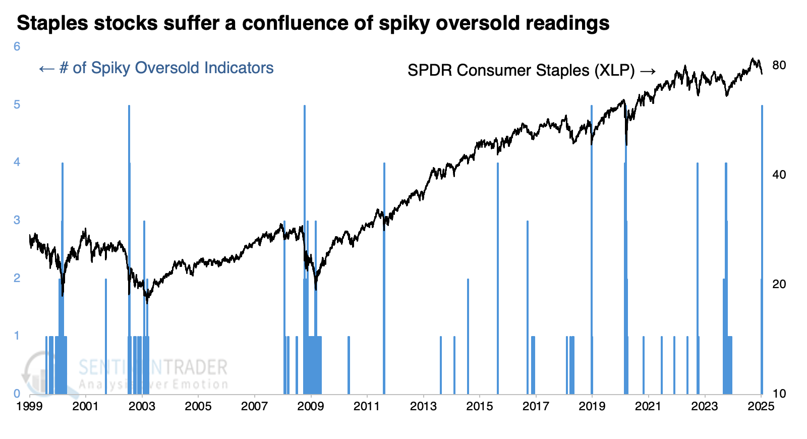
The fund suffered such a confluence only five times over 25 years. While those declines were more significant than the current pullback, XLP rallied after each. We can double the sample size if we require that at least four of the indicators trigger at the same time. Again, XLP showed a strong tendency to rebound across almost all time frames, with strongly above-average returns.
Only the 2008 financial crisis signal suffered more than a -10% decline at any point within the following year. None of the other signals suffered more than a -6.8% loss up to a year later, while all enjoyed a maximum rally of more than +10%.
Another point for staples - an un-inverted yield curve
In a recent piece, Jay noted that the 10-yr./3mo. yield curve had un-inverted at the end of December. This week, he zeroed in on sector and factor performance following un-inversions.
The table below displays the 12-month percentage return for each of the 11 S&P 500 sectors following all un-inversions. Consumer Staples and Health Care have consistently scored in the top three in most categories, with Staples showing a gain after each of the signals. The Materials sector probably deserves an honorable mention.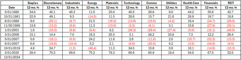
To use this systematically, we will use the following rules:
- If the 10-year-3-month yield curve un-inverts in the current month, then starting at the end of that month, we will buy and hold all 11 S&P 500 sectors for 12 months
- If another un-inversion occurs during that initial 12-month holding period (i.e., if the yield curve inverts and then un-inverts again within 12 months of a previous un-inversion), we will extend the holding period for an additional 12 months
The table below displays the summary states using the rules above and the performance for each sector during each holding period. Again, Staples came out on top with a 100% win rate and +17.2% average return.
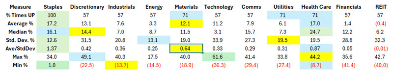
The data above suggests that a somewhat defensive approach is typically a prudent line of attack following a yield curve un-inversion. The chart below displays the hypothetical growth of $1 invested in each sector using the abovementioned rules. There is a noticeable gap between Staples and Healthcare and all other sectors.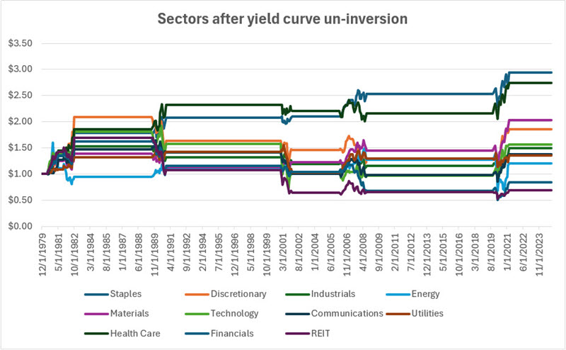
A quick and impressive turnaround in financials
The S&P 500 Financials cycled from a 42-day low to a 21-day high in three sessions. Dean noted that similar false breakdown reversals produced a 75% win rate for the sector over the subsequent two weeks.
Although ideally suited for high-octane growth stocks, this pattern works across indexes and sectors as traders reverse course after being whipsawed for fear of missing out. It's human nature.
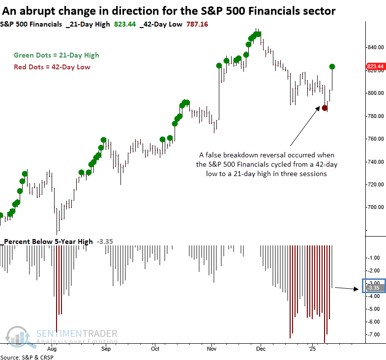
Whenever the S&P 500 Financials cycled from a 42-day low to a 21-day high in ten or fewer sessions and the index traded within 5% of a 5-year high but not at a high, the sector displayed a robust tendency to rally in the near term, rising 75% of the time over the subsequent two weeks.
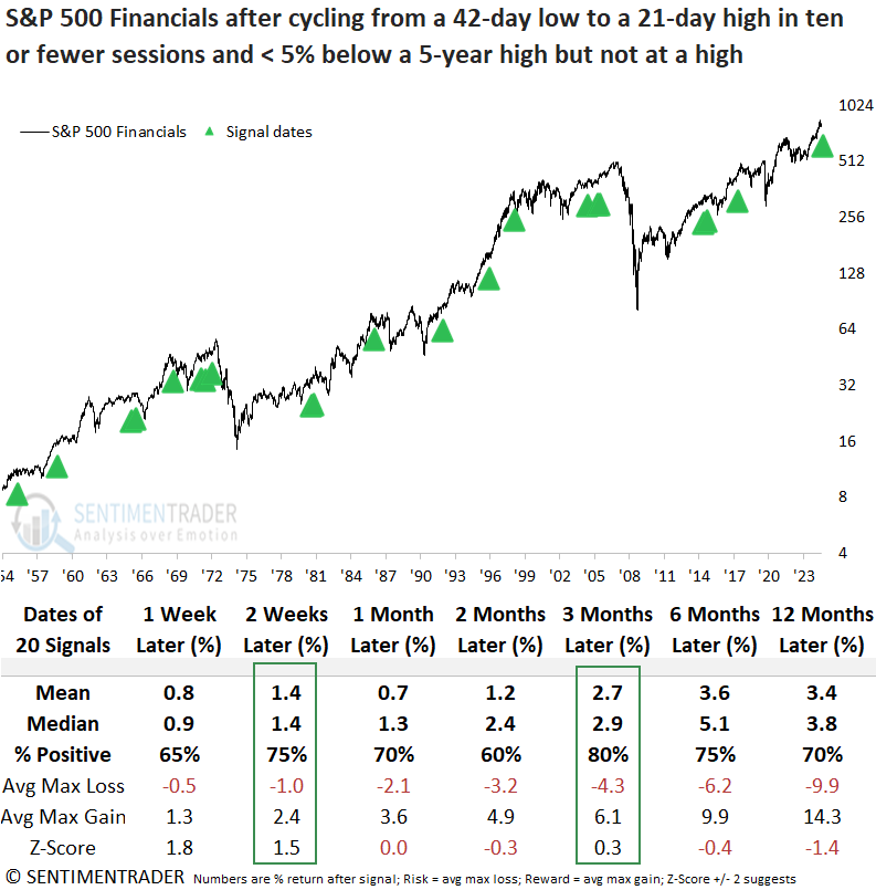
A test determining the ideal holding period between 1 and 42 trading sessions revealed that 13 days were optimal.
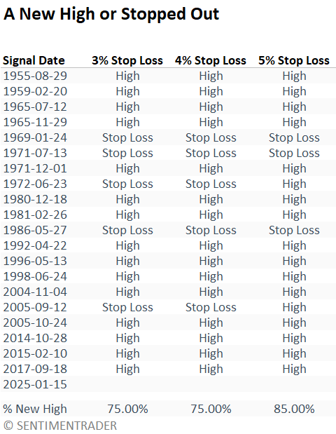
Additionally, Dean evaluated whether the S&P 500 Financials would achieve a new high or hit a stop loss first, using thresholds of 3%, 4%, and 5%. The table below illustrates that the sector recorded a new high in 75% of instances under a 3% or 4% stop-loss exit, with a 25% stop-out rate. Raising the stop loss to 5% improved the odds of a new high to 85%. Don't be surprised if financials hit new highs again.
Although broad market indexes and other sectors rallied on Wednesday following the CPI report, S&P 500 Financial sector stocks produced the highest percentage of relative highs across all time frames, notwithstanding the 1-month period, where energy had a slight edge. When stocks register relative highs ahead of an absolute high, it often serves as a reliable market clue.
Unyielding yields
The 10-year Treasury yield reached a new 1-year high while hovering near the upper end of its 3-year range. Dean showed that similar breakouts suggest the benchmark yield could increase over the subsequent two months.
In the aftermath of the previous signal, August 2023, the 10-year yield advanced 46 bps over two months, exerting pressure on stocks, with the S&P 500 declining 10% to its October low.
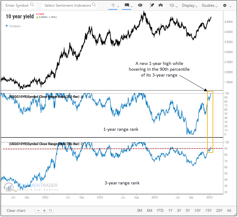
Whenever the 10-year Treasury yield reached a new one-year high while remaining in the 90th percentile or above its three-year range, it advanced over the following two months 67% of the time. Since the secular peak in yields in 1981, this pattern resulted in higher yields in 5 of 7 instances, a remarkable scenario given the declining rate environment.
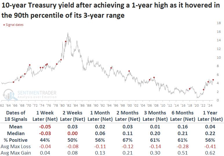
Rising rates have often acted as a headwind for the S&P 500. The index declined in six out of seven cases over the following three months since the 1981 yield peak.
Other stock indexes experienced a similar downturn as the S&P 500, particularly small-cap stocks, which declined 78% of the time over the subsequent three months. Meanwhile, the Dollar Index (DXY) strengthened, likely contributing to tightening financial conditions. This weighed on gold, which remained weak. Notably, the Bloomberg spot commodity index partially defied the trend.
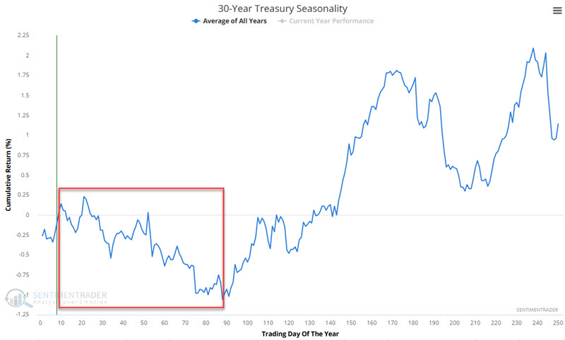
Bond seasonality and trend
Many pundits argue that t-bonds are "overdue" for a meaningful rally. However, Jay showed that as long as price action and seasonality agree, investors are encouraged to remain cautious.
The chart below displays the annual seasonal trend for 3-year treasury bonds. The red box highlights a period that tends to be unfavorable for long-term treasury bonds. This period extends from the close on Trading Day of Year (TDY) #10 through TY #89. For 2025, this period extends from the close on 2025-01-15 through 2025-05-07.
Now let's add a 14-day exponential moving average for 30-year treasury futures.
The chart below displays the hypothetical dollar gain/loss from holding a long position in t-bond futures when the price is above the 14-day EMA during the TDY #10 to #89 period.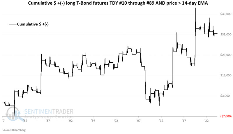
Overall, t-bonds carved out a definite - but highly erratic - gain. In this case, it has made sense not to push the short side when price and seasonality disagree.
Now, let's look at performance when seasonality and price agree. The chart below displays the hypothetical dollar gain/loss from holding a long position in t-bond futures when the price is below the 14-day EMA during the TDY #10 to #89 period.
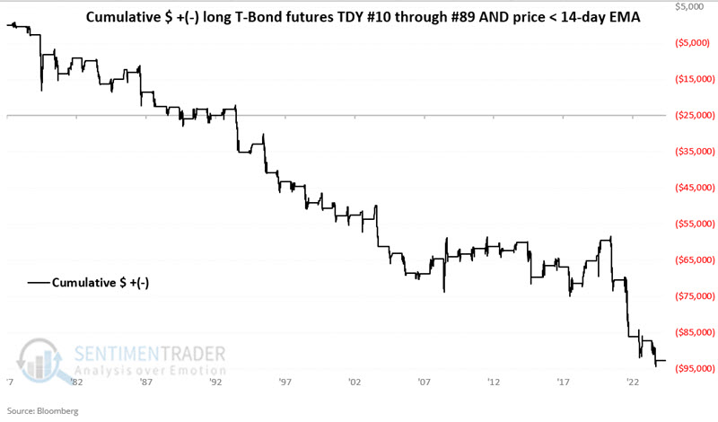
The chart above shows the danger of fighting the trend when both seasonality and price action are unfavorable and the potential for an aggressive trader to play the short side.
About TradingEdge Weekly...
The goal of TradingEdge Weekly is to summarize some of the research published to SentimenTrader over the past week. Sometimes there is a lot to digest, and this summary highlights the highest conviction or most compelling ideas we discussed. This is NOT the published research; rather, it pulls out some of the most relevant parts. It includes links to the published research for convenience, and if you don't subscribe to those products, it will present the options for access.