
TradingEdge Weekly for Jan 12 - January Effect for sectors, surging Biotech and Japan, commodities lagging

Key points:
- Dumb Money Confidence retreated quickly from a historic extreme
- Wall Street strategists are the most "meh" about stocks in a decade
- We take a look at the January Effect in stocks and sectors (hint: pay attention to Health Care in April)
- Come to think of it, pay attention to Health Care in January...
- ...and Discretionary stocks
- Biotech stocks have had a very good month
- There has been a jump in one-month highs among Japanese stocks
- Some options on trading gold
- An update on Natural Gas seasonality
- Commodities have been lagging stocks badly
A quick dip in extreme Confidence
As November came to an end, we looked at some signs that sentiment was becoming overheated. Among the most prominent examples was Dumb Money Confidence, which surged to nearly 90%, one of the most extreme levels since we began computing this in 1998.
When we got to the next extreme, in the summer of last year, the S&P rallied for a couple more weeks, then corrected into October.
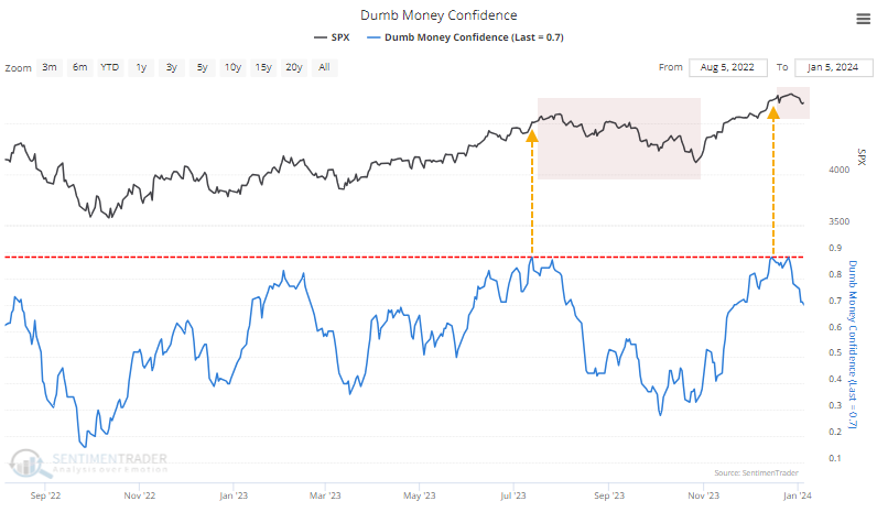
The table below shows lesser extremes when Dumb Money Confidence cycled from 80% or above to 70% or below. This shows us times when sentiment got ebullient and then started to recede.
The key with readings like this is that they don't happen during bear markets, or very rarely. So, forward returns tend to be somewhere between okay and above average. We see that in the table below as well, with the only negative one-year returns occurring ahead of the 2008 financial crisis. A notable quirk with the current cycle is how quickly it occurred. Dumb Money Confidence plunged 10% in only five sessions, which is relatively fast. The table below filters the table to include only those times when confidence dropped to 70% or lower in a week or less.
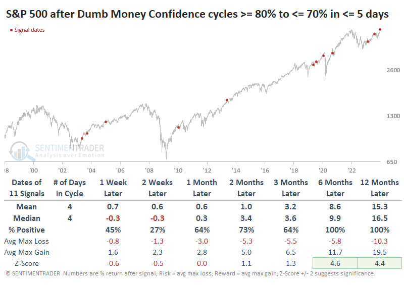
After these quick shifts in sentiment, the S&P struggled more in the short term. Only 3 out of 11 signals rallied over the next two weeks and one of those quickly gave up its gains. But over the next six months, only one precedent - the one that triggered ahead of the pandemic - witnessed more than a -6.3% drawdown.
Wall Street ain't buying it
As we do most years, it's time to see how some of the savviest sell-side denizens of Wall Street are expecting stocks to perform for the following year.
As years progress, Bloomberg periodically surveys roughly 20 prominent strategists on Wall Street to get their estimates for how the S&P 500 will perform over the coming months. For 2024, they're not very optimistic. In fact, it's the least optimistic they've been in a decade. Based on the latest December survey and where the S&P 500 was trading, they're expecting barely any change in the index.
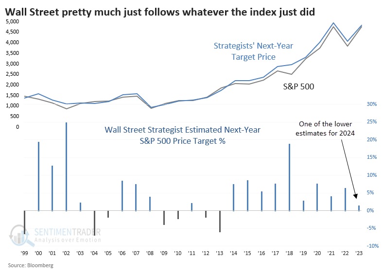
There is a lot of media and investor interest in how strategists think stocks will play out over the coming year. So, the table below shows how the index performed after the years in which strategists predicted the poorest performance for the coming year.
It's perhaps surprising that the S&P did perform quite poorly in January - it rallied only 42% of the time. But strategists weren't predicting January's return; they were guessing the full-year return. And in that case, they missed widely. The median estimate was for a return of -1.8%, yet the S&P's actual media return a year later was +12.1%, and it was positive 75% of the time.
Strategists' low expectations were vindicated in 2000, 2008 (for a while), 2020, and 2022, so it's not like there's a perfect record here of them being contrary indicators.
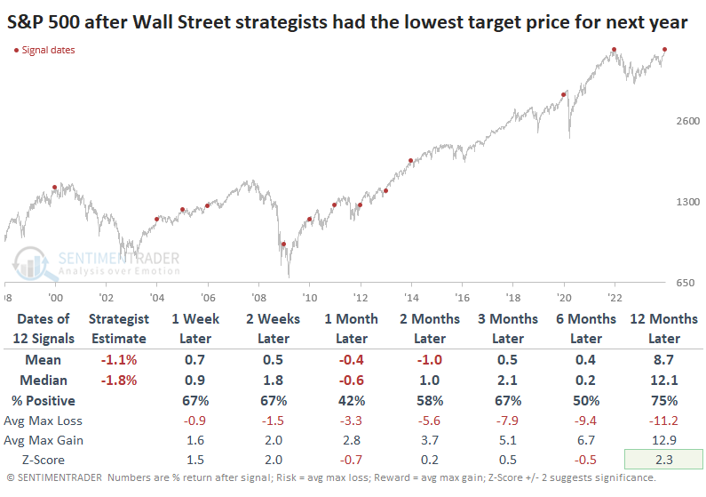
That tendency toward smart money groupthink is evident in virtually all surveys, and this one is no different. There is modest evidence that when strategists have low expectations for stocks over the next year, then stocks are more likely to thwart those expectations, which is a good sign for 2024. However, there is pretty wide variability in the results, so it's not a strong edge and was ineffective over shorter time frames.
As goes January...
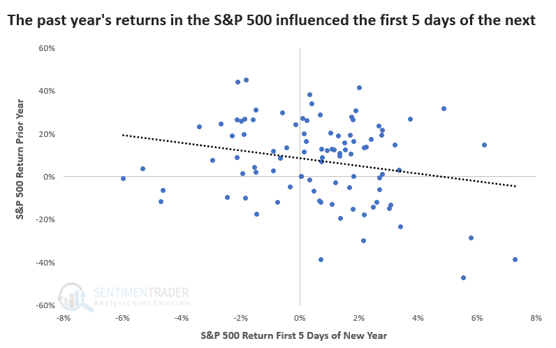
A lot of ink has been spilled about January's first five trading days and how it implies a positive or negative year. The theory borders on the ridiculous, but for those who care, this year threw a wrench into the analysis; the first five days were essentially a wash.
The first five days are heavily influenced by the prior year because, during good years, investors hold off on selling until the start of the New Year to delay paying capital gains taxes. If the S&P 500 rallied more than 20% in a year, the first five days of the following year gained only 57% of the time. If the prior year was down -10% or more, the first five days were up 80% of the time.
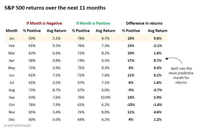
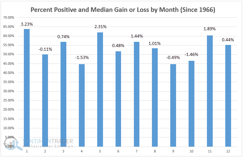
A more popular seasonal influence is the January Effect. This phenomenon suggests that investors' preferences in January extend to the entire year. The main problem with this assertion is that it doesn't account for any month's predictive power over the following 11 months. The table below corrects this, and it suggests that maybe we should focus more on the "April Effect."
The table shows returns over the next 11 months, depending on whether the current month is positive or negative. For example, when the S&P 500 showed a positive return in January, the next 11 months were also positive 78% of the time. But when the S&P declined in January, the next 11 months were up only 59% of the time. That's a difference of 19%. And the average return differed by +5.6%.
That's the most significant difference in consistency among all months, but April took the crown for differences in return. When the S&P declined in April, the next 11 months returned only +0.8%, but when it rallied in April, the next 11 months averaged +9.5%.
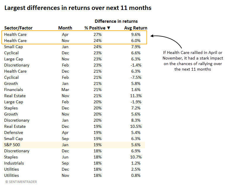
If Small Caps rallied in January, they were 24% more likely to rally over the next 11 months than if they declined in January. Growth and Discretionary stocks also showed a vast difference in returns, which suggests that higher-beta stocks had a more pronounced January Effect.
The table below looks at all sectors and factors (as well as the S&P 500) and all months' predictive power over the next 11 months. It sorts each sector and month by the greatest difference in consistency. Health Care comes out on top, with April and November having the greatest impact on returns over the next 11 months.
This shows that if Health Care stocks rallied in April, they were 27% more likely to rally over the next 11 months than if they declined in April.
The January Effect for Health Care...
Jay noted that a strong January for this sector typically portends good things for the rest of the year and Healthcare sector corporate insiders have remained surprisingly patient despite lackluster results in recent years - this too, could portend good things.
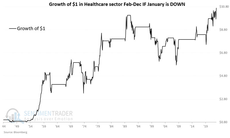
History suggests that if the healthcare sector can hold on and close the month of January with a gain, it bodes very well for the sector for the rest of the year. The chart below displays (on a logarithmic scale) the growth of $1 invested in the healthcare sector for the last 11 months of the year if the sector showed a gain during January. The initial $1 grew to $1,026.
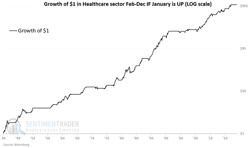
As always in the markets, nothing is a sure thing. During six of the 44 years when healthcare showed a gain during January, we have witnessed a decline the rest of the year.
For the sake of comparison, the chart below displays the growth of $1 invested in the healthcare sector for the last 11 months of the year if the sector showed a loss during January since 1945.
The long-term result is not terrible, as the equity curve works from the lower left to the upper right. Still, a closer look reveals many severe bear market declines and only a minor net gain in the past 30+ years. Likewise, while $1 invested only following up January's grew to $1,026, $1 invested only following down January's grew to just $10.69.
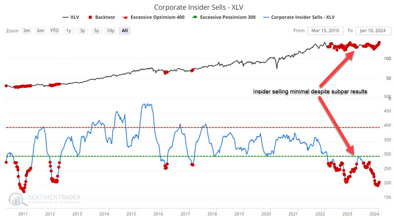
The sector has been primarily dead money since topping out in September 2021. Nevertheless, one key group of investors - corporate insiders - have been sending a clear signal regarding their longer-term outlook for the sector.
The most notable action has been a dearth of selling among corporate insiders. The chart below highlights all weeks when our Corporate Insider Sells - XLV indicator was below 280. We see that healthcare sector insiders have been extremely patient during the dead money period of the last two years. Historically, Corporate Insider Sells - XLV indicator readings below 280 have seen XLV rise 90% of the time over the ensuing year.
...and Discretionary stocks
Jay further noted that the Consumer Discretionary sector has traded sideways in a large trading range for almost three years. A strong January for this sector typically portends good things for the next twelve months.
History suggests that if this sector can turn it around and close the month of January with a gain, it bodes very well for the sector for the rest of the year.
Based on the January results, we will measure sector performance over the next 12 months - i.e., through the end of January the following year. For example, January 1945 saw this sector witness a gain. Based on this result, we will buy and hold the consumer discretionary sector for 12 months through the end of January 1946. We will keep two cumulative tallies - one for "up" January and another for "down" January.
The chart below displays (on a logarithmic scale) the growth of $1 invested in the consumer discretionary sector for 12 months if the sector showed a gain during January. The initial $1 grew to $2,038 (or +203,691%).
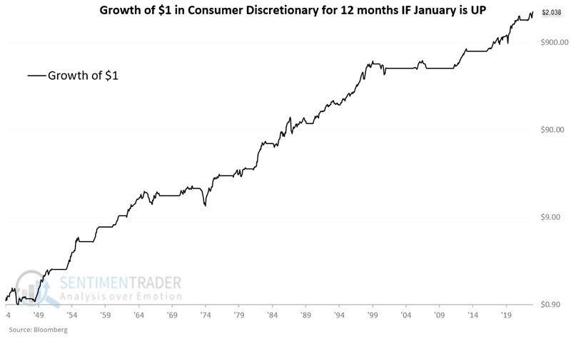
During 9 of the 49 years (18% of the time) when consumer discretionary showed a gain during January, we have witnessed a decline in the next twelve months. Nevertheless, the Win Rate (82%) and Average and Median results skew heavily to the positive side (better than 2-to-1). The most compelling result is that 23 of the 49 years witnessed a gain of +20% or more, versus just two years with a decline of greater than -20%.
For the sake of comparison, the chart below displays the growth of $1 invested in the consumer discretionary sector for 12 months if the sector showed a loss during January since 1945.
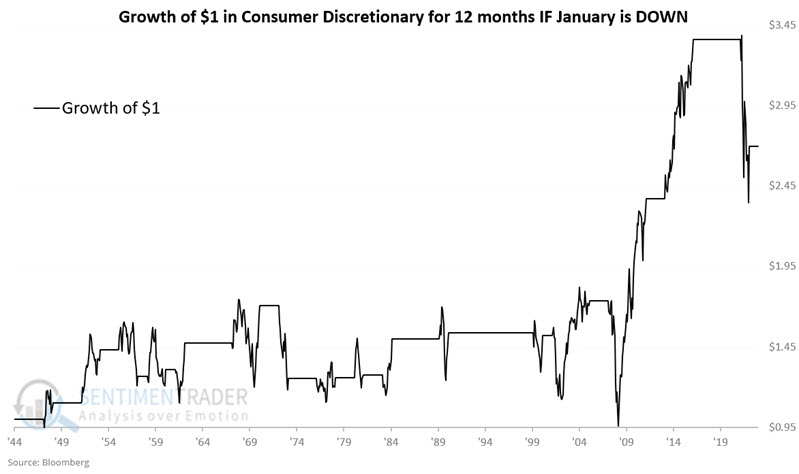
The long-term result is not terrible, as the equity curve works from the lower left to the upper right. Still, a closer look reveals many severe bear market declines and that most of the net gain occurred between 2009 and 2017. Likewise, while $1 invested only following up January's grew to $2,038, $1 invested only following down January's grew to just $2.70 (or +170% versus +203,691% following up January's).
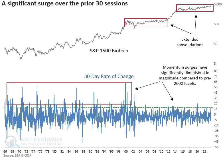
Biotech has had a very good month
Dean showed that over the prior 30 sessions, the S&P 1500 Biotech sub-industry group rallied over 17% and closed at a 252-day high. Similar momentum bursts accompanied by an annual high preceded a bullish outlook for the Biotech Index.
Although most of our research notes stem from trading signals we've tracked for years or even decades, this one belongs in the observation category. i.e., There's nothing special about a 17% rally over 30 sessions to an annual high; it's an observation given that Biotech is in the news with some recent M&A announcements, and the herd is excited about a potential cyclical upswing.
It's important to note that something changed with the Biotech Index starting in 2000. It could be a more mature industry, heightened regulatory hurdles, the index weighting methodology, or a number of other factors.
Whenever the S&P 1500 Biotech sub-industry group increased by 17% or more over 30 sessions and closed at an annual high, the cap-weighted Biotech Index rallied consistently over the subsequent year.
Still, we must be mindful that since 2000, when the character of the Biotech Index changed, momentum bursts, like now, have tended to fail, with the 2011-15 upswing being the exception.
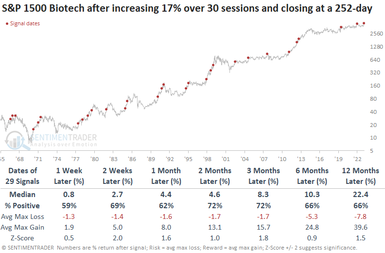
From a seasonality perspective, January maintains the highest win rate and median return.
Subscribers with access to the website can now track the net return of a stock, index, or ETF relative to a benchmark. You simply click the "Select Net Return vs. Benchmark" box on a seasonality chart and designate a benchmark from a list of options. History suggests the iShares Biotech ETF (IBB) could outperform the S&P 500 in the very near term.
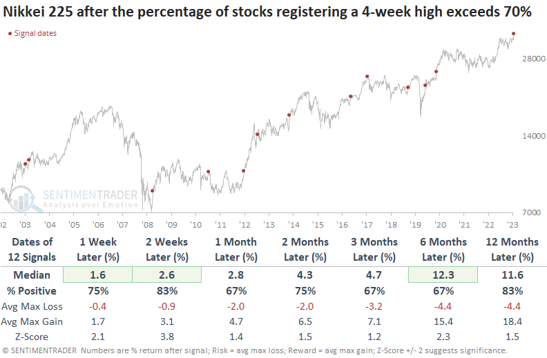
A giant surge in one-month highs for Japanese stocks
Dean showed that the percentage of Nikkei 225 stocks registering a 4-week high surged to the highest level in almost a decade. After similar thrusts, the bellwether Japanese index was higher 83% of the time over the following two weeks.
The Nikkei 225 continues to exhibit bull market characteristics with consolidations followed by impressive upside breakouts. After consolidating for six months, the bellwether Japanese index broke out this week to a 34-year high. Participation was spectacular, with more than 79% of index members registering a new 4-week high, reaching the highest level in almost a decade.
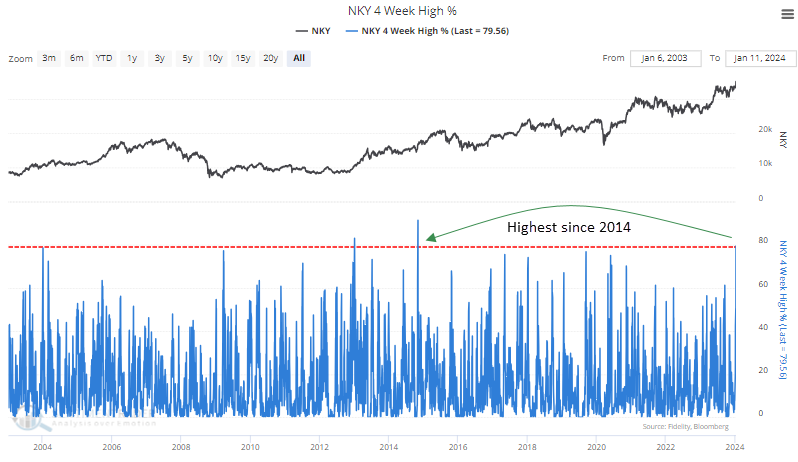
Whenever the percentage of Nikkei 225 members registering a 4-week high exceeds 70%, the bullish price momentum is likely to continue in the near term, with the index rising 83% of the time over the subsequent two weeks. Over the following year, the Nikkei was higher in all but two cases. The only signal to mark an immediate top occurred in 2011 when the Nikkei was mired in a lengthy downtrend.
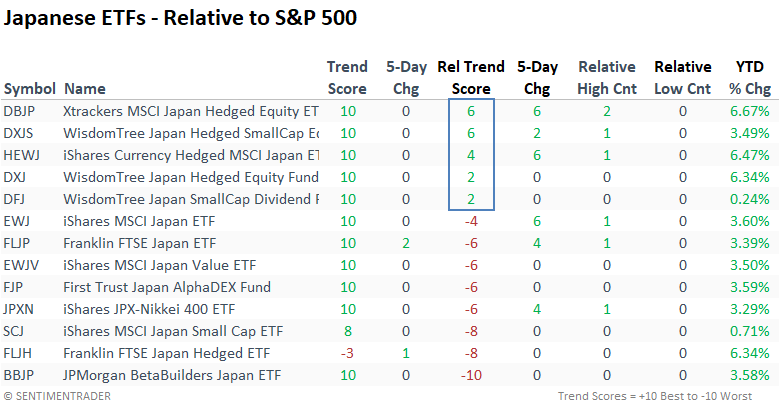
A distinction between currency-hedged and non-hedged ETFs becomes apparent when examining relative trend scores and year-to-date returns. ETFs employing currency hedging outperform their counterparts on a YTD basis and show superior relative trend scores.
Sentimentrader website subscribers can effortlessly create, save, and monitor trading signals, just like the one showcased here. With our Find Last Signal feature, users can efficiently scan hundreds of alerts at the click of a button.
Trading gold with options
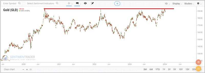
Gold recently made another run toward all-time highs and then reversed. Jay noted options on ticker GLD allow bulls and bears a relatively low-cost and limited-risk way to express their opinion.
Everyone has an opinion on gold these days, as the yellow metal (and corresponding ETFs) have spent the last four years testing and retesting multi-year price highs without successfully breaking through to the upside.
Let's assume that a trader thinks that gold is due to break out to the upside in the next several months. The most straightforward approach would be to enter a long position in gold futures or to buy 100 shares of Gold Shares Trust ETF (ticker GLD). A futures contract position involves a great deal of leverage and essentially unlimited risk, while the 100 shares of GLD require a trader to pay roughly $18,800.
Now, let's consider a lower-cost, limited-risk position. The chart below shows a price chart for ticker GLD and the current and historical values for option implied volatility for GLD options.
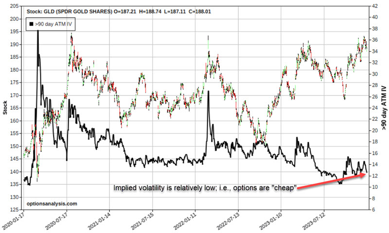
To understand implied volatility, note that option price includes "time premium" (essentially the amount of premium paid by the option buyer above and beyond any intrinsic value to the option seller to induce them to sell the option). In a nutshell, high implied volatility means that there is a relatively large amount of time premium built into the options (i.e., they are "expensive"), and low implied volatility means that there is a relatively small amount of time premium built into the options (i.e., they are "cheap"). Buying options when IV is low is generally advantageous to limit the time premium you pay.
As you can see in the chart above, IV is presently near the low end of the historical range. Thus, GLD options are relatively cheap, and buying options can make sense. So, let's consider a specific call option position.
- Buying 2 Mar15 2024 GLD 190 calls @ $3.90
The chart below displays the particulars. Note that because we are buying two contracts of an option with a delta of 50.21 ("Delta" in options represents the stock equivalent position), the position delta is 100.41 (50.21 per option x 2 contracts), i.e., it will behave much like a long 100 shares of GLD position. However, note also that the delta can and will change as the price moves and time goes by.
The chart below displays the risk curves for this option position. The black line represents the expected $ profit/loss at a given price for GLD shares as of option expiration on 2023-03-15. The other colored line represents the expected P/L as of a different date leading up to option expiration, with the red line representing the current date.
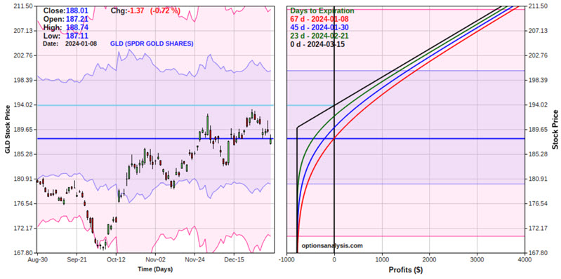
The cost to enter - and the maximum risk - is $780 (or 4.1% as much as buying 100 shares of GLD). There are 67 days calendar days left until expiration. If the position is held until expiration, GLD must be trading above the breakeven price to show a profit.
Jay then compared the option position to holding GLD shares directly, and also outlined an option trade for an investor who expects gold to fail and head lower in the months ahead.
Natty update
In an early December piece, Jay wrote of an unfavorable seasonal period for Natural gas. It plunged for one week and has since rallied steadily. History suggests that traders prepare for the other shoe to drop
Natural gas entered an unfavorable period in early December that extends from Trading Day of Year #236 through TDY #31 of the following year. For 2023-24, this period extends from the close on 2023-12-04 through the close on 2004-02-15.
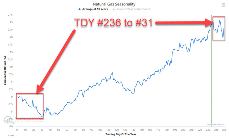
During the first six trading days of this period, natural gas plunged over $3,800 in contract value, and it looked like the rout was on. But things changed abruptly, and natural gas has since rallied over $5,700 in contract value through the close on 2023-01-05.
The chart below zooms in on the annual seasonal trend for natural gas. Historically, the period from Trading Day of the Year (TDY) #5 through TDY #31 has witnessed weakness.
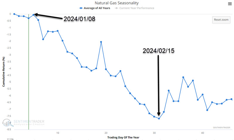
During these seasonal windows, natty rallied only 33% of the time, with an average gain that was only half the average loss. It never gained more than +$10,000, while losing more than -$10,000 during six years.
Commodities have been lagging stocks badly
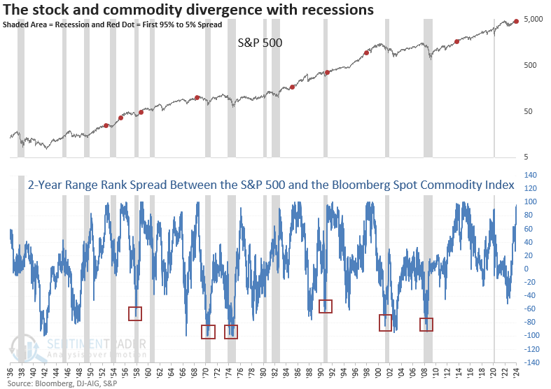
The S&P 500 is trading near the upper end of its 2-year range, with a commodity index near the lower end. Dean showed that similar divergences suggest commodities will continue to struggle as the S&P 500 trends higher.
There's a persistent belief among the perma-bear community that commodities, which have diverged from stocks by one of the most significant amounts in history, are signaling a recession.
To measure the current divergence relative to history, Dean applied a 2-year range rank to the S&P 500 and the Bloomberg Spot Commodity Index. The rank for the S&P hovers around the 97th percentile, meaning the S&P 500 exceeded 97% of all other closing values over the last two years. Conversely, the Bloomberg Spot Commodity Index ranks in the 5th percentile, ranking lower than 95% of all closing values over the previous two years.
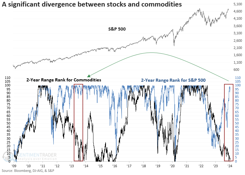
Whenever the 2-year range rank for the S&P 500 exceeded the 95th percentile as the rank for the Bloomberg Spot Commodity index simultaneously fell below the 5th percentile, the commodity index showed negative returns and unfavorable win rates across almost all time horizons. Except for 1991, the first signal was consistently accompanied by additional alerts, indicating a persistent downtrend in commodities.
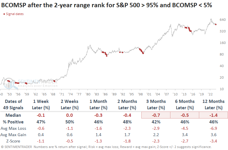
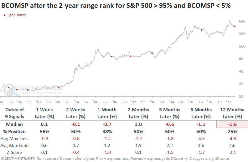
Suppose we use a reset condition to identify the first signal for context similar to now. In that case, the outlook for commodities remained challenging, especially a year later.
A high 2-year range rank spread between stocks and commodities is less likely to signal an imminent recession. However, caution is warranted when the differential falls to a low level. i.e., stocks are low, and commodities are high relative to their respective ranges.
About TradingEdge Weekly...
The goal of TradingEdge Weekly is to summarize some of the research published to SentimenTrader over the past week. Sometimes there is a lot to digest, and this summary highlights the highest conviction or most compelling ideas we discussed. This is NOT the published research; rather, it pulls out some of the most relevant parts. It includes links to the published research for convenience, and if you don't subscribe to those products, it will present the options for access.