
TradingEdge Weekly for Jan 10 - Sentiment reset, lagging participation, material washout

Key points:
- Some sentiment models have reset to the lowest level in a year
- Dumb Money Confidence is now below Smart Money Confidence for the first time in 90 days
- Year 5 of the decade tends to be positive for stocks, except for two months of the year
- Lagging participation among S&P 500 stocks continues to be a sore spot
- The yield curve has un-inverted, and that's not necessarily a good thing for stocks or the economy
- Some signs that the basic materials sector is washed out
- Natural gas may be headed for a cold stretch
Sentiment is resetting
Several sentiment composites dropped to the lowest level in more than a year. Dean showed that similar sentiment resets tended to result in a rally in the S&P 500 over a medium-term basis.
Furthermore, the current readings for these indicators have dropped to the lower bounds of their bull market ranges, a zone that historically attracts buying interest from traders, as depicted in the accompanying chart featuring the Advisor and Investor Model.
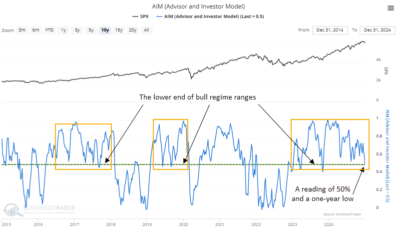
A decline in the Advisor and Investors Model to a one-year low and a reading of 50% or less tended to precede a rally in the S&P 500, with the world's most benchmarked index rising 73% of the time over the subsequent three months. Since the 1982 secular bottom in stocks, the S&P rose 88% of the time in the same horizon.
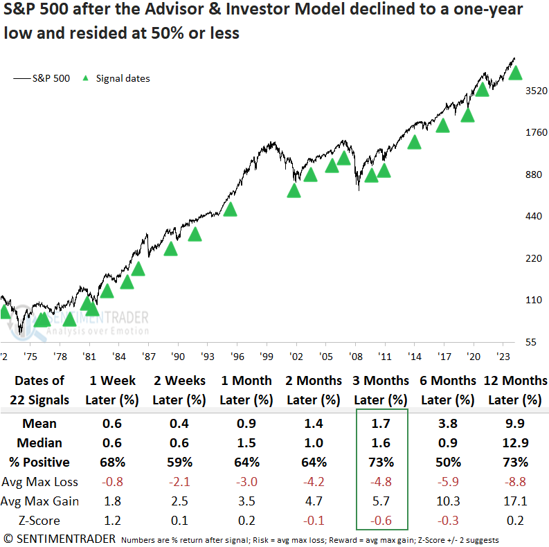
By isolating precedents near a high, a scenario like now, the win rate for the three-month interval rose to 86%, with the sole loss recorded in 1973.
The Intermediate-Term Optimism Index, a composite that measures more real-money indicators like put/call ratios, mutual fund flows, and futures traders' positioning, also declined to a one-year low and a reading of 40%, suggesting far less optimism.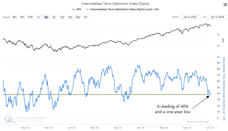
Despite its shorter history compared to the AIM model, when the Intermediate-Term Optimism Index declined to a one-year low, with a reading of 40% or less, the S&P 500 tended to perform well over long-term time frames, achieving an 88% win rate six and twelve months later.
Another look at a sentiment reset
The dumb money is the least optimistic it's been in a while. And for the first time in months, more than half of "smart money" indicators are banking on higher stock prices while less than half of "dumb money" ones are.
The shift in sentiment has moved the Smart Money / Dumb Money Confidence Spread above the zero line for the first time in more than 90 sessions. The end of the streak of at least 90 days with a negative spread was one of the longest since we began computing these models in 1998. In those 27 years, there have been 13 streaks of 90 or more days with a negative spread.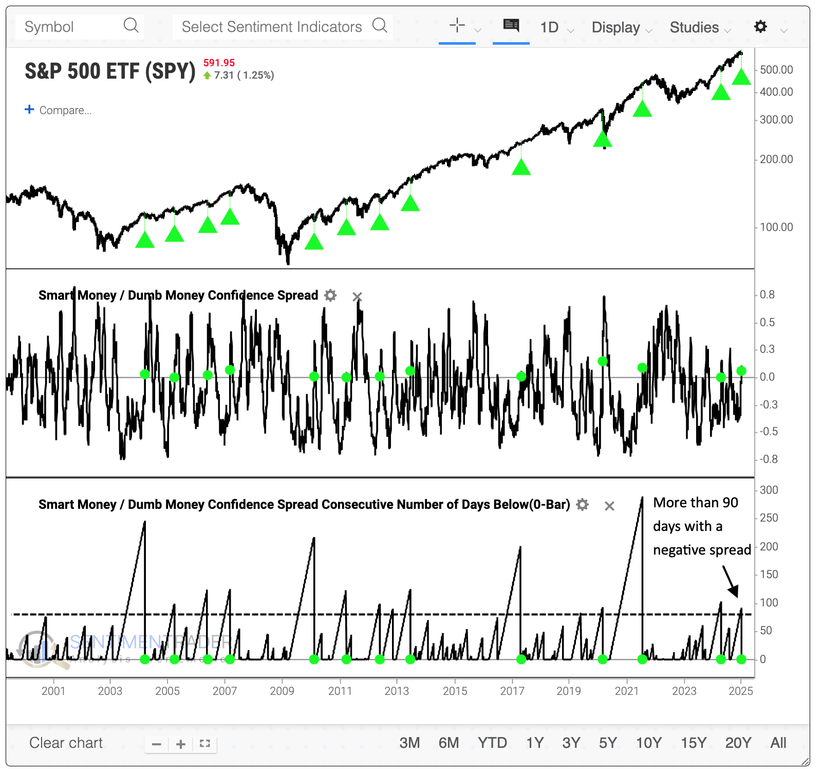
The table below shows returns in SPY after the end of a streak of at least 90 days with a negative spread. Short-term returns were mixed, with a horrid loss during the 2020 pandemic and a smattering of other minor losses. However, six months later, there was only one small loss, which was more than erased in the months afterward. Within the following six months, there were only two drawdowns larger than -6.5% compared to ten rallies of at least +6.5%.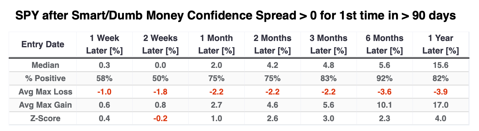
If we look at the other major U.S. equity ETFs after these signals, the best performer was QQQ, which tracks the large technology stocks in the Nasdaq 100. Thanks to a tremendous tailwind over the past two decades, the fund showed a median gain of +7.5% over the next six months with a single small loss.
The DIA fund, focused on the venerable Dow Jones Industrial Average, suffered a couple of small losses over the next six months, both of which were aggressively erased in the months afterward. The small-cap Russell 2000 fund, IWM, didn't fare as well, especially over shorter time frames. Over the next six months, it suffered a couple of losses, only one of which was meaningful, but its median return was an unimpressive +2.2%.
Even though the big tech stocks that dominate the Nasdaq 100 did exceptionally well, the broader information technology sector was mediocre. Interestingly, the most consistent winners over the next several months were health care, consumer staples, and utilities - the most defensive sectors.
Sentiment ebbed because the average stock got hit...again
Another month, another depressing drop for the average stockholder.
For the typical person, investing in the S&P 500 would mean buying the SPY, IVV, or VOO funds, which all track the S&P 500. Together, the three funds have around $2 trillion in assets under management. That money tracks the capitalization-weighted S&P 500 index, which basically everyone means by "the S&P 500."
We all know that some of the largest tech stocks in the index have dominated its returns, so the average stock within the index is somewhat forgotten. In December alone, the equal-weight version of the S&P 500, which weights every stock the same, trailed the popular capitalization-weight version by nearly 4%, one of the worst relative showings since 1957.
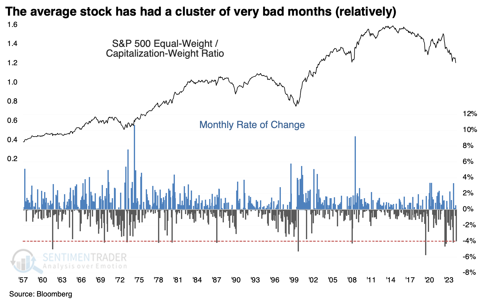
The table below shows how the two versions of the S&P performed relative to each other after large monthly declines in the equal-weight versus cap-weight ratio. Across all time frames, the equal-weight version of the index outperformed the cap-weight version, with particularly good (relative) returns over the next 1-2 months and again after 12 months.
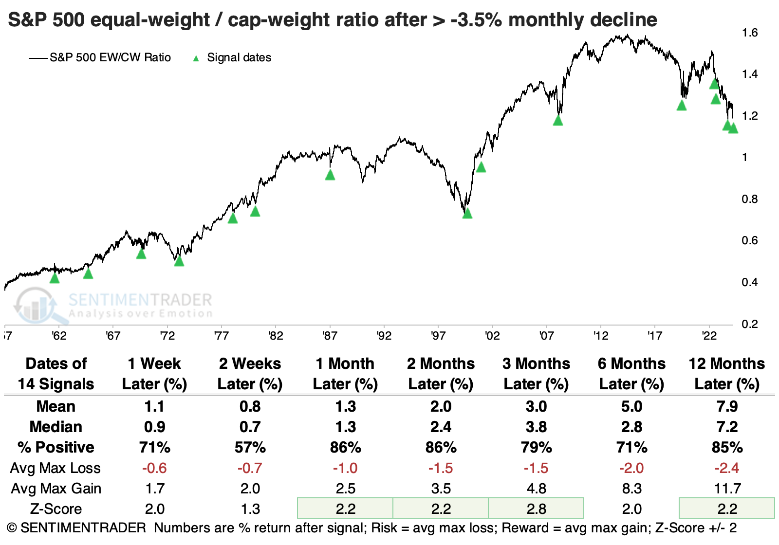
Not only did the ratio suffer one of its largest declines in 65 years, but it also fell to its lowest level in more than a year. When we filter the signals for that condition, only the March 2023 signal suffered a further loss over the next two months.
As further proof of how much the average stock has lagged, we recently went ten consecutive sessions with no more than 1% of S&P 500 stocks hitting a 52-week high.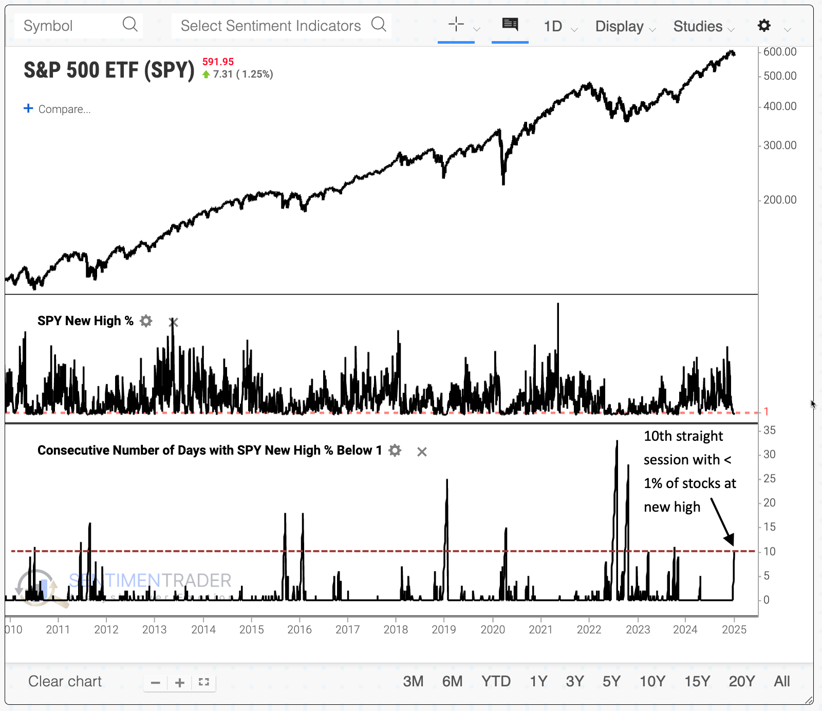
There were only ten other times we'd seen a streak like this when the equal-weight S&P 500 was trading above its 200-day moving average. Afterward, the index tended to rebound nicely, with the only meaningful and extended decline occurring after the July 1981 signal.
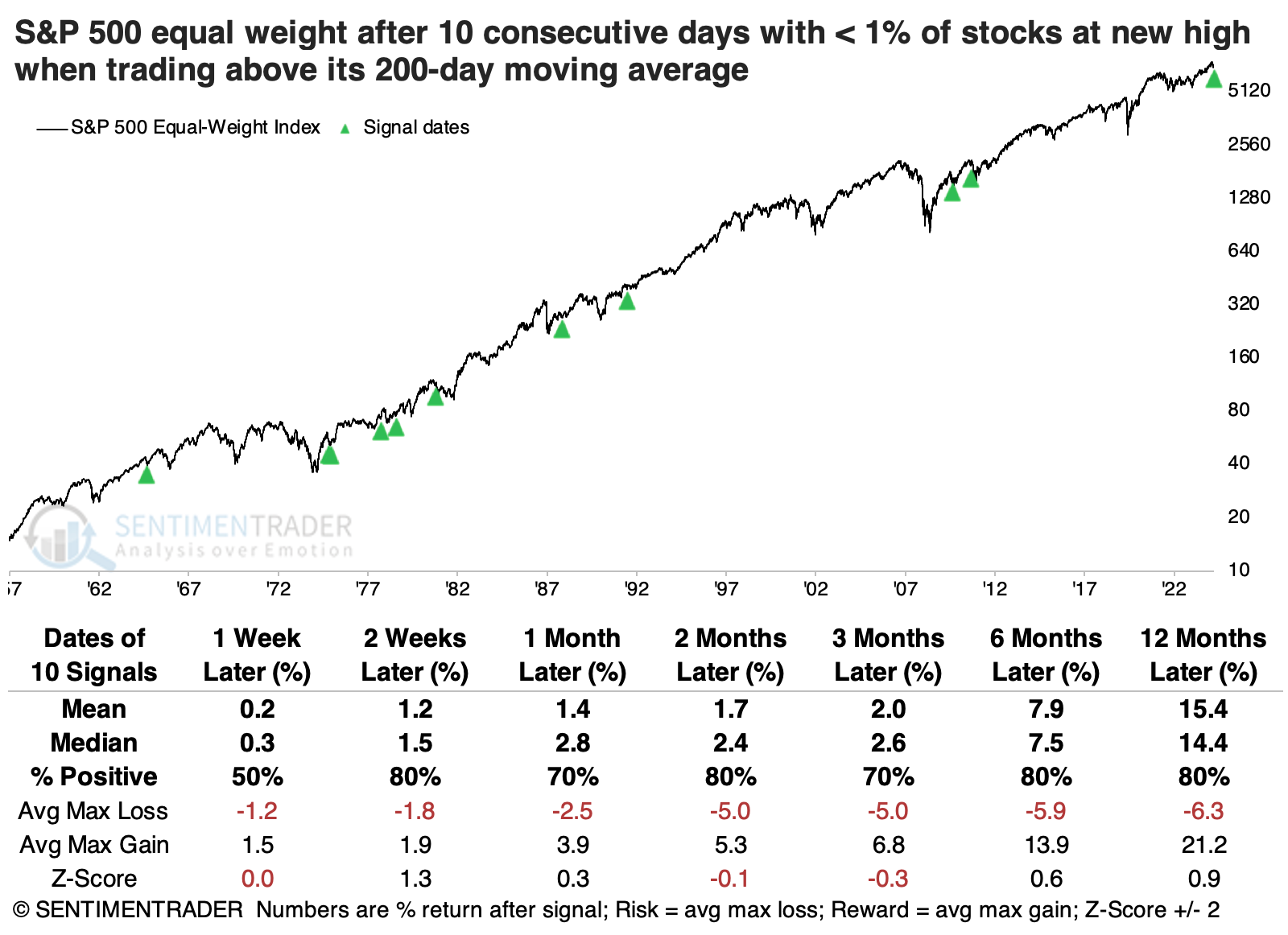
After 10-day streaks without more than 1% of stocks at new highs when the equal-weight S&P was still within correction territory, using the commonly cited threshold of 10%, again only July 1981 ended up showing a meaningful loss over the next year. Three signals suffered at least a -10% loss within the following year, versus eleven signals that witnessed at least a +10% rally.
A good year for trend continuation
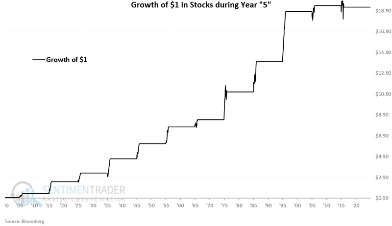
Year 5 in the decade has tended to be favorable for stocks, though Jay noted that the last two Year 5's have been somewhat subpar.
Year 5 occurs every ten years starting in 1905 (1905, 1915, 1925, 1935, etc.). Year 5 showed a gain for eleven straight decades before the S&P 500 registered a minor -0.7% price decline in 2015. That followed a relatively subpar +3.0% performance in 2005.
The chart below displays the hypothetical growth of $1 in stocks (as defined above) using month-end price data only during Years 5 since 1905. The years showed a positive return 11 out of 12 times, with an impressive median return of +31.1%.
The table below displays performance data for each month only during Year 5 starting in 1905. Only two months (March and August) declined more often than they gained and showed a median loss. They are highlighted in yellow.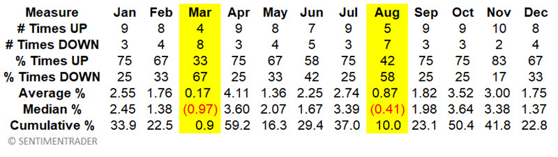
From here, we designate as favorable Year 5 months as all months except March and August, and unfavorable Year 5 months as March and August.
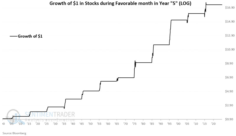
The chart below displays the hypothetical growth of $1 invested only during the ten favorable months of Year 5.
The chart below displays the hypothetical growth of $1 invested only during the unfavorable months of each Year 5.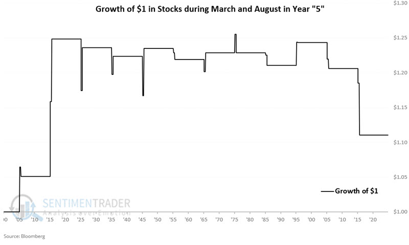
The table below summarizes stock market performance during Year 5.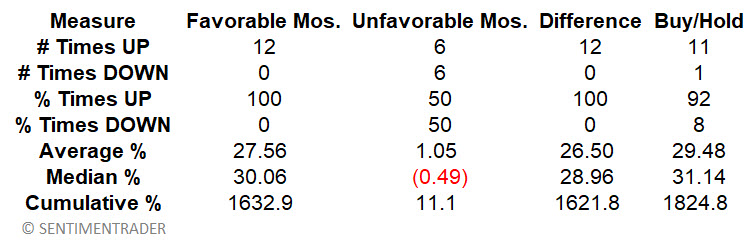
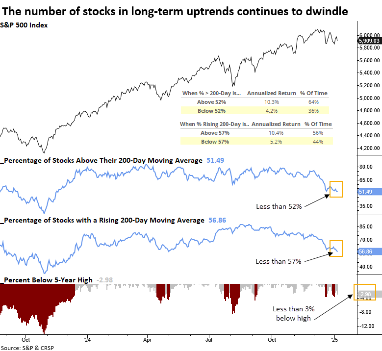
A big worry is poor participation
Two measures of long-term trend conditions for S&P 500 stocks indicate dwindling participation. Dean showed that similar breadth backdrops suggest the large-cap index could struggle in the next few months.
The latest indicator highlighting the dwindling participation comes from the percentage of stocks in the S&P 500 trading above their 200-day average. For only the 8th time since 1928, fewer than 52% of the members held above their long-term averages as the S&P 500 resided within 3% of a high.
When fewer than 52% of stocks are above their 200-day average or fewer than 57% exhibit a rising 200-day average, annualized S&P 500 returns decline to 4.2% and 5.2%, respectively, well below the returns seen above these levels.
On the rare occasions when fewer than 52% of S&P 500 stocks traded above their 200-day average, while the index remained within 3% of a 5-year high, the world's most benchmarked index tended to struggle over a medium-term horizon. Moreover, the risk was elevated in the initial month, with the index falling 86% of the time.
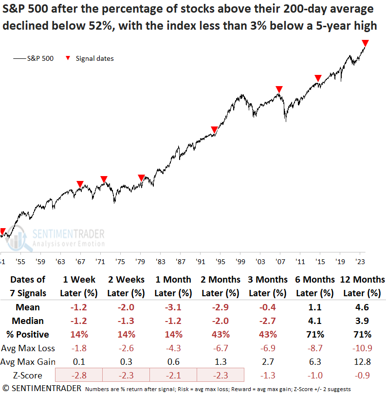
A scenario where less than 57% of S&P 500 stocks displayed a rising 200-day average, combined with the index being within 3% of a 5-year high, frequently preceded declines in the large-cap index over the following two to four weeks. From a long-term perspective, this setup delivered below-average returns and often coincided with significant market peaks.
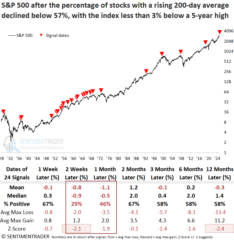
Although the participation problem remains concentrated in defensive and commodity-oriented groups, the weakness is seeping into other sectors, such as Consumer Discretionary, where only half of its members now maintain a rising 200-day average.
An un-inverted yield curve impact on stocks and the economy
The 10-year minus 3-month treasury yield curve recently returned to positive territory after spending over two years in inverted territory. Jay noted that the economy and the stock market have historically tended to exhibit subpar - though not necessarily negative - results following "un-inversion."
For testing purposes, we will define the "yield curve" using month-end data for the 10-year treasury note yield and the 3-month T-bill yield. The chart below displays month-end 10-year-3-month yield curve readings since 1976.
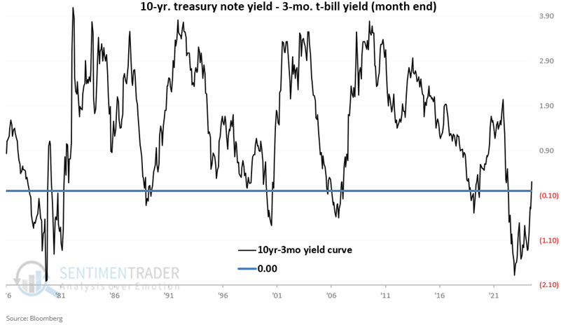
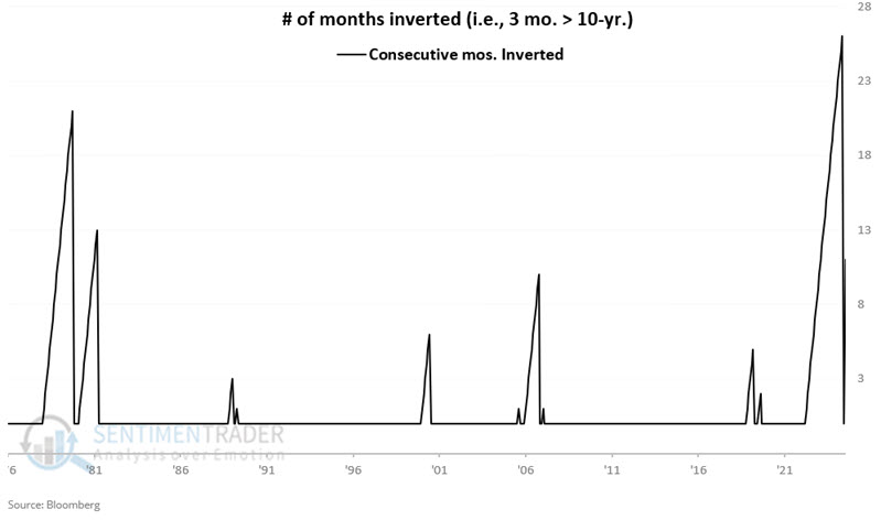
If the yield curve is negative (i.e., if the 3-month bill pays a higher rate of interest than the 10-year note), it is considered "inverted." The chart below shows periods when the yield curve was inverted. The short period was one month, which occurred on three occasions. The longest is the one just completed, which lasted 26 months.
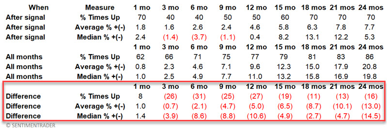
The table below displays the month when the yield curve returned to normal (i.e., it went from inverted to un-inverted) and the subsequent performance for the Coincident Economic Activity Index (CEAI).
The first part ("After Signal") displays CEAI performance only following un-inversions. The second part repeats the earlier information for ALL months (i.e., baseline performance). The third part compares the difference between post-signal performance versus baseline performance. Negative numbers mean the index performed worse overall following un-inversion.
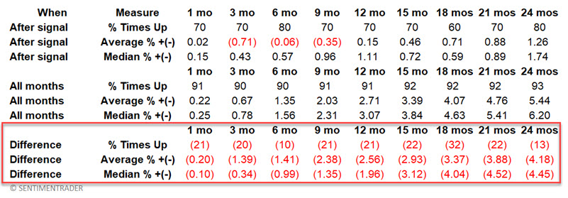
The economy does NOT always contract or perform poorly following an un-inversion. However, the % of times up and average and median results are worse across all time frames following un-inversion versus the baseline.
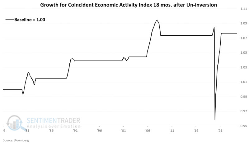
The chart below displays the cumulative growth in the Coincident Economic Activity Index during the 18 months following each month-end un-inversion date.
The chart below displays the cumulative growth in the Coincident Economic Activity Index during all months NOT included in the chart above.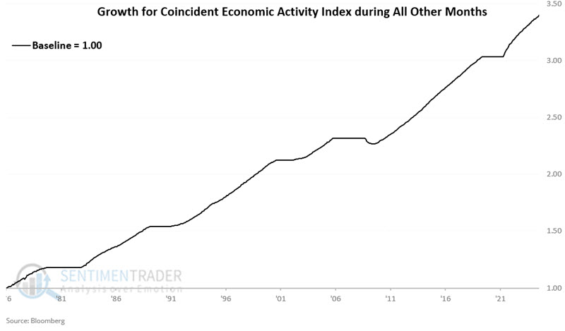
Clearly, the performance shown in the second chart is more consistent than that shown in the first chart. Still, to those who want to shout doom-and-gloom about the recent un-inversion, it must be noted that the first chart did show a net gain across the 48-year test, albeit with a lot more volatility and some significant air pockets.
Now, let's turn our attention to stock market performance. The table below displays the month when the yield curve returned to normal and the subsequent performance for the S&P 500.
The stock market does NOT always decline following an un-inversion (see 1980 and 2020). However, the % of times up and average and median results are worse across all time frames following un-inversion versus the baseline except for the first month.
The chart below displays the hypothetical growth of $1 invested in the S&P 500 only during the 12 months following each month-end un-inversion date listed above. $1 grew to $1.19.
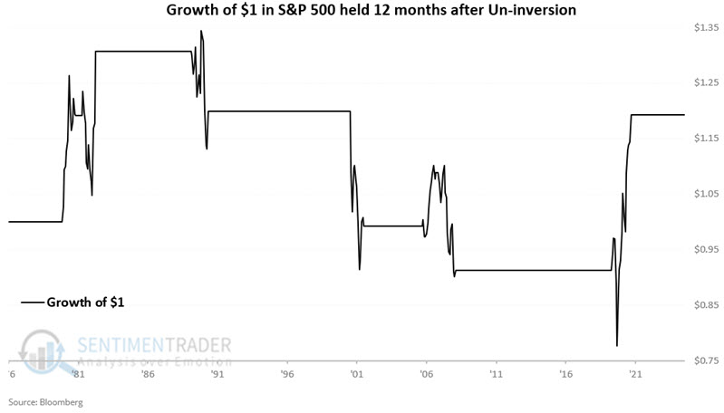
The chart below displays the hypothetical growth of $1 invested in the S&P 500 only during all months NOT included in the chart above. $1 grew to $47.27.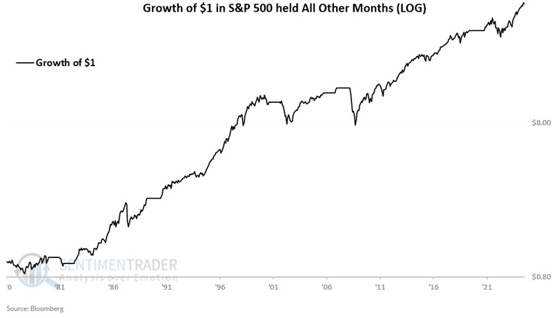
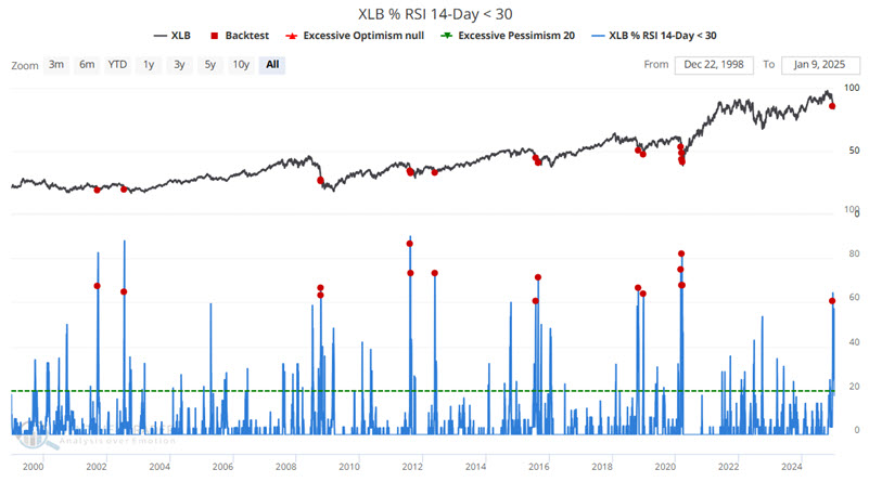
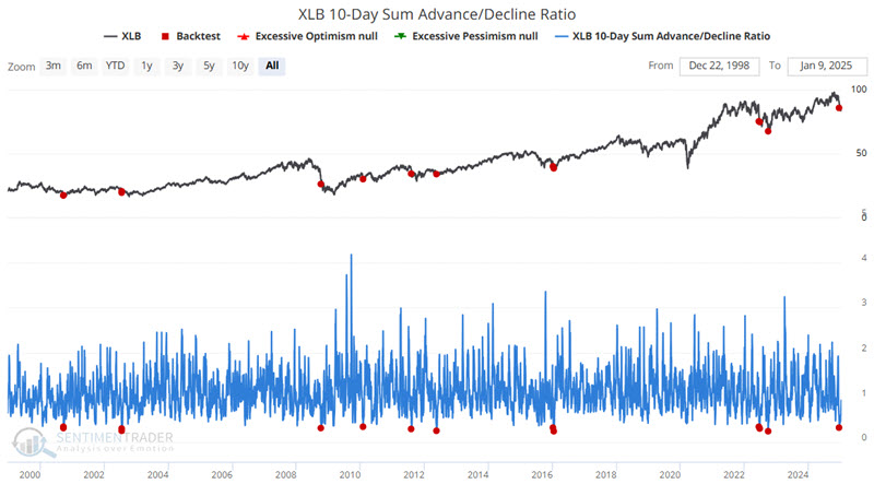
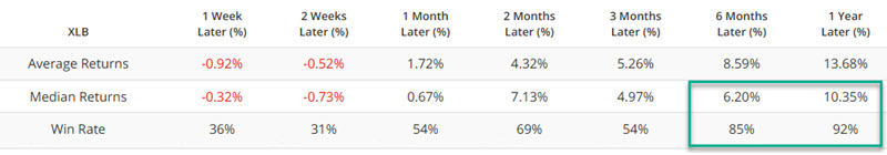
Materially oversold
Jay showed that the basic materials sector is in the throes of a steep decline, and seasonality is weak for several more weeks. On the plus side, several reliable indicators are suggesting better days ahead.
The iShares Materials sector ETF (ticker XLB), relative to the S&P 500 index, has plunged to a multi-year low. Buying into a sharp decline can provide maximum opportunity if a sharp rebound unfolds. On the other hand, this action can also end up more like trying "to catch a falling safe."
Several indicators are showing good odds of a longer-term recovery.
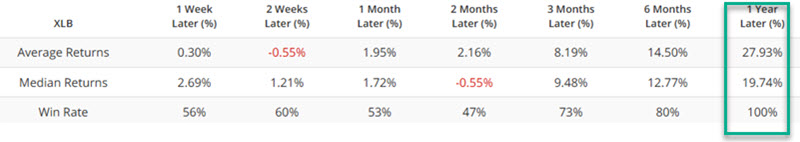
The chart below highlights with a red dot each day when the percentage of XLB constituent stocks with a 14-day RSI below 30 crossed above 60%, including overlaps. The most recent signal occurred on 2024-12-18. The fund had a 100% win rate over the following year.
The chart below highlights with a red dot each day when the XLB 10-Day Sum Advance/Decline Ratio crossed below 0.35, including overlapping signals. The most recent signal occurred on 2024-12-18. There was often some downside volatility during the first three months after a signal, but the fund showed an exceptionally high win rate one year later.
Jay also touched on several more indicators that reflect the washed-out nature of the sector and its tendency to bounce back over the next 6-12 months.
Shorter-term, the chart below displays the annual seasonal trend for ticker XLB. Note the period of weakness from Trading Day of the Year (TDY) #5 through TDY #19. For 2025, this period extends from the close on 2025-01-08 through the close on 2025-01-29.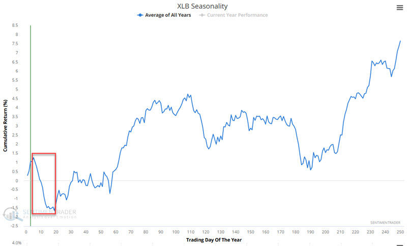
Ticker XLB tracks the S&P 500 Material Sector index. So, for testing, we looked at the performance of the index during this period every year since 1953. The chart below displays the hypothetical growth of $1 invested in the sector index from TDY #5 through TDY #19 every year.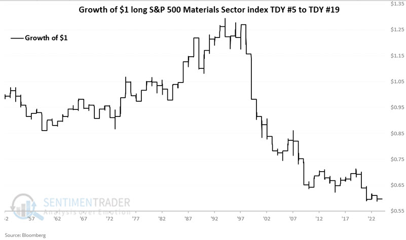
Overall, performance was decent for 40 years and then lousy for 30 years. There is no way to predict what XLB will do in January 2025. Still, the numbers above, combined with the recent absolute and relative weakness for XLB, suggest that a little more patience may be in order before making any meaningful commitment to this beaten-down sector.
A cold stretch for natural gas
Cold weather has many pundits predicting higher prices for natural gas. Jay noted that meanwhile, seasonality and sentiment stand as a warning sign in the month ahead.
The chart below zooms in on the annual seasonal trend for natural gas. Historically, the period from Trading Day of the Year (TDY) #5 through TDY #31 has witnessed weakness. For 2025, this period extends from the close on 2025-01-08 through 2025-02-13.
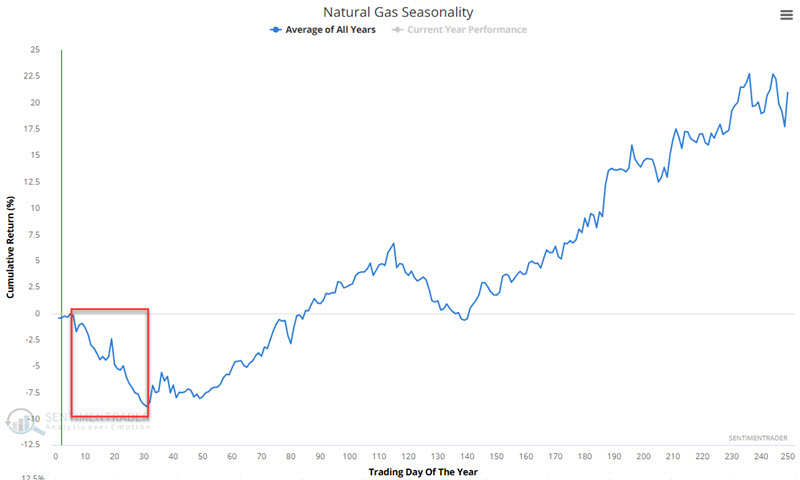
The chart below displays the hypothetical cumulative $ +(-) achieved by holding a long position in natural gas futures only from the close of TDY #5 through TDY #31 every year since 1991.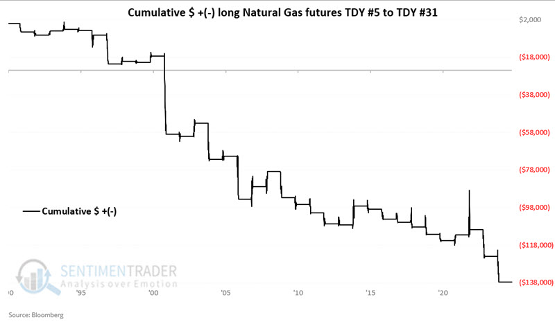
These periods witnessed a gain only 32% of the time, with the average gain about half as large as the average loss. The contract never gained more than +$10,000 while losing more than -$10,000 during seven years.
The recent favorable trend for natural gas combined with recent forecasts of seriously below-average temperatures across much of the U.S. is fueling bullishness among traders. The chart below highlights those dates when our UNG Optix indicator crossed above 94.9% for the first time in two months.
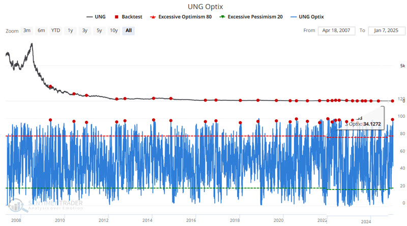
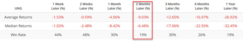
The good news is the high probability of a decline during the two months after a signal. However, natural gas can experience explosive moves. Stubbornly holding a short position in natural gas futures or UNG shares (or a long position in KOLD) is an invitation to disaster. A reasonable stop-loss is mandatory.
About TradingEdge Weekly...
The goal of TradingEdge Weekly is to summarize some of the research published to SentimenTrader over the past week. Sometimes there is a lot to digest, and this summary highlights the highest conviction or most compelling ideas we discussed. This is NOT the published research; rather, it pulls out some of the most relevant parts. It includes links to the published research for convenience, and if you don't subscribe to those products, it will present the options for access.