
TradingEdge Weekly for Feb 7 - Economic upswing, coffee percolating, an easy rally

Key points:
- The Sharpe ratio for the S&P 500 is exceptionally high and appears to be peaking
- Part of the reason it's peaking is due to short-term volatility like recent gaps down
- Manufacturing data are on the upswing
- A tweak on the January Barometer bodes well for stocks in 2025
- Developed European markets have surged with excellent participation among stocks
- Leading economic indicators are rising by one measure, a good sign for real estate
- It's also a good sign for technology, financials, and energy
- Coffee prices have spiked higher, and the countdown to a peak has begun
A very Sharpe market
Investors have had it awfully easy for a long time.
Using a version of the Sharpe Ratio, the S&P 500 has seen the best risk-adjusted returns since late 2021. The Sharpe ratio is used to help investors understand the return of an investment compared to its risk. The ratio is the average return earned in excess of the risk-free rate per unit of volatility or total risk. Volatility is a measure of the price fluctuations of an asset or portfolio.
The Sharpe ratio recently approached 2.0 for the third time in the past two decades. The other two weren't good times to extrapolate the gains into the future.
The ratio can be jumpy, so we'll apply a six-month average. Zooming out to view the past 70 years, we see that the recent average ranked in the top 7% of all days. It has since started to roll over, suggesting an end to the exceptionally accommodative conditions for investors.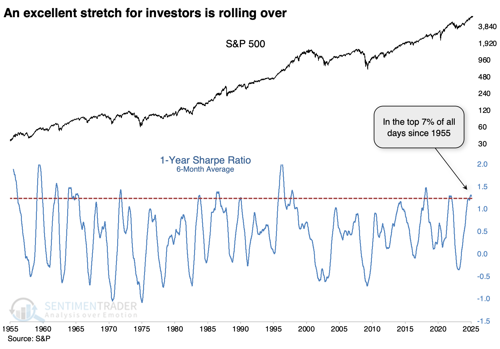
For these purposes, we'll highlight when the 6-month average of the S&P 500's Sharpe ratio exceeded 1.2, the highest level in more than a year, and didn't set another new high for at least 30 days. Using those criteria, we're at a point that suggests the ratio has peaked.
The table below shows that after other peaks, "moderate" returns didn't necessarily mean "negative." The S&P's returns were mostly below average, and its risk/reward profile wasn't impressive, but it still showed positive returns most of the time across all time frames.
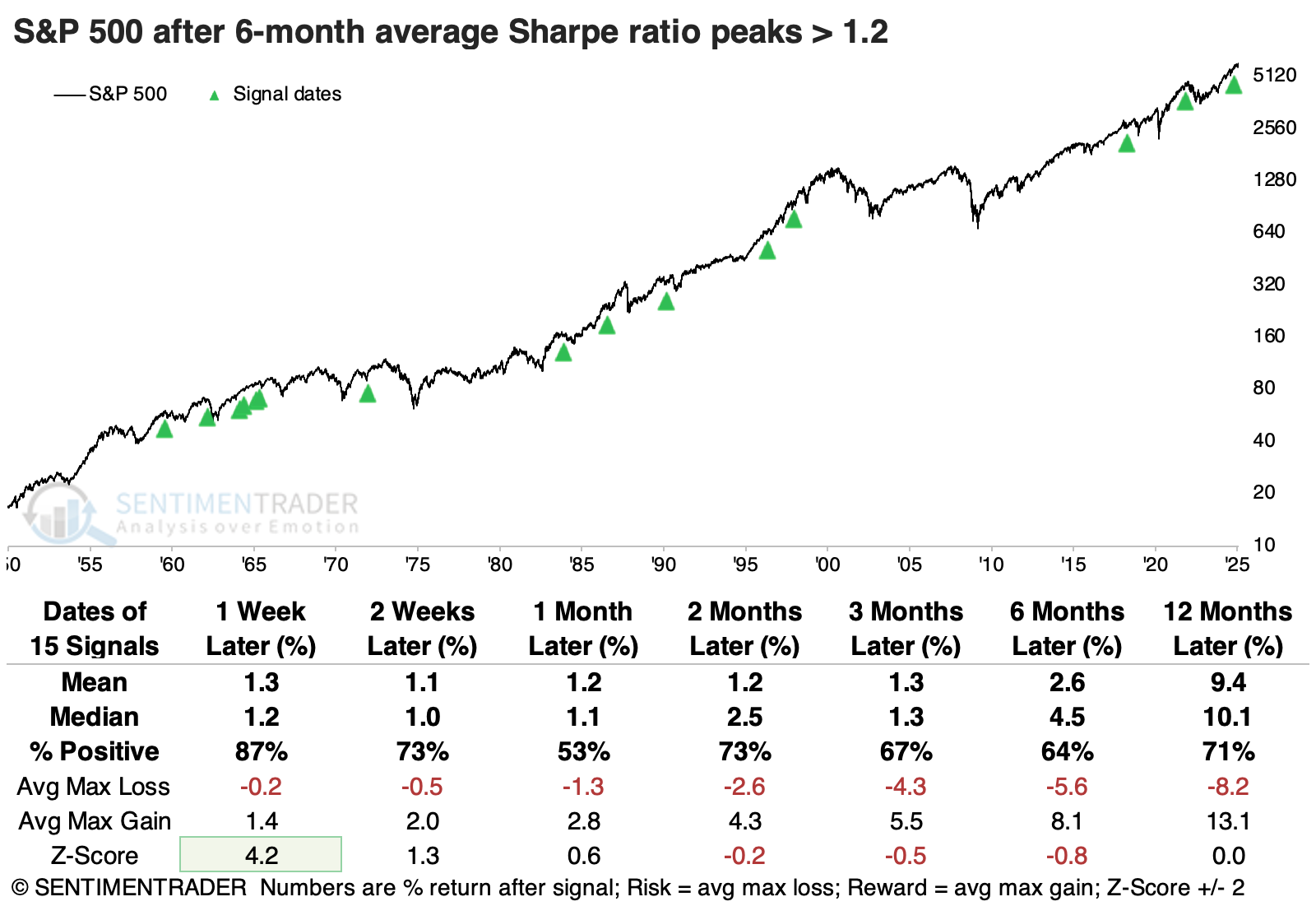
The table of maximum gains and losses across time frames shows that the S&P fell more than -10% within the next six months only twice while gaining more than +10% six times. Over the following year, moderate to large gains and losses were more evenly balanced.
Among sectors, the best returns across time frames were in staples and industrials, on opposite ends of the defensive-cyclical spectrum. However, in terms of win rate, staples came out on top. It's the only sector with a win rate over 65% across every time frame.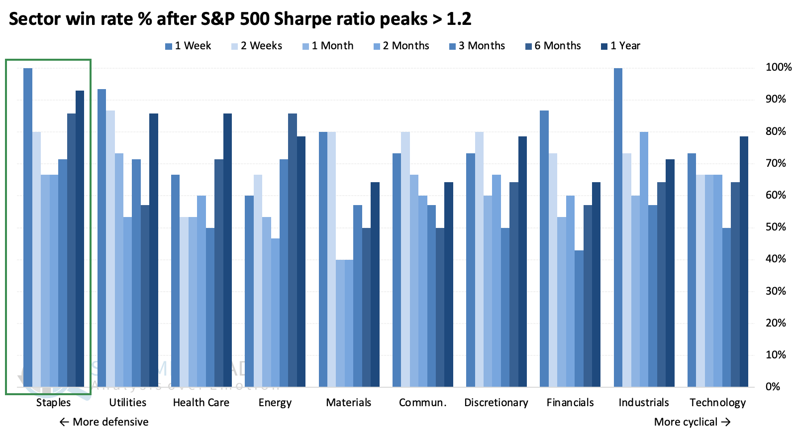
If we take a broader look at factors, value stocks were the biggest winner; they had the largest median return three, six, and twelve months later.
Gap and reversal
While long-term S&P 500 performance has shown high returns with low volatility, the index reversed lower last Friday and gapped down over 1% at the open of trading on Monday. Dean showed that similar price patterns suggest that the large-cap index could face short-term headwinds before rebounding.
Although this two-day price pattern, illustrated in the chart below, may seem alarming, it's crucial to remain objective. Throughout history, headlines have always fueled a sell first, ask questions later mentality from traders.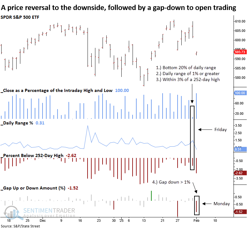
The S&P 500 ETF (SPY) was used for this study instead of the cash S&P 500 index, as it reflects price gaps-something the cash index cannot capture. Although the sample size is tiny, whenever a downside price pattern reversal was followed by a next-day gap-down of 1% or more, the S&P 500 struggled in the weeks ahead, with the most significant risk of further downside typically unfolding in the first week.
Once the shakeout concluded, the index rebounded, posting gains 100% of the time over the next two and three months.
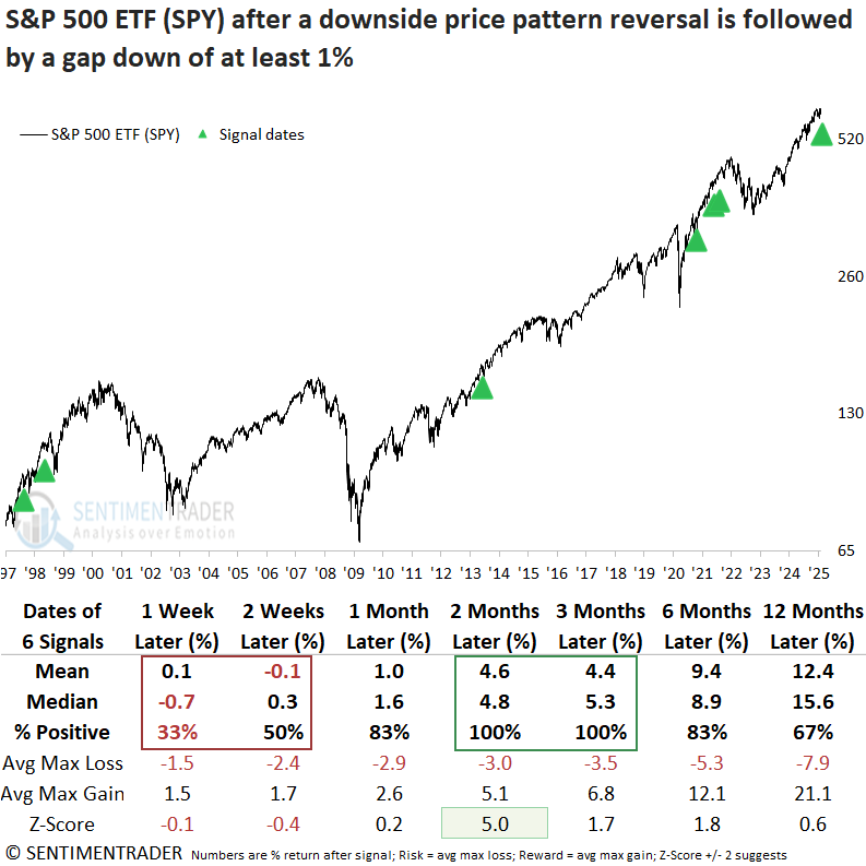
The risk/reward profile moves from unfavorable in the first month to favorable in the second, with a maximum loss not exceeding 6%.
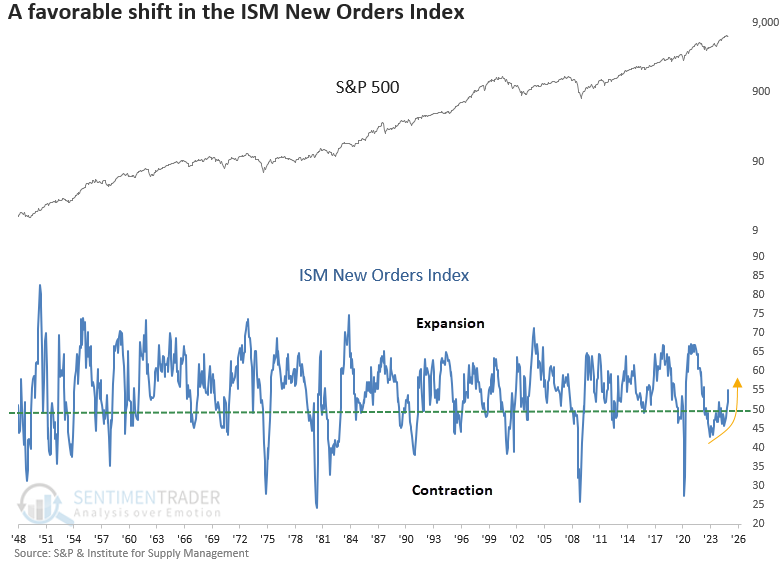
Manufacturing is on the upswing
The ISM New Orders Index cycled from below 50 to above 55, reaching the highest level in 32 months. Dean noted that similar recoveries in a leading indicator for manufacturing preceded a bullish outlook for stocks, especially financials and technology.
Why does this matter? New orders kickstart the production cycle, making them a leading indicator for manufacturing output, GDP growth, and corporate earnings. Although not a primary stock market signal, survey-based data such as new orders can validate a supportive environment.
Whenever the ISM New Orders Index cycled from below 50 to above 55 and reached at least a 12-month high, the S&P 500 produced excellent returns and consistency over the subsequent year. The sole meaningful adverse signal appeared during the 2000-02 bear market, a period markedly different from the present.
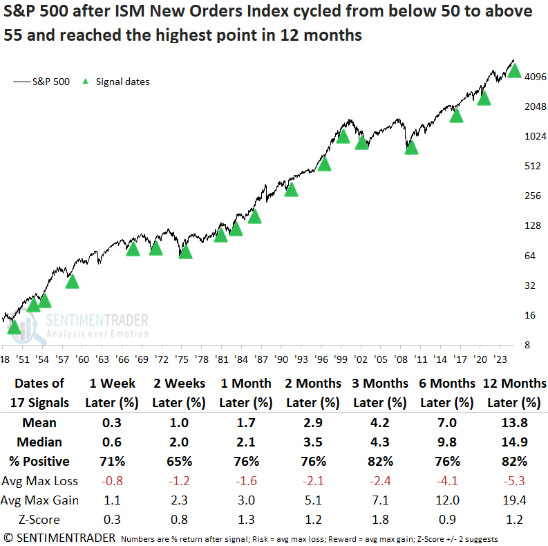
A resurgence in new orders for the manufacturing sector typically bolstered cyclical industries, with financials and technology leading the outperformance in the following year.
Suppose we apply the signals to the MSCI Country Indexes for the top 10 manufacturing nations by output. In that case, several countries like Germany, Mexico, and France displayed outstanding returns and consistency over the next year.
The 10-year Treasury yield typically moved higher, advancing 80% of the time over the next nine months. When the yield resided in the upper 80th percentile of its five-year range, it rose without exception.
So goes January...
The original January Barometer suggests that stock market performance during January tends to foreshadow performance for the rest of the year. Jay presented a version called the January Model which suggests a tailwind in 2025.
The January Model rules for the S&P 500:
- If it closes the month of January with a gain for the month, then +4 else 0 until the end of January the following year
- If it closes the first five trading days of January with a gain, then +2 else 0 until the close of the fifth trading day of the following year
- If it closes the last five trading days of January with a gain, then +1 else 0 until the end of January the following year
The January Model is considered to be favorable if the total equals 2, 4, 5, 6, or 7. Otherwise, hold cash.
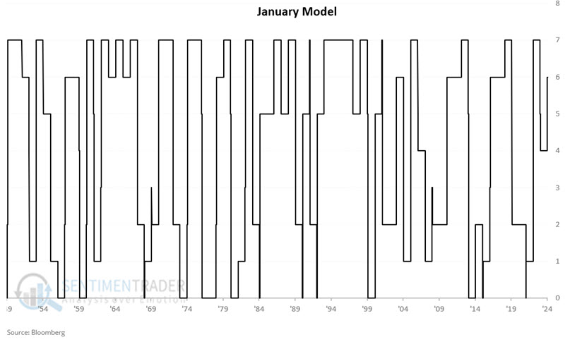
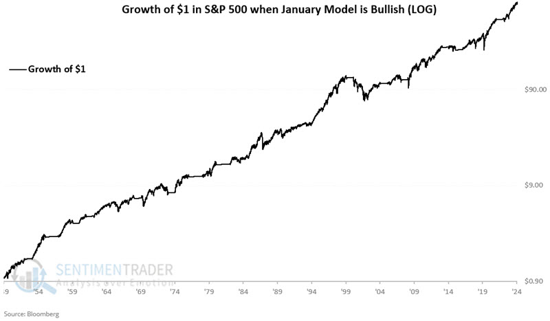
We will hold a long position in SPX if the model is favorable, otherwise be flat. The chart below displays the hypothetical growth of $1 invested in the S&P 500 Index grew to $719, a gain of +71,826%.
The hypothetical growth of $1 invested in the S&P 500 Index only when the model is unfavorable decreases to $0.595, a loss of -40.5%.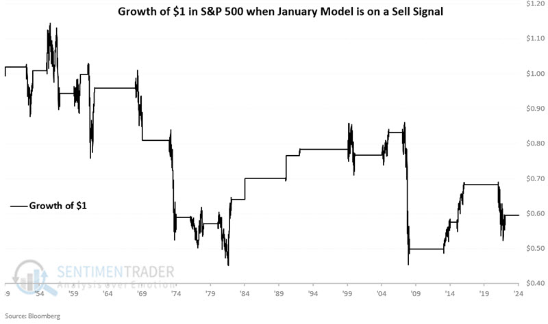
The last five trading days of January 2025 failed to show a gain, so our January Model did not "hit the trifecta," so to speak. However, the month as a whole showed a gain for the S&P 500, as did the first five trading days of the year.
As a result, the January Model reads +6 and will continue to do so through at least the first five trading days of 2026, so it is favorable for stocks through at least the end of January 2026.
Europe rising
Just when fervor reached a fever pitch about "the U.S. stock market is the only place to be," it ceased to be so. In a surprisingly quiet way, many European markets handily beat U.S. markets to start the year.
One of the primary indexes that tracks these markets is the FTSE Developed Europe Index, which counts among its largest constituents the UK, Switzerland, France, and Germany. When we average the 10-day Advance/Decline Ratio across those four markets, we see below that it has nearly reached 2.5, one of the highest readings in over two decades.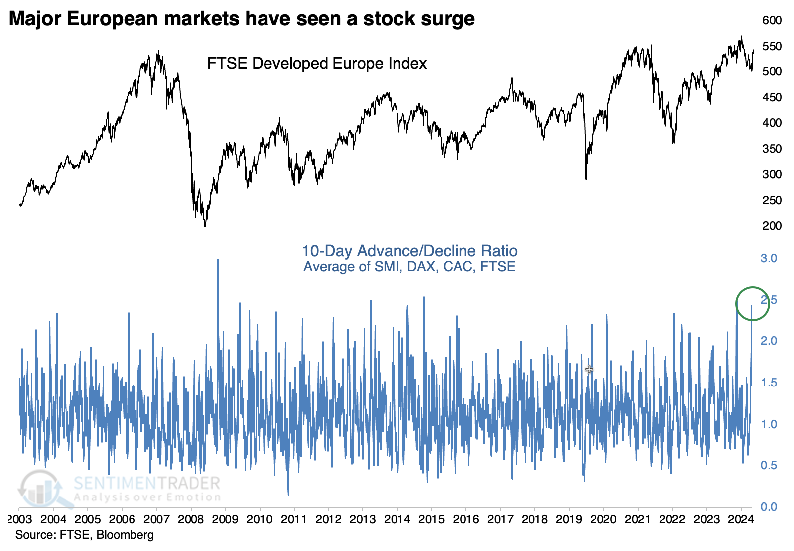
The table below shows returns in the FTSE Developed Europe Index after the 10-day A/D Ratio cycles from below 1.0 to more than 2.25. While the index is trading at the same level it was at 18 years ago, it did tend to perform well in the one to two months following these breadth surges. Out of 15 signals, 14 sported a positive return one or two months later - however, several failed longer-term.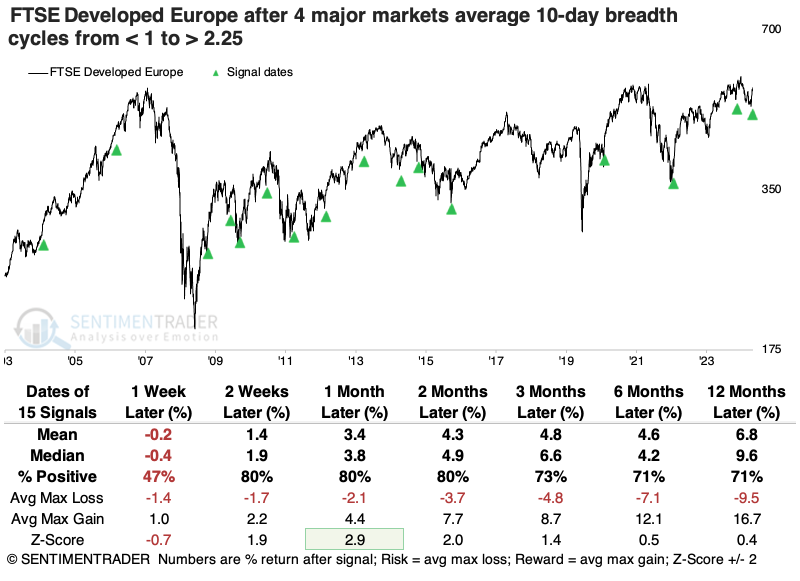
In a nod to how dominant U.S. markets have been over the past 15 years, these thrusts in European stocks were an even better sign for the S&P 500 over longer time frames.
For the first time in years, more than 85% of stocks across the SMI, FTSE, DAX, and CAC are trading above their 50-day moving averages. With an average of 87% of stocks above their moving average, the current reading is in the top 7% of all days since 2003. The chart below shows that European stocks have shown the best annualized return at the extremes - when there are either oversold conditions or highly positive internal momentum.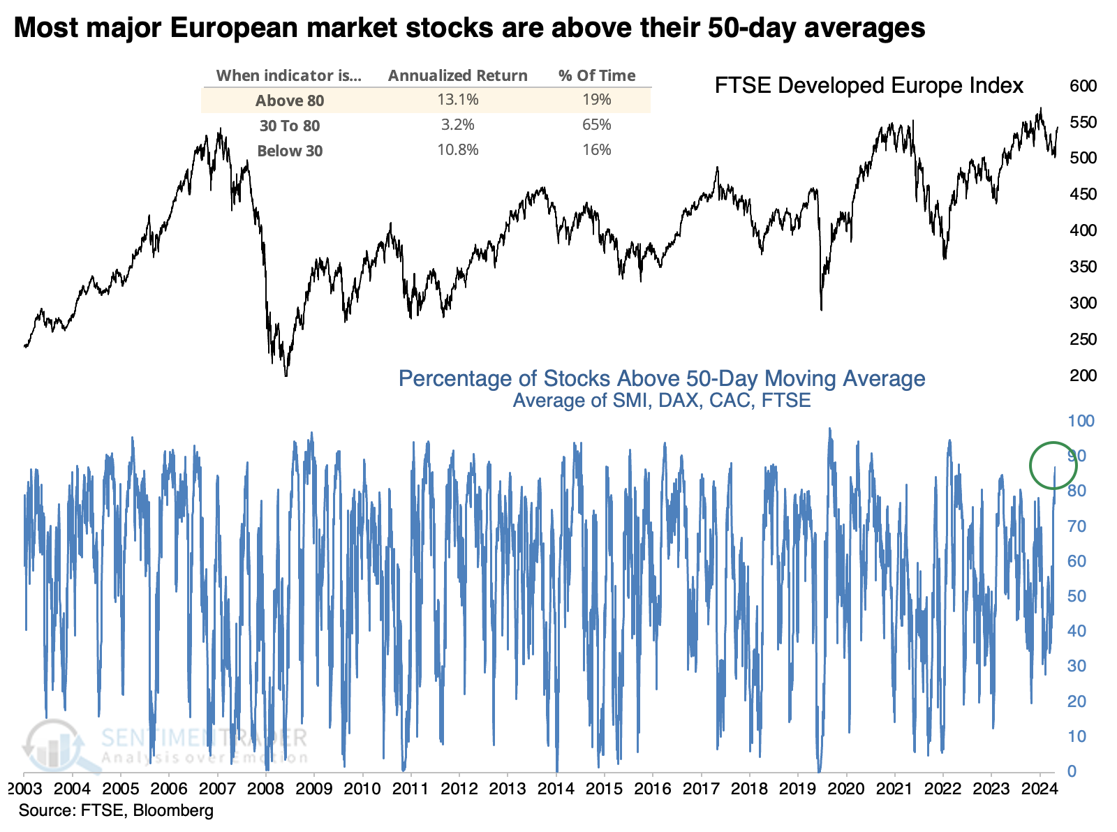
After the average percentage of members trading above their 50-day average cycles from below 40% to above 85%, the index's most consistent response was in the intermediate timeframe, with the next three months showing the best results with 14 gains versus only 3 losses.
LEI rising is good for real estate
One measure of the Conference Board Leading Economic Indicators has turned favorable. Jay showed that this development has had an outsized impact on the real estate sector.
The real estate sector is especially sensitive to the overall economy's trend. The recent uptick in the leading economic indicators strongly suggests the potential for better days ahead for the sector.
To gauge the state of the economy, we will use The Conference Board Index of Leading Economic Indicators (LEI). We will rate LEI performance based on two different measures. If the latest LEI reading is above its 12-month EMA, we add two points, and if the latest LEI 6-month simple moving average rose in the last month, we add another point. We will add those two scores and call it the LEIsum.
The LEIsum value can equal 3, 2, 1, or 0 each month, as shown in the chart below, which displays the month-end LEIsum readings since 1959.
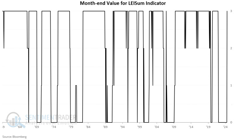
The December 2024 reading for LEI is 101.6, and the 12-month EMA is 101.5. The 6-month simple moving average for December is 100.2, and the 6-month simple moving average for the prior month was 100.1, so the value for LEIsum = 3.
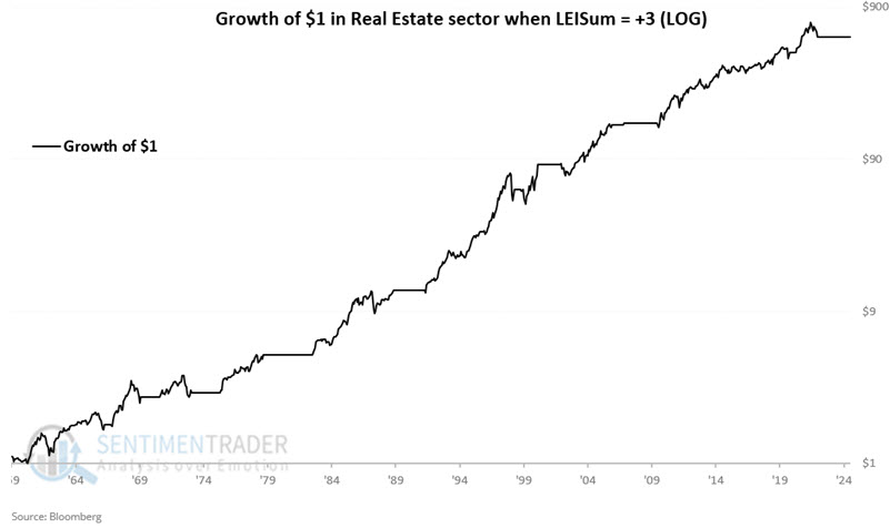
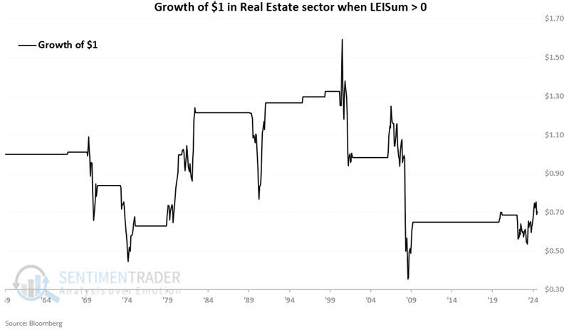
The chart below displays the cumulative growth of $1 invested in the real estate sector only during those months when LEIsum ended the previous month with a reading of +3. The cumulative hypothetical gain from October 1959 through January 2025 was +57,122%.
The chart below displays the cumulative growth of $1 invested in the real estate sector only during those months when LEIsum ended the previous month with a reading greater than 0. The cumulative hypothetical gain from October 1959 through January 2025 was +152,443%.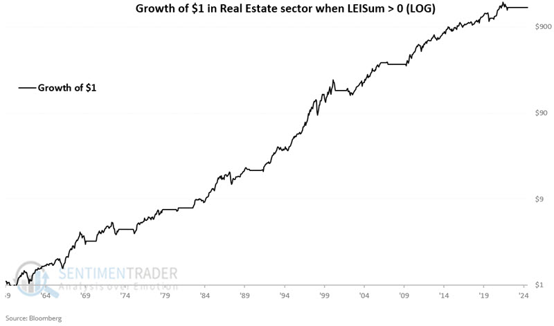
The chart below displays the cumulative growth of $1 invested in the real estate sector only during those months when LEIsum ended the previous month with a reading equal to 0.
Other sectors when the economy is growing
Jay further looked at all sector performance based on the status of our LEISum indicator.
For testing purposes, we use S&P 500 sector data starting in 1959. The table below displays the cumulative percentage growth for each sector if held only during months when LEISum ended the previous month at a particular value.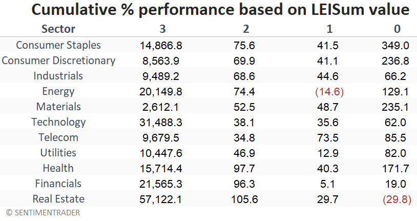
Note that all sectors gained much more ground when LEISum was at a +3 reading than during all other combined periods. This highlights the critical influence that the economy's state has on stocks.
Also note the difference in real estate sector performance during +3 periods versus 0 periods. During 0 periods, the real estate sector was the only sector to register a net loss, pointing to how inherently sensitive this sector is to economic performance.
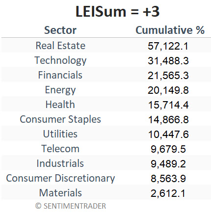
The table below ranks the sectors' cumulative performance during all +3 LEISum periods, which is currently the case. Real estate, technology, financials, and energy have been the big winners during a growing economy. On the other hand, the materials sector gained only 1/20 as much as real estate.
Coffee is percolating
Coffee futures are staging a historic price run. Jay suggested that patient, aggressive traders should be watching closely for a reversal as history suggests the decline following the next top may be just as fast and furious as the advance.
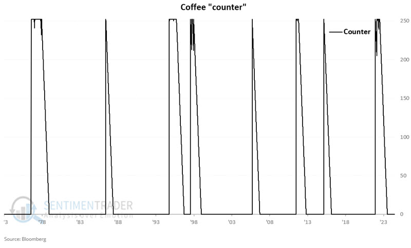
The chart below displays the 252-day percentage rate-of-change for coffee futures, starting in 1973. The blue line is drawn at the 90% level. This level is not often reached, and we are above it now.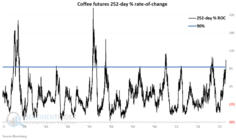 Let's run the following test:
- When the 252-day rate-of-change for coffee is above 90%, we will set a "Warning Counter" to 252 days
- As long as the 252-day ROC stays above 90%, the counter remains at 252
- If the 252-day rate-of-change for coffee is below 90%, we will subtract one from our counter until the counter reaches 0
The chart below displays the history of this Warning Counter. Remember, a reading of 252 should not be thought of as a "Sell" signal but rather as a "warning sign," while a reading of 0 suggests "no warning sign."
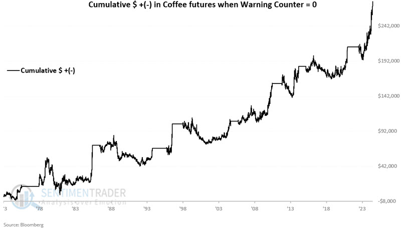
The chart below displays the cumulative hypothetical gain from holding a long position in coffee futures ($375 a point) only when the counter = 0. The hypothetical $ +(-) is +$276,589.
 On the other hand, the chart below displays the cumulative hypothetical gain from holding a long position when the counter > 0. The hypothetical $ +(-) is -$151,208.
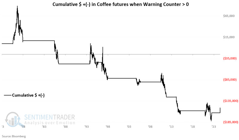 Unfortunately, the Warning Counter is not always a very accurate timing indicator, as coffee can continue to advance for some time after the first ROC reading above 90%.
Let's next factor in price trends to make this information useful for trading purposes.
- A = Warning Counter detailed above (set at 252 if 252-day ROC for coffee futures is > 90%; stays at or resets to 252 for each day 252-day ROC is above 90%; Declines by one for each day below 90% with a minimum reading of 0)
- B = Daily closing price for coffee futures
- C = 70-day exponential moving average (EMA) of B
- D = B - C
- E = If A = 0 then E = 2 else E = 0 (If Warning Counter = 0 then +2 else 0)
- F = If D > 0 then F = 1 else F = 0 (If last close > 70-day EMA then +1 else 0)
- G = E + F
So, Variable G can be 0, 1, 2, or 3 on any given day. From here, we will refer to Variable G as our Coffee Composite. The chart below displays daily readings for this indicator since 1973.
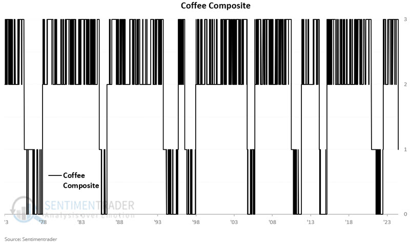
If the 252-day rate-of-change for coffee futures has been above 90% at some point in the last 252 days AND the latest closing is above the 70-day EMA, then the Coffee Composite will read +1. The chart below displays the hypothetical cumulative growth from holding a long position in coffee futures only while the Coffee Composite = +1. The hypothetical cumulative loss is -$41,479.
The current reading for the Coffee Composite = +1.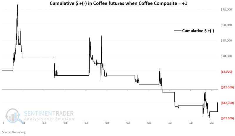
Jay also noted that our Coffee Optix indicator just closed at its highest level ever (91%). While other exceptionally high readings could be early to signal a peak, coffee's 6-12 month returns after high Optix levels were positive only 14% of the time.
About TradingEdge Weekly...
The goal of TradingEdge Weekly is to summarize some of the research published to SentimenTrader over the past week. Sometimes there is a lot to digest, and this summary highlights the highest conviction or most compelling ideas we discussed. This is NOT the published research; rather, it pulls out some of the most relevant parts. It includes links to the published research for convenience, and if you don't subscribe to those products, it will present the options for access.