
TradingEdge Weekly for Feb 28 - Volatility differences, Treasury cycles, Bitcoin breakdown

Key points:
- Traders are betting on more stock volatility than S&P 500 index volatility
- Breadth divergences are triggering some warnings
- This March is a negative one for a long-term cycle indicator
- Participation among cyclical stocks has lagged
- Corporate insiders don't look very inspired
- The Russell 2000 put in a reversal pattern
- Treasuries are heading into a short-term seasonally favorable window
- Other cycles for Treasuries are unfavorable for much of March and April
- Gold's Sharpe ratio has spiked to one of the highest levels in 50 years
- Bitcoin has suffered a breakdown
Stock vs. index volatility bets
Traders aren't pricing in much risk of rising volatility over the next month. Or maybe they are if you're looking at individual stocks.
The chart below shows the spread between the Dispersion Index and the VIX. The higher the spread, the more traders are pricing in volatility among individual stocks than the index. We can see from the chart that the S&P 500's annualized return when the spread was 15 points or higher was a wretched -18.1%.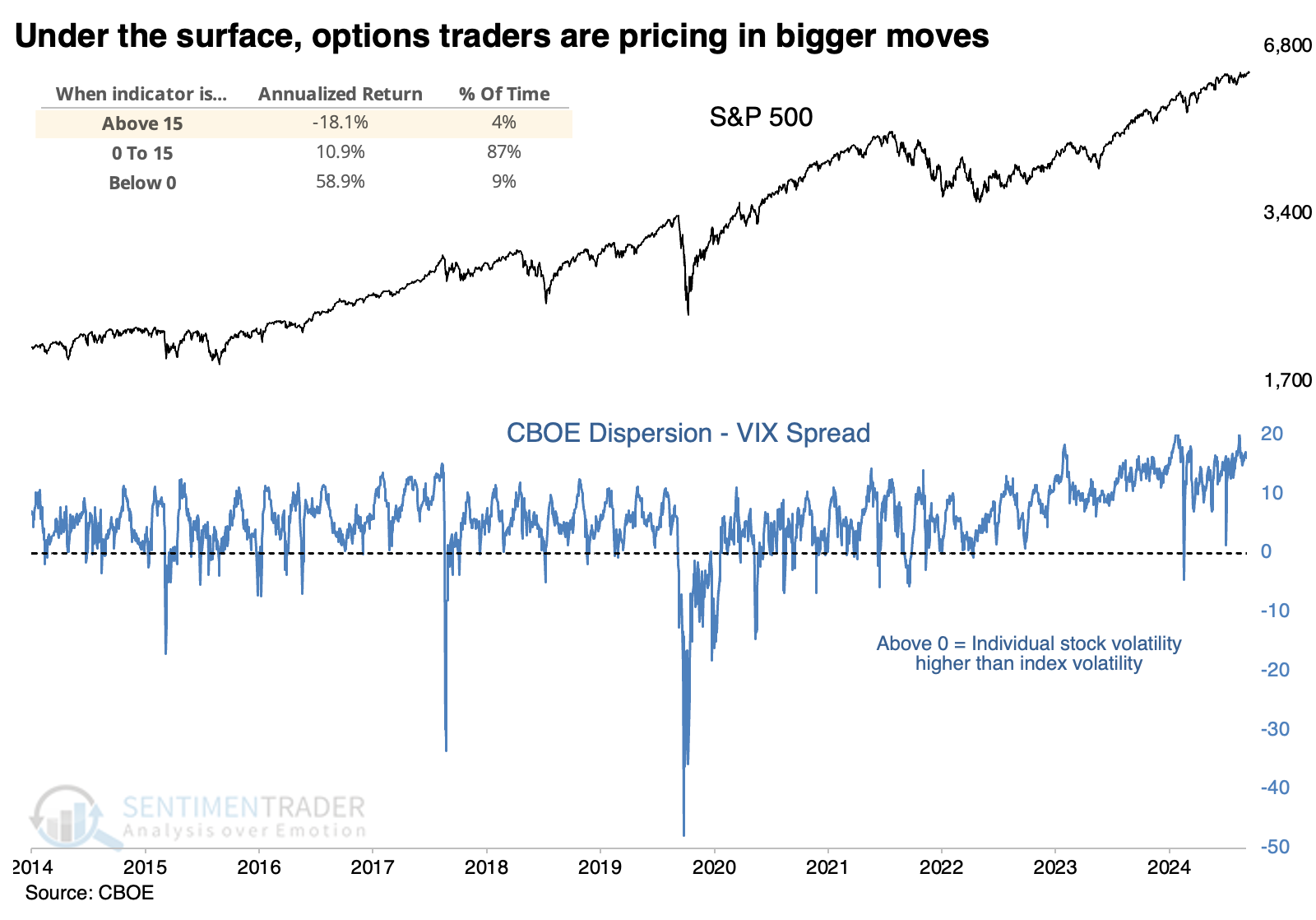
The clearest correlation between spreads and future returns was over 50 days. The scatter plot below shows the spread between the Dispersion Index and VIX along the x-axis, and the S&P 500's return over the next 50 days on the y-axis. There was a clear negative correlation, with the S&P's best returns occurring after negative spreads, and its worst returns after positive ones.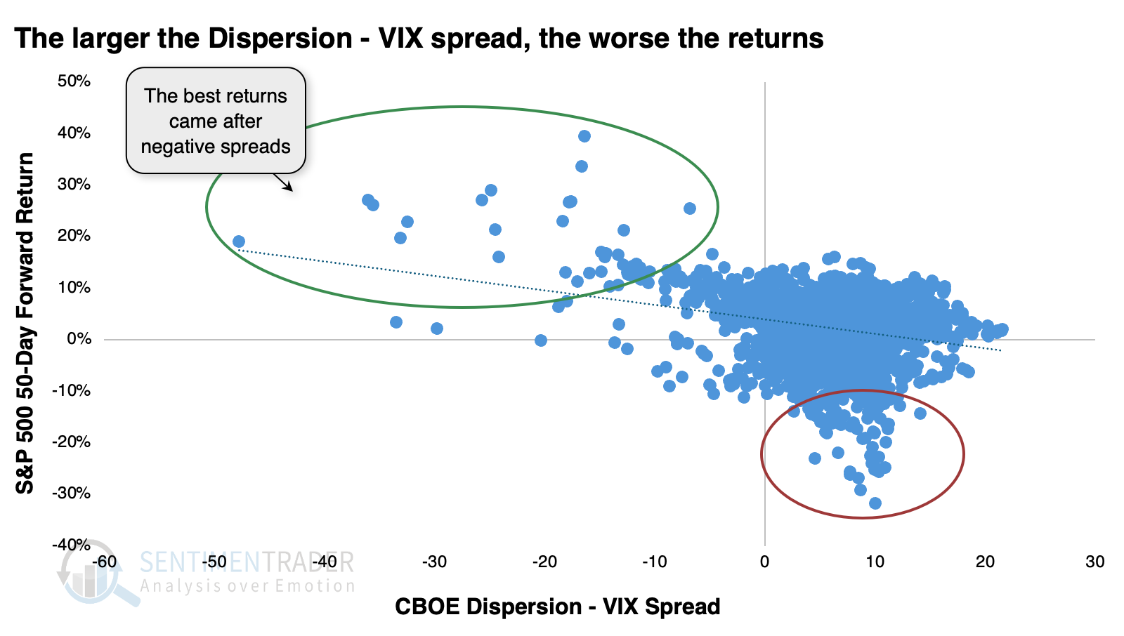
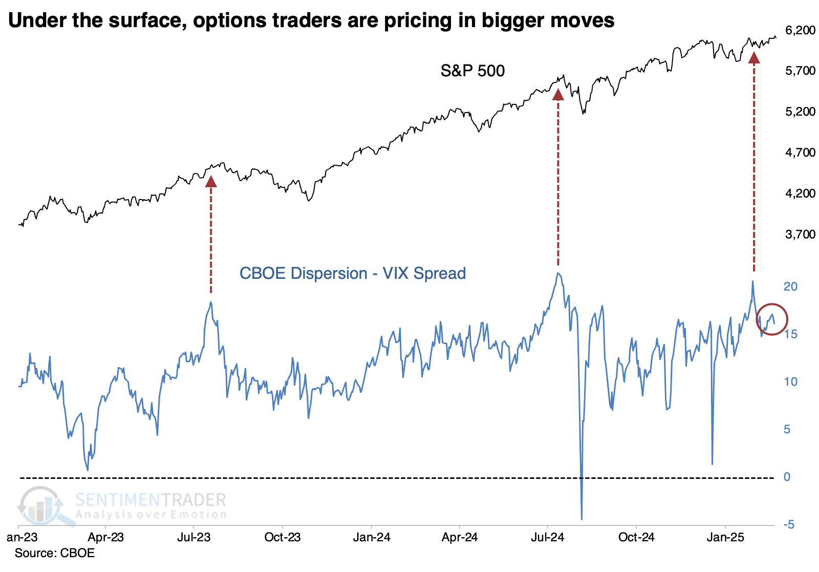
The spread between individual and index implied volatility has grown wider over the past few years as the trades have become more popular. So, a spread of +10 points is no longer the exception, it's the rule. Now, a spread of +20 or thereabouts has coincided with extremes, and the S&P has pulled back afterward. It has dipped in recent sessions but is still coming off a recent extreme.
 It's not a great shock that after spreads of +15 or more, the best-performing stocks tended to be in defensive groups. Utilities, staples, and health care were among the handful that managed positive returns.
Divergence warning
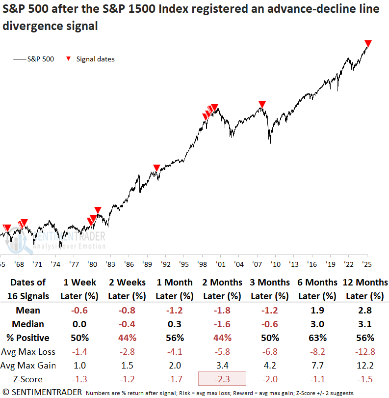
The advance-decline line for the S&P 1500 triggered a warning as the indicator failed to confirm new highs. Dean showed that comparable divergences suggest that stocks could struggle.
The advance-decline line is considered the granddaddy of market breadth indicators. It charts the cumulative sum of the daily difference between advancing and declining issues. When an index achieves a new high, it should be accompanied by a new high in the advance-decline line. If this confirmation is absent, technical analysts consider it a divergence.
The previous signal for the S&P 1500 version, which monitors small, mid, and large capitalization stocks, occurred in October 2007, providing a timely alert ahead of the GFC-driven bear market. Before that instance, a signal was generated in January 2000, preceding the Dotcom bust.
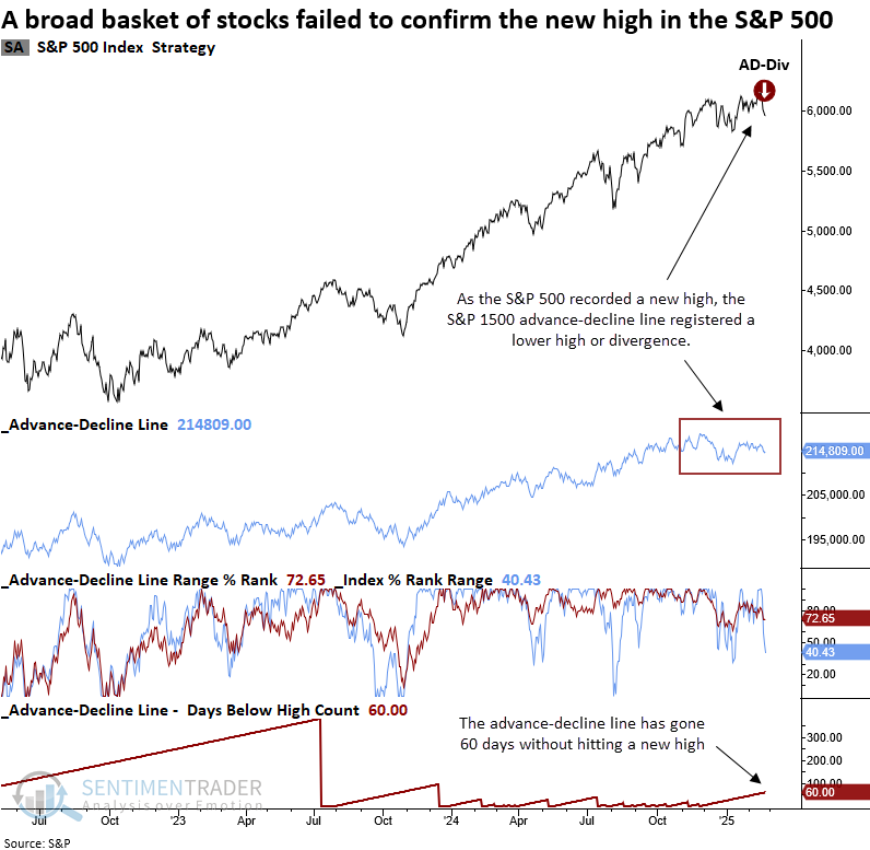
The divergence system functions in two stages. First, condition one is met if the index's two-year range rank reaches 100% as the advance-decline line rank remains below a user-defined threshold. Then, a signal is generated if, within 10 sessions, the index registers a 15-day low and the advance-decline line has not achieved a new high in at least 30 days.
Whenever the S&P 1500 index triggered an advance-decline line divergence signal, the world's most benchmarked index struggled over the following three months. The most pronounced weakness emerged at the two-month mark, where returns significantly trailed random performance.
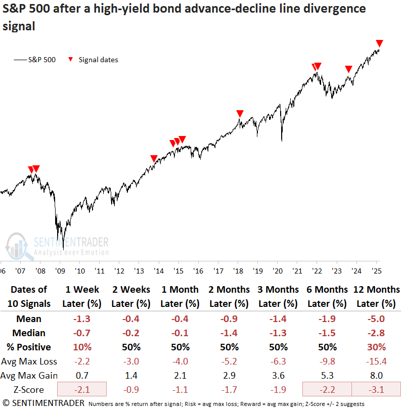
The advance-decline line divergence system for high-yield bonds also issued a cautionary signal, indicating that these economically sensitive corporate bonds, which correlate closely to equities, failed to validate the S&P 500's new high.
Like the equities version, this series can produce multiple signals before the market moves lower.
March madness
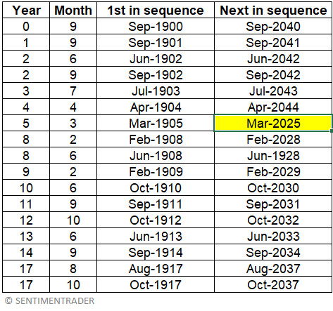
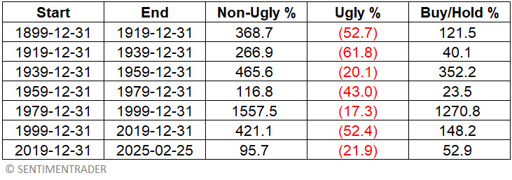
An analysis of stock market history every month across twenty-year cycles revealed 17 out of 240 months that exhibited consistently poor results. Jay noted that March 2025 is the next month in this sequence.
Jay wrote about the Ugly 17 months in 2021. The months in question occur on a 20-year cycle starting in 1900 and are shown below. Note that the next month in the sequence is March 2025.
The chart below displays the cumulative % performance for the Dow Jones Industrial Average if held long ONLY during this same sequence of 17 months every 20 years.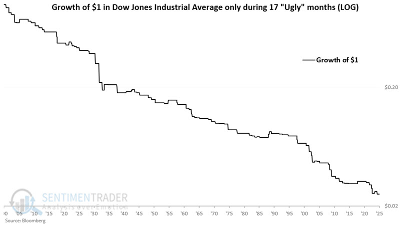
To fully appreciate the ugly nature of ugly months, note the summary of performance for the Dow Jones Industrial Average for each previous 20-year period in the table below. The last line in the table reflects performance from the end of 2019 through 2025-02-25.
 The chart below displays the cumulative % performance for the Dow Jones Industrial Average if held ONLY during Year 5, Month 3 every 20 years.
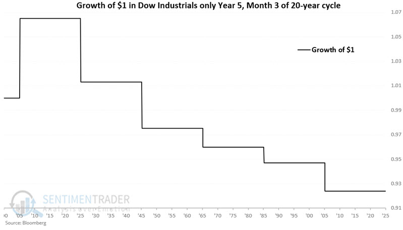
Cyclicals' participation problem
Less than half of the stocks in four cyclical sectors are trading above their 50-day moving average. Dean showed that similar breadth profiles suggest the S&P 500 could experience a lackluster outlook over a medium-term horizon.
Last Friday, 50% or fewer of stocks in the S&P 500 consumer discretionary, financials, industrials, and technology sectors closed above their 50-day averages, with the world's most benchmarked index only two days removed from an all-time high. This scenario has never occurred.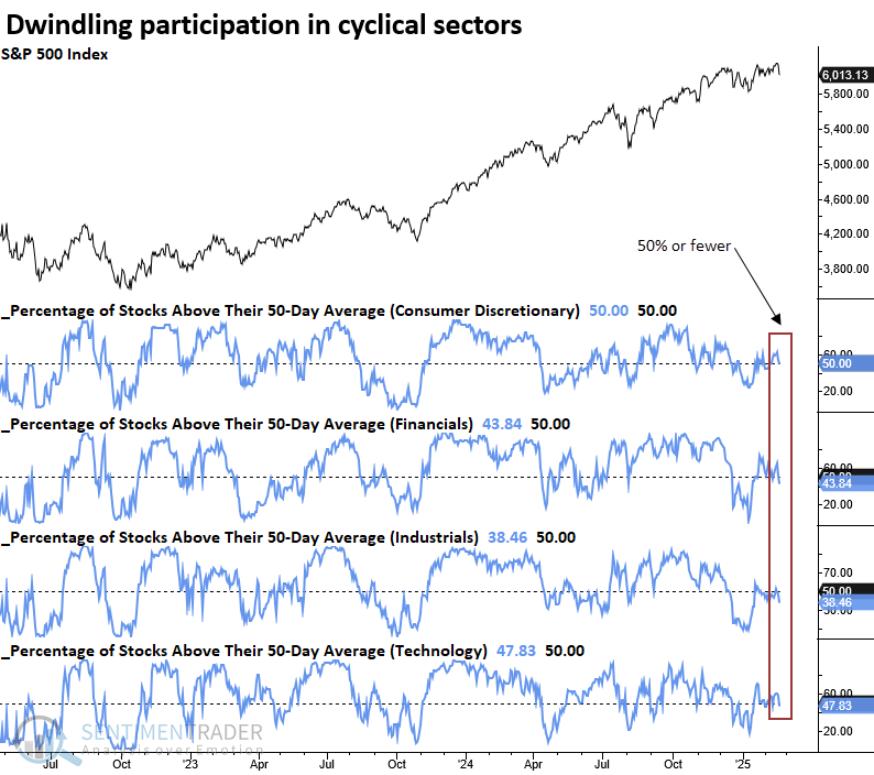
Whenever 60% or fewer of S&P 500 stocks in the consumer discretionary, financial, industrial, and technology sectors closed above their 50-day averages, the world's most benchmarked index displayed a lackluster outlook over the following six months. Several instances slightly preceded or coincided with significant market tops, with the most recent one occurring in December 2021.
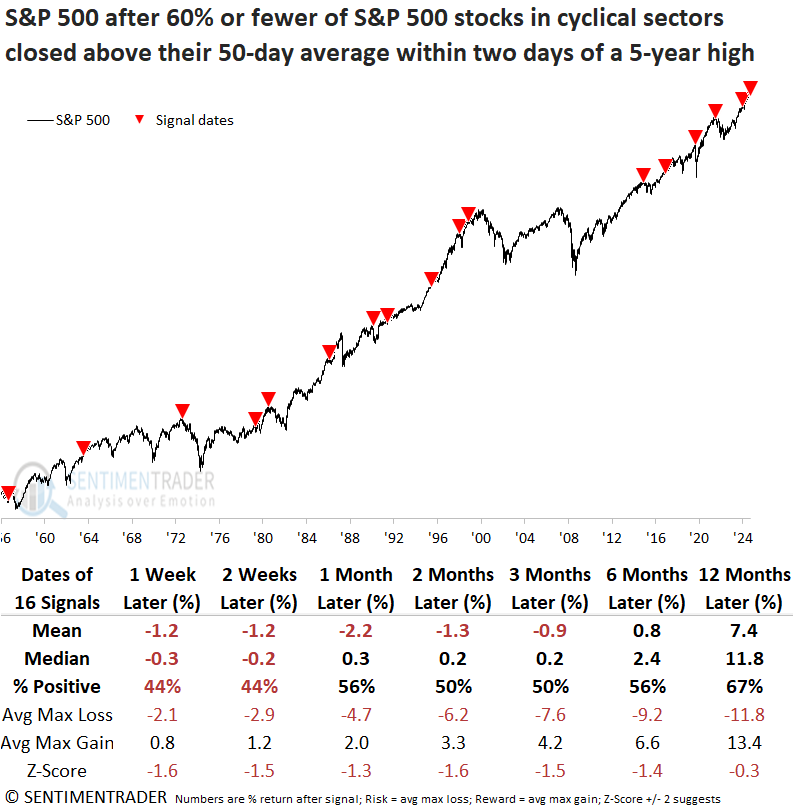
Over the sluggish six-month stretch, the S&P 500 experienced six maximum losses that surpassed -10%, occurring amid significant corrections and bear markets triggered by unfavorable macro conditions.
Two components of the Risk-Off Composite Model triggered alerts on Friday, reflecting weak stock participation for S&P 500 stocks. The chart below illustrates that breadth-based warnings have occurred more frequently over the past ten months. Since stock indexes have continued to rally, these participation warnings indicate internal churning or sector rotation.
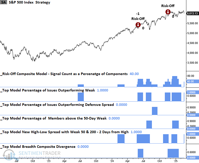
Dean showed several indicators he's keeping an eye on, including the Advance/Decline Line, High Low Logic Index, Market Environment, and Risk-On/Risk-Off Composite.
Insiders don't look very inspired
Another potential issue, as noted by Jay, is that insider activity is not favorable.
Jay generally rates overall corporate insider activity as "favorable" or "neutral" but rarely as outright "unfavorable" or bearish. In December 2024, the primary insider indicator had fallen into neutral territory.
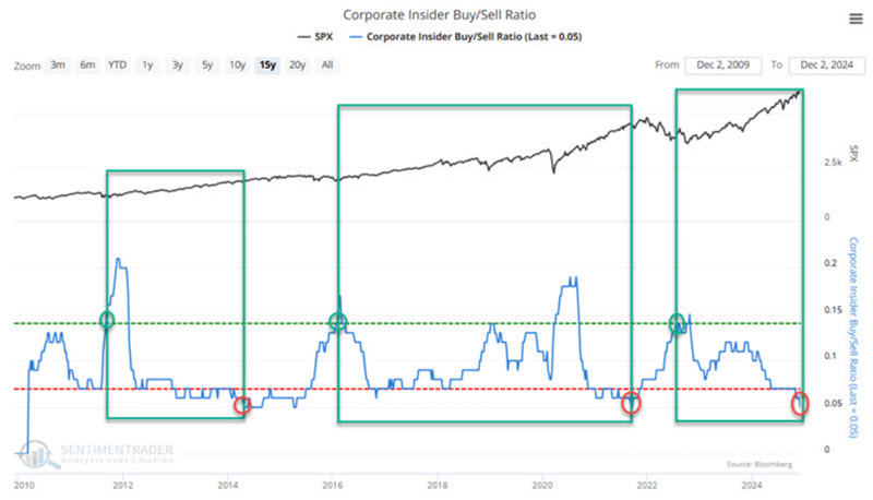
Interestingly, both insider buying and insider selling are at relatively low levels. Theoretically, the former is bad, and the latter is good. So again, the message is basically "neutral" (implying neither bullish nor bearish things specifically).
Our Corporate Insider Velocity indicator shows the velocity of corporate insider buying versus selling. It takes a 4-week rate of change for insider buys and subtracts a 4-week rate of change for insider sales.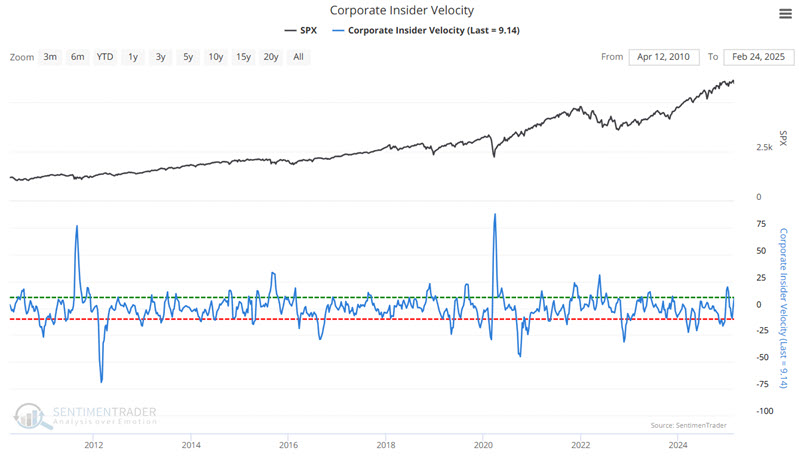
Generally speaking:
- Extremes in insider activity (high or low) have tended to be favorable for the underlying index or sector
- Extreme readings are often "early" and serve more as an "alert" than as actual trading signals
- Reversals from extremes are often an excellent time to consider entering a position
- Lastly, signals from this indicator are generally best used in conjunction with other information and not as a standalone trading model
Jay further discussed what insiders are doing in the health care, technology, discretionary, and consumer staples sectors.
Russell reversal
After reaching a two-year high, the Russell 2000 closed at a five-month low but not a 12-month low. Dean noted that similar breakdowns led to near-term downside follow-through and muted long-term prospects.
After reaching a multi-year high, the Russell 2000's breakout proved short-lived as the index reversed lower, closing at a five-month low while avoiding a 12-month low. This price action aligns with a base breakdown pattern, which some technical analysts may interpret as a failed breakout.
The previous instance occurred in January 2022, a less-than-ideal time to hold stocks across any market capitalization.
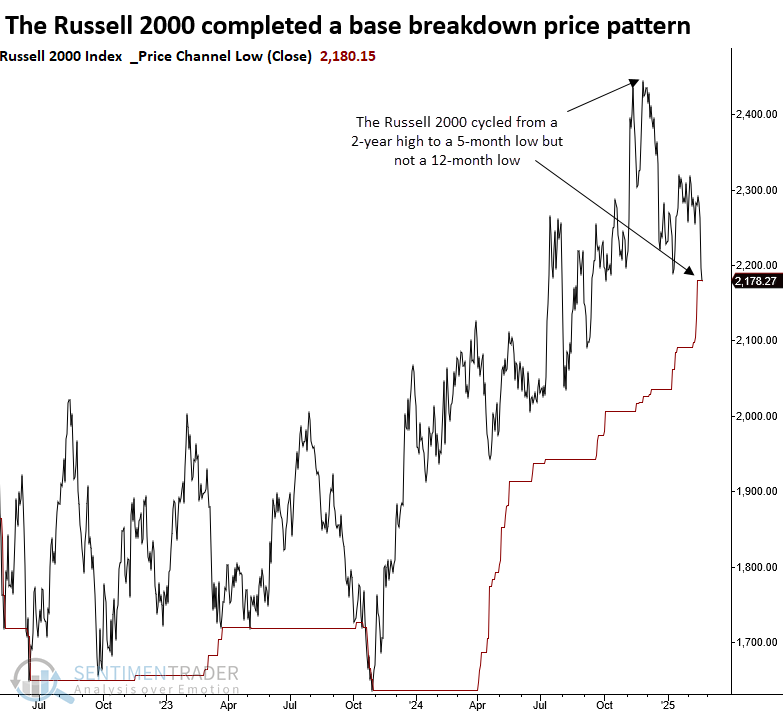
Whenever the Russell 2000 closed at a 5-month low, but not a 12-month low, and it was the first instance following a 2-year high, the small-cap index tended to see downside follow-through over the next few weeks. Although the outlook improved over medium and long-term horizons, it was uninspiring. Risk exceeded reward across all time horizons except for the 12-month window, which only managed a slight positive skew.
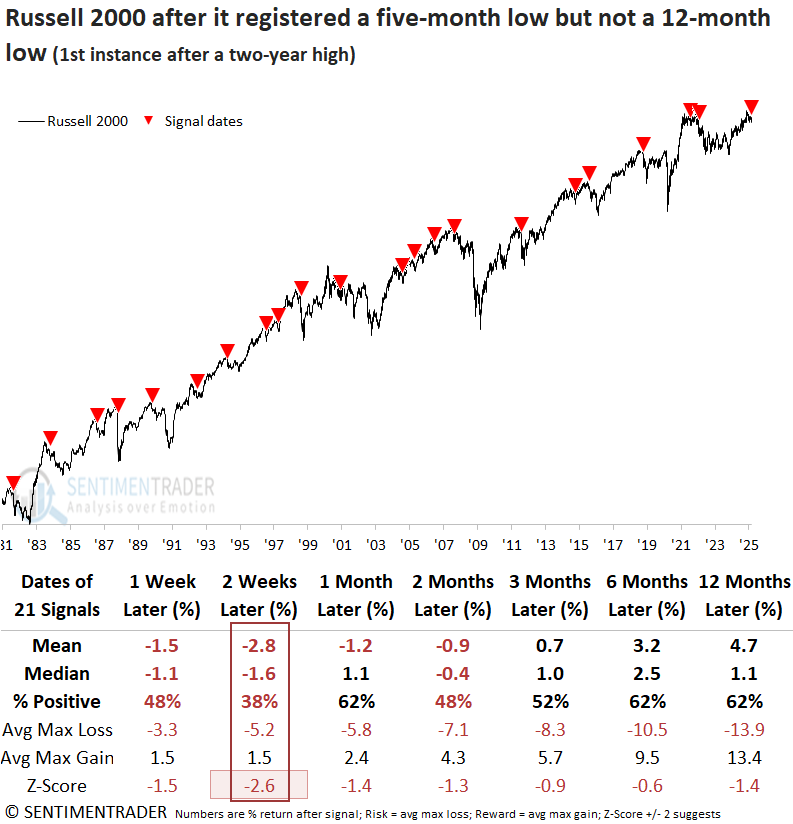
Nearly half of the historical cases experienced a maximum loss exceeding 10% within the first six months, emphasizing the need for prudent risk management.
If the signals are applied to the S&P 500, it's clear that whatever affected small-cap stocks also created issues for large-caps, as the world's most benchmarked index struggled in initial weeks and posted rather uninspiring returns over a longer horizon.
Treasury seasonality
Within the calendar year, long-term treasury bonds have displayed a surprisingly consistent amount of cyclicality. Jay showed that on a trading basis, ticker TLT is entering a favorable period.
The chart below displays the annual seasonal trend for TLT. As always, this line is backward-looking and represents an average of past years. It should not be assumed to be a roadmap for what will happen in any given year.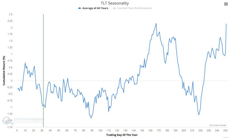
Next, let's combine all of the favorable and unfavorable periods.
For this test, we will assume that we hold ticker TLT every year only during favorable seasonal periods. The chart below displays the hypothetical growth of $1 using this approach. From 2006-06-22 through 2025-02-18, $1 grew 648% to $7.48. The bad news is that this equity curve is 17% off its peak established in 2020.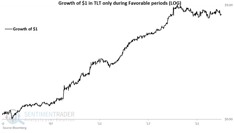
Next, let's combine all of the unfavorable periods. The chart below displays the hypothetical growth of $1 using this approach. From 2006-06-22 through 2025-02-18, $1 shrank a stunning 86% to just $0.14. While TLT performance has been subpar since 2020 during favorable seasonal periods (-14%), results during unfavorable seasonal periods have been disastrous (-39%).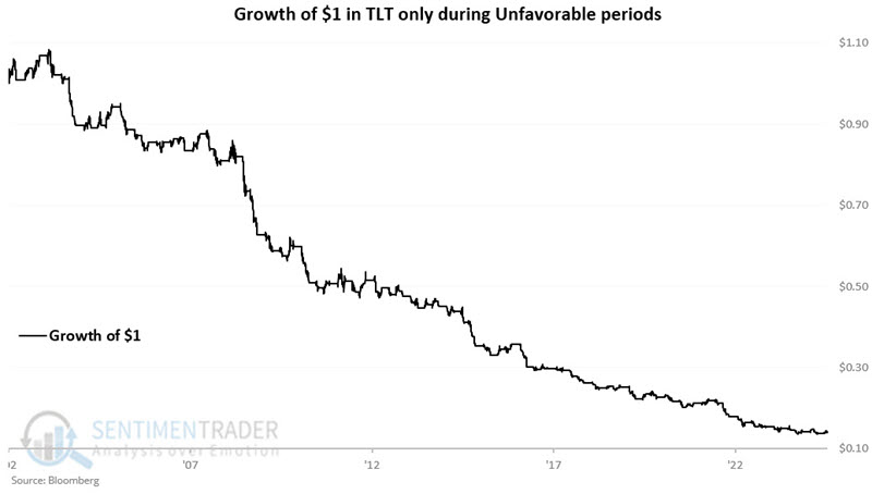
The table below displays the hypothetical annual results for holding TLT during favorable versus unfavorable periods and for a buy-and-hold approach.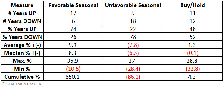
The table below displays the dates for each favorable and unfavorable period for 2025. Note that TLT entered a favorable period at the close on 2025-02-21, which will extend through the close on 2025-04-01.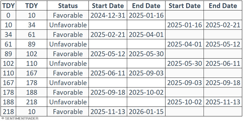
More Treasury cycles
Jay further elaborated on some cycles in Treasuries.
The table below displays an Election Cycle Month calendar for long-term treasuries. The months showing "T-Bonds" in the table are considered favorable ECM (Election Cycle Month). All other months are considered unfavorable. For example, as 2025 is a post-election year, the months of May, June, August, October, and November are deemed "favorable." All other months are deemed "unfavorable."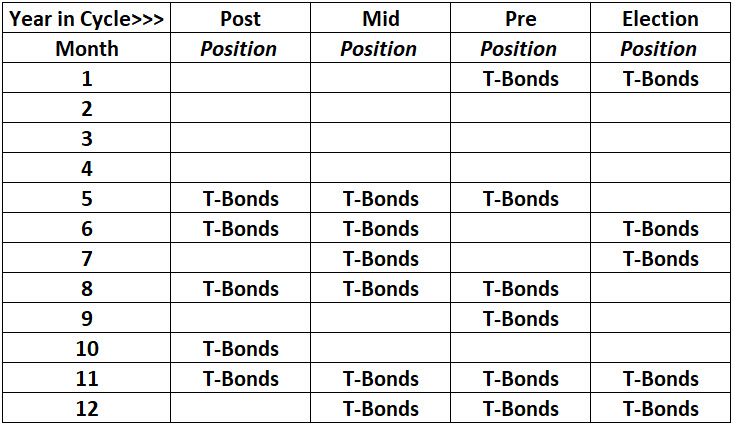
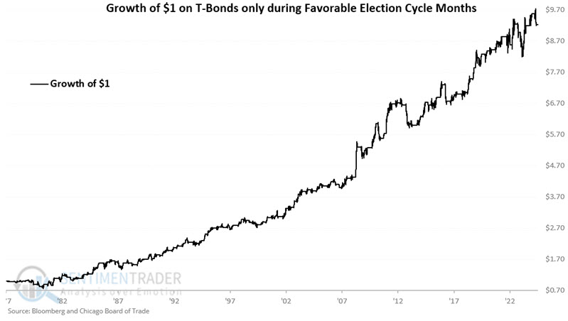
The chart below displays the hypothetical growth of $1 held in THIRTY only during Favorable ECMs since 1977. An initial $1 grew 824% to $9.24.
The chart below displays the hypothetical growth of $1 held in THIRTY only during Unfavorable ECMs since 1977. An initial $1 declined -85% to $0.15.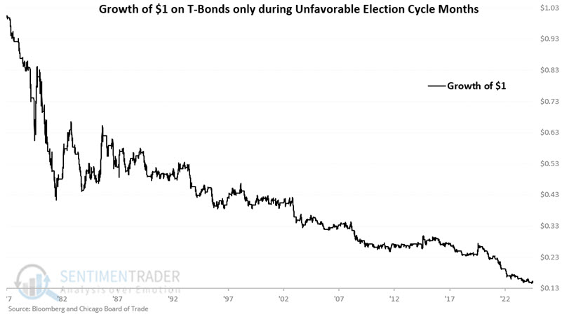
The following trading days of the months (TDM) are deemed "Favorable" for t-bonds:
- Trading Day of Month #10
- Trading Day of Month #11
- Trading Day of Month #12
- The last five trading days of the month
For each month, the trading days listed above = 1. For all other days of the month = 0.
On any given day, ECM and TDM can be favorable or unfavorable, or one could be favorable while the other is unfavorable. For our purposes, we will create an indicator called ECMTDM, which combines these two seasonal factors.
Jay showed a table outlining the total value for each day of 2025. March and April are mostly 0 or 1. The chart below displays the hypothetical growth of $1 held in THIRTY only when both ECM and TDM are unfavorable since 1977. An initial $1 declined 91% to $0.09.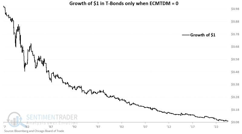
Gold's "easy" rally
We've recently looked at the historically "easy" rallies in the S&P 500 and the German DAX over the past year. It's been an even better one for gold.
Using the same calculation for the Sharpe ratio, gold's performance just entered the top 1% of all days since 1975.
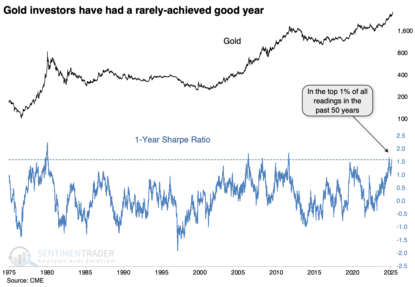
During the first exponential rally since gold started trading freely, the current level of Sharpe ratio preceded a pullback and consolidation. The other three distinct times the Sharpe ratio exceeded 1.6 occurred between 2006 - 2011. Each time the ratio peaked, it preceded a substantial correction, as did the instance in late 2009 that barely missed the threshold level.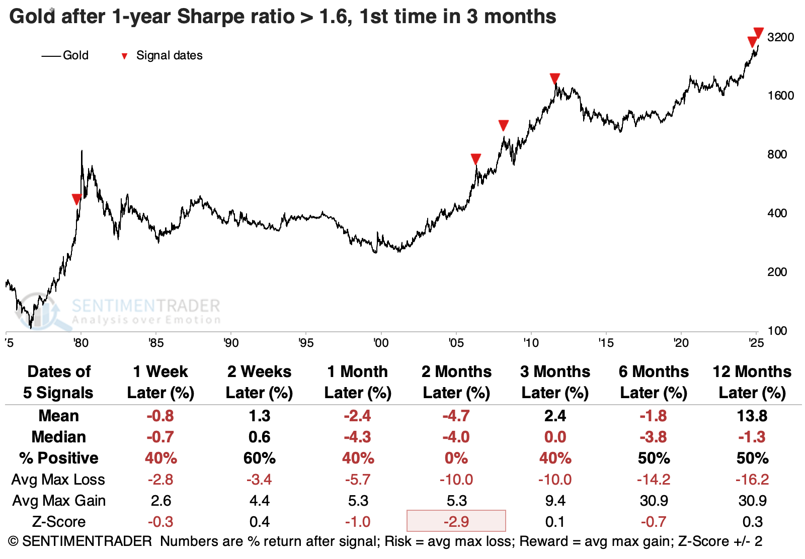
The major stock indices showed short-term weakness after gold's Sharpe ratio reached its current level, and their overall returns going forward weren't especially impressive. The dollar did okay and commodities did not. Among factors, defensive stocks held up the best. They enjoyed a 100% win rate two and three months later, and returns were consistently among the best of any factor.
Other notable aspects of gold's rally include that a fifth of all trading days over the past year have seen the metal close at a new high. This ranks among the very best periods in 50 years, and the three comparable periods saw years of digestion.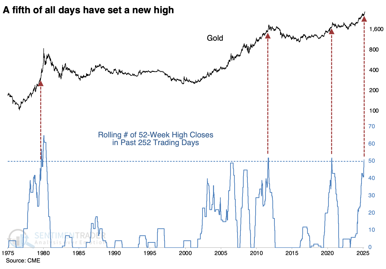
Traders seem to be jumping on board. Over the past five sessions, an average of more than $800 million per day has flowed into GLD, the largest inflow since inception. Speculators in gold futures are holding a near-record number of net long contracts as a percentage of open interest. And seasonally, gold has tended to form at least a short-term peak right around now and generally didn't make much progress over the next four months.
Bitcoin breakdown
The RSI for Bitcoin shifted to an unfavorable position, triggering a sell signal for the cryptocurrency. Dean noted that when the RSI maintains a bear regime status, returns for Bitcoin significantly underperform bull regime periods.
The system utilizes the Relative Strength Index (RSI) to identify bullish or bearish momentum regimes. A buy signal occurs when the RSI increases above 68. This bullish status will persist until the RSI dips below 37, at which point the model shifts to a bear regime. On Tuesday, the model shifted to a bear regime. Although annualized returns remain positive in bear regimes, they lag significantly behind those of bull regimes, as depicted in the chart below.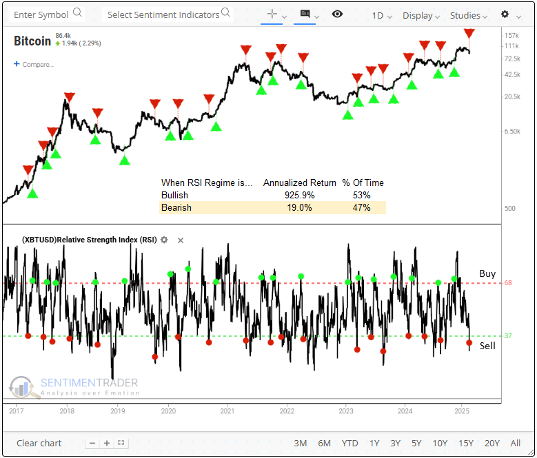
The RSI system has generated 29 bull regime signals with a 72% success rate, achieving an average gain of 176% per win, while losses averaged -12.5%. However, when the signal parameters are reversed to reflect a bear regime, the system produced a 62% win rate. Furthermore, the average gains and losses were nearly identical, suggesting that buying oversold RSI conditions lacked a favorable risk/reward profile.
Bitcoin reversed from a 1-year high, undercutting a 3-month low but not achieving a 4-month low, a price pattern known as a base or consolidation breakdown.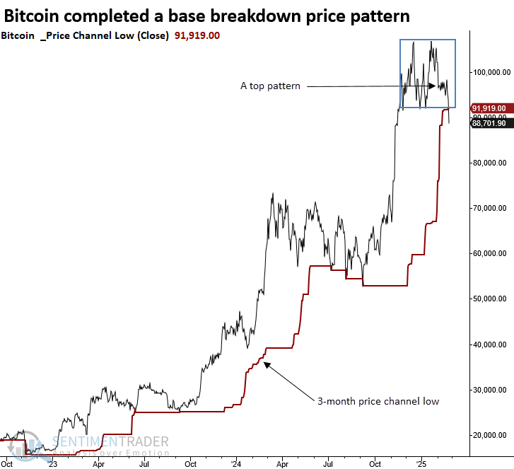
Bitcoin has historically struggled in the three months following similar top formations. While the six- and twelve-month win rates resembled a coin toss, Bitcoin displayed negative returns at some point within the next year in all but one instance, 2013. 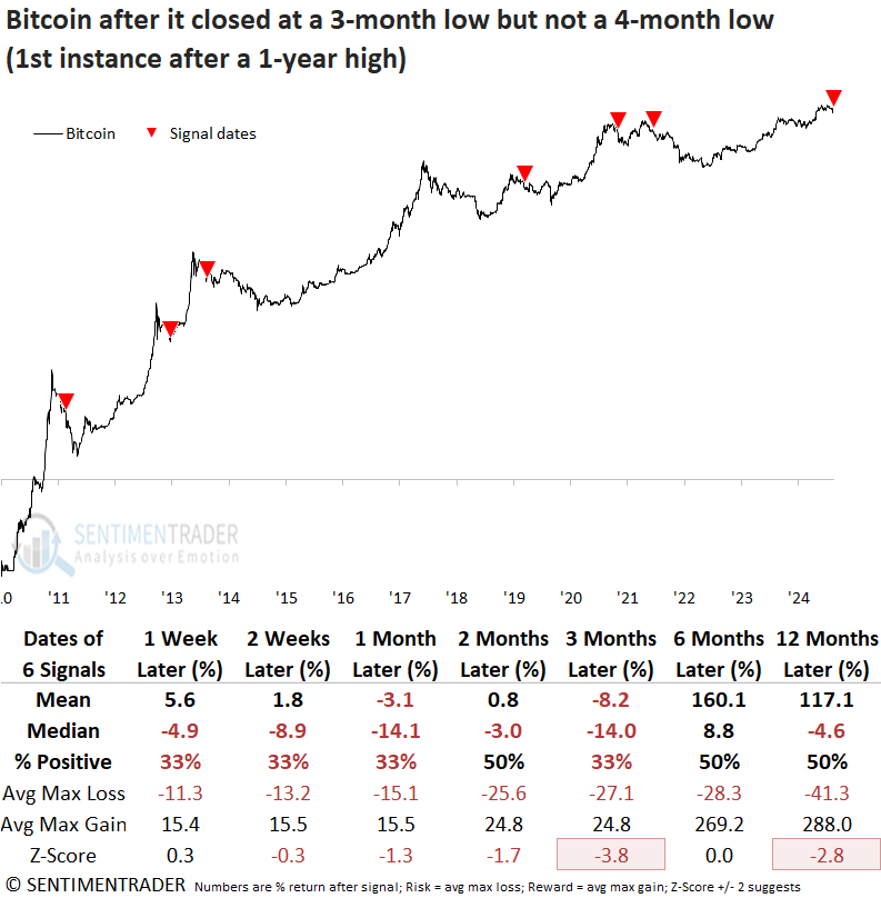
The Crypto Fear and Greed Index from Alternative.me indicates extreme fear, reaching its lowest reading since 2022. Whenever the Crypto Fear and Greed Index cycled from above 50% to below 15%, the outlook for Bitcoin was negative across all time frames except the one-month horizon.
Trading success often depends on having the confidence to take decisive action. When sentiment turns pessimistic in this asset class, hesitation keeps traders on the sidelines, most likely due to the extreme volatility.
About TradingEdge Weekly...
The goal of TradingEdge Weekly is to summarize some of the research published to SentimenTrader over the past week. Sometimes there is a lot to digest, and this summary highlights the highest conviction or most compelling ideas we discussed. This is NOT the published research; rather, it pulls out some of the most relevant parts. It includes links to the published research for convenience, and if you don't subscribe to those products, it will present the options for access.