
TradingEdge Weekly for Feb 21 - Manufacturing inflation, Valentine's Day gift, the S&P is losing its crown

Key points:
- Stocks have done well through Valentine's Day, a good sign for the rest of the year
- Manufacturers reported paying higher prices, a positive sign of relation for stocks
- Gold has done even better, pushing the S&P 500 / Gold ratio close to a one-year low
- Mexican stocks have enjoyed a breadth thrust
- So have German stocks, with the DAX pushing its historical momentum boundaries
- Regional banks tend to have a seasonal bias
- One indicator is flashing caution for metals
- Sugar is facing seasonal headwinds
A sweetheart gift for stocks
The stock market celebrated Valentine's Day by closing the day with a 4% year-to-date gain for the S&P 500 Index. Jay showed that gains of 3% or more by Valentine's Day have historically been a favorable sign for the rest of the year.
The chart below displays the hypothetical growth of $1 invested in the S&P 500 post-Valentine's Day through the end of the year, only during those years when the S&P 500 was up by 3% or more by Valentine's Day. A hypothetical initial $1 grew to $55.00.
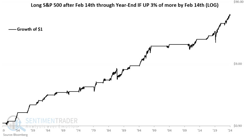
The table below summarizes performance. Note the high win rate and exceptionally positive skew in large wins versus large declines.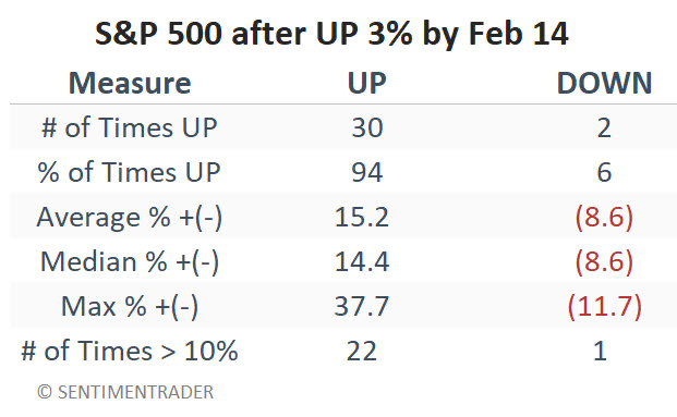
For comparison, the chart below displays the hypothetical growth of $1 invested in the S&P 500 post-Valentine's Day through the end of the year, only during those years when the S&P 500 was not up by 3% or more by Valentine's Day. A hypothetical initial $1 grew to only $2.78
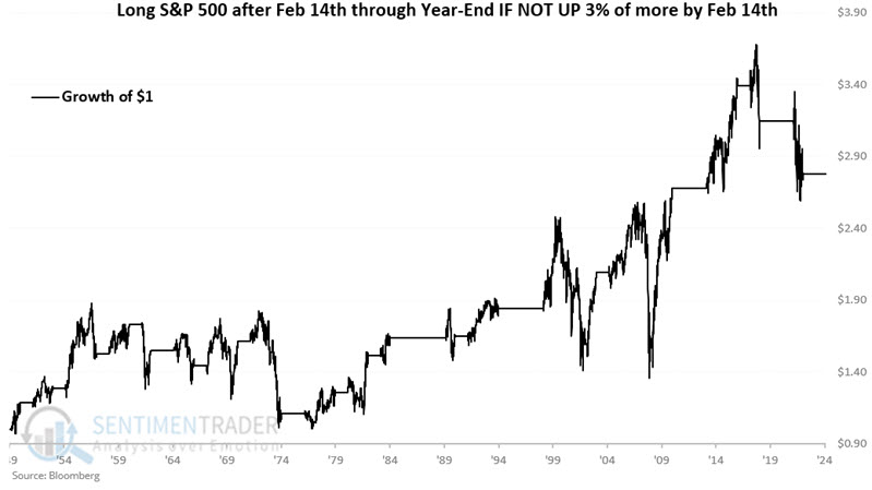
During these years, the S&P rallied during the rest of the year 60% of the time, with an average gain just barely larger than the average loss.
Manufacturing inflation
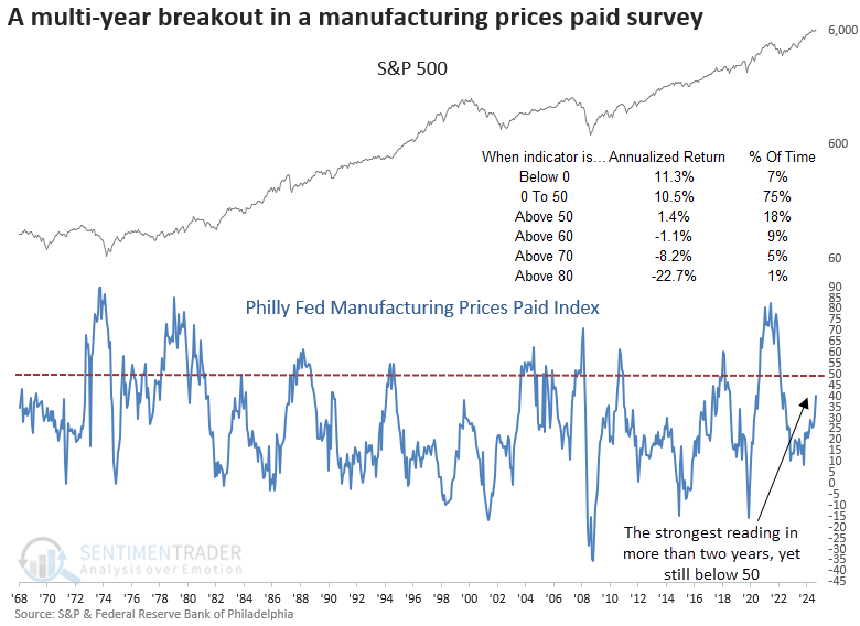
The Philly Fed prices paid index increased to the highest level in over two years. Dean showed that similar breakouts in a survey for manufacturing prices paid preceded a bullish outlook for stocks.
The Federal Reserve Bank of Philadelphia released its manufacturing survey this week. Although the overall measure edged down, the prices paid component surged by 9 points, surpassing the highest level in over two years. However, it remained below a reading of 50, a critical piece of context.
History indicates this fear is unwarranted for now, as S&P 500 returns slow considerably once surpassing 50 and turn negative beyond 60.
Signal dates were adjusted to align with the third Thursday of the month, coinciding with the data release. Although not a primary stock market signal, survey-based economic data can serve as a historical reference, offering valuable insight into the business cycle and its influence on stock prices.
A breakout in the Philly Fed prices paid manufacturing index, coinciding with the S&P 500 trading near its all-time high, produced excellent returns and consistency for the world's most benchmarked index over the subsequent year, suggesting a reflationary tailwind that supported, rather than hindered, stocks.
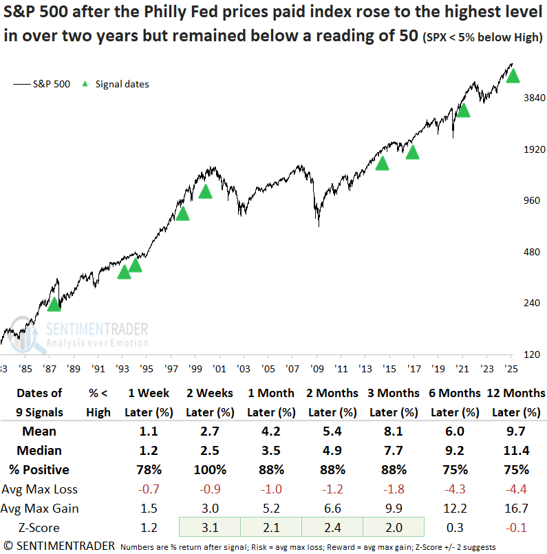
Over the subsequent twelve months, the S&P 500 experienced only one maximum loss that surpassed -10%, an anomaly associated with the 1987 crash.
The Technology sector was the clear winner following a breakout in the prices paid index, gaining 88% of the time over the next year with a median return of 24%. There was no substantial rally in commodities or gold, and the 10-year Treasury yield mostly trended lower. The small-cap Russell 2000 showed robust short- and medium-term performance, but consistency was a coin toss over the subsequent year.
The S&P has done well, but gold has done better
As well as stocks have done lately, gold has done just as well, or better. Because the S&P 500 hasn't quite kept up to gold's gains, the ratio between the two has steadily declined and came within a hair's breadth of hitting a 52-week low.
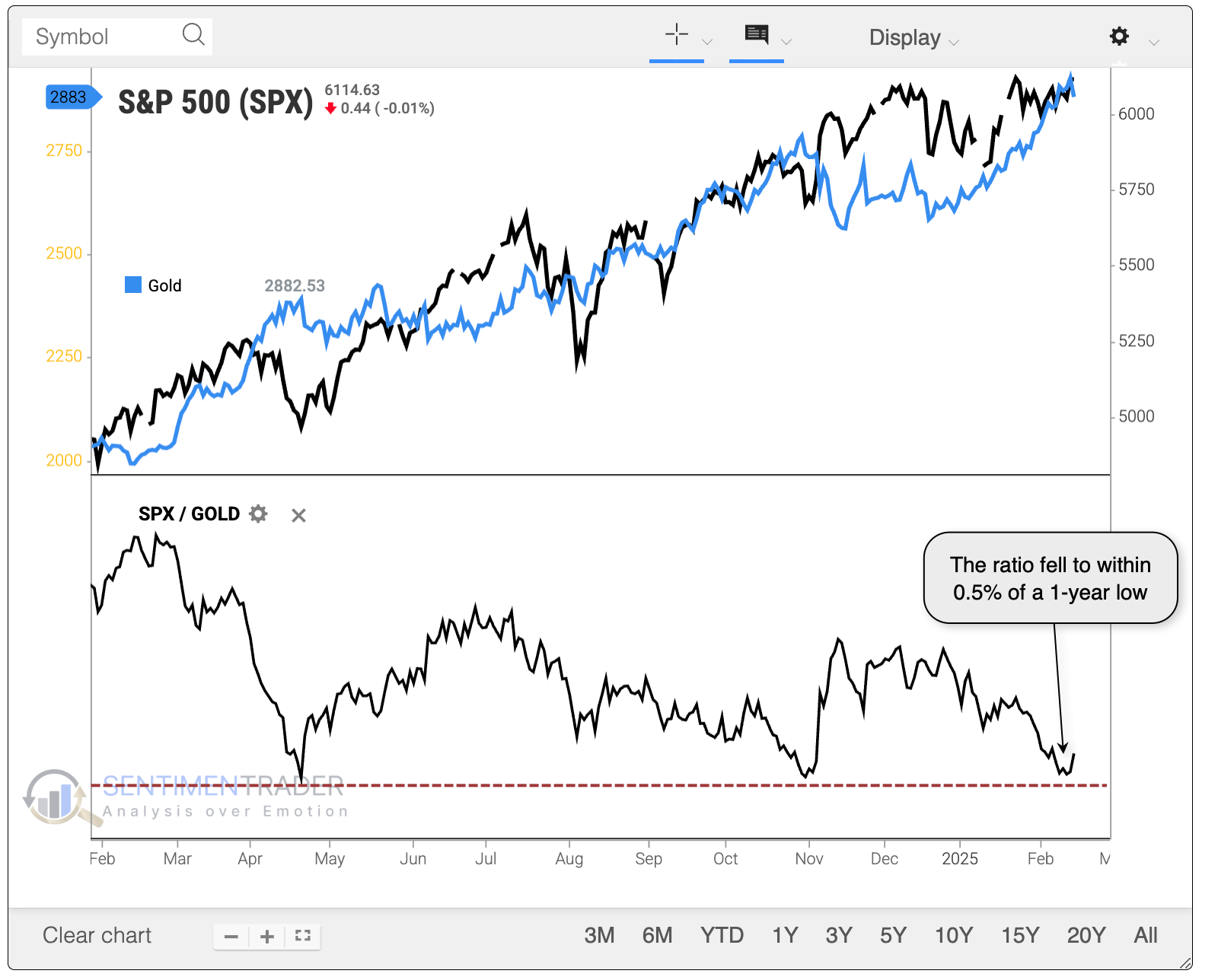
Typically, gold shines brighter than stocks because there is some flight to safety. Investors get nervous about a drop in stocks and flee to what is sometimes considered a safe haven in gold. Clearly, that isn't the case now because both assets are within 10% of their highs.
The table below filters the instances to only include those signals when both were within that threshold. Stocks tended to snap back more in the shorter term, but gold did better in the longer term. Of the twelve signals, only one showed a substantial gain in the S&P relative to gold over the next year.
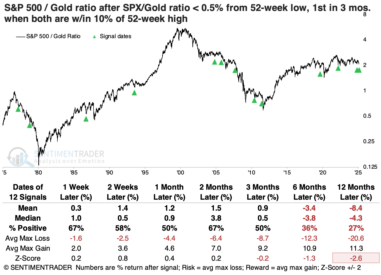
The S&P 500's absolute returns were pretty good in the weeks ahead, with only one substantial loss in the following month. After that, its returns were below average, with only one double-digit rally six months later.
Gold tended to see profit-taking behavior in the weeks and months following these signals. But over the next 6-12 months, its returns were quite good, with the 2022 signal being the only one with losses over both of those time frames.
Among other factors, small-cap stocks enjoyed the largest median returns following these declines in the S&P 500 to gold ratio. While they didn't enjoy the most significant returns, value stocks were the most consistently positive.
Stocks south of the border head north
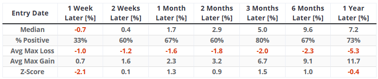
The percentage of MEXBOL Index stocks above their 50-day average cycled from below 20% to above 90%. Dean noted that similar thrusts produced an 80%-win rate for the benchmark Mexico index over the following three months.
This recovery in medium-term trends for bellwether Mexican stocks is particularly noteworthy, given the backdrop of trade tariffs, which are generally viewed as a negative by market participants. Typically, when markets or indicators surge despite unfavorable news, it indicates that investors are looking beyond the immediate risks and positioning for potential upside.
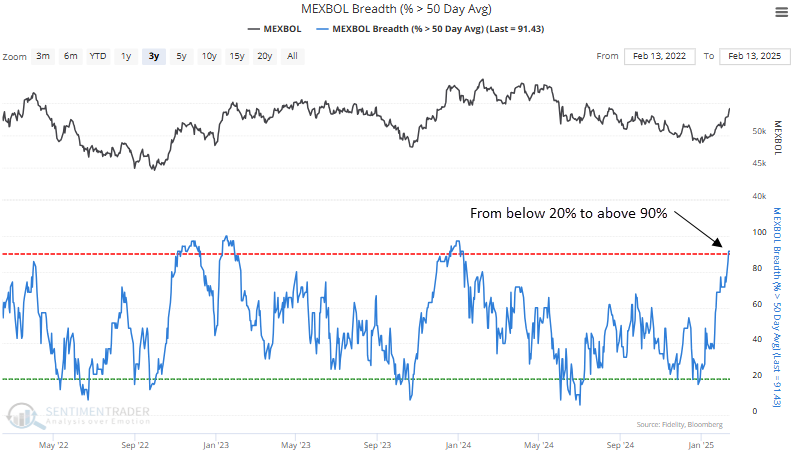
The MEXBOL Index holds the second-highest number of stocks exceeding their medium-term average among major global indices.
Dean analyzed when the percentage of MEXBOL Index stocks above their 50-day average cycled from below 20% to above 90%. The findings include a chart with green arrows marking the signal dates, offering a clear visual representation of historical events.
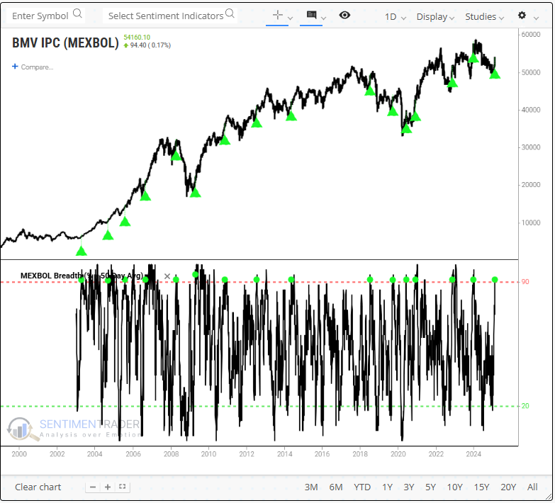
Running an optimization to identify the ideal holding period for the MEXBOL Index, the test returned 59 days. In this case, 13 of the 16 instances were profitable, resulting in a win rate of 81%.
An analysis of prior occurrences over multiple time horizons reveals that the MEXBOL index is likely to pull back in the first week, which is a typical response after thrust signals. However, in the subsequent three months, the index has experienced a rally 80% of the time.
German stocks have been on a tear, too
German stocks have been among the world's hottest for weeks. Investors haven't much cared despite what seems like political discord and economic turmoil.
The benchmark DAX index has been nearly unstoppable, rising more than 18% above its long-term 200-day moving average. The only other times in the past 20 years it has done this and hit a record high at the same time were in 2007 and 2015.
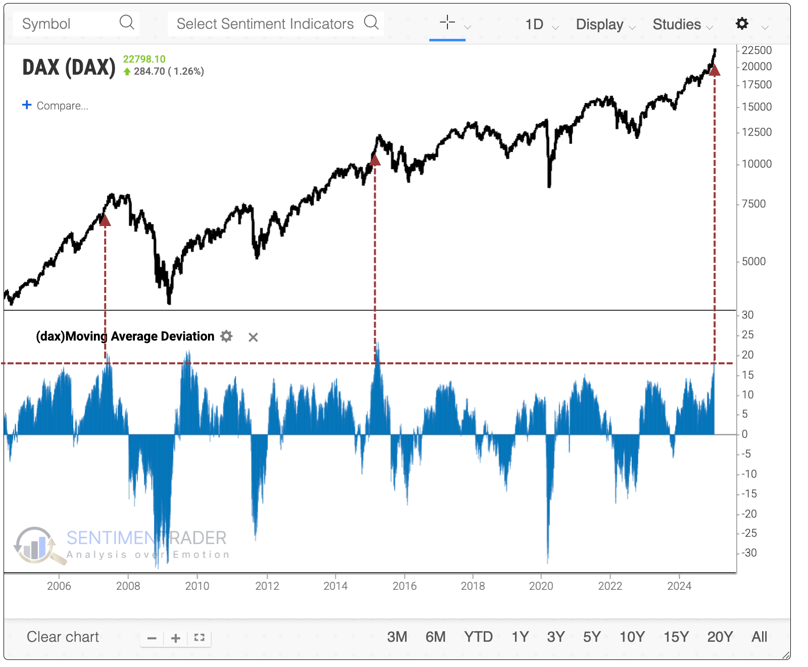
The good news for those optimistic about the DAX's prospects is that the last two instances were among the worst of the bunch.
Another sign of momentum used by many technicians is the Relative Strength Index (RSI) and that indicator hasn't dipped below 45 for months. Other times it was pinned above 45 for at least three months and at a new high, these signals mostly coincided with blow-off peaks.
When we combine both studies and look for periods of sustained high RSI readings with the DAX at least 15% above its 200-day average and at a record high, it rarely saw further sustained gains. The last three signals were especially poor for its forward returns.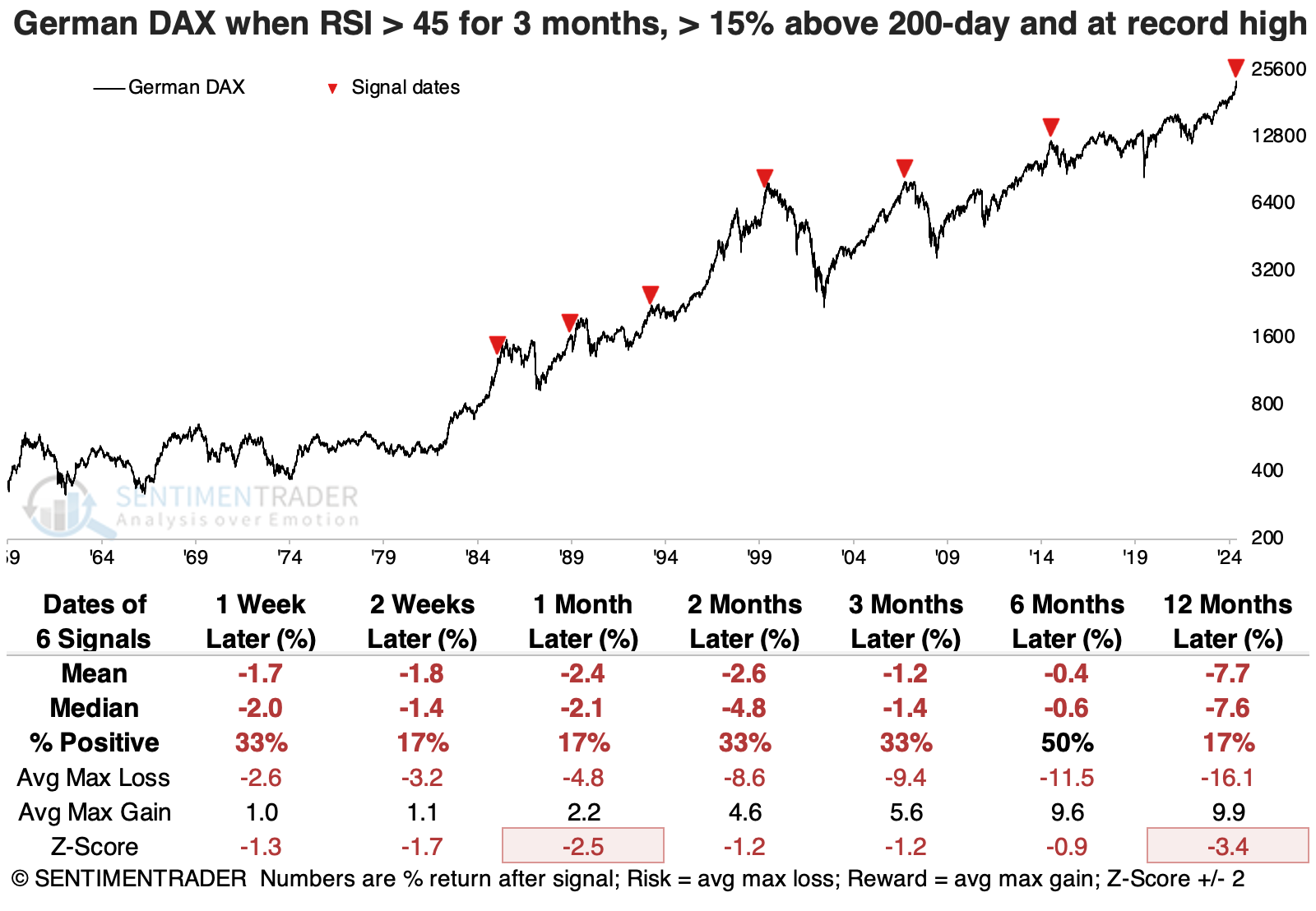
A couple of weeks ago, we looked at the S&P 500's Sharpe ratio, which showed how "easy" investors have had it over the past year. It's been just as much of a nice ride on the DAX, which is approaching the S&P's level on the Sharpe ratio.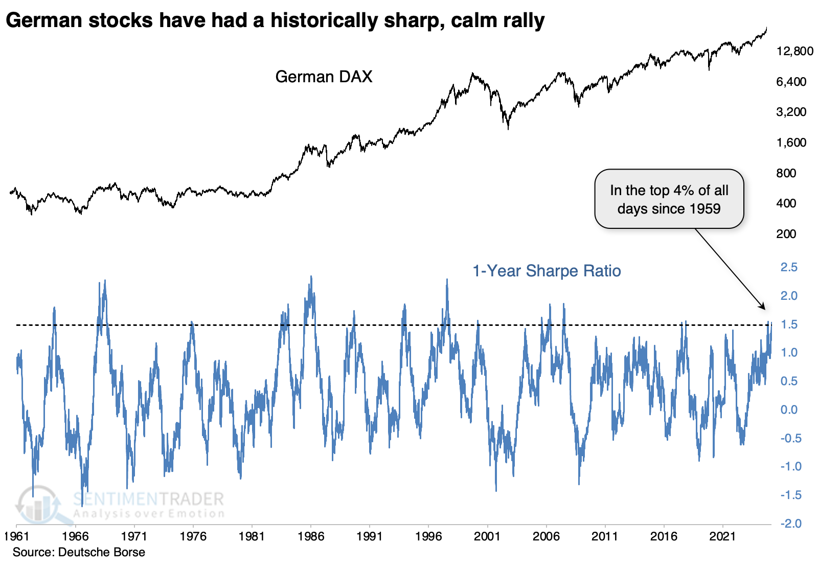
After the DAX broke out of a multi-decade malaise in the early 1980s, these signals indicated a rush of buying interest that was not easily quelled. But all the signals since 1999 have been losers over the following month, with most of those lingering for months after.
We don't like to make too much out of divergences, but it's at least worth noting that internal momentum among stocks in the DAX appears to be waning according to some measures.
The McClellan Oscillator has been making lower highs for the past six months as the DAX rises, which has translated into fewer and fewer stocks holding above their 200-day moving averages. Each time the DAX has powered higher while fewer stocks hold above their 200-day averages, the index has suffered a pullback lasting weeks to months, until it reached an oversold reading with fewer than 25% of stocks maintaining their 200-day average.
Bank seasonality
Jay took an in-depth look at the annual seasonal trend for the SPDR S&P Regional Banking ETF (ticker KRE). The results are compelling...with the standard disclaimer that real-world trading is different than hypothetical backtesting.
The chart below displays the annual seasonal trend for ticker KRE, which tracks an index of regional banks.
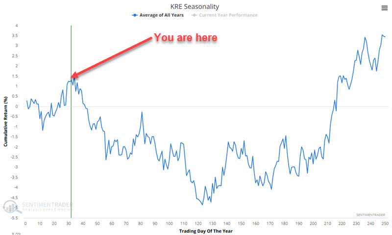
Jay then broke the chart above into "favorable" and "unfavorable" seasonal periods.
Now, let's combine all of the favorable periods. For this test, we will assume that we hold ticker KRE every year only during favorable seasonal periods. The chart below displays the hypothetical growth of $1 using this approach. From 2006-06-22 through 2025-02-18, $1 grew to $27.03.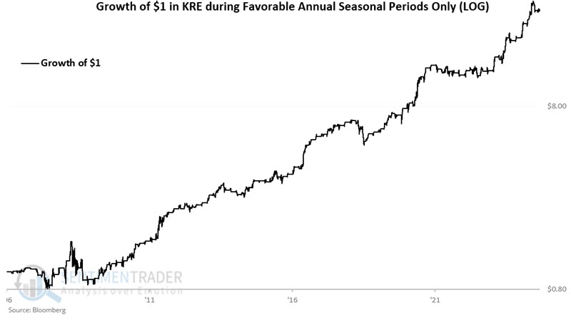
Next, let's combine all of the unfavorable periods. The chart below displays the hypothetical growth of $1 using this approach. From 2006-06-22 through 2025-02-18, $1 shrank a shocking 95% to just $0.05.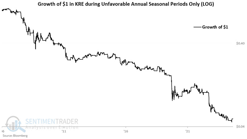
The table below displays the hypothetical annual results for holding KRE during favorable versus unfavorable periods and for a buy-and-hold approach.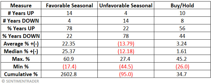
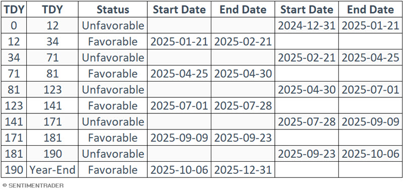
For a trader interested in tracking the above, the table below displays the seasonal calendar for KRE for 2025. Note that the next status change will occur at the close of 2025-02-21 when the status changes from Favorable to Unfavorable. It will remain Unfavorable through the close on 2025-04-25.
Metals warning
The metals markets have performed well so far in 2025. But Jay showed that the Platinum Optix has recently flashed a warning signal that suggests that the sledding may get more difficult in the months ahead.
In a note dated 2024-12-30, Jay discussed the potential for strength in the metals markets early in 2025. So far, so good.
One potential warning sign for metals is below. The chart below highlights with a red dot each time the 50-day average for Platinum Optix crossed above 50 while platinum futures exceeded their 150-day moving average.
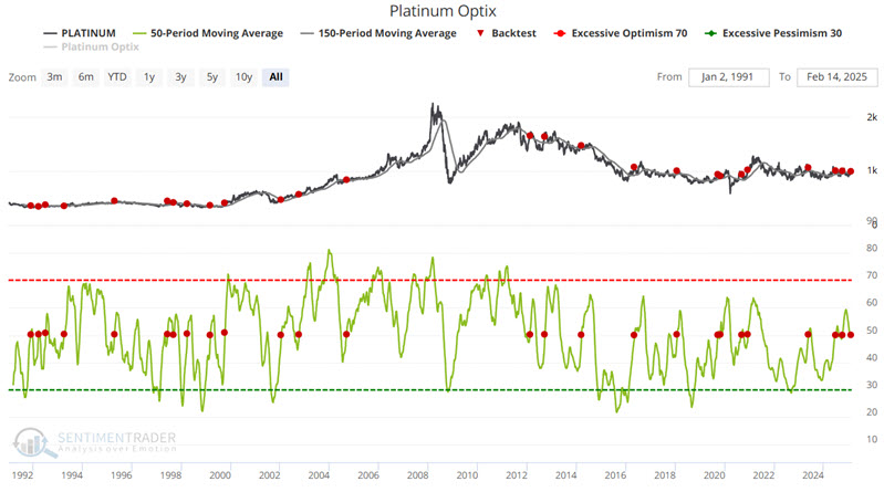
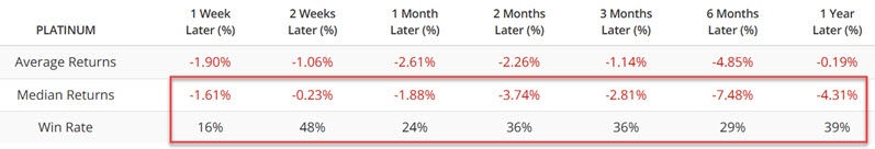
Some might conclude that platinum will flounder in the year ahead from the table above. However, platinum continued to perform very well in 1993, 1999, 2002, and 2004. Hence, we refer to the latest signal from the Optix indicator as a "warning" and NOT an outright "Sell" signal.
It is also worth noting that the "Most Platinum Time of the Year" is winding down.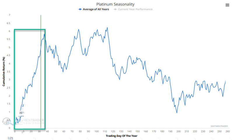
Jay further looked at the implications of these sentiment readings for gold, silver, copper, and palladium.
Sugar isn't so sweet
After successfully testing a multi-year low, sugar has recently rebounded strongly. However, Jay shows that history suggests that traders be very cautious.
In terms of pure trend, the long side of sugar appears like the place to be as it is hard to argue a bearish case for sugar. But it may be a good time to pay close attention.
Sugar has a long history of being a very cyclical market. The chart below shows the annual seasonal trend for sugar futures. As highlighted in red, this market is entering what is generally the weakest time of year.
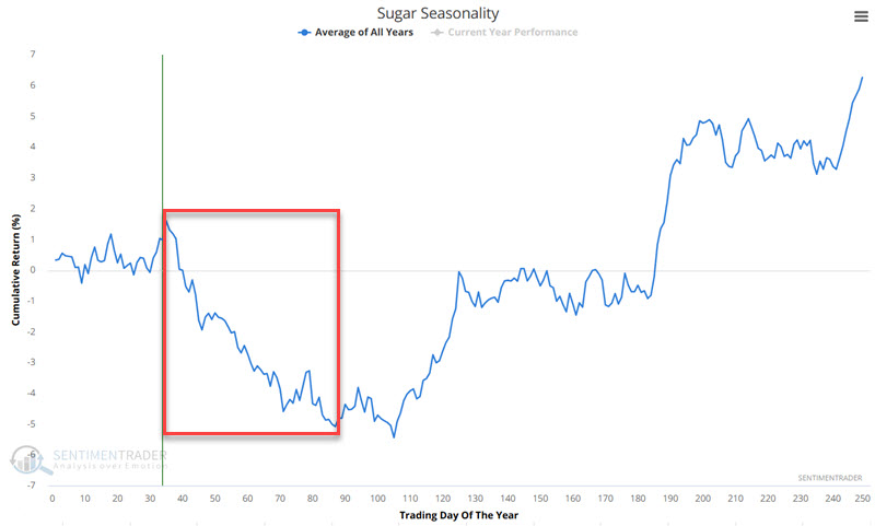
As always, it is important to remind people that seasonality is backward-looking-i.e., it is simply an average of the past-and should never be thought of as a roadmap for what will happen in the current year. Still, history is what it is for sugar.
The period of typical seasonal weakness highlighted above extends from the close of Trading Day of the Year (TDY) #35 through TDY #87. For 2025, this period extends from the close on 2025-02-21 through 2025-05-07.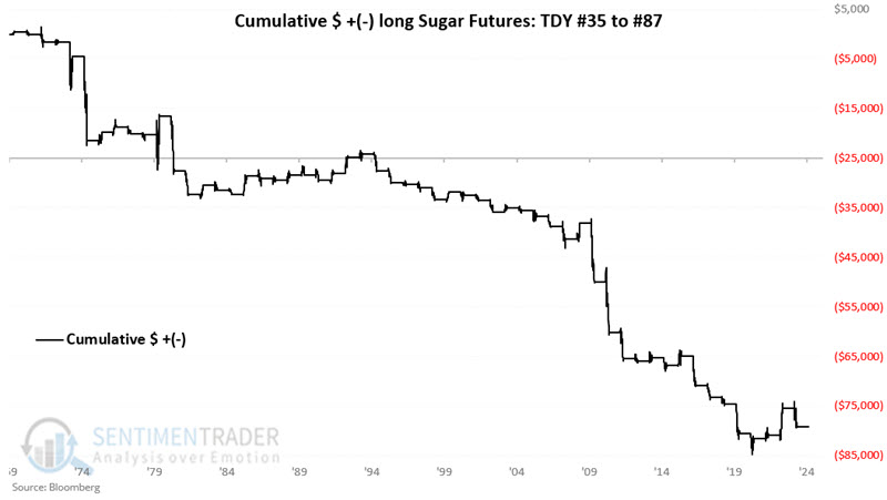
These seasonal windows showed a gain only 31% of the time, with an average loss larger than an average gain. The contract gained more than +$4,000 only once while losing more than -$4,000 eight times.
About TradingEdge Weekly...
The goal of TradingEdge Weekly is to summarize some of the research published to SentimenTrader over the past week. Sometimes there is a lot to digest, and this summary highlights the highest conviction or most compelling ideas we discussed. This is NOT the published research; rather, it pulls out some of the most relevant parts. It includes links to the published research for convenience, and if you don't subscribe to those products, it will present the options for access.