
TradingEdge Weekly for Dec 29 - Plethora of uptrends, no more Panic, inverted yield curve

Key points:
- All but two major sectors have nearly all of its stocks in medium-term uptrends
- More than 90% of S&P 500 stocks are above their 50-day moving averages
- There are even more signs of impressive internal momentum
- The Panic phase of a Typical Sentiment Cycle has fully reversed
- Looking at the potential of 3 more years of a bull market, via Benner Cycles
- What happens when the yield curve inverts, then un-inverts
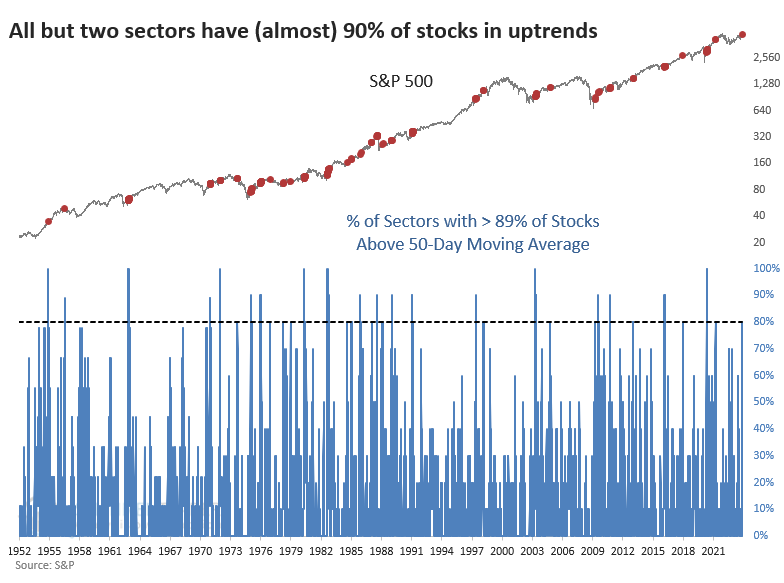
All but two sectors have nearly all stocks in medium-term uptrends
The average stock has had an excellent few weeks. We've seen that from several different perspectives, like a 52-week breakout in the S&P 500 equal-weight index and nearly all stocks in the S&P 1500 being in medium-term uptrends.
Another way of looking at this is the distribution of those uptrends among sectors. If a sector has a lot of stocks that are doing well, it can overwhelm the other sectors and skew the results to the positive side. But the distribution has been extremely broad, as 8 out of the 10 major historical sectors (excluding Real Estate) have 89% or more of their stocks in medium-term uptrends.
The table below shows returns in the S&P 500 after at least eight sectors had at least 89% of their stocks above their 50-day moving averages. Confirming other studies we've looked at in recent weeks, those returns were quite positive across all time frames.
Since the uptrends are so well distributed, looking at performance for the S&P 500 equal-weight index makes sense. There are two fewer signals for this index since we don't have history before 1957. The only major failure was in 1973.
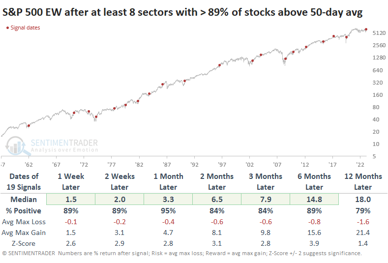
The table of maximum gains and losses across time frames shows that only the 1973 signal suffered a significant drawdown within six months. Remarkably, only two signals witnessed drawdowns worse than -3.3% at any point in the next half-year.
Among sectors and factors, there was a lot of green, which is to be expected given the above. Notably, Small Caps stand out for exceptionally strong returns across all time frames.
Uptrends proliferate in the world's most benchmarked index
Jay noted that this indicator recently spiked above 90% for stocks across the S&P 500, triggering the usual chorus of "overbought market" warnings.
Reality paints a very different picture - a reading of 90% or more invariably occurs only after a powerful thrust higher in the market. The chart below highlights each date when the SPY Breadth (% > 50 Day Avg) indicator crossed above 90% (including overlaps) since 1998. The most recent signal occurred on 2023-12-19.
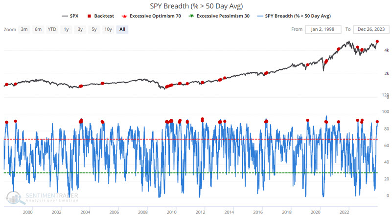
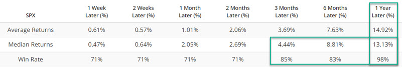
As a frame of reference, since 1998-01-02, the median 12-month return for the S&P 500 Index is +11.1%, with a Win Rate of 77%. As you can see in the table above, the median 12-month return following the dates highlighted in the chart above was +13.13%, with an exceptionally high Win Rate of 98%.
Traders relying on gut instinct and trying to play the short side of stocks following previous supposedly "overbought" readings paid a high price. Conversely, investors who used to confirm an ongoing uptrend profited handsomely and consistently.
More signs of internal momentum
Jay noted that spikes in the McClellan Summation Index, more often than not, suggest a powerful breadth thrust.
The NYSE McClellan Summation Index is calculated by adding each day's McClellan Oscillator value to the index. The chart below highlights all dates when the Summation Index crossed above 1,000 for the first time in six months. The latest signal occurred on 2023-12-28.
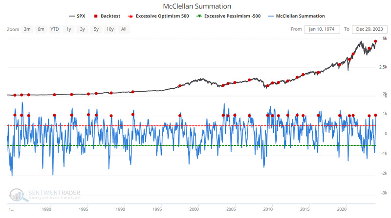
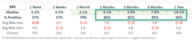
Notably, only the 1976 and 2010 signals experienced a drawdown of over -10%.
Panic has fully reversed
The panic that investors exhibited in October has now fully reversed.
Last October, we saw that according to the Typcial Sentiment Cycle, investors had been woefully discouraged for a historic length of time. Then, they exhibited signs of returning confidence by March of this year, which was also a good sign for forward returns.
A popular heuristic uses some version of the Cycle popularized by Justin Mamis in his 1999 book, The Nature of Risk. The Mamis chart encompasses the price path of U.S. stocks from roughly May 1990 through March 1991.
Due to the decline during the late summer months, the Typical Sentiment Cycle suggested that investors were back in the Panic phase of the Cycle. This is determined by comparing the price action of the S&P 500 to the typical Panic phase of past sentiment cycles. By October, this correlation had spiked above +0.6 (out of a scale from -1.0 to +1.0). It has since eased and fully reversed back to -0.6 in a historically quick fashion.
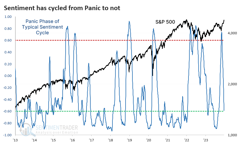
Contrarians always want to assume that a quick reversal in sentiment is bad. Sometimes it is, but usually it isn't.
The table below shows every time since 1928 when the Panic phase of the Typical Sentiment Cycle reversed from above +0.6 to below -0.6 within 30 trading days. There weren't too many examples of this happening, and a couple of them led to modest declines in the S&P 500 over the next year. However, the average risk was low, and the reward was high.
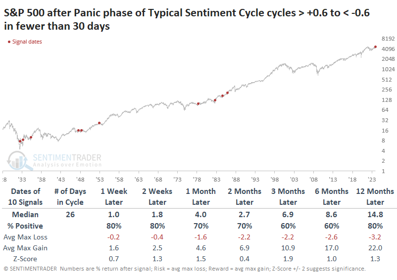
Within the next six months, two drawdowns were worse than -10%. One of those was just barely, and the other one, in 1932, occurred during a period of extreme volatility, and the maximum gains actually exceeded the maximum losses.
After these bouts of Panic had fully reversed, Value stocks showed the best average returns over the next year, at more than +30%.
Another three years of a bull market?
In a series of articles in April 2023, Jay introduced the Benner Cycle, purportedly created by a man named Samuel Benner in 1875, which consists of major cycles and minor cycles. He showed that a new favorable minor Benner cycle begins on January 1st and extends through December 2026.
The chart below was purportedly created by Samuel Benner in 1875.
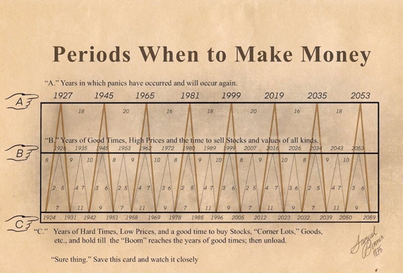
The brownish/yellow lines in the chart above highlight "major" cycles, and the light gray line highlights "minor" cycles. At the close of trading for 2023, the major cycle will turn "neutral" until the end of 2032. On the other hand, the minor cycle will turn "favorable" until the end of 2026.
The "minor" cycle in the chart above (the light gray line) starts by rising from 1924 to 1926 (favorable), then declines from 1926 to 1931. It then rises for four years and declines for 7, then completes its pattern by increasing for three years, then falling for 6. From there (1951), the overall pattern repeats.
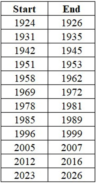
The list below contains all the "favorable" years the minor Benner cycle indicated. Note that for all tests, we start a new cycle period at the close on December 31st of the stated year and use monthly S&P 500 Index closing prices to track results.
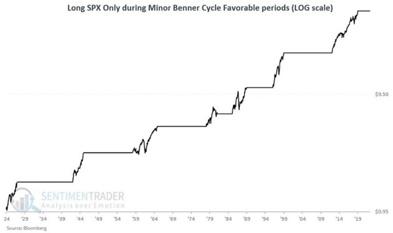
The chart below displays the growth of $1 invested only during the periods listed above (on a logarithmic scale) using monthly data. A hypothetical investment of $1 has grown to $51.33.
In the earlier Benner cycle graphic, you can note that there have only been three favorable 3-year minor cycles - from 1942 to 1945, 1969 to 1972, and 1996 to 1999. The first and third occurrences happened for the record, while the major Benner cycle was favorable. The only previous time when the minor cycle was favorable, and the major cycle was neutral, was from 1969 to 1972. Even if we include all three, it is still too small of a sample size from which to draw conclusions. Nevertheless, for the sake of historical perspective, we will take a closer look at these three previous 3-year favorable minor cycle periods.
The table below displays the cycle-by-cycle results for all favorable minor cycles, with the three 3-year favorable periods highlighted.
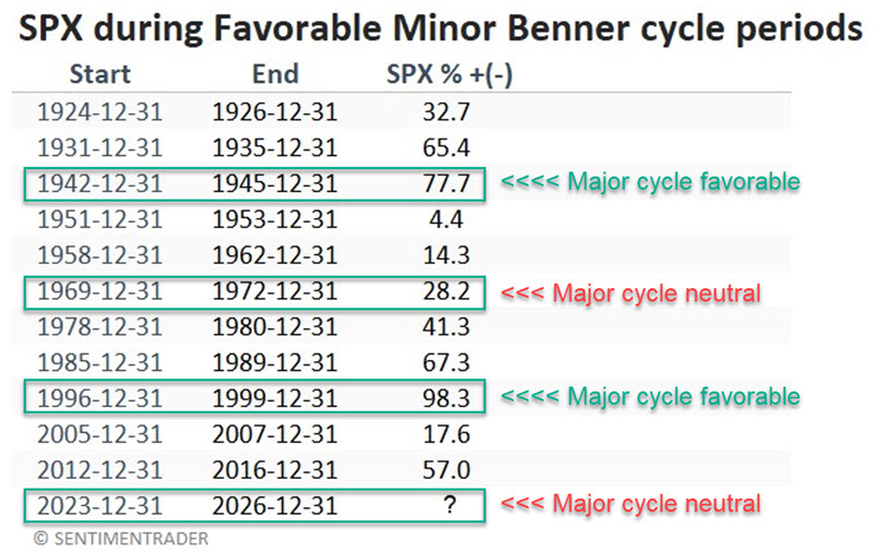
The single precedent for the "Major cycle neutral, minor cycle favorable for three years" configuration witnessed a gain of +28.2% (i.e., less than 10% per annum), and an investor who bought in on 1969-12-31 suffered a -24.7% loss before the market rebounded.
About that inverted yield curve...
The 10-year treasury yield minus the 2-year treasury yield curve has been inverted for 17 months. Jay noted that this has triggered an endless stream of warnings, but while an inverted yield curve signals something abnormal in the economy, the track record as a bearish warning sign is decidedly mixed.
There are many ways to measure the yield curve. Among others are the 10-year minus 2-year, the 10-year minus 3-month T-bill, the 10-year minus the Fed Funds Rate, the 30-year minus any or all of the above, etc. Another approach involves looking at the percentage of individual yield curves inverted at a given time.
We will examine the 10-year treasury yield minus the 2-year treasury yield at the end of each week, shown below.
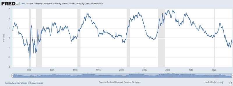
The spread sometimes goes negative, and the gray vertical areas in the chart highlight economic recessions that usually follow.
The bad news is that an inverted yield curve serves as a warning sign that something is not right. The good news is that the stock market is influenced by many factors.
The table below displays the date of each week when the 10-2 yield curve closed negative after being positive the week before and the performance of the S&P 500 Index over the next 12 months (including overlapping signals).
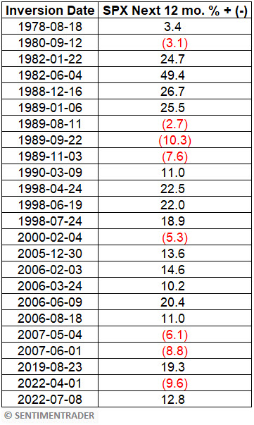
After these inversions, the S&P was higher a year later 67% of the time, with a median return of +19.1% during the positive signals versus -6.7% during the negative ones. It gained more than +10% fifteen times while losing more than -10% only once.
To make the case that it's the un-inversion (the yield curve turning positive) that's the problem, bears will point to 2000 and 2007 un-inversions that were indeed followed by significant and extended bear markets. The table below displays the date of each week when the 10-2 yield curve closed positive after being negative the week before and the performance of the S&P 500 Index over the next 12 months (including overlapping signals).
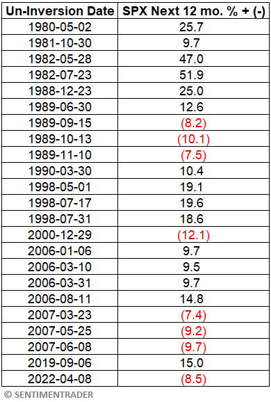
Once again, the results in the table above are neither uniformly bullish nor uniformly bearish - although they do skew to the positive side.
1989, 2000, 2007, and 2022 un-inversions correctly presaged lower stock prices. So, are the bearish pundits correct? Only if we ignore the other signals that saw stock prices rise in the 12 months following a return to positive territory for the 10-2 yield curve.
After these un-inversions, the S&P was higher a year later 65% of the time, with a median gain of more than double the median loss. It was five times more likely to rise +10% than fall -10%.
About TradingEdge Weekly...
The goal of TradingEdge Weekly is to summarize some of the research published to SentimenTrader over the past week. Sometimes there is a lot to digest, and this summary highlights the highest conviction or most compelling ideas we discussed. This is NOT the published research; rather, it pulls out some of the most relevant parts. It includes links to the published research for convenience, and if you don't subscribe to those products, it will present the options for access.