
TradingEdge Weekly for Aug 9 - Tech and Asian equity selling, commodity forecasting, stocks vs. bonds

Key points:
- The Nasdaq fell into a correction
- The S&P 500 and Nasdaq dropped well below their Bollinger Bands
- Selling pressure triggered some compelling oversold signals
- The Stock/Bond Ratio hit a historically stretched level
- Investors are moving out of the Enthusiasm phase of a Typical Sentiment Cycle
- The 26-week rate of change in the dollar has fallen into negative territory
- Taking a look at the Nikkei's crash
- Signs of capitulation in South Korea's KOSPI index
- Using short-term interest rates as a guide to commodity trends
- A look at upcoming seasonal windows for metals and miners
A tech correction
Calm and uncorrelated conditions that were likely to lead to an event have reversed sooner rather than later. Former winners are among the hardest-hit in recent days, many of which populate the Nasdaq.
The Composite fell more than 10% from its peak for the sixth time in the past five years, three of which more or less marked the bottom.
A 10% correction from what had been multi-year highs is a common occurrence for the Nasdaq Composite. Since its inception over 50 years ago, it has been triggered 32 times.
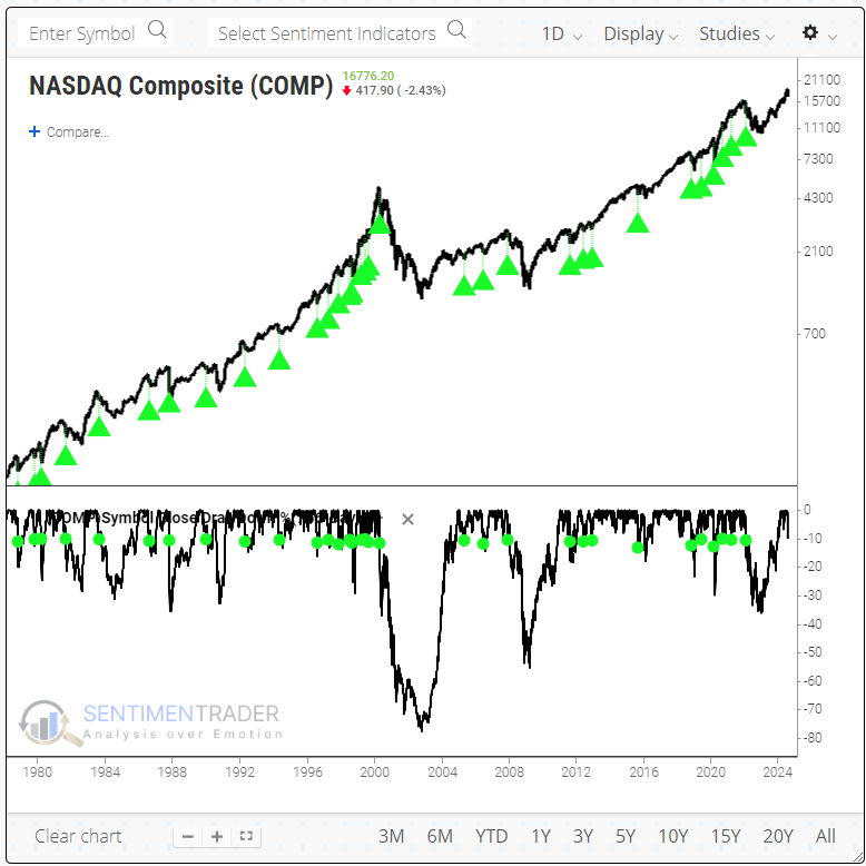
The Nasdaq was mostly positive over the following weeks and months, but the win rate was uninspiring. Over the next 6-12 months, there was more of a case to be made to be a buyer. A year later, average risk was -7.0% versus reward of +25.6%.
Since the 2008 global financial crisis, these corrections proved to be excellent buying opportunities, even including the pandemic...until the 2022 bear market. The Nasdaq suffered a further 10% or larger loss 11 times. In other words, the corrections morphed into bear markets about 1/3 of the time.
Interestingly, among sectors, information technology was the best-performing sector over the next 6-12 months after the Nasdaq fell into a correction. Over the medium term, however, defensive-leaning sectors like consumer staples and health care showed the most consistent win rate.
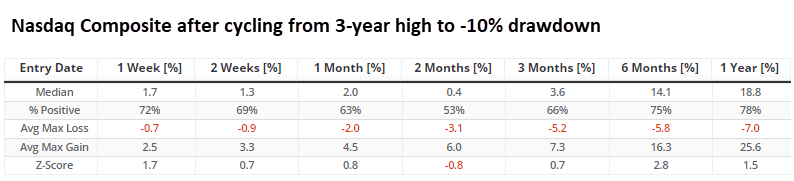
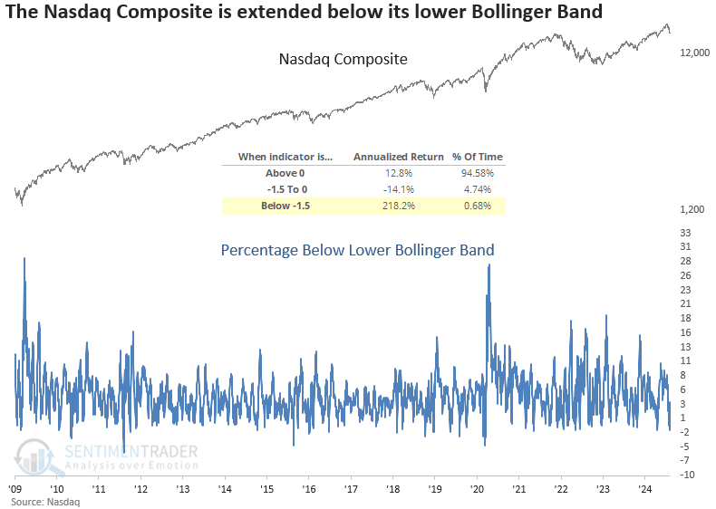
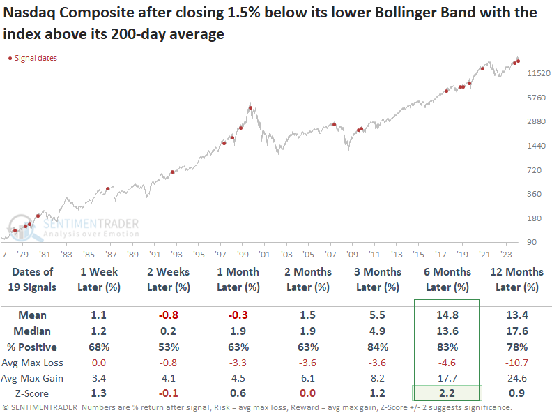
A stretched Band
The S&P 500 recorded its deepest close below the lower Bollinger Band since the Covid crash. Dean showed that a comparable scenario for the Nasdaq Composite suggests it will rally over the following six months.
For the 57th time since 1928, the S&P 500 closed more than 1.8% below its lower Bollinger Band, indicating an extreme downside extension in price relative to a volatility-derived benchmark. Whenever the S&P 500 closed more than 1.8% below its lower Bollinger Band while remaining above its 200-day average, over the next three to twelve months, the S&P 500 continued to rally 80% to 85% of the time.
While not as extreme as the S&P 500, the Nasdaq Composite closed 1.54% below its lower Bollinger Band, an event occurring less than 1% of the time since 1971. Readings below 1.50% produced significant annualized returns.
The Nasdaq Composite tended to bounce back the following week. Over the following six months, the index rallied 83% of the time, with its median return showing significance relative to random returns over the study period. Only two precedents coincided with significant market peaks, both linked to market bubbles.
Oversold signals
Jay highlighted a couple of extreme indicators. The percentage of S&P 1500 stocks with a 2-day RSI below 30% spiked during the recent decline and the NASDAQ McClellan Oscillator plunged.
The Oscillator is a look at the momentum of the underlying breadth of the market. When it is above zero, momentum is positive; below zero, it is negative. It also works as an overbought/oversold indicator when it pushes above extreme positive readings (overbought) or negative ones (oversold).
The chart below highlights previous dates when the Nasdaq McClellan Oscillator crossed below -75 and the Nasdaq 100 Index was above its 200-day moving average.
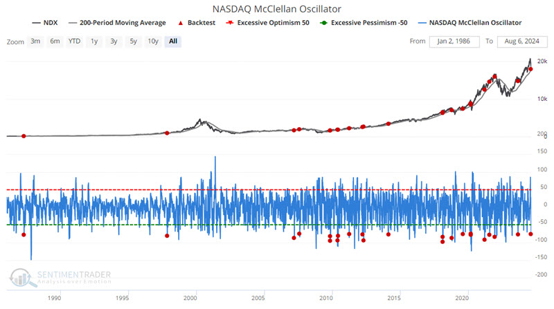
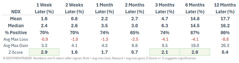
Win Rates are significantly strong across all timeframes, and results have been excellent over three to six months following a signal. However, as with an indicator signal, there are meaningful exceptions to the rule (following the 2021-12-01 signal, NDX lost -11.6% three months later and -18.8% six months later). So, this indicator should not be relied on as a standalone trading model.
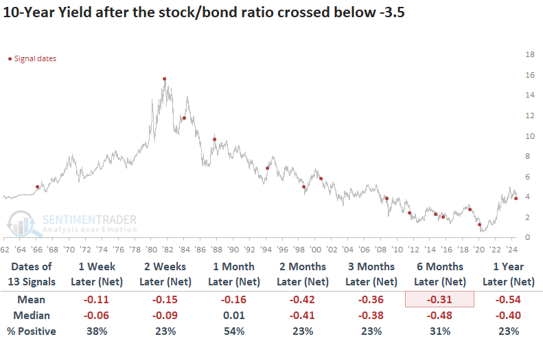
A stretched intermarket relationship
Stocks plunged, and bonds rallied, sending the stock/bond ratio to one of the lowest points in history. Dean noted that comparable stock/bond ratio swoons produced excellent short and long-term outcomes for the S&P 500.
The recent yen-carry trade unwind, which some describe as a global margin call, drove the stock/bond ratio, which compares the S&P 500 against a long-dated Treasury bond, to one of its lowest points in history. On Monday, the ratio fell to -3.75, a condition seen in less than 1% of instances since 1962.
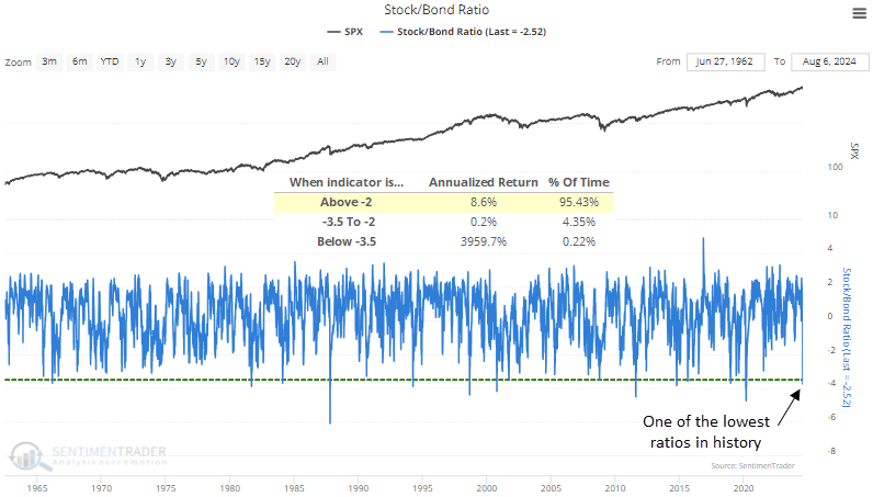
Whenever the stock/bond ratio plunged beneath -3.5, panic selling in stocks in favor of buying bonds reached a climactic point. Not only did the S&P 500 bounce back in the short term, displaying a gain at some point over the next month in 12 out of 13 instances, but it also rallied 92% of the time a year later and displayed significance relative to random returns.
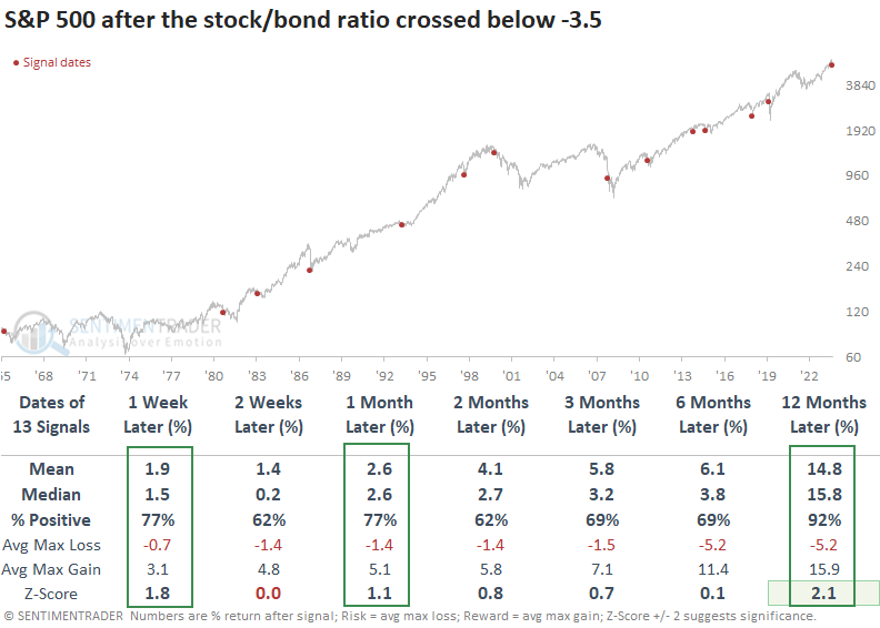
Over the following month, the maximum gain surpassed the maximum loss in 11 out of 13 instances. Additionally, during this same period, only three precedents recorded a maximum loss of more than -5%, a remarkable feat considering the challenging environment surrounding these events.
Considering that most signals occurred in a secular downtrend, the 10-year yield's decline over long-term horizons is not unusual.
Ebbing enthusiasm
With a mostly uninterrupted rally in stocks since last October, it's hard to blame investors for feeling enthusiastic.
According to the Typical Sentiment Cycle, investors are just starting to reverse from an extreme of Enthusiasm. The cycle has four major parts, including both qualitative and quantitative measures.
1. Enthusiasm - High optimism, easy credit, a rush of offerings, risky stocks outperforming, stretched valuations
2. Panic - Extreme pessimism, oversold breadth, risky stocks crash, negative media coverage, credit slams shut
3. Discouragement - Stocks go nowhere, trend-followers suffer, some pockets of outperformance, credit starts to thaw, activity slows
4. Returning Confidence - Stocks rise choppily, smaller stocks do well, credit becomes easy, more new offerings
The S&P 500's correlation to the Enthusiasm part of the cycle has now peaked above 0.9, an exceptionally high correlation that has been met only a few times in the past decade.
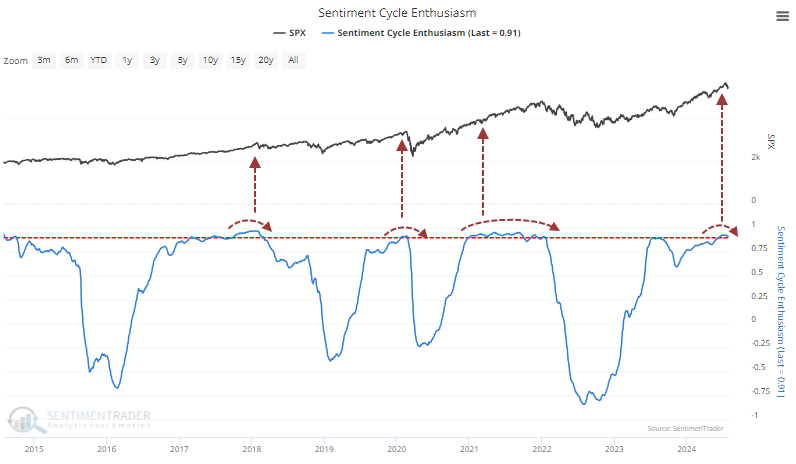
The opposite of Enthusiasm is Panic, and it stands to reason that investors have exhibited the opposite of that, which they have. After the phases peaked at true extremes, the S&P 500's returns were mediocre-to-mixed up to three months later, with a poor ratio of reward to risk. There wasn't much impact on longer time frames, so the most damaging effects did seem to be mostly confined to shorter time frames.
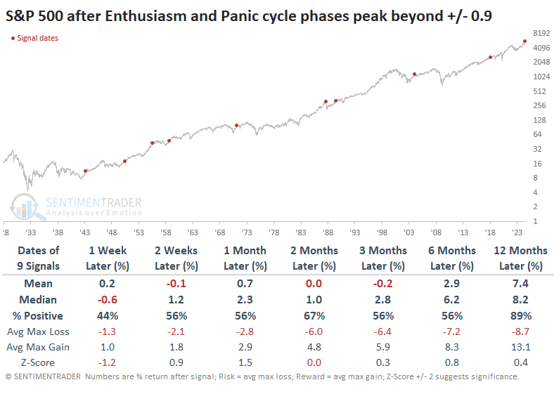
Among the other major equity indices, the small-cap Russell 2000 fared the worst, with only a 25% win rate over the next six months. The Nasdaq's returns were more consistently positive, but the Dow Industrials improved on that over the next year, with an 89% win rate.
It makes sense that when investors reverse a prolonged period of enthusiasm and lack of panic, they might gravitate toward defensive sectors, and we see that in the table below. The defensive factor returned an average of +16.0 % over the next year, powered by health care and utilities.
Dollar doldrums
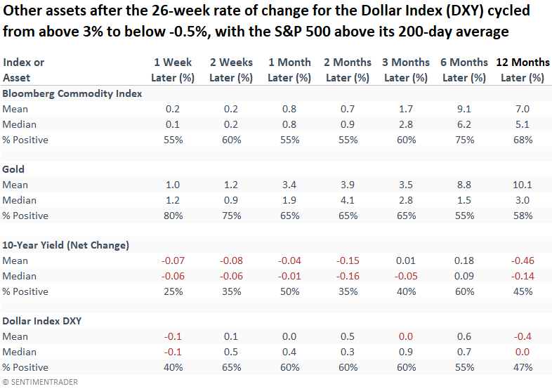
The 26-week rate of change for the Dollar Index (DXY) shifted from above 3% to below -0.5%, which Dean showed preceded excellent returns for the S&P 500 over the next year. Commodities and gold benefitted, long-dated yields eased, and the dollar was mixed.
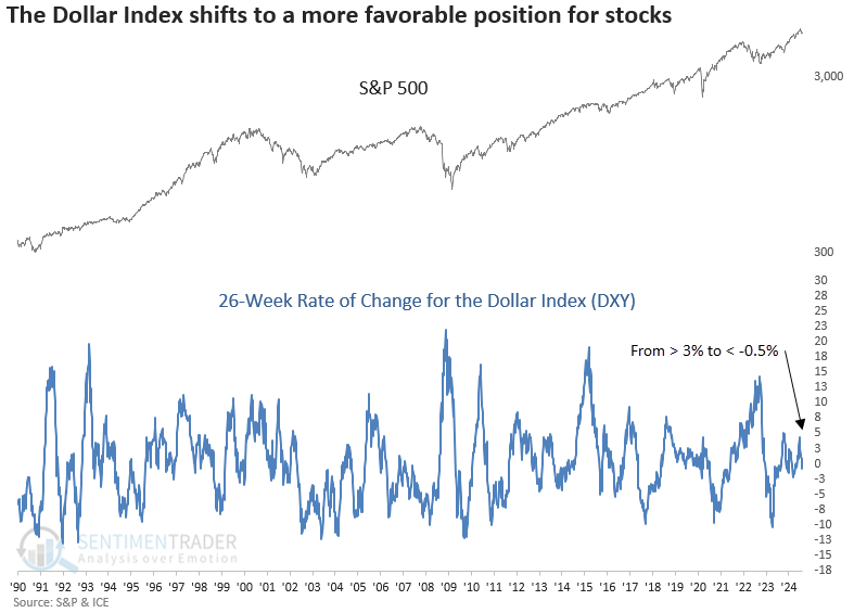
Whenever the 26-week rate of change for the Dollar Index (DXY) cycled from above 3% to below -0.5%, with the S&P 500 above its 200-day average, the world's most benchmarked index rose 90% of the time over the subsequent three and six months. Additionally, the index displayed significance relative to random returns from one to twelve months later.
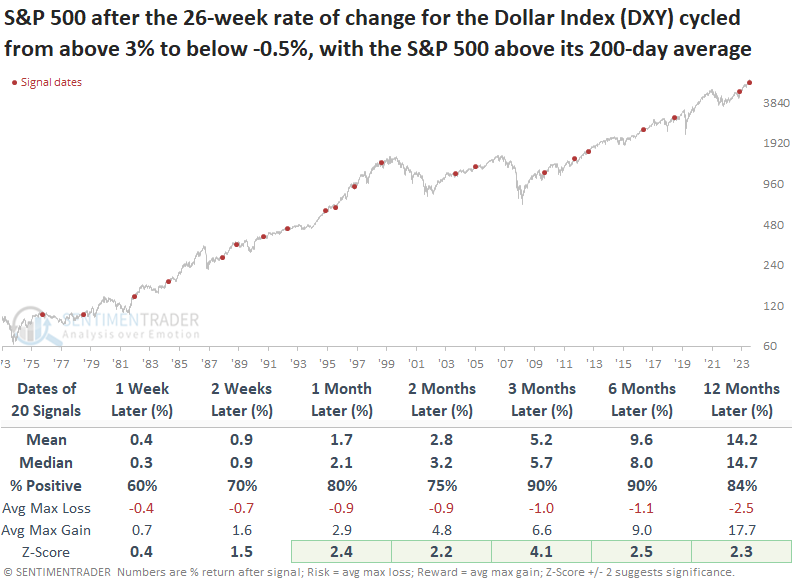
While there is no clear-cut winner from a sector perspective, companies with a large multinational presence generally tend to benefit when the dollar is not a headwind.
Among other assets, bonds tended to rise (yields decline), while the dollar itself showed a modest upside bias over the next several months.
Nikkei nicked
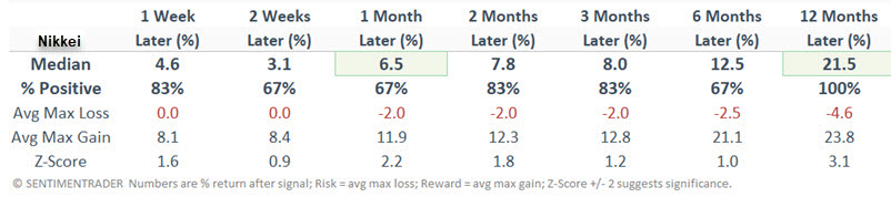
The Nikkei Index lost -12.4% in one day. Jay showed that short-term selloffs of this magnitude have typically been followed by better price action - often in short-order.
The chart below shows all dates since 1970 when the Nikkei lost 7.9% or more in a single day. It rose over the next year after each instance, with a median return greater than +21%.
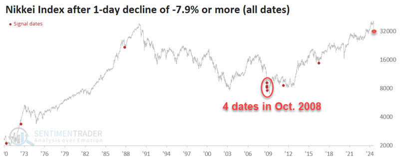
The Nikkei also registered a 3-day decline of -19.4%, which is about three times more common and has also resulted in positive future returns.
Now, let's put the two together into a simple strategy that applies the following rules:
- If the Nikkei Index registers a 1-day loss of -7.9% or more OR a 3-day loss of -10% or more, buy and hold the Nikkei for 12 months
- If a new signal occurs within those 12 months, then extend the holding period another 12 months
The chart below displays the hypothetical growth of $1 invested using this strategy.
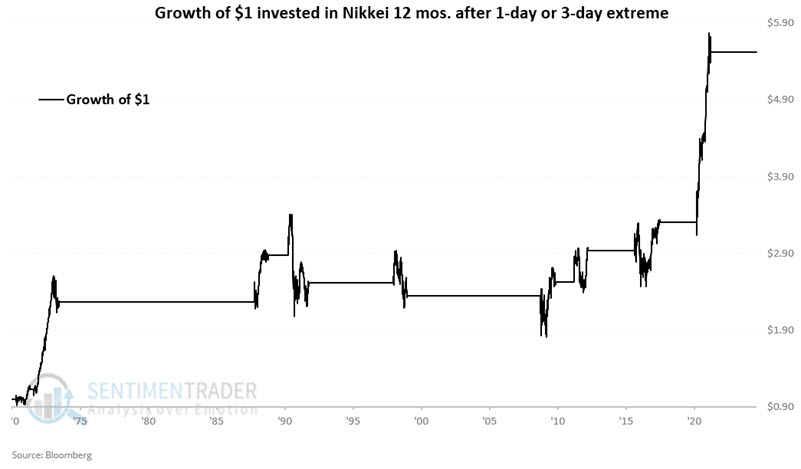
The "trades" showed a gain 78% of the time with an average of +25%. The maximum gain was +100.8% and the maximum loss was -12.6%.
KOSPI capitulation
The crash in Japanese stocks made most of the worldwide headlines on Monday. Less mentioned but nearly as dramatic was the crash in South Korea.
If we look for 2-day declines larger than -12% in the KOSPI, the 1997-98 currency crises appear in the precedents. After each plunge, the KOSPI rallied over the next two months.
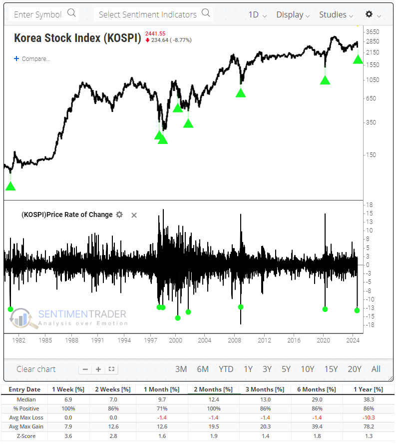
When we look at the breadth metrics, most of the longer-term ones are somewhat oversold but not remarkably so. One exception is the percentage of stocks at 52-week lows, which surged to nearly half of all stocks. Each of the other times there was this level of coordinated selling pressure, the KOSPI rallied over the following year by an average of more than +50%.
There is perhaps no better reflection of this wholesale selling pressure than the Panic Breadth Composite, which aggregates various breadth metrics across various time frames into a single indicator. It spiked above 75 on Monday, one of the highest readings in over 20 years.
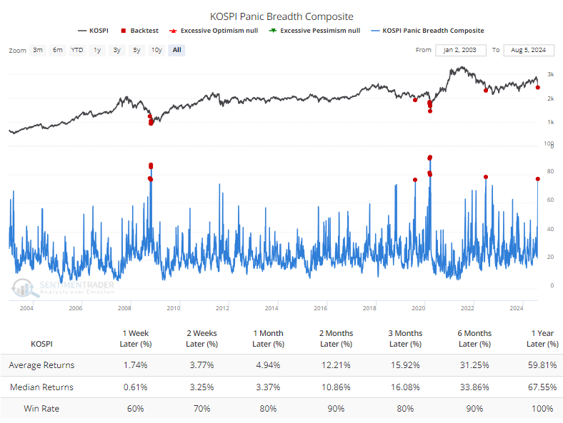
Over the next twelve months, the worst signal was a double-digit gain. On average, the KOSPI rallied more than +67% over the following year.
While the one-year returns were excellent, it's worth noting that investors who bought into the panic likely suffered some doubts along the way. Most of the instances saw a short-term bounce but a test of the panic lows at some point before sustained gains.
For U.S.-based investors, the iShares MSCI South Korea ETF (EWY) showed even better performance, with a median one-year return of +87.3%.
Using short-term rates as a commodity guide
Inflation can be a huge factor that affects commodity prices in general. Jay showed that there is an interesting relationship between (very short-term) interest rate trends and the trend of commodities as an asset class.
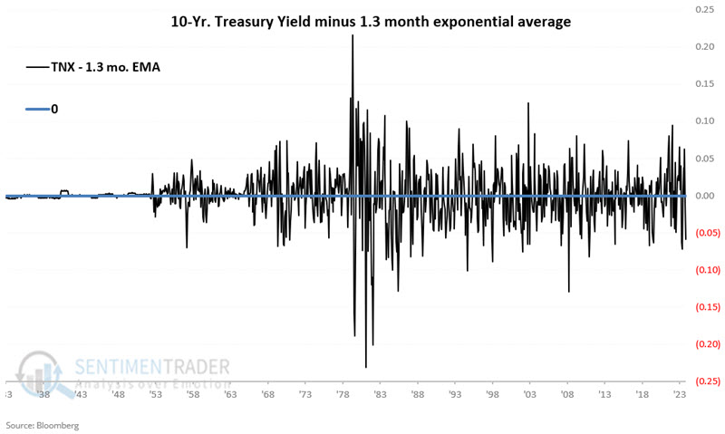
We can note two primary long-term waves between the two. The chart below plots both data series on the same chart. Interest rates are in blue (left scale), and commodity prices are in black (right scale).
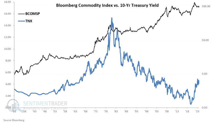
Just eyeballing the chart seems to reveal a high correlation at times and almost no correlation whatsoever at others. In fact, for the full period, the correlation coefficient is -0.18. So, technically speaking, the two are somewhat inversely correlated.
For our test, we will compare TNX at the end of each month to its 1.3-month exponential moving average. The chart below subtracts the month-end value for the 1.3-month EMA from the month-end value for TNX. Positive readings mean TNX is above its 1.3-month EMA and vice versa.
Our rules are as follows:
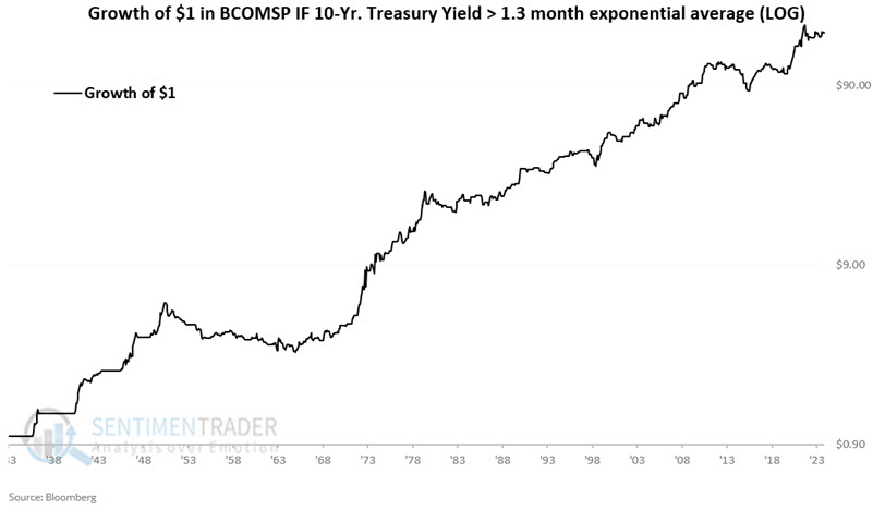
- If TNX - 1.3-month EMA > 0 at the end of this month, then hold BCOMSP (i.e., a basket of commodities) for the entirety of the next month
- If TNX - 1.3-month EMA <=0 at the end of the month, then remain flat with no position in commodities for the entirety of the next month
The chart below displays the hypothetical growth of $1 invested in BCOMSP only during favorable months (i.e., TNX ended the previous month > 1.3-month EMA). The hypothetical gain for the full September 1933 through July 2024 period is +17,450%.
Now let's look at the flipside. The chart below displays the hypothetical growth of $1 invested in BCOMSP only during unfavorable months (i.e., TNX ended the previous month < 1.3-month EMA). The hypothetical loss for the full September 1933 through July 2024 period is -44%.
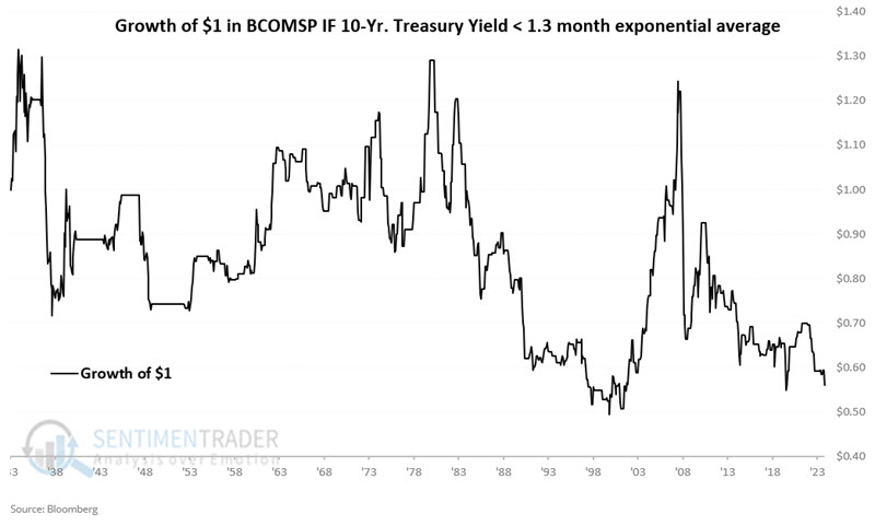
Note that TNX has been below the 1.3-month EMA at the close of June and July 2024, indicating an unfavorable signal for commodities in July and August 2024.
Metal seasonality
Jay noted that except for gold bullion, seasonality is an unfavorable factor across much of the metals arena in the months ahead.
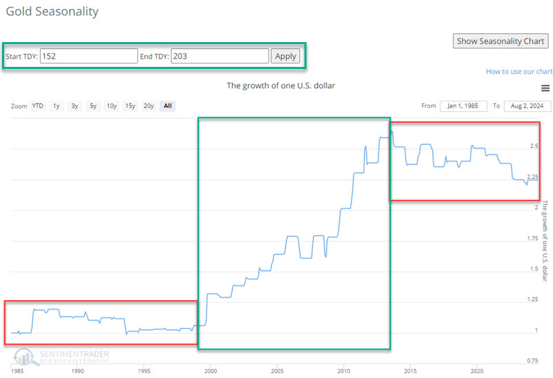
The annual seasonal trend chart for Gold shows a favorable period that extends from the close of Trading Day of the Year (TDY) #152 through TDY #203. The chart below displays the hypothetical growth of $1 invested in Gold only during these windows since 1985. Overall, it's positive, but not exactly a sure thing.
Gold mining stocks have a history of spotty performance and didn't share gold's positive seasonal window.
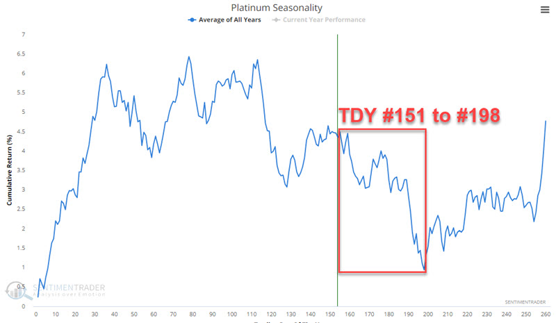
"What's good for gold is good for other metals" may be a common line of thinking but is often incorrect. While gold threatens new all-time highs, platinum is languishing and lagging badly.
The annual seasonal chart for platinum futures shows an unfavorable seasonal period that extends from TDY #151 to TDY #198.
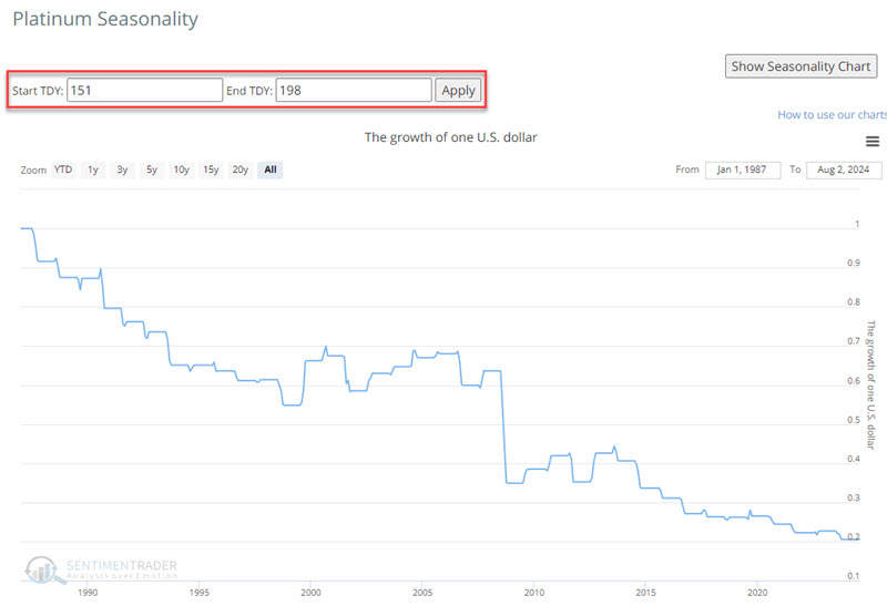
The chart below displays the hypothetical growth of $1 invested in platinum only during the TDY #151 through #198 period since 1987. During these periods, the price of platinum has declined by almost 80%.
Jay also looked at the upcoming seasonal biases for copper, copper miners, other miners, and palladium, with similar conclusions.
About TradingEdge Weekly...
The goal of TradingEdge Weekly is to summarize some of the research published to SentimenTrader over the past week. Sometimes there is a lot to digest, and this summary highlights the highest conviction or most compelling ideas we discussed. This is NOT the published research; rather, it pulls out some of the most relevant parts. It includes links to the published research for convenience, and if you don't subscribe to those products, it will present the options for access.