
TradingEdge Weekly for Aug 2 - Volatility returns, optimism ebbs, commodity headwinds

Key points:
- Volatility has returned as the VIX returns to a normal level
- Optimism ebbed as investors awaited the Fed
- One damper is seasonality for August through September
- How sectors and factors fare during those months
- More industries are doing (relatively) well
- A troubling number of tech stocks have fallen into corrections and bear markets
- Biotech stocks are facing a seasonal headwind and optimistic sentiment
- Treasury yields across the curve are falling
- Corn and soybean prices have cratered and seasonality doesn't give much reason to expect a reversal
- Unleaded gas if facing a couple of headwinds
No longer an absence of fear
After a historically long stretch of calm and uncorrelated conditions, fear levels returned to normal in less than a calendar month.
The VIX "fear gauge" cycled from suppressed levels under 12 to jump above 18 last week, slightly exceeding its median value since 1986. The chart below highlights those dates when the closing level of the VIX went from below 12 to above 18.
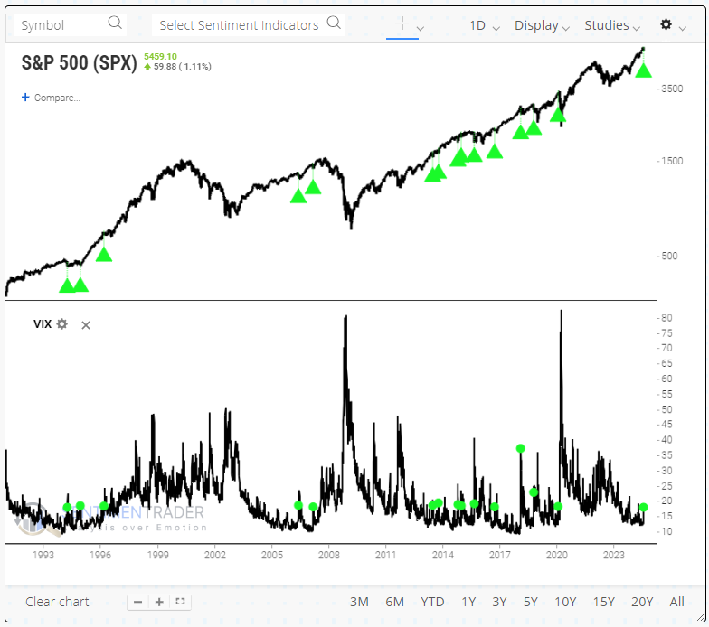
There were three dates when these cycles ended up being the peak for the next month. On average (using the median), it took four days and another 17% rise before it formed at least a 1-month peak.
We can use Backtest Engine 2.0 to see how markets performed after these cycles in the VIX. For the S&P 500, returns were modestly better than random in the short term and gradually improved over the ensuing months. Over the next 6-12 months, returns and consistency were well above any random time, with only minor losses, if any.
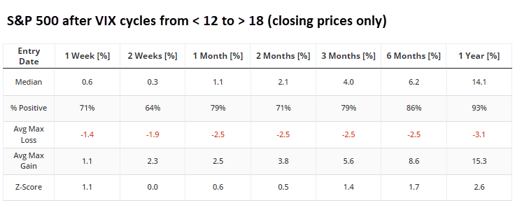
Within the next three months, there were only three signals when the S&P lost more than -3.5%. Each of them was quite painful and unfolded quickly. The only signal when the VIX showed a gain 2-3 months later was during the pandemic shutdown.
If we look for any time the VIX jumped above 18 for the first time in at least three months, regardless of what level it dropped to in the months prior, it gives us another handful of precedents that remain relatively positive for stocks. Over the next six months, the S&P 500 suffered only two minuscule losses.
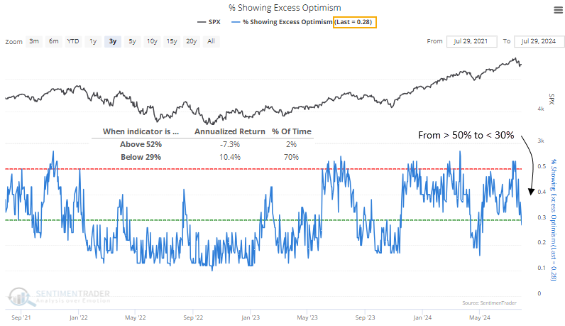
Optimism ebbs ahead of the Fed
A composite measuring excess optimism retreated from an extreme level. Dean showed that the S&P 500 rallied 83% of the time in the subsequent month following similar reversals in optimism.
After reaching one of the most optimistic levels in history, the percentage of core indicators showing excess optimism indicator cycled from 53% to 28%, signaling a substantial easing in excess optimism.
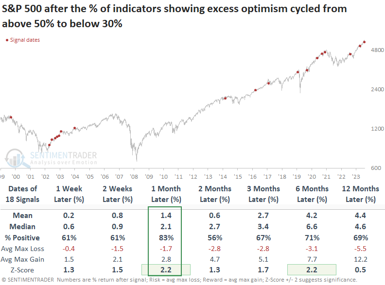
The previous reversal in excessive optimism occurred in April, leading to a 9.9% gain in the S&P 500 over the following three months.
Whenever the percentage of indicators showing excess optimism cycled from above 50% to below 30%, the S&P 500 showed a solid tendency to rally over the subsequent month, rising 83% of the time and producing a gain at some point in 16 out of 18 precedents. Over the next two months, a maximum loss exceeding -5% was limited to only a few instances.
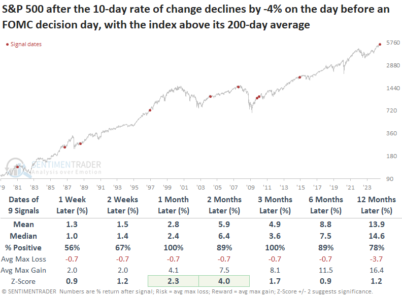
Dean also noted that over the last ten trading sessions, the S&P 500 has fallen over 4%, coinciding with the session before a FOMC decision day.
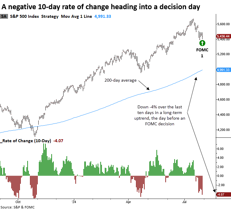
Similar Fed decision day conditions preceded outstanding returns and consistency for the S&P 500 over the following year, especially one and three months later, with both exhibiting a 100% win rate.
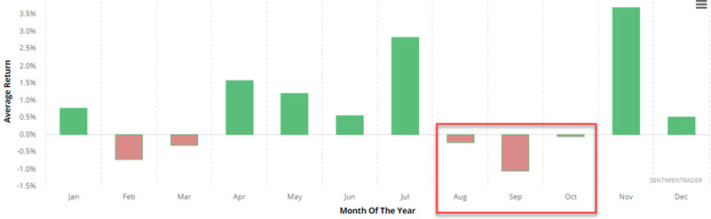
Seasonal damper
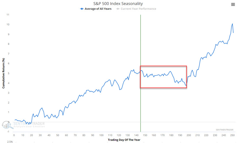
Historically, stocks have been higher during August and September (combined) more often than they have been lower. However, Jay noted the cumulative return for the S&P 500 during these two months since 1946 is almost -60%.
The chart below displays the annual seasonal trend for the S&P 500 Index over the past 30 years. We see that the next several months are generally a period when the stock market can struggle to make gains and is the time of year most likely to witness a pullback.
The chart below displays the cumulative growth of $1 invested in the S&P 500 Index (price data only, not total return) during August and September every year starting post-World War II in 1946.
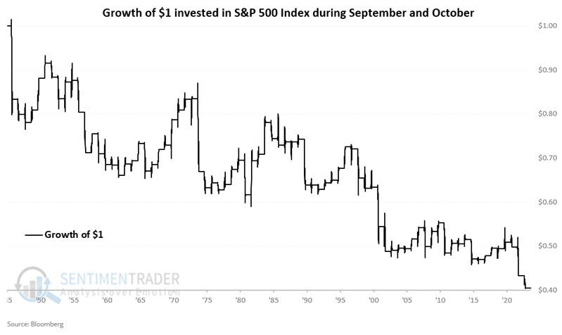
The net result is a cumulative loss of -59.6% even though the Win Rate is slightly favorable at 54%. Two-month moves of 10% or more have skewed negatively by a factor of 9-to-2, so the improved breadth in recent weeks is facing some temporary headwinds from the calendar.
Sectors and factors during those months
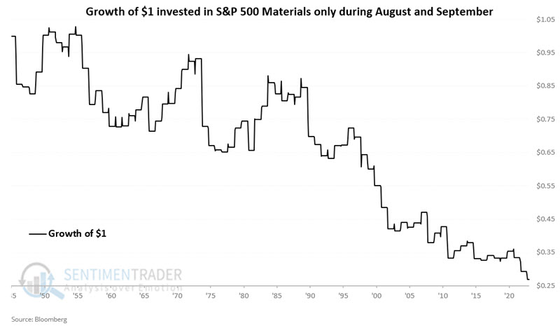
Sector and factor performance is also very hit-or-miss during this time. Jay showed that Materials, Industrials, and Technology have been the worst August/September performers since WWII.
The table below displays the percentage of years when a given sector/factor showed a net price gain from the end of July to the end of September and the cumulative percentage return achieved by holding it only during these two months every year since 1946.
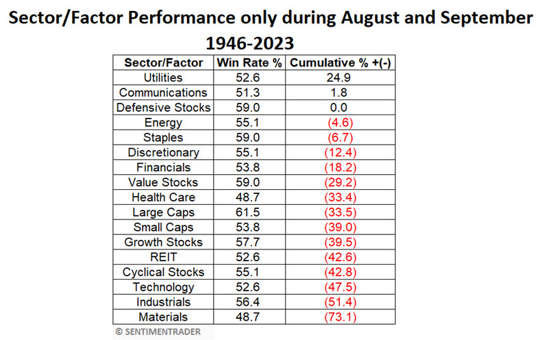
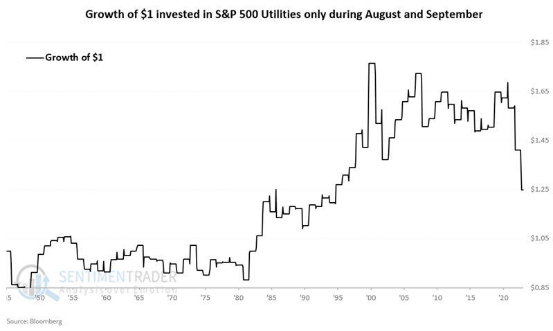
These results are not much to write home about. Even the apparent "top performers" (Utilities and Telecommunications) have struggled mightily in recent years during August and September, as seen below.
As for the worst sector, the chart below displays the hypothetical growth of $1 invested in the Materials sector only during August and September every year since 1946.
So, should investors avoid these sectors during August and September? It's complicated. On a year-by-year basis, any of these sectors can perform exceptionally well during this supposedly "weak" two-month period.
More industries are doing relatively well
The percentage of sub-industries within 5% of a 6-month relative low cycled from above 75% to below 15%. Dean showed that similar relative trend reversals preceded solid returns and consistency for the S&P 500 over the next year.
After climbing to one of the highest levels in history, the percentage of S&P 1500 sub-industry groups hovering within 5% of a 6-month relative low versus the S&P 500 reversed to the downside, indicating an improvement in relative trends for stocks across all market capitalizations.
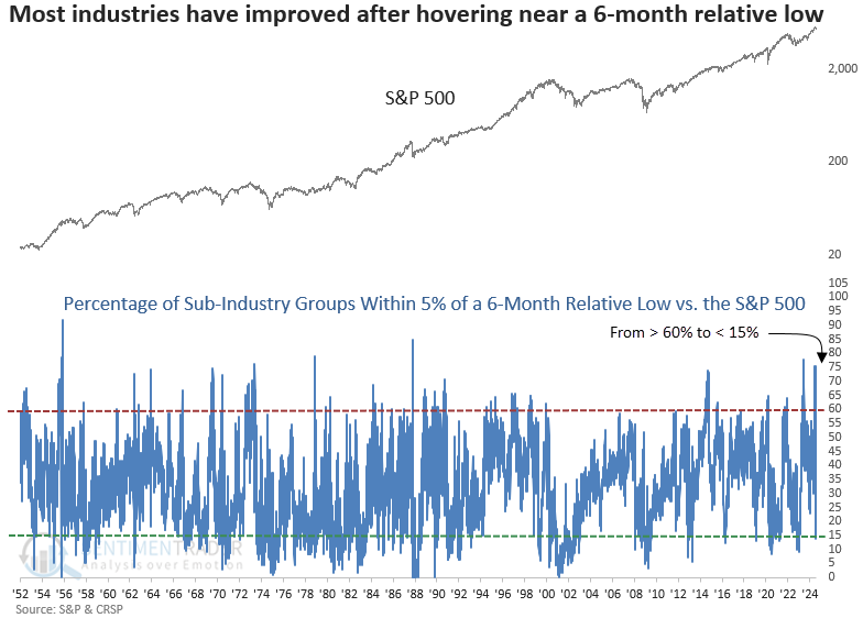
Whenever the percentage of sub-industry groups within 5% of a 6-month relative versus the S&P 500 cycled from above 60% to below 15%, the world's most benchmarked index demonstrated solid returns and consistency over the following year. Signals that occurred within 5% of a 5-year high in the S&P 500 saw the index rise five out of six instances a year later, with the only loss being in April 2000.
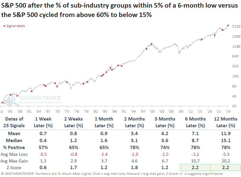
While the research team has highlighted several favorable signals, suggesting a broadening in participation and the potential for improvement in relative trends down the market-cap spectrum, a significant rotation theme has yet to emerge.
More tech stocks are falling into corrections and worse
Now that the Nasdaq 100 has finally pulled back, we've seen more stocks getting hit, and the percentage of stocks in a correction has spiked above 60%.
We'll usually see fewer than 60% of NDX stocks in corrections during healthy bull markets. If it reaches that level (like now), it's almost always "spikey" and quickly falls below that threshold as buyers step in.
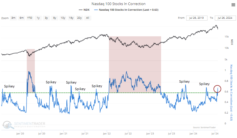
The percentage of stocks in bear markets has jumped as well, to the highest level in more than six months. During bull markets, this figure routinely stays below 30%, and if it nears or exceeds that threshold, it tends to be near the ends of pullbacks.
The table below shows each date when the Nasdaq 100 ended a streak of at least six months with fewer than 60% of its members in corrections and 30% in bear markets. Returns for the index were mixed over the next couple of months, with a few decent gains and a few moderate losses.
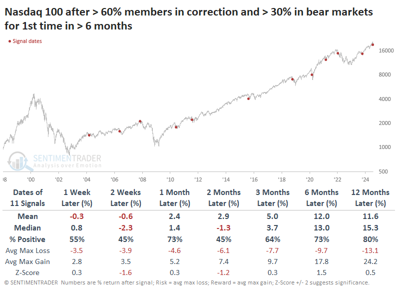
There were three instances when there was absolutely no buy-the-dip mentality, and two of those preceded protracted bear markets. The other, in 2011, led to a bit more weakness then an impressive rally. It suggests that if we don't see any interest from dip-buyers in the days ahead, we should be wary.
Biotech blues
In May and June, Jay noted upcoming positive seasonal trends for biotech. Biotech shares acted as hoped and advanced; the bad news is that it may be a good time to step away from the biotech sector, at least temporarily.
As always, seasonality is not a roadmap. Still, the chart below displays potential seasonal weakness for ticker IBB from Trading Day of Year #144 through TDY #153.
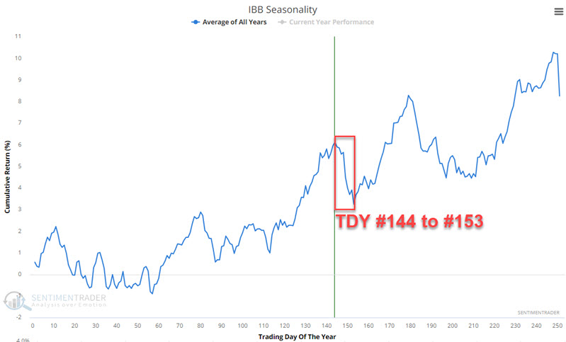
While results are not universally bearish (39% Win Rate), the tendency for weakness is unmistakable. Taking a broader look, August through October is the weakest time of year on average.
The chart below displays the growth of $1 invested in ticker IBB only during August, September, and October each year since 2002.
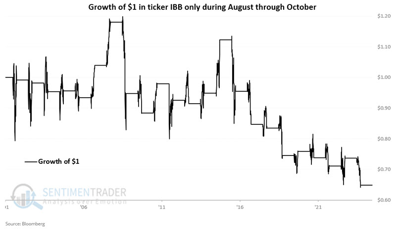
Results are by no means uniformly bearish. But the specter of seasonal weakness looms in the months ahead.
Also, our IBB Optix indicator recently crossed above 92%. When combined with what we've just seen with seasonality, it does convey a potentially important message.
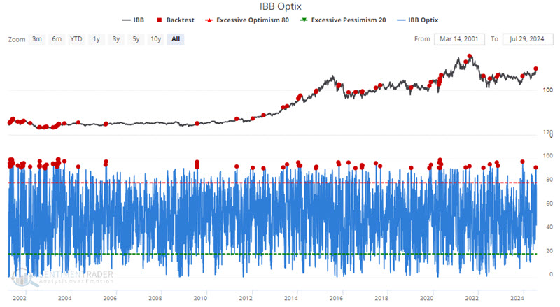
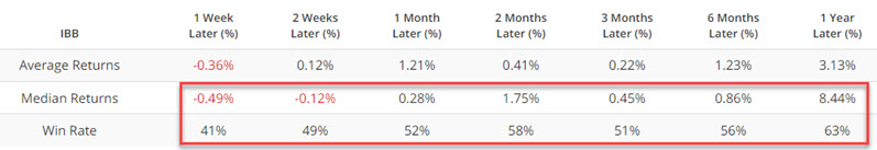
The results are by no means disastrous. That said, Win Rates and median returns are hardly anything to get excited about. When we compare them to the average for all dates, returns have been below average across the board.
Falling yields across the curve
Dean noted that trend-following indicators for Treasury yields have progressively shifted from positive to negative. Comparable trend configurations signaled a falling yield environment over the subsequent six months.
For the first time since the initiation and subsequent suspension of the Federal Reserve's interest rate hike cycle, trend-following composites for Treasury yields ranging from two to ten years have uniformly shifted to a negative condition for 8 out of 10 indicators.
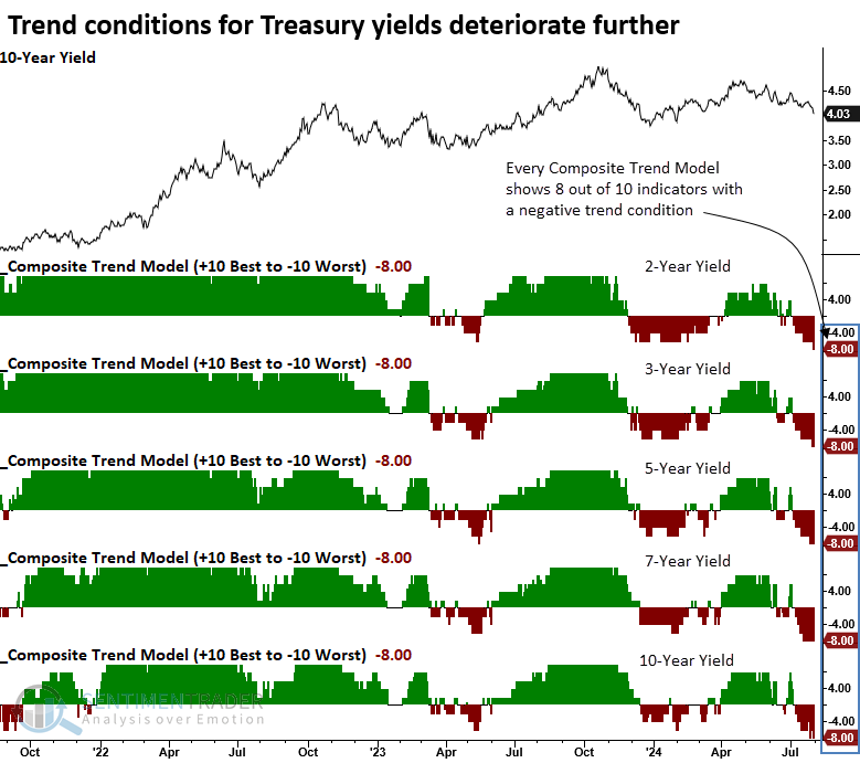
Dean included a condition in the study requiring three interest rate increases by the Federal Reserve to identify composite trend profiles similar to the current environment.
Following precedents when 8 out of 10 trend-following indicators exhibited a negative condition for Treasury yields ranging from two to ten years, the 10-year Treasury bond yield tended to decline over the subsequent six months. That was especially the case since 1982.
Before the secular peak in yields in 1981, composite trend conditions similar to those we see today did not lead to a falling yield environment. Instead, they usually signified a bottom.
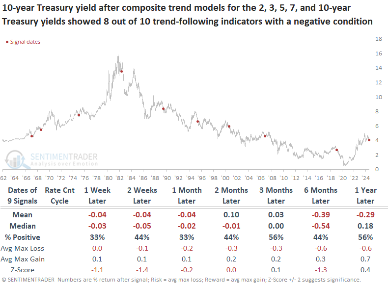
Treasury yields across the curve exhibited a fairly consistent downward bias over the subsequent six months.
Stocks benefitted from lower yields, with the S&P 500 showing a steady upward trend. At some point over the next six months, the world's most benchmarked index rallied in all but one instance, September 2000.
Consumer-oriented sectors exhibited solid returns in the subsequent six months, likely helped by the softening in interest rates. In contrast, Financials faced relative challenges.
Aside from a momentary boost in gold, potentially supported by a softer dollar, there's not much to get excited about in other asset classes.
Grain groans
Corn and Soybeans have been in steady decline for over two years. Jay showed that seasonality strongly suggests that traders fight that urge and continue to focus on the short side - or at least stand aside.
We covered corn and soybean seasonality recently, but it is worth another look. Let's start with corn. The chart below displays the annual seasonal trend for corn futures and highlights the period from Trading Day of the Year (TDY) #145 through the close of TDY #155. For 2024, this period extends from the close on 2024-07-30 through 2024-08-13.
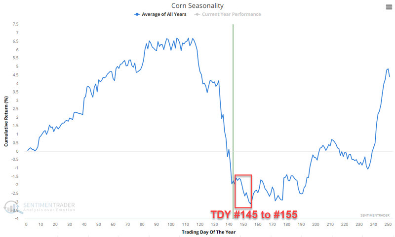
These results suggest that traders either focus on playing the short side or stand aside until some concrete signs of a market bottom and/or reversal appear.
A similar short-term bearish seasonal window exists for soybeans. For 2024, this period extends from the close on 2024-07-30 through 2024-08-15. The outlook for beans gets even worse if we extend it to the end of the unfavorable seasonal period highlighted in the chart below.
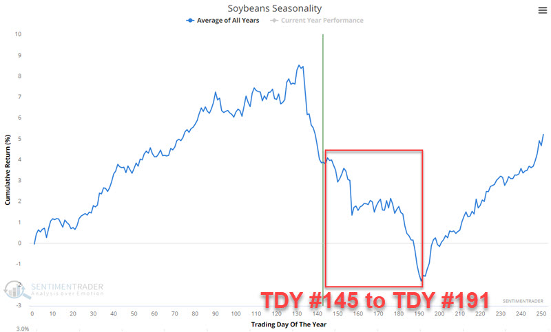
The chart below displays the hypothetical dollar +(-) from holding long one soybeans futures contract only during the TDY #145 to TDY #191 period every year since 1974. For 2024, this period extends out to 2024-10-03.
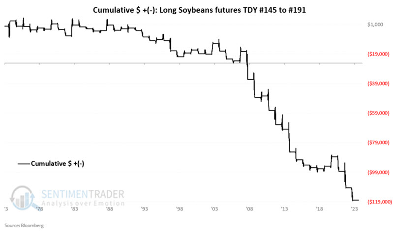
Soybeans rallied during these seasonal windows only 32% of the time. What's worse is that the contract lost more than -$8,000 during eight years, while never showing a gain of more than +$8,000.
Gas leak
Jay showed that unleaded gas is entering its weakest time of year. A recent development in crude oil pricing is also flashing a warning sign.
This is clearly a highly cyclical market. The price just recently dipped back below its 200-day moving average, and in recent years, prices have moved back above and below this average on many occasions.
The chart below displays the annual seasonal trend for Unleaded Gas futures.
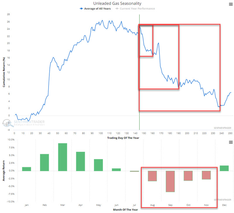
Here, we see a distinct annual pattern, which tends to show strength from December into June and then significant weakness in the year's second half. In the bottom clip, we see that August through November has historically averaged out to be losing months.
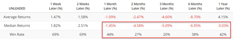
The chart below displays the hypothetical cumulative $ +(-) achieved by holding a long position in unleaded gas futures only from TDY #145 through TDY #236, and the table below summarizes unleaded gas performance during this period.
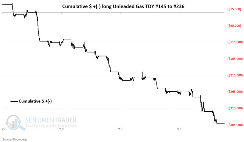
During these approximately 100-day windows, the contract rallied only 17% of the time, with an average loss about three times larger than the average gain.
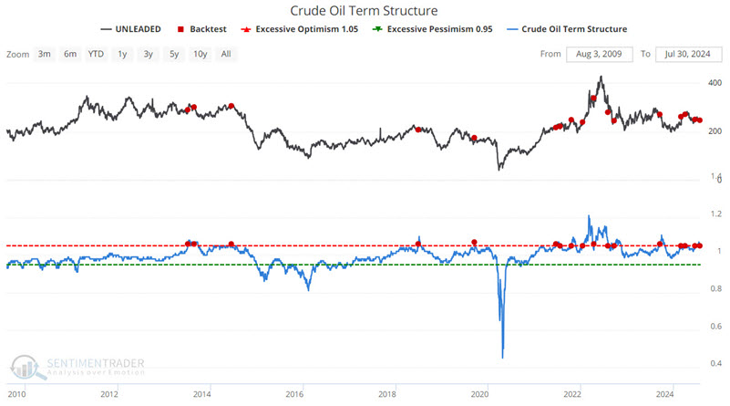
Jay also noted that the term structure of crude oil futures shows the relationship of the near-term futures contract to a further-out contract. If it is above 1.0, then the near-term contract is priced higher than the further-out contract, called backwardation. Crude and unleaded typically trade with a correlation of somewhere in the 80 to 85% range.
The chart below uses unleaded gas futures as the index and again shows the dates when the Crude Oil Term Structure crossed above 1.05 for the first time in 21 days in the last 15 years. We can see that gas rallied only 20% of the time over the next three months.
About TradingEdge Weekly...
The goal of TradingEdge Weekly is to summarize some of the research published to SentimenTrader over the past week. Sometimes there is a lot to digest, and this summary highlights the highest conviction or most compelling ideas we discussed. This is NOT the published research; rather, it pulls out some of the most relevant parts. It includes links to the published research for convenience, and if you don't subscribe to those products, it will present the options for access.