
TradingEdge Weekly for Aug 19 - A bevy of buy signals, fewer tech bear markets, using metals to trade bonds

Key points:
- There have been a bevy of buy signals in recent weeks
- Stocks have followed through, and the S&P 500 advance/decline line reached a new high
- Other indicators have also triggered thrusts
- Tech stocks entered a new bull market, or at least a 20% rise from a 52-week low
- Fewer than half of tech stocks are now in a bear market, down from 90%
- The smart money continues to buy
- One worry - a rejection by the 200-day moving average
- How we can use the price action of metals & mining stocks as a guide for bond prices
- A way to use an options trade on Apple
A bevy of buy signals
Several indicators triggered long-term buy signals this month, and stocks followed through.
Jay noted that the Economic Surprise Index recently reversed higher from a low reading, suggesting that the economy may be doing better than analysts' extremely unfavorable expectations. Our ROBO Put/Call Ratio recently reached an elevated level, suggesting that bearish sentiment among small traders reached an extreme. And the percentage of stocks in the S&P 500 above their 50-day moving averages just flashed a widely reported thrust signal.
Regarding the options indicator, ROBO is an acronym for Retail-Only, Buy-to-Open. This ratio looks only at buy-to-open option transactions of 10 contracts or less. When ROBO reaches an extremely high level, it indicates that small traders are buying put options heavily - typically out of fear of a further stock market decline.
The chart and tables below display all dates when the 10-day average for ROBO crossed below 75. The most recent signal occurred earlier this month.
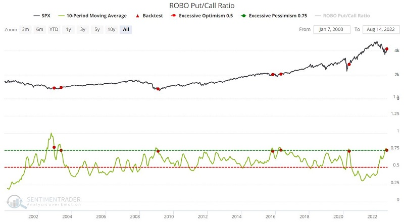
Over the past 22 years, when this indicator triggered a signal, the S&P 500 showed a gain over the next 6-12 months each time.
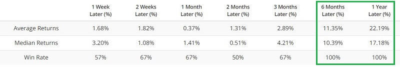
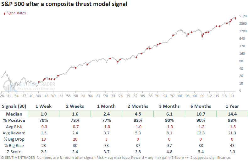
Similar to the other indicators, a thrust in the percentage of S&P stocks above their 50-day averages has been a positive sign for future returns. The chart below displays the cumulative return for the S&P 500 if held for twelve months after each signal.
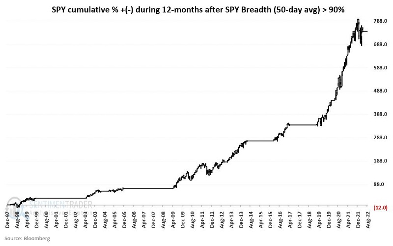
Underlying strength powers a new high in the S&P's A/D Line
With an impressive and broad-based rally over the past month, the Cumulative Advance/Decline Line for the S&P just reached a new all-time high. The index itself is capitalization-weighted, and weakness in some of its big component stocks has left it more than 10% below its own high.
When the A/D Line reached a new high for the first time in years, it was a good sign for the index in the weeks and months ahead. The current breakout is only the fourth time in history when the index was more than 10% below its high. The others saw the S&P 500 make decent gains over the next year. In fact, any time the index was more than 1% below its high, it showed gains.
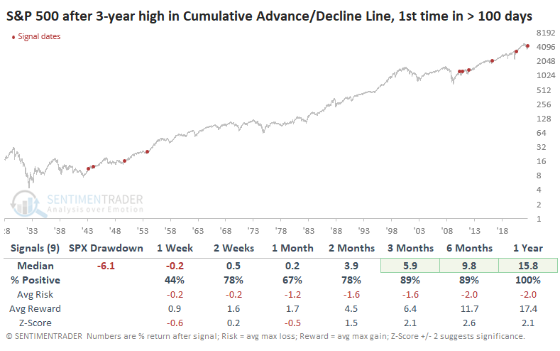
The Risk/Reward Table shows that over the next six months, only one signal saw the index lose more than -4% at any point. That's a pretty remarkable amount of consistency.
So...many...thrusts
With a new bear killer alert on Friday, Dean noted that his TCTM composite thrust model count has increased to 50%, triggering the first buy signal since November 2020 and the 39th alert since 1932.
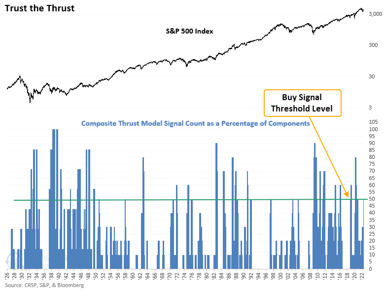
While the alert struggled during the challenging 1929-42 period, returns, win rates, and z-scores were still excellent across medium and long-term time frames. Since 1943, the signal results look phenomenal. The worst drawdown across all time frames was 6.4% due to an alert that occurred ten months before the 1987 crash.
With the new composite thrust model signal, the TCTM status changes to a cautious bull outlook. It will remain with that view for the next three months.
Tech stocks' new bull market
There are compelling reasons to believe this is not just another bear market rally, as noted in previous weeks.
Based on commonly accepted definitions, in fact, the Nasdaq is already back in a bull market, as are other technology-related indexes. Including dividends, the S&P 500 Information Technology rally popped above 20% last week.
The rally took 37 trading days from the last 52-week low on June 16 until the 20% threshold last week. That seems short, but it's not. Since 1926, the tech sector's total return has enjoyed 34 rallies of 20% off a 52-week low. It took a median of only 21 days for it to accomplish that.
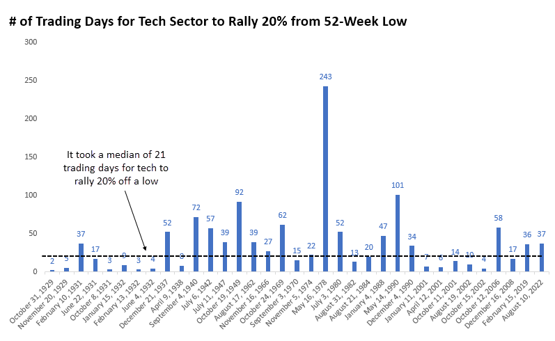
Maybe this is counter-intuitive, but it has been better for the index to enjoy a slower-unfolding rally than a quicker one. The table below shows every 20% rally from a low that took 30 or more trading days to unfold.
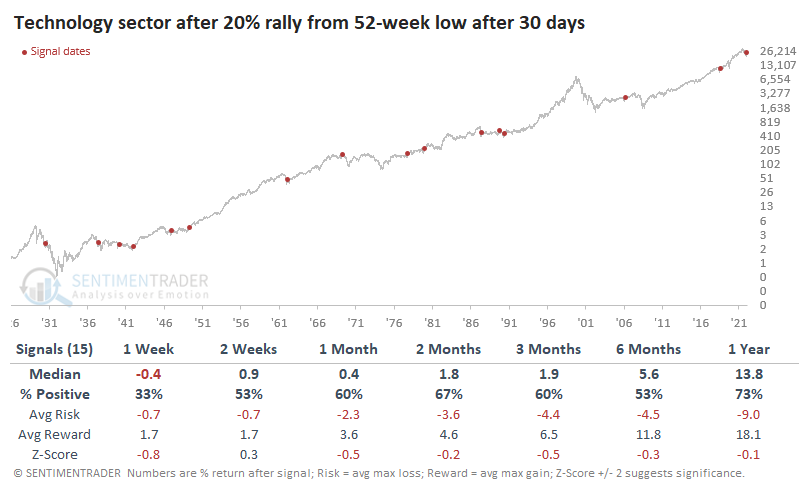
The sector's forward returns were okay. It rallied most of the time, but its median returns were below random, and the risk/reward skew was unimpressive. But they're better than quicker rallies. When rallies took fewer than 30 days to jump 20%, the sector's future returns were significantly weaker across most time frames.
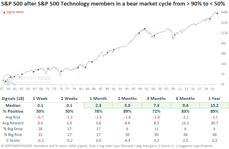
Fewer tech stocks in bear markets, too
The rise in tech indexes was powered by a recovery in many component stocks. Dean noted that S&P 500 Technology stocks in a bear market cycled from more than 90% to fewer than 50% of the total.
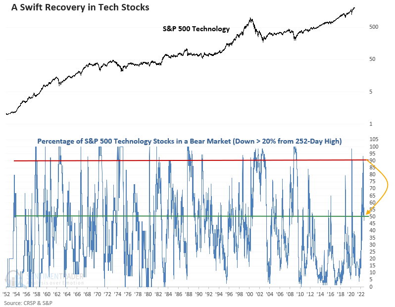
The reversal occurred in only 34 sessions, marking one of the shorter number of days to recover in history. At the time of the cross below 50%, the indicator had spent seven sessions above 90%, which is brief compared to other instances.
Similar reversals happened 18 other times over the past 65 years. While returns and win rates look solid, we don't see any time frames with a z-score that shows significance.
Returns improved if we applied these reversals in tech stocks to the S&P 500. In that case, the results look excellent, especially the z-scores across medium and long-term time frames. So, except for the July 2000 signal, what was good for technology was good for the broad market.
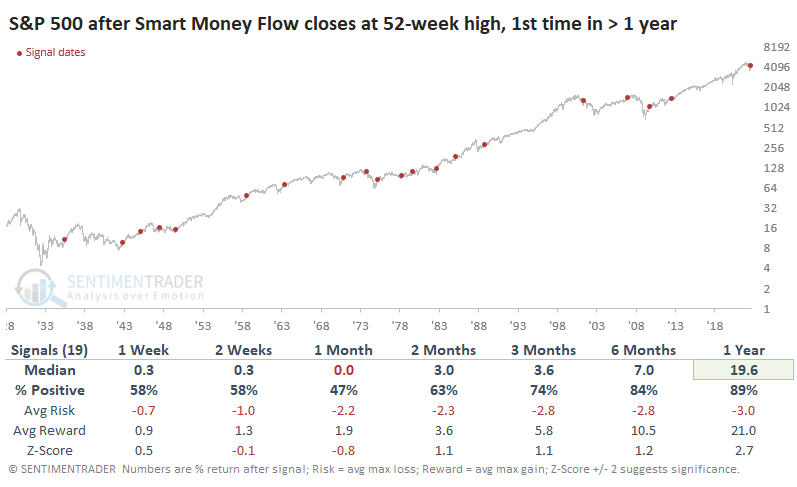
The smart money is still buying
In February 2021, there was compelling evidence that dumb money traders were in a state of speculative euphoria while smart money investors were busy selling.
An argument can be made that we're seeing the opposite scenario now. Sentiment in June reached one of the most egregious extremes of pessimism we'd seen in decades, and smart money has been buying. It broke out to a new 52-week high a couple of weeks ago and hasn't fallen apart.
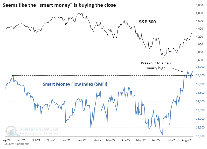
Here, "smart money" refers to the Smart Money Flow Index (SMFI) calculated by Bloomberg. It subtracts the price of the Dow Industrials at 10 am from the previous day's close and then adds today's closing price.
Below, we can see the S&P 500's return after the first new high in the SMFI in at least a year. Short-term returns were meh, but after the first couple of months, returns improved significantly. Out of the 19 signals, there were two big failures, and both are troubling because they showed up in other studies - the fall of 1973 and spring/summer of 2001.
A minor worry - the most important index was rejected at the most important level
The most important index in the world approached the most important technical level in the world on Monday. It failed.
Both superlatives are arguable, of course. But the S&P 500 has more assets benchmarked against it than any other global index. And the 200-day moving average is the most consistently used indicator among those who look at price charts.
For the first time in several months, the S&P approached its 200-day average on Monday, and so far, it has failed to pop above it. This also happened in 2001 and 2008. Gulp.
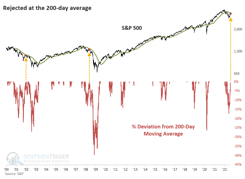
This only includes times when the index spent more than 63 trading days at least 1% below its 200-day average. It got close to this in 2011 and 2020 but didn't quite meet the criteria.
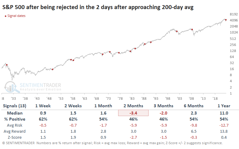
Since 1928, there have been a dozen similar failures in the couple of days following an approach to the 200-day average. These short-term rejections led to massive losses in 1930 and 1973, along with 2001 and 2008. Those are the cherry-picked disasters that bears will focus on, but there were nine times when the rejections didn't mean much. Seven of them preceded double-digit gains over the next year.
While the S&P index neared its 200-day moving average, fewer than half of its member stocks have climbed above theirs. A hallmark of a healthy index is when 60% or more of the constituent stocks trade above their 200-day moving averages; we still haven't seen that.
Some might argue that the Dow Jones Industrial Average is the most important index. And for its part, it approached its 200-day average after months below it and then kept right on chugging. Since 1900, there have been a couple of dozen times when the Dow spent at least three months more than 1% below its average and then, after the next few days, successfully breached the average and traded higher.
These successful approaches did have a better track record of gains for the Dow in the months ahead. Most importantly, risk was significantly reduced.
Metals & miners as a guide for bonds
Jay showed that the metals and mining sector has a solid correlation to interest rates. This sector also has a strong correlation to inflation. These factors make the metals and mining sector a useful contrary indicator for bonds, particularly long-term treasuries.
Rising interest rates and high and/or rising inflation are the enemies of fixed-income securities such as bonds. We will use index data for testing purposes, as these indexes have more history than the related ETFs. We will look at the 5-week and 30-week moving averages for the S&P Metals & Mining Select Industry Index (the index that XME tracks) to determine if this sector is favorable or unfavorable for bonds.
We will use the Bloomberg Barclays 20+ Treasury Index to track bond performance, which measures the total return for long-term treasuries.
The black line in the chart below displays the cumulative % +(-) for the Treasury bond index when the 5-week average for the Metals & Mining index is below the 30-week average. The red line shows its return when the Metals & Mining index 5-week average is above the 30-week average.
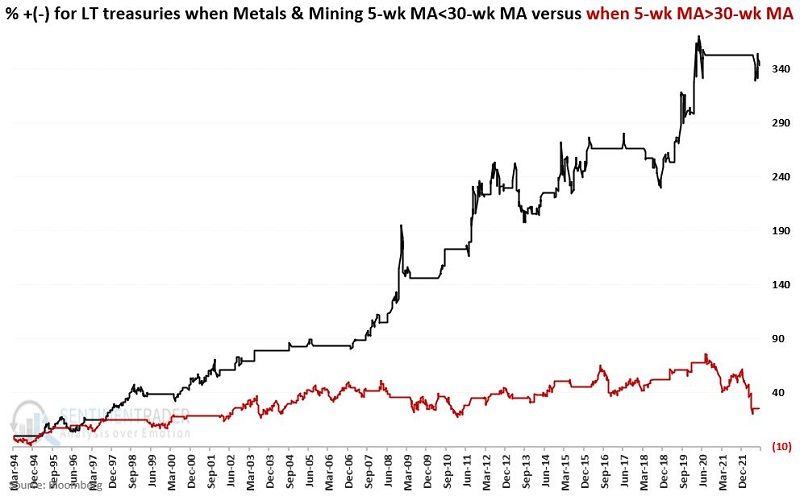
Over nearly 30 years, bonds returned +343% when metal & mining stocks were in a downtrend versus only +26% when they were in an uptrend.
At the moment, the 5-week XME average is below the 30-week average. This bullish for bonds configuration began on 2022-06-24.
Using a spread in Apple options
AAPL has rallied sharply, and many traders are looking for a potential new all-time high. Buying 100 shares of AAPL stock costs over $17,000 but Jay showed that a calendar spread using options offers the potential for a high rate of return at a fraction of the cost.
In the minds of many investors, Apple is, well, the apple of their eye when it comes to outstanding companies. It has staged a terrific rally, with some traders expecting a retest of the old highs and possibly a new all-time high.
However, one problem is that at $173.19 a share, it costs $17,319 to buy just 100 shares of AAPL stock. A trader who expects AAPL to continue to rally in the next several months might consider the example trade below:
- Buy 25 AAPL Dec16 2022 200 call @ $2.18
- Sell 25 AAPL Nov18 2022 200 call @ $1.34
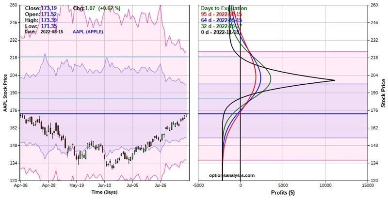
The particulars for this position and the risk curves (i.e., the expected profit/loss as of a given date at a particular price for AAPL shares) appear below (courtesy of Optionsanalysis).
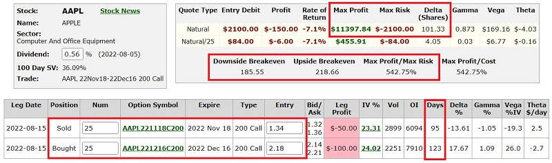
Things to note:
- The cost to enter a 1-lot is just $84. The cost to enter a 25-lot is $2,100
- $2,100 is also the maximum risk
- If held until November options expiration, the trade will show a profit if AAPL is between roughly $185 and $219 a share (depending on changes in volatility which we will discuss in Part II)
The bottom line: This trade will start to accumulate a profit if AAPL rises, but the profit level will roll over and begin to decline if AAPL rallies above the short strike price of $200. On the flip side, if AAPL drops in price by November options expiration, this trade will lose money (but no more than $2,100 no matter how far the stock might fall).
In part 2, Jay showed ways to adjust a trading plan on an Apple options spread based on price action, time decay, and implied volatility.
About TradingEdge Weekly...
The goal of TradingEdge Weekly is to summarize the research published to SentimenTrader over the past week. Sometimes there is a lot to digest and this summary is meant to highlight the highest conviction or most compelling ideas we discussed. This is NOT the full research that's published, rather it pulls out some of the most relevant parts. It includes links to the published research for convenience; if you don't subscribe to those products it will present the options for access.