
TradingEdge Weekly for Apr 7 - The importance of a big Q1, risk-on behavior, breadth thrusts, gold rally

Key points:
- Investors are back to showing risk-on behavior
- A couple of major breadth thrust signals triggered recently
- Stocks have rallied every time the S&P jumped during Q1 following a down year
- What happens after the S&P enjoys a big Q1
- A model combining different Q1 performance metrics
- This year saw one of the most intense buy-the-dip mentalities ever
- The Nasdaq 100 triggered a price momentum buy signal (a breadth signal, too)
- There are some positive signs for Utilities
- What happens when gold nears a multi-year high
- A rally in gold has pushed the lumber/gold ratio to new lows
- A positive seasonal window for soybeans
Back to risk-on behavior
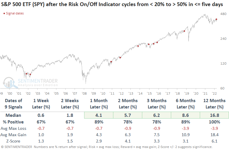
Investors are feeling frisky again. The Sentimentrader Risk-On/Off Indicator cycled from a bearish to a bullish condition. Dean showed that after similar reversals, the S&P 500 ETF showed a consistent upward bias across all time frames.
The Risk-On/Off Indicator checks all the boxes you want in a composite by incorporating 21 diverse sentiment and breadth-based measures. A trading model that uses the Sentimentrader Risk-On/Off Indicator cycled from the bottom of its recent range toward the upper end, triggering a risk-on signal for stocks.
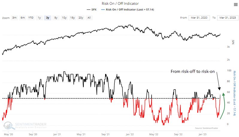
After the four-month range falls below a reset level and subsequently increases above a buy level, the system generates a signal. While most of the 51 total signals were generated in a bull market environment, the bear market alerts performed well over the next month in prior down cycles.
When indicators reverse swiftly, a concept that Marty Zweig incorporated into the Zweig Breadth Thrust system, trading signal performance trends are typically more bullish.
Speaking of Zweig...
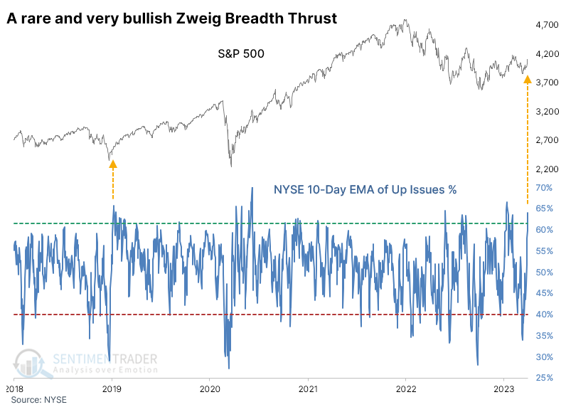
There are no rules when it comes to auction markets. There are many theories, heuristics, and mystical projections, but no actual rules. There cannot be when human emotions are involved. Regarding technicals and breadth, the closest analysts have come to cementing a rule is the Zweig Breadth Thrust, named after the late money manager Marty Zweig.
The chart below shows the indicator and the last triggered signal in January 2019. It didn't trigger during the March 2020 pandemic relief rally because it took a few days too long to unfold.
Our most reliable NYSE breadth data began in 1962, so the table below shows all similar signals from that date. There were no losses of any magnitude across any time frame after any signal. Even up to a year later, no signal suffered more than a 9.2% pullback. Even a 5% pullback was rare within the following year.
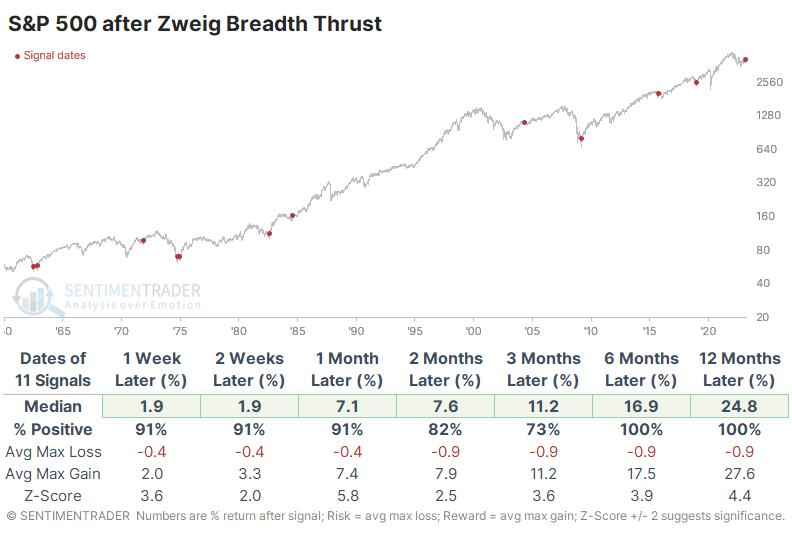
Because volume figures are more volatile than issues, there were many more signals using volume. And that included some false positives, with double-digit losses over the next 6-12 months. The current signal is one of the few times in history that the thrust triggered using both issues and volume. There were only two other dates when this occurred - the great 1982 bull market kickoff and 2019 following the Christmas Eve panic.
The impressive thrust in the number of rising stocks also triggered a rapid about-face in the NYSE McClellan Oscillator. When the Oscillator has been above +85 since 1962, the S&P 500 returned an annualized -3.0%, so there was usually some short-term backing and filling after such high readings.
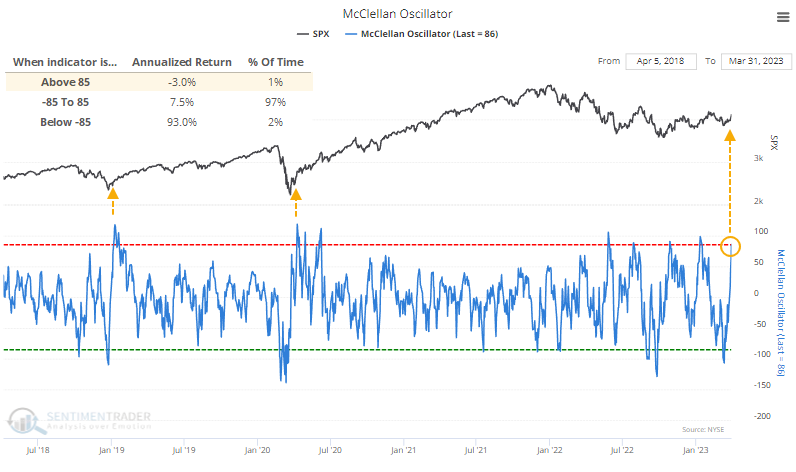
Context is critical, and the context of the current overbought reading is that it occurred soon after an equivalent oversold reading. When the Oscillator cycled from below -85 to above +85 within a month, it didn't prevent some indigestion within the next few months but all but one signal showed a gain over the next year, and the sole loser was negligible.
Down year, up quarter
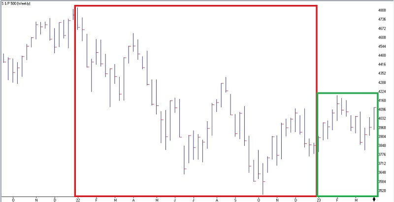
Jay noted that the S&P 500 registered an annual decline during 2022 then enjoyed a gain during the first quarter of 2023. This configuration of performance has historically offered an essential clue for investors.
The S&P 500 was down over -19% in 2022. As you can see in the chart below (courtesy of AIQ TradingExpert), the index registered a gain for the first quarter of 2023.
In the past 69 years, the S&P 500 has registered an annual gain 49 times and a yearly loss 20 times. Following those 20 losing years, we will analyze the performance of the S&P 500 during the first quarter of the following year to see if it registers a 3-month gain or loss. If the S&P increases during this period, we will analyze S&P 500 performance for the remaining nine months of the year.
The chart below displays the cumulative gain achieved by holding the S&P 500 only during the last nine months if Q1 is positive after a down calendar year.
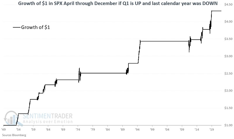
There were 11 of these down year / up quarter combos. From April through December, all 11 sported further gains, averaging +14.6%, 7 of them gained more than +10%, and 10 of the 11 occurrences experienced no more than a -3.6% drawdown from the entry price.
About that great quarter...
Jay further noted that not only did the S&P 500 register a gain in Q1, it was quite large. First-quarter gains over +5% have tended to presage bullish years in the past.
The S&P 500 registered a gain of +7% during the first three months of 2023. In the past 73 years, there have been 26 times when the S&P 500 gained +5% or more during the first three months of the year. For our test, we will buy the S&P 500 Index at the March 31st close if the index has gained at least +5% or more through that date. Then we will hold the index for nine months through the end of the current calendar year.
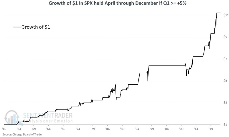
From April through December during these years, the S&P enjoyed further gains in 23 out of 26 years. The median gain was more than twice as large as the median loss, and the index gained more than 10% during 14 years while suffering a loss larger than -10% only once.
Folding a few Q1 metrics into a model
As Jay has outlined previously, a Q1 gain above 5%, any Q1 gain after a down year, and a Q1 low above the previous December low have all typically been followed by further gains. He then added the three measures together into one Q1Combined Model.
The Q1 Combined Model summarizes the readings for these three indicators at the end of March each year. For any given year, the Combined Model can read +3, +2, +1, or 0 for the remaining nine months of the current calendar year. The test started in 1950.
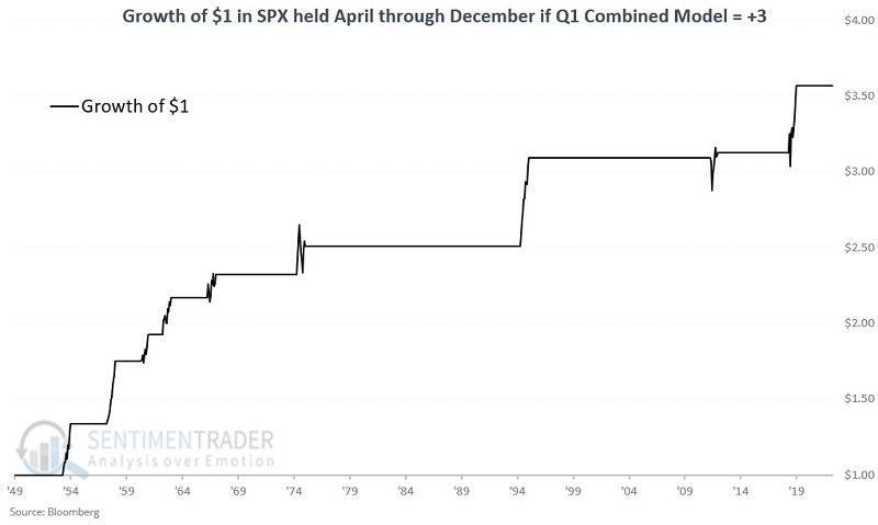
The Q1 Combined Model reading at the end of March 2023 is +3. Only nine previous years have had a Q1 Combined Model reading of +3. All nine showed an April through December gain. The chart below displays the growth of $1 in the S&P 500 held only for the last nine months of +3 years.
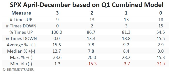
The table below displays a summary of April through December performance results for the S&P 500 Index based on the Q1 Combined Model reading at the end of March each year.
To put results in perspective, the chart below displays the growth of $1 in the S&P if the Q1 Combined Model reading is greater than 0 (black line) AND the growth of $1 in the S&P if the Q1 Combined Model reading is equal to 0 (blue line).
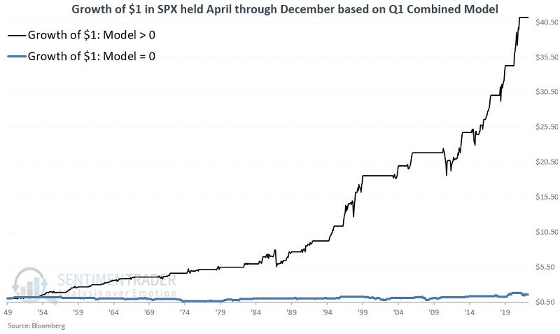
The April-December period showed a gain 88% of the time when the model was above 0, versus only 55% of the time when the model was 0. The S&P's average return, maximum gain, and maximum loss were all extraordinarily better for any year when the model was above 0 versus when none of the factors were in play.
No wonder traders are buying the dip
According to a Bloomberg article, investors in 2023 have been among the most willing ever to buy stocks after a down day. Indeed they have, as this year ranks as the 7th-best ever for BTFD (Buy The F*cking Dip).
The chart below shows the average next-day return in the S&P 500 after it suffered a daily decline. The average is from the first trading day of the year through the end of March for each year. So far this year, the S&P has snapped back by an average of 0.32%.
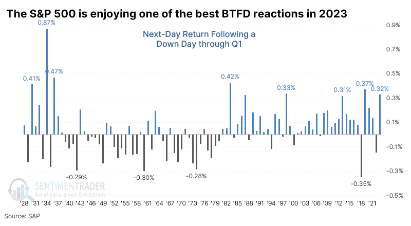
Most of the worst returns following a first quarter with heavy BTFD behavior occurred during the 1930s. If we look at modern markets, years since 1950, returns improved significantly. April tended to be a fantastic month, with only a single slight loss.
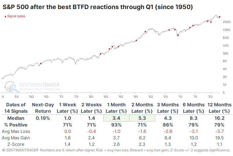
The worst failure over the medium- to long-term was in 2008 when the S&P gained nearly 6% over the next two months, then completely crapped out and suffered a massive loss. This also triggered in 1987, leading to the October crash, but for the most part, it led to consistently positive years.
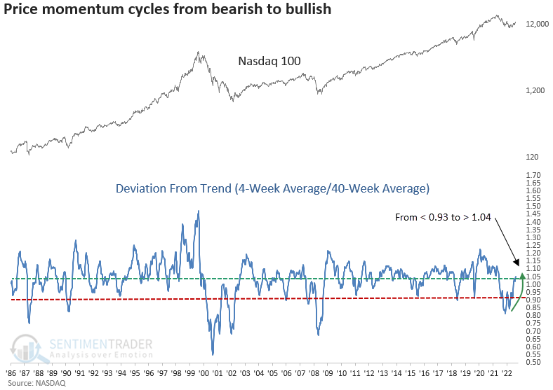
A big momentum signal for big tech
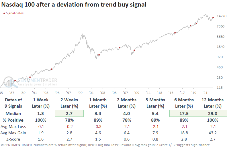
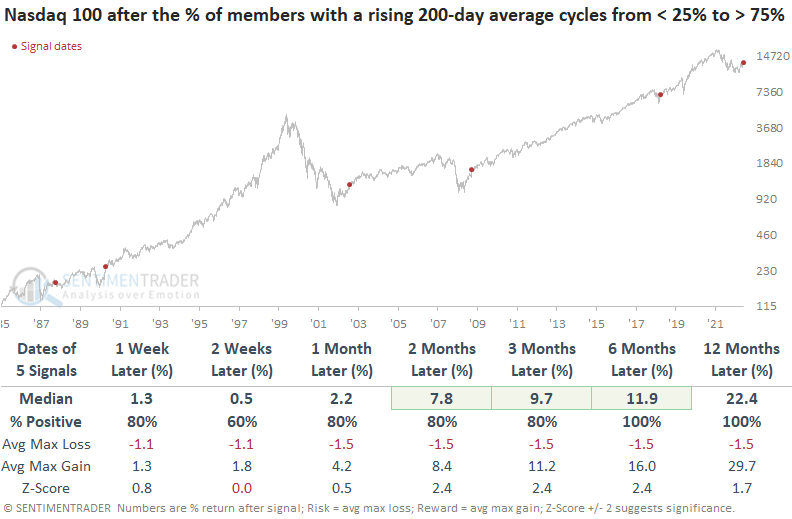
Dean showed that the Nasdaq 100 triggered a bullish long-term price momentum signal, and the percentage of Nasdaq 100 members with a rising 200-day average cycled from < 25% to > 75%.
For only the 10th time since 1985, the Nasdaq 100 registered a deviation from trend buy signal. The system measures the 4-week moving average for the index relative to the 40-week average. An alert occurs when the ratio between the two averages cycles from less than 0.93 to greater than 1.04.
When the ratio cycled like this since the index's inception, the NDX 100 showed excellent results across all time frames, especially a year later. And drawdowns were remarkedly low in the first three months with a median loss of -2.1%.
With so much buzz about how a handful of mega-cap stocks are driving the positive performance for capitalization-weighted indexes this year, it's interesting to see most Nasdaq 100 members maintain a rising 200-day average.
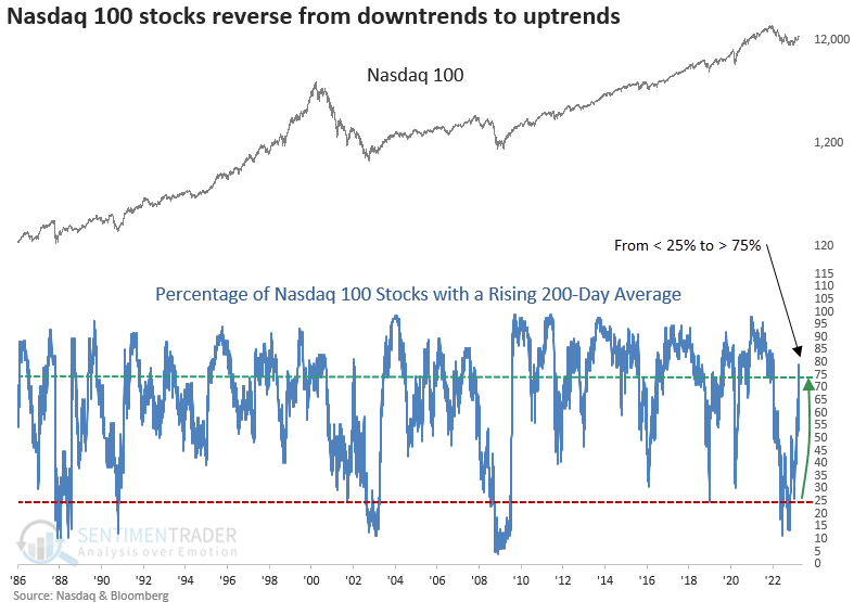
When the percentage of Nasdaq 100 stocks with a rising 200-day average cycle from < 25% to > 75%, the index showed a consistent upward bias across most time horizons, with excellent long-term results. While the sample size is small, once again, drawdowns were minimal.
Some positive signs for Utilities
Several indicators have flashed favorable signals for the utility sector in recent months. Jay suggested this confluence of indicators creates a favorable "weight of the evidence" environment for utilities.
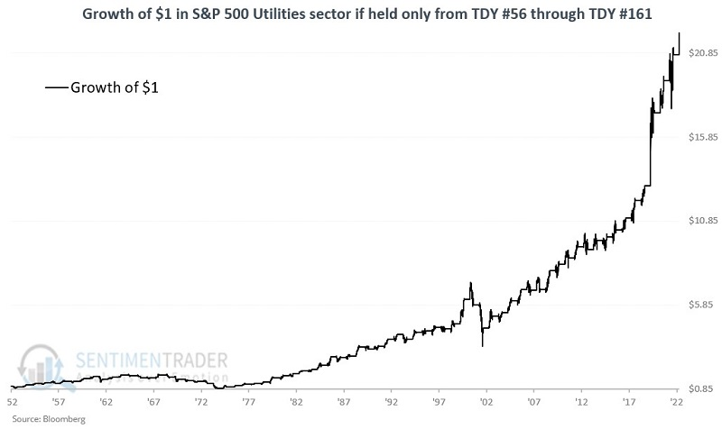
The chart below displays the annual seasonal trend for utilities and highlights the period from Trading Day of Year #56 through TDY #161. For 2023, this period extends from 2023-03-23 through 2023-08-24.
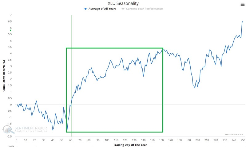
The chart and table below display performance for the S&P 500 Utilities Sector index if held only during this period every year since 1953. The results through 1974 were decidedly mixed. Since then, this period has shown a gain in 40 of the past 47 years.
Seasonality is only one potential positive for utilities. Various other indicators have flashed positive in the past nine months as the sector (like many sectors) thrashed around, trying to establish a bottom.
Jay outlined a handful of indicators that are currently on buy signals for the sector:
- An oversold breadth reading from XLU % RSI14 < 30 indicator
- A deeply oversold reading from the XLU 12-week Low % indicator
- A cluster of high readings from the XLU Component Correlation indicator
- Utilities as a bond proxy can be affected by extreme Bond Risk Levels
- A bearish sentiment extreme in 10-Year Treasury Note Optix
Individually, each of the indicators detailed above may or may not pan out now as they have in the past. Taken together, though, they create a compelling weight of the evidence outlook for the utility sector. That said, if the stock market experiences a bullish run in the months ahead, the likelihood is excellent that other sectors may outperform utilities. Hence, this opportunity may best suit investors seeking income and lower volatility.
Gold is nearing a multi-year high
Gold futures closed within 1.5% of a 2-year high for the first time in over two years. Dean noted that after similar conditions, gold showed a strong tendency to close at a new high and rally further.
With gold building a multi-year base, the commodity could be on the verge of a significant breakout.
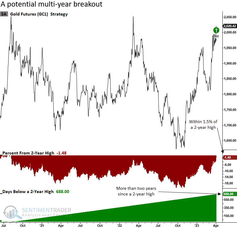
When gold futures close within 1.5% of a 2-year high for the first time in two years, the commodity tended to break out and rally with a fairly consistent upward bias across all time frames. The February 2019 signal is the only instance that did not close at a new 2-year high within ten trading days. It eventually registered a new multi-year high on 2019-06-20.
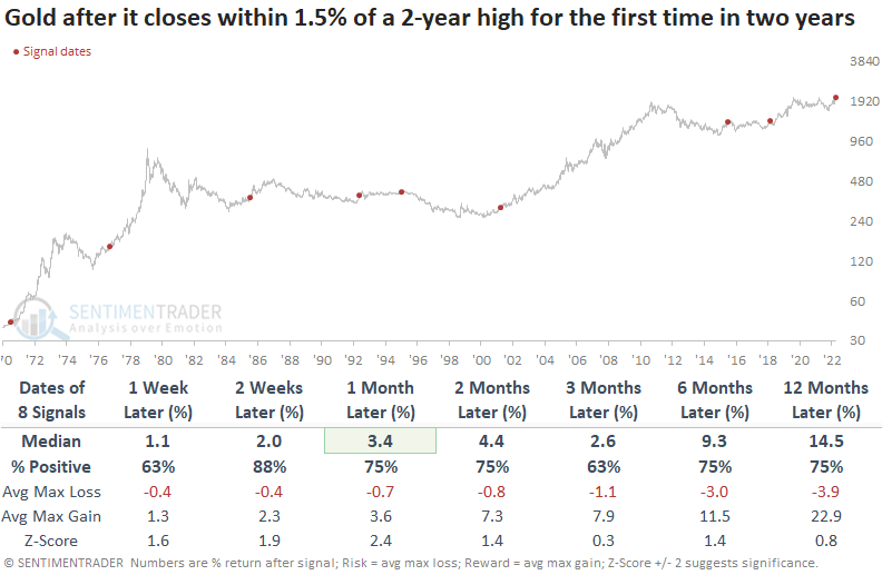
The potential breakout signal led to favorable results for the Gold BUGS Index (HUI), a basket of gold stock companies that hedge their production no more than 18 months in advance. However, in comparing the two options, a gold ETF like GLD looks like a better risk/reward.
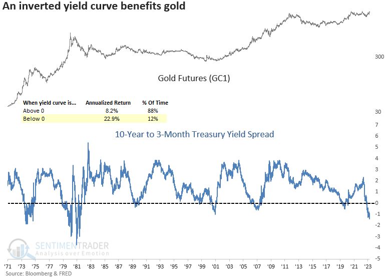
The potential for a breakout and extension of the current rally looks more favorable with an inverted yield curve. Annual returns for gold futures are significantly better when the curve is inverted.
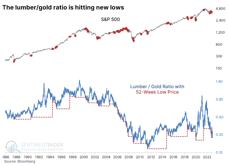
Rally in gold pushed the lumber/gold ratio to new lows
One worry that has cropped up lately is the drastic moves in some commodities. The ratio of lumber to gold prices is a fairly common one, as lumber is a reflection of building and economic activity. In contrast, gold is mostly just a shiny rock that sometimes serves as a safe haven asset.
In recent weeks, the former has been plunging while the latter soars. That raised concerns that an essential part of the economy is faltering while investors rush into the "safety" of gold.
Taking a long-term view, a lagging lumber/gold ratio gave a few decent heads-ups. The chart below plots red dots on the S&P 500 whenever the lumber/gold ratio sets a new 52-week low.
Future returns in the S&P when the ratio set a new low for the first time in at least 50 sessions, which was triggered at the end of March, were decent. It did precede a couple of large losses, but across all time frames, the S&P rose most of the time. Overall returns for the S&P weren't great, but they also weren't consistently terrible.
New lows in the ratio were mainly a good sign for lumber prices. Even though the contract has spent years (even decades) without going much of anywhere, there was a modest tendency toward mean-reversion. Over the next six months, lumber rose 74% of the time, averaging +8.7%. There were many double-digit, even some triple-digit, gains, but also four signals that suffered double-digit losses.
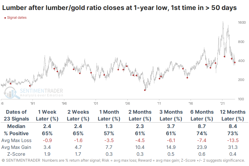
Curiously, gold also tended to show positive returns, especially over the past twenty years; before 2002, not so much.
A few good weeks for soybeans
Jay noted that soybeans entered a seasonally favorable period on February 1st; so far, there has been a sharp decline, followed by an equally strong rally. While some may conclude that things are just not working out this time around, starting now is often when the spring planting cycle-induced rally begins in earnest.
As we can see in the annual seasonal trend chart below, after TDY #21, beans rallied slightly, fell hard, and then rallied back to almost exactly where they started.
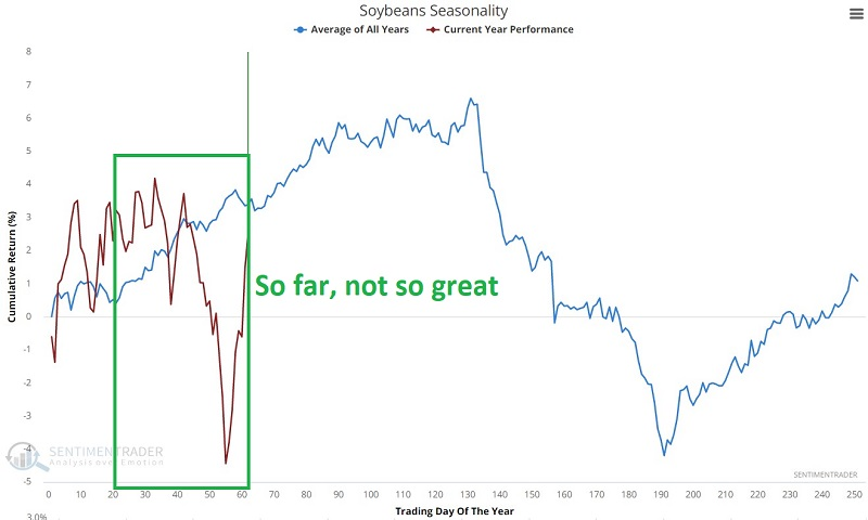
This type of volatility, whipsawing action can be enough to drive off even the most ardent bull. But another opportunity may be at hand. Note the area in the green box below. It highlights the period from TDY #64 through TDY #90.
The chart below displays the hypothetical $ gain from holding long one soybean futures contract only during this seasonal window each year starting in 1937.
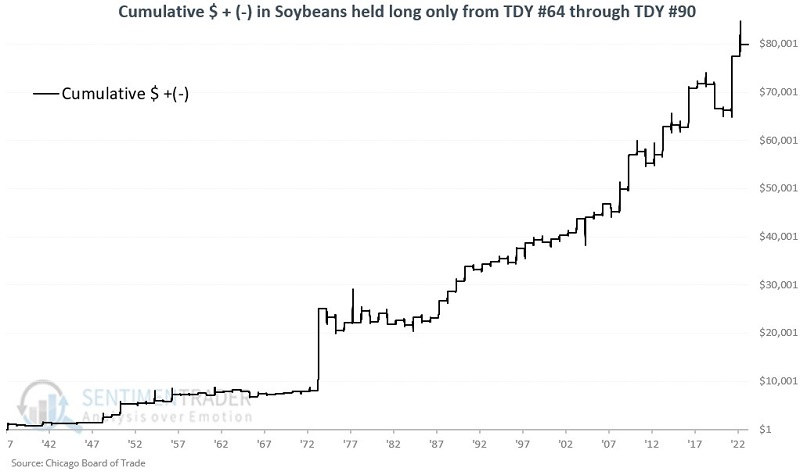
These windows sported a gain 69% of the time, with an average gain almost double that of the average loss. The contract gained more than $3,000 during eight of these years, versus only one year with more than a $3,000 loss.
Note that traders who eschew futures contracts can play the long side of the soybean market via the Teucrium Soybean ETF (ticker SOYB), which is intended to track soybean futures.
About TradingEdge Weekly...
The goal of TradingEdge Weekly is to summarize some of the research published to SentimenTrader over the past week. Sometimes there is a lot to digest, and this summary highlights the highest conviction or most compelling ideas we discussed. This is NOT the published research; rather, it pulls out some of the most relevant parts. It includes links to the published research for convenience, and if you don't subscribe to those products, it will present the options for access.