
TradingEdge Weekly for Apr 4 - Correction correlations, new low expansion, interest rate cycles

Key points:
- Taking a look at post-correction periods most like the current one
- The S&P 500's performance in the 50 days following Trump's inauguration is not encouraging
- New lows are increasing among S&P 500 stocks
- The momentum of credit spread movements is unfavorable for stocks
- Companies are paying more and new orders are falling, not a good combination
- Semiconductors have been below their 200-day average for a month after a long uptrend
- A simple model for long-term interest rate trends
- Using PMI data for trading Bitcoin
Correction correlations
The selloff into this week isn't encouraging, as it mostly correlates with other poor reactions to corrections.
We can go back to 1928 and look at every time the S&P corrected 10% from a multi-year high and then at how it performed in the following weeks. The chart below shows the 15 corrections with the highest correlation to the past 11 sessions and their price paths going forward.
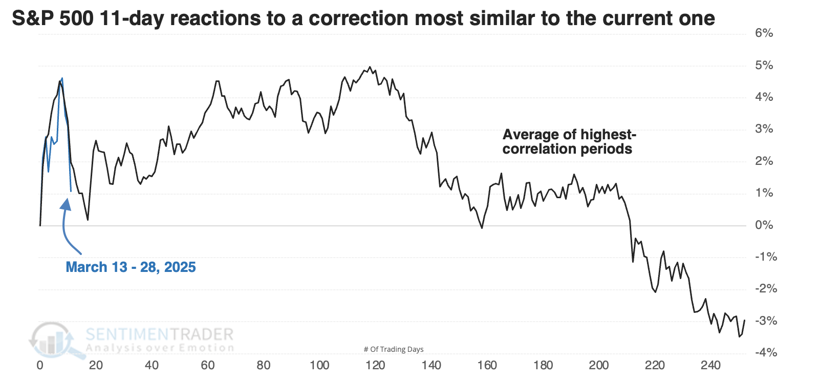
The table below looks at S&P 500 returns following the 11-day reactions most similar to the past couple of weeks.
In 1955, then again during the ending phase of the internet bubble, the S&P did just fine, recovering well from its initial disappointing rebound. The signal from 2015 meandered for a while and returned only a little over +2% during the next six months, but at least it didn't result in a significant loss. But the others were not good.
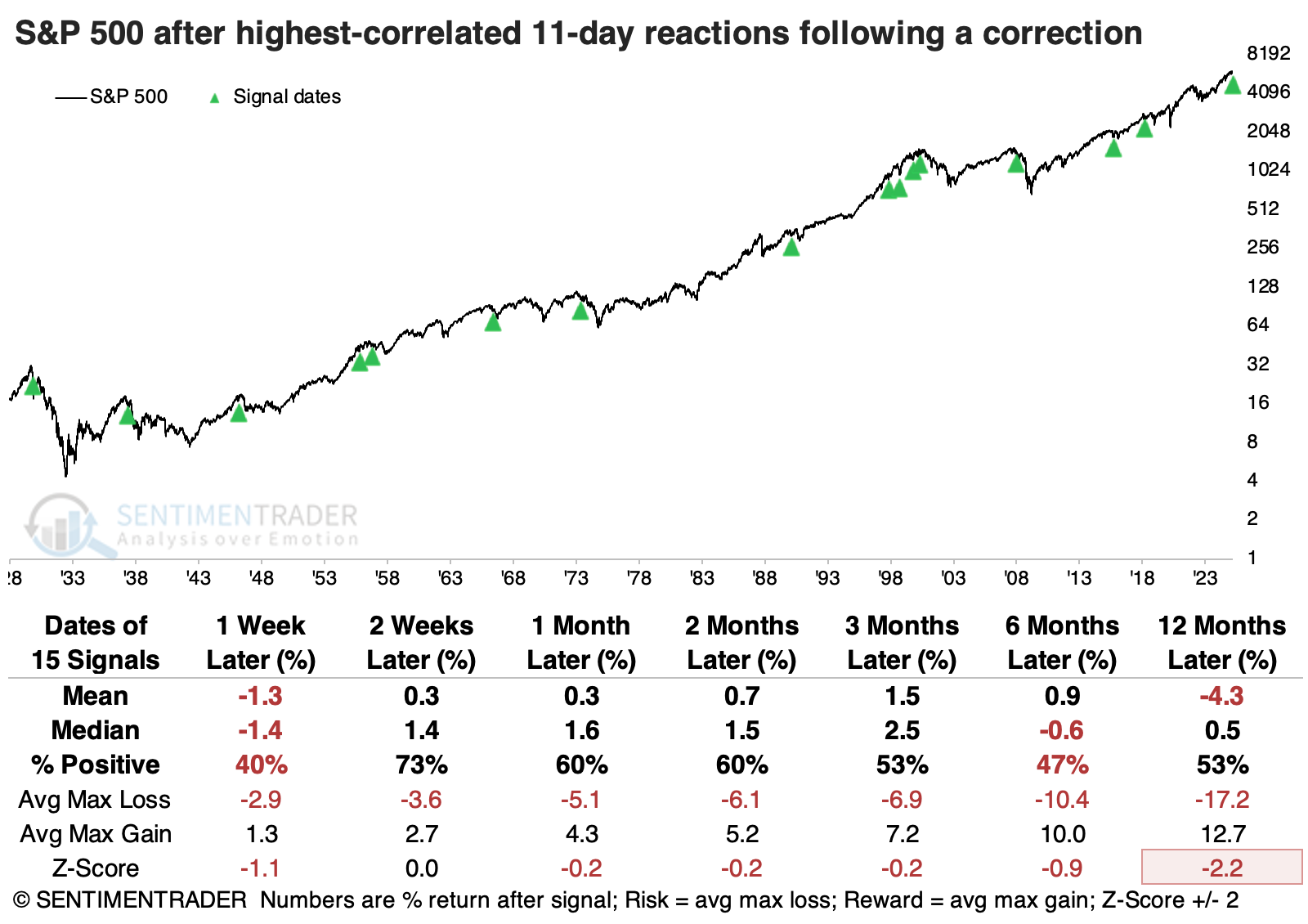
The table of maximum gains and losses across time frames shows a lot of red over the following year, with a median drawdown of -15%, significantly larger than the median drawup (maximum gain) of around +10%. There were ten losses of at least -10% compared to seven gains of +10% or more.
We like to look at counterexamples, so below is an aggregate of the 15 corrections in which the initial 11-day reaction from correction territory was the least like the past two weeks.The S&P 500's returns following these signals were much better.
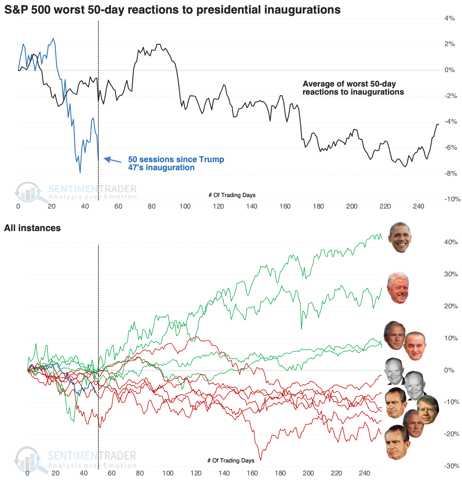
Poor presidential precedents
A couple of months ago, we saw that investors shouldn't short a dull President. Buyers tend to stick around when they are pretty comfortable with the initial administrative moves following an inauguration. The problem is that President Trump is anything but dull.
This reaction places the market's response to Trump's inauguration among the bottom of all Presidents since 1950. The chart below shows an aggregate and then individual price path of the years when the S&P 500 showed a negative return in the 50 sessions following an inauguration. The market recovered strongly in the cases of Obama and Clinton and did okay after Bush and Johnson. The others struggled to build on any gains.
The table below shows that the S&P's median return six months after those first 50 days was -1.9%, and even a year later, it was flat. Only four of the ten instances showed a larger maximum gain than loss over the following year.
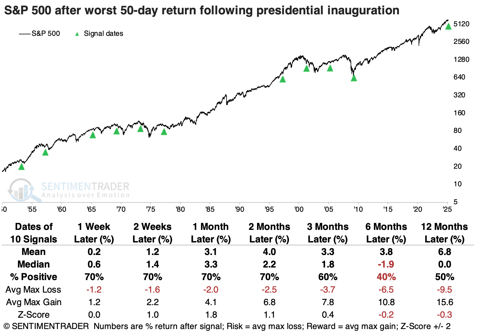
Focusing on the most significant adverse reactions, we see that only the inflating of the internet bubble during Clinton's second term avoided a loss for the index over the following six months.
Contrast those returns with the years when the S&P showed the best reaction in the first 50 days following an inauguration. Stocks jumped at the start of Reagan's first term, then fell as Volker raised interest rates to fight inflation, and the economy fell into a recession (ultimately forming a generational low). Other than that, stocks continued to build on the good starts and showed mostly solid gains over the following year.
Now new lows are expanding
The percentage of S&P 500 stocks registering a 252-day low spiked above 18%. Dean showed that similar expansions in annual lows suggest the S&P 500 could struggle over the following year.
Historically, environments where new lows are rising, not falling, tend to be fraught with downside risk. Rather than rushing in, it has often paid to wait for a contraction in new lows, which typically signals that selling pressure is abating and a more favorable risk/reward backdrop is taking shape. Until that happens, caution is warranted.
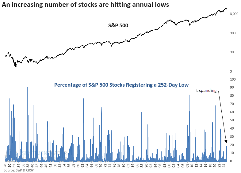
Since 1929, there have been 25 instances when annual lows increased above 15% for the first time following an all-time high. To focus on more relevant historical parallels, Dean narrowed the criteria to include only those cases where the S&P 500 was down less than 15% or within 50 days of its peak. At some point in the next year, the world's most benchmarked index was lower in 14 out of 16 cases.
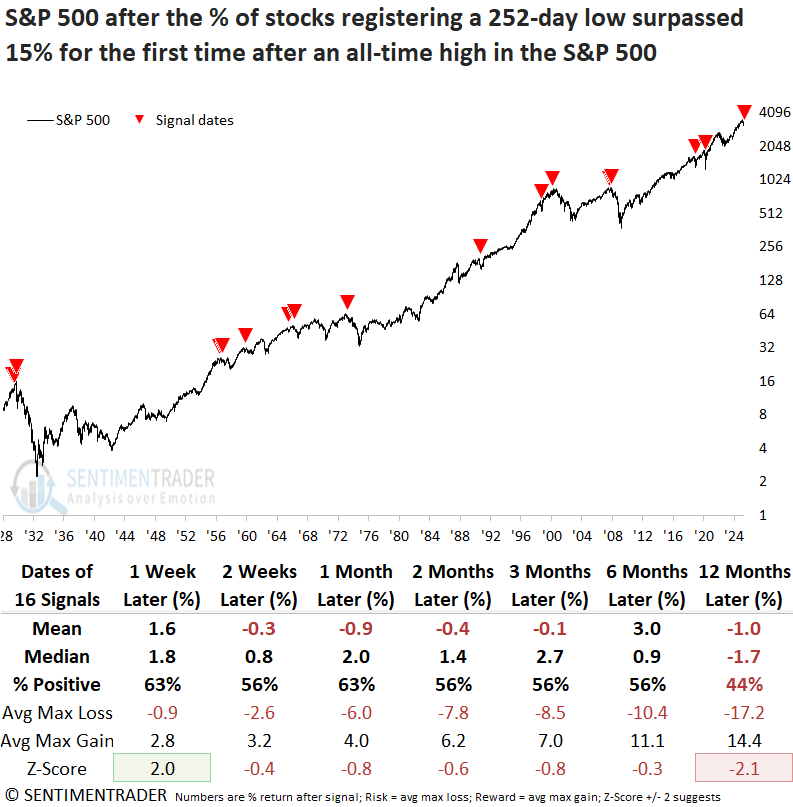
Over the following year, the maximum loss surpassed -10% in 12 out of 16 cases, including each of the last nine signals starting in 1966. By comparison, just 9 of 16 rose more than 10%, underscoring an unfavorable risk-reward profile.
The rise in annual lows is concentrated mainly in cyclical sectors, while defensive groups remain relatively untouched. Historically, significant drawdowns tend to culminate in broad-based selling, including defensive names.
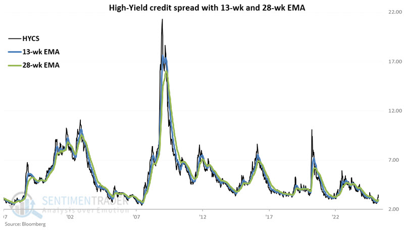
Credit spread trends are worrisome
Credit spreads serve as a "fear gauge" in the credit markets. Jay showed a Credit Spreads Combined Model that recently fell into unfavorable status.
The ICE BofA US High Yield Index Option-Adjusted Spread (HYCS) measures the spreads between a computed of all bonds in a calculated index of below investment grade bonds and a spot Treasury curve. We rate the spread as favorable when it is in a downtrend and unfavorable when it is in an uptrend.
The chart below displays the spread with 13-week and 28-week exponential moving averages.
To measure momentum in the spread, the chart below displays the two-week change between the 13-week minus 28-week averages.
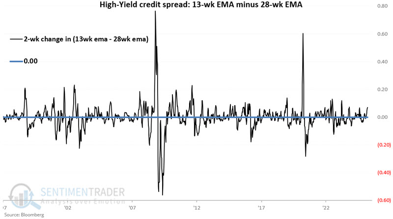
If the 13-week EMA is above the 28-week EMA AND the difference between the 13 and 28-week EMAs this week is above the difference two weeks ago, then we rate this indicator as "unfavorable." If either of the measures is in a downtrend, then this indicator is "favorable."
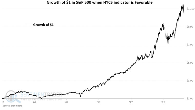
The chart below displays the hypothetical growth of $1 in the S&P 500 only when this model is favorable (i.e., G = 1). Since 1997, $1 grew to $10.48.
The chart below displays the growth of $1 in the S&P 500 only when the model is unfavorable. Since 1997, $1 has declined to $0.69.
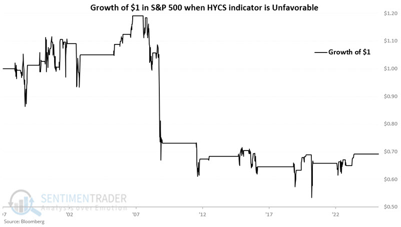
This High-Yield Credit Spread model turned unfavorable on 2025-03-28.
Jay did a similar analysis using credit default swap spreads and combined the two models into a single one. That combined model is currently at its most negative possible reading for stocks, as both indicators are showing unfavorable trends.
A fundamental headwind
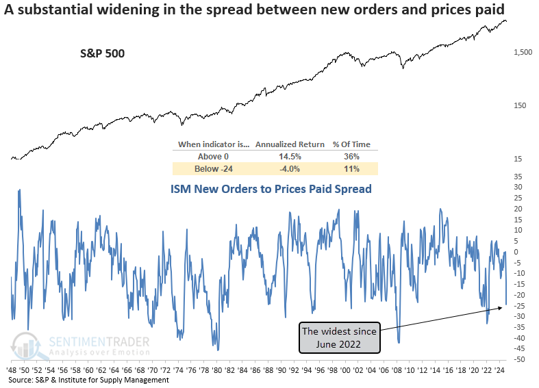
The ISM new orders to prices paid spread plunged to the lowest level since June 2022. Dean showed that similar indications of stagflation suggest stocks could struggle over the following year.
On Tuesday, the Institute for Supply Management released its survey results for March. The data was not encouraging as the spread between new orders and prices paid plunged below -24%. This sharp contraction signals that future manufacturing demand is deteriorating as input costs rise, a hallmark of stagflation.
The chart below shows that when the new orders-to-prices-paid spread resided below -24%, the S&P 500 delivered an annualized return of -4%, starkly contrasting its performance when the spread was positive.
Whenever the ISM new orders to prices paid spread dropped below -24% for the first time after a positive reading, the S&P 500 tended to struggle over the next year. The market was particularly weak in the first month, with losses occurring 75% of the time. Moreover, several precedents occurred near the outset of bear markets.
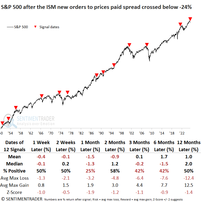
Consumer discretionary and technology, both hit hard during the recent correction, show little promise for the next month. In contrast, energy, the year's top performer, may continue to thrive in a stagflationary environment. Interestingly, owning gold added little value.
Applying the signal dates to the year-over-year reading for the Consumer Price Index (CPI) suggests consumer inflation is likely to increase, as the widely followed measure has risen 75% of the time over the next three months.
Semiconductors fail
Multiple price trend indicators activated technical warnings for the semiconductor group. Dean noted that similar trend conditions suggest the semiconductor group could struggle over the next six months.
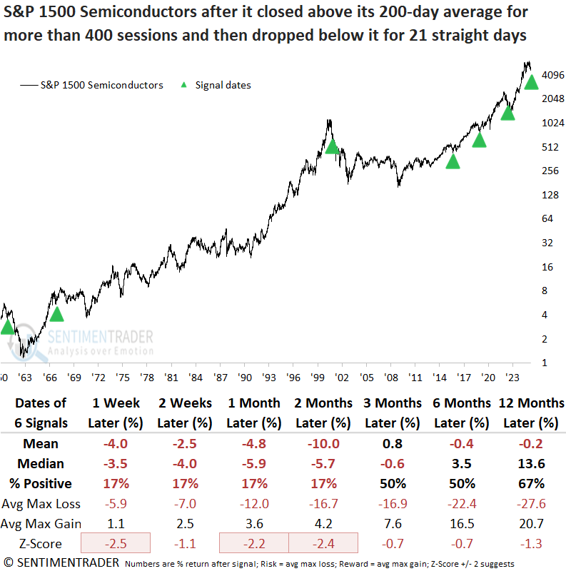
After closing above its 200-day average for two years, the 4th longest stretch in history, the S&P 1500 Semiconductor group, a key beneficiary of the AI boom, closed below its long-term average for 21 straight sessions. The prior signal emerged in May 2022, after which the semiconductor index tumbled 21% over the next two months.
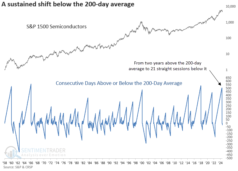
Although the sample size is small, whenever the S&P 1500 Semiconductor industry closed below its 200-day average for 21 straight days following an extended period above it, the bellwether technology group displayed unfavorable returns and consistency across all time frames.
The S&P 1500 Semiconductor group's sharp move from a 5-year high to a 6-month low strengthens the case for a significant trend change. Similar price breakdowns led to consistent declines in the semiconductor group over the following six months, with significant risk in the initial weeks, during which it dropped 73% of the time.
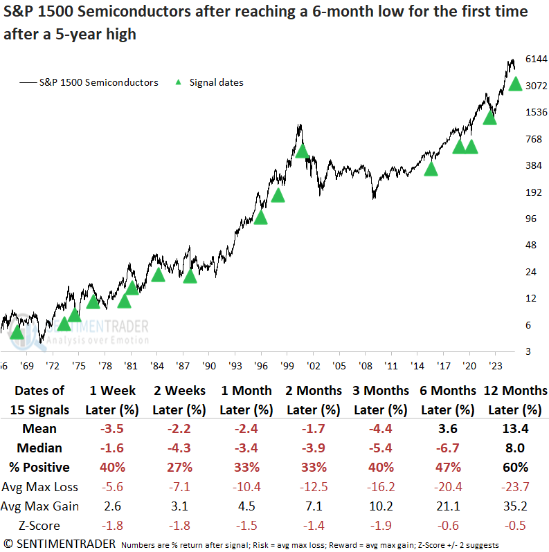
Over the next six months, the index fell by 10% or more in 11 of 14 instances. In line with the 200-day average analysis, cyclical sectors such as technology weakened, while defensive sectors, especially staples, posted favorable returns and consistency.
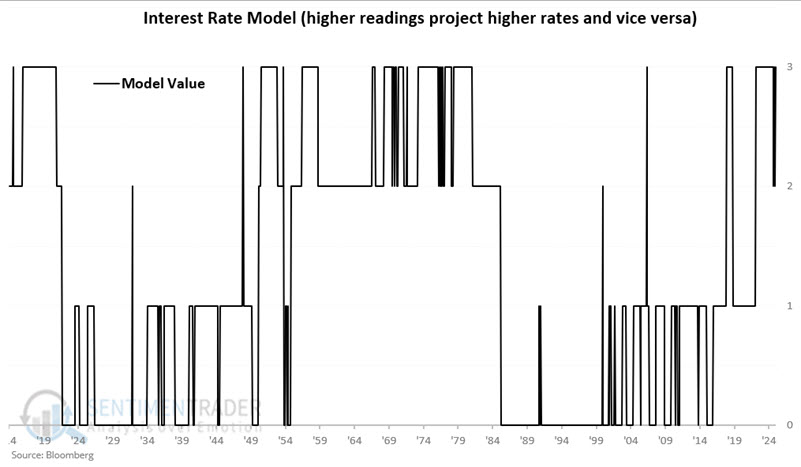
Long-term interest rate trends
Interest rates tend to move in long-term waves. Jay combined treasury yields versus their long-term trend and real interest rates into a simple and surprisingly helpful model.
Let's take a closer look at a trend-following method for designating the trend for interest rates as "rising" or "falling." We will use two measures:
- The yield on 10-year treasury notes (ticker $TNX) versus its 120-month exponential moving average
- The "real" interest rate (here defined as the 10-year treasury yield minus the inflation rate) versus its long-term average
The chart below displays the history of 10-year treasury yields since 1914. We use the month-end value for ticker $TNX and adds the 120-month exponential moving average of month-end readings.
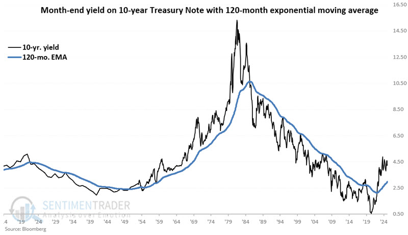
For our purpose, the "real" interest rate is the yield on 10-year treasuries minus the 12-month change in the Consumer Price Index (CPI). This measure tells us how much yield we get after inflation. The long-term average is roughly 1.45 points, and the long-term median is about 1.95 points, so we will use the midpoint to set our long-term cutoff at 1.70 points. In other words, a real interest rate above 1.70 is considered "above average," and below is considered "below average."
At the end of each month, if yields are above the 120-month average, the model adds +2 points, and if real rates are below 1.7, the model adds +1.
Based on the calculations, the model's value can be +3, +2, +1, or 0 at the end of any given month. The chart below displays the value for each month since 1914. The reading on 2025-03-31 = +3, which applies to April 2025.
The chart below displays the cumulative movement of interest rates only during months when Value J closed the previous month equal to +3. Through 2025-03-31, the cumulative total is +12.10 points.
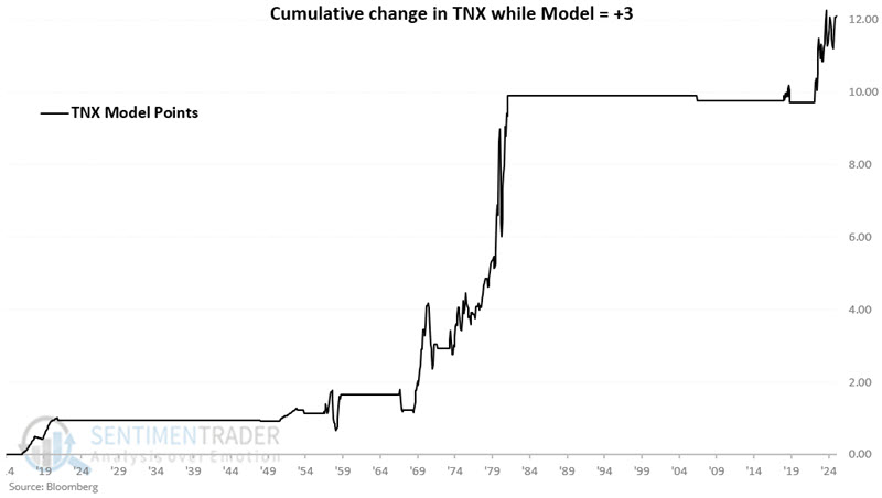
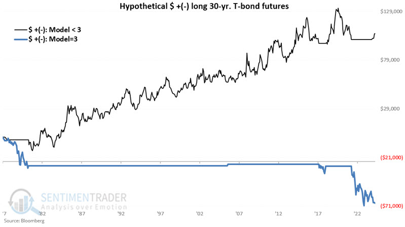
In a nutshell, interest rates have tended to rise when the model is = +3 and fall during all other periods. The chart below overlays +3 TNX performance (blue line) with less than +3 TNX performance (blue line).
PMI trend for...Bitcoin?
Historical analysis of Bitcoin performance relative to any given indicator has to be taken with a grain of salt. That said, Jay showed the Purchasing Managers Index (PMI) has, to date, proven helpful.
The method we will examine involves the ISM PMI Manufacturing Index, which is based on data compiled from monthly replies to questions asked of purchasing and supply executives in over 400 industrial companies. A higher-than-expected reading should be taken as positive/bullish for the USD, while a lower-than-expected reading should be taken as negative/bearish for the USD.
PMI values are updated once a month. We will only evaluate the latest PMI reading at the end of each month, not when the newest value is reported. If PMI is above its 10-month moving average, it's considered favorable for Bitcoin for the following month, and vice-versa.
The chart below displays Bitcoin price action with the signals since 2018 using the abovementioned method. Please note that the red down arrow at the far right denotes the end of the data and NOT an "unfavorable" signal (as the PMI is still above its 10-month average and thus still considered "favorable").
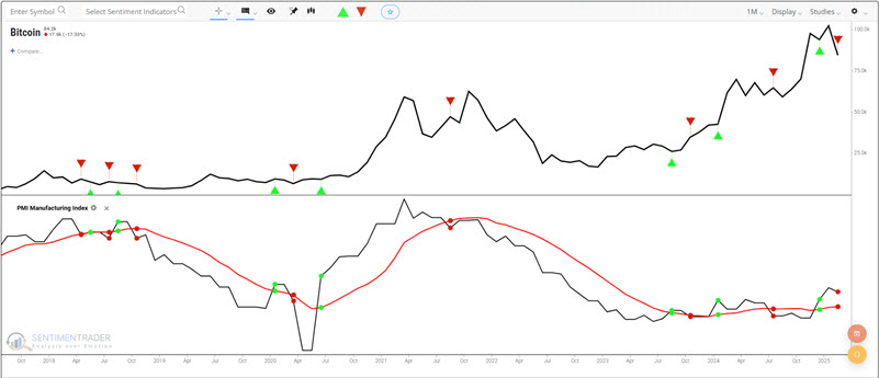
The table below summarizes Bitcoin's performance during "favorable" periods. The key things to note are a) that Bitcoin was in the market only 42.8% of the time, with an Average Win of 303% versus an Average Loss of -17.8%.
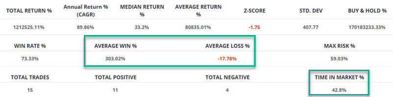
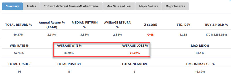
Now let's look at Bitcoin performance when PMI < 10mo MA. Labeling results as "bearish" would be incorrect since there is an overall net gain. Nevertheless, it would be accurate to label results as far less favorable (and far less consistent) than performance during favorable periods.
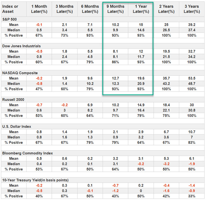
As long as we are looking at PMI, let's also look at stock market results after PMI crosses above its 10-month moving average. In the table below, note that the S&P 500, Dow Jones Industrials, and Nasdaq 100 gained 93% of the time one year after a PMI crossed above its 10-month moving average.
About TradingEdge Weekly...
The goal of TradingEdge Weekly is to summarize some of the research published to SentimenTrader over the past week. Sometimes there is a lot to digest, and this summary highlights the highest conviction or most compelling ideas we discussed. This is NOT the published research; rather, it pulls out some of the most relevant parts. It includes links to the published research for convenience, and if you don't subscribe to those products, it will present the options for access.