
TradingEdge Weekly for Apr 18 - Equity earthquake, unfriendly trend, sector extremes

Key points:
- Investors suffered through an equity earthquake
- A breadth composite rebounded from an extreme signal
- The S&P 500's long-term trend has turned negative
- The whipsaws are causing investors to exhibit risk-off behavior
- Buy-the-dip mentality is almost nonexistent
- Biotech shares are singing the blues, but maybe not for long
- Transport stocks have derailed
- There are stock correlation extremes in basic materials, energy, and technology
- The dollar and stocks both gold sold hard
Equity earthquake
Investors have suffered through the equivalent of an earthquake.
The past week has been very similar to the seismograph of an earthquake. Similar to that approach, a good way to do that is to use z-scores, which measure each daily change, compare how far it is from the average over three years, and divide that by the standard deviation.
We use the Dow Industrials for this exercise since we can go back to the year 1900. And we can see that even with 125 years of data, there aren't many precedents of such volatility clusters.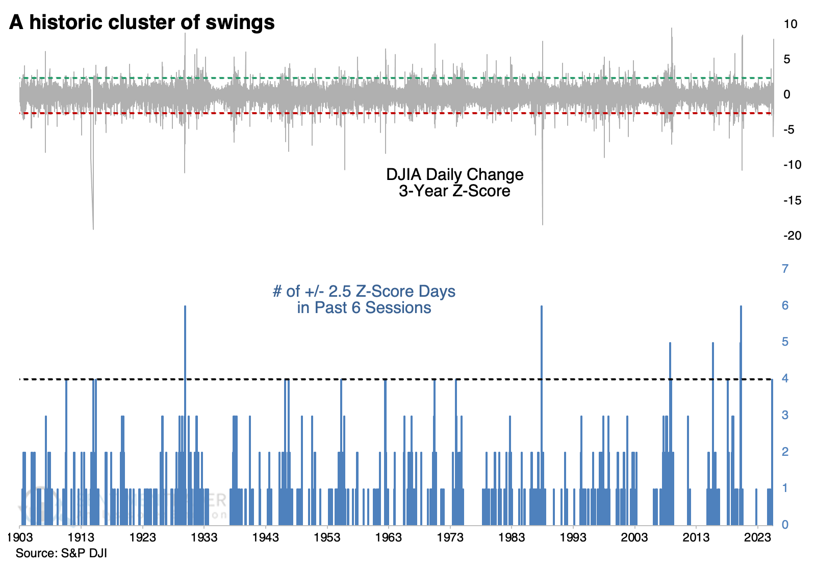
The table below shows how the Dow performed when it cycled from zero days with an extreme move to a cluster of them. There was a negative skew to the short-term returns, which is typical of high-volatility environments.
But over the following three and six months, 13 of the 15 instances sported a positive return. Within six months, all but one of the signals saw the Dow climb at least +5%, while only five of them saw a drawdown larger than -5%.
The bouts of truly exceptional volatility dragged on the returns of higher-beta sectors like discretionary and technology stocks. These sectors had poor short-term returns but tended to climb back strongly from their depths over longer time frames.
Additional context for the equity earthquake is how suddenly it developed. The Dow went from having zero days with an extreme z-score to a cluster of them, all within ten sessions. After these instances, tthe Dow showed a positive return either three or six months later every time, risk was reduced, and reward was higher.
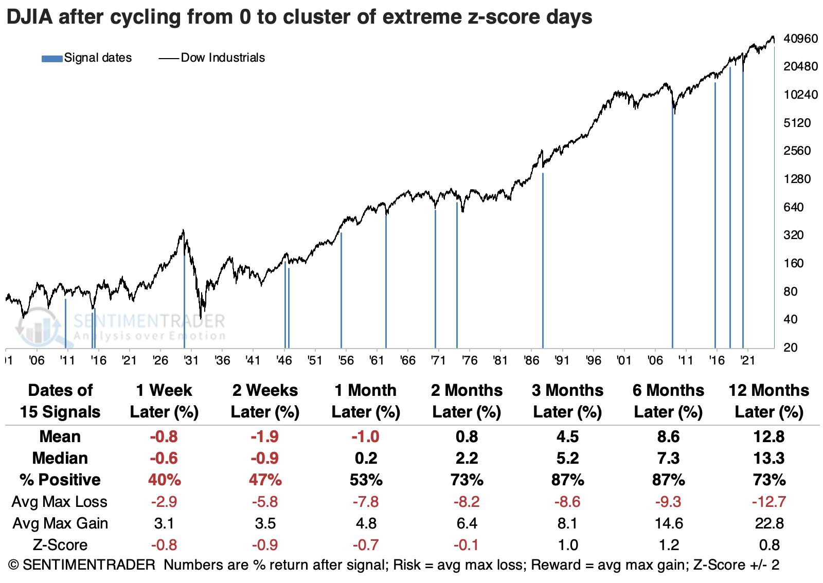
Breadth rebound
A breadth composite cycled from below -13% to above 18% in 15 or fewer sessions. Dean showed that comparable recoveries in breadth saw the S&P 500 rally 78% of the time over the next two months.
Last week, Dean mentioned a breadth composite, which had reached extreme levels. Subsequently, that composite climbed above a critical threshold, triggering a reversal signal.
Whenever a breadth composite triggered a reversal signal for the first time after an all-time high, the S&P 500 rose in 78% of the cases over the subsequent two months. Signals have been markedly more robust since 1981, likely due to the interest cycle. During the secular uptrend in yields between 1966 and 82, oversold reversals did not produce favorable bear market rallies. In contrast, signals afterward, like those in 2001, 2008, and 2022, posted gains within the first three months.
During the favorable two-month window, the S&P 500 rallied 5% or more on 11 occasions, compared to just 4 instances of 5 %+ declines, indicating a favorable risk/reward setup.
Following an oversold condition, the technology sector tends to lead the rebound, outperforming all other groups over the subsequent one-, two-, six-, and twelve-month periods.
The trend is no longer a friend
Following a year-long rise, the 200-day average for the S&P 500 has declined for 10 straight days. Dean showed that comparable trend shifts saw the S&P 500 struggle over the subsequent year.
After rising for 458 consecutive trading sessions, the 11th-longest streak in history, the 200-day average for the S&P 500 has now fallen for 10 straight days, indicating that the long-term trend for the world's most widely benchmarked index has shifted to a downtrend.
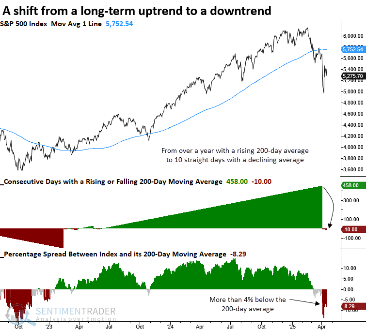
Each time the S&P 500 shifted to a long-term downtrend, its performance over the next year consistently underwhelmed, with returns and win rates that lagged random expectations across all time frames. Furthermore, the average maximum loss surpassed the maximum gain, underscoring a risky environment.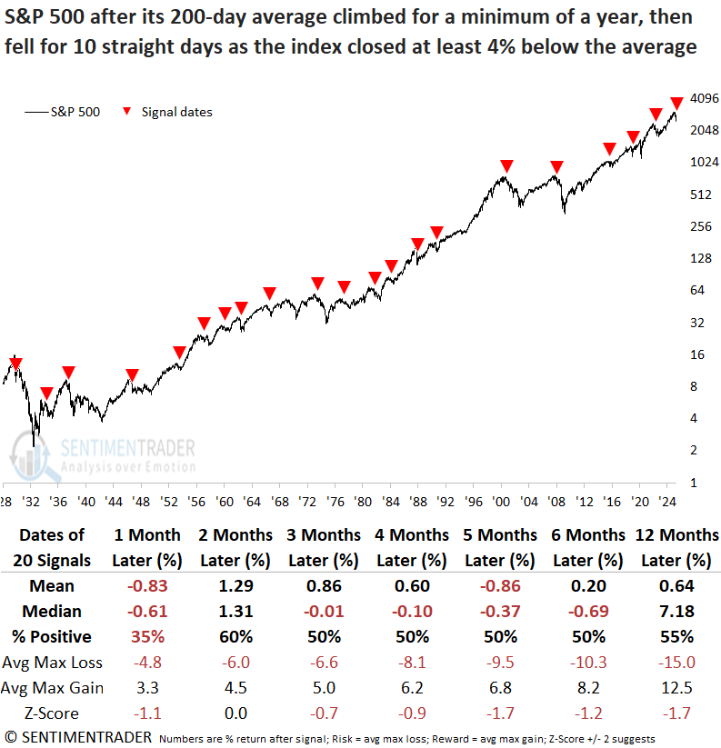
Over the following six months, declines exceeding 5% and 10% occurred more frequently than gains of the same magnitude across all time horizons, signaling a challenging environment.
Over short-term horizons of one to fifteen days, the S&P 500's outlook for the next three weeks appears weak, suggesting that a retest of recent lows remains a distinct possibility.
Whipsaws trigger risk-off behavior
Our Risk On/Risk Off indicator measures the relative performance of a variety of indicators. Jay noted that this indicator fell to an extremely low reading.
The Sentimentrader Risk On/Risk Off indicator combines 21 measures of investor mood to objectively designate overall investor behavior as "risk on" (i.e., investors are aggressively buying) or "risk off" (i.e., investors are aggressively selling).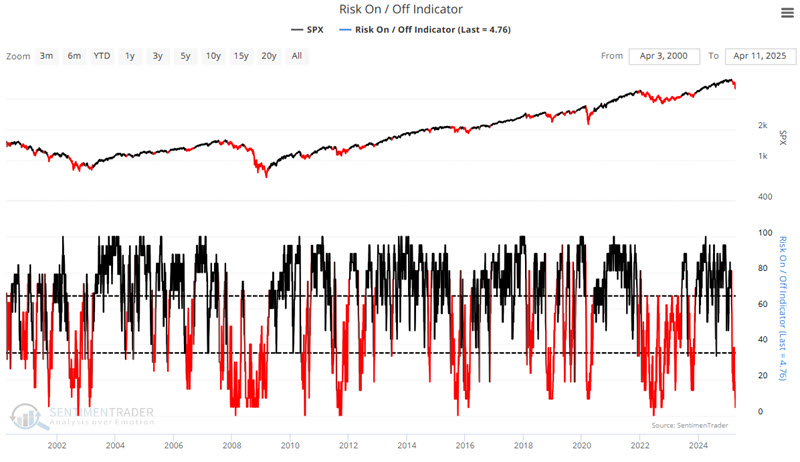
Historically, declines in the Risk On/Risk Off indicator below 35 have been associated with volatile periods in the market involving significant declines.
The green line in the chart below displays the three-day moving average of the Risk On/Risk Off indicator. The red dots highlight those dates when this three-day average closed below 5 for the first time in three months.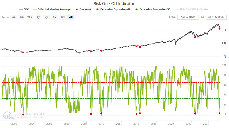
The good news is that previous performance results have been highly favorable. The bad news is that (as always) past performance is never a guarantee of future results.
The worst maximum loss within 12 months of a previous signal was -6.83%. There is no reason this previous worst decline cannot be exceeded. However, note that a 6.83% decline from the April 10th S&P 500 close of 5268.05 would pull the index back down to roughly 4908. The intraday low during the recent market sell-off was 4835.
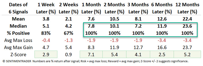
Buy the dip is dead
Almost exactly two years ago, investors bought the dip with both hands. Now, we're seeing the opposite.
The lack of buying interest in the week following a -1% or larger daily decline is among the most egregious in nearly a hundred years through 63 trading days in a year.
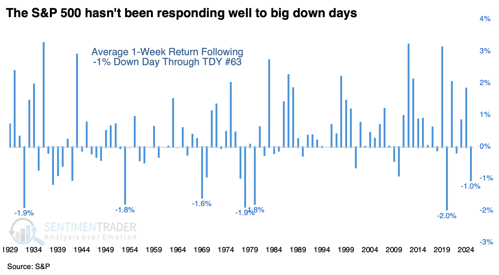
The table below shows how the S&P 500 performed following an average return of -1% or worse in the week following a -1% down day through the first three months (63 trading days) of a year.
There was a woeful performance in 1932 when stocks crashed over the next couple of months, forming a long-term bottom. Other than that, the S&P tended to rebound quite well in the months ahead. There was only one additional loss two months later.
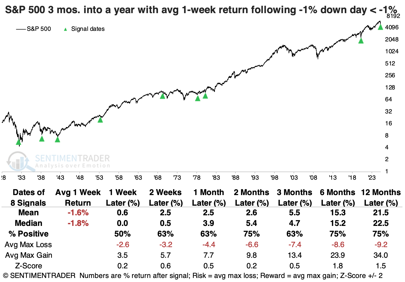
After such poor buy-the-dip behavior through the first few months of a year, the more cyclical sectors showed significantly higher average returns across longer time frames than defensive sectors.
Biotech blues, but maybe not for long
Biotech is one of the most volatile and unpredictable sectors. But Jay noted the most aggressive of speculators may find some recent signals in this sector particularly intriguing.
The iShares Biotechnology ETF (IBB) tracks the ICE Biotechnology Index. From its high in November 2024 to its low in April 2025, IBB plunged 27% in value. The chart below highlights those dates when the 100-day moving average for our IBB Optix indicator crossed above 41.75 for the first time in three months.
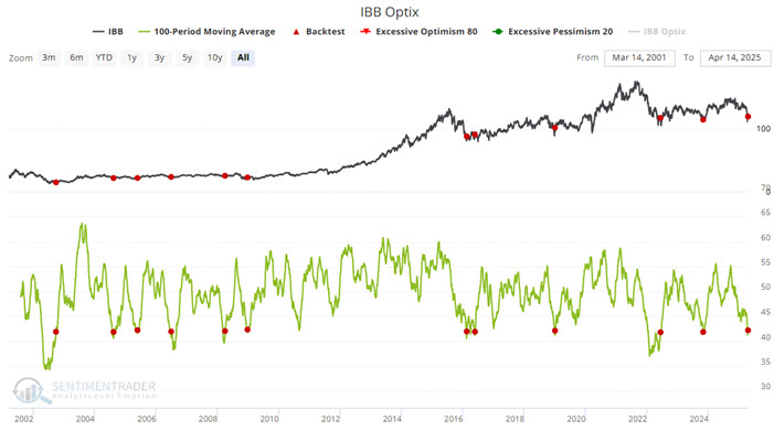
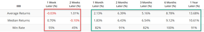
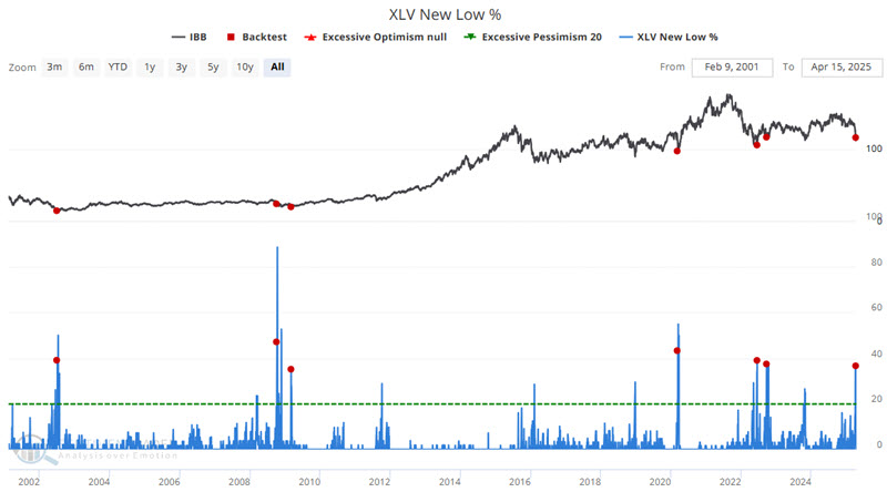
Also, during the recent market plunge, the number of healthcare stocks making new 52-week lows spiked to a significantly high level above 35%, often a sign of an overdone decline. Ticker IBB enjoys an almost 80% correlation with the Health Care Select Sector SPDR Fund (XLV).
The chart below highlights those dates when the XLV New Low % indicator crossed above 35% for the first time in three months. As you can see, this doesn't happen often, so the sample size is relatively small.
Transports have derailed
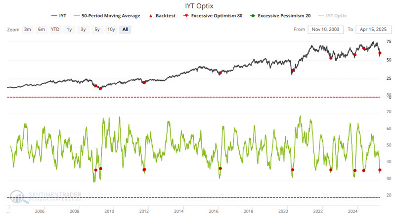
Signs of overdone fear in the market continue to pile up. Jay showed the latest example from transportation stocks via our IYT Optix indicator.
The iShares US Transportation ETF (IYT) tracks the S&P Transportation Select Industry FMC Capped Index. It's a broad-based, modified market-cap-weighted index that invests solely in companies defined by GICS (Global Industry Classification Standard) as transportation.
As with most sectors, investor fear spiked during the recent tariff-related market decline. Fortunately, this fear appears to be reversing. The chart below highlights those dates when the 20-day moving average for our IYT Optix indicator crossed above 36.
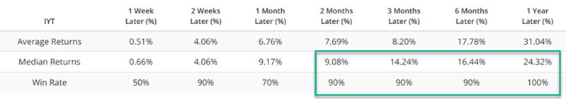
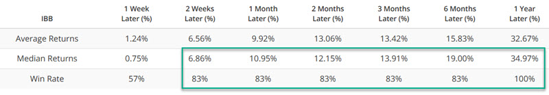
The 2008 and 2024 signals saw initial downside activity. Nevertheless, the high win rates across the board and the solid six-month and one-year returns suggest looking for an opportunity to play the long side of the transportation sector.
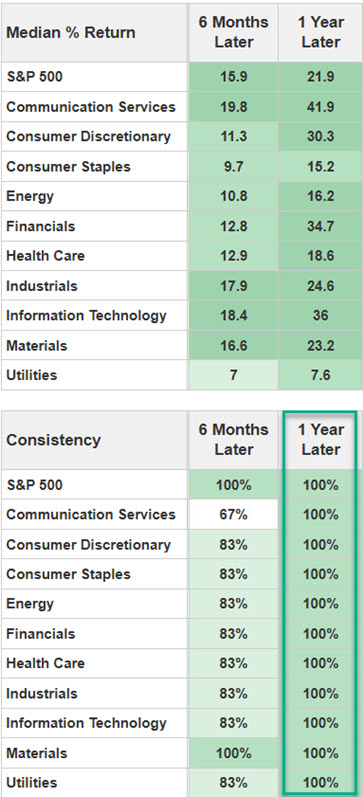
While the signal above emanates solely and specifically from the transportation sector, it typically serves as a positive sign for the broader stock market. Following the December 2008 signal, the S&P 500 proceeded to fall another 26% before finally bottoming. With that caveat firmly in mind, it is also compelling to consider the results for the S&P 500 sectors below, following the IYT signals highlighted above.
Other sector extremes
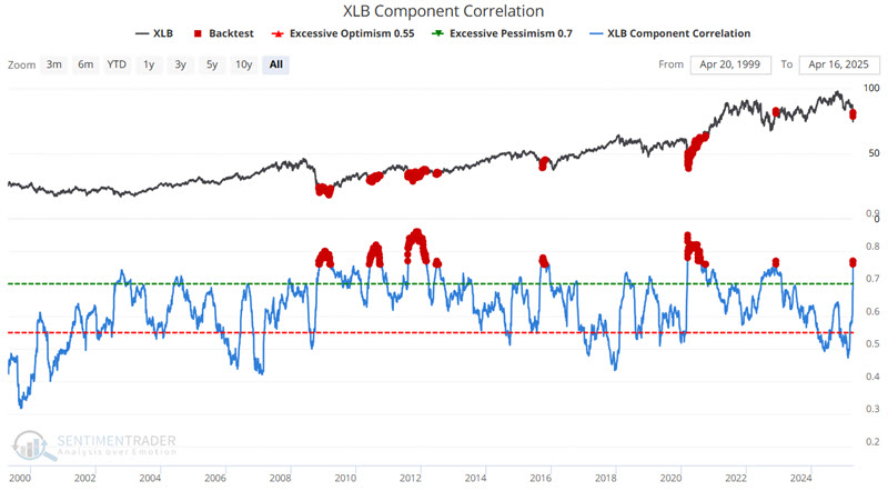
Jay further looked at recent Component Correlation and Panic Risk Extreme examples in Materials, Energy, and Technology.
Our Component Correlation indicator shows the correlation among members of the Sector. During times of panic, investors tend to buy or sell everything together, no matter their merits, so correlation rises.
The Materials Select Sector SPDR Fund (XLB) tracks the S&P Materials Select Sector Index. The chart below highlights all dates when the XLB Component Correlation indicator was at 0.76 or higher.
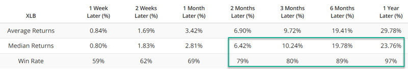
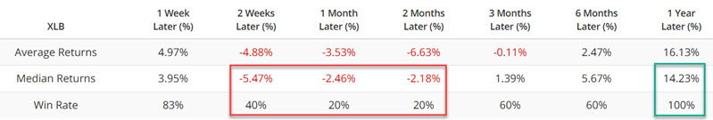
The Panic Breadth Composite provides a comprehensive snapshot of market sentiment and potential panic-driven behaviors by amalgamating 8 metrics that tend to spike during panics and normalizing them into a composite score.
The chart below highlights all dates when the XLB Panic Breath Composite crossed above 80 for the first time in three months. XLB showed weak returns over the following month, but had a 100% win rate over the following year as the fund underwent bottoming processes.
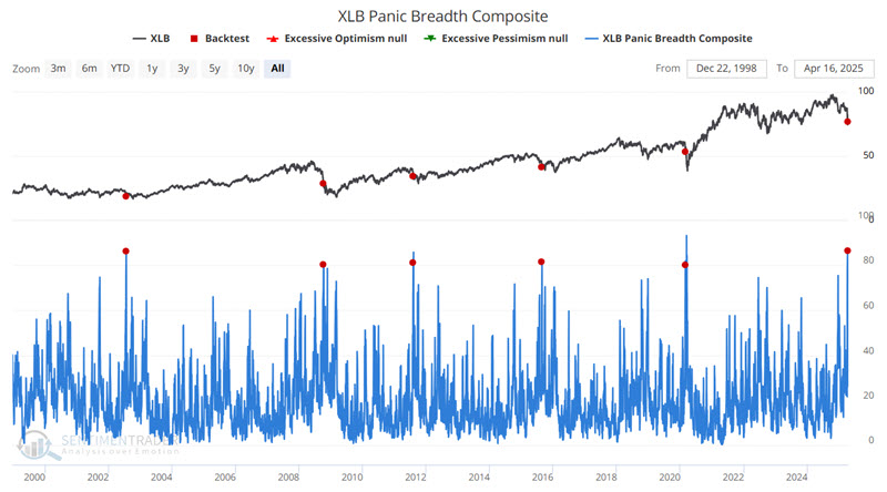
Jay looked at similar data for the energy and technology sectors.
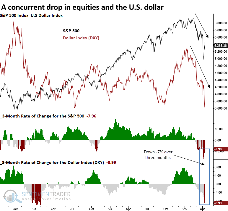
Dollar falls with stocks
Over the past three months, the S&P 500 and the Dollar Index (DXY) have weakened simultaneously. Dean showed that the Dollar Index (DXY), the S&P 500, and most sectors displayed lackluster returns and consistency.
Over the past three months, the S&P 500 and the U.S. Dollar Index (DXY) have experienced notable declines. Although the headlines lean dramatic, the underlying dynamics, while rare, appear more routine. We're likely witnessing a repatriation flow, a common feature during global equity market stress when investors seek the safety of their home country.
The S&P 500 and the Dollar Index (DXY) declined by -7% over three months, the first such instance after a high in the world's most benchmarked index.
Given that fluctuations in the dollar often influence stock prices, especially for large-cap multinational companies, let's see how the dollar reacts after it and the S&P 500 dropped as they have over the last three months. In the six months that followed, the dollar showed no consistent pattern, behaving much like a coin toss. However, a year later, it was higher in 75% of the cases.
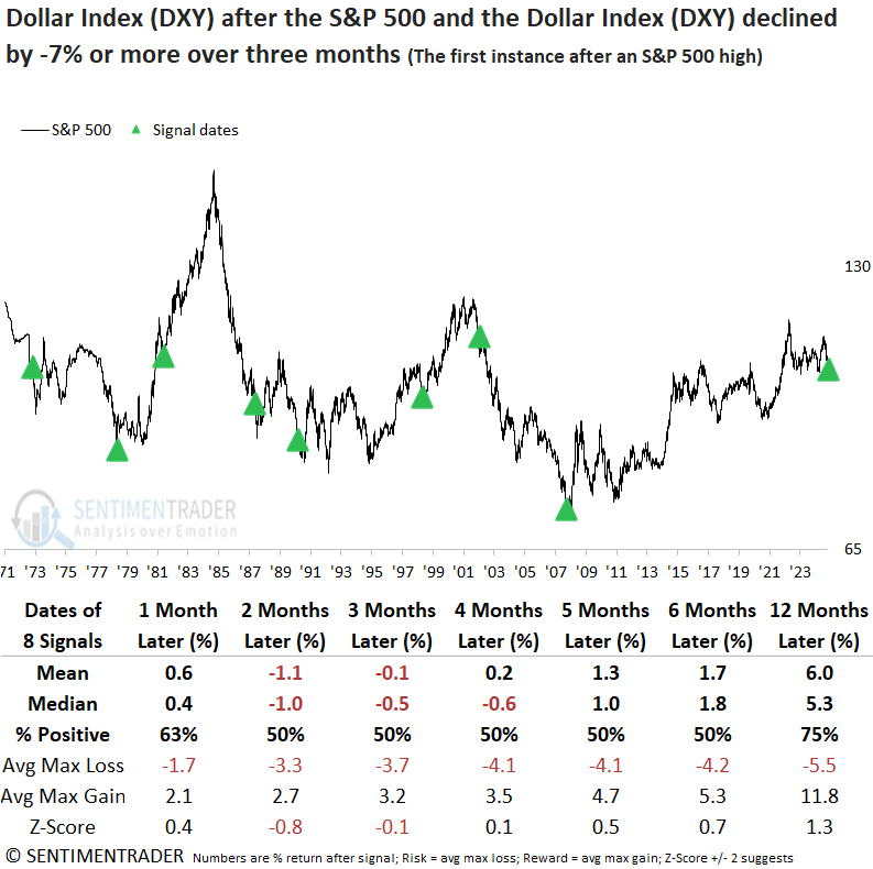
The S&P 500 exhibited a modest rally during the first three months, but momentum faded, with the index advancing in just half of the instances between months four and six. In six of the eight historical parallels, the world's most benchmarked index went on to post a lower low.
Sector performance was mixed in the initial three months. A year later, however, technology outperformed all other groups, potentially due to its global reach and the tailwind of a weaker dollar. The MSCI World Index underperformed the S&P 500, suggesting that the simultaneous decline in the S&P 500 and the dollar stemmed from a systemic issue.
About TradingEdge Weekly...
The goal of TradingEdge Weekly is to summarize some of the research published to SentimenTrader over the past week. Sometimes there is a lot to digest, and this summary highlights the highest conviction or most compelling ideas we discussed. This is NOT the published research; rather, it pulls out some of the most relevant parts. It includes links to the published research for convenience, and if you don't subscribe to those products, it will present the options for access.