
TradingEdge Weekly for Apr 12 - Trend persistence may be nearing its end, rate cycles, surging commodities

Key points:
- The S&P 500 equal-weight index surpassed 100 sessions above its 50-day moving average
- Technical issues are arising again on the Nasdaq
- A long at long-term cycles in interest rates
- Combining multiple cycles into a single model for rate cycles
- Applying that model to T-bond futures prices
- Commodities have surged after a selloff
- Gold is surging, too
- Mining stocks have rebounded but typically ran into trouble with upside momentum
- A good sign from energy stock insiders
A momentum streak nearing its shelf life
The S&P 500 has shown monster momentum, largely thanks to a few behemoth stocks. It's not quite that simple, though - even the equal-weight version of the index has shown remarkable persistence.
This version of the index assigns the same weight to every stock, so no one (or two, or three...) stocks can distort its performance. And the average stock has been doing well; the popular RSP fund has now gone 100 consecutive sessions above its 50-day moving average.
The streak has moved into 5th place in its most persistent medium-term uptrends. Three of the other four preceded some further upside (except in 2018) but then rolled over and more than erased those gains.
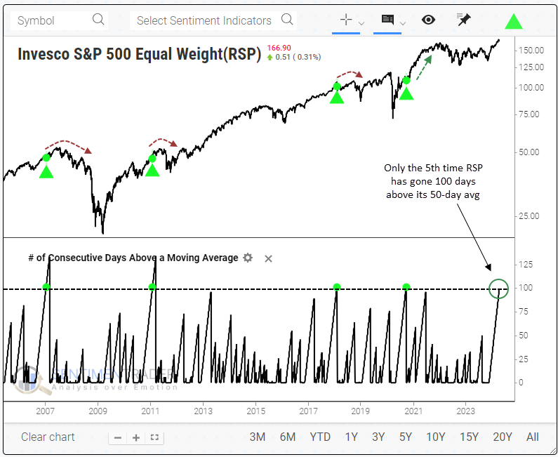
The table below goes back the furthest we can, to 1957. It shows every time the equal-weight S&P 500 levitated 100 days above its 50-day moving average and its performance in the following weeks and months. The "# of Days in Streak" column shows the number of days the streak ultimately lasted. The median was an additional 34 trading days once the streak reached 100 days.
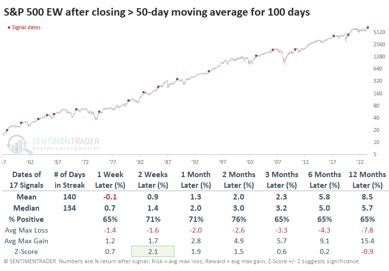
Over the next few months, only five signals suffered more significant losses than gains, and none of those losses were larger than -8%.
These signals were also a good sign for the weeks ahead for the "regular" S&P 500 index, which weights its constituent stocks based on their market capitalization. It actually outperformed the equal-weight version over the next month, in particular. The cap-weight index suffered only three losses over that time frame, all relatively small.
Some issues on the Nasdaq
Some of the big stocks on the Nasdaq have held up exceptionally well this year. That has helped mask what otherwise has been declining health in many other stocks.
As noted by The Wall Street Journal, some concerns are piling up. Most of the past month has seen more declining than advancing stocks, pushing the cumulative advance/decline line lower.
More notable is that the McClellan Summation Index has been slipping for weeks and just dipped below zero. This is not a good place for any Summation Index, and we can see that for the Nasdaq, too. The Composite's annualized return when its Summation Index was below zero - but not oversold - was half the return when the Summation Index was positive (healthy environments) or deeply negative (heavily oversold and prone to mean-reversion).
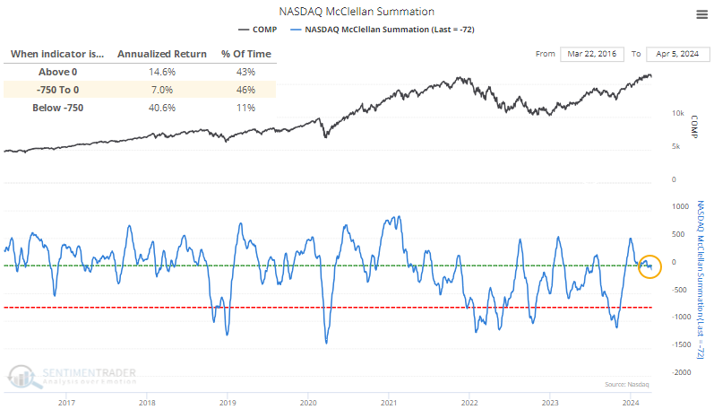
If you only held the Composite when the Summation was above zero, you'd avoid almost all the worst losses, though you'd have to suffer numerous small whipsaws.
The article also noted the decreasing percentage of stocks reaching new highs. This is also true, as it has been declining for months.
The chart below shows times when the Nasdaq Composite was hitting 52-week highs with a 90-day rate of change larger than +10%, while there were more 52-week lows than 52-week highs over a rolling 10-day basis. These were not the best times for buy-and-hold investors.
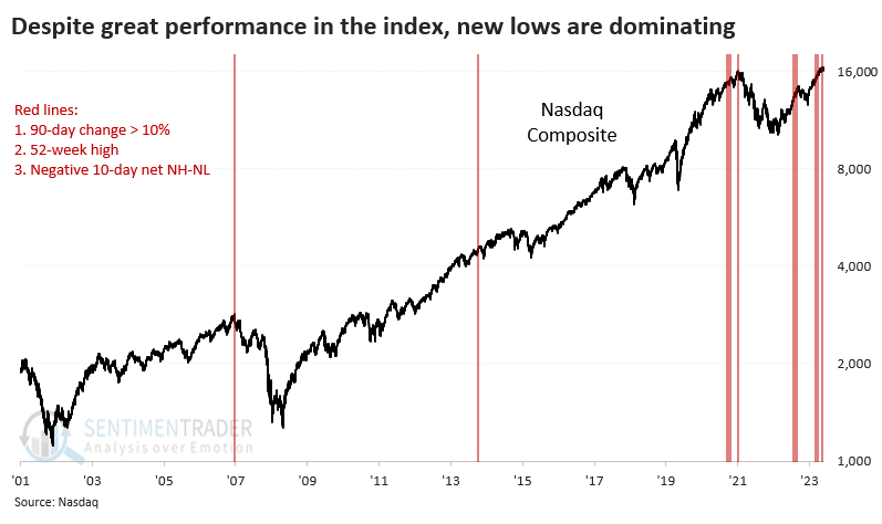
The divergences have been triggering technical warnings for months. We noted this in January, then they went away for a while. They've returned and added to the total over the past year. The number of Titanic Syndrome warnings over the past 200 days has exceeded all periods other than those leading up to bull market peaks in 2000 and 2007. Similar divergences have triggered many Hindenburg Omen warnings on the Nasdaq. The 50-day average is at the 3rd-highest level in more than 20 years.
A look at long-term rate cycles
Interest rates tend to move in long-term waves. Jay noted that three distinct cycles plus one trend-following method have stayed mainly on the right side of bond price movements for over 100 years.
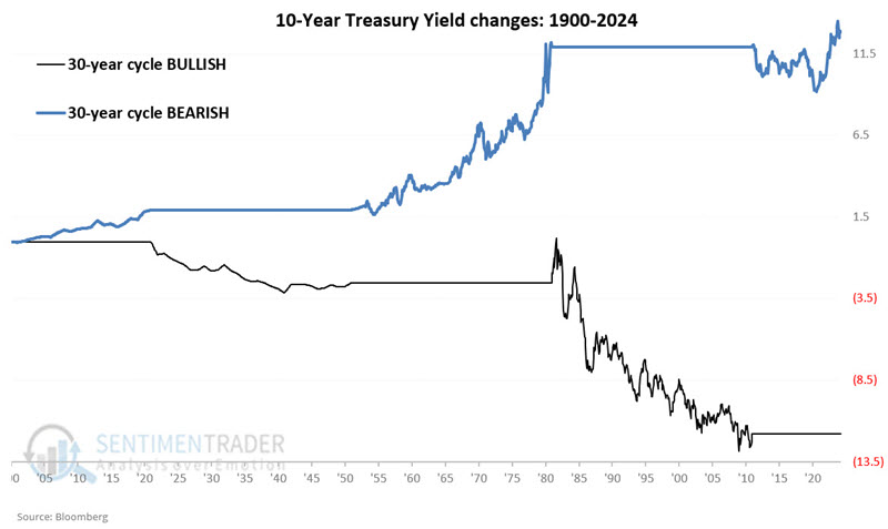
To measure performance, we will track monthly changes in the yield on 10-year treasury notes using month-end data starting in 1900. Interestingly, interest rates have historically tended to move in roughly 60-year waves, 30 years down, and then 30 years up. The chart below displays this phenomenon.
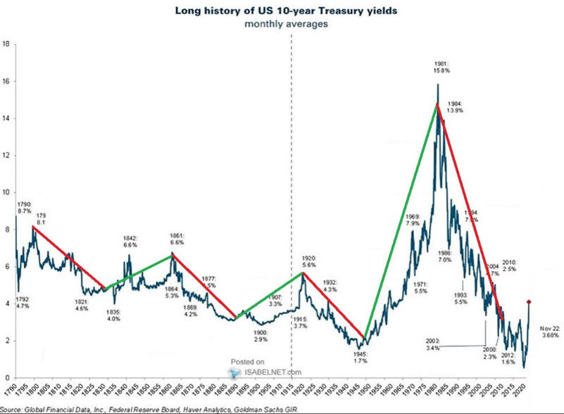
Note that after a declining trend from 1920 to 1950 and a rising trend from 1950 to 1980, interest rates were theoretically due for a declining trend from 1980 to 2010. As it turns out, the trend overshot by ten years, as interest rates did not bottom out until March 2020. If this cycle persists, it suggests that interest rates will generally trend higher until roughly 2040. Because this cycle is presently calling for interest rates to rise, it is considered bearish for bond prices.
The black line in the chart below highlights the net change in 10-year treasury yields when the 60-year cycle was bullish. The blue line in the chart below highlights the net change in 10-year treasury yields when the 60-year cycle was bearish.
Jay also looked at how bonds performed during 45-month cycles, during election cycles, and when they were above/below the 120-month exponential moving average.
Combining rate cycles into an indicator
In Part II, Jay combined the four indicators into the JK Bond Cycle Thermometer. It can read from 0 to +4; It presently reads 0, which is considered bearish for bonds.
The JK Bond Cycle Thermometer notes the number of bullish measures at the end of a given month and can read 0, +1, +2, +3, or +4. All four of these factors are currently rated as bearish for bonds. The chart below displays the month-end value of the JK Bond Cycle Thermometer reading using the axis on the left overlaid with the 10-Year Treasury Yield (using the axis on the right).
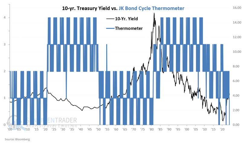
We can note in the chart above that during long periods of declining rates (1920-1950 and 1980 to 2010), the Thermometer was typically at a reading of +2 or more. Conversely, during long periods of rising rates (1900-1920, 1950-1980, and 2020-2024), the Thermometer was typically at a reading of +2 or less.
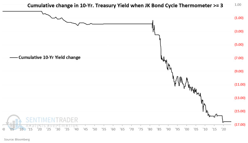
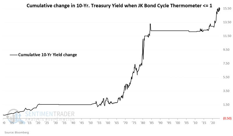
The chart below displays the cumulative change in 10-year treasury yields (-16.53 yield points) while the JK Bond Cycle Thermometer was greater than or equal to +3.
The chart below displays the cumulative change in 10-year treasury yields (+15.52 yield points) while the JK Bond Cycle Thermometer was less than or equal to +1.
This reading will remain 0 or +1 until May 2026 UNLESS the 10-year treasury yield falls back below its 120-month EMA between now and then.
Creating a rate trading system
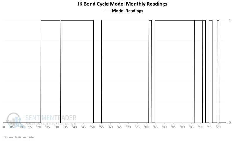
In Part III, Jay introduced the JK Bond Cycle Model, which compares changes in interest rates since 1900 to changes in 30-year treasury bond futures prices since 1977.
One of the model's goals is to avoid excessive trading whenever possible (as most investors tend to hold bond positions for long periods rather than trading in and out). So, the JK Bond Cycle Model uses the following rules:
- Buy bonds when the JK Bond Cycle Thermometer rises to +3 or higher (the JK Bond Cycle Model turns bullish and is set equal to 1)
- Sell bonds when the JK Bond Cycle Thermometer falls to +1 or lower (the JK Bond Cycle Model turns bearish and is set equal to 0)
The chart below displays the status of the JK Bond Cycle Model since 1900. A model reading of 1 is bullish for bonds, and a reading of 0 is bearish for bonds.
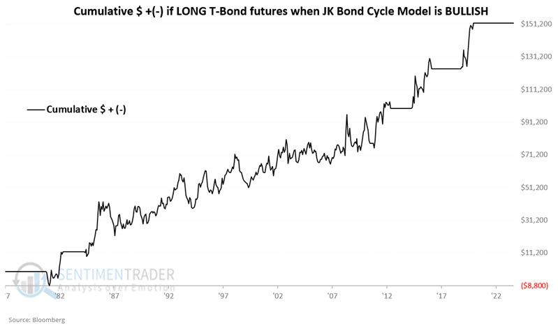
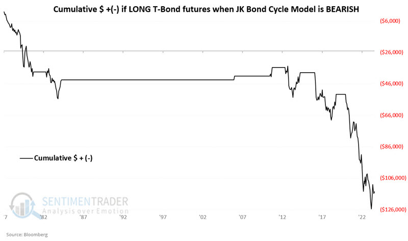
Up until now, everything has been measured in changes in yield points. 30-year treasury bond futures started trading in 1977. So, we will next look at hypothetical returns from holding a long position in t-bond futures if the JK Bond Cycle Model is bullish or bearish.
The chart below displays the hypothetical cumulative $ +(-) for holding a long position in t-bond futures only when the JK Bond Cycle Model is bullish (i.e., it hit +3 or +4 and has yet to drop back to +1 or lower).
The chart below displays the hypothetical cumulative $ +(-) for holding a long position in t-bond futures only when the JK Bond Cycle Model is bearish (i.e., it hit +1 or 0 and has yet to rise back to +3 or higher).
Surging commodities
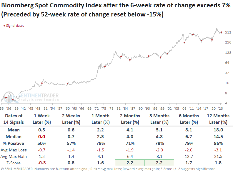
Following a significant decline, the Bloomberg Spot Commodity Index surged over the past six weeks. Dean showed that similar reversals preceded favorable returns for the commodity index over the subsequent year.
A trading model that seeks to identify a reversal in commodity prices hinting at improved economic prospects triggered an alert at the close of trading on Friday. The system generates a signal when the Bloomberg Spot Commodity Index's 6-week rate of change increases above 7%, following a 52-week rate of change reset below -15 %.
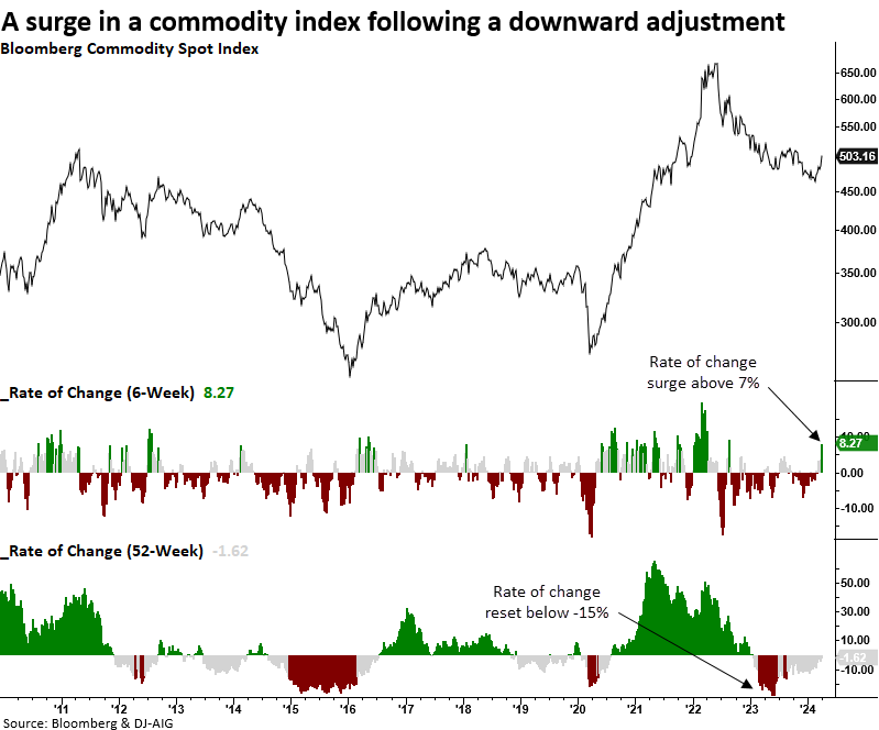
Whenever the Bloomberg Spot Commodity Index surged by 7% or more over a six-week period following a 52-week rate of change reset of -15%, the broad basket of commodities showed a consistent upward bias, with only two negative returns a year later.
A resurgence in commodity prices after a significant decline tended to benefit economically sensitive sectors, with Consumer Discretionary, Financials, Industrials, and Technology outperforming the S&P 500. Interestingly, the two commodity-based groups, Energy and Materials, underperformed the world's most benchmarked index.
It's not uncommon for year-over-year CPI to rise following a commodity reset and surge signal like now. In the two prior instances, 1976 and 1983, where CPI was higher than the current February reading of 3.2%, CPI fell over the following nine months.
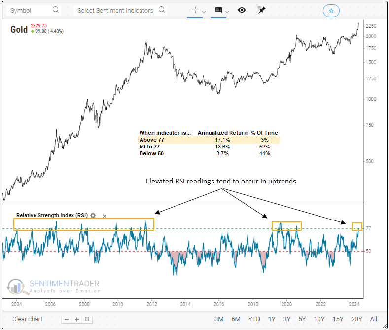
Gold is surging, too
Dean also noted that gold's Relative Strength Index using weekly data has risen to the highest level in more than four years. Similar price momentum conditions occurred in uptrends, with Gold rising 86% of the time a year later.
This extraordinary surge in gold has driven the Relative Strength Index to a reading of 77 based on a 14-week setting, a scenario observed in just 3% of precedents since 1973. Instances above 77 have yielded a remarkable 17% annualized return for the precious metal.
Whenever Gold's Relative Strength Index reversed from below 50 to above 77, the precious metal encountered short-term difficulties. However, investors who entered the market during this consolidation or pullback phase enjoyed significant rewards in the ensuing year, as the commodity exhibited a median gain of 21%. Additionally, consistency was excellent, rising 86% of the time.
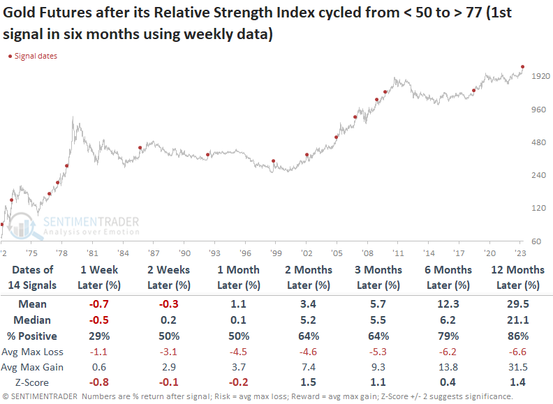
Similar precedents in Gold's Relative Strength Index tended to coincide with broad-based commodity uptrends. Over the subsequent six and twelve months, the Bloomberg Spot Commodity Index rallied 86% of the time.
The NYSE Gold BUGS Index showed more pronounced weakness over the near term after similar RSI conditions for Gold. While the median return and win rate exhibit excellent results a year later, both metrics underperformed an allocation to the precious metal.
The challenge of gold miners
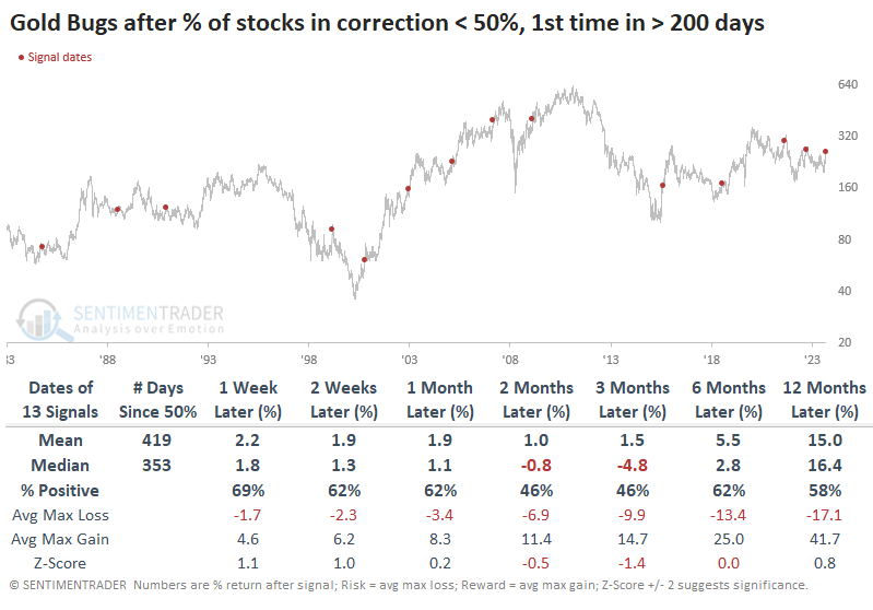
Gold mining stocks are perking up after a mostly brutal couple of years. The problem is that gold bugs are a relatively small group of investors and either don't have the buying power or willingness to persistently push the stocks higher.
We can see that just in the past couple of years. Whenever fewer than half of the miners were mired in a correction - meaning at least half of them were within 10% of their 52-week highs - the GDX fund soon peaked. The annualized return of GDX is excellent as long as fewer than 50% of miners are in a correction; the problem is when it ticks back above 50%, and that's most of the time.
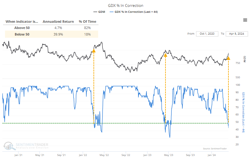
The table below shows that when enough stocks recover to within 10% of their highs after a long stretch below, the Gold Bugs index has tended to see waning momentum over the next two to three months. The last three signals preceded double-digit drawdowns with little upside over the next few months, while in the early 2000s, the group shrugged off any concerns.
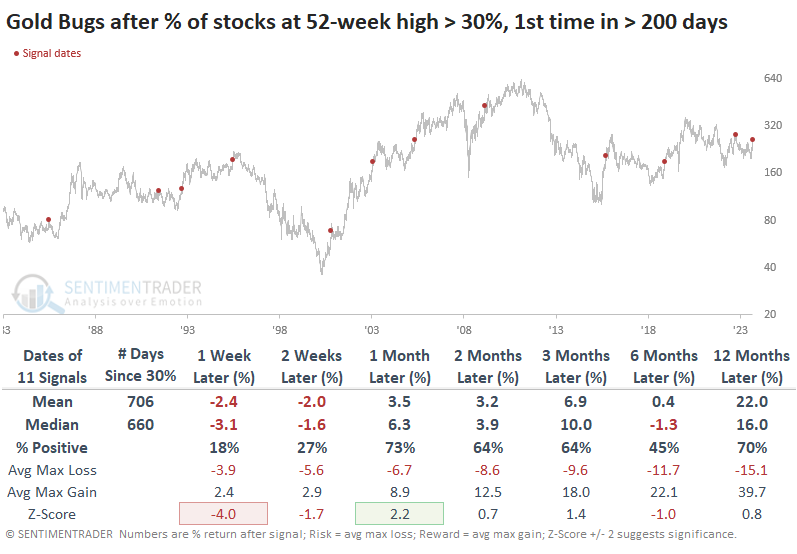
We can see something similar with the percentage of miners hitting new highs. More than 30% of the stocks hit a 52-week high in the past week, the largest percentage since August 2020.
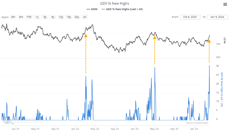
The table below shows how investors were immediately punished for chasing these stocks higher, with exceptionally poor returns in the short term. But other than the last signal in 2023, they showed a solid tendency to rebound in the weeks and months ahead. Returns were volatile and inconsistent, another hallmark of this group.
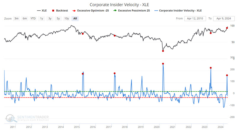
Energetic insiders
Some indicators are best used as part of the decision-making process and not as automatic buy or sell signal generators. Jay suggested our Corporate Insider Velocity indicator fits in this category. Extremes and/or reversals in corporate insider activity often highlight potential opportunities for investors.
The Sentimentrader Corporate Insider Velocity indicator shows the velocity of corporate insider buying versus selling. It takes a 4-week rate of change for insider buys and subtracts a 4-week rate of change for insider sales. Generally speaking:
- Extremes in insider activity (high or low) have tended to be favorable for the underlying index or sector
- Extreme readings are often early and serve more as an alert than as actual trading signals
- Reversals from extremes are often an excellent time to consider entering a position
- Lastly, signals from this indicator are generally best used in conjunction with other information and not necessarily as a standalone trading model
As an example of the potential utility of monitoring Corporate Insider Velocity, the energy sector saw some early clues before the most recent rally. The chart below highlights those dates when the Corporate Insider Velocity - XLE indicator crossed above 160.
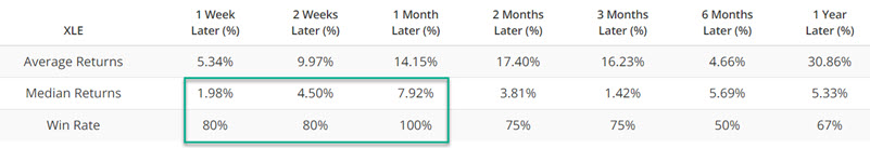
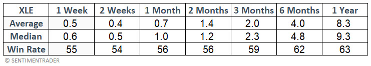
For comparison, the table below displays XLE performance for all dates.
Jay also looked at insider data for health care, technology, and utilities, all of which tended to show above-average returns following similar insider behavior.
About TradingEdge Weekly...
The goal of TradingEdge Weekly is to summarize some of the research published to SentimenTrader over the past week. Sometimes there is a lot to digest, and this summary highlights the highest conviction or most compelling ideas we discussed. This is NOT the published research; rather, it pulls out some of the most relevant parts. It includes links to the published research for convenience, and if you don't subscribe to those products, it will present the options for access.