
TradingEdge Weekly for Apr 11 - Extreme moves, bevy of oversold indicators, safe haven concerns

Key points:
- The S&P 500 one-day return and market breadth were among the most extreme in history
- A historic week of volatility, with one of the highest ranges in history
- A collection of indicators are suggesting investors capitulated
- The S&P 500 approached but didn't quite trigger a bear market
- A bevy of indicators flashed oversold signals
- High-beta stocks have plunged relative to high-quality
- The most highly correlated corrections have typically seen positive returns
- Safe havens may not be so safe
Extreme gains
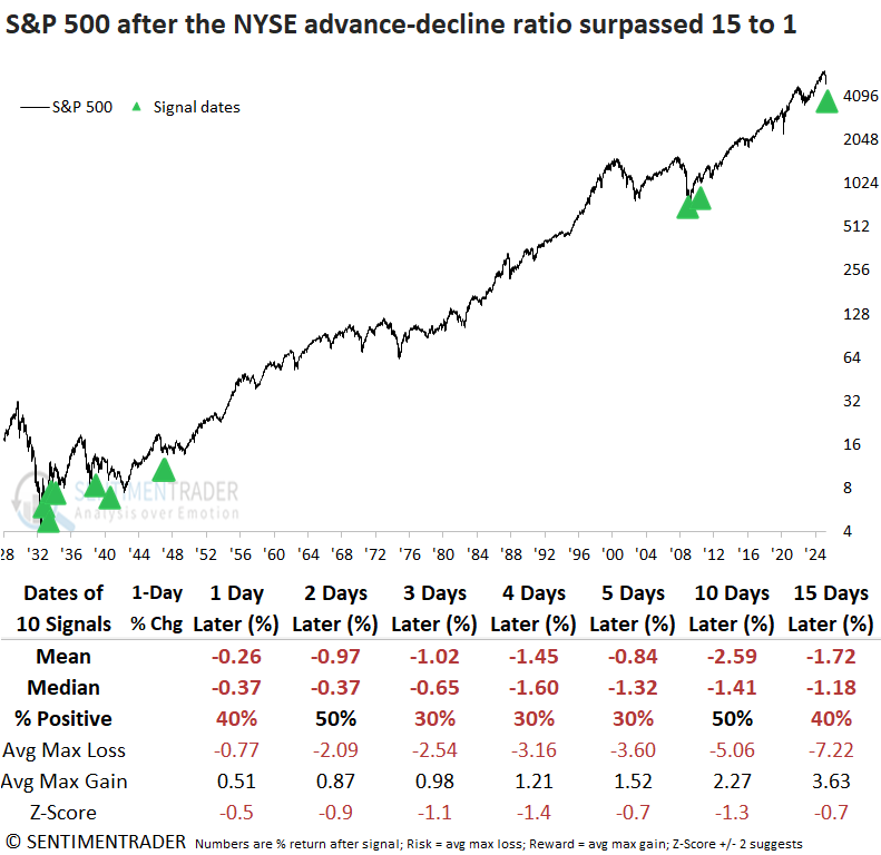
On Wednesday, the S&P 500 rallied 9.52%, one of the most significant daily gains in history. Dean showed that market breadth was equally impressive, with the NYSE advance-decline ratio exceeding 15 to 1. Similar one-day events did not bode well.
With President Trump easing his tariff stance, stocks quickly responded to the positive shift. The S&P 500 jumped 9.52%, tying for the 9th most significant single-day gain since 1928, from one of the most historically oversold conditions. Breadth was explosive, with the NYSE advance-decline ratio reaching 15-to-1.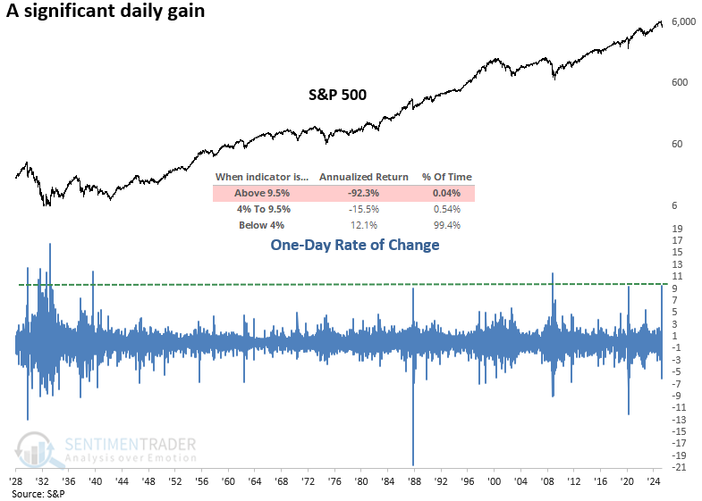
Whenever the S&P 500 surged 9.5% or more in a single trading session, the move was usually short-lived. The index fell 78% of the time the following day. While a secondary rally around day three was possible, the likelihood of further gains remained low.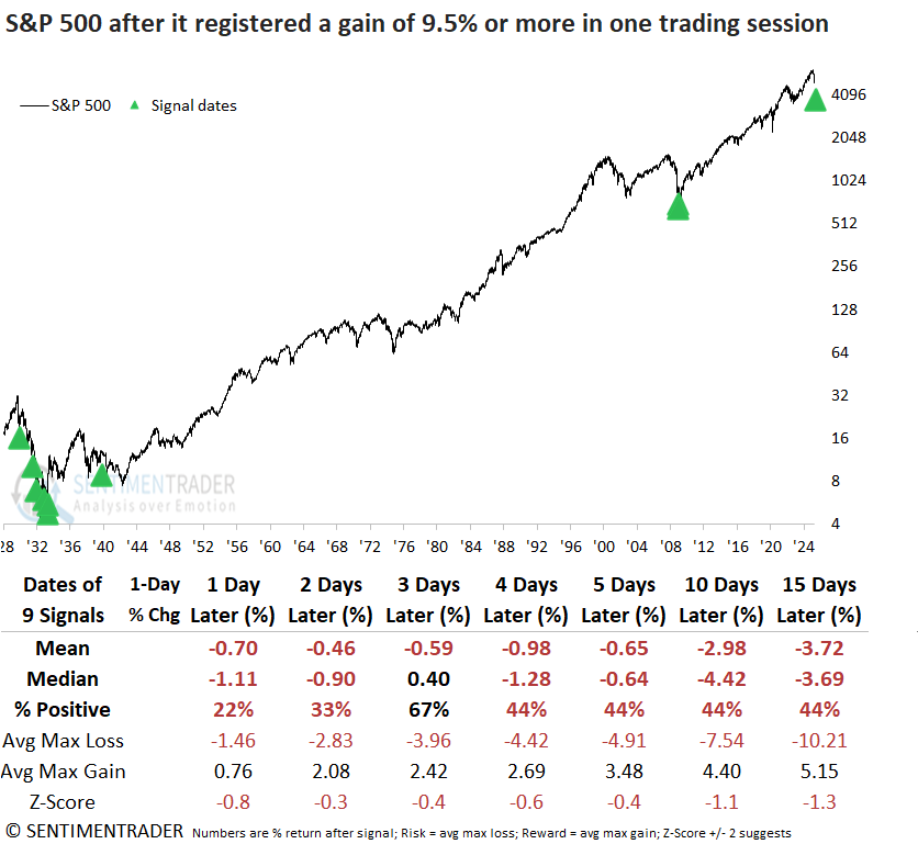
Much like the annualized returns following substantial one-day rallies, when the daily advance-decline ratio exceeded 15-to-1, the outcome was negative, with the S&P 500 posting an annualized return of -11.2%.
Each time the NYSE advance-decline ratio exceeded 15 to 1, the S&P 500 experienced negative returns and unfavorable win rates from one to fifteen days afterward, indicating a lack of upside follow-through.
A historic week
We rarely reference technical indicators, but Average True Range (ATR) is one of them. It measures each day's range, creates a relative value by dividing it by the closing price, and averages it over a given number of days.
If we use a 5-day average for the S&P 500, the current value just spiked above 6% for only the fourth time since 1962, when our intraday data begins.
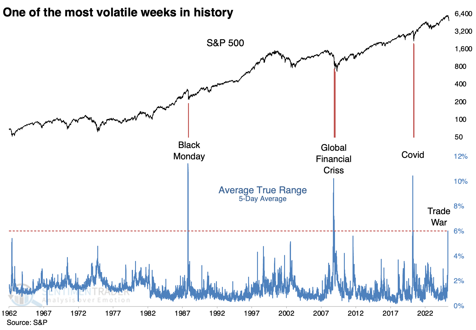
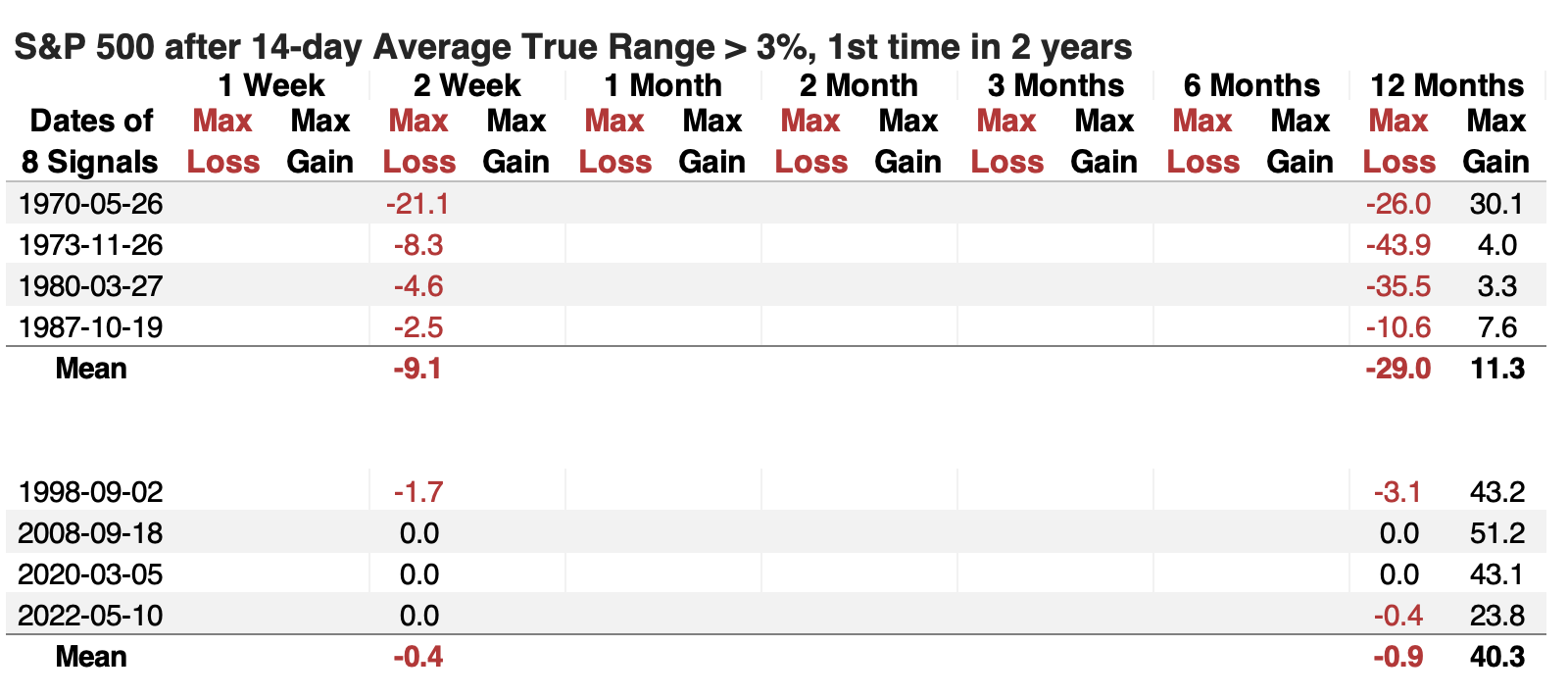
The default value is 14 days, so we'll use that. Over that long of a lookback, the S&P's ATR is half as large, just over 3%. It still ranks in the top 2% of all days since 1962. For the most part, investors took this as an opportunity, with the S&P rising 6 out of 8 times during the following three months and one year.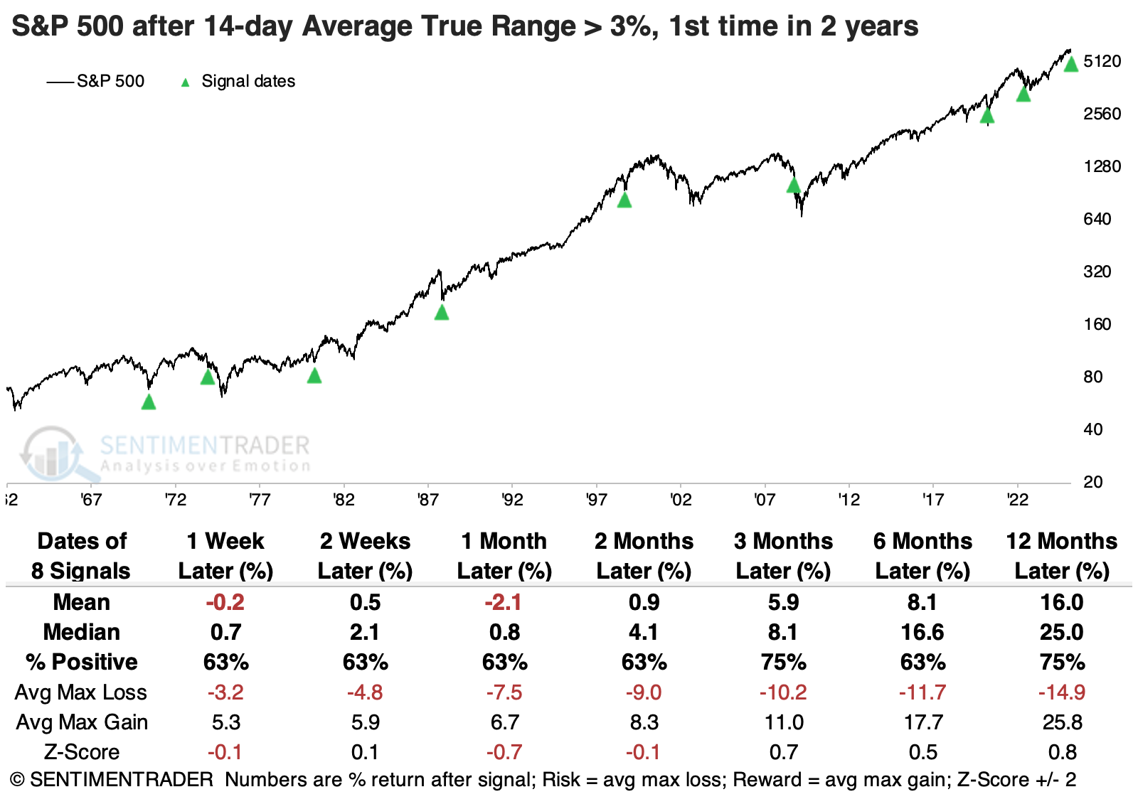 The table below shows the S&P 500's maximum loss over the next two weeks, and its maximum loss and gain over the next year. It's sorted by the two-week max loss.
The four instances with more than a -2% drawdown are grouped together, and we can see that those did not turn out well long-term. Over the following year, they suffered an average drawdown of -29% and average drawup (maximum gain) of only +11%. Compare that to the signals when investors stepped up right away. When the two-week drawdown was smaller than -2%, the average drawdown over the following year was negligible, while the maximum gain averaged +40%.
After spikes in the S&P 500's Average True Range, average returns across sectors tended to increase with the sector's cyclicality.
Capitulation time
A breadth and momentum indicator plunged to one of the lowest levels in history, suggesting capitulation. Dean noted that similar oversold conditions saw the S&P 500 rally over the following six months in all but one case.
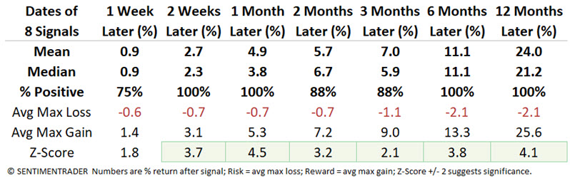
The model blends market breadth and price momentum indicators (see chart for components) to pinpoint capitulation or deeply oversold conditions. On Monday, the indicator fell to -4.33, a reading that has only occurred 13 other times since 1929.
Whenever the capitulation indicator plunged below -4.25, the S&P 500 tended to rally over the next year. The most favorable window occurred at the six-month mark, which rose 92% of the time and displayed significance relative to random returns.
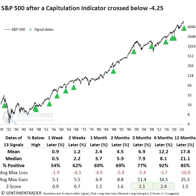
Over the bullish six-month window, a maximum loss of -10% was surpassed in only 2 out of 13 cases, albeit a few were close. By comparison, 9 of 13 rose more than 10%, underscoring a favorable risk-reward profile.
Not quite a bear market
As of last Friday's close, the S&P 500 had dropped more than 17% from its all-time high. Dean showed that similar corrections saw the large-cap index decline 67% of the time over the subsequent six months, while a 20% decline in the world's most benchmarked index often sets the stage for a bear market bounce.
For only the 16th time since 1929, the S&P 500 has plunged over 15% from a record high, a feat achieved in just 32 trading sessions, marking the fifth-fastest decline in history.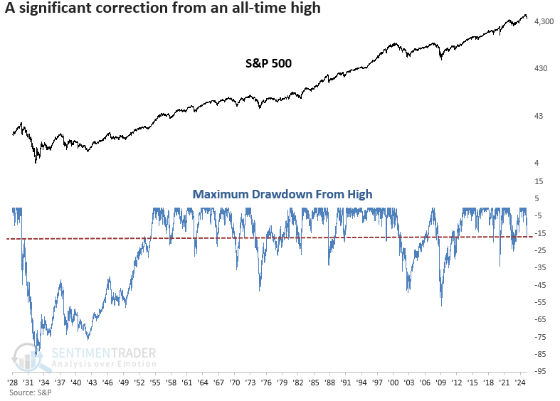
Although the S&P 500 had already endured a 15% decline from its peak, history offered little reason for optimism for someone wishing to buy the dip. Over the next six months, the index advanced just a third of the time, and downside risk generally outweighed upside reward across most time frames, with only a slight edge at the one-year mark.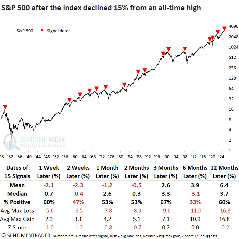
A 15% drawdown from an all-time high resulted in a bear market in 12 out of 15 instances. If the S&P 500 sidesteps a 20% decline, one potential silver lining is that past swift corrections, like those in 1990, 1998, and 2020, tended to bottom relatively quickly.
If the S&P 500 were to decline by 20%, a commonly used threshold for a bear market, a relief rally lasting several months could follow. Historically, over the next two months, the S&P 500 has rebounded 92% of the time, with the sole exception being 1929.
Oversold indicators are flashing
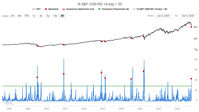
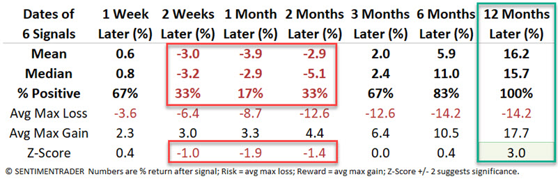
The stock market has plunged, and many reliable indicators are flashing "oversold" signals. Jay suggested that the good news is that stocks have shown a strong tendency to trade higher twelve months after these types of signals. The bad news is that there is also a strong tendency for things to get worse before they get better.
One of those indicators calculates 14-day RSI values for each of the S&P 1500 stocks and reports the percentage of those stocks showing a 14-day RSI reading below 30. The chart below highlights those dates when this indicator crossed above 40% for the first time in three months.
Jay further looked at recent signals from our Panic/Euphoria Model, PE/VIX Spread indicator, and the VIX Index.
The chart below displays all dates when our Panic/Euphoria Model was at -0.23 or lower. Again, we are not making the case that any initial signal should be interpreted as an automatic buy signal. The key thing to note is how clusters of red dots tend to occur during buying opportunities.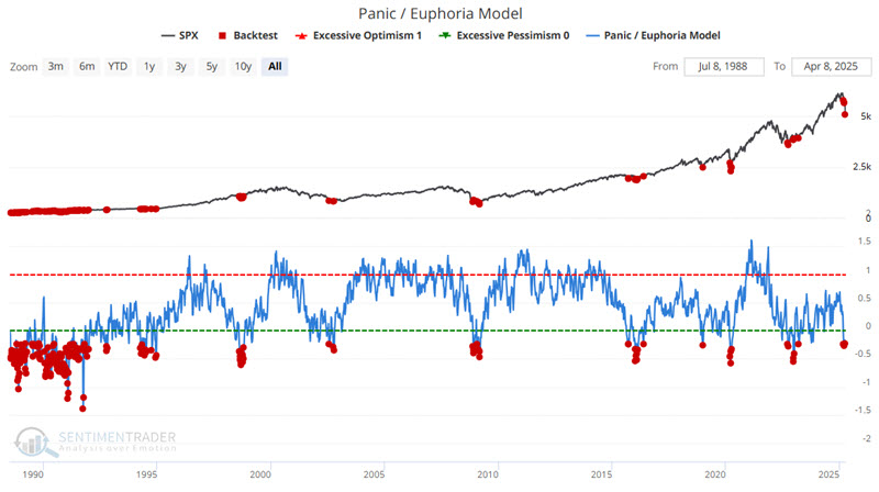
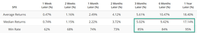
The chart and table below present results for only the most recent twenty years (eliminating the virtually non-stop sea of red dots during the early to mid-1990s).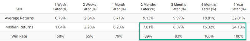
Jay also discussed the VIX and VIX / PE Spread indicators, which have consistently reached levels preceding gains in the S&P 500 over the next 6-12 months.
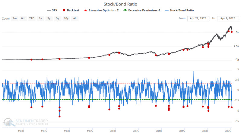
The extremes continued, and Jay pointed to The chart below displays all dates when our Stock/Bond Ratio indicator was at -3.5 or lower.
He further studied the Intermediate-term Optimism Index and VIX Term Structure.
High-beta problems
Jay noted that in the short term, investors' primary focus should be deciding how to manage risk. Looking further out, the plethora of breadth, sentiment, volatility, and options-related indicators that have recently flashed favorable signals has increased, including a drop in high-beta versus high-quality stocks.
The S&P High Beta / S&P High-Quality Relative Ratio Rank indicator shows where the ratio is relative to its range over the past four months. When the relative ratio is high, investors are showing risk-on behavior. When the ratio drops to a low level, they exhibit risk-off behavior. The chart below highlights those dates when this indicator's 50-day moving average crossed above 15.2.
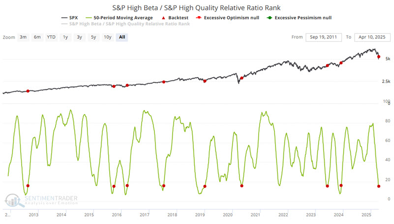
No investor should rely solely on this signal to determine their investment strategy. That said, the table below displays first-year results for various indexes. Historically, stocks and commodities have advanced while the US Dollar and bond yields have declined. 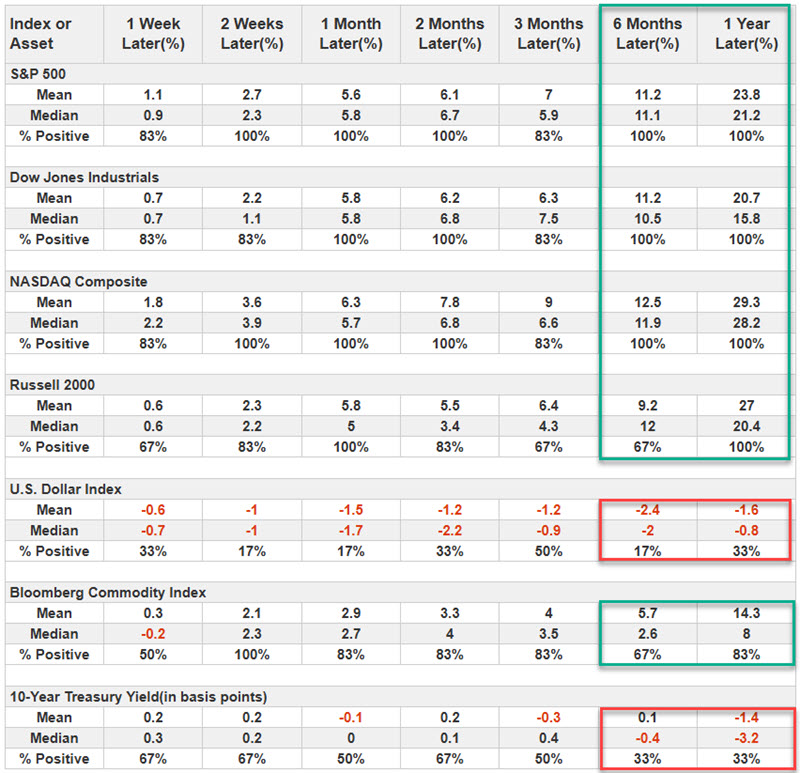
Highly correlated corrections
An argument could be made that the reasons for this decline don't matter; only investors' behavior does. We don't dabble in theories and guesswork here, so we'll focus on the precedents and how investors have behaved in the past as a guide to how they may behave now.
For the most critical equity index in the world, the pattern of its decline since the peak has some highly correlated precedents, but few of this magnitude.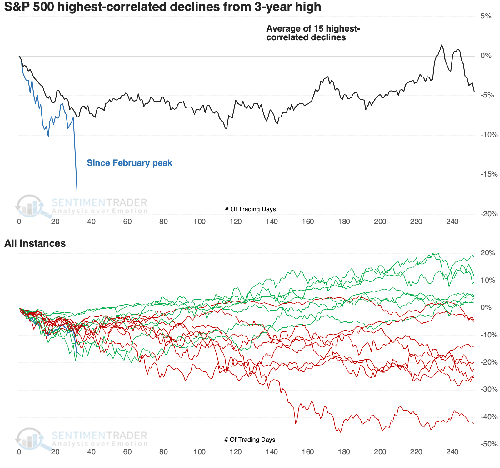
In terms of behavior and magnitude, the closest are 1998 (which was nearly exact) and 1990. Neither one suffered much more losses, though both took about 30 more trading days before bottoming.
The S&P's returns following these selloffs were mostly positive. Over the following month, there was only one loss of any magnitude during the 1990 recession. That one bottomed soon after, though several other initial rallies failed.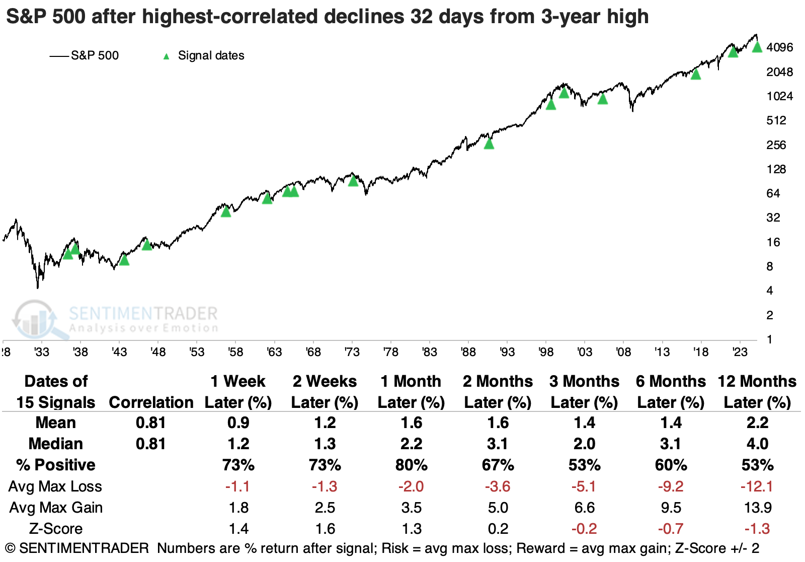
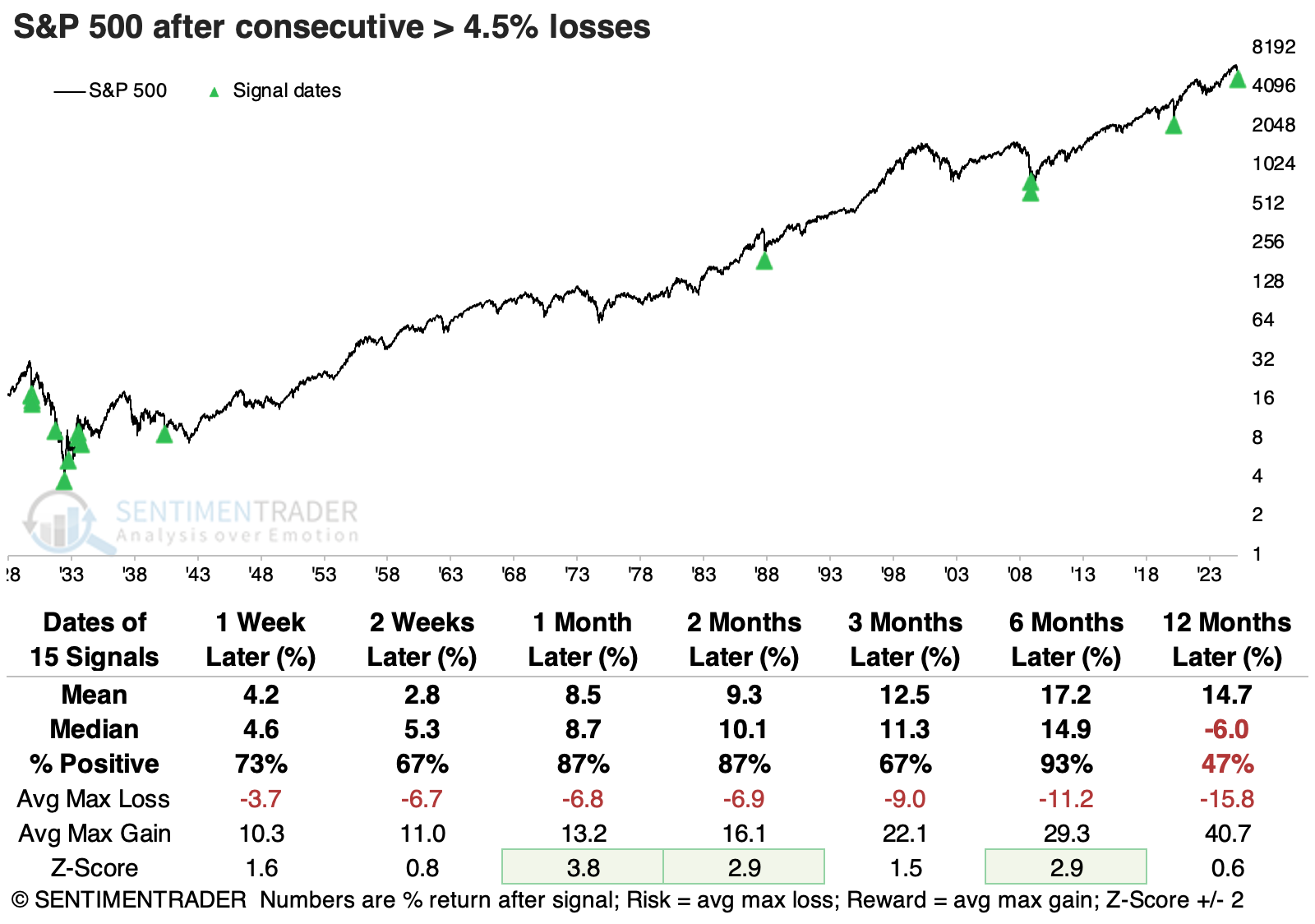
The last couple of sessions were the main reason why the S&P has endured few precedents magnitude-wise. Since 1928, the index has only had 15 instances of consecutive daily losses greater than -4.5%. Over the next one to two months, the S&P lost more ground only twice and only once over the following six months.
 The Nasdaq Composite has suffered more than the S&P 500. While there have been more than a dozen sell-offs of similar direction, the magnitude of this decline is exceptional. After the most similar declines, the Nasdaq mainly showed positive returns.
The small-cap Russell 2000 has endured losses more significant than the other two indices. Overall, the Russell did tend to rebound over the next two months, with 1998 and 2022 being the notable exceptions. Those losses were also approximately when the index formed a more sustainable bottom.
Safe haven concerns
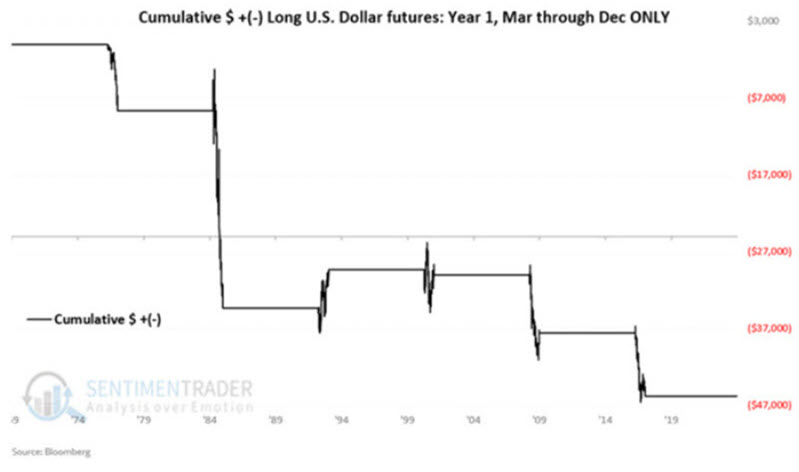
Jay showed some evidence that suggests that the US Dollar, gold stocks, and treasury bonds may not offer much in the way of safe havens as 2025 unfolds.
In prior articles, he highlighted that 2025 is Year 1 of a new eight-year cycle for the US Dollar and that the last ten months (i.e., March through December) of Year 1 have had a history of significant weakness. The chart below displays the hypothetical growth of $1 invested in the US Dollar only during March through December of these years (1977, 1985, 1993, 2001, 2009, 2017).
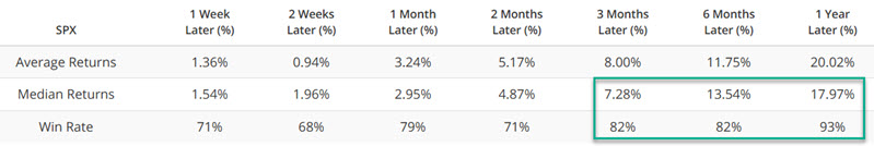
 One of the trendiest prognostications before the Tariff tantrum was that gold stocks were destined to rally sharply following the metal's trend. Such a possibility can in no way be ruled out. However, recent sentiment readings cast a shadow over gold stock prospects in the year ahead.
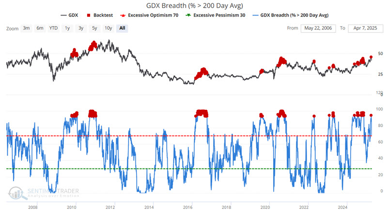
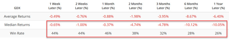
Like the US Dollar above, the results are negative (Median and Average return) with a below 50% Win Rate across the board and a particularly dismal -10.05% Median return and 26% Win Rate for 12 months. While this is only one indicator and does not guarantee negative results in the year ahead, it does suggest that traders see bullish price trend confirmation before taking a long position in gold stocks.
Jay also looked at the Optimism Index for 30-year Treasuries, showing weak medium- to long-term returns after readings similar to what we have now.
About TradingEdge Weekly...
The goal of TradingEdge Weekly is to summarize some of the research published to SentimenTrader over the past week. Sometimes there is a lot to digest, and this summary highlights the highest conviction or most compelling ideas we discussed. This is NOT the published research; rather, it pulls out some of the most relevant parts. It includes links to the published research for convenience, and if you don't subscribe to those products, it will present the options for access.