
Traders betting on higher stock vs. index volatility

Key points:
- Traders are pricing in higher volatility over the next 30 days for individual stocks than the S&P 500 index
- The spread between these volatility figures is among the highest in a decade
- Stock returns tend to suffer after high spreads, with defensive stocks being the biggest beneficiaries
Stocks vs. the index
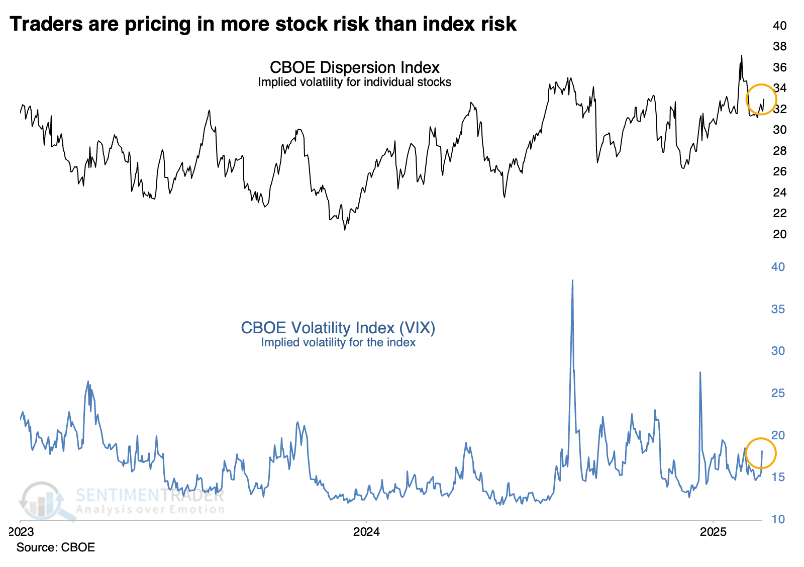
Traders aren't pricing in much risk of rising volatility over the next month. Or maybe they are if you're looking at individual stocks.
Most traders, investors, and analysts watch the VIX for clues on how nervous the market is. The higher the VIX, the bigger the moves that traders are pricing in over the following 30 days.
Another index, much less widely followed, tracks implied volatility in individual stocks within the index. According to the CBOE:
The Dispersion Index was created to provide market participants with a transparent, standardized and accurate measure of 30-day forward S&P 500 dispersion expectations. The Dispersion Index provides an indicator for the market's expectation of the magnitude of idiosyncratic movements in S&P 500 constituent prices over the next 30 days.
Lately, those moves have been compressed and on the lower end of their range of the past few years, showing a lack of anxiety about an imminent rise in volatility. But the implied volatility pricing for individual stocks within the S&P 500 has been climbing and is on the upper end of its range.
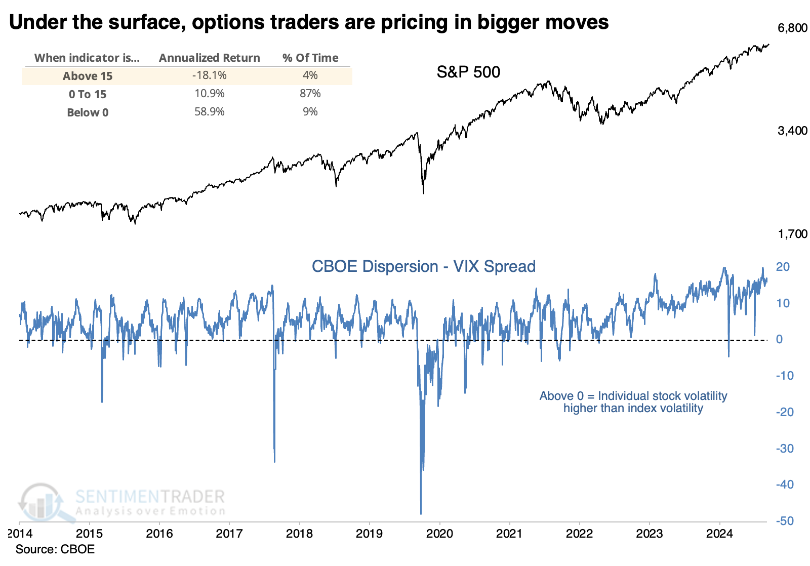
Wide spreads have been an issue
The chart below shows the spread between the Dispersion Index and the VIX. The higher the spread, the more traders are pricing in volatility among individual stocks than the index. We can see from the chart that the S&P 500's annualized return when the spread was 15 points or higher was a wretched -18.1%. When the spread was negative (implied volatility on the index higher than that of individual stocks), the return skyrocketed to +58.9%.
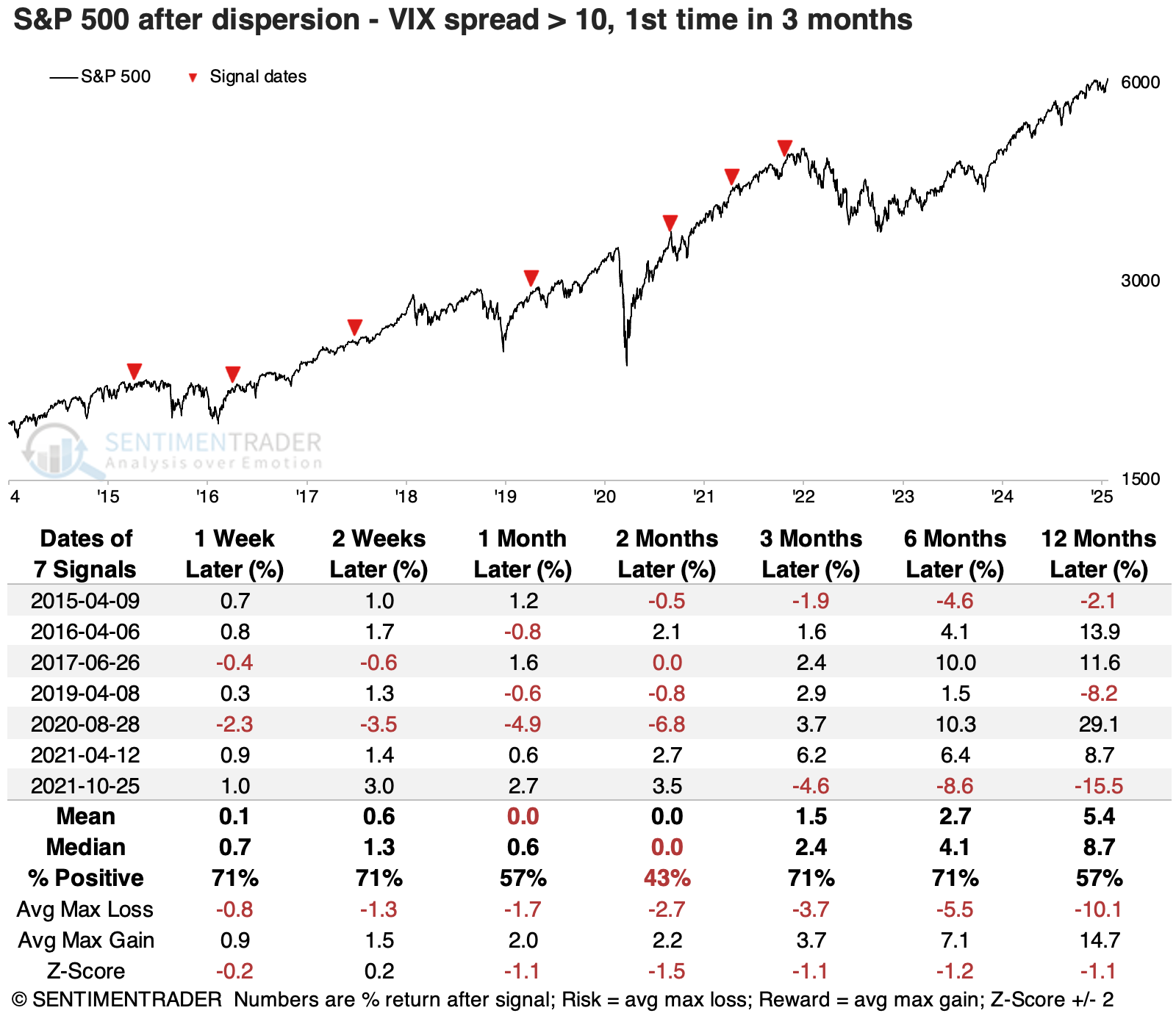
The table below shows times when the spread spent months below +10, then rose above. Returns in the S&P going forward were mixed, with short-term rallies being muted and mostly erased over the next couple of months. Only one signal, in April 2021, saw the S&P rally persistently with increasing returns over time. The others floundered.
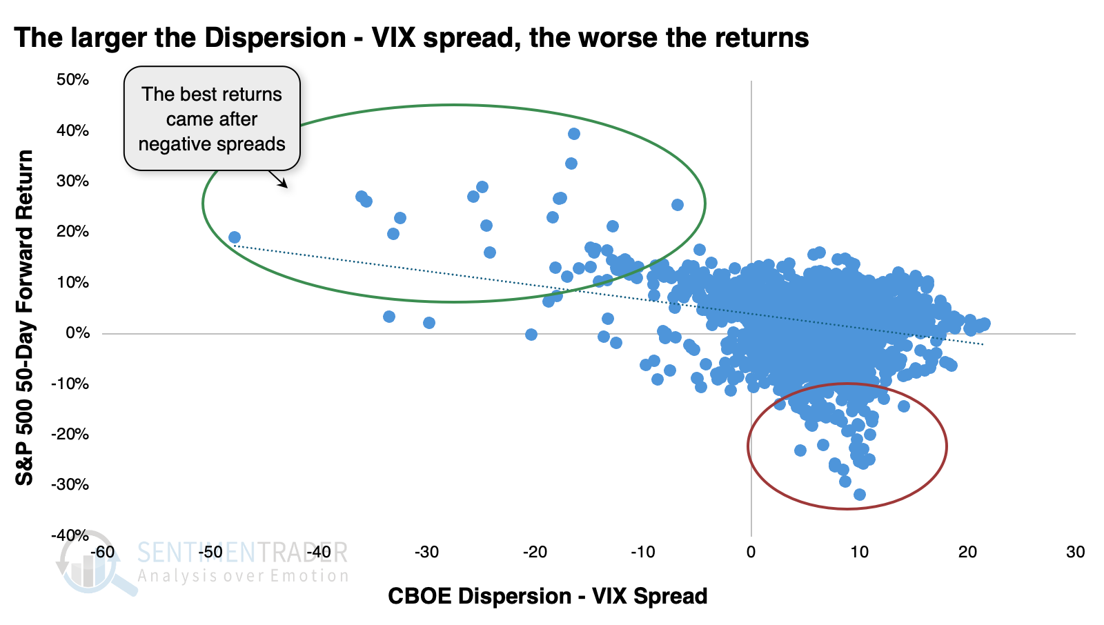
The clearest correlation between spreads and future returns was over 50 days. The scatter plot below shows the spread between the Dispersion Index and VIX along the x-axis, and the S&P 500's return over the next 50 days on the y-axis. There was a clear negative correlation, with the S&P's best returns occurring after negative spreads, and its worst returns after positive ones.
This difference between index and individual stock volatility has become a popular trade on Wall Street desks. I'm not going into detail about how the trades work because it can get complicated and I don't fully understand the mechanics behind some of the option pricing, anyway.
Whatever the machinations behind the scenes, the spread between individual and index implied volatility has grown wider over the past few years as the trades have become more popular. So, a spread of +10 points is no longer the exception, it's the rule. Now, a spread of +20 or thereabouts has coincided with extremes, and the S&P has pulled back afterward. It has dipped in recent sessions but is still coming off a recent extreme.

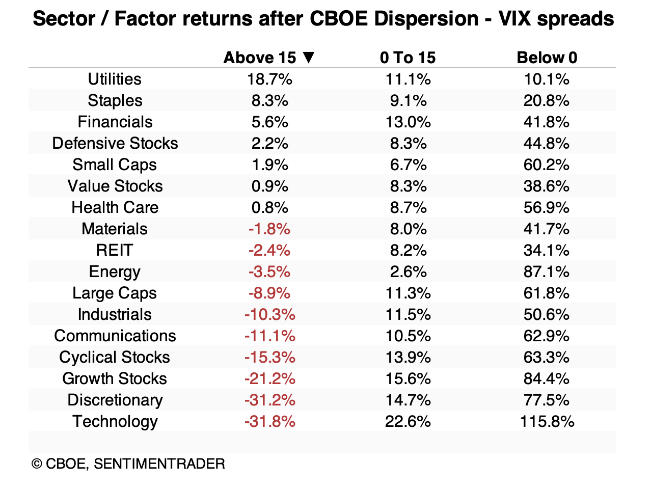
Below, we can see annualized returns in the S&P 500's major sectors and factors after various thresholds in the spread between the Dispersion Index and the VIX.
It's not a great shock that after spreads of +15 or more, the best-performing stocks tended to be in defensive groups. Utilities, staples, and health care were among the handful that managed positive returns. Small-caps and value stocks did as well. Higher-beta stocks like technology, discretionary, and growth and cyclical stocks suffered the most...but also enjoyed the most positive returns following negative spreads.
What the research tells us...
Every once in a while, an indicator shows promise, is useful for quite a while, then becomes too popular and no longer works. Or the market structure changes, or a data provider no longer tabulates the metrics or changes its methodology. Perhaps this is one of those times, as Wall Street has grabbed hold of a trade between implied volatility in individual stocks and the S&P 500 index, distorting the data too much.
If that's the case, we can't read much into the recent (and current) extreme divergence, with traders pricing in much higher implied volatility in individual stocks than the index. But it's too soon to issue an obituary for the indicator, as the last extreme is still in effect, and the S&P hasn't made much progress, since. It's not a major warning sign, as pullbacks tended to be relatively brief, but it is a yellow flag, especially for shorter-term traders.