
The market environment is losing some legs

Key points:
- Two long-term measures of equity market health have switched to negative
- Stocks tend to show limited upside in the months after similar behavior
- One mitigating circumstance is Friday's quick reversal of some of the damage
A deteriorating environment
For most of the past two years, most, if not all, signs of a healthy market have been present. Those signs are starting to fall off.
A couple of the primary ones we watch are the net percentage of securities traded on the NYSE that hit 52-week highs minus 52-week lows and the NYSE McClellan Summation Index, a long-term view of internal momentum.
For the first time since last fall, both are in unhealthy territory below zero. A couple of times over the past year, the NH-NL differential dipped into negative territory, but the Summation Index continued to show positive momentum. The current situation is more like the pullback during the fall of 2023.
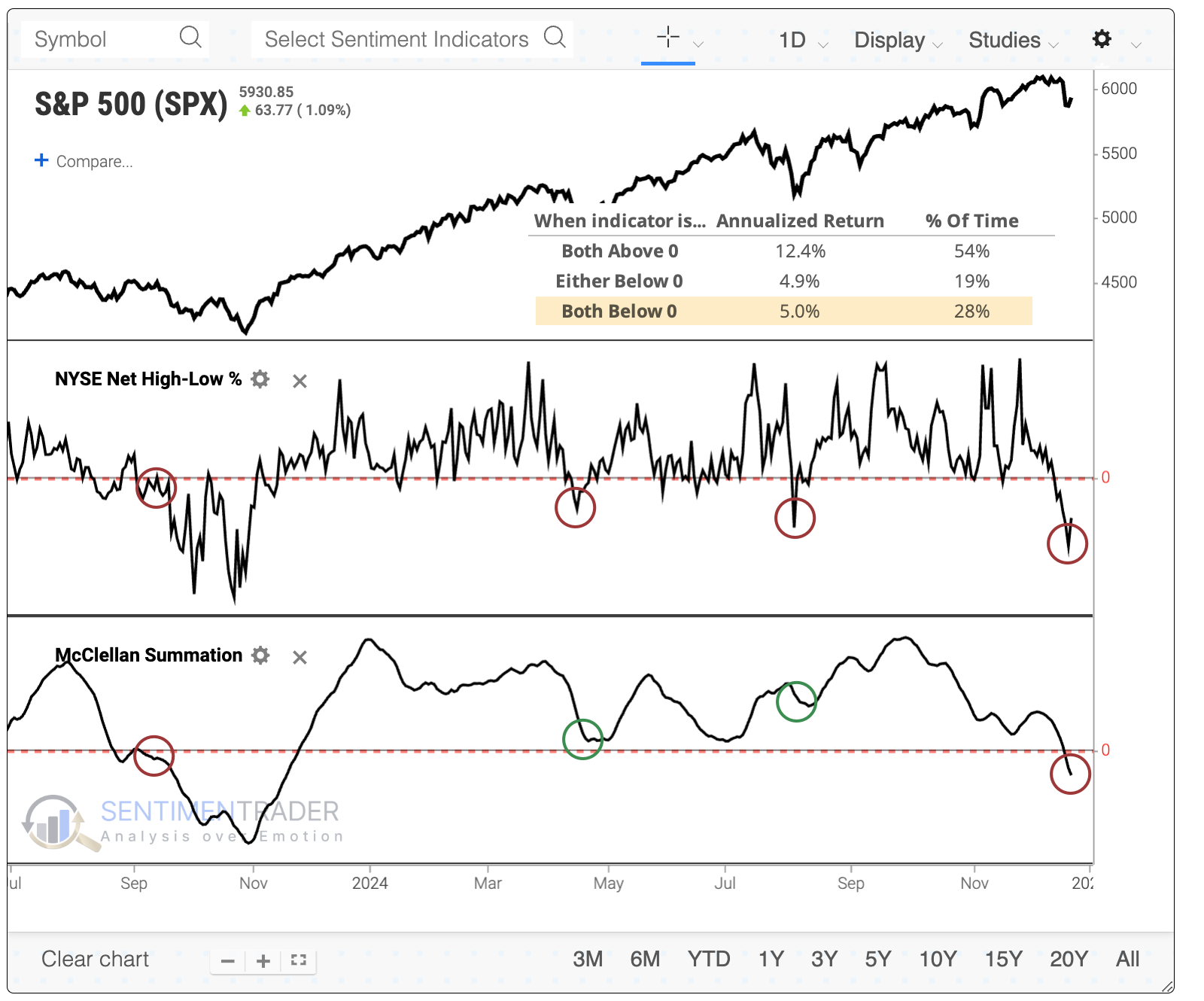
This ended the fourth-longest streak since both indicators had been in negative territory since 1962.
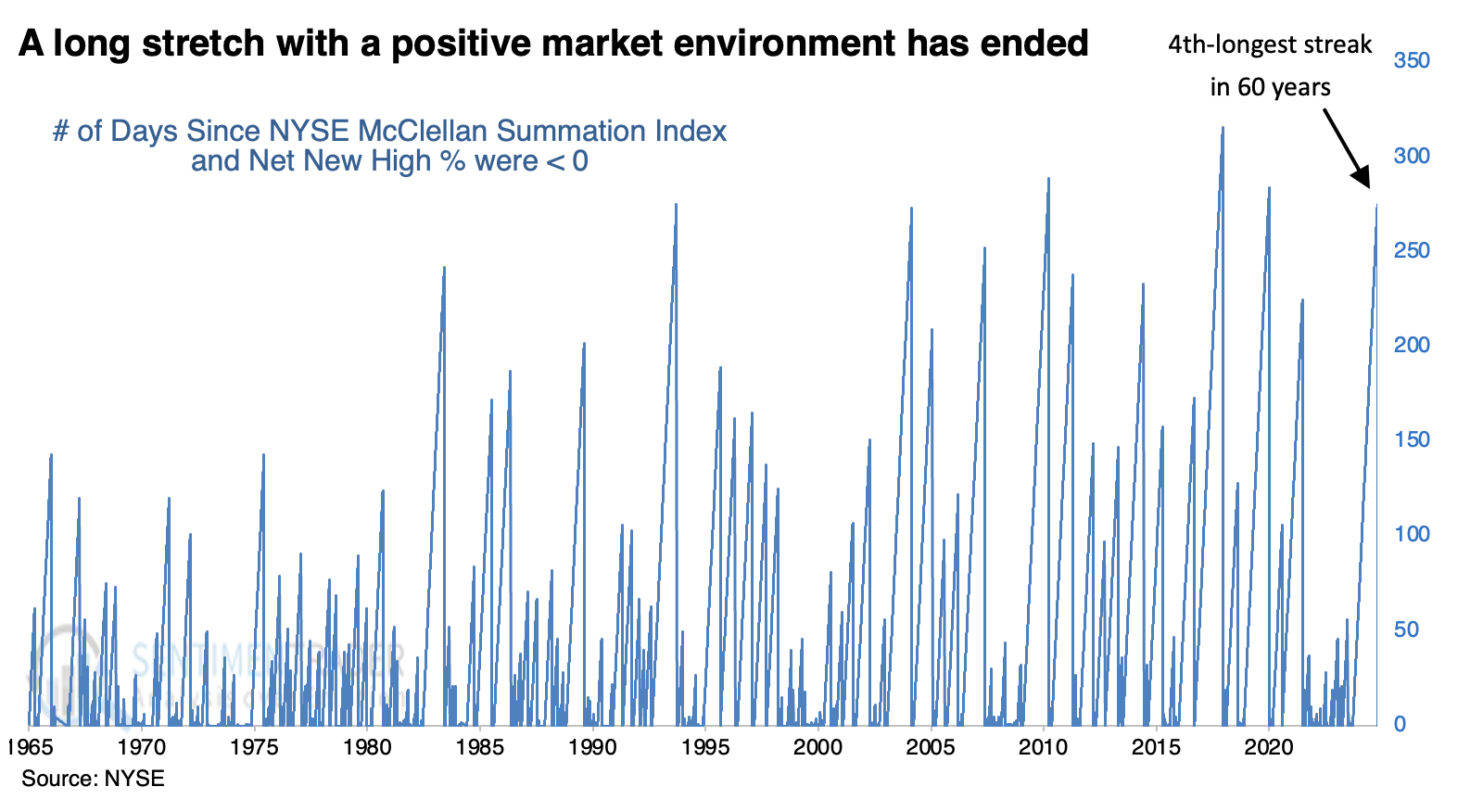
The chart below shows that streaks have been getting longer, so most of the longest streaks have occurred in recent decades. Even though most of the past 40 years have been dominated by bull markets, forward returns after the ends of similar streaks were relatively poor. The S&P 500's upside was limited in the months ahead since the 2008 global financial crisis.
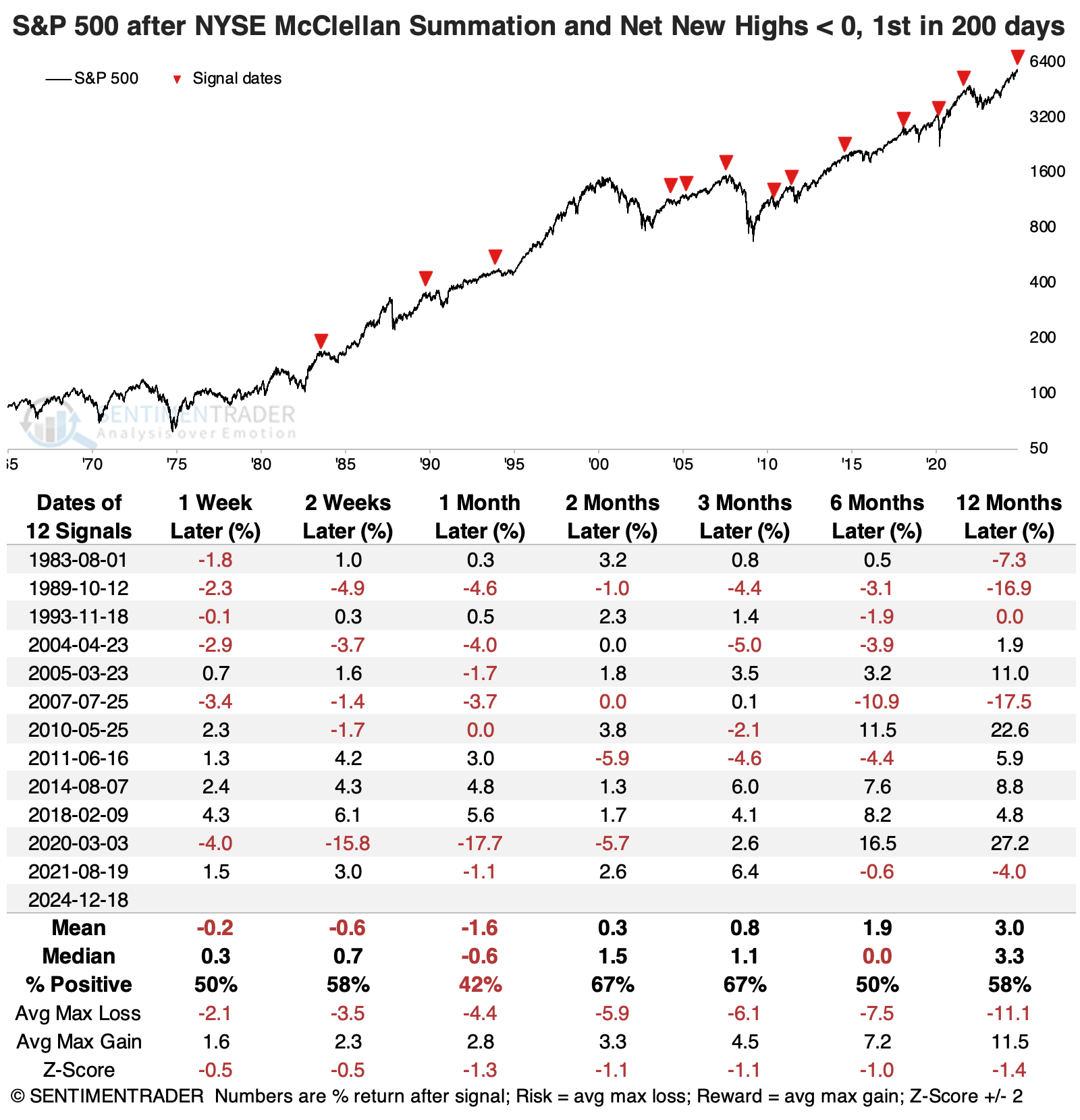
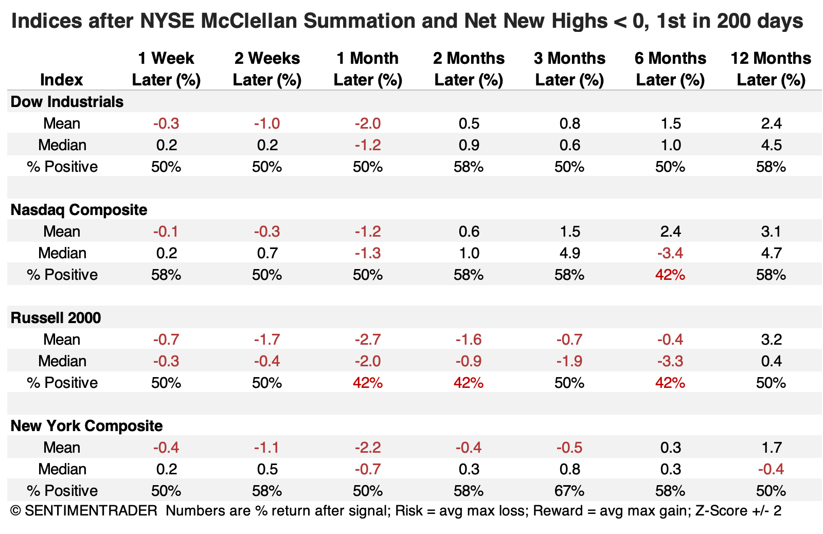
The Dow Industrials fared the best out of other major equities indices, though that's not saying much. The small-cap Russell 2000 sported the worst returns and consistency across most time frames.
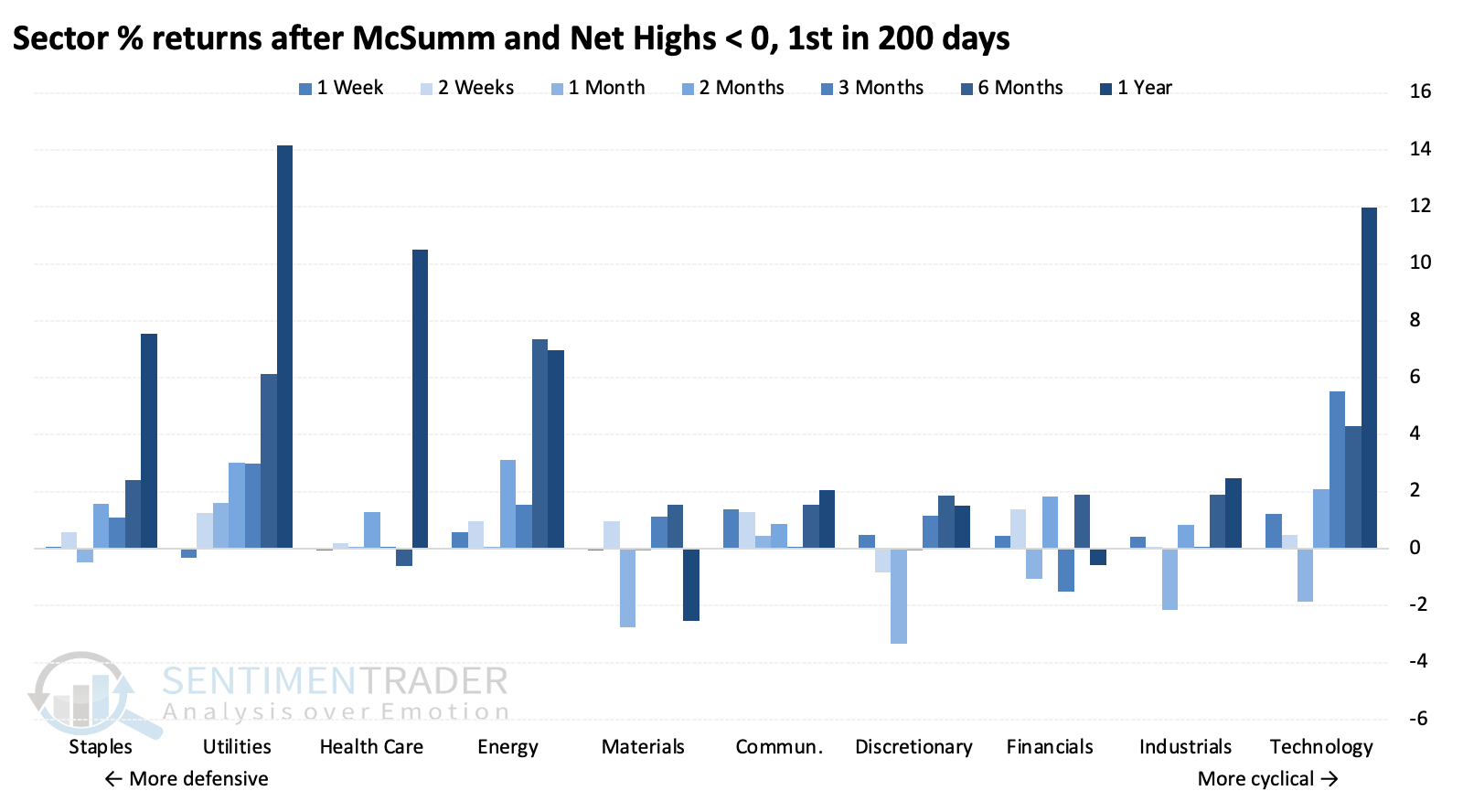
Because the returns tended to be poor, we shouldn't be surprised that more defensive sectors consistently showed the best returns, especially utilities and staples. Returns drifted lower the further along the defensive-to-cyclical scale we go, until we get to technology, which was a standout. That's primarily due to the sector's exceptional post-financial-crisis run.
A quick flip
We're navigating a quickly moving tape, causing whiplash with some short-term measures.
The same poor breadth dragging down the indicators noted above made a marked turn on Friday. Even though the impressive showing ebbed during the afternoon, the percentage of volume flowing into advancing securities on the NYSE went from one of the year's worst readings on Wednesday to one of the best on Friday.
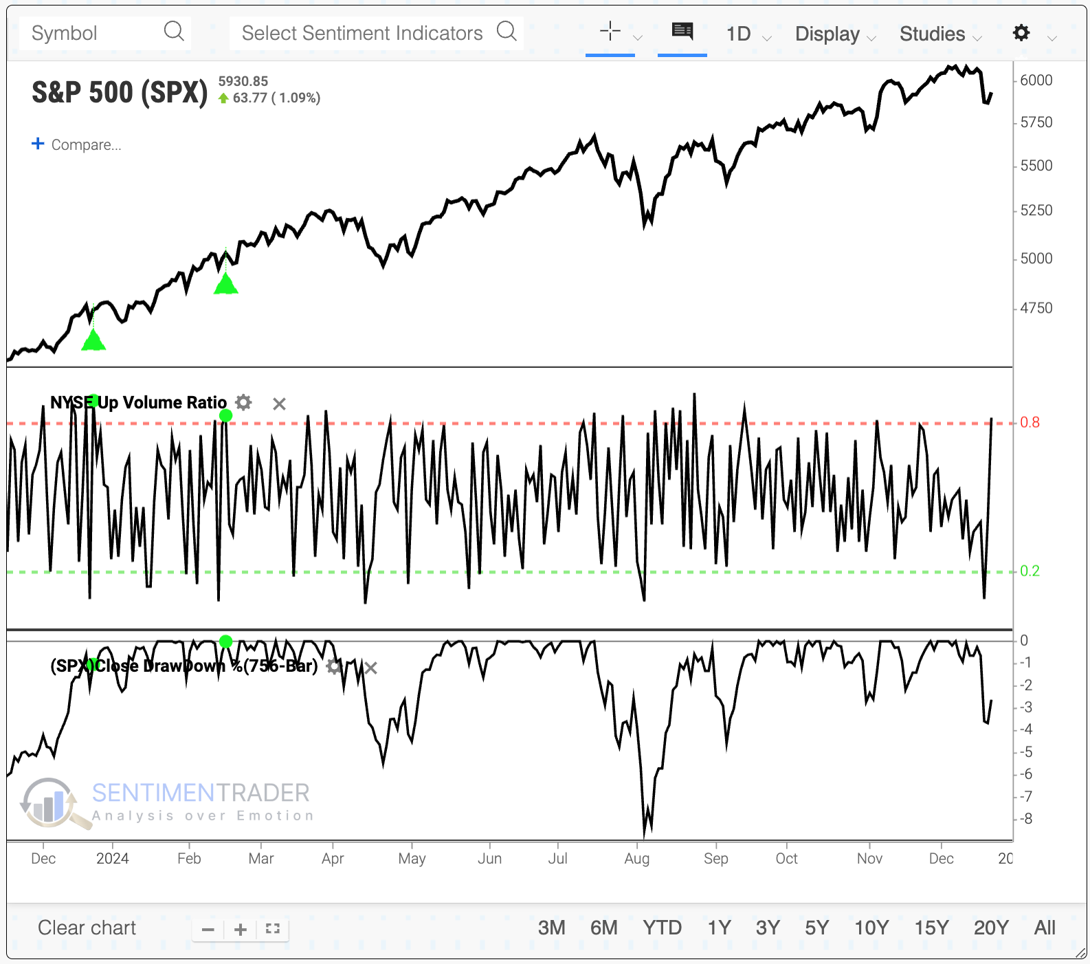
The chart and table below show the S&P 500's returns after Up Volume made a dramatic about-face within only a few sessions, and the S&P was within 5% of a multi-year high. To run this test yourself, click this link and then the Run Backtest button when it loads.
The S&P tended to hold up well after these breath whiplashes, and over the following six months, it suffered only one tiny negative return (though that ended up morphing into a wicked drawdown).
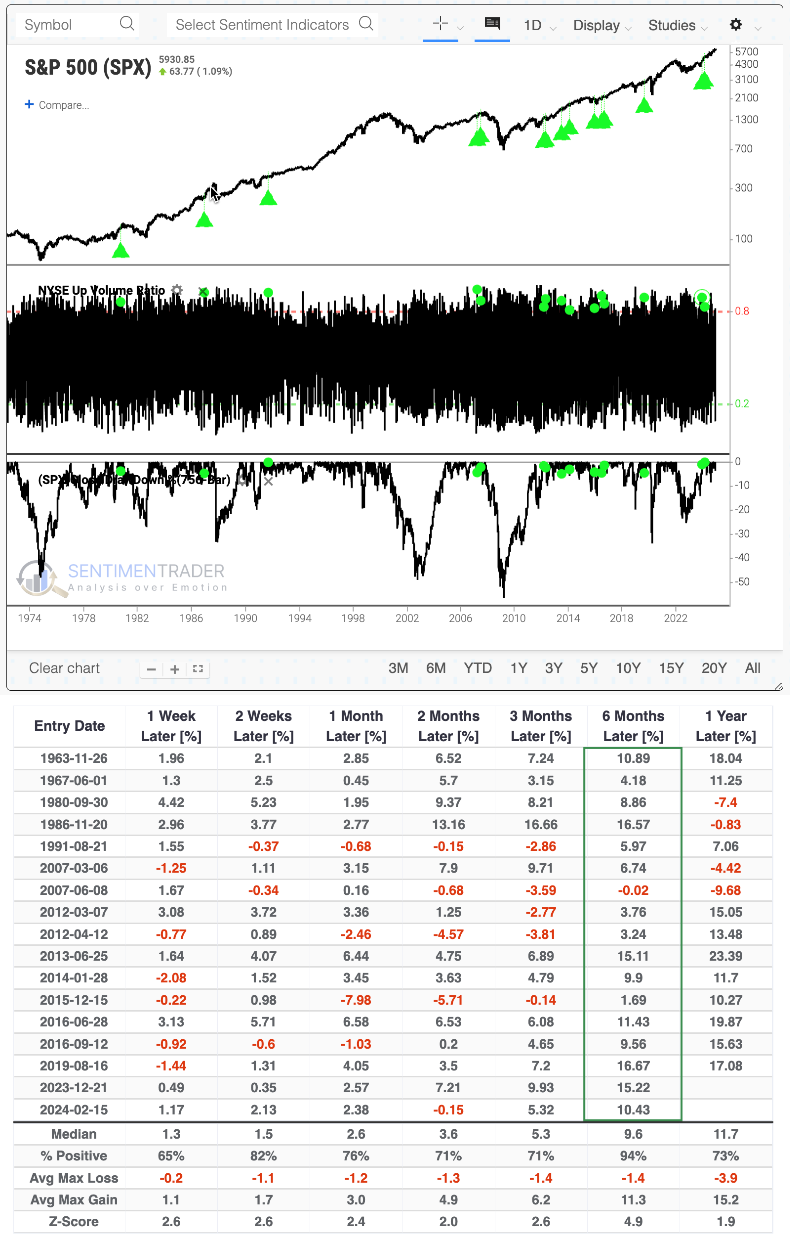
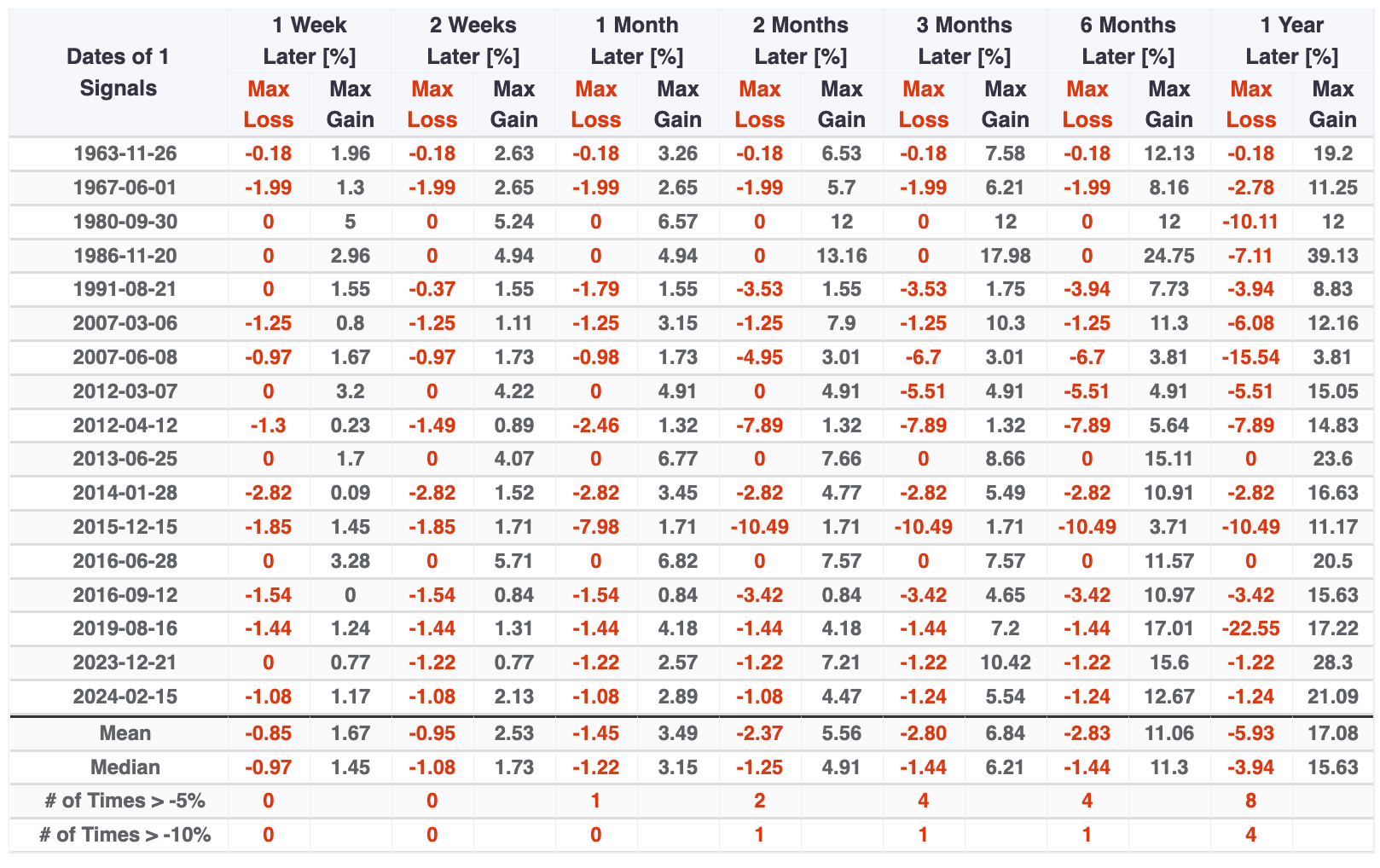
The table of maximum gains and losses across time frames shows that the risk/reward was heavily skewed in favor of reward, especially over the longer time frames. Only four signals suffered more risk than reward up to six months later, and there were few instances of even -5% drawdowns while all but three signals rallied at least +5% at some point.
What the research tells us...
Warning signs had been building again in the weeks before last week's volatility, and Wednesday's session gave some credence to those signs. The level of deterioration under the surface has been evident for a while, and many measures are now confirming that the market environment is the riskiest it's been in a year.
One of the problematic aspects of last week is just how much damage had already been done under the surface, with many indicators already at levels that have coincided with oversold levels, particularly during ongoing bull markets. And the quick shift on Friday supports the idea that we're on the cusp of relieving some of those. This is challenging for all sides and suggests that while going all-in may not be the most prudent action, neither would be being all-out.