
The latest trends in market relationships

Key Points
- There are no permanent relationships in the financial markets
- No security, sector, index, or commodity ever has a permanent edge on another (although it does seem that way at times)
- Alert investors often gain an advantage by monitoring key relationships and a) recognizing completed turning points and b) the current trend
- In this piece, we look at the current status of a variety of key market relationships to help highlight areas of strength and weakness for further examination
Relative Strength Charts
All charts below are weekly relative strength charts courtesy of StockCharts.com. In other words, these charts do not show the actual price action of a single security. Instead, they compare the relative price performance between two different securities.
- The main solid line displays the weekly trend of the relative performance.
- If the main solid line is black, it rose in the latest week, and if red, it means it fell in the latest week.
- A rising line means that the first security listed in the comparison is outperforming and vice versa.
- Each chart also displays a 52-week simple moving average. Suppose the black/red relative strength line is above the blue moving average line. I refer to that as an "uptrend" and another confirmation that the first security listed is outperforming - and vice versa.
- Likewise, if the 52-week moving average is rising, that is another indication that the first security listed is outperforming.
- Please note that I do not use the action in these charts to generate automatic buy or sell signals. I use them strictly as a "starting point" in finding securities exhibiting significant strength (or weakness).
- A red/black line making a new high above a rising 52-week moving average suggests further investigation for a buying opportunity in the first security listed.
- A red/black line making a new low below a falling 52-week moving average suggests further investigation for a buying opportunity in the second security listed.
- The primary goal is to find opportunities to trade with the trend in the more robust security.
Stocks vs. Bonds
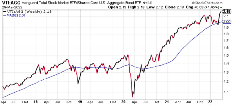
Comparing: VTI vs. AGG (Total U.S. Stock Market vs. Total U.S. Bond Market)
Recent Action: After a brief dip below 52-week MA, the RS line has reversed higher to a new multi-year high
Current Trend: RS line making a new high above 52-week MA (stocks outperforming bonds)
Stocks vs. Commodities
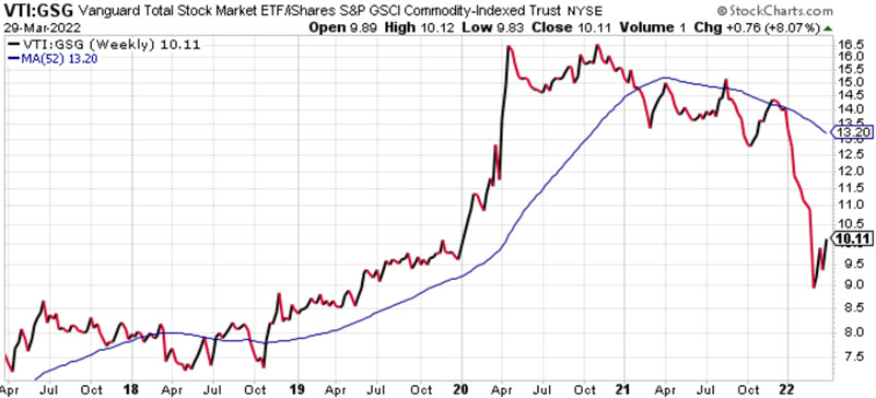
Comparing: VTI vs. AGG (Total U.S. Stock Market vs. Goldman Sachs Commodity Index)
Recent Action: Commodities have been significantly stronger than stocks since October 2021, with a slight reversal in March
Current Trend: RS line trending lower below 52-week MA (commodities outperforming stocks)
U.S. Stocks vs. International
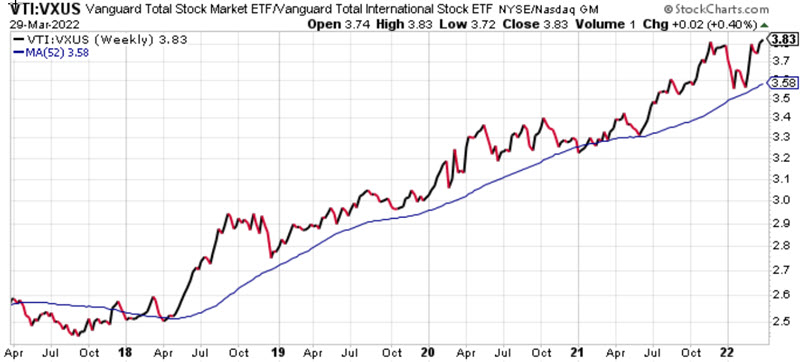
Comparing: VTI vs. VXUS (Total U.S. Stock Market vs. Total International Stock Market)
Recent Action: The RS line and 52-week MA continue to trend steadily higher
Current Trend: RS line making a new high above 52-week MA (US stocks continue to outperform international stocks)
U.S. Stocks vs. Emerging Markets
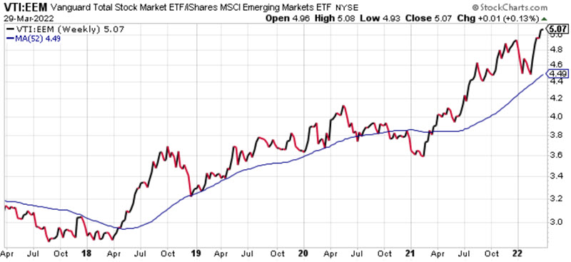
Comparing: VTI vs. EEM (Total U.S. Stock Market vs. Emerging Markets)
Recent Action: The RS line and 52-week MA continues to trend steadily higher
Current Trend: RS line making a new high above 52-week MA (No sign of a reversal favoring emerging markets)
Developed Markets vs. Emerging Markets
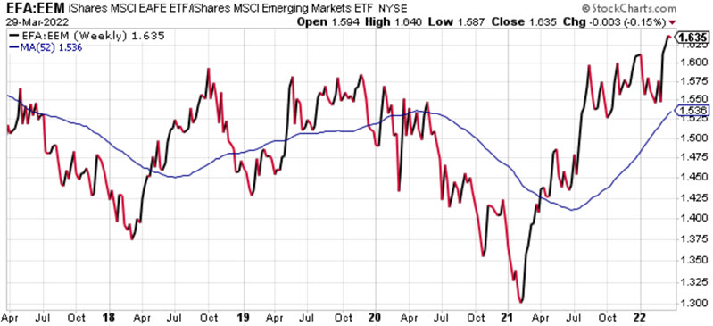
Comparing: EFA vs. EEM (Developed Market vs. Emerging Markets)
Recent Action: RS line making a new high
Current Trend: RS line making a new high above 52-week MA (developed markets continue to outperform emerging markets)
Large-cap vs. Small-cap
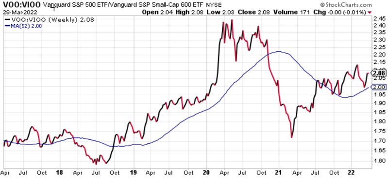
Comparing: VOO vs. VIOO (US Large-cap sector vs. US Small-cap sector)
Recent Action: Large-cap outperforming since March 2021, though not as dominant as during 2018-2020
Current Trend: RS line working higher above 52-week MA (Large-caps leading Small-caps in a somewhat grinding fashion)
Large-cap vs. Mid-cap
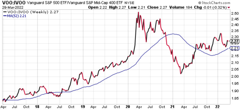
Comparing: VOO vs. IVOO (US Large-cap sector vs. U.S. Mid-cap sector)
Recent Action: Large-cap outperforming since March 2021, though not as dominant as during 2018-2020
Current Trend: RS line working higher above 52-week MA (Large-caps also loading Mid-caps in a somewhat grinding fashion)
Growth vs. Value
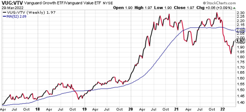
Comparing: VOO vs. IVOO (US Growth stock sector vs. US Value stock sector)
Recent Action: RS line with a double top and sharp reversal lower since November 2021
Current Trend: RS line below a 52-week MA that is just starting to roll over (Value stocks appear to have reversed course relative to growth stocks, though this relationship should be watched closely)
Momentum vs. Low Volatility
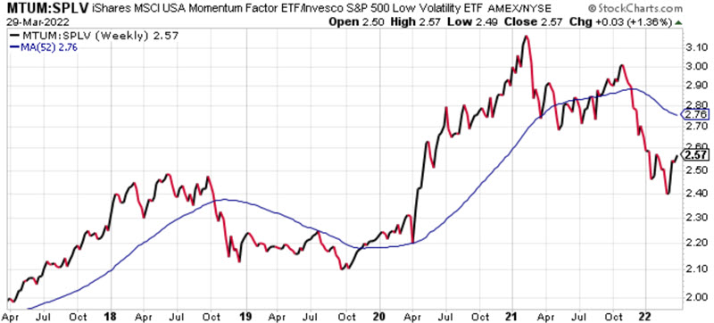
Comparing: MTUM vs. SPLV (US Momentum stocks vs. US Low Volatility stocks)
Recent Action: Low volatility held up better than the notably weak Momentum sector during the first quarter market correction
Current Trend: RS line below a declining 52-week MA (Low volatility stocks outperforming Momentum stocks). The big question going forward is "can Momentum stocks regain their place as market leaders?" Keep an eye on this chart to find out.
Technology vs. All Stocks
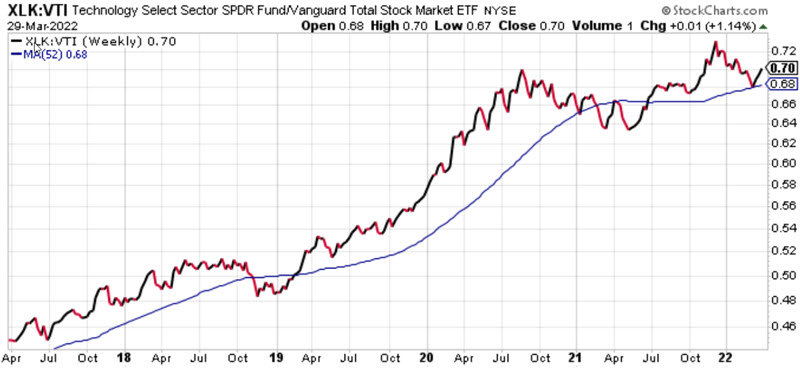
Comparing: XLK vs. VTI (Technology stock sector vs. Total U.S. Stock Market)
Recent Action: RS line weakness from December 2021 into March 2022, but reversed higher of late and still above 52-week MA
Current Trend: Despite the "conventional wisdom" that technology was/is wildly overvalued, it has held up surprisingly better than most investors realize, with the RS line above a rising 52-week MA
Energy vs. All Stocks
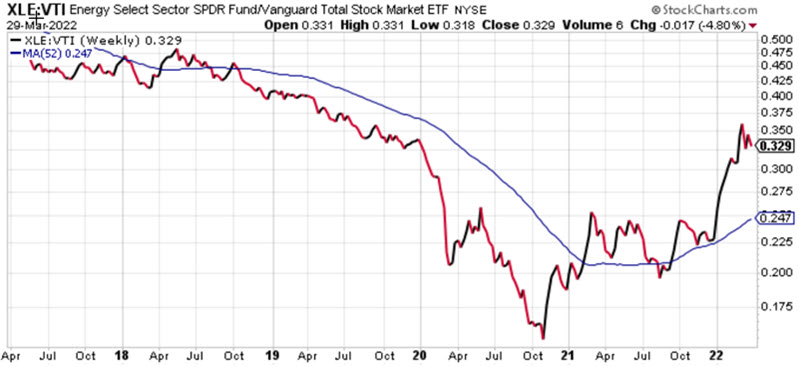
Comparing: XLE vs. VTI (Energy stock sector vs. Total U.S. Stock Market)
Recent Action: Energy has been a market leader since November 2020, with a recent moderate pullback
Current Trend: RS line far above a rising 52-week MA. A powerful uptrend, but the gap between the RS line and 52-Week MA could suggest a cooling-off period
TIPs vs. Aggregate Bond Index
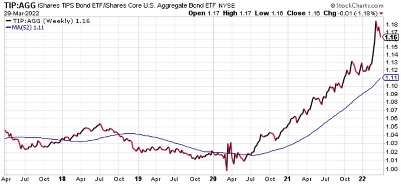
Comparing: TIP vs. AGG (Treasury inflation-protected bonds vs. Total U.S. Bond Market)
Recent Action: In the current inflationary environment, TIP has powered higher relative to the total bond market since June 2020
Current Trend: RS line far above a rising 52-week MA. A powerful uptrend, but the gap between the RS line and 52-Week MA could suggest a cooling-off period. As long as high inflation persists, TIP can continue to outperform straight bonds
Long-term treasury vs. Short-term treasury
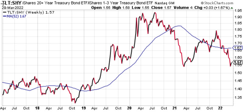
Comparing: TLT vs. SHY (20+ year treasury bonds vs. 1-3 year treasury securities)
Recent Action: As should be expected in a rising interest rate environment, long-term bonds get hit the hardest (as they are most sensitive to changes in interest rate). SHY has not performed well but has held up far better than TLT; thus, the RS line has trended lower since July 2021, and sharply lower since November 2021 as interest rates "spiked" higher
Current Trend: RS line below 52-week MA. However, 52-week MA is flat, and the RS line could be carving out a double bottom. The trend favors SHY, but things may have gotten a bit overdone in the near-term
REITs vs. All Stocks
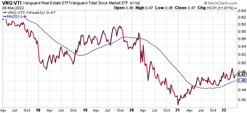
Comparing: VNQ vs. VTI (Real Estate Investment Trusts vs. US Total Stock Market)
Recent Action: REITs outperforming since January 2021, though not in a decisive fashion
Current Trend: RS line working higher above 52-week MA (REITs outperforming overall stock market in a somewhat grinding fashion)
Traditional Energy vs. New Energy
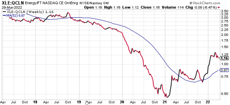
Comparing: XLE vs. QCLN (Traditional oil/gas-based energy sector vs. Clean energy sector)
Recent Action: Traditional energy sector has significantly outperformed the clean energy sector since January 2021 after a long period of just the opposite
Current Trend: RS line far above a rising 52-week MA (traditional energy sector outperforming clean energy sector)
Base Metals vs. Precious Metals
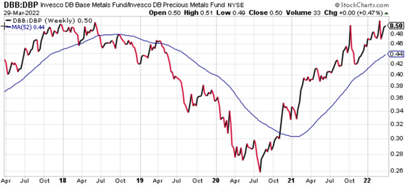
Comparing: DBB vs. DBP (Base Metals vs. Precious Metals)
Recent Action: The RS line continues to trend steadily higher but is running into what has previously been a resistance level
Current Trend: Rising RS line above a rising 52-week MA (No sign yet of a reversal favoring precious metals)
What the research tells us...
The process of trading can essentially be boiled down to two steps:
- Spotting opportunity
- Exploiting opportunity
The information above is intended to help traders focus on the most robust trends as part of Step #1 above. Focusing on owning the best-performing securities - and avoiding (or selling short) weaker-performing securities - is typically one of the keys to achieving long-term success.