
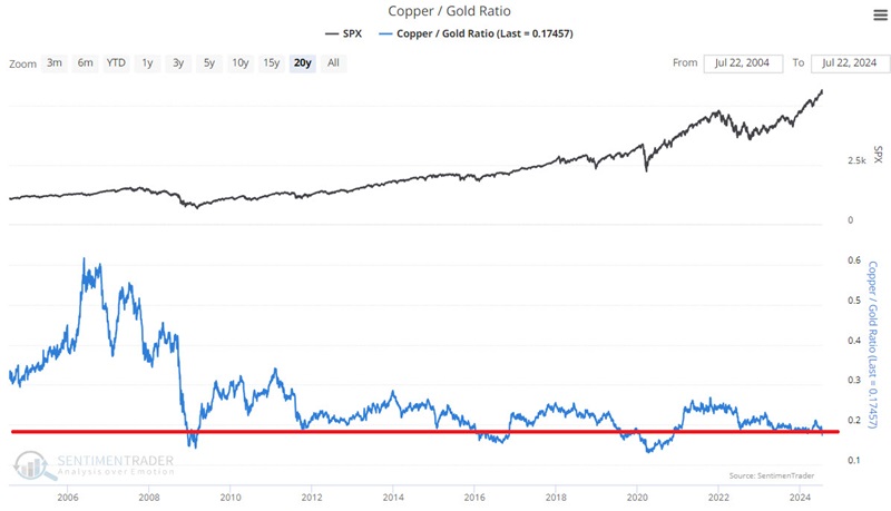
The Copper/Gold Ratio crosses an important threshold

Key points
- The Copper/Gold Ratio essentially compares the price of the leading industrial metal to the price of the leading precious metal
- This ratio has widespread influence across the financial markets
- The ratio recently crossed below a critical level
- Historically, many markets have reacted significantly; however, the sample size is small
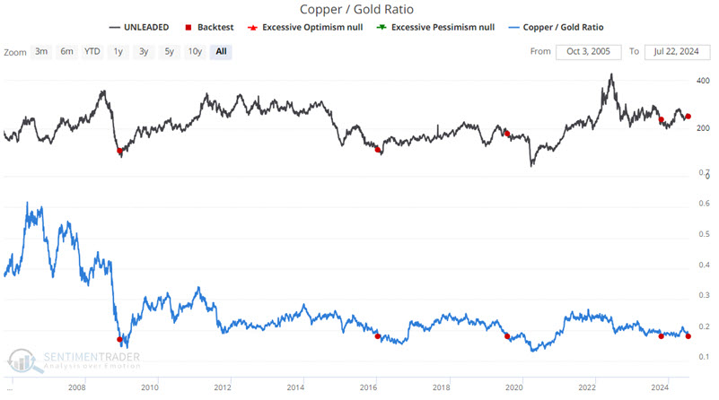
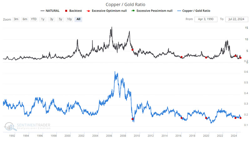
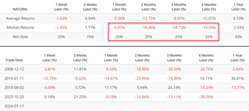
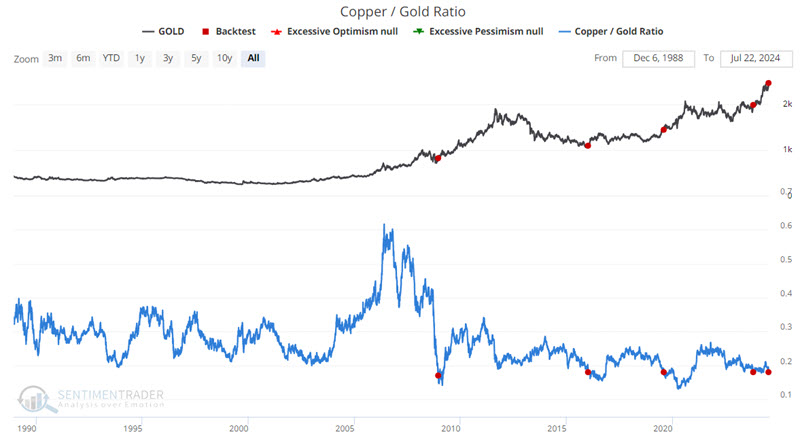
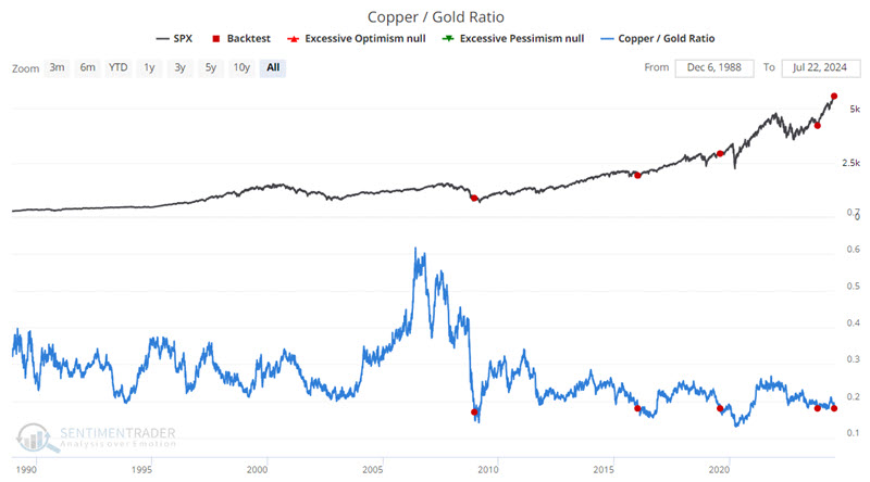
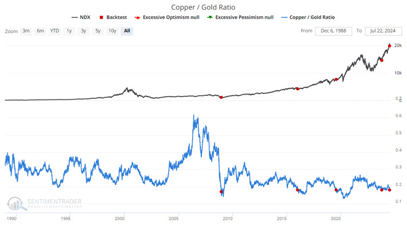
The Copper/Gold Ratio crossed below 0.18
Jeffrey Gundlach, CEO of DoubleLine Capital LP, popularized the Copper/Gold ratio. Note: Our calculation uses Copper and Gold Continuous Futures contracts. The chart below shows that the ratio recently crossed below 0.18, which is a relatively rare occurrence.
The good news is that many markets have previously made distinctive moves (some up, some down), including some well above (or below) average and median returns. The bad news is that the sample size is so tiny it is somewhat risky to draw any conclusions about the reliability of future signals.
So, below, we will highlight the performance of various securities or assets following previous dips in the Copper/Gold Ratio. However, we strongly encourage individuals to view signals as "weight of the evidence needing price trend confirmation" and not as automatic or standalone trading signals.
Energy has tended to be weak in the short term
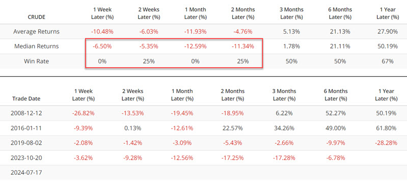
The chart and table below display previous signals and subsequent performance for the United States Oil Fund LP ETF (ticker USO) following the first cross below 0.18 in six months.

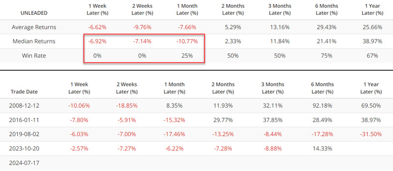
The chart and table below display previous signals and subsequent performance for Unleaded Gas futures following the first cross below 0.18 in six months.
The chart and table below display previous signals and subsequent performance for Natural Gas futures following the first cross below 0.18 in six months.
The critical point to note is the tendency for these energy markets to show weakness. Crude and unleaded have tended to show immediate weakness in the near term, while natural gas has shown significant weakness two to six months after a signal.
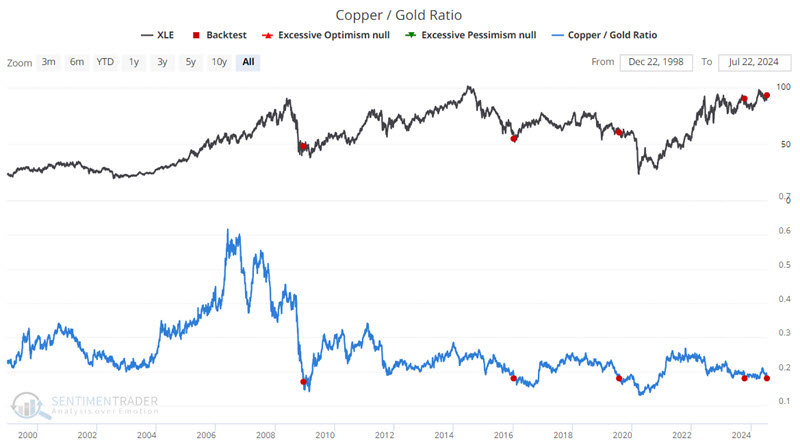
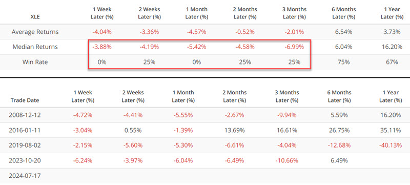
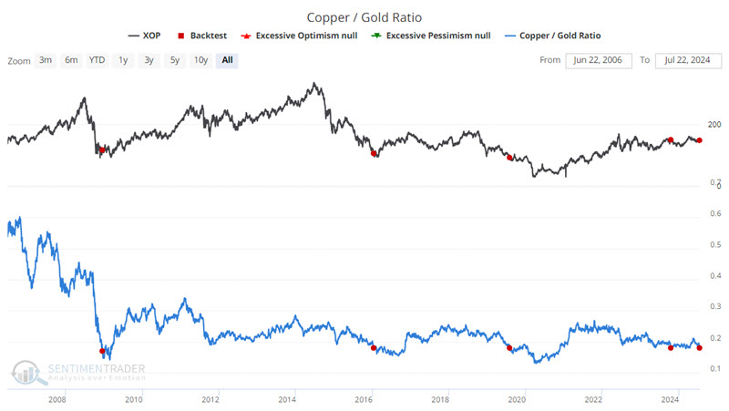
Speaking of energies, the energy sector in the stock market has also tended to experience near-term weakness. The charts and tables below highlight performance for the Energy Select Sector SPDR Fund (ticker XLE) and SPDR S&P Oil & Gas Exploration & Production ETF (ticker XOP).
The U.S. Dollar has rarely made much headway following a signal
The chart and table below display previous signals and subsequent performance for U.S. Dollar futures following the first cross below 0.18 in six months.
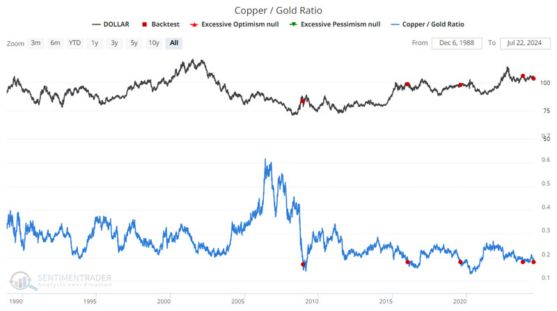
The dollar has rarely made much upside headway in the twelve months following a signal.
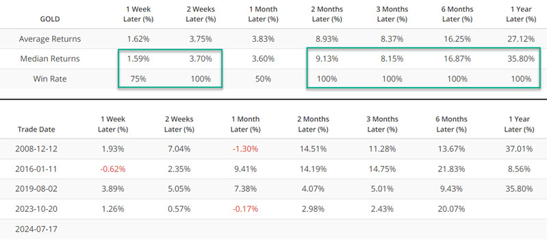
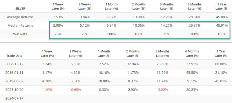
Precious metals have tended to respond very favorably
Precious metals have tended to perform well in the twelve months following a signal.
The chart and table below display previous signals and subsequent performance for Gold futures following the first cross below 0.18 in six months.
Last week, I wrote a piece noting several indicators that flashed unfavorable signs for gold stocks. The results below suggest the polar opposite (it is impossible to predict which will be correct, which is why price trend confirmation is critically important).
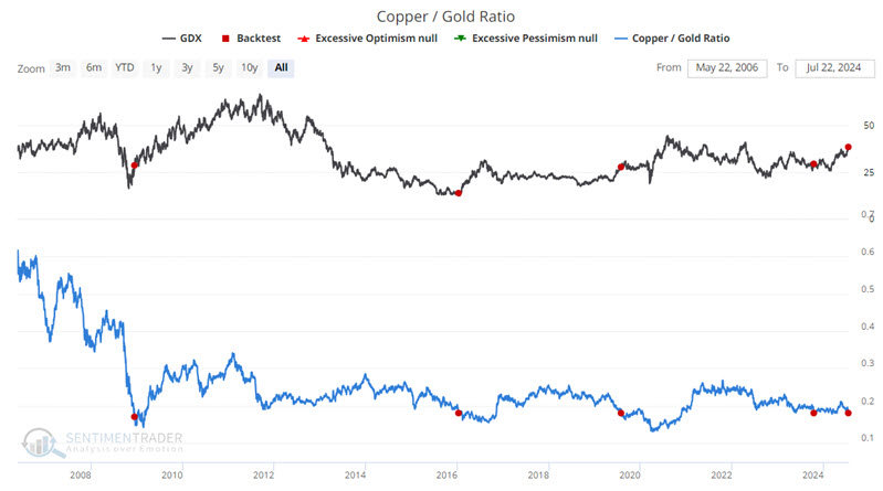
The chart and table below display previous signals and subsequent performance for the VanEck Gold Miners ETF (ticker GDX) following the first cross below 0.18 in six months.
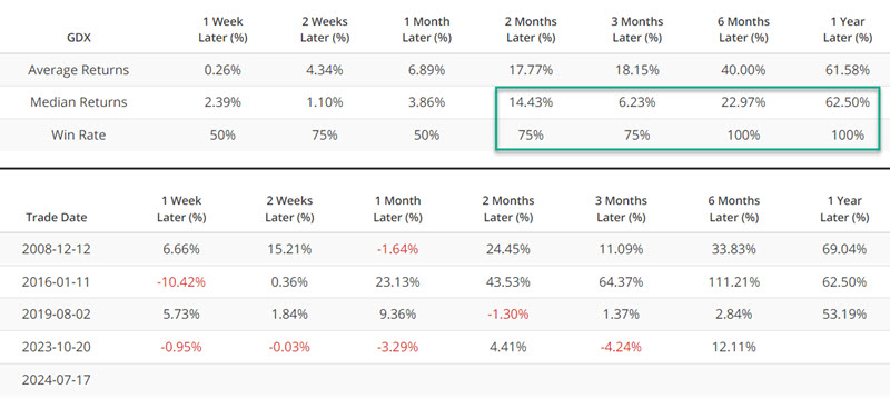
The Median 12-month return of 62.5% should not be taken as a sign that gold stocks will soar in the year ahead. That said, it does alert us to pay close attention to price trends and ride them if a strong trend develops.
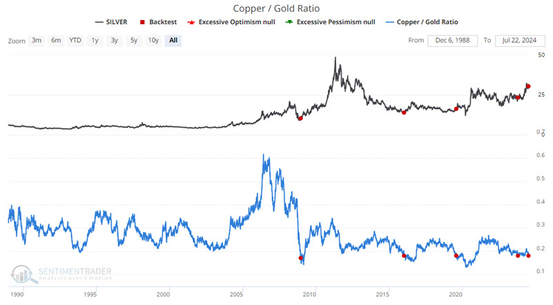
The chart and table below display previous signals and subsequent performance for Silver futures following the first cross below 0.18 in six months.
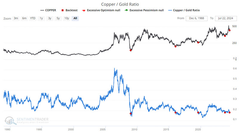
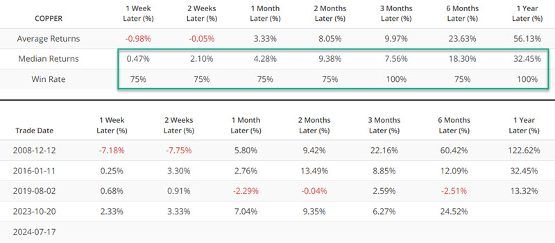
The chart and table below display previous signals and subsequent performance for Copper futures following the first cross below 0.18 in six months.
The results above suggest that traders should pay close attention to price trends in precious metals in the year ahead.
A look at stock market performance following signals
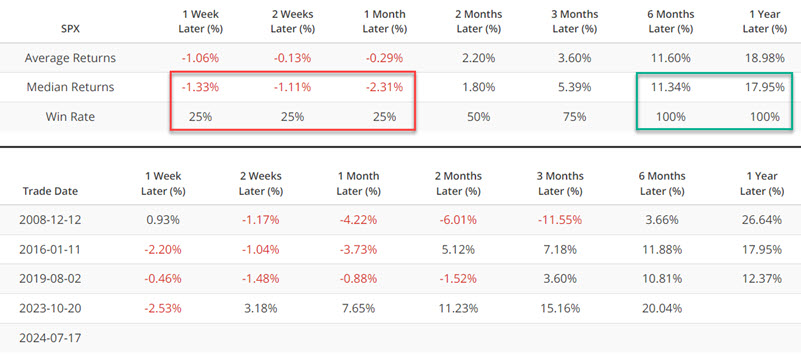
The chart and table below display previous signals and subsequent performance for the S&P 500 Index following the first cross below 0.18 in six months.
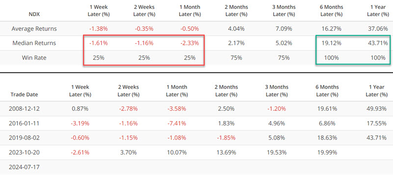
The chart and table below display previous signals and subsequent performance for the Nasdaq 100 Index following the first cross below 0.18 in six months.
The chart and table below display previous signals and subsequent performance for the Technology Select Sector SPDR Fund (ticker XLK) following the first cross below 0.18 in six months.
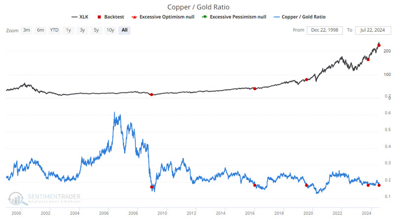
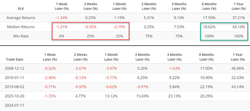
The key things to note are the tendency for weakness during the first month after a signal, followed by significant gains after that.
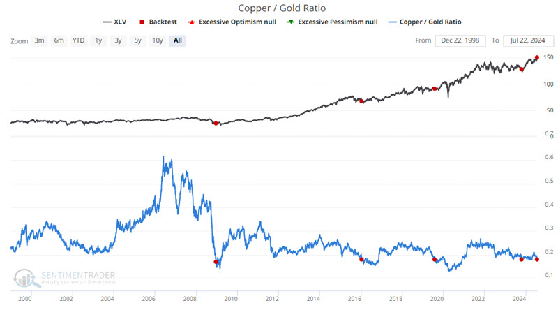
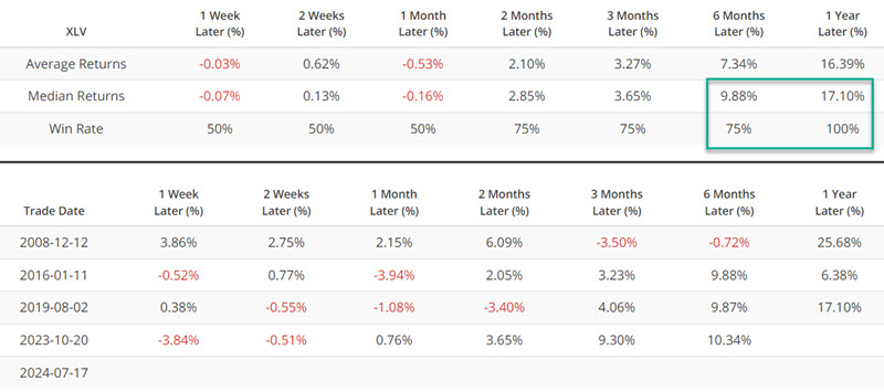
The chart and table below display previous signals and subsequent performance for the Health Care Select Sector SPDR Fund (ticker XLV) - which recently broke out to a new all-time high - following the first cross below 0.18 in six months.
A look at bond market performance following signals
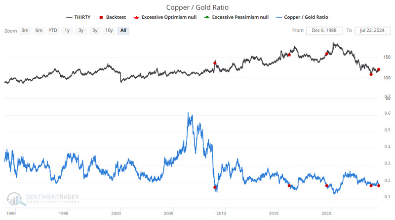
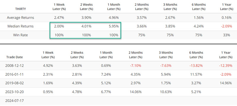
The chart and table below display previous signals and subsequent performance for 30-year Treasury bond futures following the first cross below 0.18 in six months.
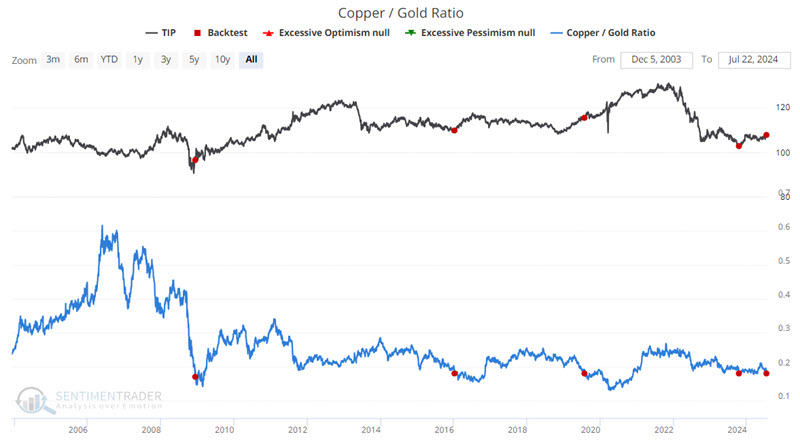
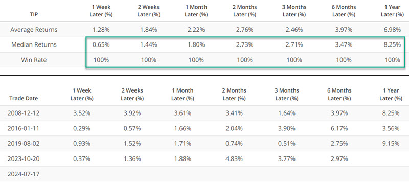
The chart and table below display previous signals and subsequent performance for the iShares TIPS Bond ETF (ticker TIP) following the first cross below 0.18 in six months.
What the research tells us…
As highlighted above, many markets/sectors have reacted meaningfully to previous crosses by the Copper/Gold Ratio below 0.18. That said, there is nothing "magic" about the 0.18 level. Likewise, remember that the small sample size means we should be cautious not to automatically assume that markets will react this time as they have in the past. The key is to follow the price action closely for any markets of interest highlighted above. If price action shows signs of confirming a move in accordance with the results above, this may represent an opportunity to achieve outsized returns.