
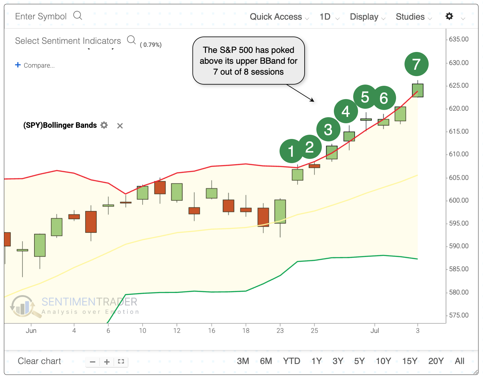
Pushing beyond a stretched Band

Key points:
- The S&P 500 has pushed above its upper Bollinger Band for most of the past 8 days
- Such persistent bouts of momentum while trading at a multi-year high have preceded mixed returns
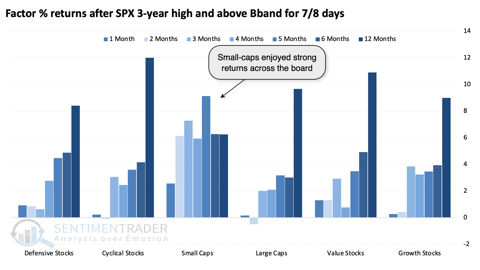
- Smaller stocks tended to benefit the most from such momentum, with impressive outperformance versus the S&P
Riding a wave of momentum
One of the few technical tools we regularly discuss on the site is Bollinger Bands. A measure of trend and volatility, the indicator can give useful signals in various ways-mean reversion, trend-following, or some mix of the two.
The indicator is widely followed and getting some attention now because the world's most benchmarked equity index has poked above its upper BBand almost every day for over a week, all while trading at record highs. This is either a sign of remarkable momentum or "too much, too fast."
We have about 60 years of reliable intraday data for the S&P 500, so we can go back that far and see how traders reacted after similar behavior. The BBand is typically interpreted as a shorter-term indicator, so we'll first look at those time frames.
Overall, the S&P did okay in the following days. It rose more often than not, but average returns were below average, and the risk/reward was unimpressive. Since 1997, every signal showed a loss over the following week, with most of those building on the losses in the couple of weeks after.
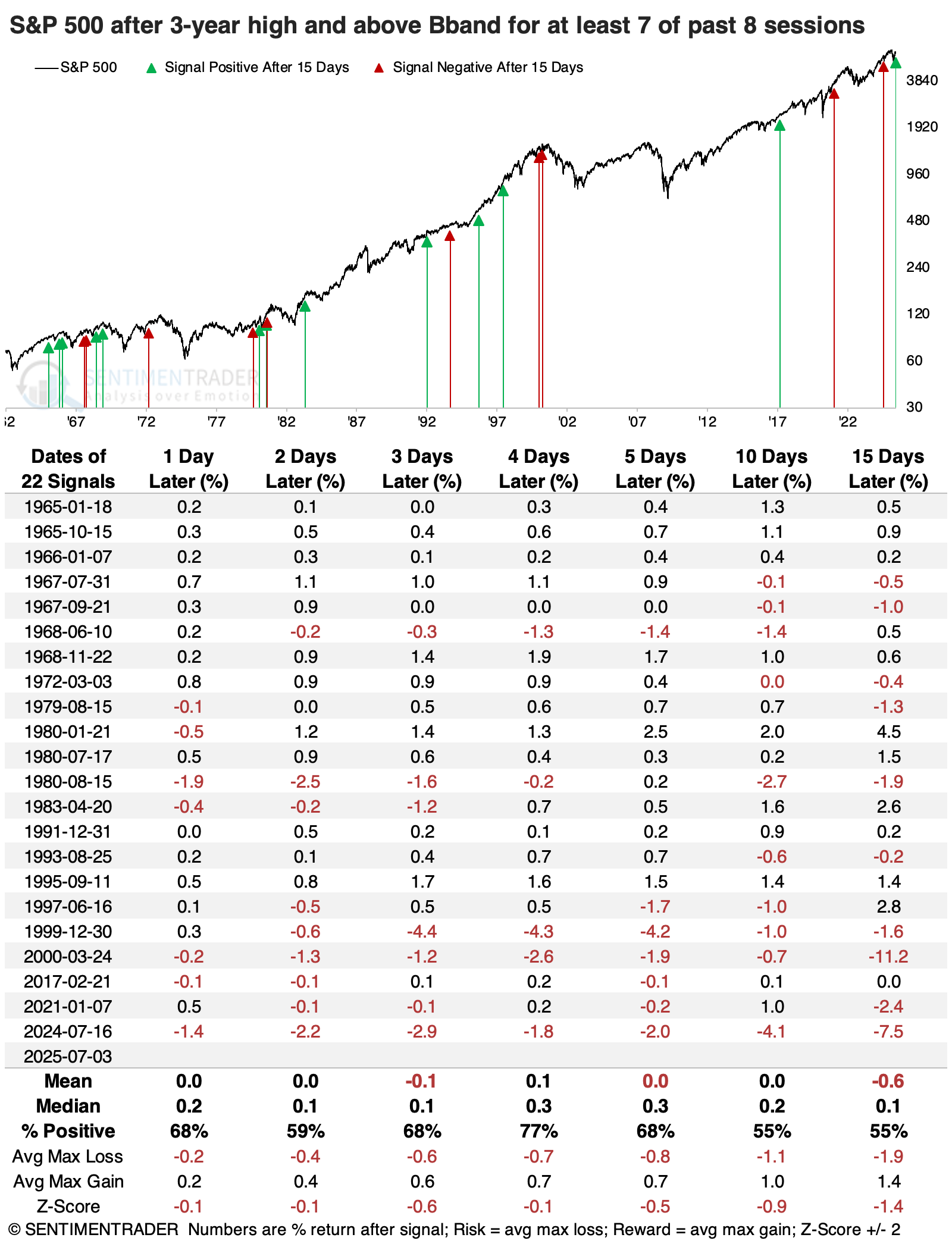
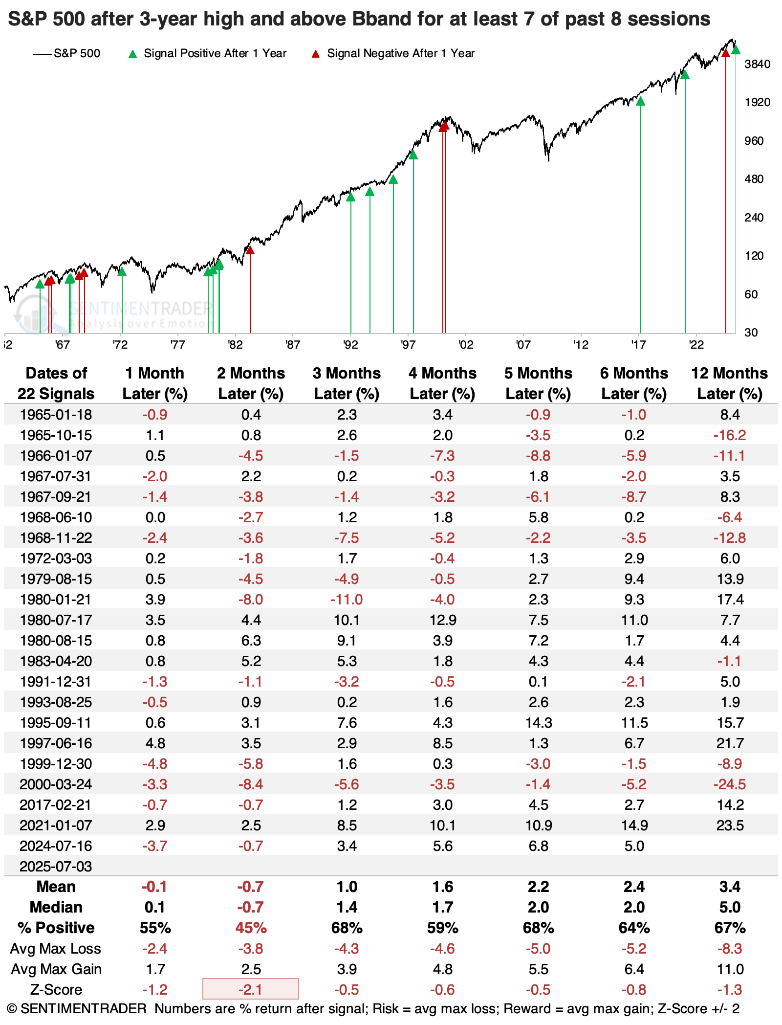
From a longer-term point of view, the next two months showed the weakest returns. The S&P sported a positive return only 45% of the time, with an average return significantly below random. While that tended to be the trough for returns and consistency, the index had modestly below-average returns across time frames.
Within the following six months, it gained more than 5% ten times, and lost more than -5% ten times as well, so a really mixed picture. Only two signals (1966, 2000) preceded bear markets within the following year, and six preceded declines of -10% or more.
A promising sign for smaller stocks
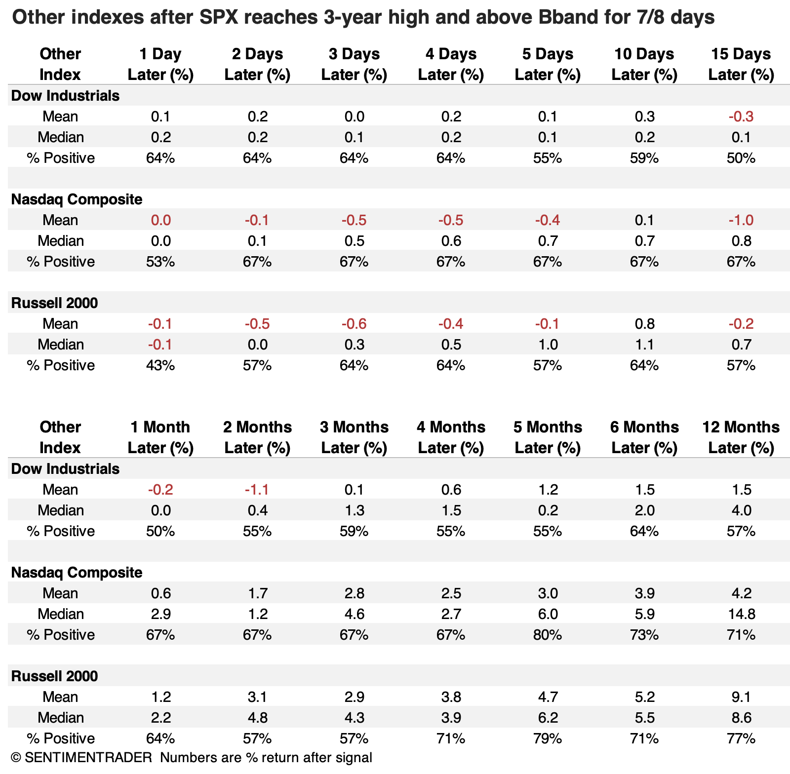
Such persistent bouts of momentum slightly favored higher-beta indexes like the Nasdaq Composite and Russell 2000 over very short time frames, as hot-money traders jumped on the bandwagon. Those indexes tended to outperform the S&P even over more extended time frames.
Two months later, the Russell 2000 showed a median return of +4.8%, compared to -0.7% for the S&P 500. Five months later, the Nasdaq Composite enjoyed a positive return 80% of the time, compared to 68% for the S&P.
We can see this bias among factors, with small-caps enjoying the strongest and most consistent returns across most time frames, concentrated on the more intermediate ones from 2-5 months.
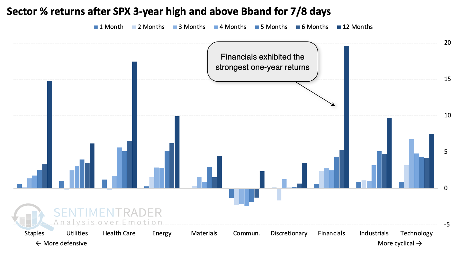
Sector returns were an interesting mix, with financials sporting the highest average one-year returns. The three cyclical sectors that have led the recent breakout all enjoyed moderately strong intermediate returns.
What the research tells us...
Contrarian-minded traders and investors like to view everything through that lens. Strong momentum? Profit taking is sure to follow. Weak momentum? A sure sign that bargains are about to be had. In reality, it doesn't usually work that way. Momentum tends to feed on itself until it reaches a true extreme, and even then, it doesn't consistently precede a worthwhile risk/reward setup for short positions.
The fact that the S&P 500 has gathered and sustained so much interest that it has pushed beyond its upper volatility band for over a week is a decent sign. It should not be considered a buy signal by any stretch, but assuming it's a sell has also been mostly folly. What it has been good for is the small-cap factor, which has been trying to play catch-up, and this is a decent sign that it may continue to do so.