
Price action is just like 2008...and many more placid markets

Key points:
- Over the past year, the S&P 500's price pattern has matched that just before the 2008 panic
- But it even more closely matched many other periods without such dire consequences
- The Nasdaq Composite also matches some terrible periods, but most of them rebounded in the next half-year
A year that looks like 2008 (and many others)
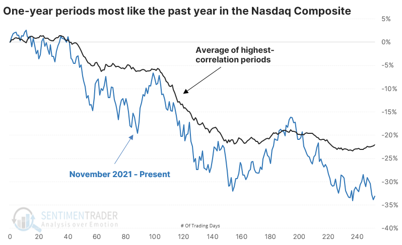
Whenever stocks tumble, social media fills up with some version of the chart below. It lines up the peak in the S&P 500 a year ago with the peak in 2007 and points out how the squiggly lines look similar. The conclusion, of course, is that we're about to crash.
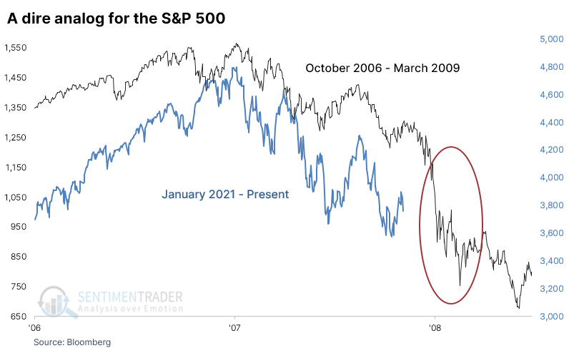
Some version of this usually has whipped its way across the internet for at least eight years. Maybe now is when it'll finally unfold just how the bears would like.
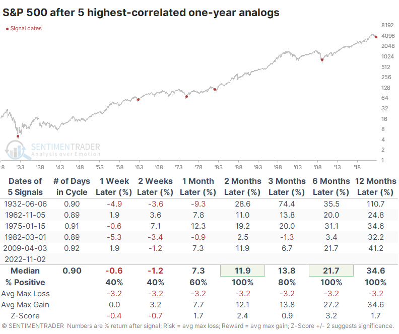
As we usually do, let's use an objective approach. We'll go back to 1928 and look at the highest-correlation one-year periods to the past year. There were 22 periods that had a correlation of more than +0.80 (on a scale from -1.0 to +1.0).
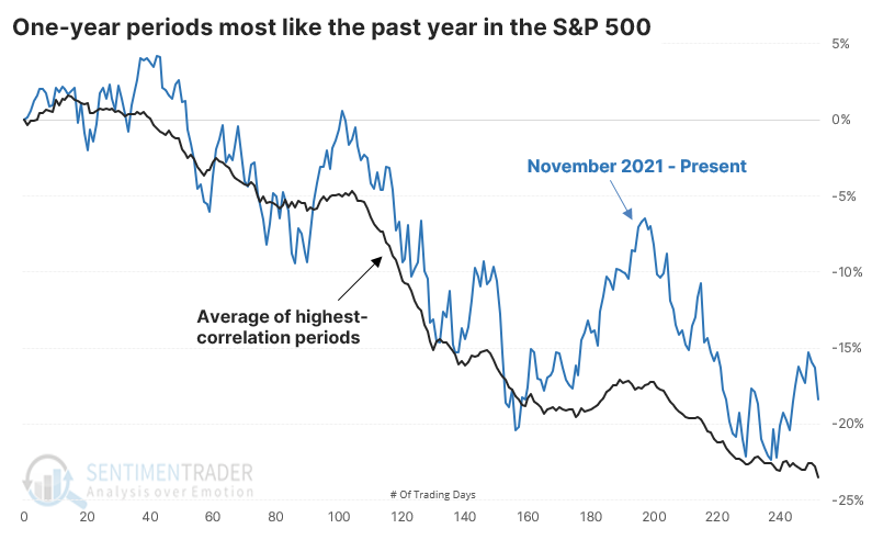
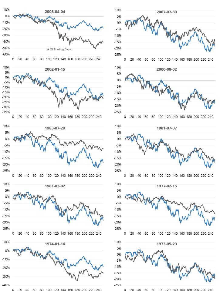
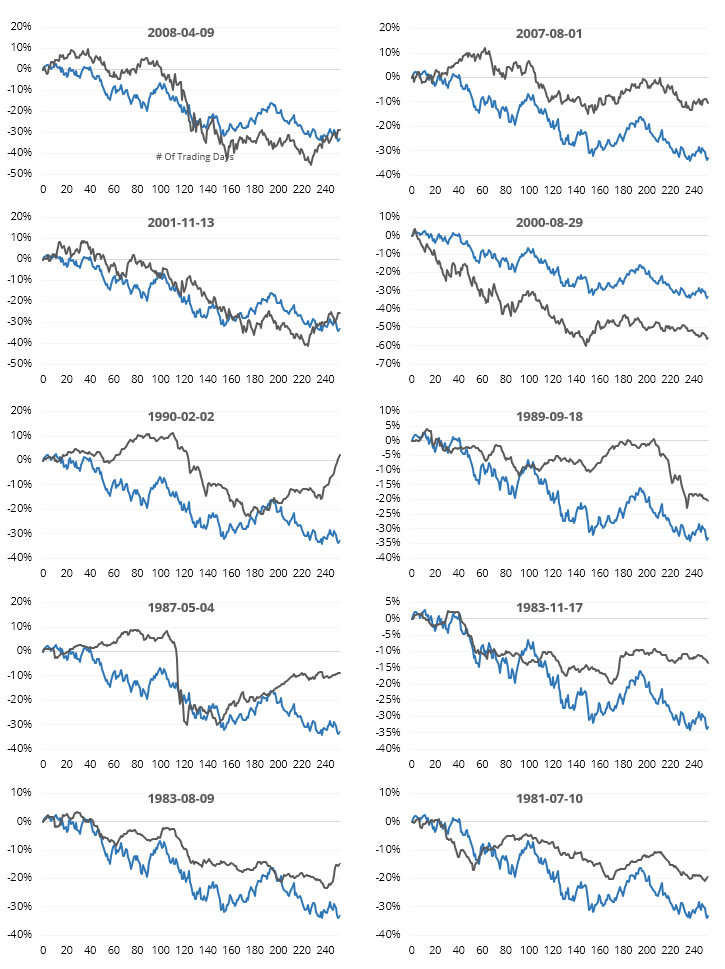
We can see the most recent ones in the thumbnails below. Some of the periods overlap; we didn't exclude those.
As always, we're more interested in what happened going forward than what happened going backward. The table below shows the S&P 500's returns in the year following the highest one-year analogs.
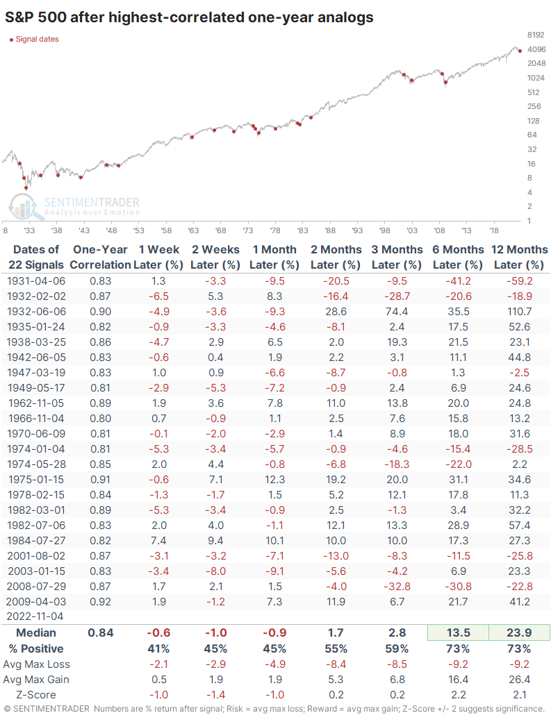
Interestingly, the five analogs with the highest correlation, close to +0.90 or above, showed some of the best returns going forward.
Switching to the Nasdaq
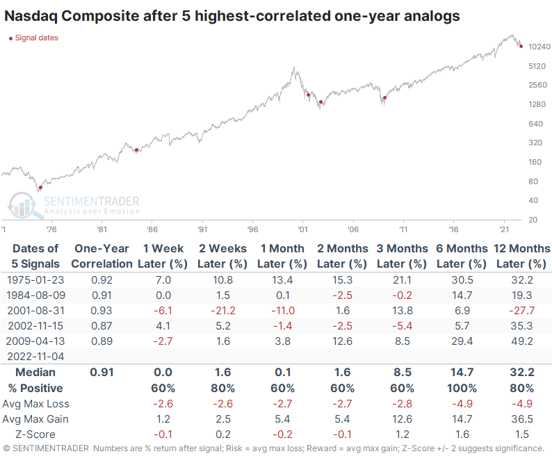
The meltdown in tech stocks has ushered in other dire warnings. The bears tell us that if this isn't a repeat of 2008, then surely it is of 2001. Since the 1971 inception of the Nasdaq Composite, there have been 14 years with a high correlation to the past year.
Snapshots of the ten most recent are shown below.
Over the next year, the Nasdaq suffered some drastic losses...and some even more dramatic gains. Only 2 out of 14 analogs suffered a negative return over the next six months, and the maximum gain averaged nearly three times the average decline.
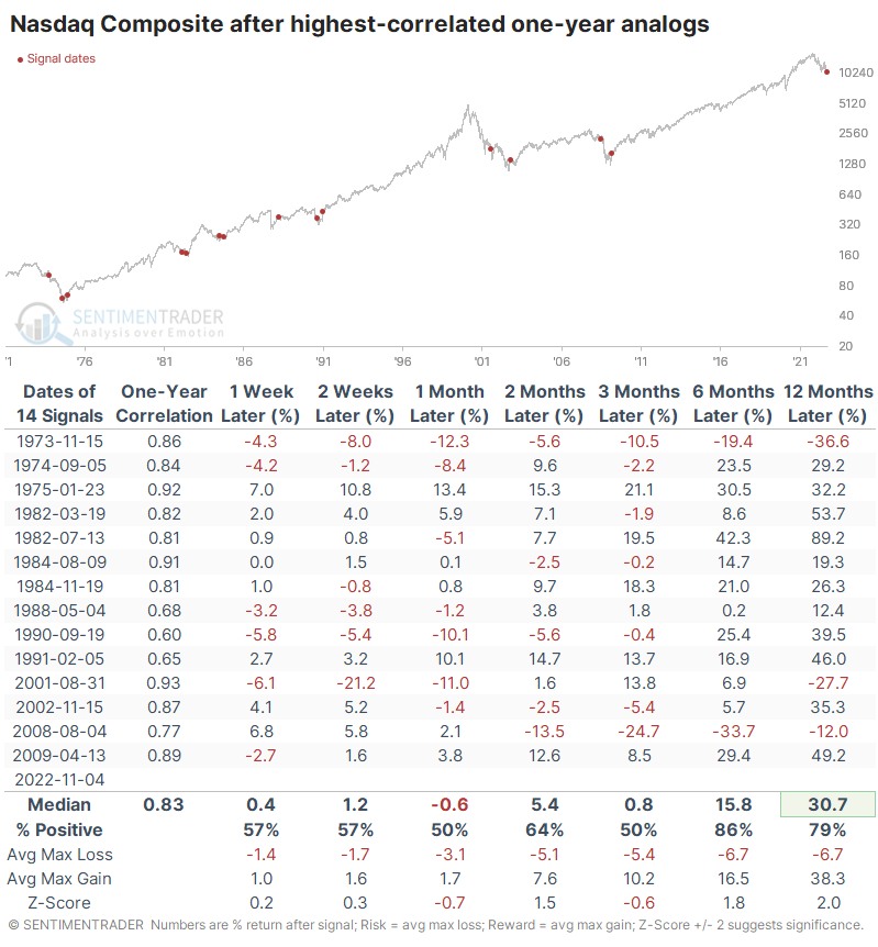
The five highest-correlated analogs all showed gains over the next six months.
What the research tells us...
Overlaying price analogs is fraught with dangers, particularly for those who like to eyeball charts and cherry-pick an example or two that look alike. Using an objective method diminishes that risk, and it has proven to be modestly helpful over the years. A lot of it is just random, but it also incorporates the truism that investor behavior never fundamentally changes.
The past year has been dreadful for investors of all stripes. When they've faced price action like this, over a year's time, in two of the most widely-followed indexes, it has typically been toward the end of prolonged declines, with a high probability of buyers being more eager than sellers over the next six months.