
One area that needs to see serious improvement

Key Points
- Much like stocks, high-yield corporate bonds are highly in tune with the overall economy
- When the high yield bond advance/decline line is trending higher, it typically portends a favorable economy - and in turn, higher stock prices
- Serious economic downturns are often foreshadowed by a downtrend in the high yield bond advance/decline line
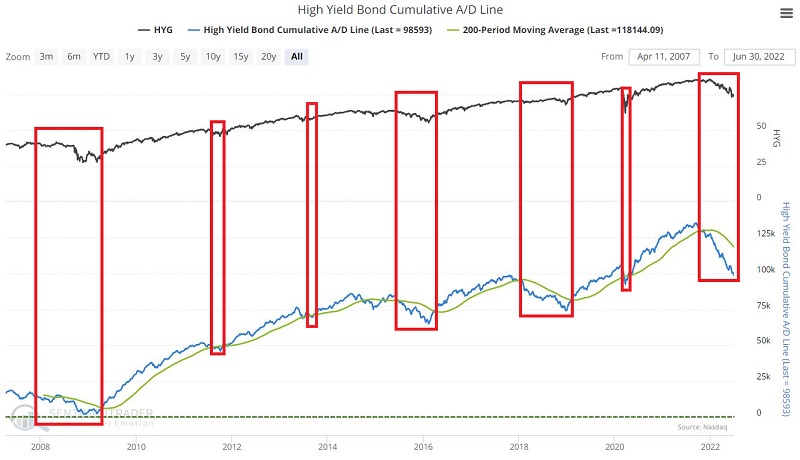
High yield cumulative A/D line
This indicator displays the cumulative advance/decline line for the high-yield bond market. This line will rise if more high-yield (junk) bonds are rising than falling and vice versa. Many traders look for divergences between this line and tickers, such as HYG (iShares iBoxx $ High Yield Corporate Bond ETF) and SPY (SPDR S&P 500 Trust), for advance signs of a potential reversal. Specifically, a shorter-term trader may look for the A/D line to make a higher low, while HYG or SPY makes a lower low as a sign of internal market strength.
For longer-term investors, it does appear to be possible to use this indicator beneficially on a simple trend-following basis. The chart below displays the High Yield Bond's Cumulative A/D Line and its 200-day moving average.
The basic interpretation is pretty straightforward:
- When the A/D Line is ABOVE, its 200-day MA = BULLISH
- When the A/D Line is BELOW its 200-day MA = BEARISH
The Test
For testing, we will use A/D line data and S&P 500 Index closing price data from 10/19/2005 through 6/30/2022. We then looked at S&P 500 Index performance depending on whether the High Yield A/D line was above or below its 200-day moving average.
The chart below displays the hypothetical cumulative % +(-) for the S&P 500 when the High Yield A/D line was above its 200-day moving average.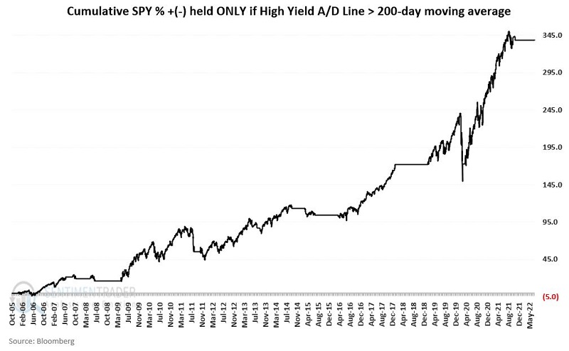
The cumulative % return was +338%.
The chart below displays the hypothetical cumulative % +(-) for the S&P 500 when the High Yield A/D line was below its 200-day moving average.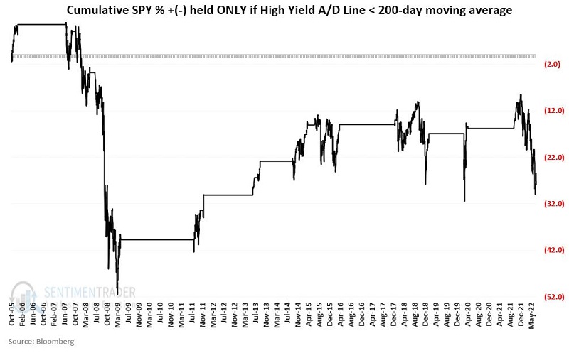
The cumulative % return was (-28%).
The results
A closer look reveals that results are typical for a pure trend-following approach. If we count bullish and bearish trades, this "system" (such as it is) shows more losers than winners. However, the strategy rides the big winners for an extended time and avoids some of the worst losing trades.
The table below displays the results for the bullish and bearish trades.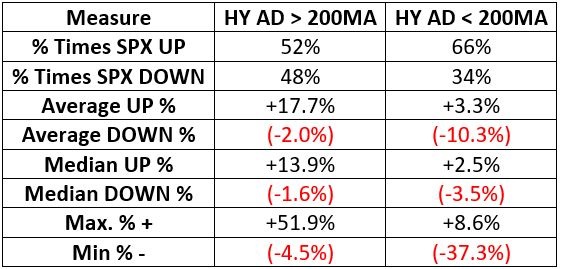
The Win Rate on bullish trades is only 52.4%. However, the average winning trade is 8.8 times the size of the average losing trade, and the median winning work is 8.6 the size of the Median losing trade.
The S&P 500 gained ground during 2/3rds of the supposedly bearish trades. However, the average losing trade was three times the size of the average winning trade. Note that this method sidestepped a -37.3% decline between June 2008 and April 2009. Likewise, it has been bearish since 11/10/2021, thus avoiding a -18.5% decline for the S&P 500 through the end of June 2022.
What the research tells us…
This indicator is most effective as a "weight of the evidence" type of indicator rather than as a standalone trading model. The critical thing to note is that when the High Yield Cumulative A/D Line is above its 200-day moving average, the probability of a bear market is extremely low, as evidenced by the Average DOWN % (-2.0%), Median DOWN % (-1.6%) and worst instance (Min %- = -4.5%). Conversely, while not every bearish signal from this indicator is followed by a bear market in stocks, most major stock market declines have occurred when this A/D line is in a downtrend. Investors looking for a reason to be bullish on stocks should watch for a positive reversal in this A/D line back above its 200-day moving average.