
More oversold indicators worthy of note

Key points
- The stock market has plunged, and many reliable indicators are flashing "oversold" signals
- Many of these individual signals do not necessarily qualify as standalone "buy" signals, but taken together, they do suggest not giving in completely to panic and fear
- This note looks at recent signals from our Panic/Euphoria Model, PE/VIX Spread indicator, and the VIX Index
Where we stand
Repeating from my last note, I follow hundreds of indicators and over a thousand potential "signals" that they can trigger. After the close on Friday, April 4th, and again on April 7th, my scan lit up with many signals, mostly all "favorable." That's the good news. The bad news is that, in this case, a "signal" is primarily "weight of the evidence" and not necessarily an outright "buy signal." Likewise, many of the signals that triggered fall into the "typically favorable (i.e., 80% of higher Win Rate) six to twelve months out. But what happens in the interim is a) often close to a coin flip, and b) there is no guarantee that things won't get worse (sometimes even much worse) before they get better.
Keeping that in mind, let's look at more useful indicators that recently generated such signals.
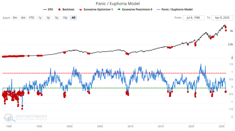
Our Panic/Euphoria Model shows precisely what you would expect
The chart below displays all dates when our Panic/Euphoria Model was at -0.23 or lower. Again, we are not making the case that any initial signal should be interpreted as an automatic "buy" signal. The key thing to note is how clusters of red dots tend to occur during buying opportunities. It is also fair to note that the latest small cluster began just as the latest selloff was beginning (i.e., it was "early," another reminder that no single "red dot" qualifies as a buy signal).
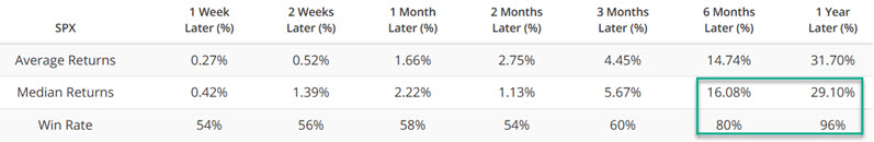
The table below summarizes the results.
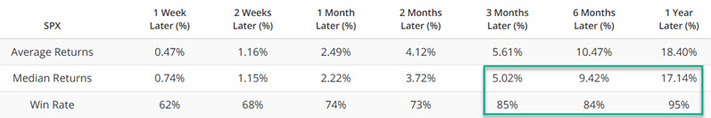
Will this latest cluster of "red dots" ultimately qualify as a buying opportunity? Only time will tell. Does it - based on history - qualify as "favorable weight of the evidence?" Decide for yourself.
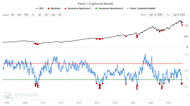
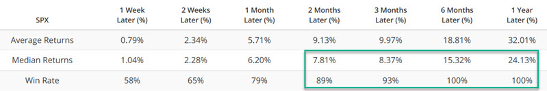
The chart and table below present results for only the most recent twenty years (eliminating the virtually non-stop sea of red dots during the early to mid-1990s).
The PE/VIX Spread collapses
This indicator shows the spread between the forward price/earnings multiple on the S&P 500 and the VIX volatility gauge. The higher it is, the more investors are willing to value stocks while not suffering the consequences of high volatility, which tends to lead to poor future returns. A very negative spread shows that investors may be pricing in too great of a price swing relative to the earnings that stocks will likely generate.
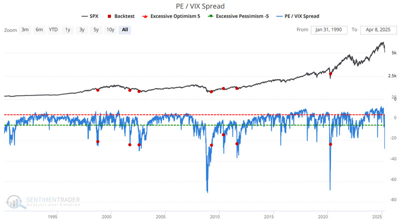
The chart below displays all dates when our PE/VIX Spread indicator was at -25 or lower. It is fair to note that the 2008 and 2020 clusters began well before an actual bottom (in terms of time and price in 2008 and in terms of price in 2020). Again, this is not a "call to action" but a "call to start paying attention in looking for a buying opportunity."
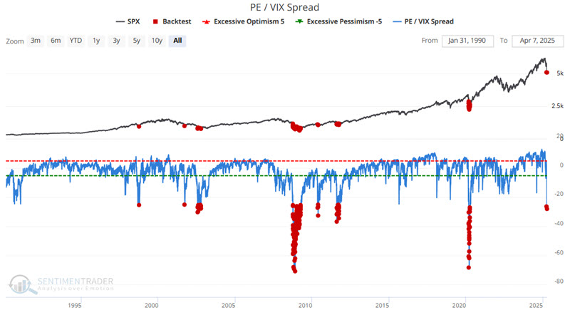
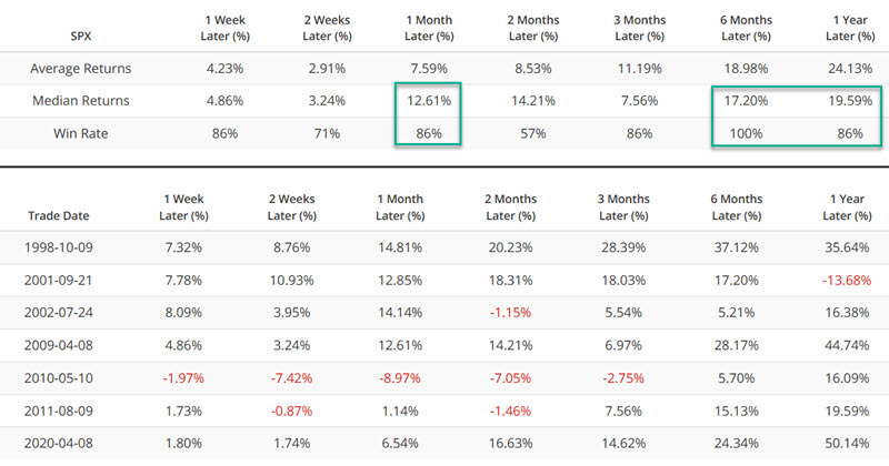
The below summarizes the results.
An alternative strategy might be to wait for the PE/VIX indicator to cross back above -25 as a potential actionable signal. The chart below highlights the dates when it crossed above -25 for the first time in six months.
This might be something to watch for.
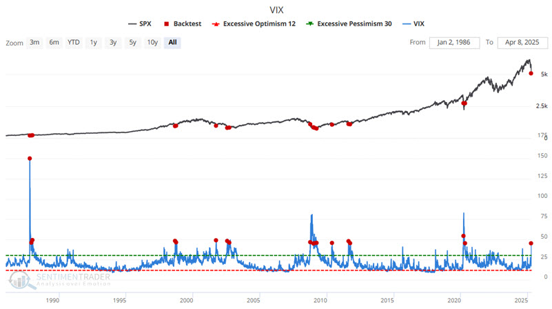
The VIX Index has spiked
The VIX Index is often referred to as the "Fear Gauge." Invariably, when great fear and pessimism arise in the market, option sellers ramp up the amount of time premium they demand from option buyers to induce them to sell the option in the first place. This phenomenon is reflected in the VIX Index, which measures the amount of time premium built into S&P 500 options traded at the CBOE.
As with the other indicators above, it isn't easy to pinpoint an exact scenario regarding VIX that equates to an automatic buy signal. Sometimes, VIX spikes and the market turns around quickly; other times, a much more protracted and/or deep decline ensues prior to the actual bottom.
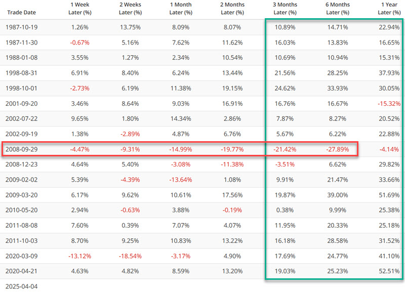
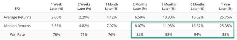
The chart below highlights all dates when the VIX Index closed above 45 for the first time in at least one month.
The table below displays subsequent S&P 500 results for the following year.
The table below summarizes the results above.
What the research tells us…
The fear overwhelming the markets of late is based on the concern that recent events are not "business as usual." The bearish argument at present is that the proliferation of tariffs will lead to a global trade war, which will lead to a worldwide economic slowdown, which could lead to a global depression. I cannot state whether this is true or false (unfortunately, my crystal ball broke a very long time ago - and just my luck, I continued to stare into the damn thing for a long time before I realized it was broken, but I digress). Nevertheless, traditional indicators of breadth and sentiment are lining up abundantly on the favorable side of the weight of the evidence ledger. Make of it what you will.