Products
SentimenTrader Trading Tools
‍
Backtest Engine
My Trading Toolkit
Correlation Analysis
Seasonality
Indicators & Data API
‍
Proprietary Indicators & Charts
Market Data API
Strategies & Scanner
‍
50+ Trading Strategies
Smart Stock Scanner
Research Reports
‍
Research Solutions
Reports Library
Free Resources
Simple Backtest Calculator
Simple Seasonality Calculator
The Kelly Criterion Calculator
Sentiment Geo Map
Public Research Reports
Pricing
Company
About
In the News
Testimonials
Client Success Stories
Contact
Log inLoginSign up
< BACK TO ALL REPORTS

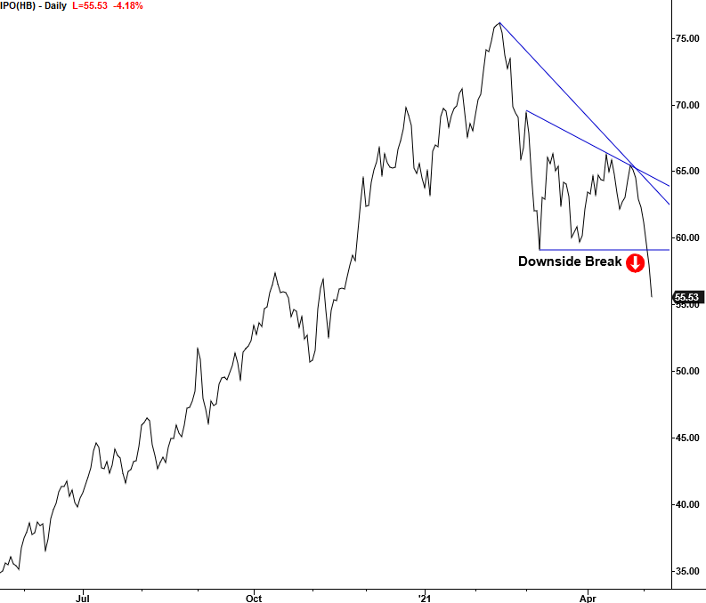
IPO Index - The Balloon Popped

Dean Christians
2021-05-07
The Renaissance IPO Index formed a significant intermediate-term top this week. Let's assess what might happen now that the balloon has popped.

After a multi-month bounce and consolidation phase, the Renaissance IPO Index formed a significant intermediate-term top this week.

I've been monitoring the IPO group closely and even shared a big picture chart in a note on March 26th. IPOs represent one of the more speculative areas of the market, especially in the last few decades as the percentage of unprofitable companies coming public has surged.

One has to wonder what, if any, message can we gain from the balloon popping. Are the speculative pockets of the market like IPOs starting to discount peak liquidity as the fiscal and monetary accommodation can't last forever?  

Let's take a look at an update to my IPO chart and a trading signal that suggests one should avoid the group in the near term.

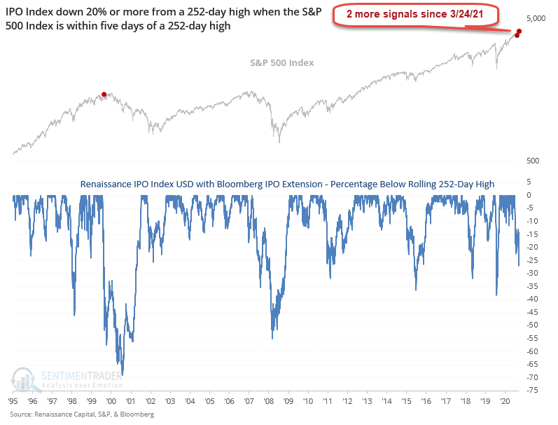
IPO DIVERGENCE CHART

Since the first signal on 3/24/21, the IPO index has now registered two more divergence alerts, both this week. Even at the height of the internet bubble in March 2000, the down 20% within five days of an S&P 500 high setup only occurred one time. In case you were wondering, the date was 3/30/2000.

IPO MARKET

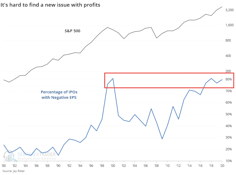
While one can make an educated guess as to why a market does what it does on any given day, I suspect this chart helps explain some of the narratives in IPO underperformance. Thanks to Jason for sharing this chart.

RELATIVE LOWS CHART

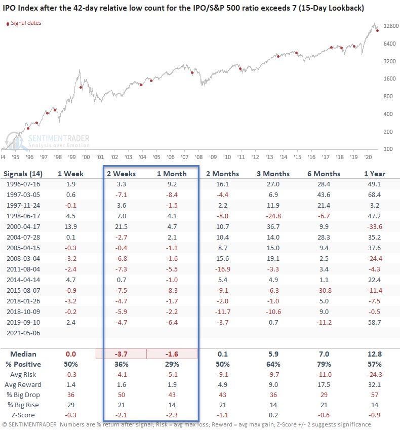
Given the limited sample size in the down 20% divergence set up in the first chart, I thought I would apply one of my relative strength indicators to the IPO/S&P 500 ratio to assess the underperformance. The indicator in the chart below counts the number of IPO Index 42-day relative lows versus the S&P 500 index in the last 15 days. A high count reflects severe underperformance. The current count reached 7 on Thursday. 

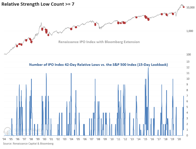
Let's see what happens if we buy the IPO Index when the relative low count reaches 7. I also included a condition that requires the IPO Index to register a 252-day high to identify the first signal after a peak.

HOW THE SIGNALS PERFORMED

Performance is weak in the 2-4 week timeframe with z-scores that show significance. I would also add that the 1-month timeframe shows eight consecutive down periods starting in 2005.

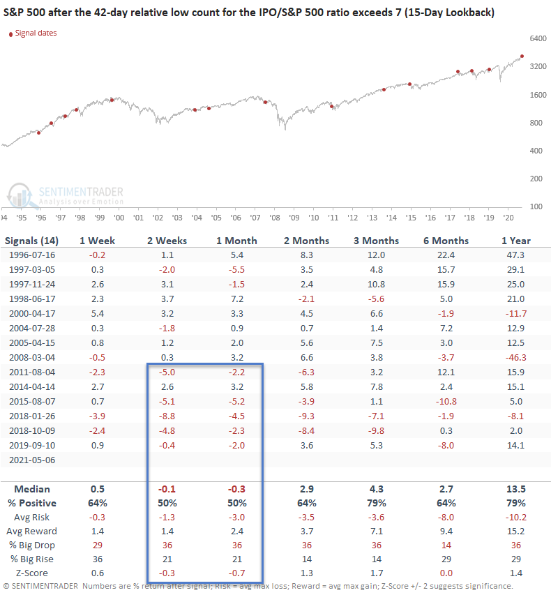
Let's look at what happens to the broad market if we apply the signals to the S&P 500 index.

HOW THE SIGNALS PERFORMED - S&P 500

While not as weak as the IPO results, I would note that the 2-4 week timeframe was somewhat soft, and more so with recent signals. It would appear that severe IPO underperformance is not a significant risk for the broad market on a long-term basis.

IPO ETF CONSOLIDATION BREAKDOWN CHART


Sorry, you don't have access to this report

Upgrade your subscription plan to get access
Go to Dasboard
PRODUCTS
SentimenTrader
Trading Tools
Indicators & Data API
‍
Strategies & Scanner
‍
Research Reports
FREE
RESOUrCES
Simple Backtest
Calculator
Simple Seasonality
Calculator
The Kelly Criterion
Calculator
Sentiment Geo Map
‍
Public Research Reports
‍
Pricing
Bundle pricing
‍
Announcements
‍
FAQ
COMPANY
‍
About
‍
In the News
‍
Testimonials
‍
Client Success Stories
CONTACT
‍
General Inquiries
‍
Media Inquiries
‍
Financial Professionals Inquiries
‍
© 2025 Sundial Capital Research Inc. All rights reserved.
Setsail Marketing
TermsPrivacyAffiliate Program
Risk Disclosure: Futures and forex trading contains substantial risk and is not for every investor. An investor could potentially lose all or more than the initial investment. Risk capital is money that can be lost without jeopardizing ones’ financial security or life style. Only risk capital should be used for trading and only those with sufficient risk capital should consider trading. Past performance is not necessarily indicative of future results.

Hypothetical Performance Disclosure: Hypothetical performance results have many inherent limitations, some of which are described below. No representation is being made that any account will or is likely to achieve profits or losses similar to those shown; in fact, there are frequently sharp differences between hypothetical performance results and the actual results subsequently achieved by any particular trading program. One of the limitations of hypothetical performance results is that they are generally prepared with the benefit of hindsight. In addition, hypothetical trading does not involve financial risk, and no hypothetical trading record can completely account for the impact of financial risk of actual trading. for example, the ability to withstand losses or to adhere to a particular trading program in spite of trading losses are material points which can also adversely affect actual trading results. There are numerous other factors related to the markets in general or to the implementation of any specific trading program which cannot be fully accounted for in the preparation of hypothetical performance results and all which can adversely affect trading results.

Testimonial Disclosure: Testimonials appearing on this website may not be representative of other clients or customers and is not a guarantee of future performance or success.