
Introducing the JK Misery Index - Part II

Key points:
- Part I detailed how the JK Misery Index (JMI) is calculated and some general performance stats regarding S&P 500 performance
- In Part II, we will take a more systematic approach and review stock market performance during favorable and unfavorable periods as designated by the JK Misery Index
- While we will be analyzing JMI as if it were a standalone trading system, note that we do not, in practice, treat it as such, and continue to prefer a weight of the evidence approach to market analysis
A quick review
For full details on the construction of the JK Misery Index (JMI), please review Part I. In a nutshell, however, the model:
- Combines mortgage rates, inflation, and unemployment
- Compares the raw calculated value to a moving average (14-month exponential)
- Observes the gap between the raw value and the moving average and reports that as the indicator value
- Readings below 35 are considered "favorable" for stocks
- Readings above 35 are considered "unfavorable" for stocks
Taking a systematic approach
To reiterate, we do not advocate using JMI as a standalone trading model to decide whether to be 100% in or out of stocks. The model is intended to offer weight of the evidence to a balanced approach to analyzing the stock market. That said, for this note, we will analyze results using JMI as a standalone model.
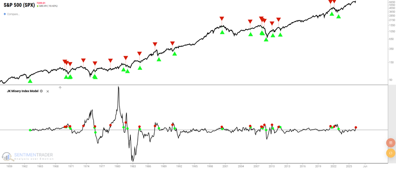
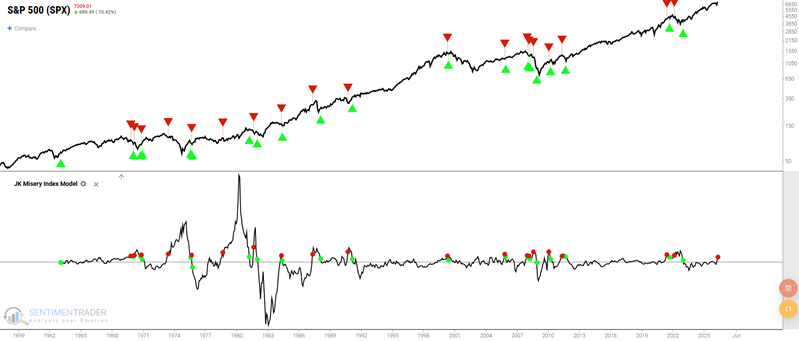
The chart below shows all periods when JMI was below 35. The up green arrows indicate a "Buy" signal, and the down red arrows indicate a "Sell" signal (except for the last one at the far right, which merely notes the last day of data)
The table below summarizes S&P 500 performance during the so-called "favorable" periods.
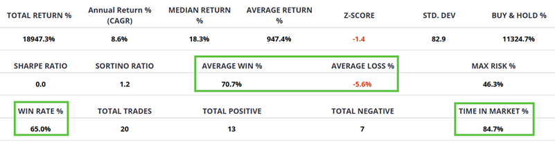
The key things to note:
- The strategy has been in stocks almost 85% of the time
- The Win Rate is only 65%
- However, the Win/Loss Ratio is a robust 12.6-to-1 (70.7% average win versus -5.6% average loss)
The chart below shows the cumulative % return from holding the S&P 500 only during favorable JMI periods.
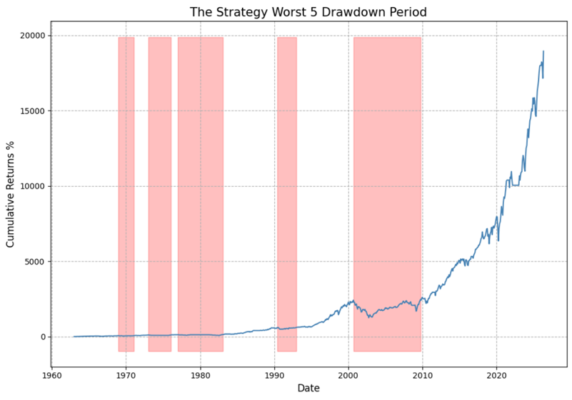
The equity curve has clearly trended lower-left-to-upper-right over time. It must be noted that no "sell" signal occurred between the May 31, 2000, buy signal and the market bottom in 2003. The resultant drawdown was a not inconsequential -46%.
The table below shows results on a signal-by-signal basis. For any strategy, it is helpful to review the Max Loss % and Trade Return % to see what kind of open losses one would have had to ride out during the course of a given trade.
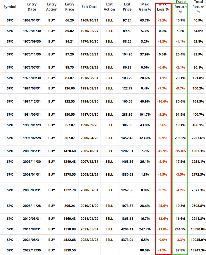
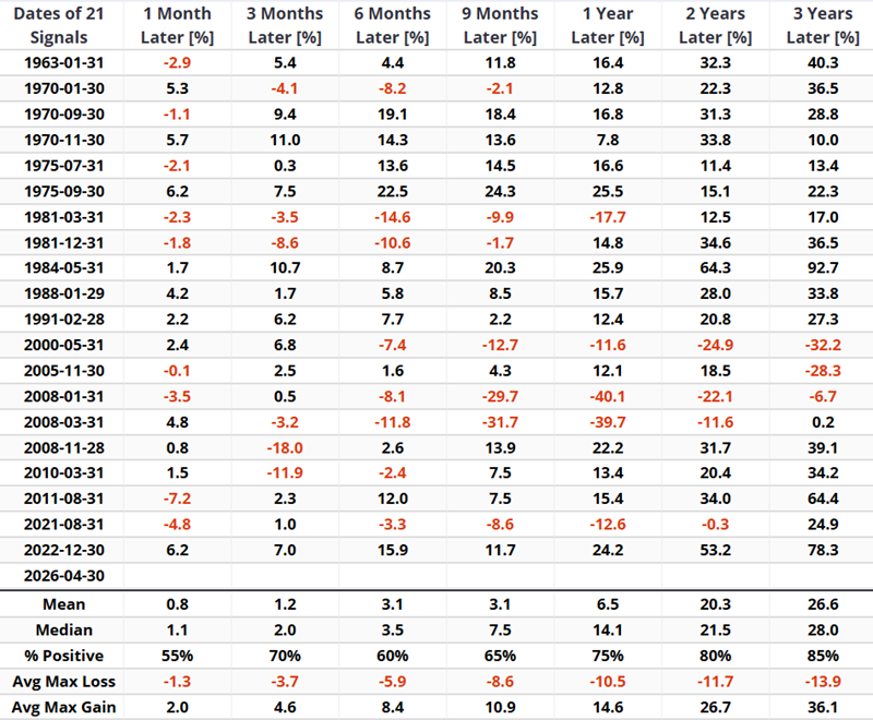
The next table illustrates S&P 500 performance following each buy signal since 1963.
A closer look at unfavorable periods
Now let's look at S&P 500 performance following JMI "Sell" signals. The chart below is the same as the one above. However, this time we will focus on the periods between each down red arrow and each subsequent up green arrow, i.e., the "unfavorable" periods.
The table below summarizes S&P 500 performance during the so-called "unfavorable" periods.
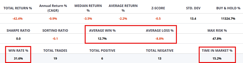
The key things to note:
- The strategy has been out of the stock market roughly 15% of the time
- The Win Rate is 31.6% (versus 65.6% for favorable periods)
- The Win/Loss Ratio is 1.44 (versus 12.6 for favorable periods)
- The cumulative total return was -42% (versus +18,947% during favorable periods)
The chart below shows the cumulative % return from holding the S&P 500 only during unfavorable JMI periods.
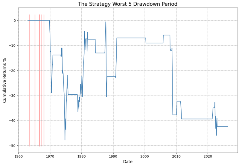
While not every signal ended in a loss, the tendency for extreme volatility - and a lot of sharp downside price action - is apparent in the chart above. This suggests that JMI dropping above 35 can serve as a useful warning sign for stock investors.
The table below shows results on a signal-by-signal basis.
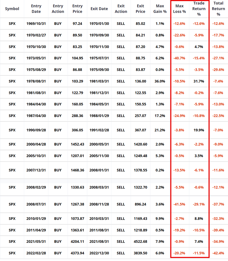
The reality is that sitting out of certain periods would have cost an investor significant upside potential (31.7% from 1978 to 1981 and 19.9% from 1990 to 1991). Still, the downside volatility during unfavorable periods is something to consider. Nine of the nineteen unfavorable periods experienced an open loss in excess of -10%, and five an open loss in excess of -20%.
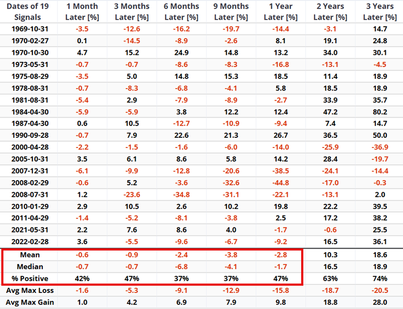
The table below clearly highlights the overall subpar nature of market performance during unfavorable JMI periods. All periods through one year averaged a loss, and a win rate below 50%
What the research tells us…
Do we advocate abandoning all other analysis and merely adopting the JK Misery Index as a one-and-only approach to investing? Of course not. However, as a weight-of-the-evidence indicator, JMI can lend significant weight. The indicator remains in the stock market most of the time (85%), and over the past 60+ years, overall market performance has been significantly better during favorable periods. Finally, unfavorable period performance has been sufficiently subpar to argue strongly for "playing defense" during these much rarer occasions. The JK Misery Index is presently in favorable territory (below 35); however, it has been rising in recent months and could trigger a "Sell" signal if rising trends in interest rates and/or inflation persist.