
Gold/SPX Ratio flips to favor gold

Key points
- One iteration of the Gold/S&P 500 Ratio just tipped favorably for gold
- Is it time to load up on the yellow metal?
- To answer that question, the discussion below reviews the history of this indicator
The History of the Gold/S&P 500 Ratio
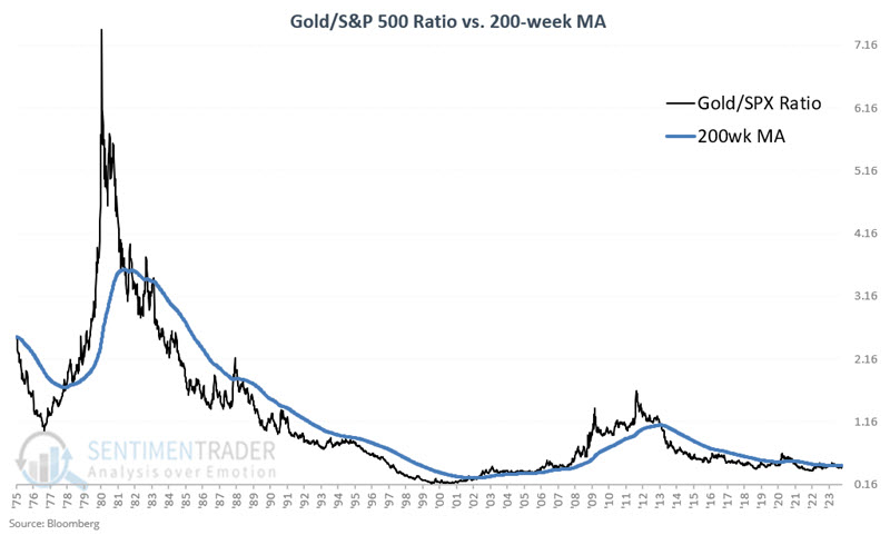
The Gold/S&P 500 Ratio (Gold/SPX Ratio) is derived by dividing the weekly closing price for gold by the weekly closing price for the S&P 500 Index. The chart below displays the Gold/S&P 500 Ratio since 1975. Comparing the weekly reading to the 200-week moving average creates a long-term trend-following indicator.
Interpretation is relatively simple:
- When the ratio is above the 200-week moving average, the indicator is considered favorable for gold
- When the ratio is below the 200-week moving average, the indicator is considered unfavorable for gold
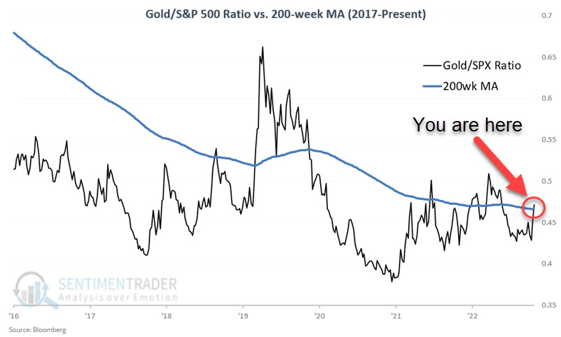
Note that as of the close on 2023-10-20, the Gold/SPX Ratio had once again closed back above the 200-week moving average. As a result, this indicator is once again deemed favorable for gold bullion.
The chart below displays the Gold/SPX Ratio since 1975 and includes the 200-week moving average of weekly ratio readings.
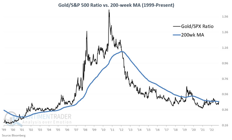
The chart below zooms in on the 2000-present period.
The chart below zooms in on roughly the last eight years of history.
I am unsure of the original origin of this version of this particular indicator. Still, for the record, I first learned of it from Mark Ungewitter (@mark_ungewitter), a former Investment Officer at Charter Trust.
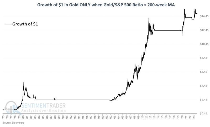
When the indicator is favorable
Let's look first at "favorable" periods. The chart below displays the hypothetical growth of $1 invested in gold bullion only when the Gold/SPX Ratio was above its 200-week moving average since 1975. The cumulative gain has been +1,386.4%.
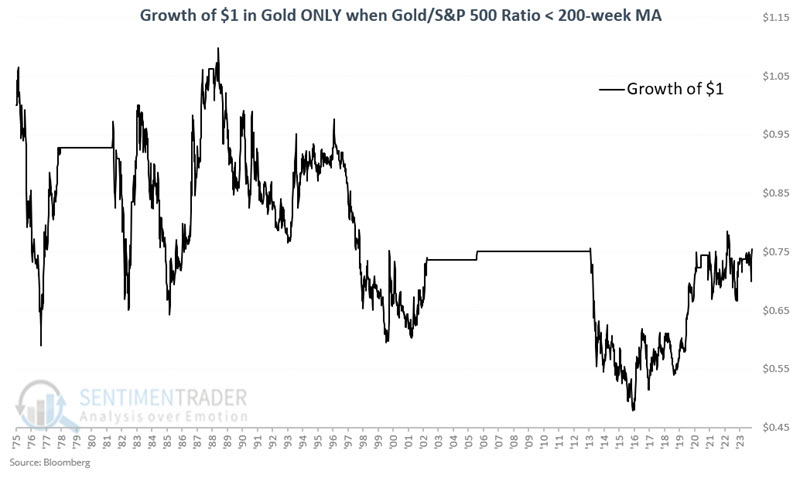
When the indicator is unfavorable
Let's look first at "favorable" periods. The chart below displays the hypothetical growth of $1 invested in gold bullion only when the Gold/SPX Ratio was below its 200-week moving average since 1975. The cumulative loss has been -25.4%.
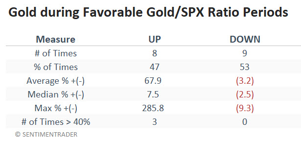
Summarizing performance results is tricky
The table below displays the % +(-) performance of gold for each favorable period derived from the indicator highlighted above.
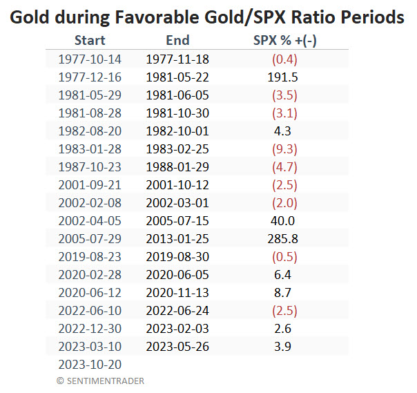
The following table summarizes the performance of all previous favorable periods since 1975.
So, does the latest signal from the Gold/SPX Ratio guarantee that "Happy Days are here again" for gold? Not at all. It does, however, a solid addition to the bullish side of the weight of the evidence ledger.
What the research tells us…
The results are something of a mixed bag. The Win Rate is only 47%. So, it would be a mistake to assert that the latest favorable signal is "bullish for gold" or that "gold is likely to rise because the Gold/SPX Ratio just turned favorable." A more accurate assertion might be that "if gold does rally from here, it could be substantial - or it could peter out and turn out as a small gain or even a loss."
That less-than-enthusiastic assessment must also be countered by the fact that this particular indicator rode the bulk of every primary bull market for gold in the past 48 years. For now, this indicator suggests giving the bullish case for gold the benefit of the doubt.