Daily Report : TradingEdge Weekly for Dec 15 - More new highs, moderating inflation, Treasury yield downtrends

| View/Print a PDF version of this Report |
Headlines
|
TradingEdge Weekly for Dec 15 - More new highs, moderating inflation, Treasury yield downtrends: This week, we saw a bullish regime change in the number of stocks at 52-week highs versus lows as inflation moderates, which is the sweet spot for stocks. Small Caps are entering a period when they tend to outperform Large Caps. A multi-year bullish signal for Consumer Staples triggered, and plunging crude oil is a poor excuse to be bearish. Gold miners tend to rally around now. |
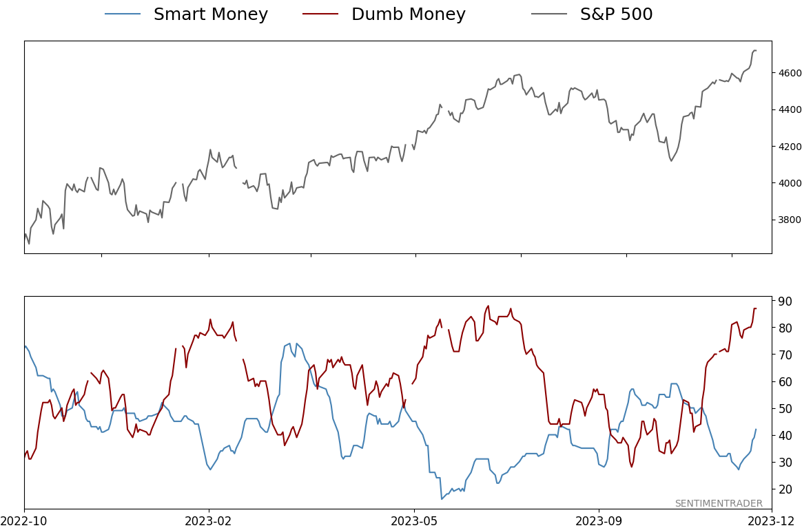
Smart / Dumb Money Confidence
|
|
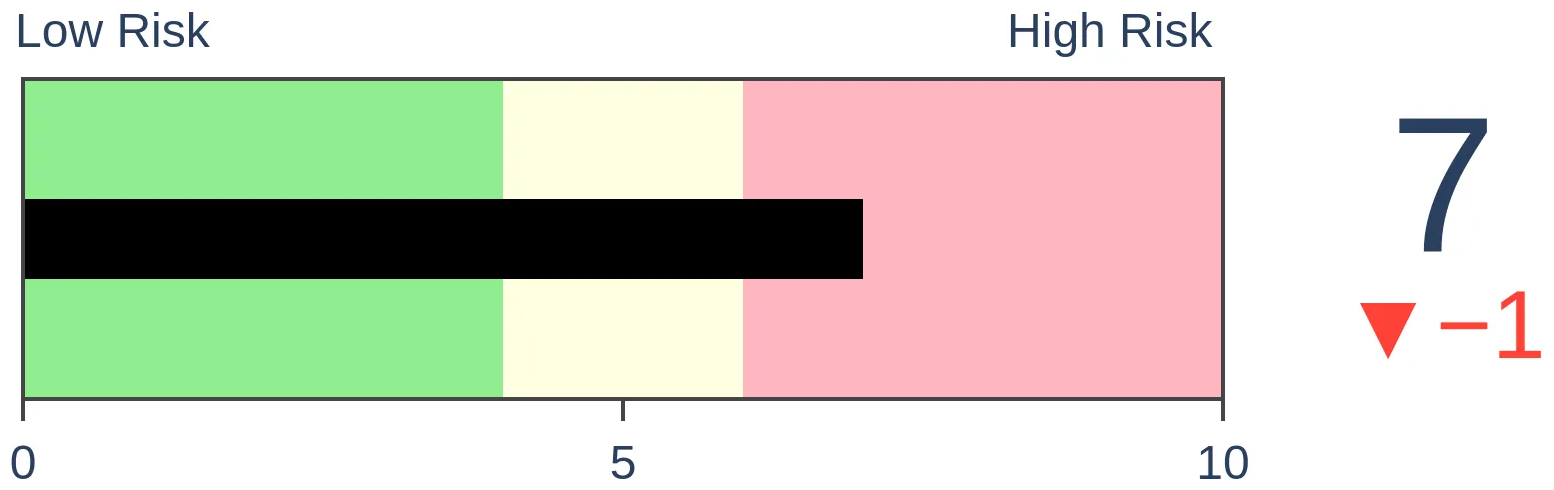
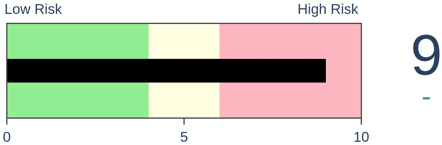
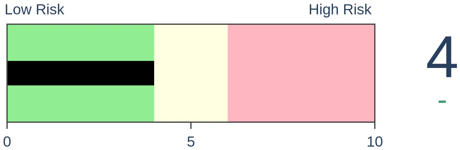
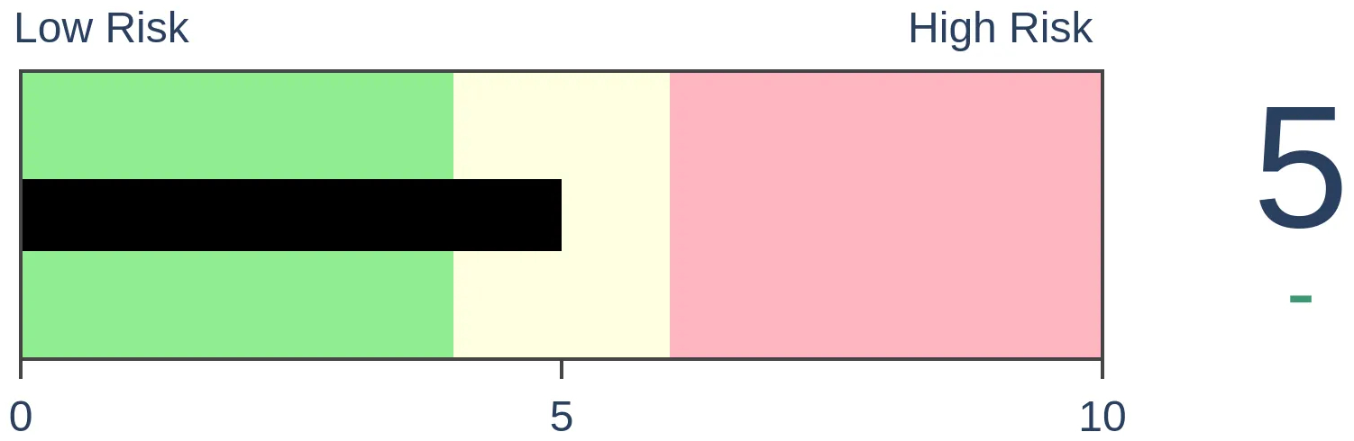
Risk Levels
|
|


|
Research
TradingEdge Weekly for Dec 15 - More new highs, moderating inflation, Treasury yield downtrendsBy Jason GoepfertBOTTOM LINEThis week, we saw a bullish regime change in the number of stocks at 52-week highs versus lows as inflation moderates, which is the sweet spot for stocks. Small Caps are entering a period when they tend to outperform Large Caps. A multi-year bullish signal for Consumer Staples triggered, and plunging crude oil is a poor excuse to be bearish. Gold miners tend to rally around now. FORECAST / TIMEFRAME |
Key points:
- New high and new low data shows a welcome regime change for bullish investors
- Multi-month highs among Small Caps (and many others) have been surging
- Most of our indicators have quickly moved into excessive optimism territory
- Why moderate inflation is such a good thing for stocks
- We're now in a Small Cap time of year
- Behavior among Consumer Staples is consistent with a multi-year bullish backdrop
- Every Treasury yield is in a downtrend
- Plunging oil prices is a poor excuse to be bearish
- A seasonal switching system for silver
- Gold bugs are hoping that Santa delivers again
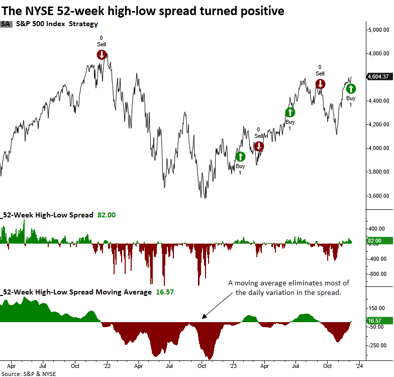
A welcome regime change for bullish investors
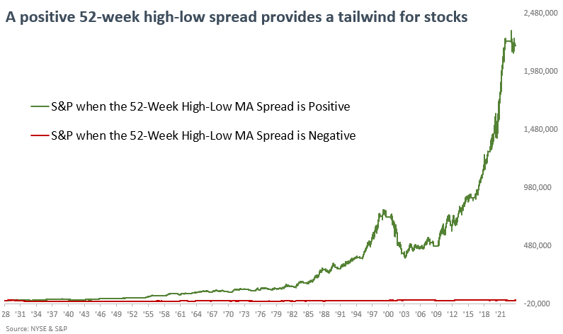
The spread between 52-week highs and lows on the NYSE shifted to a favorable profile. Dean noted that annual highs outpacing annual lows is indicative of a bullish stock market backdrop.
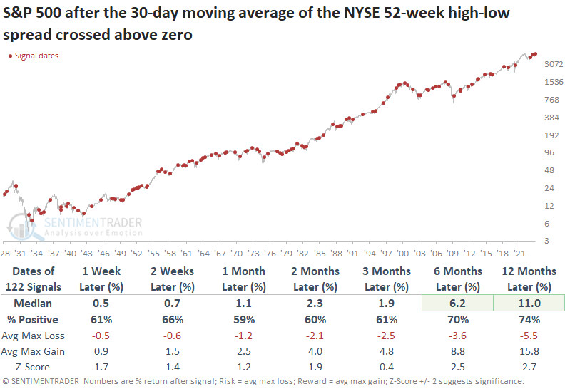
Last week, the 30-day moving average for the spread between 52-week highs and lows on the NYSE crossed above zero, generating a bullish market breadth signal.
Whenever the 30-day moving average spread between 52-week highs and lows on the NYSE rose above zero, the median return for the S&P 500 exceeded the median return over the study period across all time horizons. The results over the six- and twelve-month periods were especially favorable, suggesting a trend environment more indicative of bull than bear markets.
Using this data as a risk-on/risk-off system, it generates a buy signal when the 30-day moving average for the 52-week high-low spread exceeds zero. Conversely, the model registers a sell signal when the indicator falls below zero.
The 52-week high-low system can be applied to any exchange or index data series. Dean showed similar signals have triggered in the Nasdaq 100, S&P 500, and Russell 2000.
More good news from new-high lists
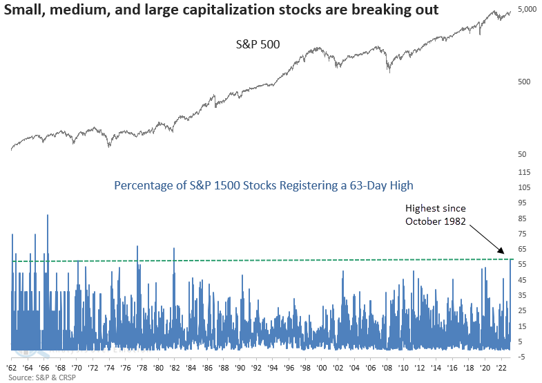
Dean further noted that the percentage of small-cap stocks registering a 63-day high surged to one of the highest levels in history. A small, medium, and large capitalization stock index also recorded a significant expansion in new highs.
Throughout 2023, the prevailing narrative has centered around the notion that seven stocks solely propelled the market's upward trajectory. One area where opportunities have been limited is small-capitalization stocks. However, on Thursday, the percentage of Russell 2000 stocks recording a 63-day high increased to the 5th highest level in history.
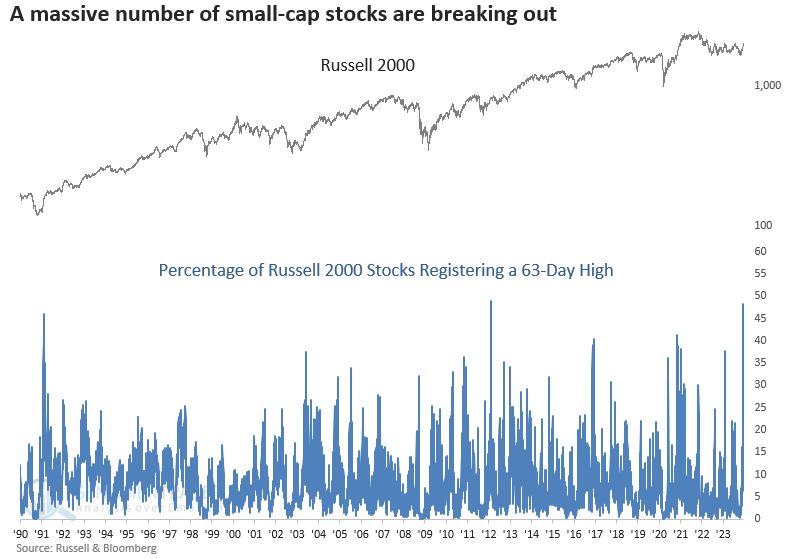
When the percentage of Russell 2000 stocks registering a 63-day high increased above 38%, returns, win rates, and z-scores for the small-cap index were outstanding. A year later, the index was higher every time.
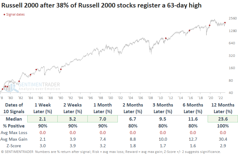
A comparison between the Russell 2000 and the S&P 500 suggests investors should consider an allocation to small-cap stocks as they tended to outperform the S&P across all time frames after those signals.
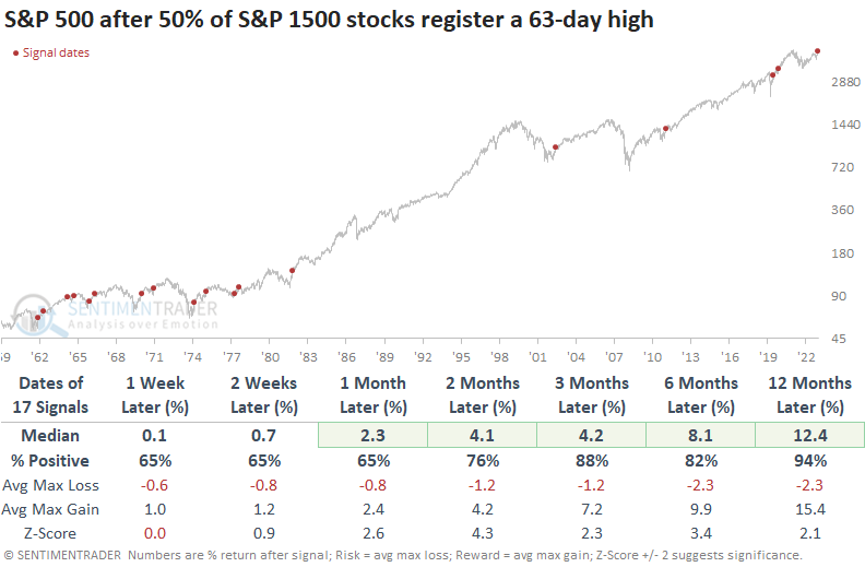
Members in the S&P 1500, an index containing small, medium, and large capitalization stocks, recorded the highest expansion in 63-day highs since October 1982.
When 63-day highs expand like now, the S&P 500 displayed excellent results across all time horizons. Twelve months later, the world's most benchmarked index was higher in all but one case.
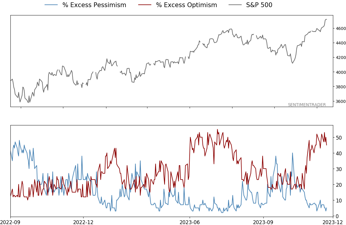
A quick move back to indicators showing excessive optimism
Even though it seems like consumers and investors want reasons to be pessimistic, and (depending on the source) they're saying they're pessimistic - or at least not all that optimistic - some objective indicators show that they're buying stocks, even if they're holding their noses.
The percentage of core indicators showing optimism minus those showing pessimism widened well into extreme territory last week and has stayed there. A 10-day moving average of the spread has now cycled from negative (more pessimistic than optimistic indicators) to +40%, the 2nd-highest level in two years.
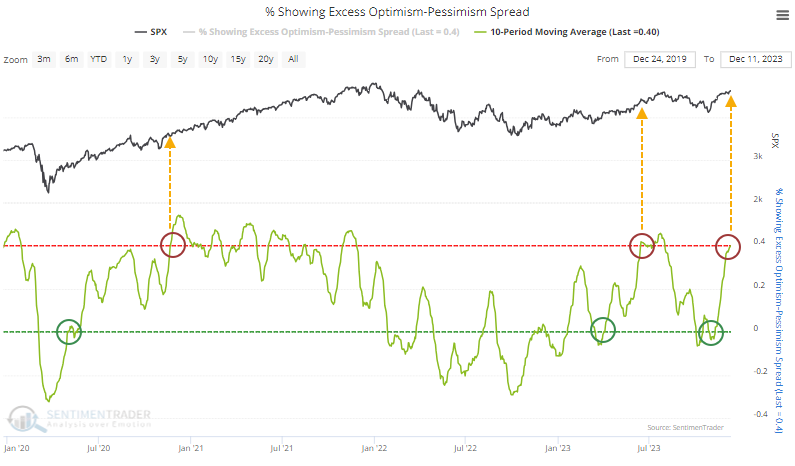
Returns in the S&P 500 after the spread cycles like this were mostly positive. The sweet spot was 1-3 months after it reached extreme optimism territory, with the S&P rising 70% of the time. There were two large losses out of the ten signals.
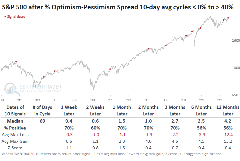
As we often see, context can be critical, especially how quickly these sentiment cycles occur. After the quickest cycles, when it took about three months or less to cycle from negative to extreme optimism, the S&P's behavior was pretty consistent. It didn't suffer any losses over the next two to three months, with returns that were all within a couple of percent of each other.
Contrast that with the cycles that took the longest. After these slow-rolling cycles, the S&P's returns were more bifurcated, with three losses and a couple of gains over the medium-term.
The wonderful world of moderate inflation
Jay noted that the stock market hates uncertainty and few things cause more uncertainty for investors than extreme inflation (or deflation). While inflation can be analyzed six ways to Sunday, a simple objective measure has proven quite helpful over the years.
The Producer Price Index (PPI), per Investopedia, is:
The Producer Price Index (PPI) measures the average change over time in the prices domestic producers receive for their output. It is a measure of inflation at the wholesale level that is compiled from thousands of indexes measuring producer prices by industry and product category. The U.S. Bureau of Labor Statistics (BLS) publishes the index monthly. The PPI is different from the consumer price index (CPI), which measures the changes in the price of goods and services paid by consumers.
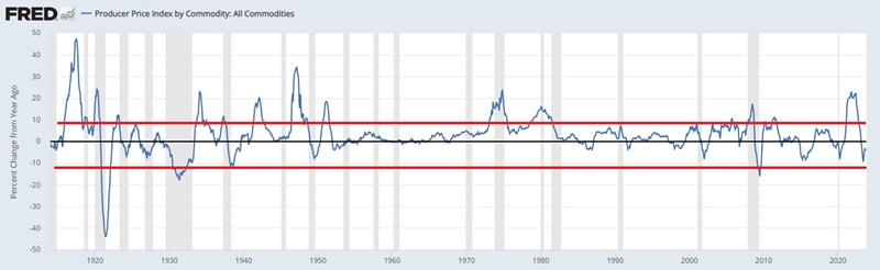
The most relevant information is the 12-month percentage rate of change. The only time the PPI becomes a problem for the stock market is when it reaches an extreme - i.e., too much inflation or deflation, which can cause chaos with business, government, and individual budgets and, in turn, significant uncertainty.
The chart below draws extremes at +9% and -12% based on the 12-month percentage rate of change. Readings above or below the red lines indicate trouble, and between the two red lines indicate "moderate" inflation.
Too much inflation: Jay looked at the growth of $1 invested in the Dow Jones Industrials Average only when the 12-month percentage rate-of-change at the end of the previous month was above +9% since 1914. The cumulative result was a loss of -66.1%.
Too much deflation: The growth of $1 invested in the Dow Jones Industrials Average only when the 12-month percentage rate-of-change at the end of the previous month was below -12% since 1914 was a loss of -74.1%.
Just right: The chart below displays (on a logarithmic scale) the growth of $1 invested in the Dow Jones Industrials Average only when the 12-month percentage rate-of-change at the end of the previous month was less than or equal to +9% AND more than or equal to -12% since 1914.
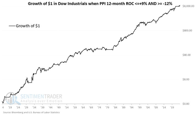
While the stock market does not always go up when inflation is moderate, the cumulative result was a gain of +864,788%.
This indicator has been favorable since 2022-12-31, and as of the report on 2023-12-14, the current 12-month change for PPI is -3.57%. For the record, this value will be applied at the close of trading for December 2023, and this indicator will be deemed favorable during January 2024.
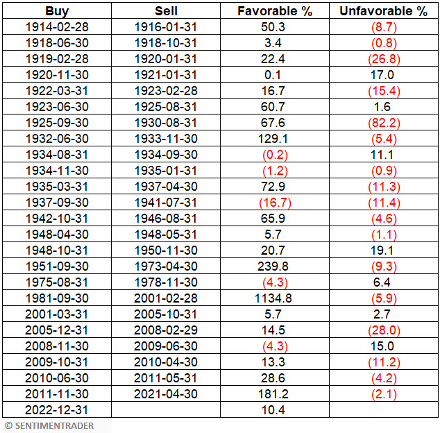
The table below displays the Dow Jones Industrial Average's historical results during favorable and unfavorable periods.
Inflation remains a hot topic among the pundit class, and many investors are focusing on the day's narrative. Does the information above mean that the market is sure to rally? Not at all. Many other factors impact the stock market. However, The data above suggests that - despite the deafening noise regarding inflation - investors might do well to focus their attention on other factors.
A Small Cap time of year
Small caps will soon enter their most favorable seasonal period of the year. Jay showed that a particular window from mid-December into mid-February has tended to witness outperformance by small-cap stocks while large-cap stocks have historically dominated the rest of the year.
We will focus on two seasonal periods, one favoring small-caps and the other large-caps.
- Period #1 extends from the close on the 11th trading day of December through the close on the 11th trading day of February. This period tends to favor small-caps. The next Period #1 will begin on the close of trading on 2023-12-15 and will extend through the close on 2024-02-15.
- Period #2 extends from the close on the 11th trading day of February through the close on the 11th trading day of December. This period tends to favor large caps.
The chart below displays the growth of $1 invested in small-caps (black line) versus $1 invested in large-caps (blue line) only from the close on the 11th trading day of December through the close on the 11th trading day of February, every year starting in 1926. This is "Period #1."
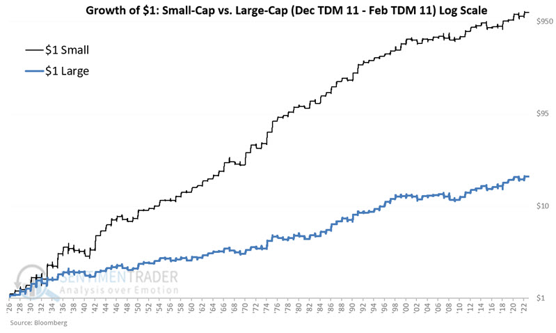
During "Period #2," in contrast, $1 in small caps grew to $21 (+2,006%), while $1 in large caps increased to $422 (+42,117%).
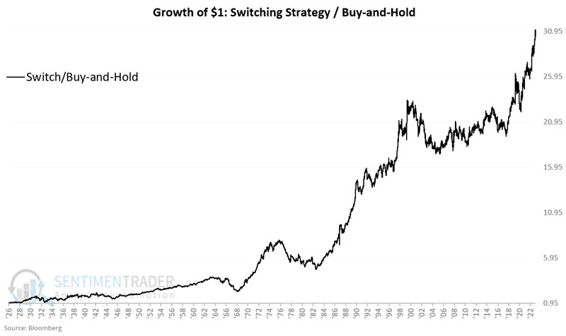
Let's examine a strategy that holds small-cap stocks during the Dec TDM #11 through Feb TDM #11 period and then switches to large-cap stocks during the Feb TDM #11 through Dec TDM #11 period. The chart below displays the growth of $1 invested using the Switching Strategy divided by $1 invested using buy-and-hold.
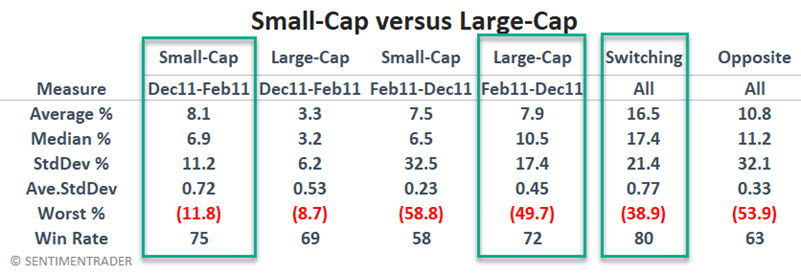
The table below summarizes small-cap and large-cap performance during the two seasonal periods. It also compares the performance of the Switching Strategy to a strategy that does just the opposite.
The green boxes highlight that small-caps outperformed from Dec TDM 11 to Feb TDM 11, large-caps outperformed during Feb TDM 11 to Dec TDM 11, and the Switching Strategy outperformed the Opposite Strategy.
A multi-year signal for Consumer Staples
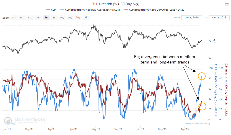
In October, signs of capitulation were piling up among Consumer Staples stocks. At the height of the selling pressure, nearly half of the stocks in the sector were trading at 52-week lows simultaneously, a reasonably reliable signal of total give-up among investors.
At the time, only a handful of Staples stocks were trading above their 50-day moving averages. In the robust rally since then, that has cycled to more than 85% of them, a rapid and impressive turnaround.
There were two similar washout-then-surge cycles since Staples peaked in April 2022. The first led to an immediate decline, the other lasted a bit, then gave up its gains.
The table below shows all similar cycles over the past 70 years. These are times when fewer than 5% of Staples were trading above their 50-day average, then more than 85% of them were, all within 50 days or fewer.
We can see from the forward returns that this was an excellent sign of returning momentum, with a 90% win rate from two months and beyond. The last two signals have been less robust, so that's a bit of a concern.
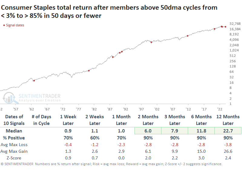
The table of maximum gains and losses shows that only one signal - the whoopsie-do from August 2022 - suffered more than a double-digit drawdown up to a year later. This is an impressive track record of low risk and high reward.
What's even more remarkable about the turnaround in medium-term trends is that it has occurred while most of the stocks are still mired within long-term downtrends; fewer than a quarter of Staples are trading above their 200-day moving averages.
Over the decades, we've witnessed this type of contextual surge quite a few times in various sectors. Almost invariably, they occur at long-term turning points.
We can see this same phenomenon below. It shows each time there is more than a +60% spread between the percentage of Consumer Staples stocks trading above their 50-day versus 200-day moving averages. For example, it would trigger if more than 80% of stocks are above their 50-day average while fewer than 20% are trading above their 200-day.
Once again, it has a good track record of triggering near multi-year turning points.
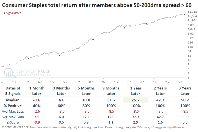
The biggest caveats are the usual ones regarding tiny sample sizes and the substantial drawdown an investor would have suffered as stocks were hammering out a bottom during the 2008 financial crisis.
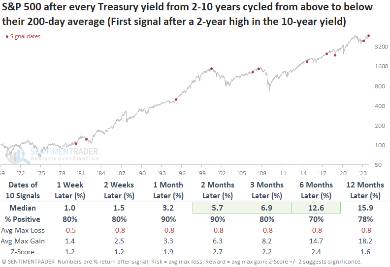
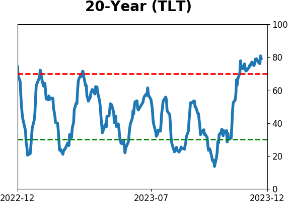
Every Treasury yield is trending lower
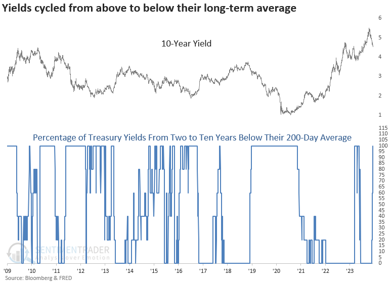
Dean showed that every single Treasury yield ranging from two to ten years is now trading below its 200-day average. Similar shifts across the curve suggest the path of least resistance for the 10-year yield is down, which tended to be bullish for the S&P 500.
With the FOMC holding the target rate steady for a third consecutive meeting and signaling a potential reversal in their interest rate policy, yields across the curve plunged on Wednesday, sending every Treasury yield from two to ten years below their respective 200-day averages.
When every single Treasury yield from two to ten years cycled from above to below its 200-day average, the 10-year yield consistently declined across all time frames.
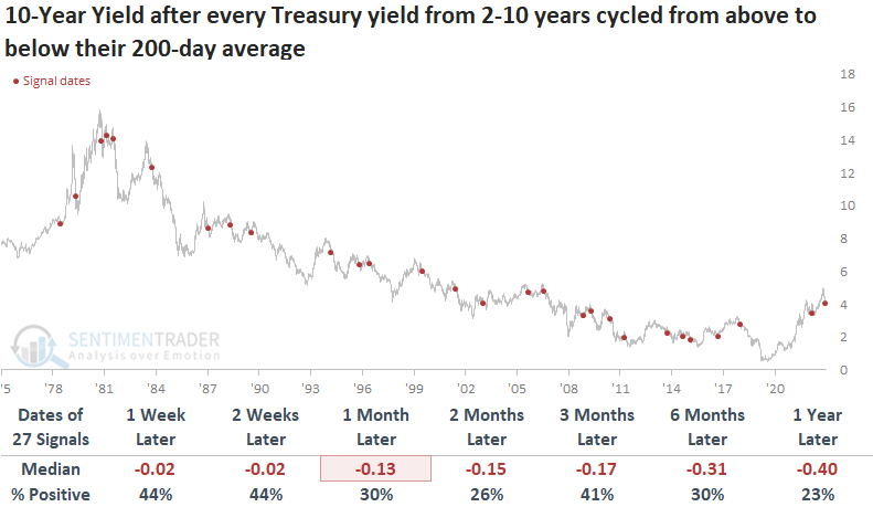
If we require the 10-year yield to close at a 2-year high before a new signal can occur again for context similar to now, the 10-year yield tended to bounce over the subsequent few weeks and then consistently fell from one to twelve months later.
The downdraft in yields proves to be a bullish factor for stocks over the following six months. While the subsequent year tends to deliver solid returns and success rates, the cautionary tales of 2000 and 2007 underscore the importance of vigilance in navigating the potential risks associated with rising rate environments.
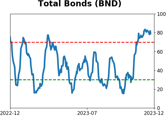
In a research report titled "Cash is King," Dean shared a composite that measures whether ten diverse bond ETFs are on a buy signal relative to a cash proxy. The composite started to shift in favor of bonds over cash in mid-November and surged to 100% on Wednesday.
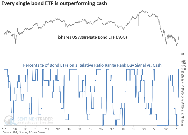
More often than not, the trend change shift tended to occur after the FOMC completed an interest rate hiking cycle.
From 1929 to 1974, the final FOMC interest rate hike produced extremely unfavorable results for the S&P 500, with seven consecutive losses over the subsequent six and twelve months. However, since 1980, the outlook over the same horizons showed gains in 5 out of 7 precedents.
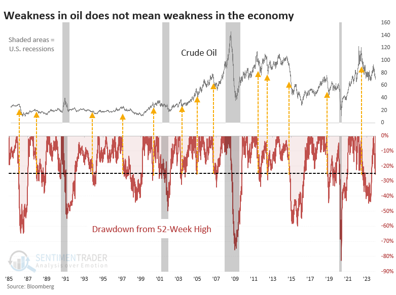
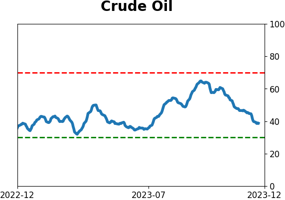
Plunging oil is a poor excuse to be bearish
People really want to be bearish. They'll look for any excuse, no matter how outlandish or poorly supported. It's no secret that investors pay much more attention to exciting stories than compelling data, and it seems like it's getting worse.
One of the recent reasons has been that crude oil has plunged - and it doesn't do that in a strong economy. Right? The fact, easily verified, is that, yes, oil does plunge like this in a strong economy. All the time.
Just eyeballing the chart, there have been 13 times when oil plunged 25% or more from a 52-week high, and it didn't result in an imminent recession.
Our process has never been to just eyeball a chart and call it a day. So, the chart below shows every time crude oil futures cycled from a 52-week high to a -25% drawdown and oil's future returns. They were relatively weak overall but nothing too devastating. Returns should be more consistently poor if it were a reliable signal of an economic contraction.
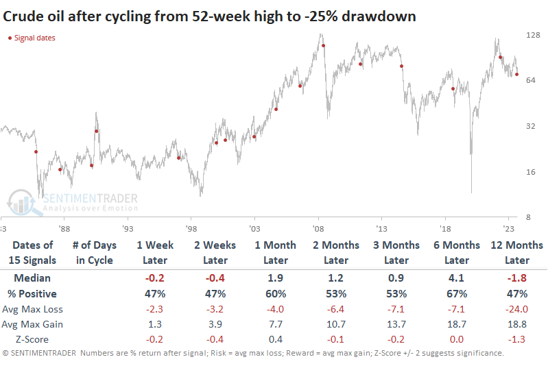
Looking at other markets, there was no evidence of a 25% decline in oil being an accurate doom signal. If it was effective at predicting economic weakness, then why was the small-cap Russell 2000 index the one with the most consistently positive returns? Doesn't make sense.
As for the Energy sector, those drawdowns in oil did not prove to be a consistent reason to worry. It did precede the worst of the financial crisis meltdown, but other than that, it was a feeble reason to sell the sector. The risk/reward for Energy stocks over the next year was excellent, and returns were consistently positive and above those of any random time.
Among sectors and factors, there was some mixed performance. Cyclical stocks did stronger shorter-term, while Defensive ones did better longer-term. Energy stocks were among the strongest long-term performers.
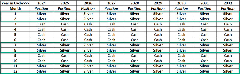
A seasonal switching approach for silver
Last week, Jay highlighted three cycles. This week, he combined the three cycles into one model labeled the JK Seasonal Silver Model.
The model reading is arrived at by adding the values for Variables A, B, and C.
Variable A: Months of the Year: November and December of 2023 and January and February 2024 are all deemed favorable. Variable A = +4 (and will remain +4 through the end of February 2024)
Variable B: Eight-Year Cycle: A new favorable four-year cycle will begin on 2025-01-01. So, until then, Variable B = 0.
Variable C: 30-year cycle for commodities: This cycle will remain favorable until 2038-06-30, so Variable C = +1.
When we add up the variable values, we find:
JK Seasonal Silver Model = Variable A + Variable B + Variable C = 4 + 0 + 1 = +5
The critical thing to note is readings of +5 or more are favorable for silver; readings of +4 or less are unfavorable for silver.
The table below displays the monthly Model readings for the next nine years. The table replaces any Model reading of +5 or higher with the word "Silver." All other months display the word "Cash." According to the Model, traders looking to play the short side of silver should stick to doing so during the months labeled "Cash."
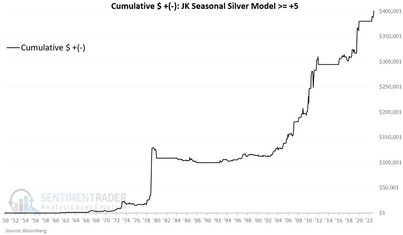
The chart below displays the hypothetical cumulative $ +(-) from holding a long position in silver futures only during months when the JK Seasonal Silver Model was at +5 or higher.
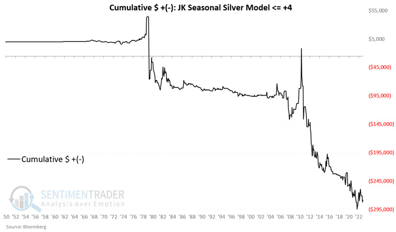
The chart below displays the hypothetical cumulative $ +(-) from holding a long position in silver futures only during months when the JK Seasonal Silver Model was at +4 or lower.
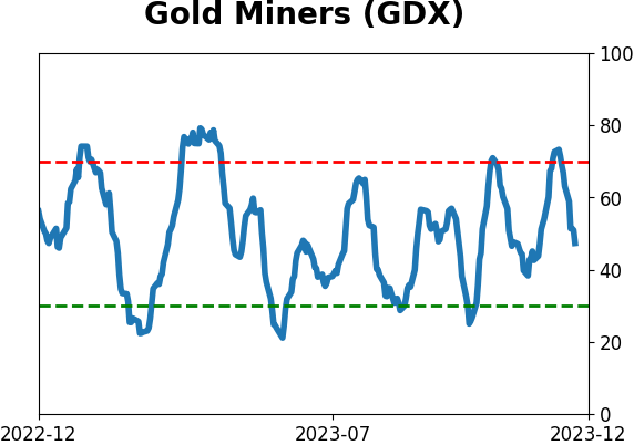
Gold bugs are hoping Santa delivers again
Most investors have heard reference to the "Santa Claus Rally" in stocks. Jay noted that gold-related stocks have also enjoyed a boost during a specific late-year seasonal window.
The Santa Claus Gold Miner Rally period begins on the close of the 11th trading day of December and extends through the close on the first trading day of January in the New Year. For 2023, this period extends from the close on December 15 through the close on January 2 of next year.
To test the longest possible history, we will use the Gold Bugs Index (ticker HUI), which we have data from 1957. The chart below displays the growth of $1 invested in HUI only from the close of December Trading Day of Month (TDM) #11 through January TDM #1.
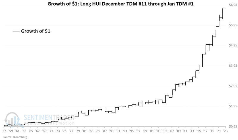
Through 1990, HUI showed a gain during this seasonal window 20 out of 33 years or 61% of the time. Since then, HUI has shown a gain in 28 out of 33 years or 85% of the time - including each of the last 12 years.
The Vaneck Gold Miners ETF (ticker GDX) is an exchange-traded fund that tracks an index of gold mining stocks, thus offering traders a direct way to play the sector. During the December 2006-January 2007 window, GDX lost -3.1%. Since then, it has rattled off 16 consecutive Santa Miner Rally gains. The chart and table below display GDX performance during this favorable window since inception.
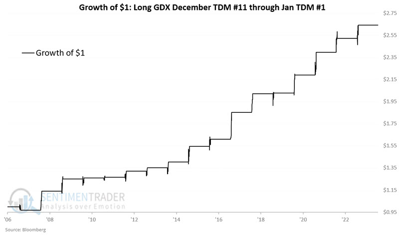
The fund has sported a gain during 16 out of 17 windows, with a median gain of +4.7% and eight years showing a gain larger than +7%.
About TradingEdge Weekly...
The goal of TradingEdge Weekly is to summarize some of the research published to SentimenTrader over the past week. Sometimes there is a lot to digest, and this summary highlights the highest conviction or most compelling ideas we discussed. This is NOT the published research; rather, it pulls out some of the most relevant parts. It includes links to the published research for convenience, and if you don't subscribe to those products, it will present the options for access.
Indicators at Extremes
|
|
|
Phase Table
|
|
|
Ranks
|
|
|
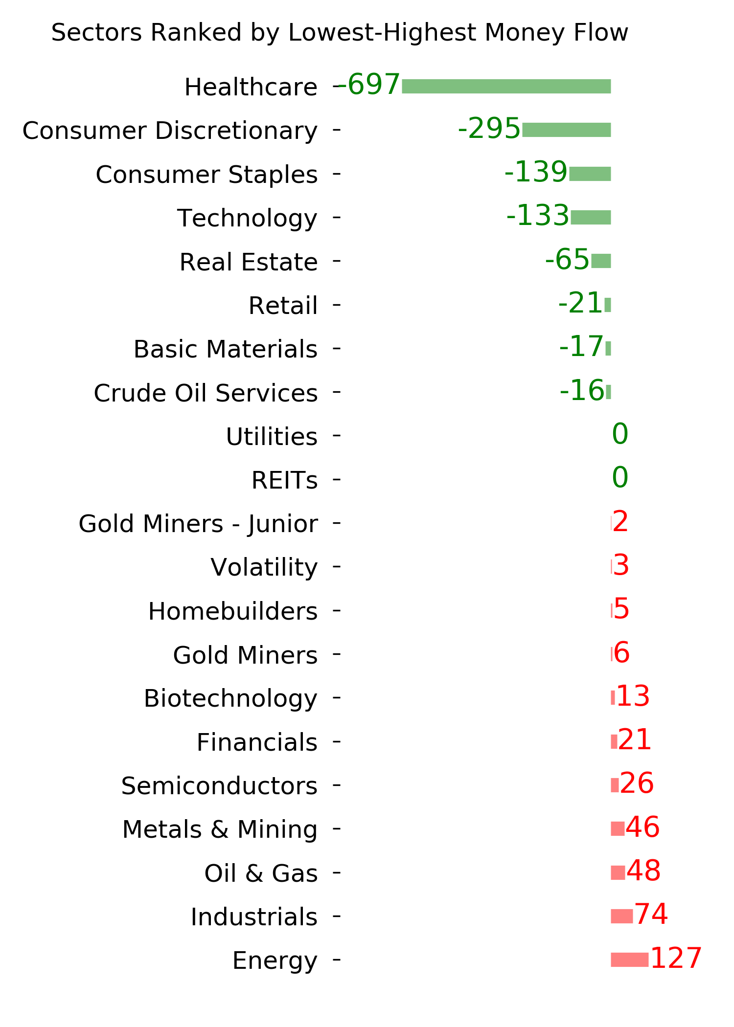
|
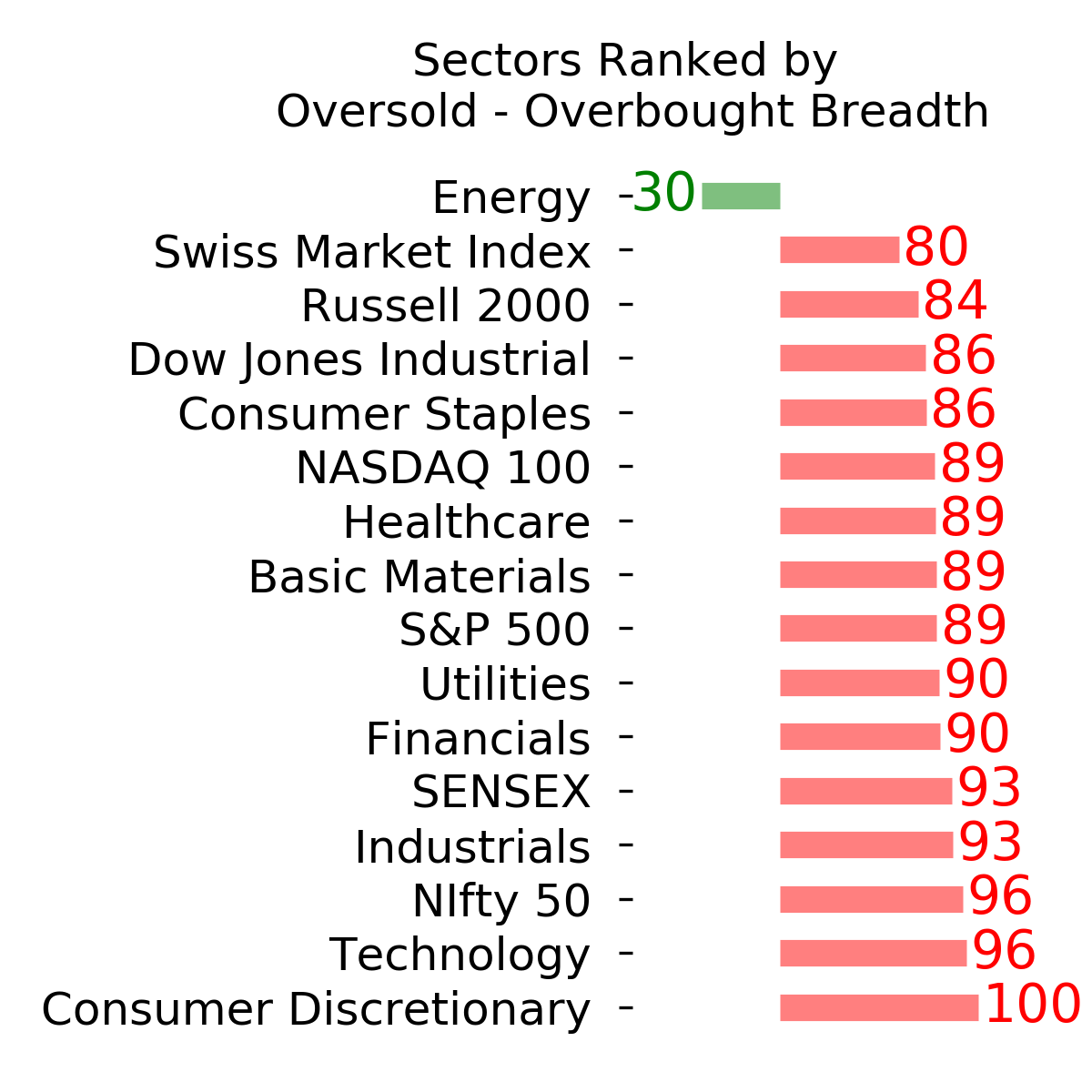
|
|
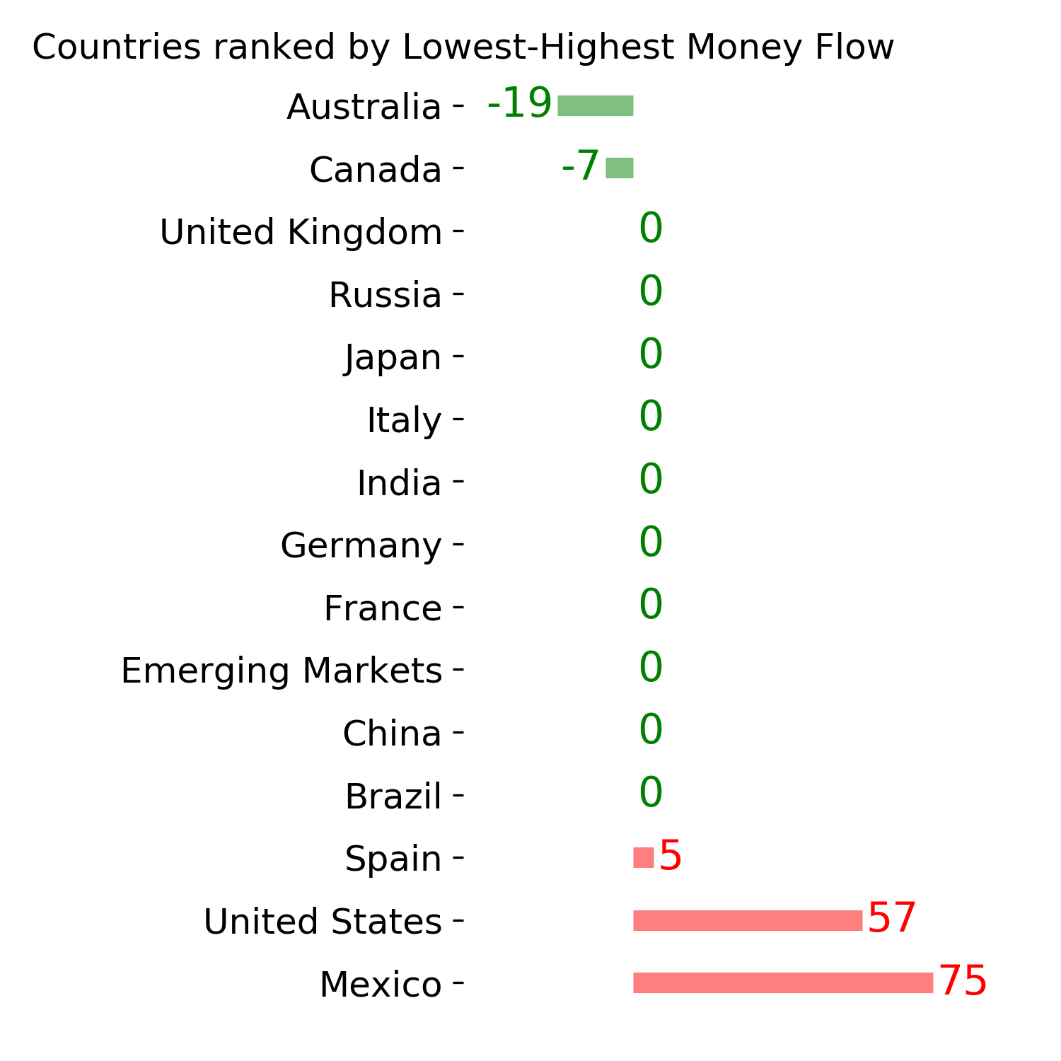
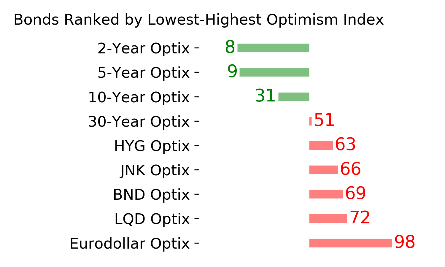
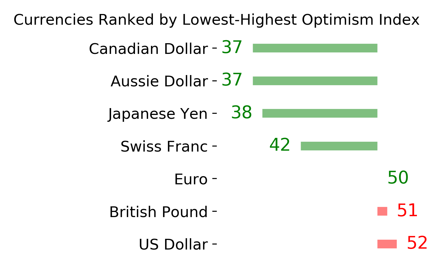
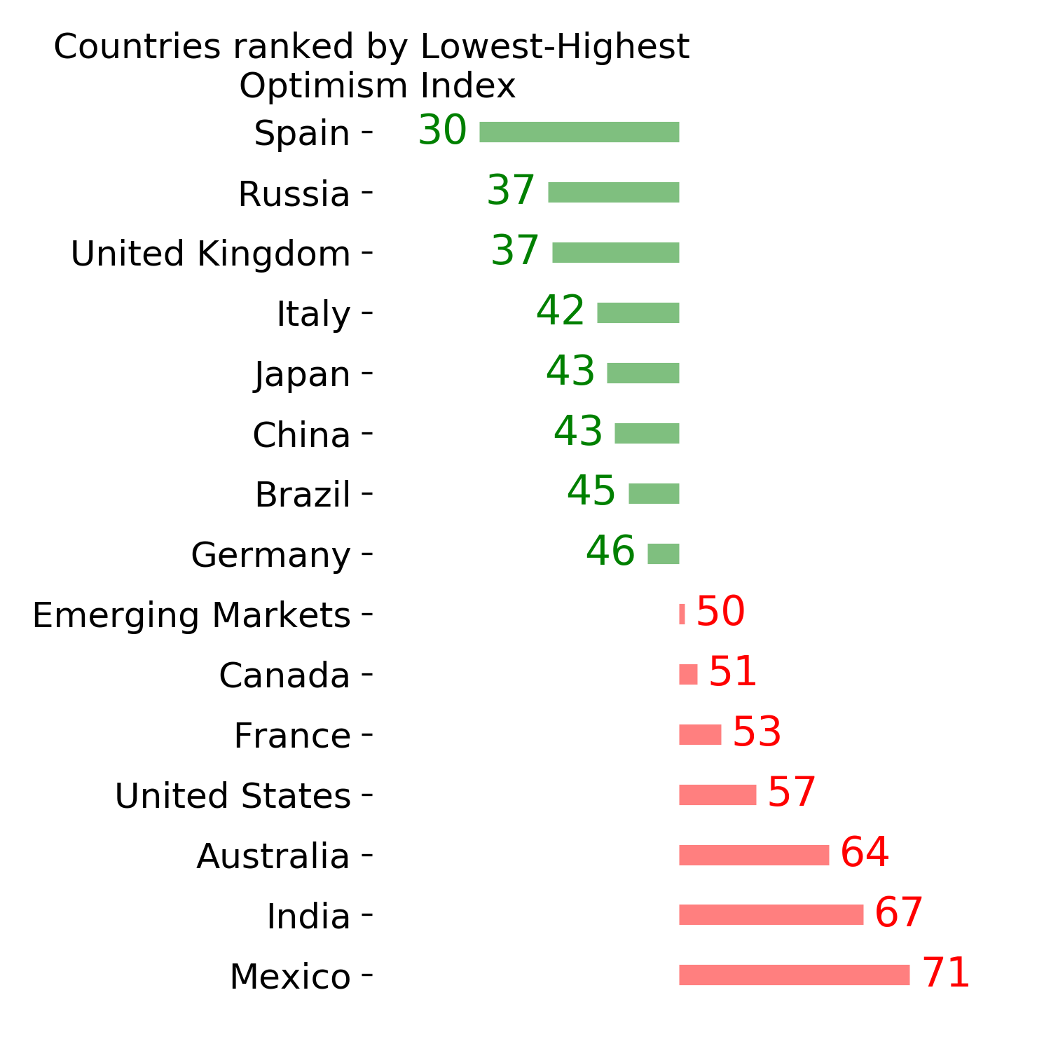
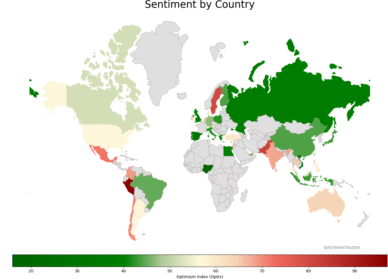
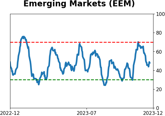
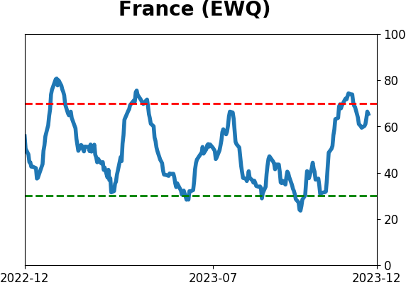
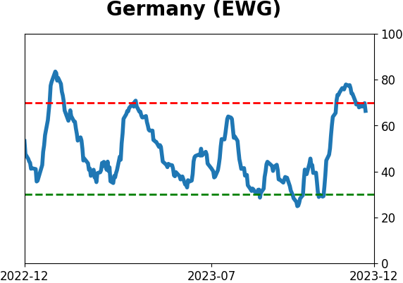
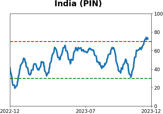
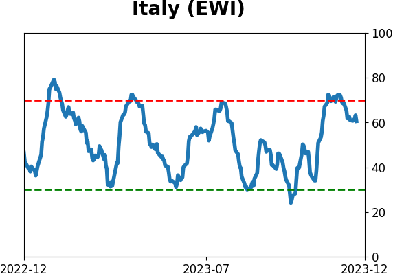
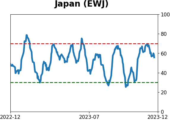
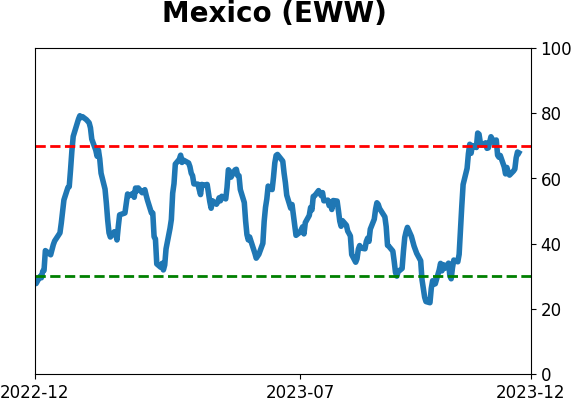
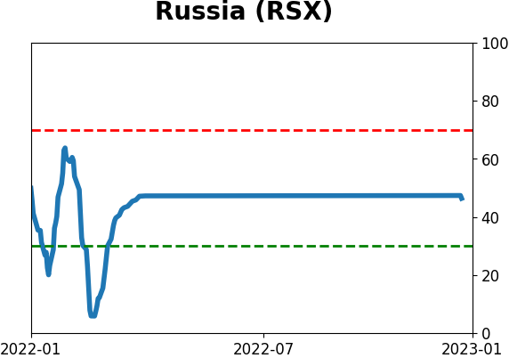
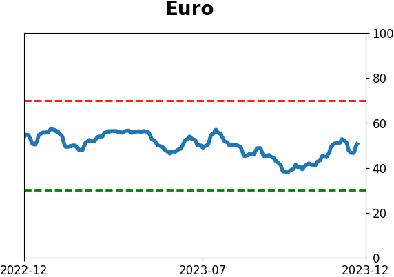
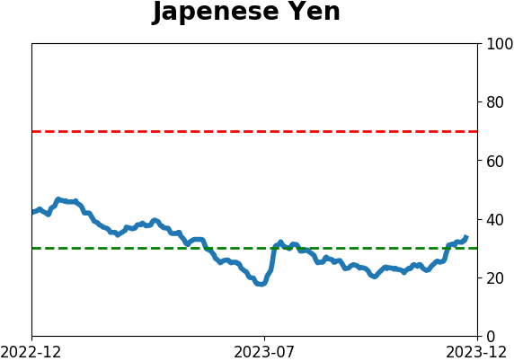
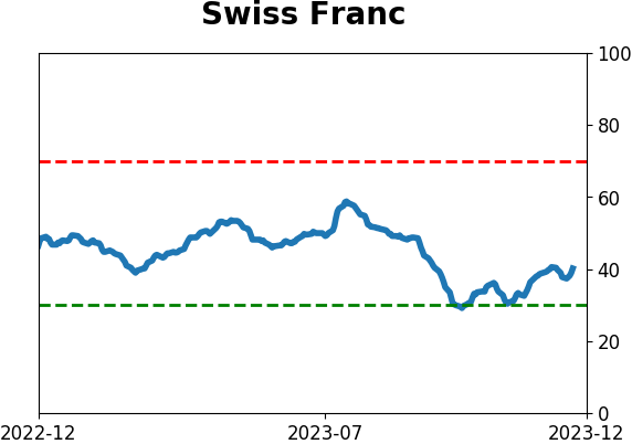
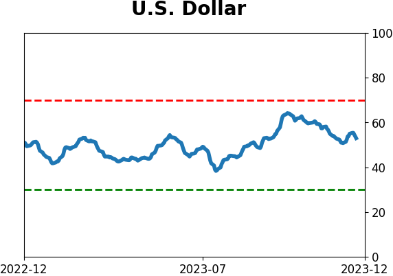
Sentiment Around The World
|
|
|
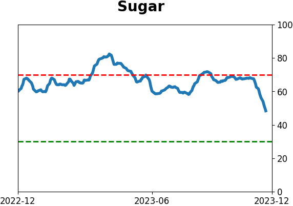
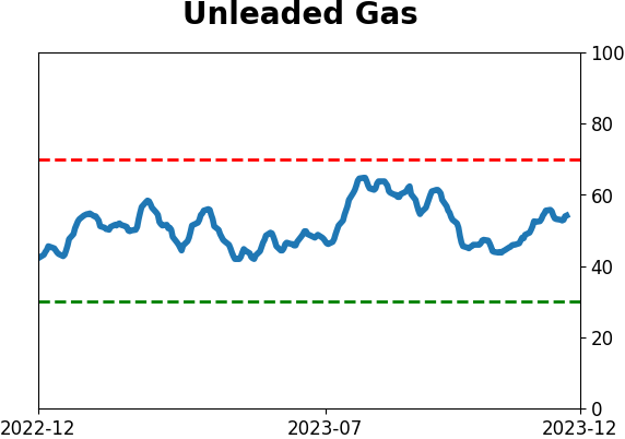
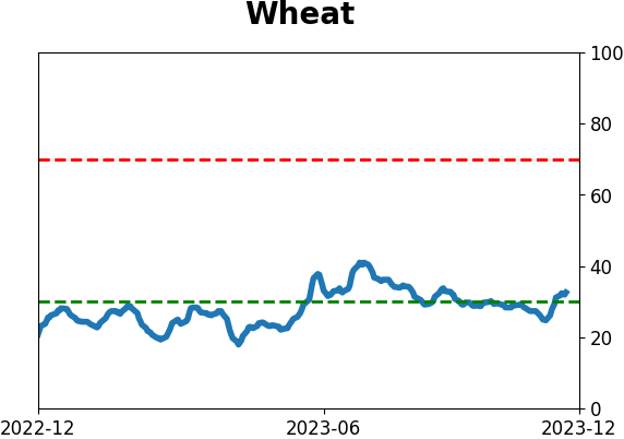
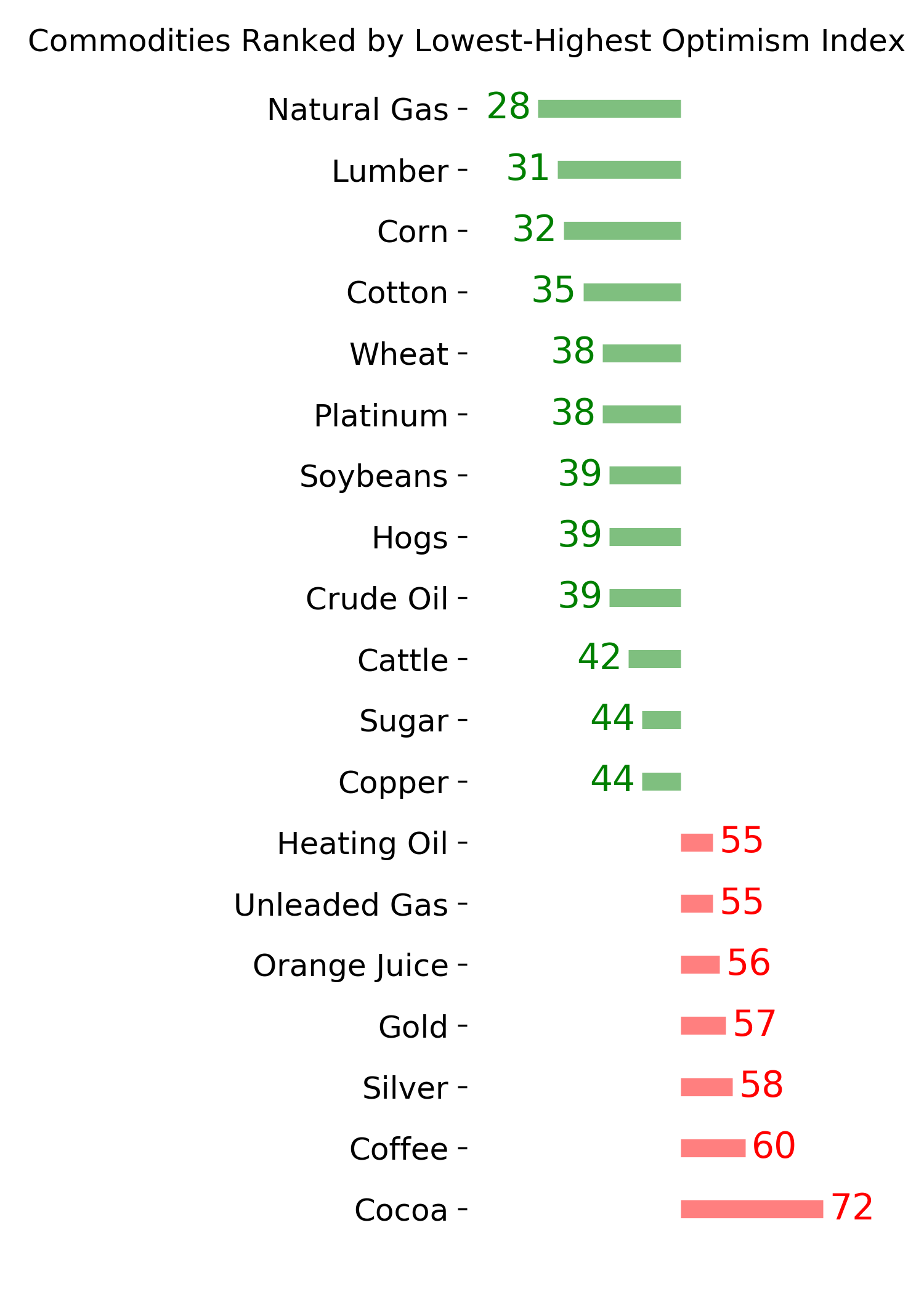
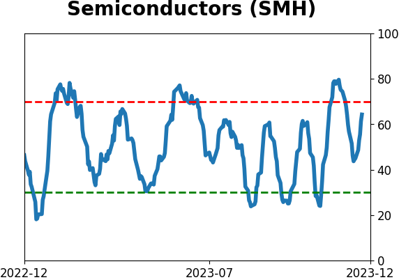
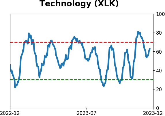
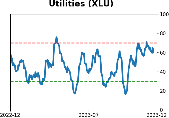
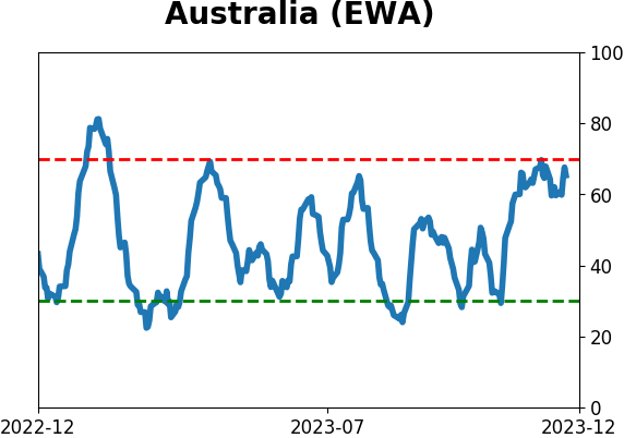
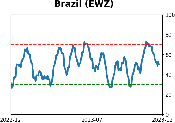
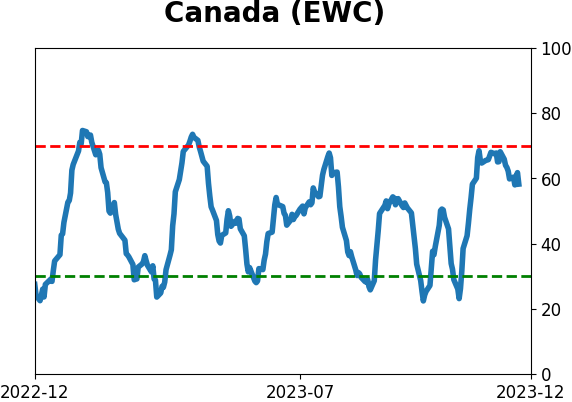
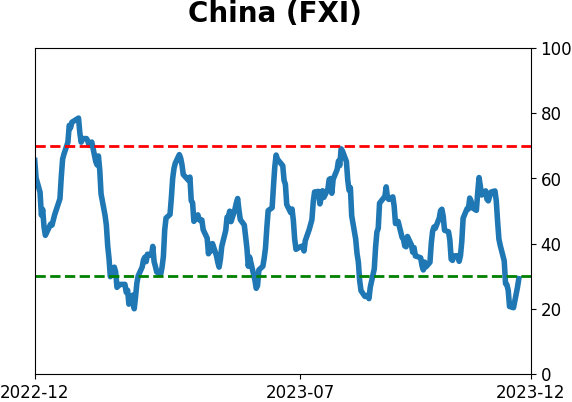
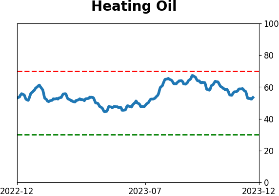
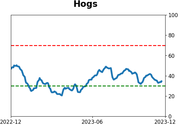
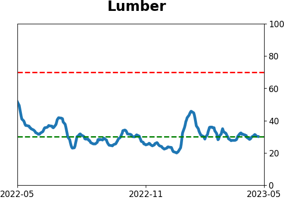
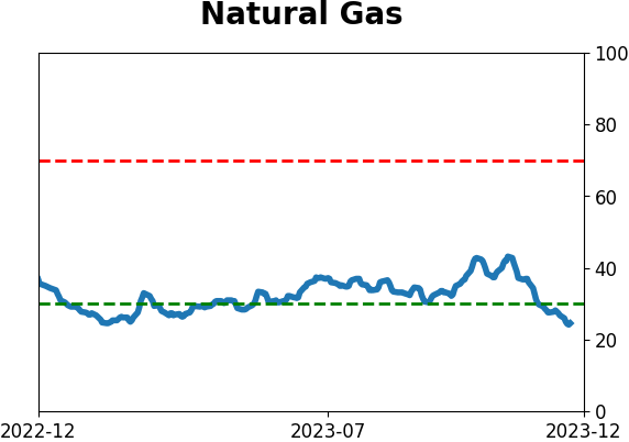
Optimism Index Thumbnails
|
|
|
|
|
|
|
|
|
|
|
|
|
|
|
|
|
|
|
|
|