Daily Report : TradingEdge Weekly for Nov 4 - Surge in sectors and countries, lingering fundamental concerns

| View/Print a PDF version of this Report |
Headlines
|
TradingEdge Weekly for Nov 4 - Surge in sectors and countries, lingering fundamental concerns: This week, we saw a surge in Industrial stocks that pushed an important breadth metric near a 70-year high. The stocks jumped relative to broader indexes, even though fundamental concerns remain. Some sectors, and countries, are showing notable relative strength. Among them is Mexico, where stocks also enjoyed a broad-based surge. |
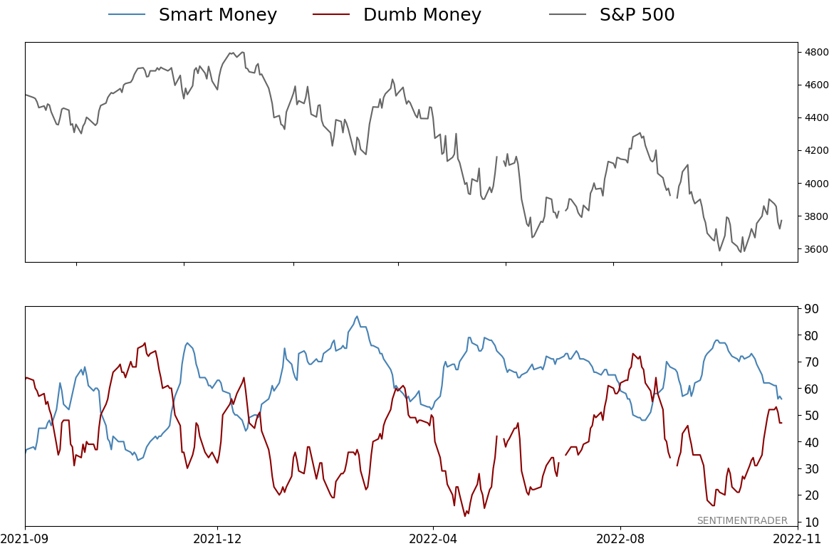
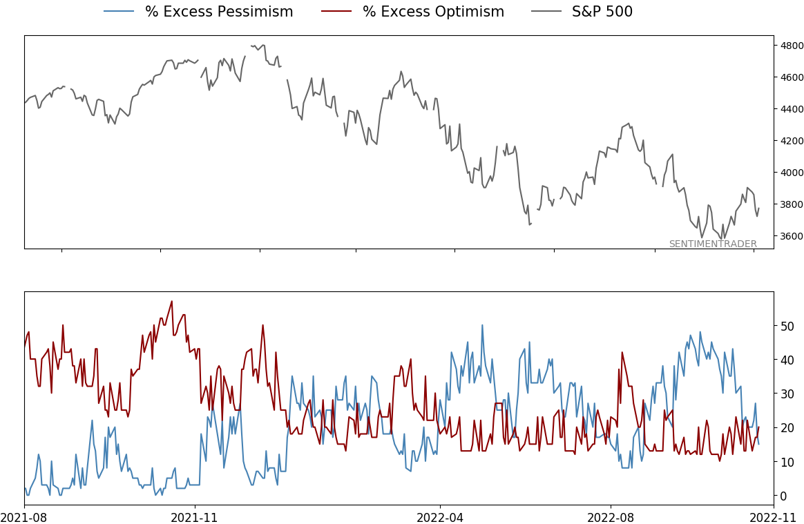
Smart / Dumb Money Confidence
|
|
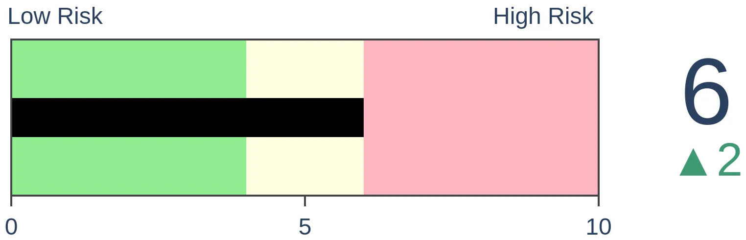
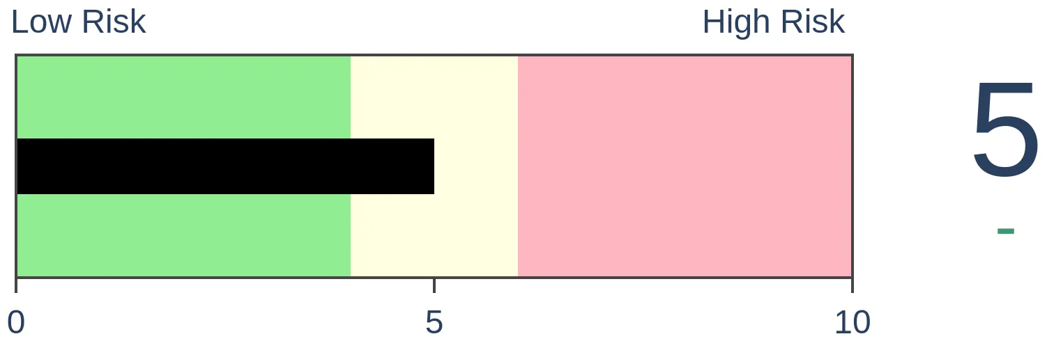
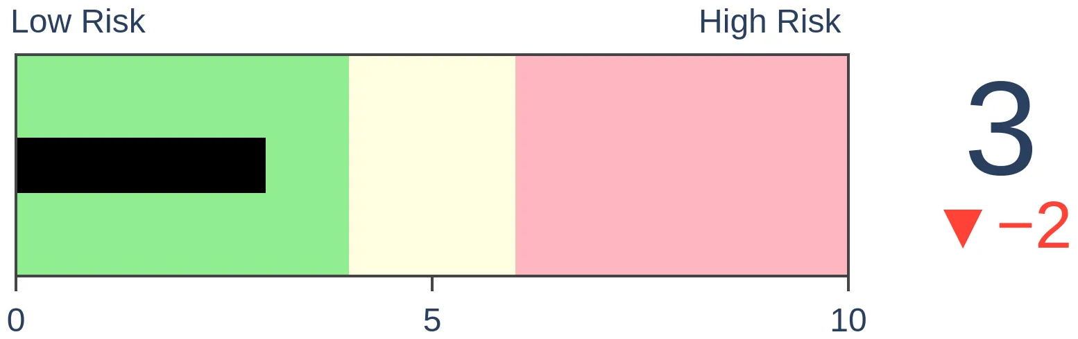
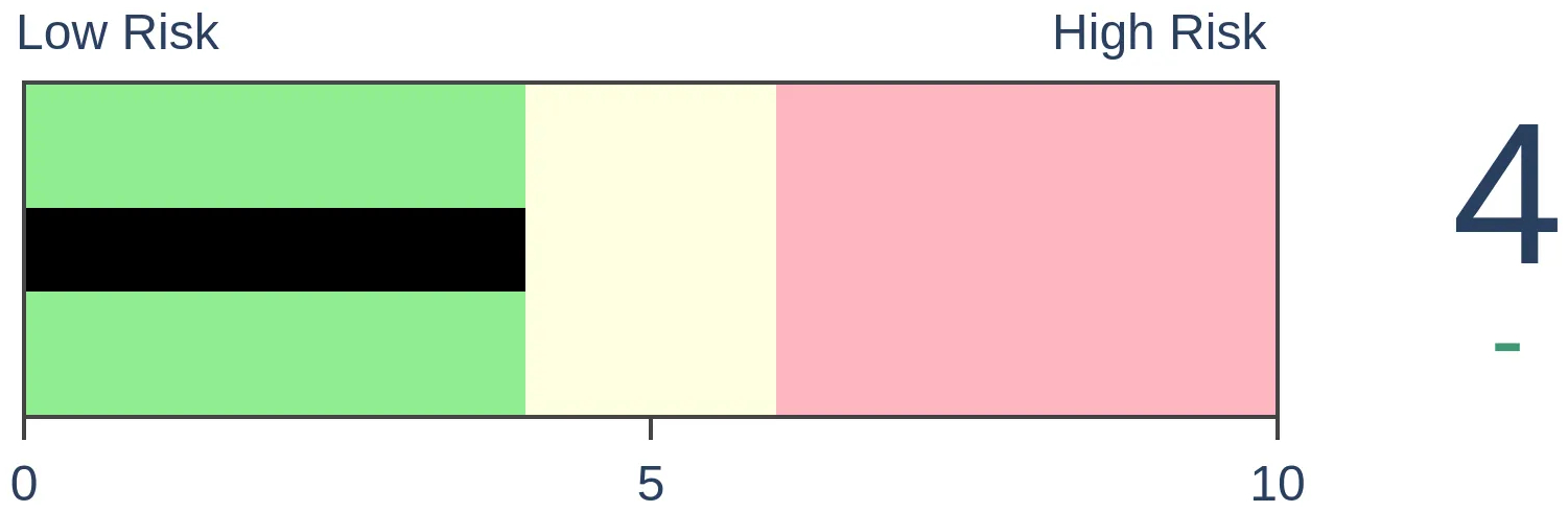
Risk Levels
|
|
|

Research
TradingEdge Weekly for Nov 4 - Surge in sectors and countries, lingering fundamental concernsBy Jason GoepfertBOTTOM LINEThis week, we saw a surge in Industrial stocks that pushed an important breadth metric near a 70-year high. The stocks jumped relative to broader indexes, even though fundamental concerns remain. Some sectors, and countries, are showing notable relative strength. Among them is Mexico, where stocks also enjoyed a broad-based surge. FORECAST / TIMEFRAME |
Key points:
- A surge in Industrial stocks pushed their McClellan Oscillator to one of the highest readings in 70 years
- Industrial stocks jumped relative to stocks in the S&P 500 and Nasdaq Composite
- Fundamental concerns like yield curve inversions continue to linger
- At least inflation may be about to be tamed according to the Price Paid index
- Some sectors, and countries, are showing notable relative strength
- That has helped to fuel a recovery in 52-week highs versus 52-week lows
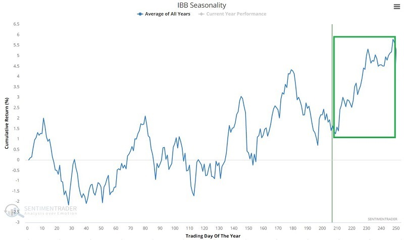
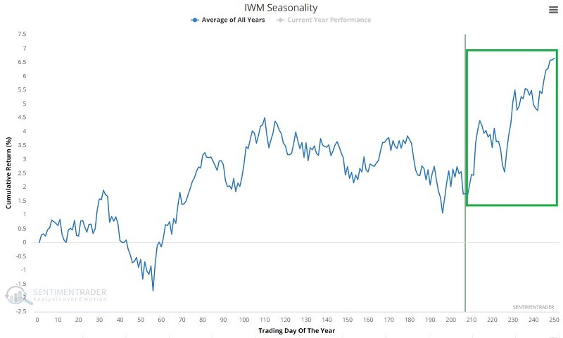
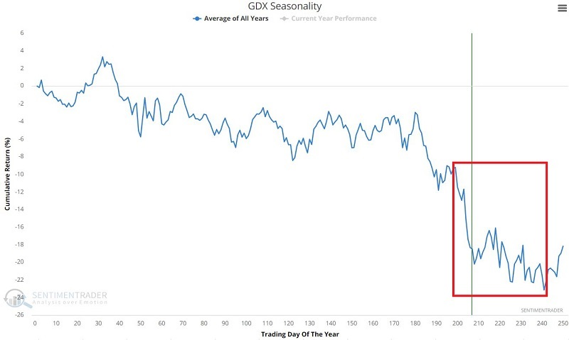
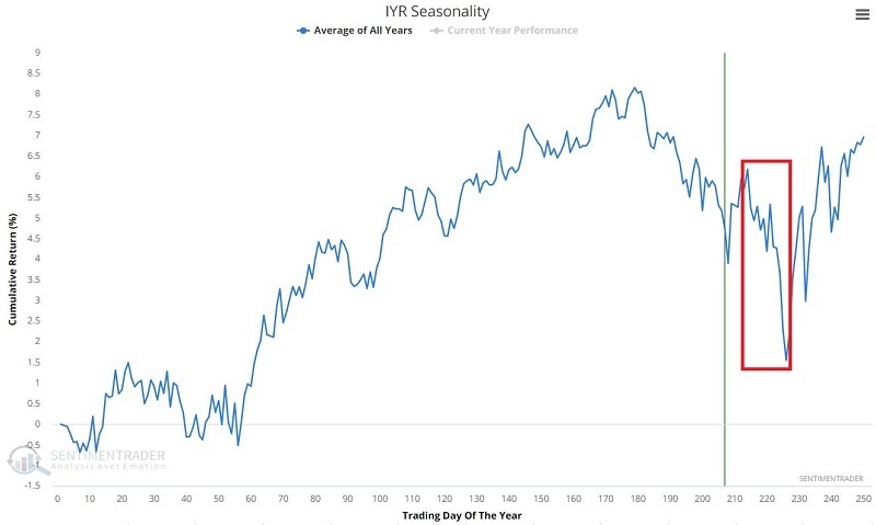
- There are about a dozen sectors showing especially strong seasonality now...and a handful not so much
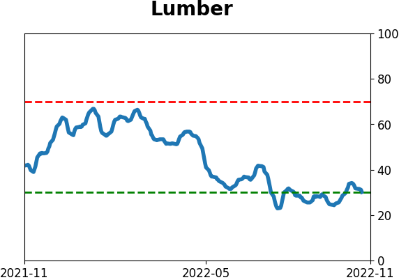
- Lumber, and related trading vehicles, tends to show strength about now
- Mexican stocks have also surged, helping a broader recovery in emerging markets
- An options trade for a low dollar-risks speculation on bitcoin
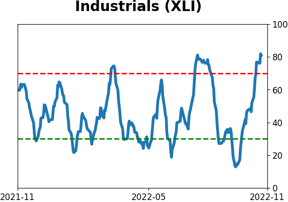
Investors are hiding out in Industrial stocks
With losses pretty much everywhere an investor looks, money's gotta go somewhere, and it recently flowed into Industrial stocks, for one.
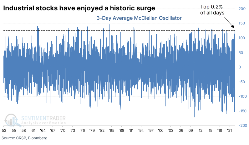
For the Dow Industrials, the number of advancing stocks has overwhelmed declining stocks so much that the McClellan Oscillator surged to its 2nd-highest level in our database. The only day to exceed it was in March 2003, as stocks emerged from the post-bubble bear market.
Using additional data sources, going back to 1952, the jump in the Oscillator for the Industrial sector ranks in the top 0.2% of all days.
After the 3-day Oscillator exceeded 125, Industrials showed excellent 6-12 month returns. There was only one loss out of the fourteen signals, it was relatively minor, and it was more than erased in subsequent months.
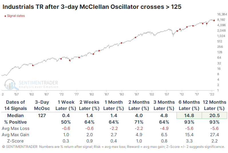
Within the next twelve months, only two signals suffered a drawdown exceeding -10%. The 2011 loss was an outlier because it was one of the very few times there was a surge like this while the sector was trading near a 52-week high.
As we saw in the broader market, corporate insider selling transactions over the past six months have trailed off to the lowest since at least 2010. Combined with an increase in buying interest, the Buy/Sell Ratio among Industrial companies is at the 2nd-highest level since then.
Another potential tailwind is the calendar. The annual seasonal trend for Industrial stocks turned up this week.
Industrials surged relative to other indexes, too
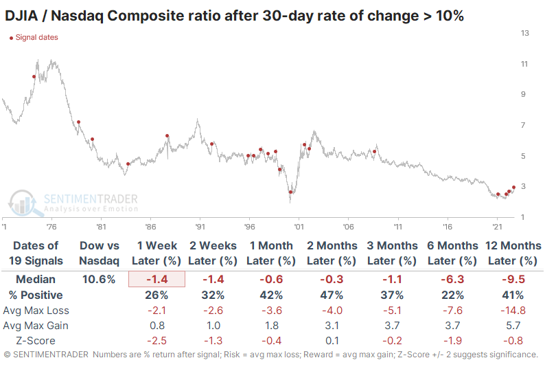
The move in Industrial stocks has been unusual in another respect - it has far outpaced the broader market. The ratio of the Dow Jones Industrial Average to the S&P rallied more than 5% over the past 30 days, one of the most significant moves since 1928.
The Dow's gains have been especially notable relative to another major index, the Nasdaq Composite. Thanks to a heavy weighting of recently-crushed tech stocks, the Dow Industrials / Nasdaq Composite ratio jumped more than 10% over the past 30 days.
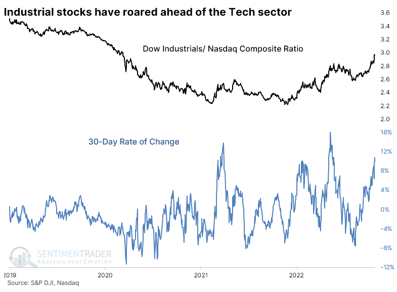
After surges like this, the Dow was even less likely to continue to outperform the denominator index. And after these, the Dow continued to underperform, unlike the S&P signals above. Over the next six months, the Dow kept outperforming only 22% of the time, or 4 out of 18 times.
Fundamentals have been - and remain - a challenge
Dean noted that the Federal Reserve's preferred yield curve spread for calculating the probability of a recession, the difference between the 10-year and 3-Month Treasury securities, inverted last week for the first time since 2019.
With a recession more likely based on the historical record of the yield curve, a resumption of the downtrend is a real risk.
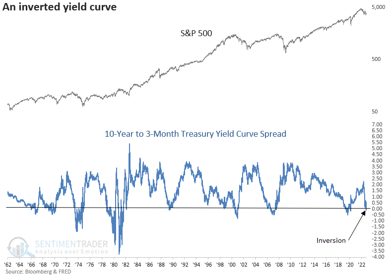
Suppose an inversion occurred during a bear market. In that case, the average number of days to a recession was 123. In contrast, if a signal occurred during a bull market, the average number of days was 208. Stocks struggle after yield curve inversions with mostly flat to negative returns across all time frames.
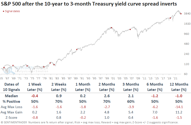
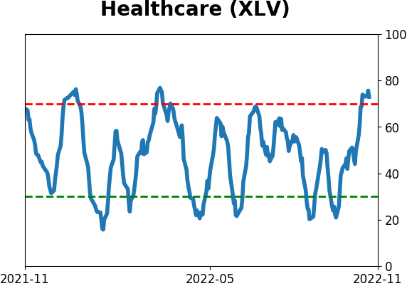
Consumer staples and health care, two defensive sectors, show the most consistent returns across all time frames. The yield curve slope weighed on cyclical and interest rate-sensitive groups.
The Bloomberg Spot Commodity Index showed negative to flat returns across all time frames. With a yield curve inversion signaling weaker economic activity, one needs to be careful with an allocation to a broad basket of commodities.
Inflation may be about to be tamed
Dean also noted that the Institute for Supply Management released the latest manufacturing data this week, and the Prices Paid Index plunged into contraction territory. At the same time, the index closed at a 12-month low.
With the Federal Reserve tightening monetary policy to tame inflation, easing price pressures would be a welcome development for consumers and stocks.
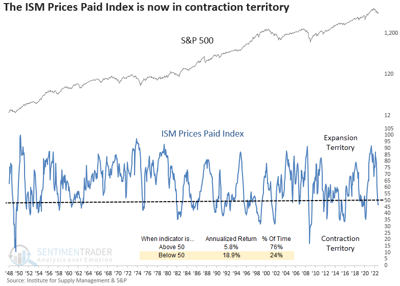
When the Prices Paid Index falls below 50%, and the index registers a 12-month low, the S&P 500 was higher 94% of the time a year later. While long-term performance is excellent, the signal can be untimely on a medium-term basis during extended bear market periods. Significant drawdowns occurred in 1982, 2001, and 2008.
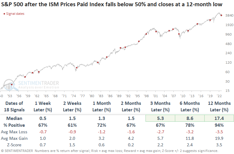
Sector results suggest one should continue to favor energy over technology for the next few months. A plunge in the ISM Prices Paid Index bodes well for a potential easing in the inflation outlook from the Federal Reserve's preferred inflation measure, which showed a drop 80% of the time over the next 9 months.
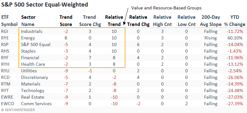
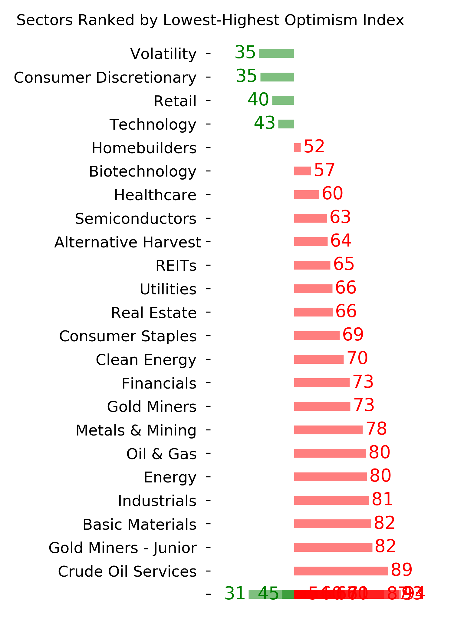
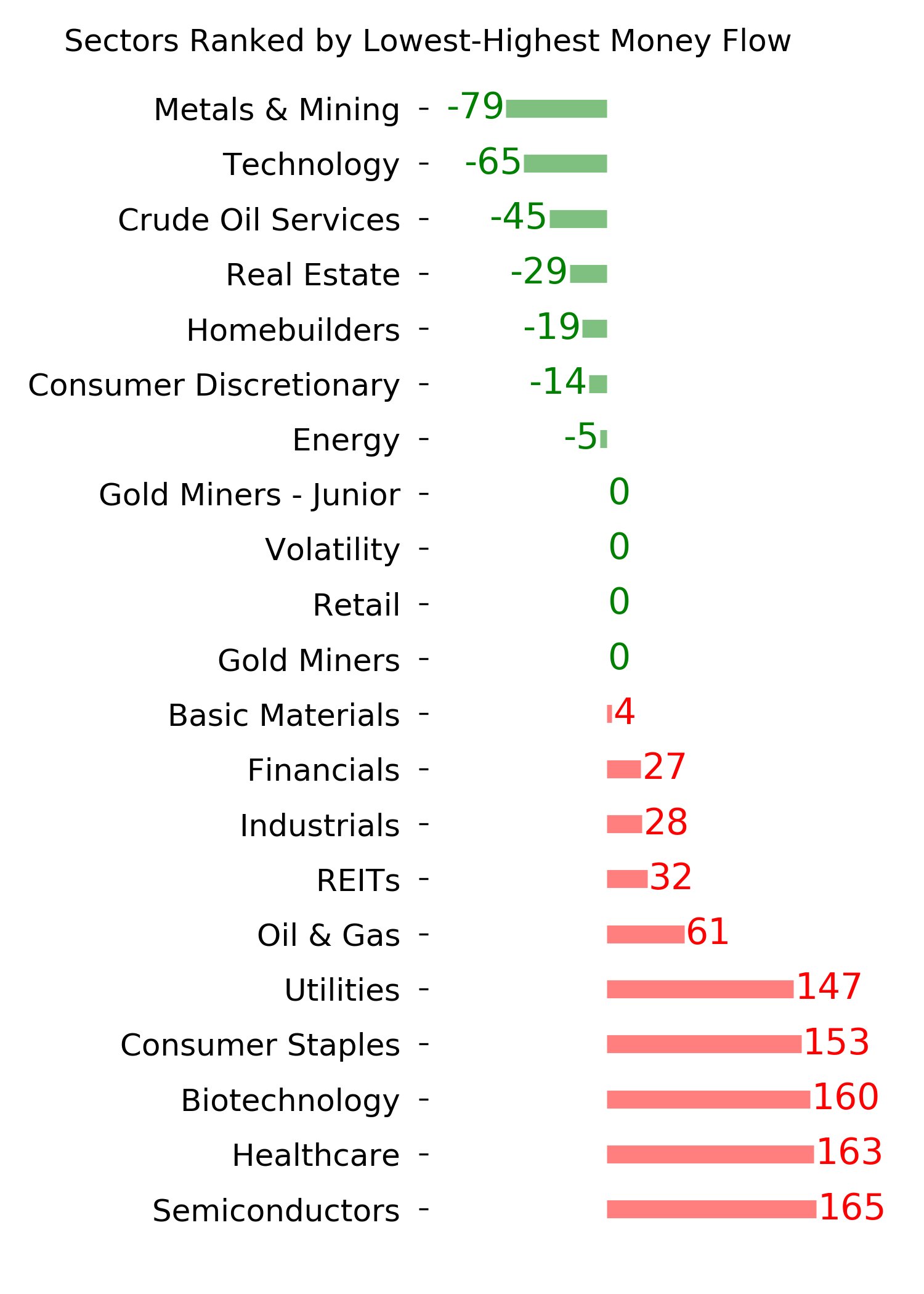
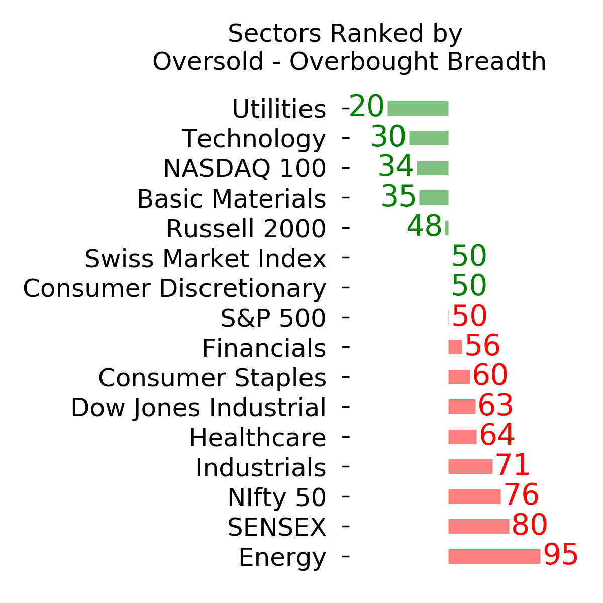
Despite challenges, some sectors have held up well
Thanks to a defensive mindset among investors, Dean noted that sectors geared to that mentality have been showing relative strength.
While it's not a surprise to see defensive sectors like Consumer Staples and Health Care with high relative scores, the rankings for value and resource-based sectors, like Industrials, Energy, and Financials, are interesting, especially Industrials. One has to go back to March 2001 (Dotcom bust) to find the last time industrials had a relative trend score of 10, with the S&P 500 down a like amount from the high.
The equal-weighted relative scores, which provide an unbiased assessment of trends, confirm the value and resourced-based strength in the cap-weighted rankings.
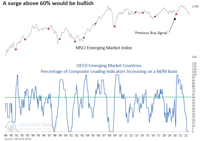
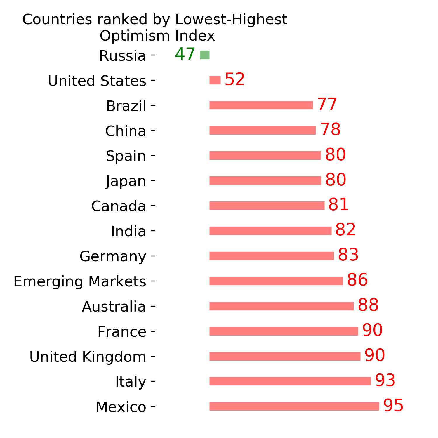
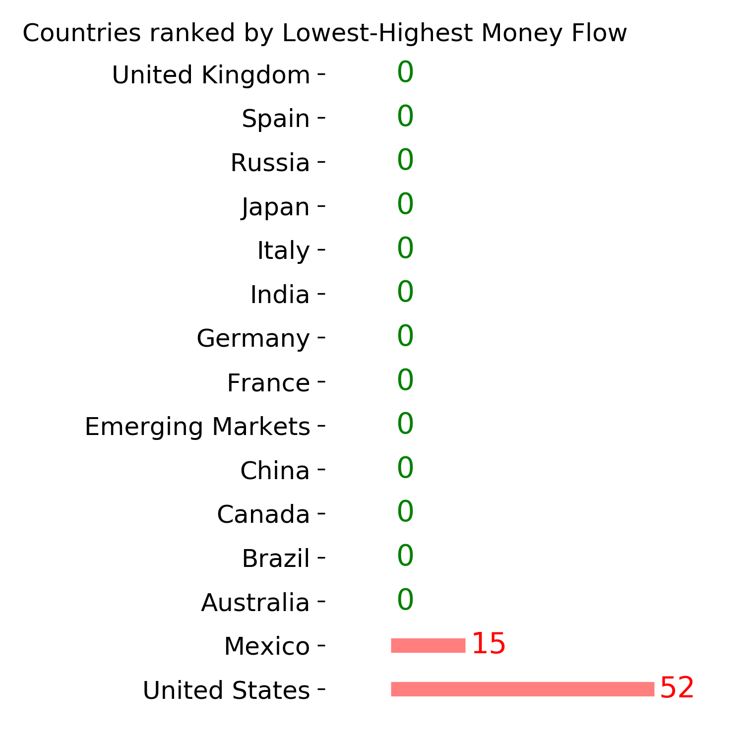
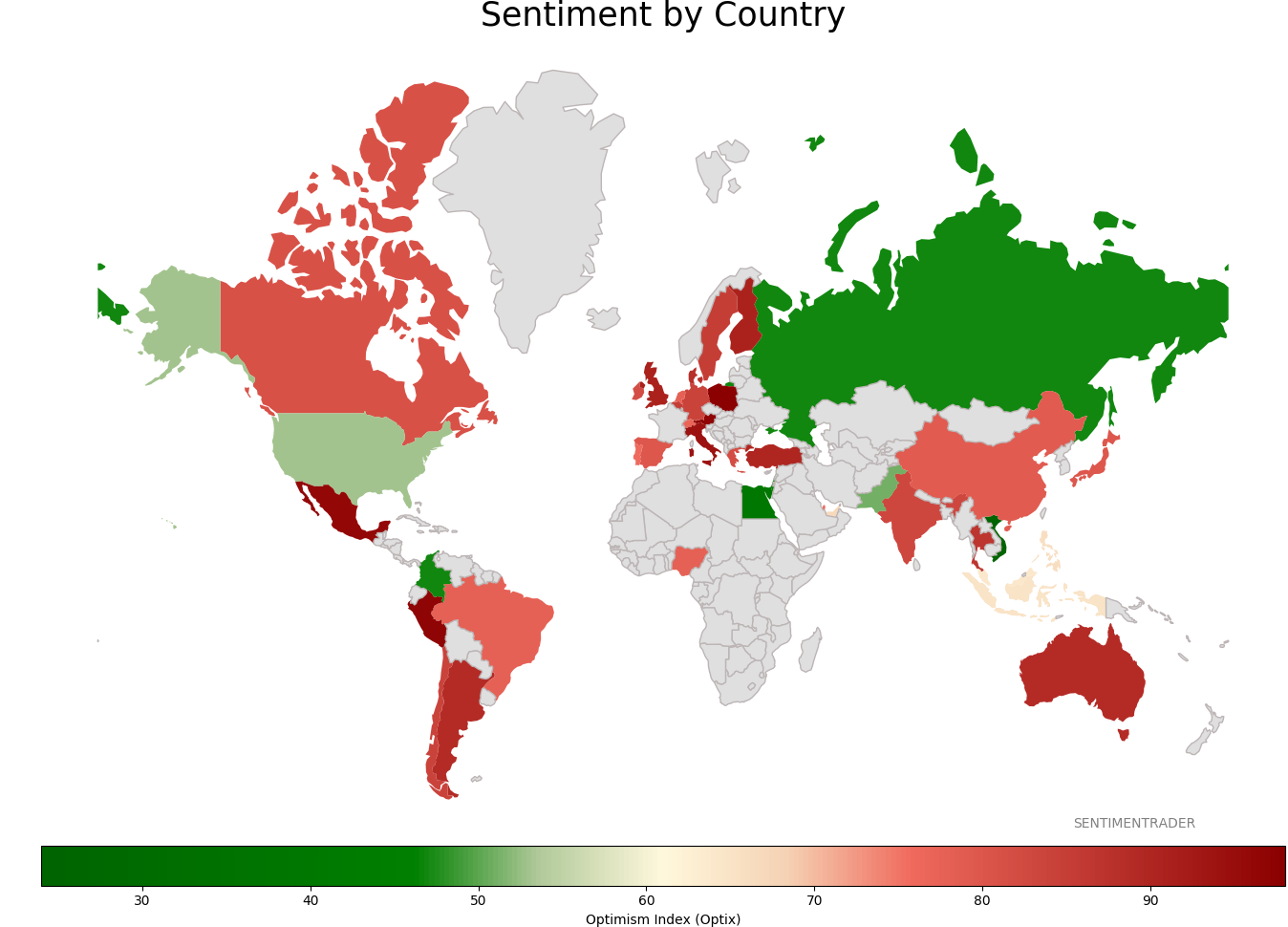
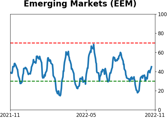
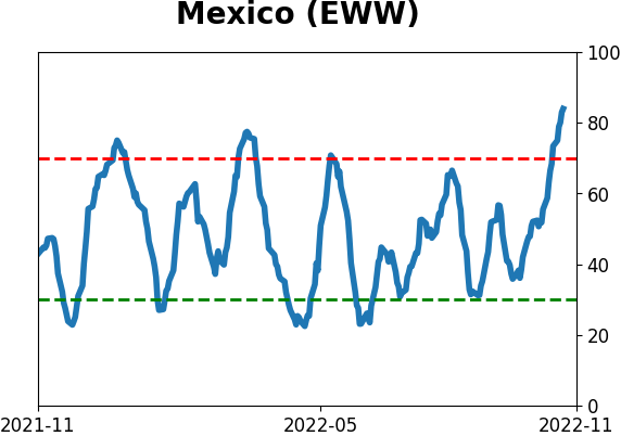
Whether the strong dollar, war or Covid related issues in China, opportunities around the globe have been few and far between. However, several emerging market countries show strong relative trend scores versus the S&P 500. Remember, an emerging market ETF like EEM contains a considerable allocation to China, which currently ranks -10 on an absolute and relative basis.
The Composite Leading Indicators (CLI) from the Organization for Economic Co-Operation and Development (OECD) is an excellent time series for identifying a trough in the economic cycle. I monitor an LEI diffusion index for all countries and one for emerging markets. With the diffusion index pinned at zero, the next buy signal will occur when the indicator surges above 60%. Stay tuned.
More signs of broad recoveries
The recovery in many sectors has helped to push a recovery in the broad NYSE universe.
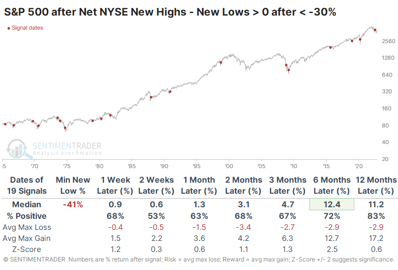
In September, there were 33% more securities on the NYSE trading at 52-week lows than 52-week highs, one of the lowest Net NYSE High-Low figures in nearly 60 years. This week, the indicator turned positive, with more securities trading at a new high than new low.
This is a welcome change in the market environment, as the S&P's annualized returns when this is above zero is more than twice as great as when it's below zero. For most of this year, it has struggled to hold above the zero line, so we'll have to see if buyers can maintain momentum for once.
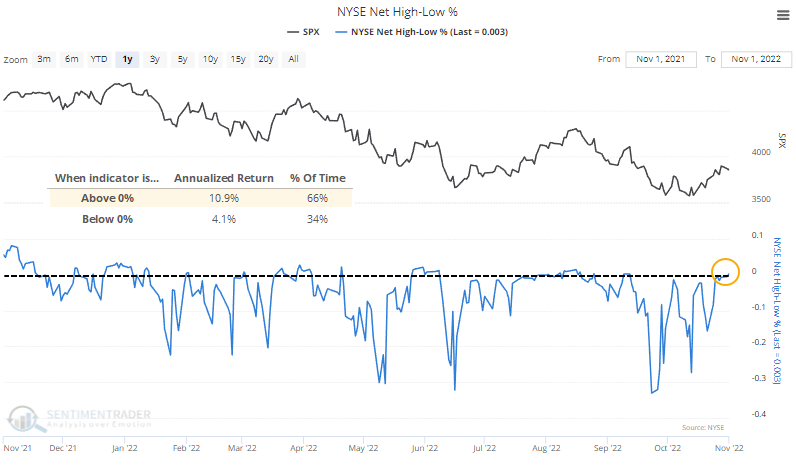
After a protracted time below zero and a lot of net new lows, a pop above the zero line has tended to lead to positive long-term returns. The 1970s were a problem, with several false signals. Since late that decade, though, every signal has shown a positive one-year return.
It's a similar situation among big tech stocks. The net percentage of stocks at new highs minus new lows has turned positive after one of the most negative readings since the Nasdaq 100's 1985 inception. After similar behavior, the index showed a positive return over the next six months every time, though with the usual caveats about small sample sizes.
Seasonal trends tend to separate between the weak and the strong about now
The best use Jay has found for seasonal trends is in helping to highlight potential opportunities. Once an opportunity is spotted, it is up to the individual to decide whether to trade it, how to trade it, how much to risk, when to exit, etc.
The table below lists ten assets entering a favorable seasonal period and seven entering - or in the middle of - an unfavorable period. The assets listed on the left-hand side of the table below have shown a historical tendency to advance during the fourth quarter. The assets listed on the right-hand side have tended to lag.
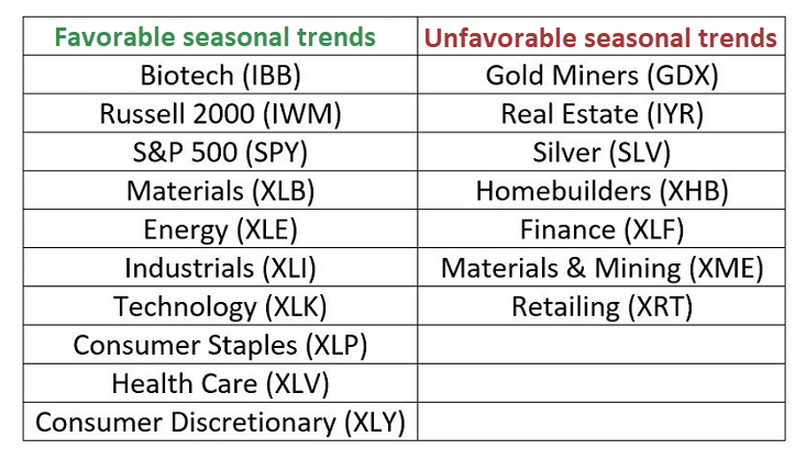
Some traders might consider the assets in the right-hand column as potential plays from the short side. There is nothing wrong with that. However, for the record, they are presented here as assets to avoid on the long side relative to those listed on the left-hand side of the table and not as short candidates.
The charts below display the annual seasonal trend for a couple of the assets listed on the left-hand side of the table above.
And a couple of the annual seasonal trend for the assets listed on the right-hand side of the table above.
Lumber (and WOOD) also tend to do well about now
Few people understand how cyclical lumber price movements are. Jay showed that this is important because lumber has entered its most favorable time of year.
The favorable period extends from the close on Trading Day of Year (TDY) #206 through the close on TDY #28 of next year. For 2022-2023, this period will extend from the close on October 26 through the close on February 10 of next year. The chart below shows the hypothetical cumulative dollar gain from a long position in lumber futures held only during this period since 1987.
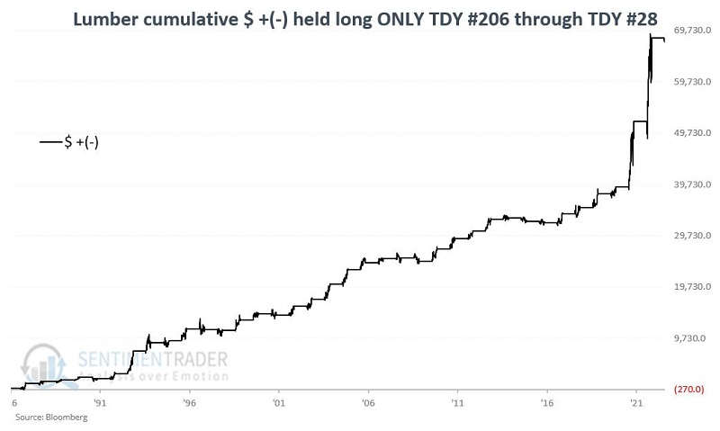
During these 36 years, lumber rallied 29 times. Its gains during the up years swamped losses during the down years.
The iShares Global Timber & Forestry ETF (ticker WOOD) correlates well with lumber futures. As the name implies, this ETF holds shares of companies in the timber and forestry industry. The largest holding is Weyerhaeuser (WY).
The chart below displays the cumulative percentage return for WOOD held long during the TDY #208 through TDY #28 period since WOOD started trading in 2008.
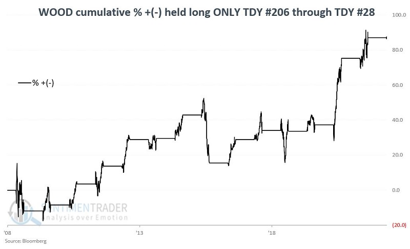
The fund enjoyed a gain during 11 out of 14 years, though losses were quite heavy during the down years.
To stretch the example further, let's run the same test using WOOD's largest holding, Weyerhaeuser (WY), going back to 1973. The cumulative gain is +3,596% and the stock rallied during 38 out of 49 years.
Mexican stocks, and broader emerging markets, have enjoyed a revivial
Some sectors have enjoyed a persistent and broad-based recovery over the past couple of weeks. Thanks partly to a stumble in the dollar, those moves have broadened out to other markets, including emerging ones.
Among the most impressive is Mexico. The McClellan Oscillator for the Mexbol index has surged from below -100 to above +100, one of the highest readings in years. An Oscillator this high means that advancing stocks far outpaced declining ones over a multi-week stretch.
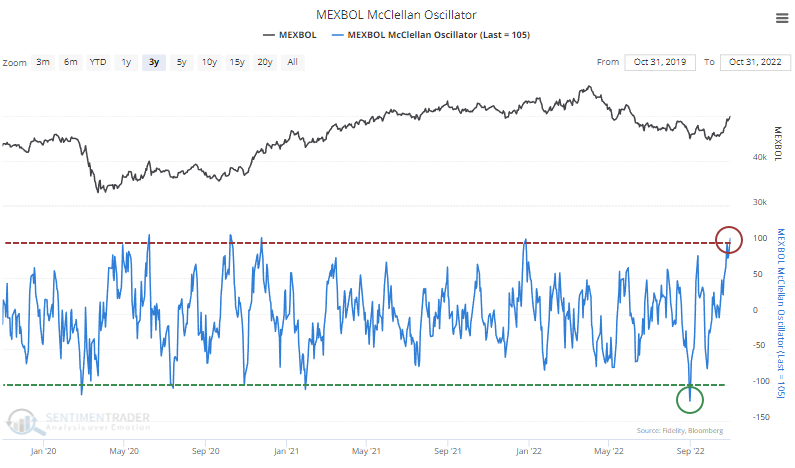
With only rare exceptions, readings this high in the Oscillator tend to lead to poor short-term returns as buyers take a breather. But they also tend to precede above-average long-term returns, particularly when there is a cycle from an extremely low Oscillator reading to an extremely high one relatively quickly.
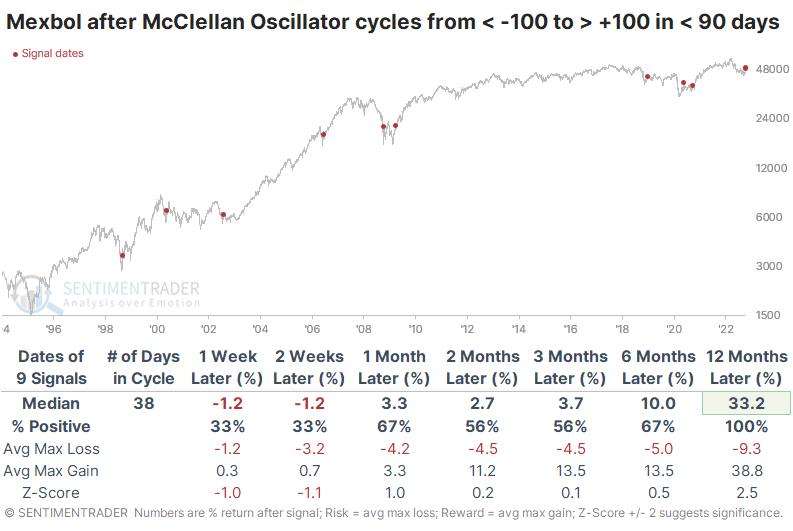
The table below shows these cycles for the Mexbol, filtering the signals to only include those that triggered when the Mexbol was 10% or more below its most recent 52-week high. Short-term returns were weak, but the index was higher all nine times over the next year. Its average return was a whopping 33.2%.
Due to the recovery in Mexico and several other emerging markets, the longer-term McClellan Summation Index for emerging markets has turned higher from one of the most depressed levels in nearly 30 years. Since 1995, there have been 65 days with a Summation Index below -1000. Over the next year, the MSCI Emerging Markets Index showed a positive return after all 65 days, with a median return of +60.1%.
Using options for a low dollar-risk speculation
Jay outlined a detailed look at an options trade that has a high degree of risk, but is potentially limited in dollar risk due to "cheap" options.
The example below has a high risk of a potential 100% loss of capital committed. If the security does not move in the hoped-for direction, the position will expire worthless, resulting in a total loss of the premium paid. However, the actual dollar amount that a trader commits is very low on a 1-lot basis.
The strategy we will highlight is referred to as an out-of-the-money call calendar spread.
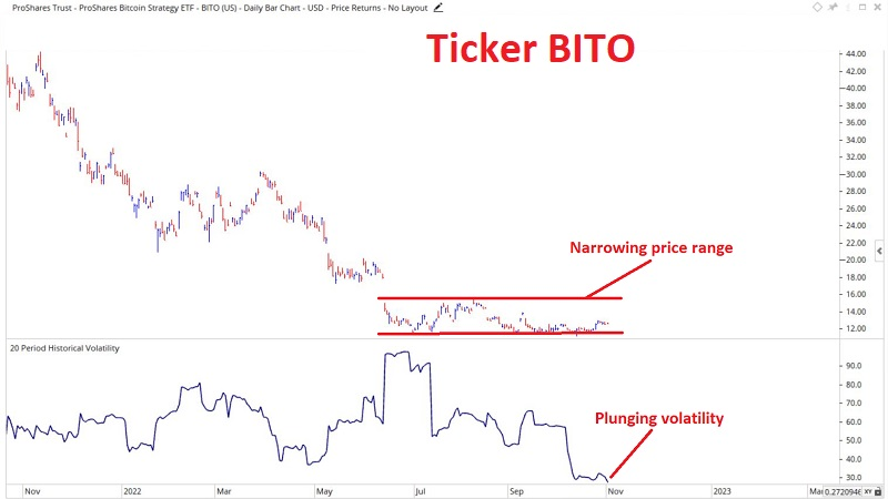
The chart below displays a daily chart for ProShares Bitcoin Strategy ETF (BITO). Note that after considerable volatility, the ETF has now settled into a very narrow range and that historical volatility has plunged. Low-volatility periods are usually followed by a significant move
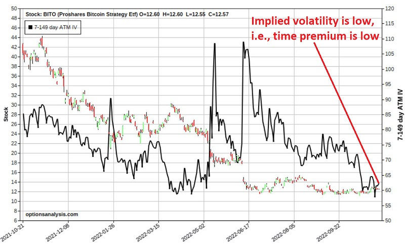
The chart below also shows a bar chart for BITO along with the implied volatility (IV) for options on BITO (black line). Note that IV has plunged. The implications of this are that the time premium built into BITO options is very low, suggesting that options are "cheap" and that a subsequent increase in IV will inflate the price of BITO options.
The hope is that BITO will make a meaningful price movement, IV will increase, and BITO shares will pop back up towards $15 a share between now and the end of the year. In addition, an increase in volatility along the way would also be welcome.
For our example trade, we will use a strategy known as an out-of-the-money call calendar spread, with the hope that BITO will move higher in price. Note that a trader who expects another price breakdown could just as easily use a put calendar spread to take advantage of that possibility.
Jay detailed the exact options used to construct the trade and potential ways to manage it as BITO moves for or against the position.
About TradingEdge Weekly...
The goal of TradingEdge Weekly is to summarize some of the research published to SentimenTrader over the past week. Sometimes there is a lot to digest and this summary is meant to highlight the highest conviction or most compelling ideas we discussed. This is NOT the full research that's published, rather it pulls out some of the most relevant parts. It includes links to the published research for convenience; if you don't subscribe to those products it will present the options for access.
Indicators at Extremes
|
|
|
|
Phase Table
|
|
|
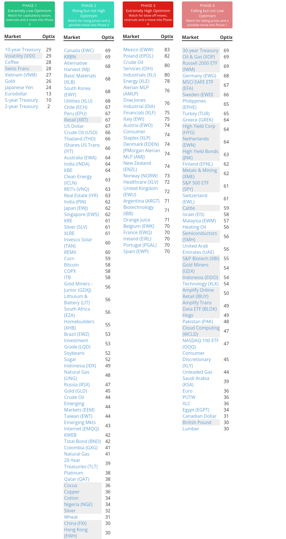
Ranks
|
|
|
|
|
|
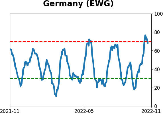
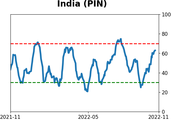
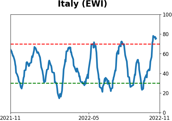
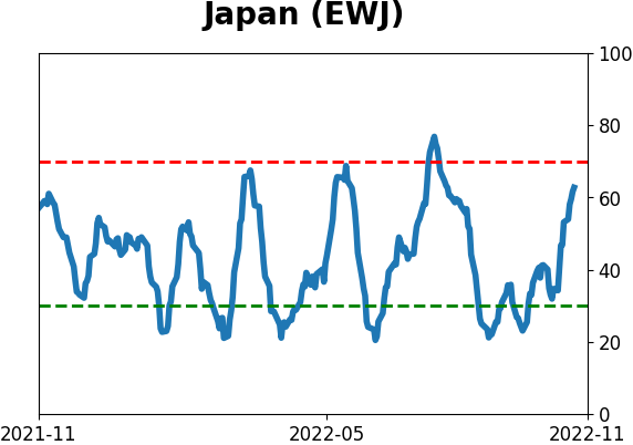
Sentiment Around The World
|
|
|
Optimism Index Thumbnails
|
|
|
|
|
|
|
|
|
|
|
|
|
|
|
|
|
|
|
|
|