Daily Report : TradingEdge Weekly for Sep 30 - Record hedges, few uptrends, positive divergences, dollar momentum

| View/Print a PDF version of this Report |
Headlines
|
TradingEdge Weekly for Sep 30 - Record hedges, few uptrends, positive divergences, dollar momentum: This week, we saw that options traders had established record amounts of hedges. It's hard to blame them, as uptrends among stocks became scarce, triggering many extreme indicator readings. There are some divergences in breadth metrics, though. Rising rates remain a big headwind, as is the dollar's massive momentum. |
Smart / Dumb Money Confidence
|
|
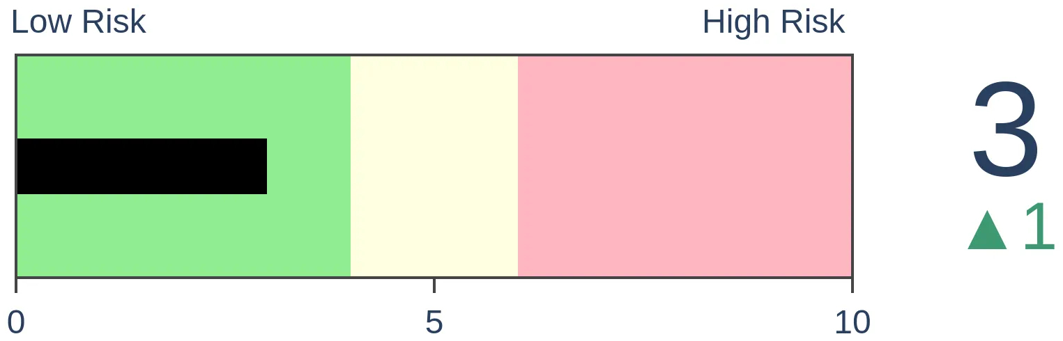
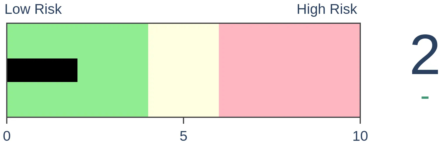
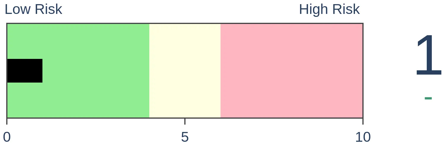
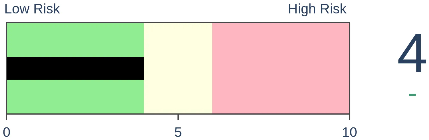
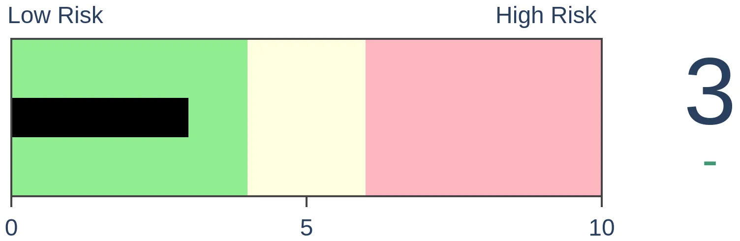
Risk Levels
|
|
|

Research
TradingEdge Weekly for Sep 30 - Record hedges, few uptrends, positive divergences, dollar momentumBy Jason GoepfertBOTTOM LINEThis week, we saw that options traders had established record amounts of hedges. It's hard to blame them, as uptrends among stocks became scarce, triggering many extreme indicator readings. There are some divergences in breadth metrics, though. Rising rates remain a big headwind, as is the dollar's massive momentum. FORECAST / TIMEFRAME |
Key points:
- Retail options traders were buying a record amount of hedges...again
- Hard to blame them as uptrends among stocks became scarce
- The selling pressure triggered a bevy of extremes
- Even with lower lows in the indexes, though, 52-week lows showed a positive divergence
- A majority of industry groups have become oversold
- The top 5 sectors during the coming election cycle
- Rising interest rates remain a stiff headwind, especially when coupled with poor price trends
- More and more commodities are falling well below a long-term average, and crude oil is facing headwinds
- That's thanks in part to the dollar's massive momentum
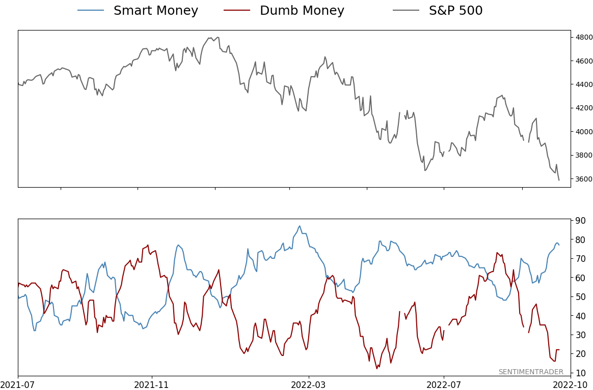
Retail traders are spending a record amount on hedges
Small options traders have shown a steadily decreasing appetite for risk. Last week, it became extreme again.
Earlier this summer, the smallest options traders, transacting in 10-lots or fewer, were spending more on buying equity put options to open than call options. It's extremely rare for them to be net bearish, and they're back at it. It's even more egregious in ETFs.
Among large traders, activity is even more notable. Once again last week, they spent a record amount on hedges relative to speculative contracts. Their net premiums approached $8 billion, meaning they spent nearly $8 billion more on equity put options to open than call options to open.
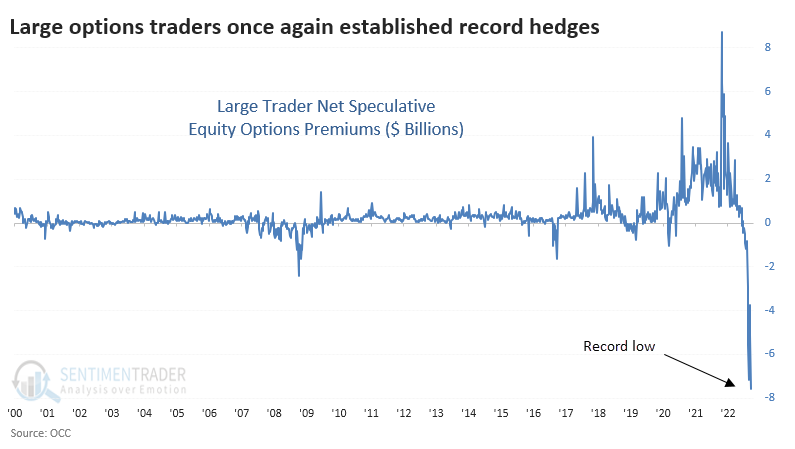
The same is true in ETFs. Large traders spent $2.2 billion more on ETF put options than call options, also a 22-year record.
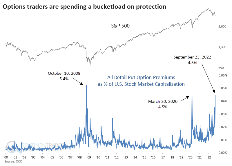
When we look at the amount of money spent on opening put buying among all retail traders, regardless of size, it's stunning. Last week totaled nearly $18 billion, by far a record high. The chart below puts this into the context of the total market capitalization of all U.S. stocks.
It's hard to blame them, since uptrends are scarce
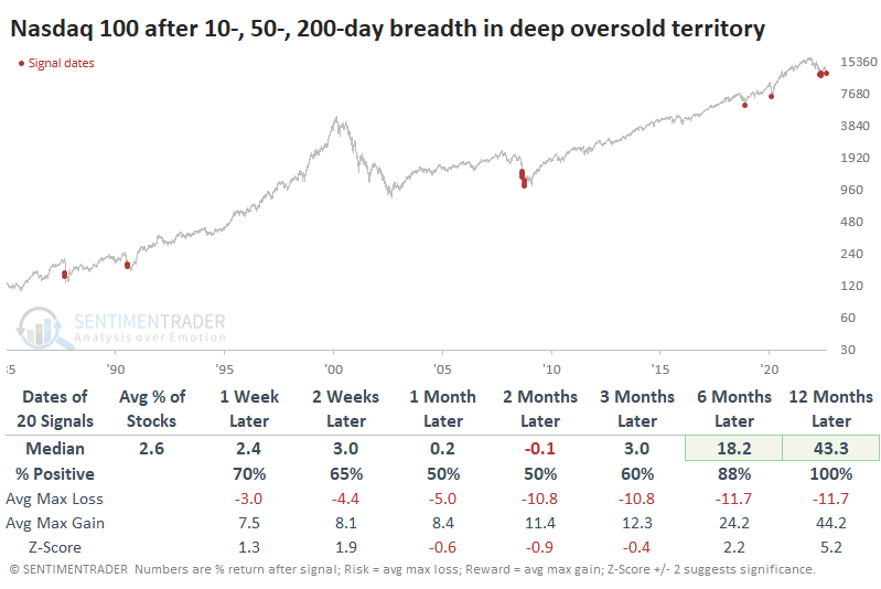
Big tech stocks kept getting slammed into mid-week, and uptrends on any time frame were becoming scarce. Among stocks in the Nasdaq 100 index (NDX), almost all are below their 10-day moving average.
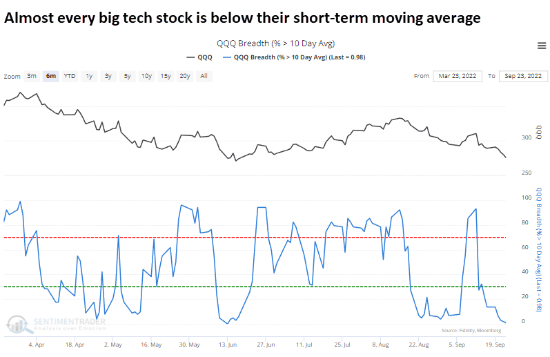
Virtually all have also dropped below their 50-day moving average and even long-term uptrends have reversed strongly, with fewer than 15% of stocks above their 200-day average.
Since the inception of the NDX in 1985, there have only been 20 other days with readings this low across all three breadth metrics. Following the others, big tech stocks suffered wild swings in the weeks and months ahead, with both large gains and losses.
Every instance, however, was the beginning of a significant bottom. Over the next year, the NDX showed a positive return every time, with a minimum gain of about 13% and an average of more than 43%.
We highlighted a handful of other indicators, which also showed extremes in big tech selling. About the only one bucking the trend was "smart money" insider trading, which is coming down from a record high.
Sellers haven't just been in big tech stocks
Jay highlighted a few more indicators triggering compelling extremes.
With further declines on Monday, few stocks in the S&P 500 are trading above their 50-day moving average. Extreme readings often mark exhaustion for a particular price move.
Investors haven't just been selling S&P 500 stocks. It has been spread across the wider NYSE exchange, and has been quick and severe.
The McClellan Oscillator tracks the difference between NYSE advances and declines and, at times, highlights seriously oversold situations - like now. The chart below displays those dates when the McClellan Oscillator dropped to -128 or lower for the first time in a month, and the table summarizes subsequent S&P 500 Index performance.
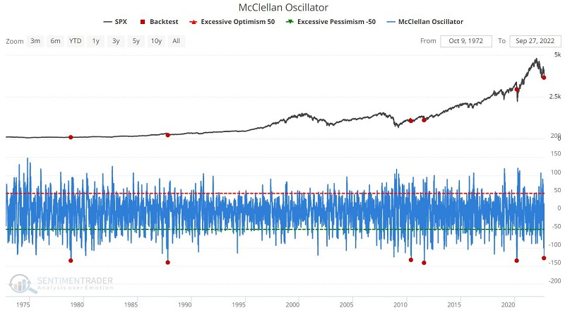
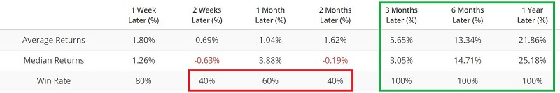
The sample size is small. However, that is simply a function of the fact that the market rarely reaches as oversold of a level as it just did. Like the previous indicator, signals tend to be early (note the 40% Win Rate two months after previous signals).
But here, too, the implication is that a bottom is forming. Things could get highly volatile in the next several months. Nevertheless, the message is to keep one's eyes open to the possibility of a terrific buying opportunity.
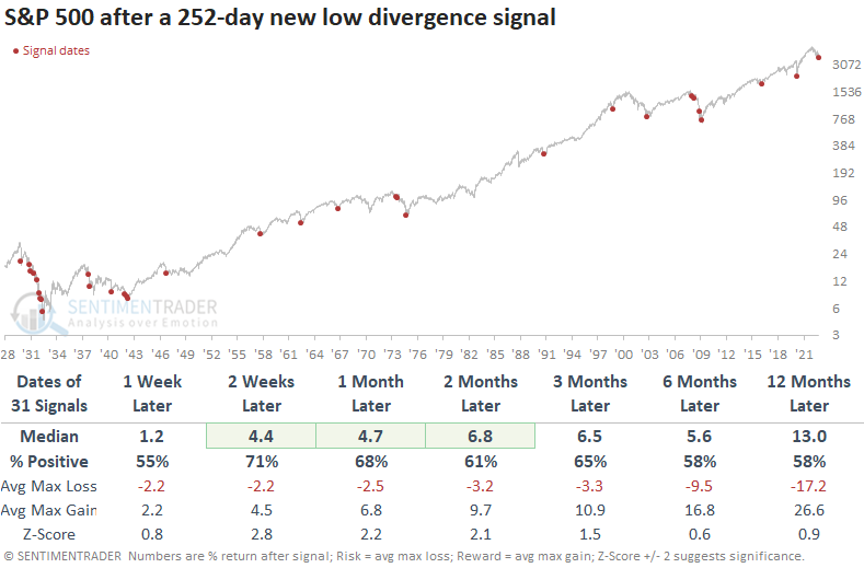
Even though indexes dropped to a lower low, there were fewer 52-week lows
The S&P 500 registered a lower low on Tuesday when it fell below the intraday low from June, but Dean noted that it triggered a divergence. The setup occurs when an index and an indicator move in opposite directions or fail to confirm each other.
Bear market bottoms are a process. The divergence between an index and the percentage of issues at a new low is one of the best ways to identify a potential counter-trend rally or a bearish to a bullish trend change.
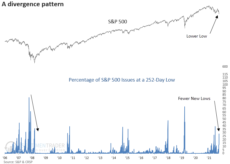
It's important to note that new lows can show a series of lower peaks in bear markets. For example, the internal low occurred in October 2008 when more than 80% of issues achieved a 252-day low. However, the index bottomed in March 2009, with only 20% of issues at a low.
The new lows divergence signal shows favorable returns, win rates, and z-scores, especially in the first few months. As with most historical studies that include the 1929-32 bear market, the outlook improves dramatically post that period.
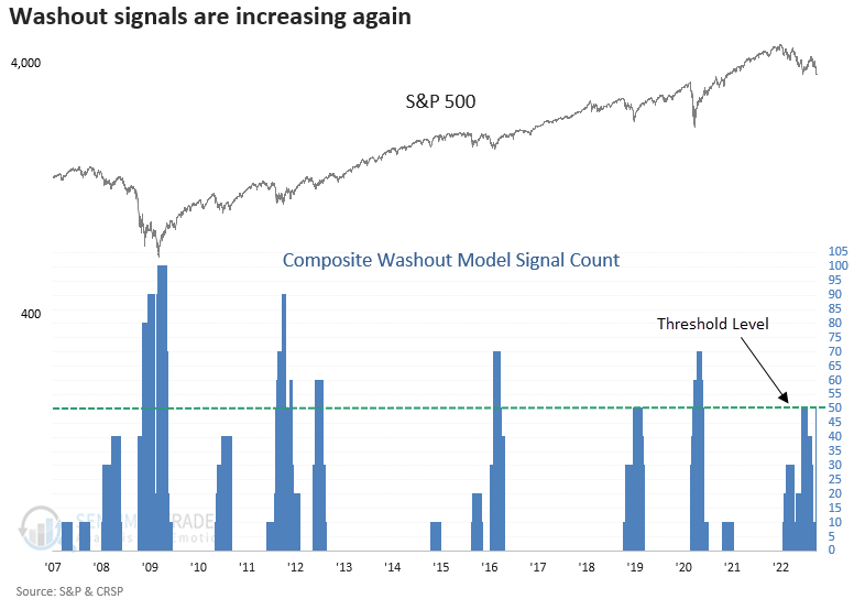
Over the last five weeks, the relentless equity market decline created an oversold condition for several breadth-based indicators in the Composite Washout Model. On Tuesday, the composite count increased to 50%, with four new alerts. With the Composite Washout Model count increasing to 50%, a new signal will trigger if S&P 500 price momentum turns positive.
More signs the selling is becoming overdone
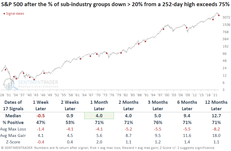
This week, the S&P 500 fell to a new cycle low on a closing and intraday basis. Dean showed that the selling pressure pushed the percentage of sub-industry groups down > 20% from a 252-day high to an extreme, which exceeded the previous peak in June.
For only the 18th time since 1929, the percentage of sub-industry groups down > 20% from a 252-day exceeded 75%. Repeats were screened out by requiring the indicator to fall below 15% before a new alert could occur again.
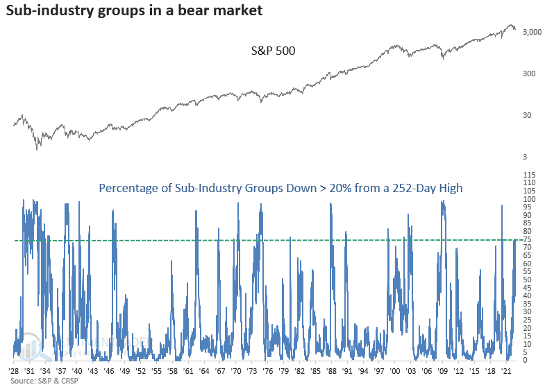
Over the next week, stocks could struggle as the selling pressure continues. However, a month later, the S&P 500 was higher 71% of the time with a favorable z-score. The two outlier signals occurred in 1937 and 2008. So, cash is king if you think we're about to have a Lehman event.
Also this week, more than 70% of sub-industry groups declined by 10% or more over the past 10 sessions. The short-term selling pressure has now occurred twice, with the other instance triggering on June 16, which marked the low for a powerful multi-month countertrend rally.
One of the biggest issues has been (and remains) rising rates
Jay showed that interest rates are stuck in a solid uptrend, and that has meant headwinds for stocks.
To designate the current trend for interest rates, we will track a 7-month exponential moving average of month-end 10-year treasury yields.
- If the current 10-year yield is below the 7-month EMA, the interest rate trend is falling
- If the current 10-year yield is above the 7-month EMA, the interest rate trend is rising
To put this performance into perspective, the chart below displays the cumulative price performance if held only when the 10-year yield was above its 7-month EMA at the end of the previous month. The cumulative return in the Dow Industrials since 1900 is only +5.6% - barely breakeven.
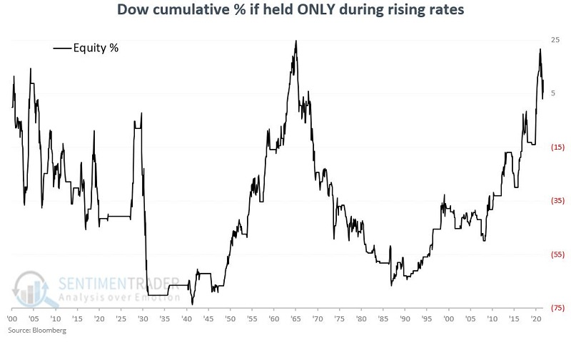
Rates were falling only 46% of the time but the percentage return in the DJIA during those months accounted for nearly all of the gains over the whole study period.
Jay then combined the stock market and interest rate trends to build a simple model. There are only two rules:
- If the stock market trend (Dow > 10-month average) OR the interest rate trend (10-year yield < 7-month EMA) is favorable , we will call that Risk-on
- If the stock market trend (Dow < 10-month average) AND the interest rate trend (10-year yield > 7-month EMA) are both unfavorable, we will call that Risk-off
The chart below displays the cumulative price return for the Dow if held only when both the stock market and the interest rate trends are unfavorable, as they will be to end this month. The cumulative return over the past 122 years is a decline of -89%.
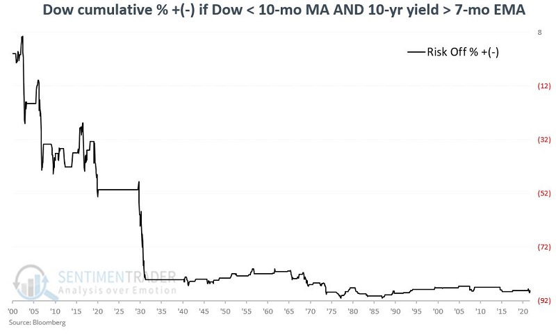
The results in the chart above reveal that the bulk of the damage occurred way back in the 1930s. Even since then, the cumulative return during Risk-off periods is -29% versus +74,322% during Risk-on periods (not shown).
Some potential seasonal sector tailwinds
Last week, Jay highlighted the stock market's performance during the most favorable ten-month period within the 48-month election cycle. This ten-month period encompasses October of each mid-term election year through July of the following (pre-election) year.
He furthered that research with a look at sector performance during these seasonal windows and found the top five:
- Materials
- Technology
- Industrials
- Discretionary
- Health Care
Let's consider the historical performance of these five sectors if held only during the favorable ten-month period. At the close of September during the mid-term election year, we assume each sector holds 20% of a hypothetical portfolio.
The chart below displays the cumulative return for this five-sector portfolio held only during the favorable ten-month period every four years (in black). The blue line shows the cumulative return for holding the S&P 500 Index only during this period.
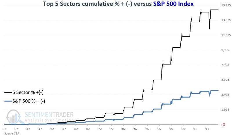
The sector strategy vastly outperformed. In fact, there was no ten-month cycle during the entire study period when these five sectors did NOT outperform the S&P.
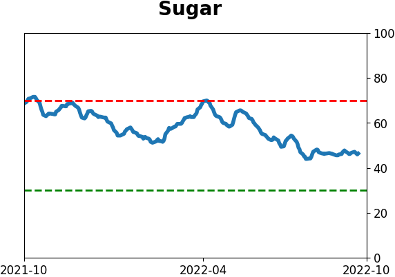
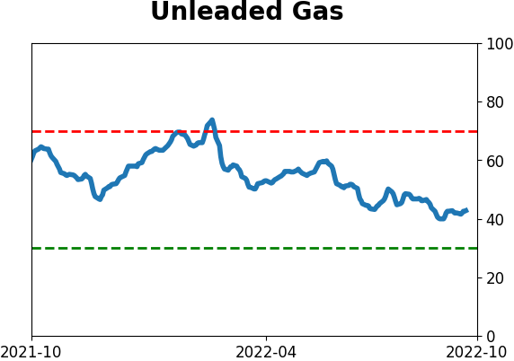
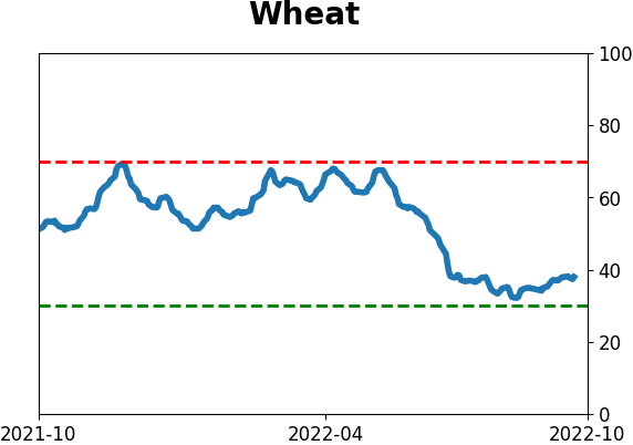
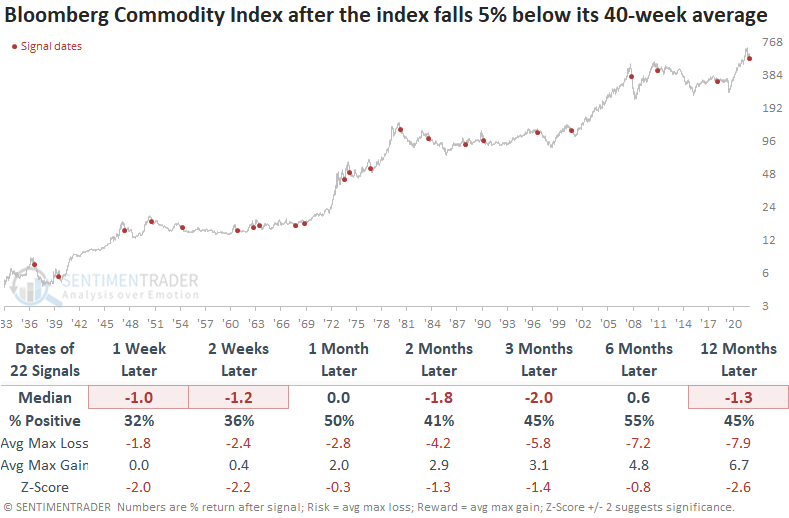
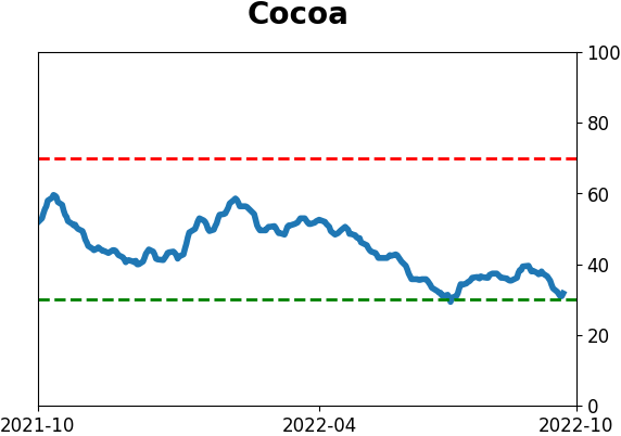
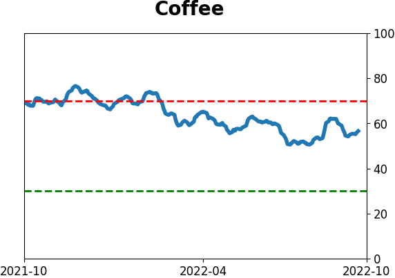
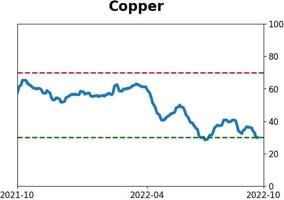
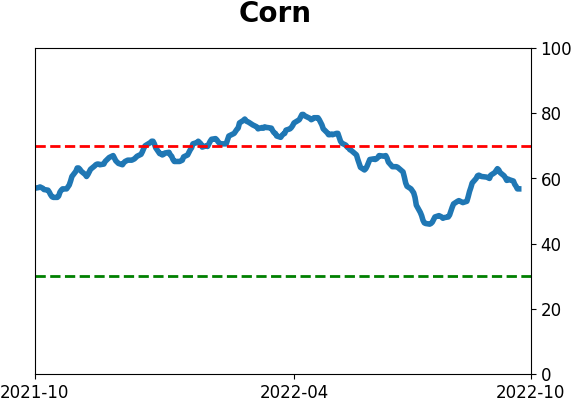
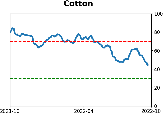
Commodity trends are deteriorating quickly
Commodities, like most assets, hit a rough patch last week. Dean noted that the adverse price action pushed the Bloomberg Commodity Spot Index more than 5% below its 40-week average, triggering a sell signal.
The long-term moving average model for commodities is simple. You buy when the commodity index closes 5% above its 40-week average. Conversely, if the index closes 5% below its 40-week average, you sell commodities.
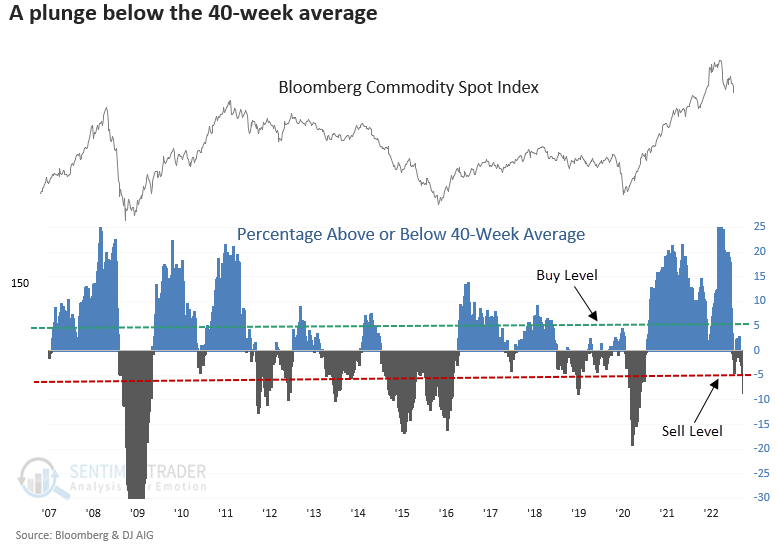
A long-term trend change for a basket of commodities looks unfavorable across most time frames. The Bloomberg Commodity Spot Index was negative at some point in the first year in all but three cases.
Context is important. So, let's isolate the first trend change signal after the commodity index registers a multi-year high, which is the case now. Results look worse across all time frames, especially a year later.
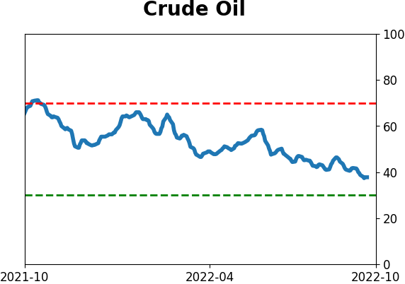
Most-watched commodity of them all is facing further headwinds
October through January has historically been an unfavorable period for crude oil, and Jay showed how adding a simple price trend filter magnifies the results.
The chart below displays an equity curve of holding a long position in crude oil futures from October through January each year since 1983. A one-point movement in the price of a contract equals a $1,000 change in contract value.
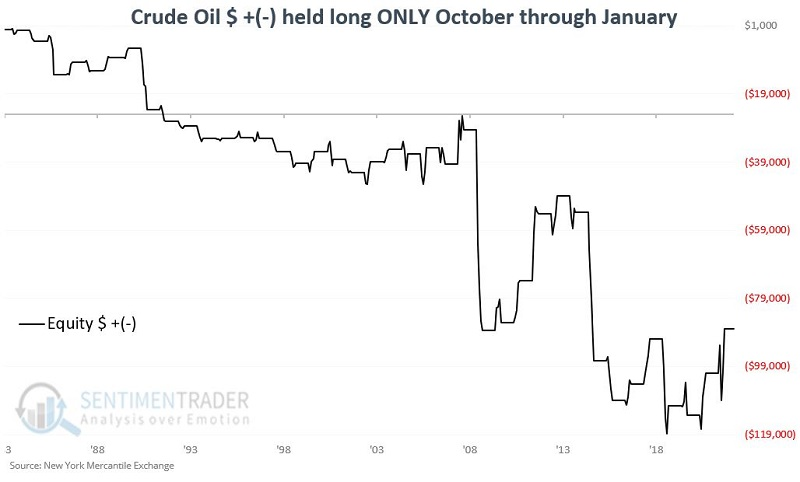
While there were some isolated gains, the trend is down. It gets worse when adding the contract is already in a downtrend.
For our filter, we will compare the month-end price for crude oil to its four-month moving average. If the month-end close is below the four-month moving average, the price trend is unfavorable.
The chart below shows the return on a crude oil contract if held long during those four months and crude oil closed the previous month below its four-month moving average.
The results were essentially neutral through 2006 but have been decisively bearish since. The net hypothetical result is a loss of -$99,200.
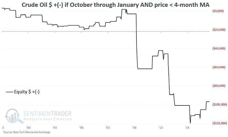
Barring a significant rally, crude oil will begin the month of October 2022 with price in a downtrend, suggesting a bearish setup.
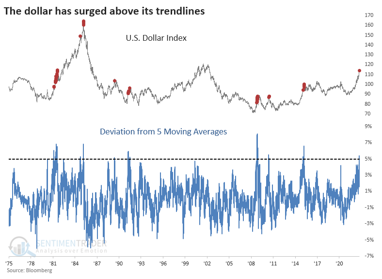
Commodities are struggling thanks in large part to the dollar's massive momentum
With the U.S. dollar being blamed for asset declines (or credit if you're a short-seller), investors are becoming more tuned to its daily wiggles. The number of daily news articles mentioning the dollar has skyrocketed the most in at least five years.
Almost invariably, those "wiggles" have been to the upside. Over five time periods, the dollar's rate of change has reached rarified air. We're looking at 10, 20, 50, 100, and 200 days for these purposes. The buck has jumped nearly 9% over those time frames.
Another slightly different way of looking at this is the dollar's position relative to moving averages over those same time frames. This evens out the extremes somewhat. Even so, the dollar is more than 5% higher than its moving average across those five time frames.
If we average those two studies, we can see how unusual the currency's uptrend has been. The dollar didn't have much more room for a rally during the next 2-4 weeks after all but one of those signals, and that one ultimately reversed hard. Momentum doesn't die easily, though, and even though most of these saw some short-term weakness, all but the 2010 signal witnessed a higher dollar three months later.
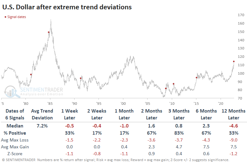
Speaking of persistence, the number of days the dollar has spent above its moving averages is nearing a record. The average number of days the dollar was above its averages, which just passed six months. That's the 2nd-highest persistency in its history.
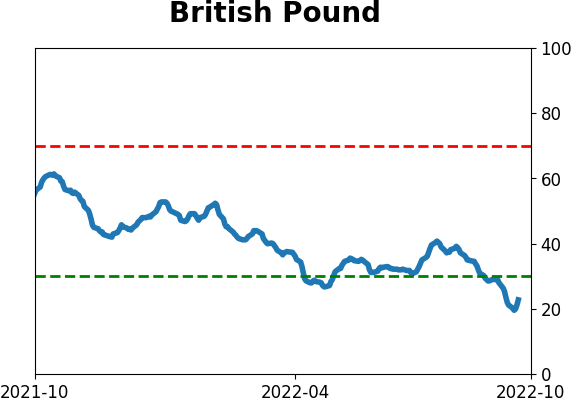
The moves have been so extreme in currencies like the British pound that traders are genuinely panicking. A good way to visualize this is via risk reversals. It shows how much they're paying to protect against extreme moves. The cost of these has spiked in the pound, preceded by declines in the dollar. There is a lot of room for the long-dollar trade to unwind. Large speculators in dollar futures are starting to unwind their positions, which have continued for weeks to months, and keep a cap on further rallies.
About TradingEdge Weekly...
The goal of TradingEdge Weekly is to summarize the research published to SentimenTrader over the past week. Sometimes there is a lot to digest and this summary is meant to highlight the highest conviction or most compelling ideas we discussed. This is NOT the full research that's published, rather it pulls out some of the most relevant parts. It includes links to the published research for convenience; if you don't subscribe to those products it will present the options for access.
Indicators at Extremes
|
|
|
Phase Table
|
|
|
Ranks
|
|
|
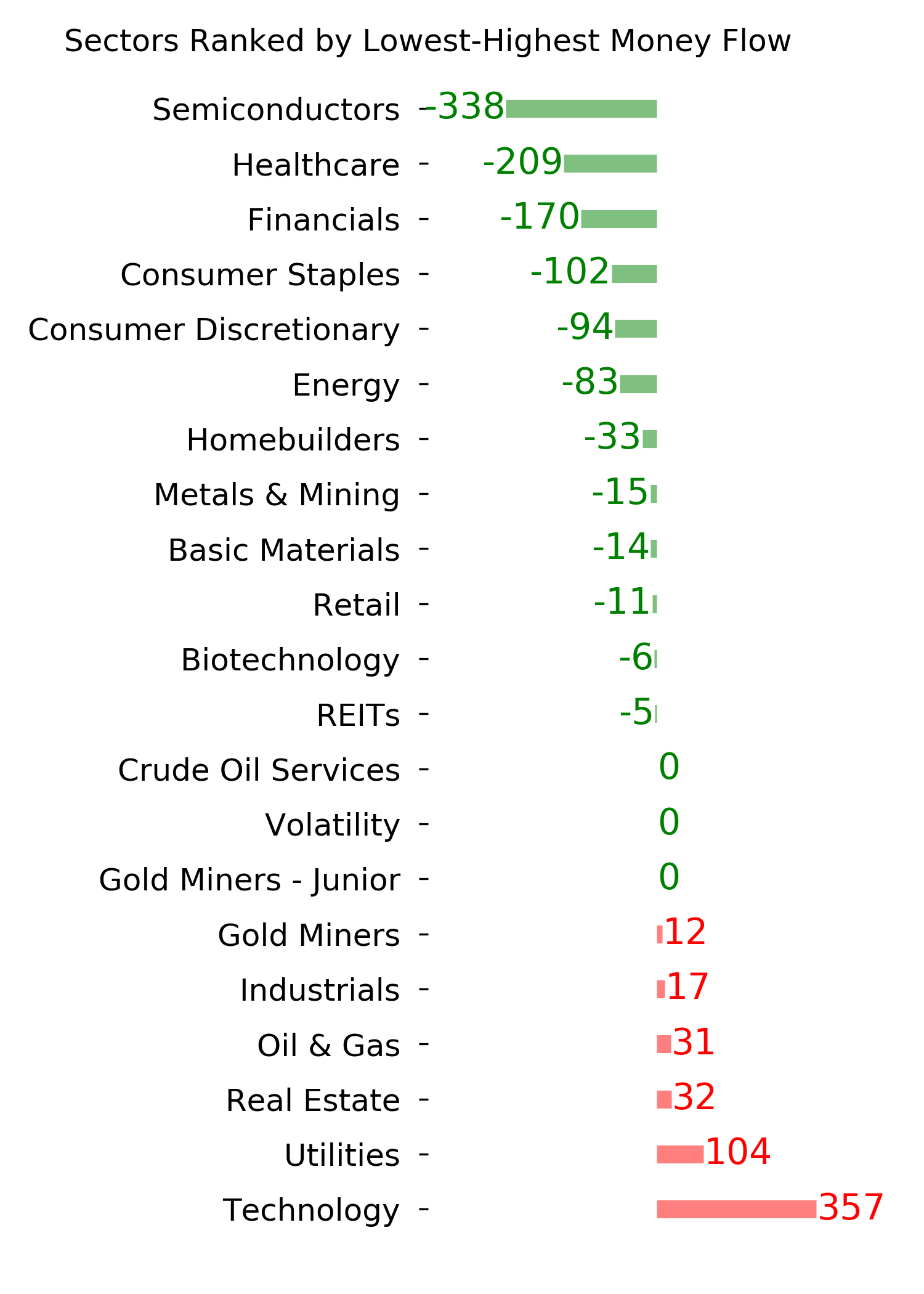
|
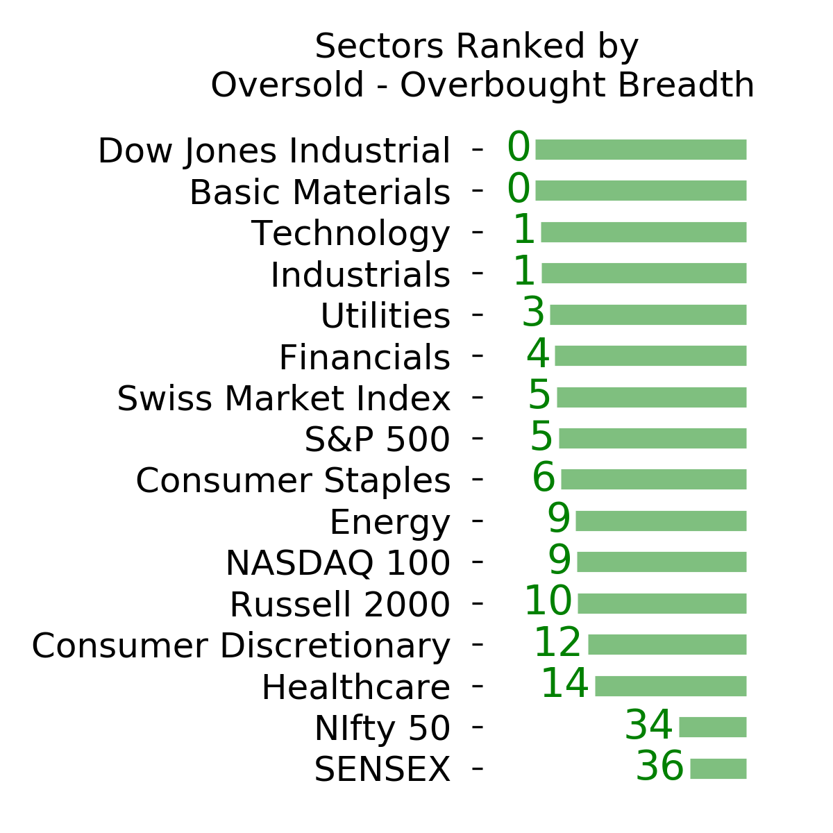
|
|
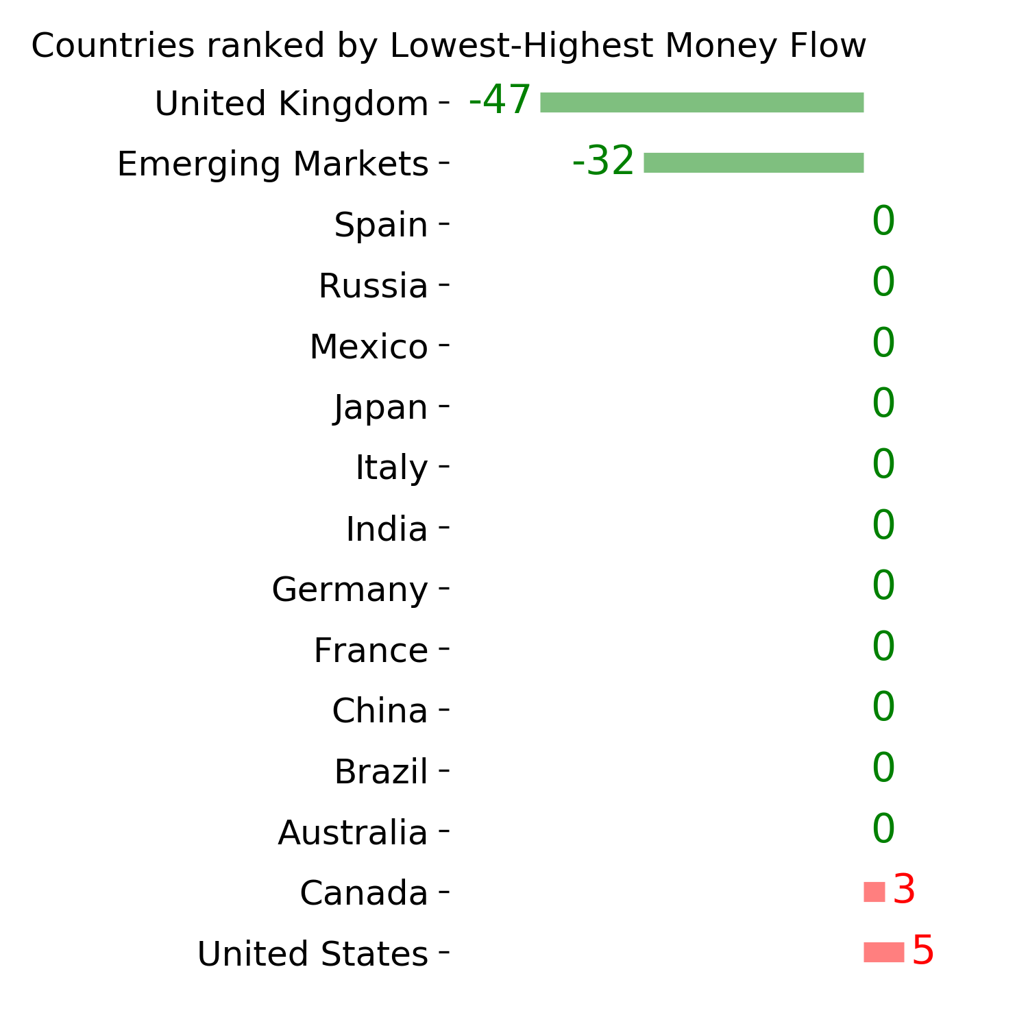
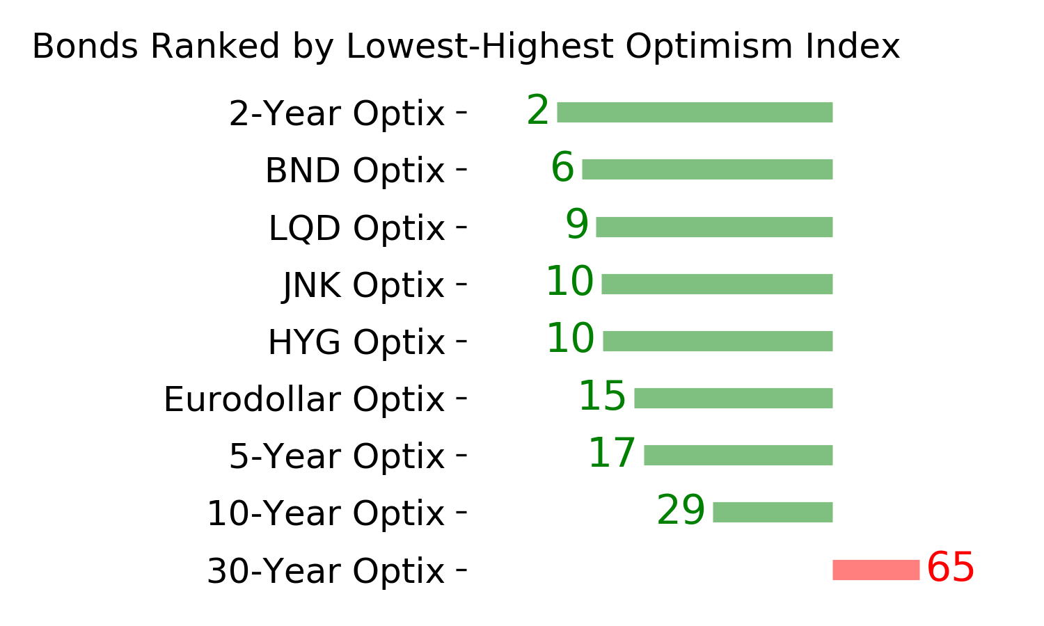
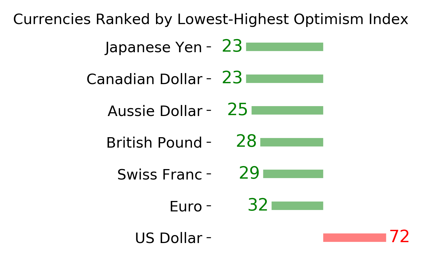
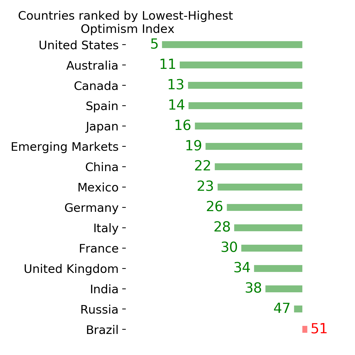
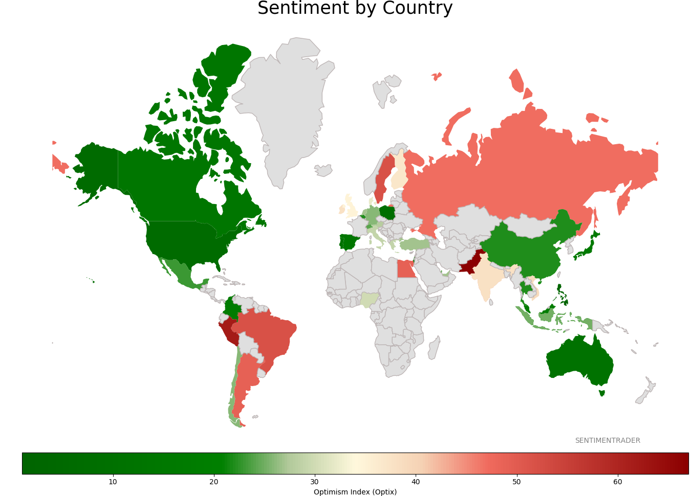
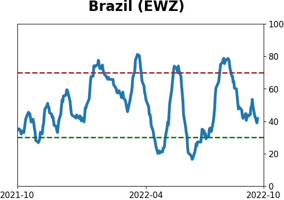
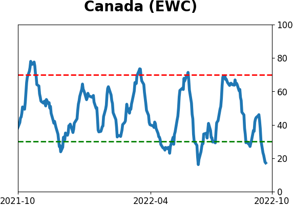
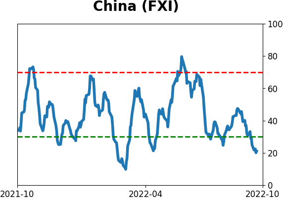
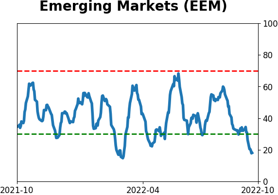
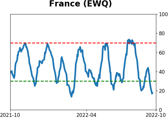
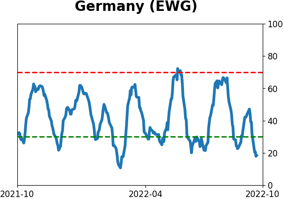
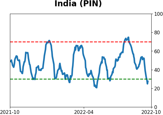
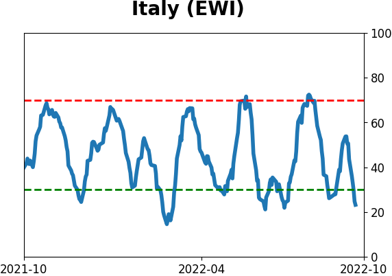
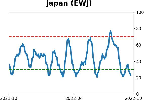
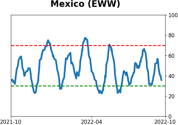
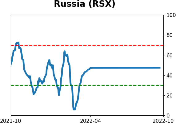
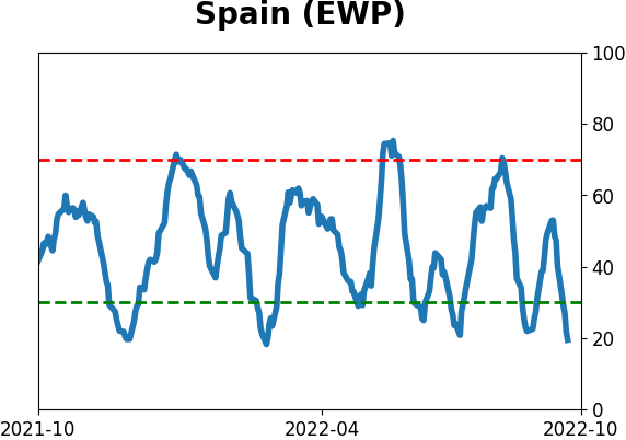
Sentiment Around The World
|
|
|
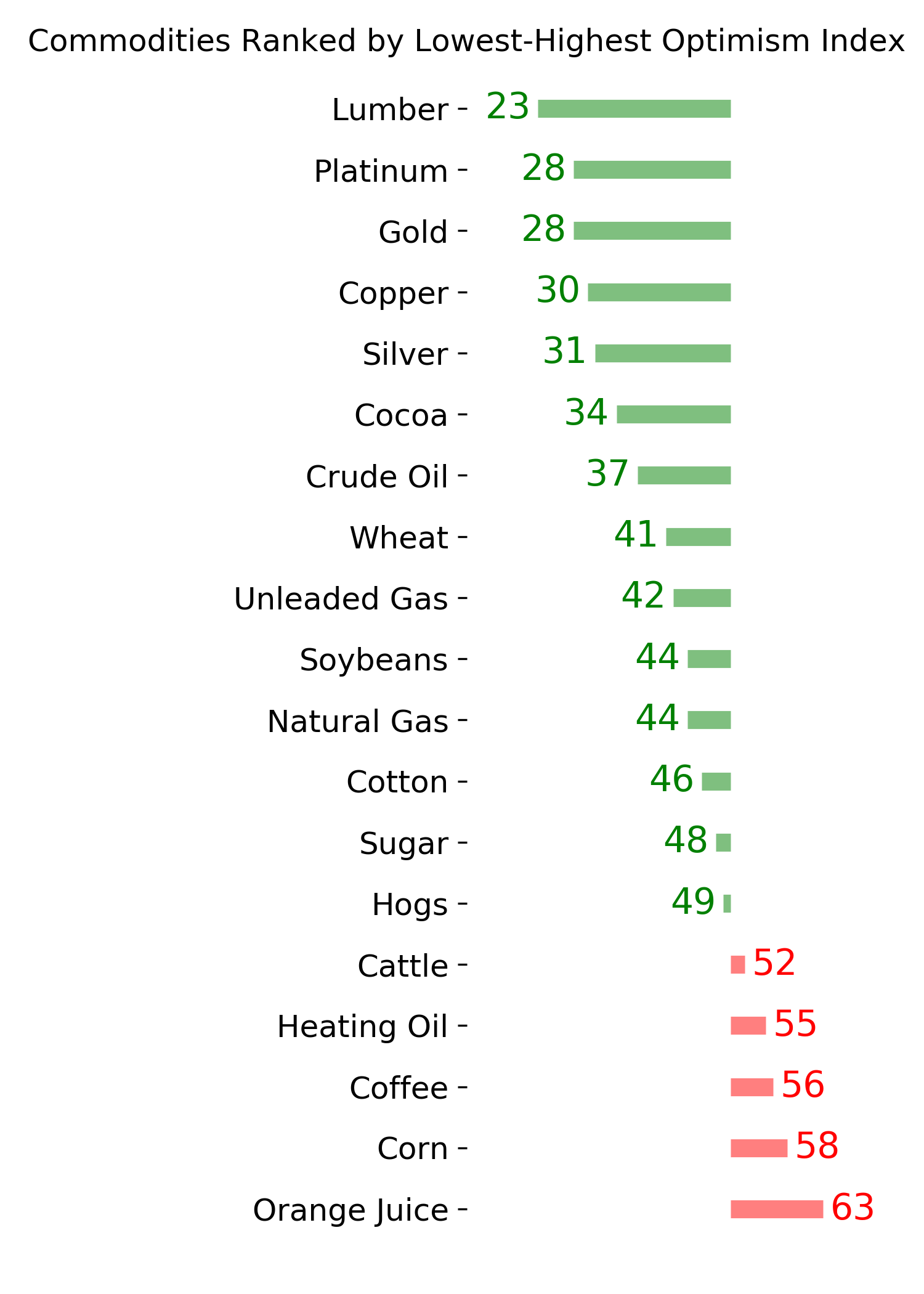
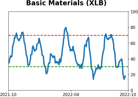
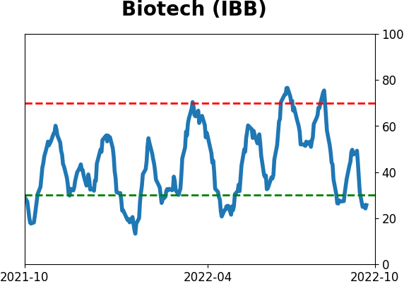
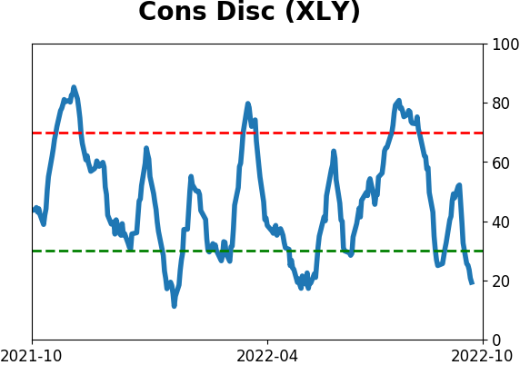
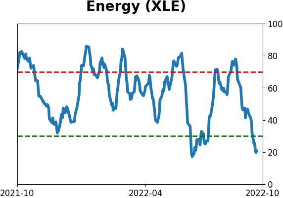
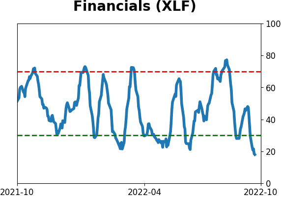
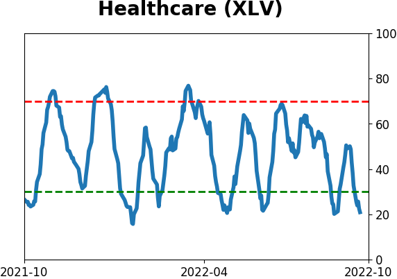
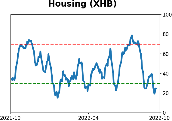
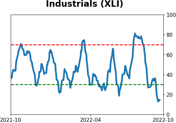
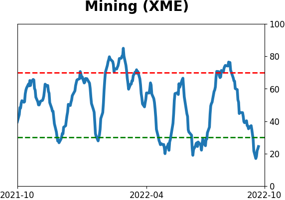
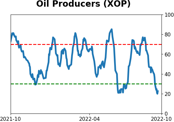
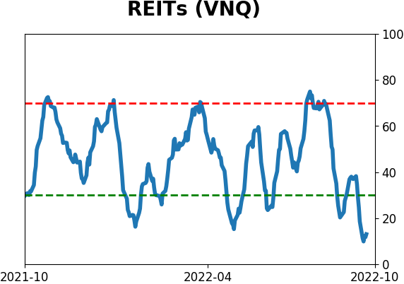
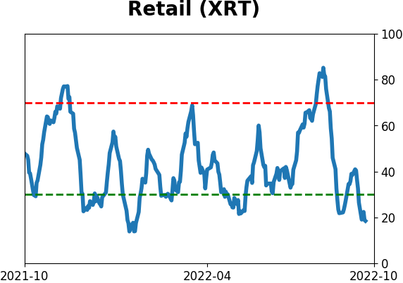
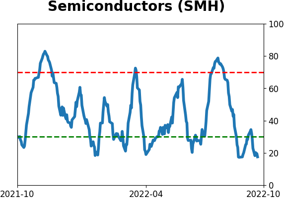
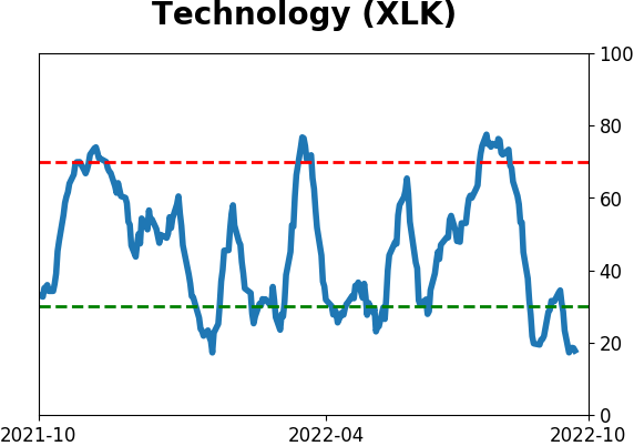
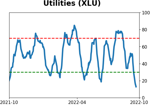
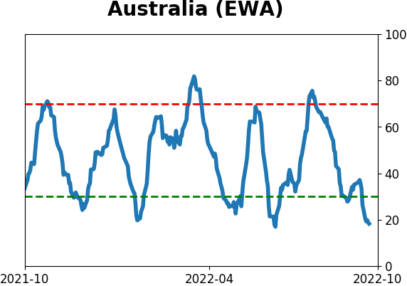
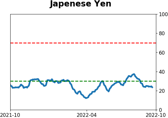
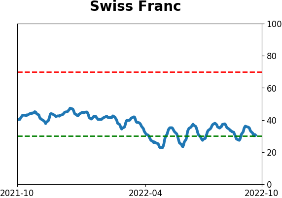
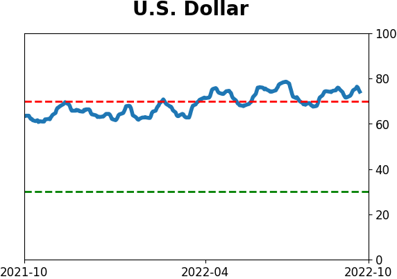
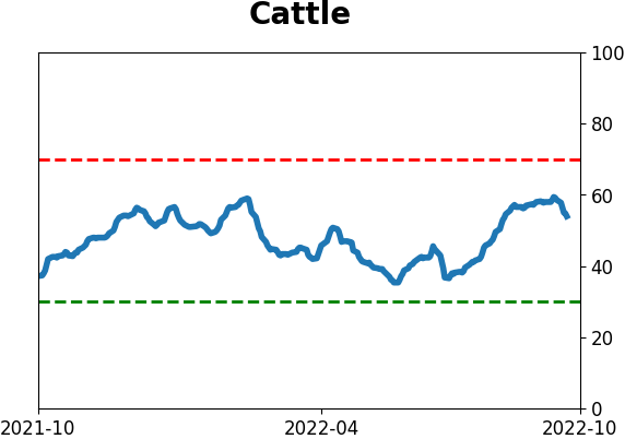
Optimism Index Thumbnails
|
|
|
|
|
|
|
|
|
|
|
|
|
|
|
|
|
|
|
|
|