Daily Report : TradingEdge Weekly for Aug 4 - Momentum milestones, returning confidence, lagging health care

| View/Print a PDF version of this Report |
Headlines
|
TradingEdge Weekly for Aug 4 - Momentum milestones, returning confidence, lagging health care: This week, we saw that the S&P 500 ended a long period in a pullback, with impressive momentum. It was enough to trigger a "2nd quarter trifecta" and pushed the index far above its long-term average. More signs have emerged that confidence has returned among investors and consumers. Health Care has greatly underperformed. |
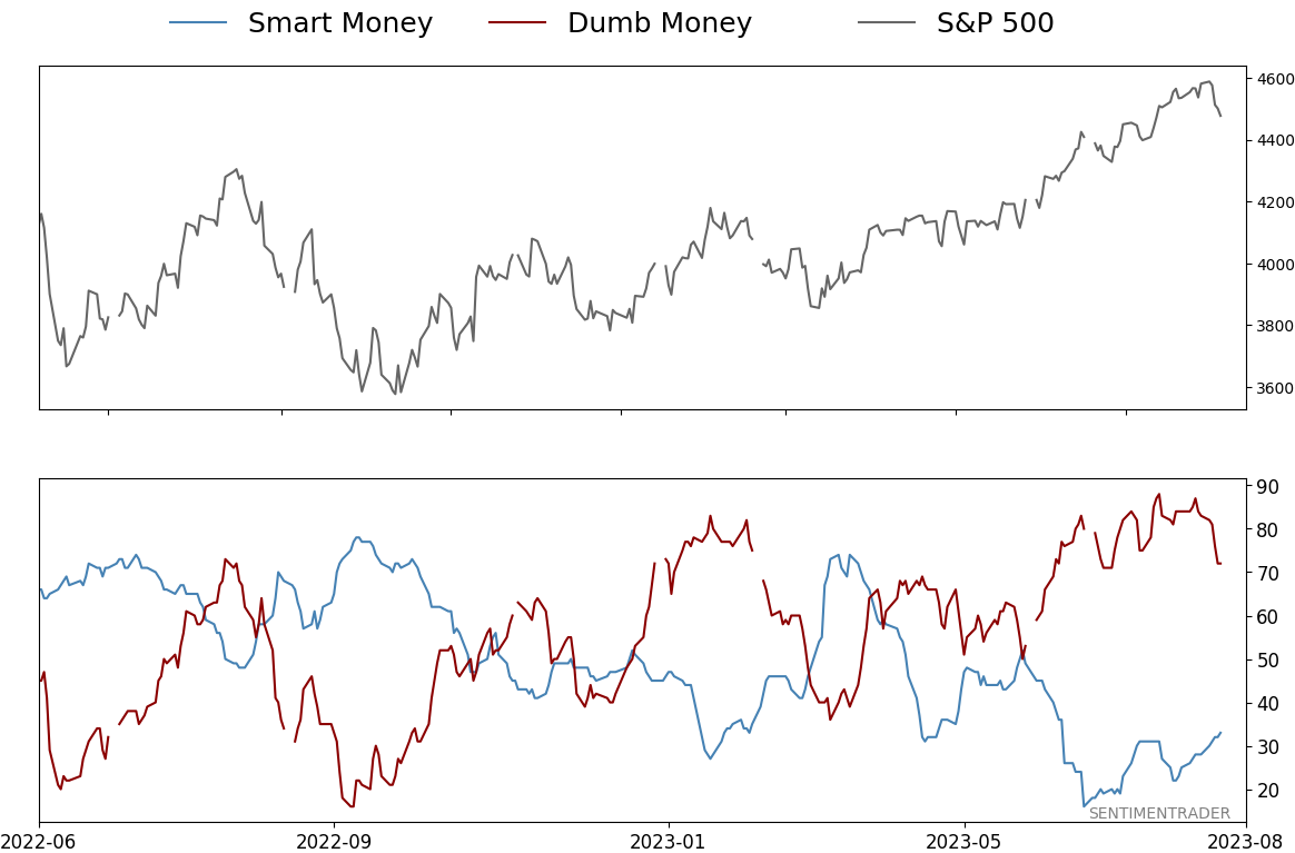
Smart / Dumb Money Confidence
|
|
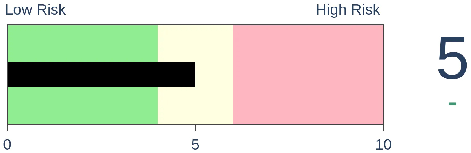
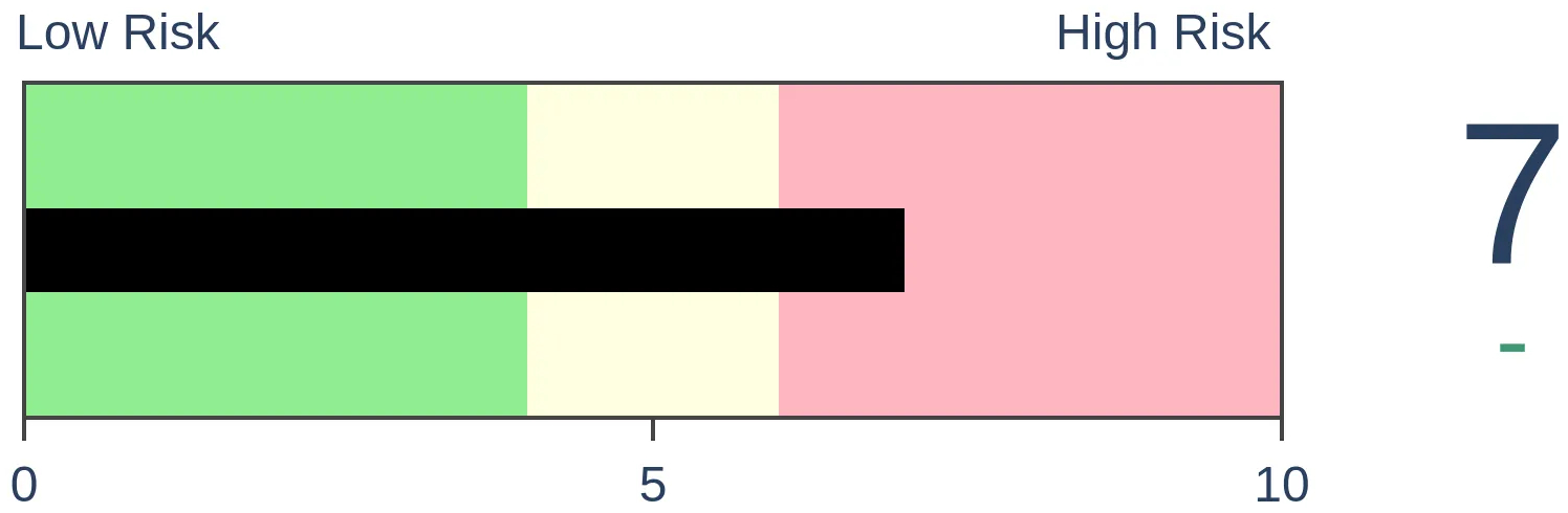
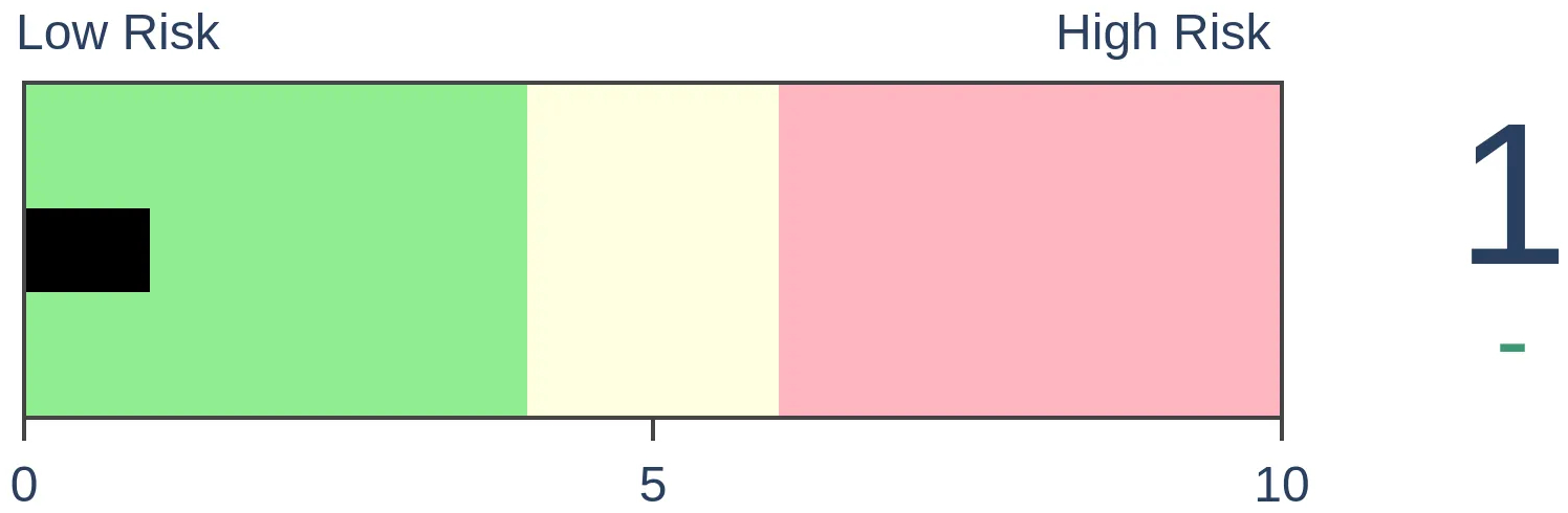
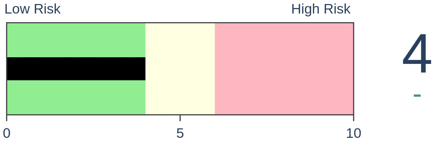
Risk Levels
|
|

|

Research
TradingEdge Weekly for Aug 4 - Momentum milestones, returning confidence, lagging health careBy Jason GoepfertBOTTOM LINEThis week, we saw that the S&P 500 ended a long period in a pullback, with impressive momentum. It was enough to trigger a "2nd quarter trifecta" and pushed the index far above its long-term average. More signs have emerged that confidence has returned among investors and consumers. Health Care has greatly underperformed. FORECAST / TIMEFRAME |
Key points:
- The S&P 500 has ended a very long pullback
- Momentum in the S&P has been impressive, completing a 2nd Quarter Trifecta
- More signs are emerging that investor confidence has returned
- The S&P and Technology sectors are far above their long-term trendlines
- The S&P's long-term average has now risen for 40 straight days
- Emerging markets face a short-term seasonal headwind
- Health Care has massively underperformed the market, and indicators suggest it could continue
- A couple of warning signs for biotech
- A look at the copper/gold ratio and what it means for various markets
The end of a very long pullback
Last week, the most benchmarked index in the world climbed out of pullback territory. That's a subjective term denoting a decline of at least 5% from a recent high. The S&P 500 pulling back to within 5% of its all-time high ended a streak of more than 300 trading days that the index was at least in a pullback.
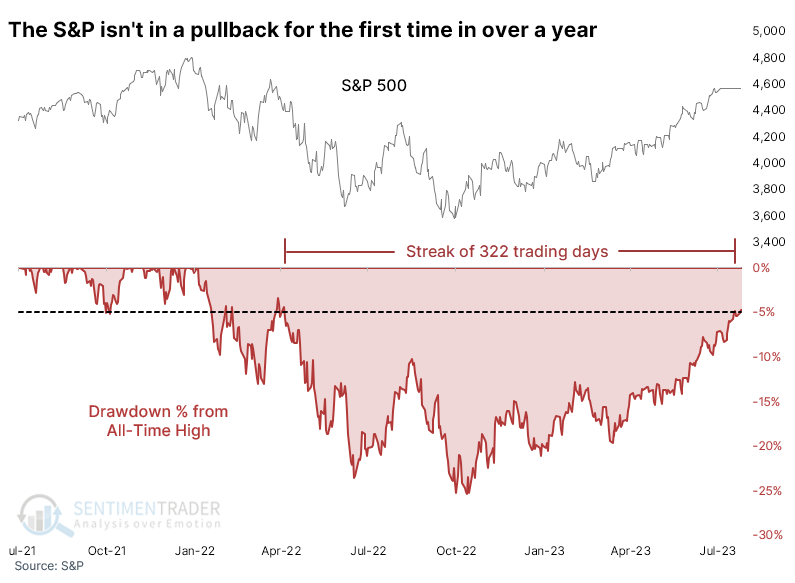
After ending streaks of at least 200 days in a pullback, the S&P took a median of 46 trading days before it closed the remaining gap and closed at a new all-time high. Four signals took longer than that, with two taking longer than 100 sessions.
Still, its returns were quite good in the months ahead, with two losses across most time frames, and only one of those, on one time frame, was double-digits. 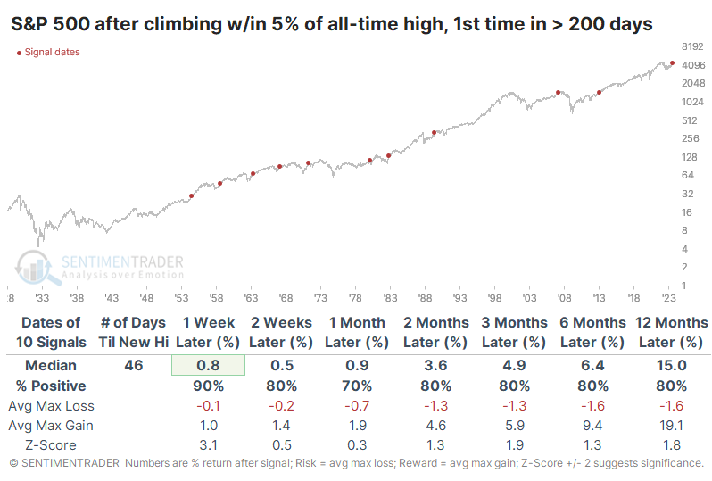
The table of maximum gains and losses across time frames shows how minimal the risk was over the next few months. Only a single signal lost more than -5.6% within the first three months while five signals preceded gains larger than +5.6%.
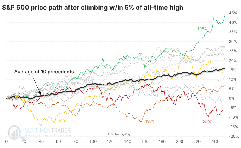
After these signals, the S&P's price path shows a consistent trend from the lower left to the upper right. Three signals lost more than -10% (or nearly so) within the next year, but those were clear outliers.
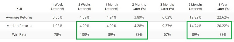
Returns among sectors and factors showed some interesting twists. The 3-month time frame was by far the most consistently positive across all sectors.
A really good run for the most important index
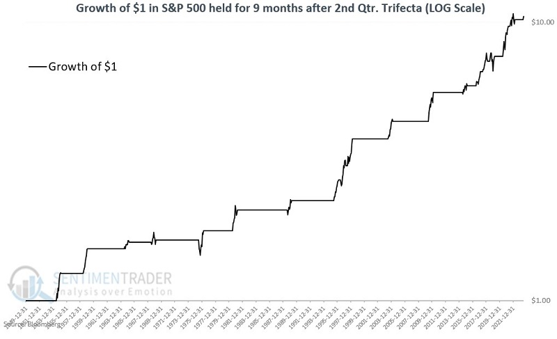
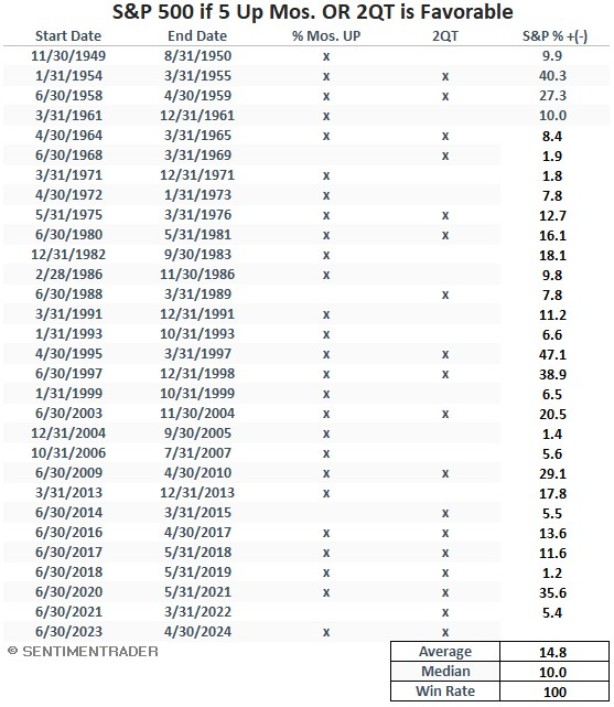
Jay noted that the S&P 500 closed July with a gain, the 5th consecutive up month. During this time, April, May, and June all closed higher, completing a 2nd Quarter Trifecta.
As noted last week, there have been only 29 times when the S&P 500 Index showed a calendar monthly gain for five consecutive months. This has tended to be followed by favorable stock market action over the ensuing nine months.
A 2nd Quarter Trifecta occurs when the S&P 500 shows a monthly gain for April, May, and June during the same year. This tends to be a favorable sign for stocks over the next nine months (i.e., through March of the following year). The chart below displays the growth of $1 invested in the S&P 500 on a logarithmic scale during the nine-month periods following a 2nd Quarter Trifecta.
Next, we will combine the two price patterns and consider all periods when either pattern is triggered. The table below displays all periods when at least one of the price patterns was favorable. It shows the nine months after the 5th consecutive up months for the S&P 500 and/or the nine months after April, May, and June all see the S&P 500 close higher.
The chart below displays the growth of $1 invested in the S&P 500 only during the favorable periods listed in the table above.
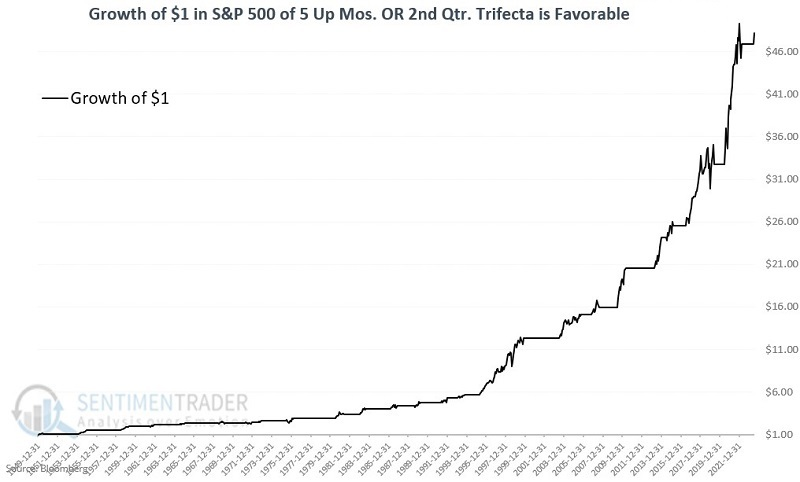
Momentum can be a powerful force in the stock market. The results highlighted above represent a clear case in point.
More signs of returning confidence
Dean noted that the net percentage of consumers expecting stocks to increase in the months ahead cycled from < -19% to 8%. Similar reversals in consumer expectations for stock prices preceded excellent returns for the S&P 500.
After falling to the 5th lowest reading in history, the Conference Board's net percentage of consumers expecting stocks to increase minus decrease rose to 8%. The survey, which measures 3000 households, confirms what we have seen from several other sentiment indicators: a reversal from pessimism to optimism.
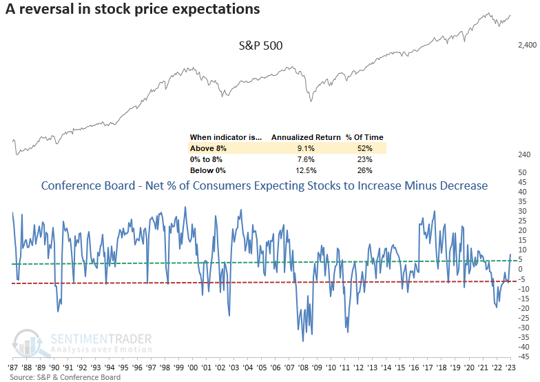
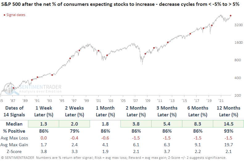
When the spread for consumer expectations on stocks cycles from less than -5% to greater than 5%, returns, win rates, and z-scores for the S&P 500 are excellent. A year later, the world's most benchmarked index was higher in all but one precedent. A year later, the risk/reward skew was astonishing as the median gain far surpassed the median loss.
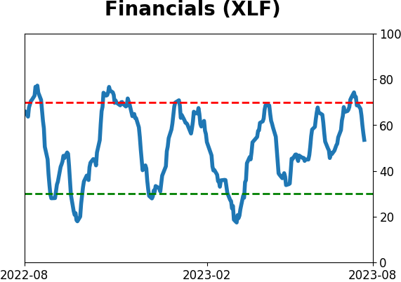
History suggests sentiment shifts like the one occurring now are favorable for the Consumer Discretionary and Technology sectors, aligning with bullish relative trends for those groups. While Financials do well, the industry is struggling on a comparable basis.
The National Association of Active Investment Managers (NAAIM) exposure index crossed above 100% for the first time in a year. The index measures the average exposure to US Equity markets reported by members and can range from 200% long to -200% short.
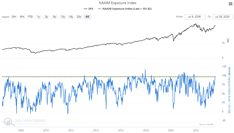
While the sample size is small, when the exposure index crosses above 100% for the first time in a year, the S&P 500 consistently rises over the next year. Moreover, despite being fully invested, stocks tend to follow through in the near term, with a 100% win rate two weeks later.
Far above long-term trendlines
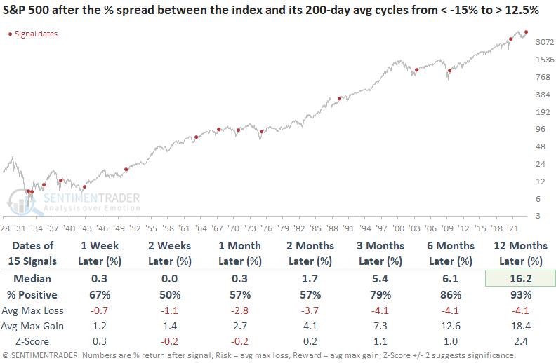
The S&P 500 cycled from an extremely oversold condition to an overbought one. Dean showed that after similar oversold-to-overbought reversals, the S&P 500 was higher 93% of the time over the next year. When Technology shifted from oversold to overbought, like now, it was higher a year later every time.
The S&P 500 fell 17.1% below its 200-day moving average in June 2022 and subsequently reversed higher, increasing 12.8% above the average a little over a week ago.
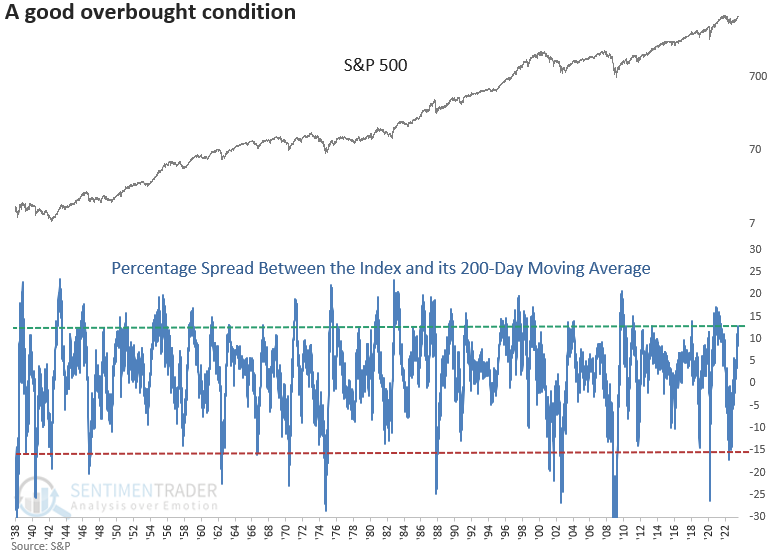
When the S&P 500 transitioned from 15% below its 200-day moving average to 12.5% above, the index was higher a year later in all but one instance, and it showed a gain at some point every time. Based on the returns and win rates over the next month, the evidence favoring a brief overbought pullback scenario lacks overwhelming support.
The Technology sector fell 20.9% below its 200-day moving average, creating the most oversold condition since the GFC. It subsequently reversed higher, increasing to 28.6% above the average as of 2023-07-18.
In contrast to the S&P 500, there is a more compelling case for a consolidation or pullback in the first month, a trend that has already surfaced within the first week. Nevertheless, the sector has consistently rallied one year later in all nine previous instances. Let's adjust the overbought threshold to 25% to increase the sample size. Similar to the original study, the results suggest a near-term digestion period, followed by a continuation of the bullish price momentum over the coming year.
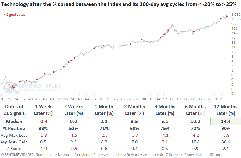
Buying these overbought conditions led to much better returns than buying oversold ones. The sector's median six-month return after falling more than 20% below its 200-day average was -6.4%.
Two months above the long-term average
Dean further noted that because of the impressive push above its 200-day moving average, the S&P 500's average has now risen for 40 consecutive trading days. It is reaching a level that has historically foreshadowed an all-clear sign for stocks.
Whether we analyze short-term, medium-term, or long-term trends, one consistent feature of uptrends is the continuous upward movement of moving averages, distinguishing them from downtrends and broad consolidations.
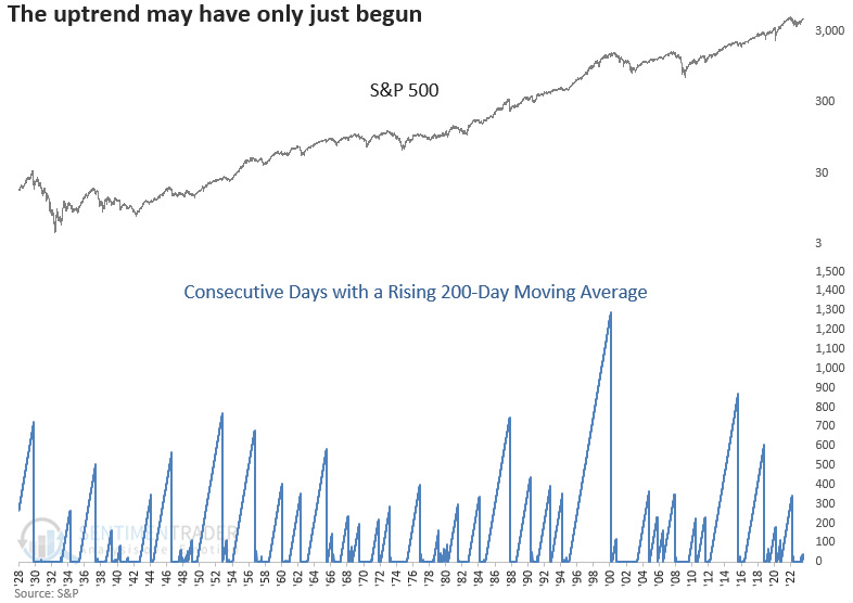
Suppose we buy the S&P 500 every time the 200-day moving average rises for 40 consecutive trading days, like now, and hold until the slope of the average turns negative. In that case, the 200-day average remained positive for a median duration of 232 trading days.
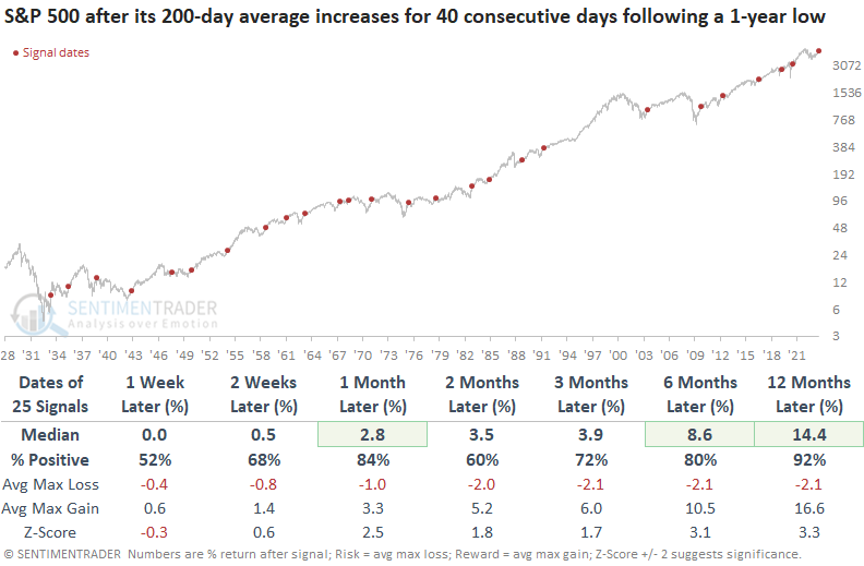
To better understand the current market context, let's analyze signals that occurred after the S&P 500 closed at a 1-year low, creating a similar reference point. A persistent rise in the 200-day moving average after a 1-year low produced excellent results for the S&P 500. A year later, the world's most benchmarked index was higher in all but two cases. Significant drawdowns over the next three months were minimal, with only one max loss exceeding -10%
An emerging seasonal headwind
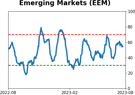
Emerging markets have been showing signs of strength of late. However, in the case of emerging markets, Jay noted that traders should remain alert to signs of a reversal.
The iShares MSCI Emerging Markets ETF (ticker EEM) has once again poked its head above a critical long-term resistance level. The good news is that the price has moved above the 200-day moving average, and the 200-day moving average has begun to rise. However, there are two reasons to be wary. There is a recent resistance level at $42.53 and the other potential fly in the ointment regards EEM seasonality.
For that fund, there is a period of seasonal weakness that extends from the close on Trading Day of Year #145 through TDY #160. For 2023 this period extends from the close on 2023-08-01 through the close on 2023-08-22. The chart below displays the hypothetical cumulative % +(-) from holding a long position in EEM only during this unfavorable period every year since 2003. The cumulative result is a loss of -38.7%.
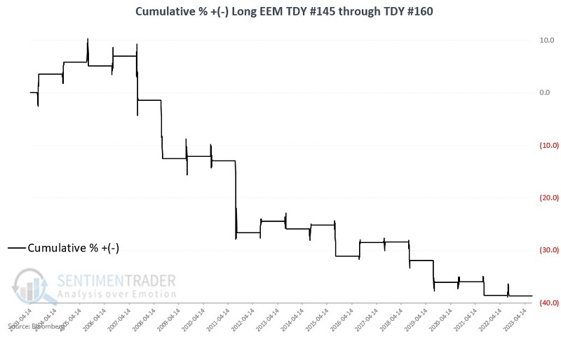
Over 20 years, the fund showed a gain 40% of the time, with an average negative return far greater than the average positive return. It lost more than -5% during seven years while rallying more than +5% only once.
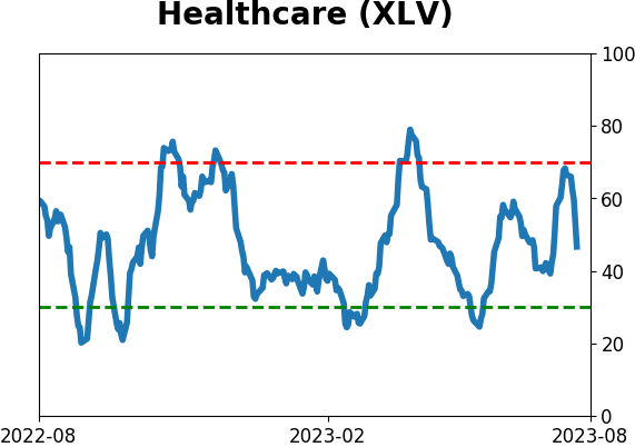
Health Care is lagging badly
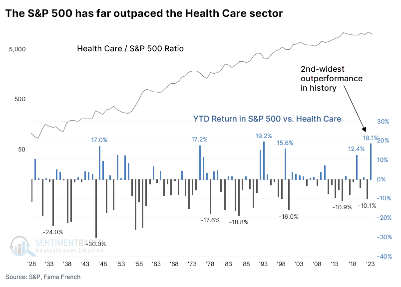
This year has been healthy for the S&P 500 but not so much for its Health Care sector. Out of the major sectors, Health Care has the fewest percentage of members trading above their 200-day moving averages.
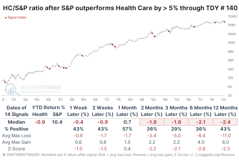
Because of the differences in fortunes, the broader S&P index has outperformed the Health Care sector by nearly 20% year-to-date.
Through this many trading days of the year, this is the 2nd-widest spread in performance since 1928. With the broad S&P index outperforming Health Care by more than 18%, only 1993 saw a larger outperformance by the index, and that was because the index gained slightly while investors sold Health Care heavily.
For the broad S&P 500, these bouts of outperformance tended to be a good sign, with above-average returns across almost all time frames. While its returns over the next three months were unimpressive, the index was higher 86% of the time by six months later. Every signal since the index became a 500-stock index showed a gain over the next six months.
For the Health Care sector, it wasn't such a rosy story. There was not much mean-reversion after the stocks underperformed the index by so much. Over the next six months, the sector gained only 43% of the time, with a negative median return and average risk of more than -9%.
The ratio of the S&P 500 to the Health Case sector shows this relationship more clearly. The sector's relative returns were inferior over the next two to six months, with a low win rate, poor median return, and an unappetizing risk versus reward profile.
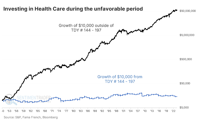
Among other challenges, while it's not a primary consideration, seasonality for the sector is about to enter its worst stretch. August and September for the XLV fund have not been particularly kind.
On a log scale, we can see that since 1950, investing during the weak seasonal window treaded water while the sector consistently made headway during the rest of the year. The "other" window should vastly outperform because it encompasses many more trading days, but one didn't miss much by staying out during the roughly 50-day seasonally weak periods.
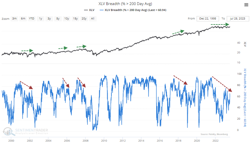
Even though the XLV fund has been making some headway, the percentage of stocks in the sector in long-term uptrends hasn't broken out. There is a divergence in the percentage of stocks in the sector that have managed to hold above their 200-day moving averages.
Investors have given up, with XLV suffering an outflow of more than $125 million per day over the past month. And after spiking to one of the highest levels in over a decade earlier this year, the put/call ratio of members in the sector has dropped dramatically and is hovering near the lowest level in over a year.
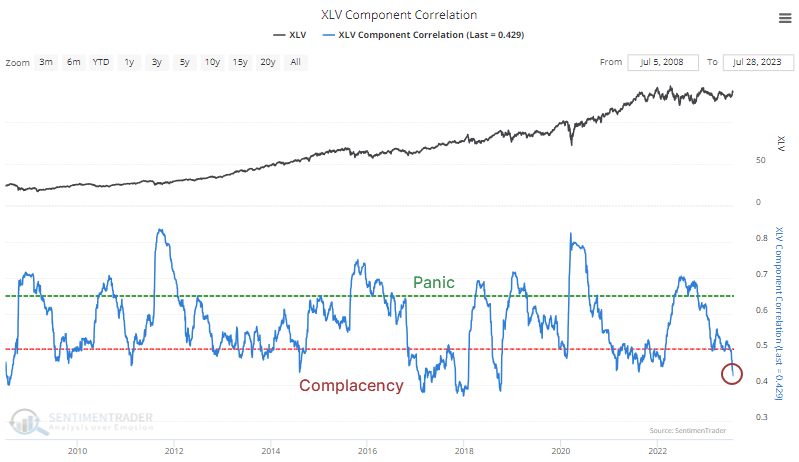
The correlation among stocks in the sector has plunged, suggesting investor confidence in stock picking. When correlations decrease, investors are more comfortable considering each stock's potential, with less concern for broad declines. The correlations have recently declined to the lowest since October 2018 as the sector peaked.
Corporate insiders have not been eager to buy as the Buy/Sell Ratio remains stuck near the lower end of its historical range. A spike in buying interest tends to be a consistently helpful bullish signal. Spikes in selling pressure are less consistent as a bearish signal but can still be useful. The current level isn't extreme, though for bulls, it would be better to see the smart money more interested in their shares.
Biotech blues
Biotech has entered a short, unfavorable time of year. Jay also noted that the sector has tended to perform poorly when Stock Risk Levels are high.
The annual seasonal trend for iShares Biotechnology ETF (IBB) shows a period of weakness that extends from the close on Trading Day of Year #145 through TDY #159. For 2023 this period extends from the close on 2023-08-1 through the close on 2023-08-21. The chart below displays the hypothetical cumulative $ +(-) from holding a long position in IBB only during this unfavorable period every year since 2001.
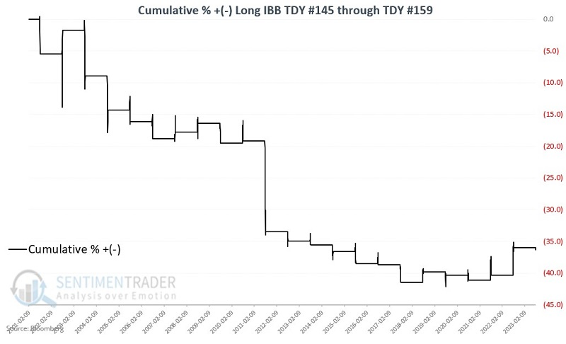
The fund managed to gain only 32% of the time during these windows, with an average loss of about twice the size of the average gain.
Signs of excessive risk-taking are also a warning sign for a speculative sector. Our Medium-Term Risk Levels indicator is heavily based on the spread between the Smart and Dumb Money Confidence indexes. The chart below highlights when the Medium-Term Risk Levels indicator was equal to nine versus IBB.
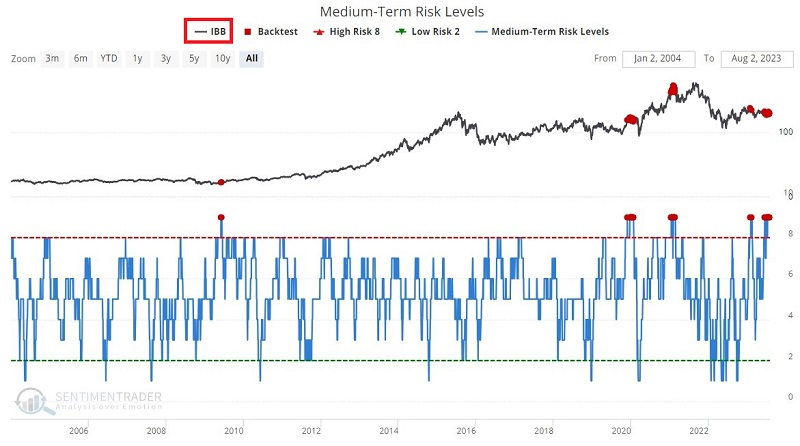
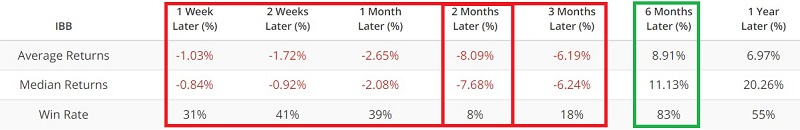
The sample size is small, so this should not be as some trading signal. Still, Average and Median Returns are negative for each time frame out to three months. Two months have shown only an 8% Win Rate. Combined with the unfavorable seasonality above, this suggests short-term caution in biotech.
Copper/Gold ratio shows signs of bottoming
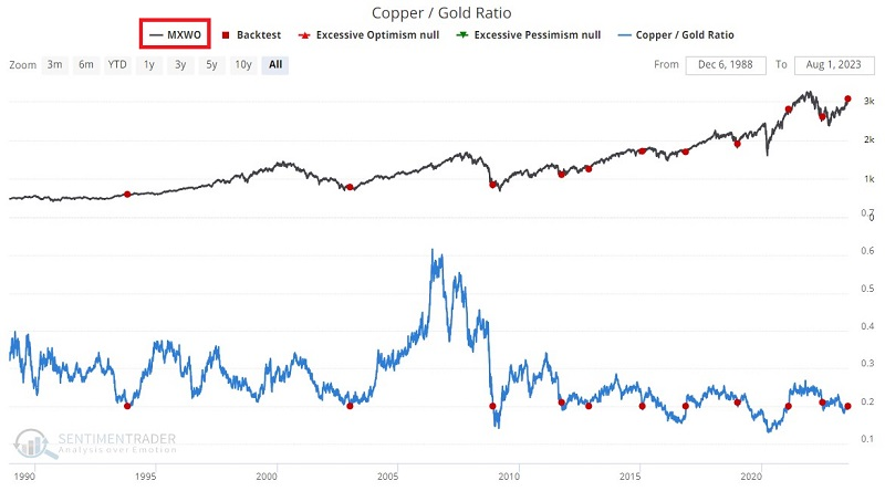
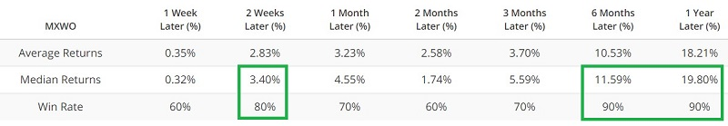
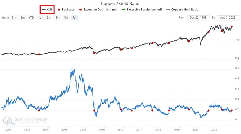
Jay noted that the Copper/Gold Ratio just jumped and for some markets, specific actions in the Copper/Gold Ratio seem to matter a lot.
Jeffrey Gundlach, CEO of DoubleLine Capital LP, has popularized the Copper / Gold Ratio. It shows the relationship between a critical industrial metal and the most widely followed precious metal.
For our test, we will look at those times when the Copper/Gold Ratio crossed above 0.202 for the first time in 12 months, as it did on 2023-07-31.
The chart and table below display Copper futures performance following the abovementioned signal.
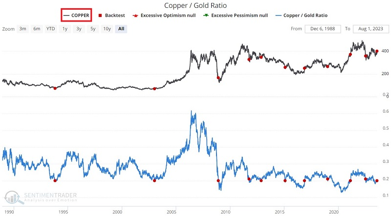
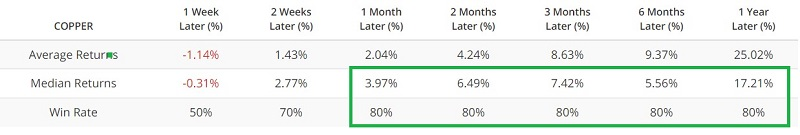
Copper showed a strong tendency to rise, as did the broader commodity complex.
30-year Treasury prices, on the other hand, strongly tended to decline after these signals, as did the Japanese yen. Stocks mostly rose, including those outside the U.S.
Jay showed returns for most of the major U.S. sectors after these signals. Basic Materials, which have the highest exposure to the metals, tended to rise with strong returns across time frames.
About TradingEdge Weekly...
The goal of TradingEdge Weekly is to summarize some of the research published to SentimenTrader over the past week. Sometimes there is a lot to digest, and this summary highlights the highest conviction or most compelling ideas we discussed. This is NOT the published research; rather, it pulls out some of the most relevant parts. It includes links to the published research for convenience, and if you don't subscribe to those products, it will present the options for access.
Indicators at Extremes
|
|
|
Phase Table
|
|
|
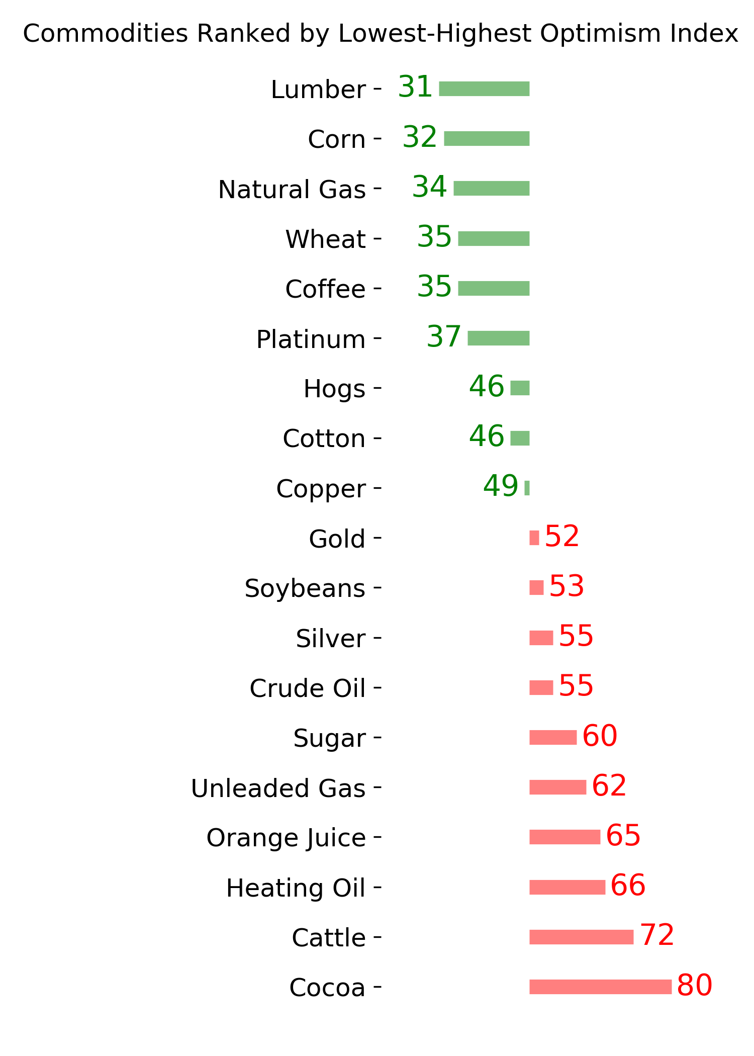
Ranks
|
|
|
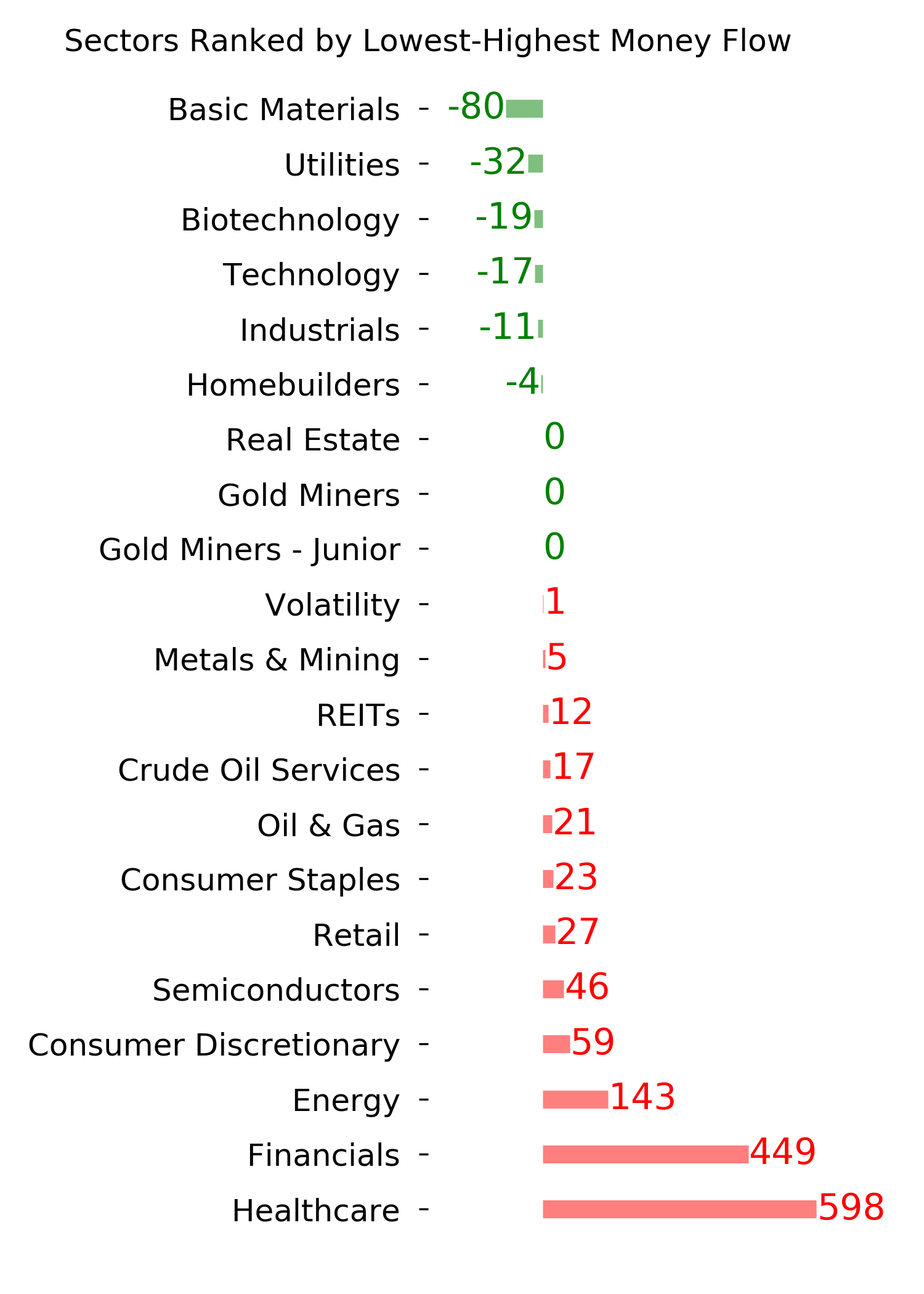
|
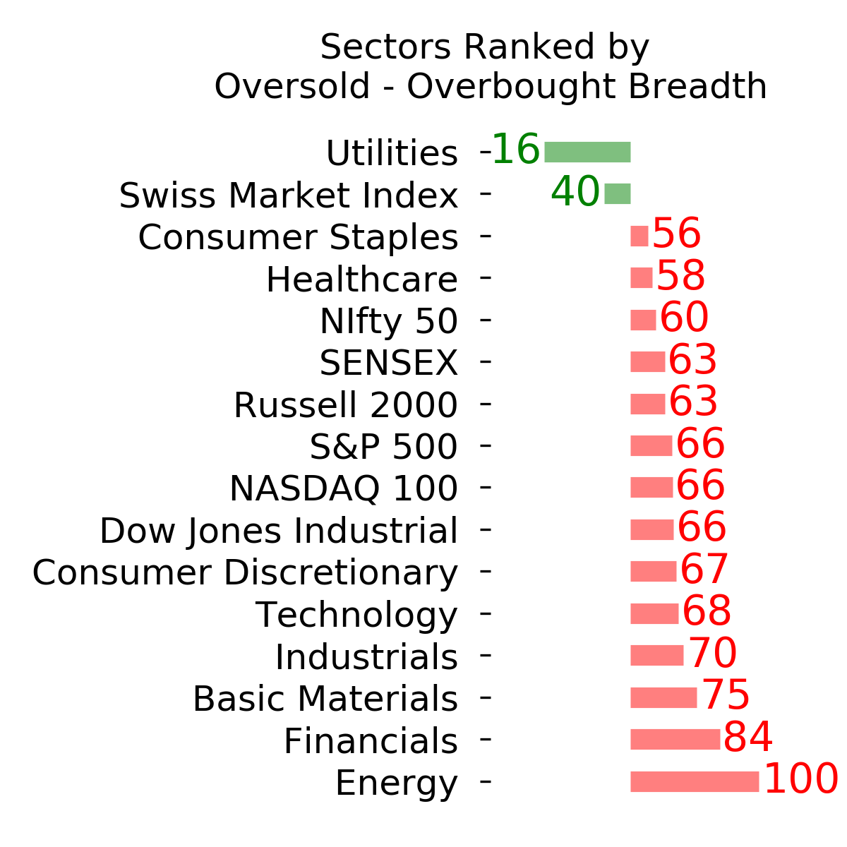
|
|
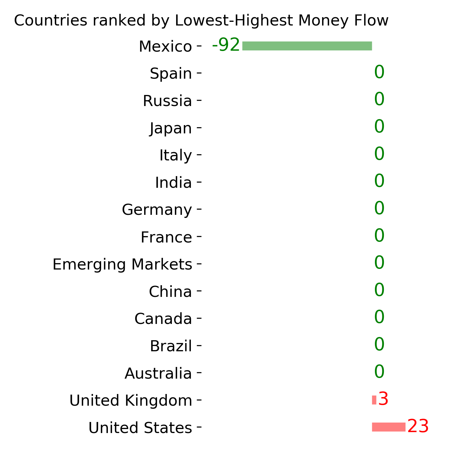
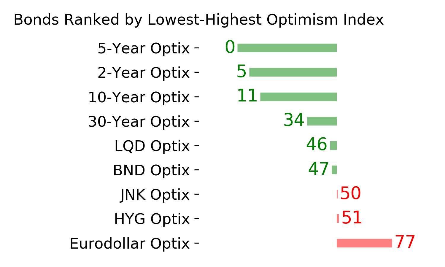
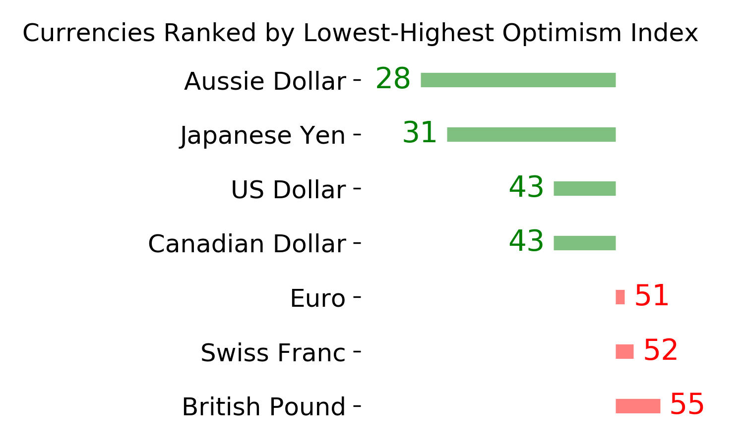
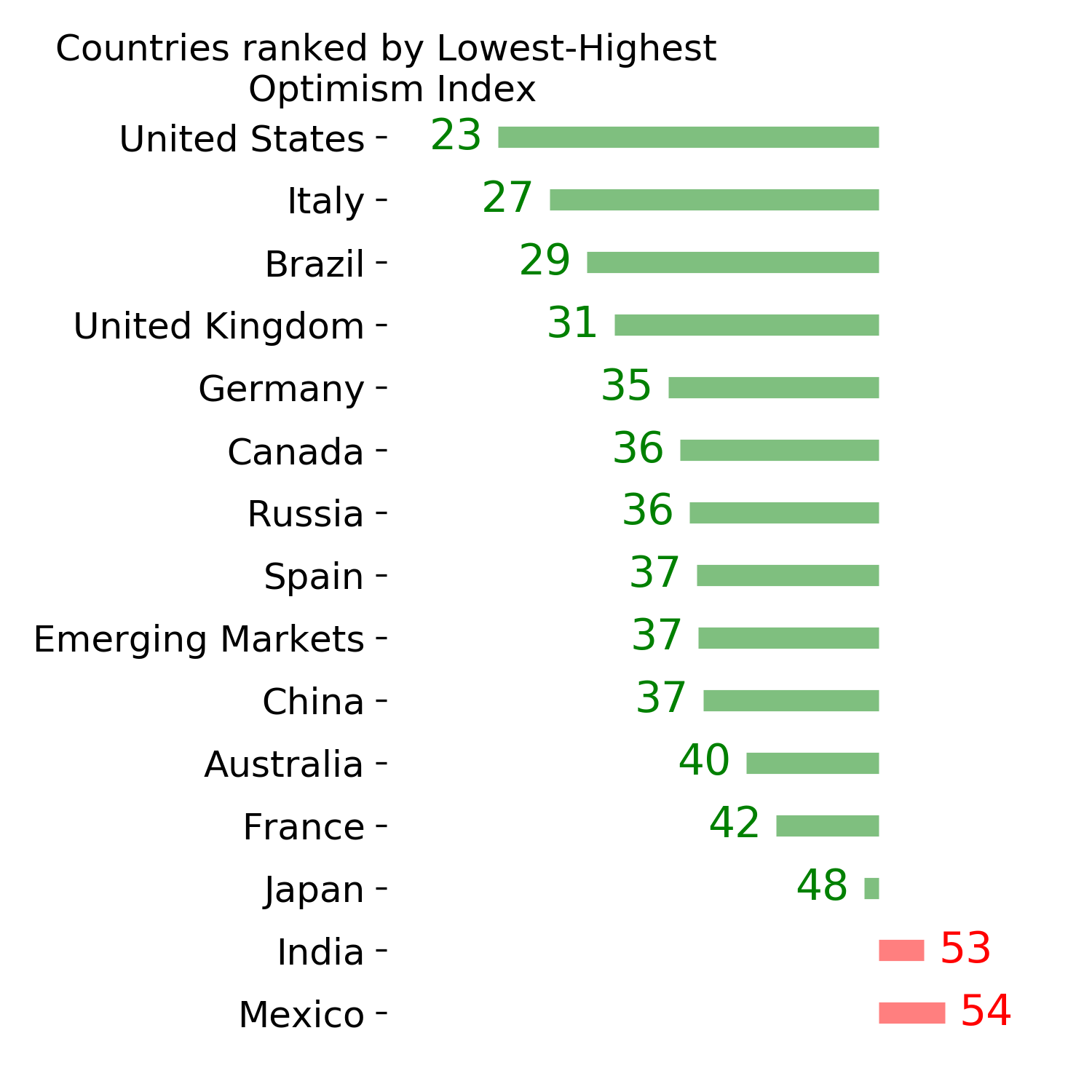
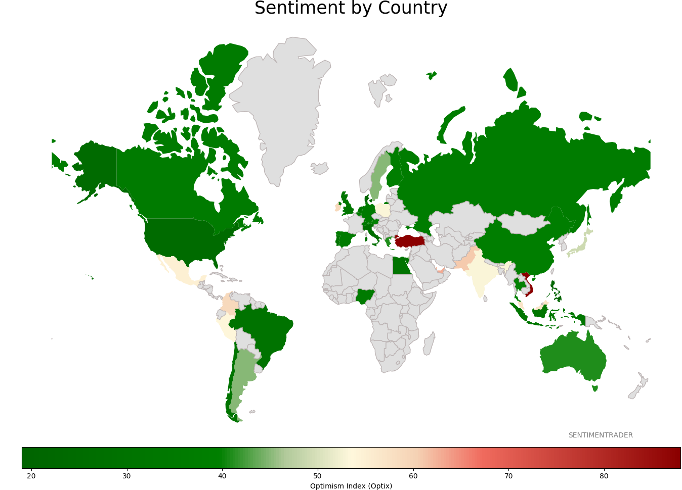
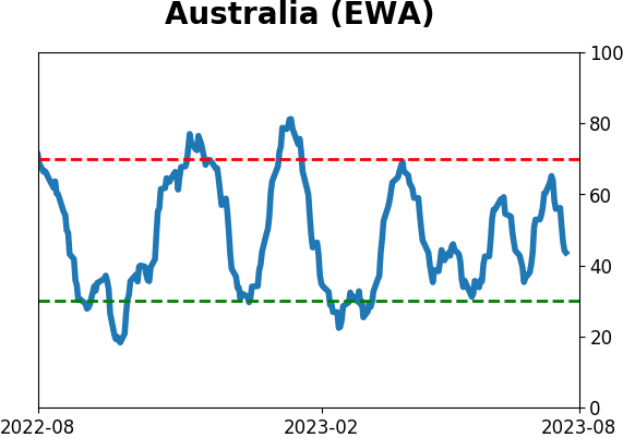
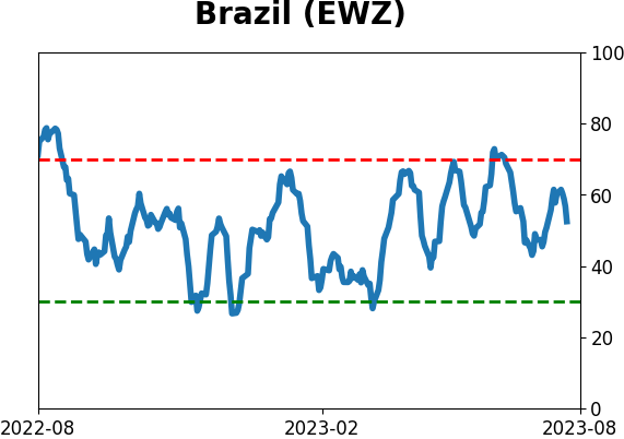
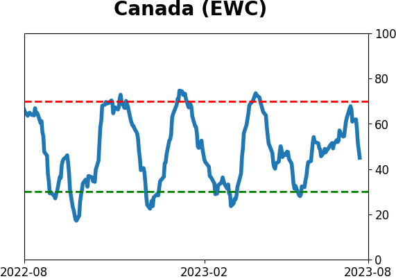
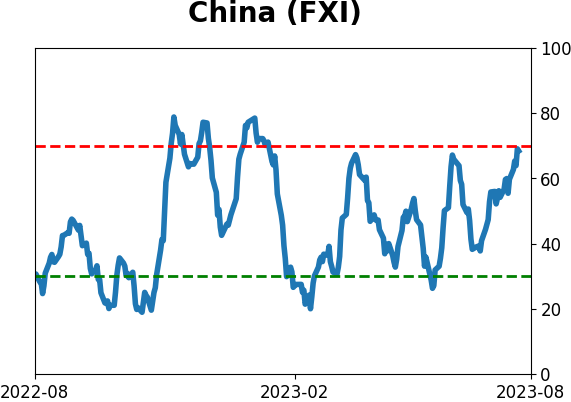
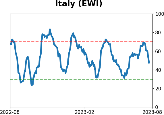
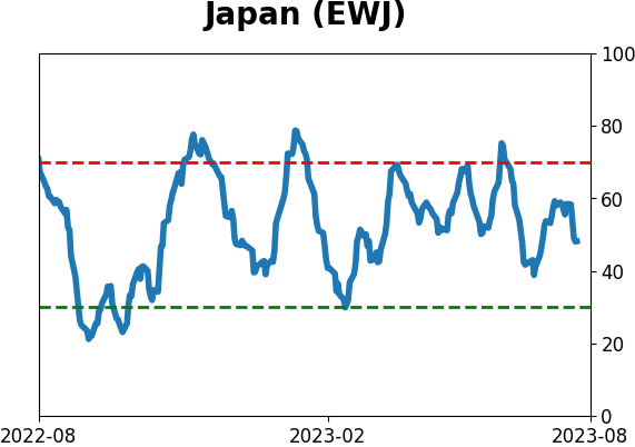
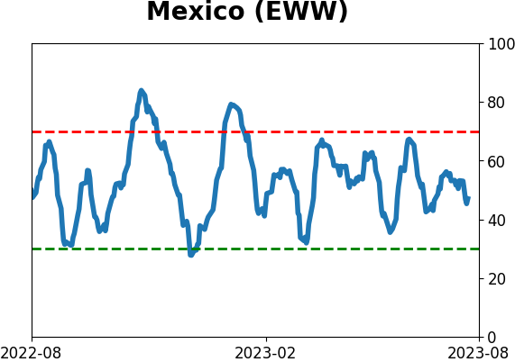
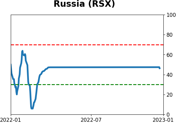
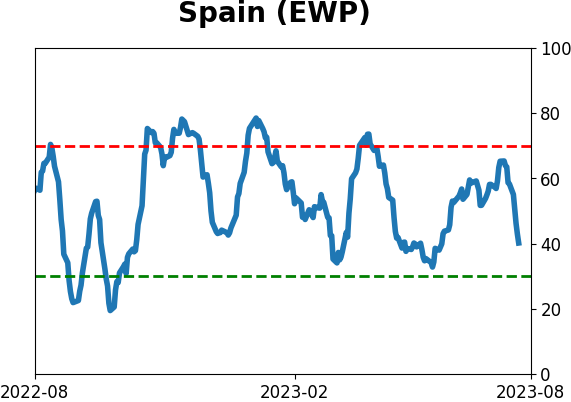
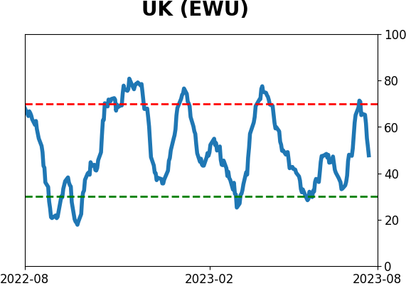
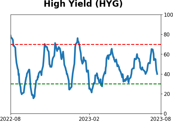
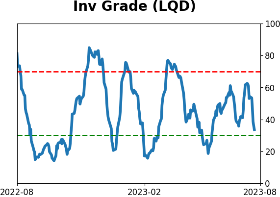
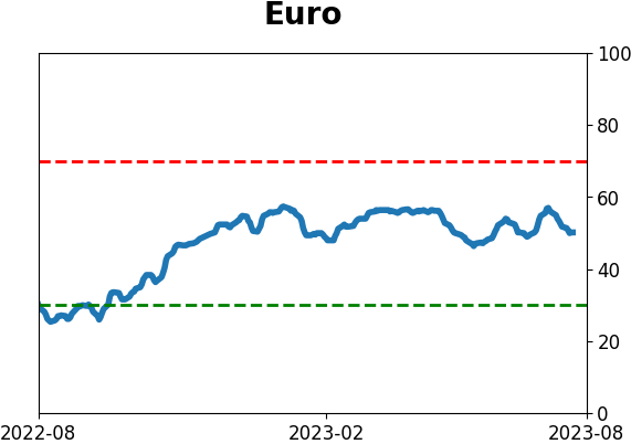
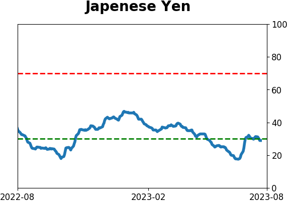
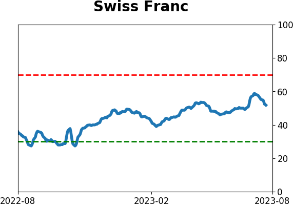
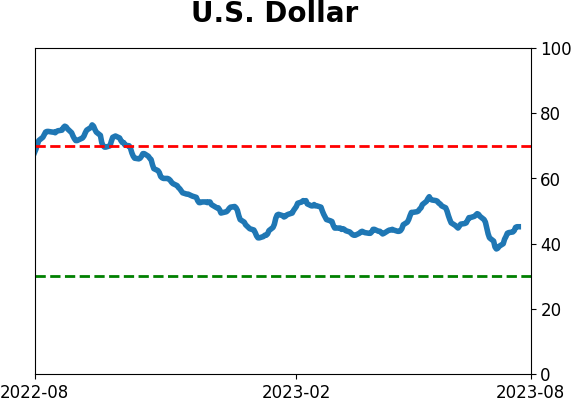
Sentiment Around The World
|
|
|
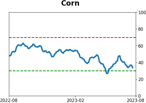
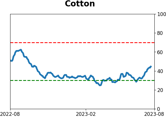
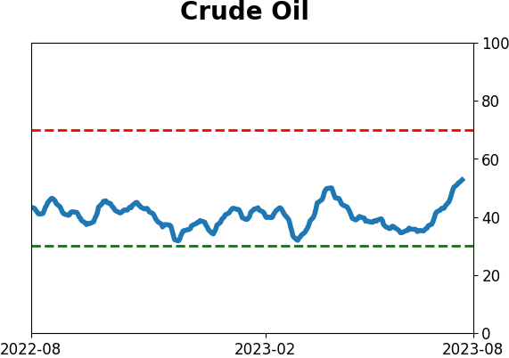
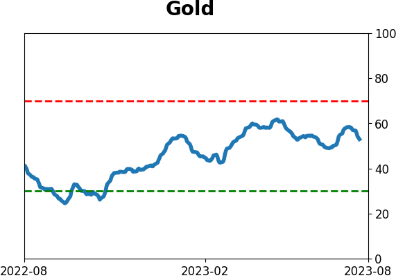
Optimism Index Thumbnails
|
|
|
|
|
|
|
|
|
|
|
|
|
|
|
|
|
|
|
|
|