Headlines
|
|
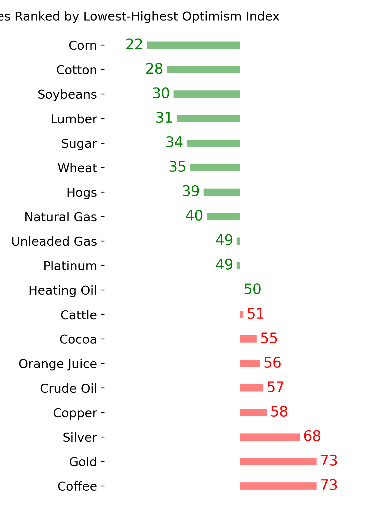
A sentiment extreme in yellow commodities:
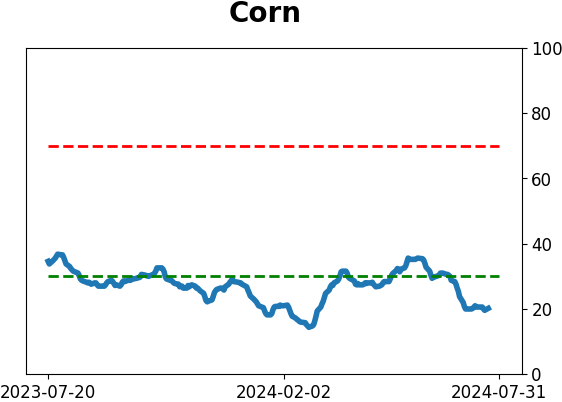
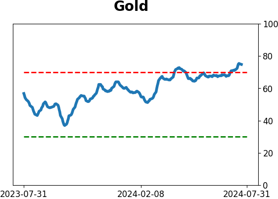
Over the past month, gold and corn have taken opposite paths. Traders have piled into gold and shucked corn. There is now a historically wide spread in optimism between the two markets. That doesn't tell us much about gold, but it tended to trigger near major multi-year troughs in corn prices.
|
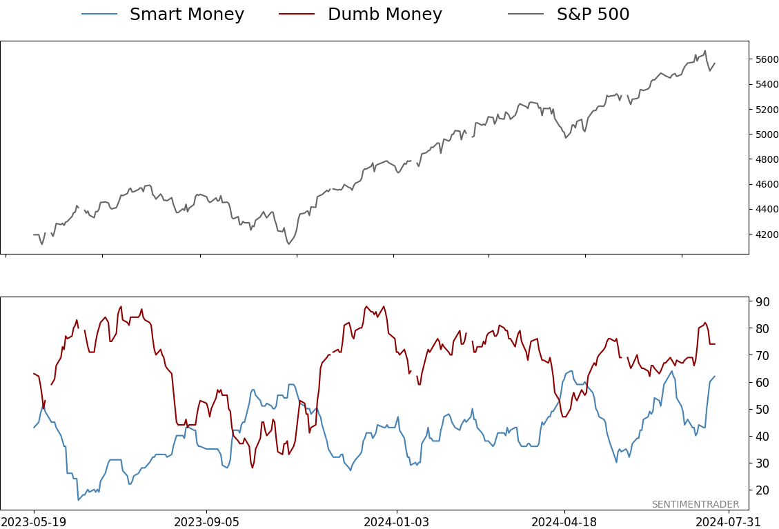
Smart / Dumb Money Confidence
|
Smart Money Confidence: 62%
Dumb Money Confidence: 74%
|
|
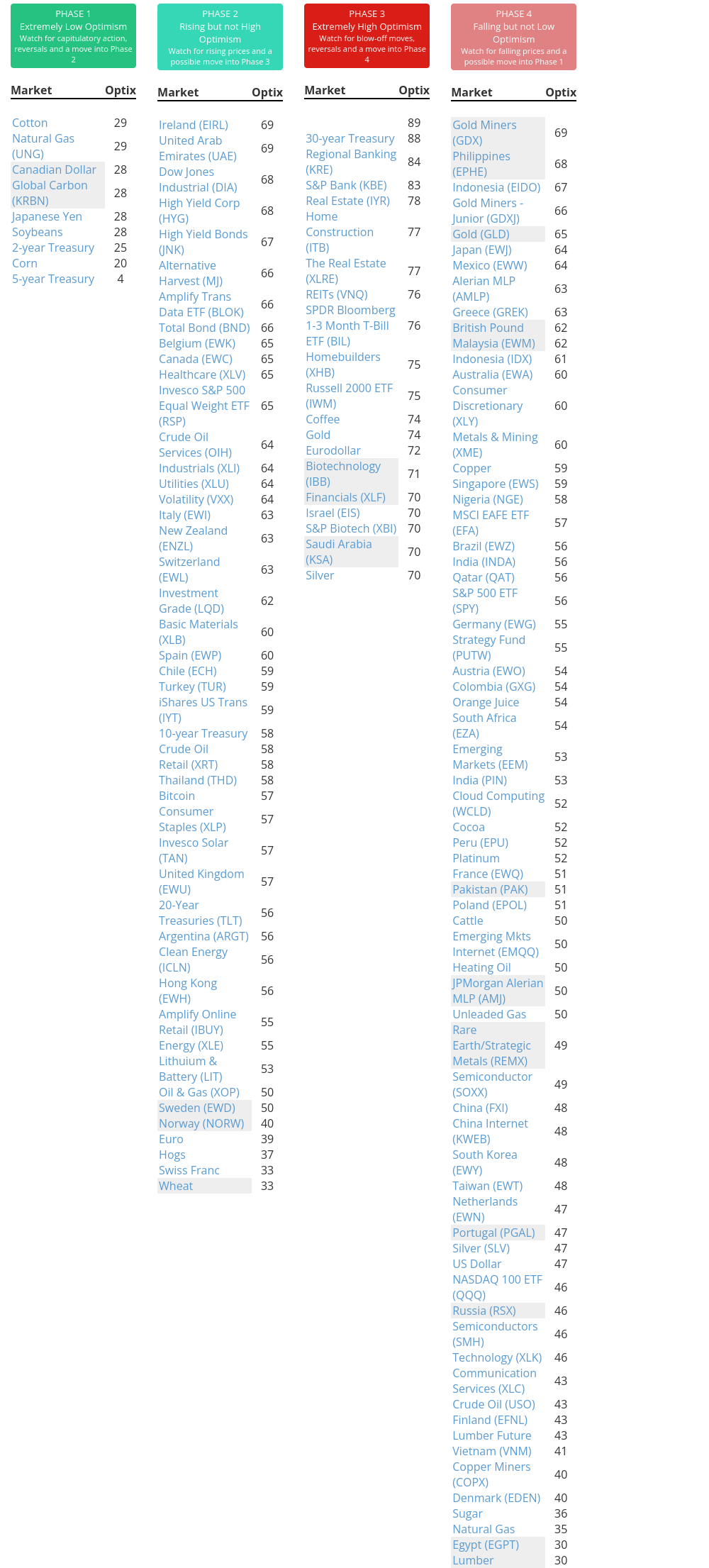
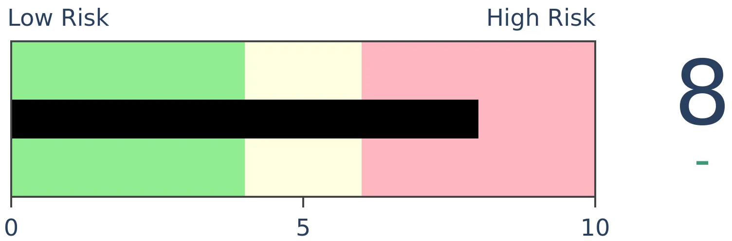
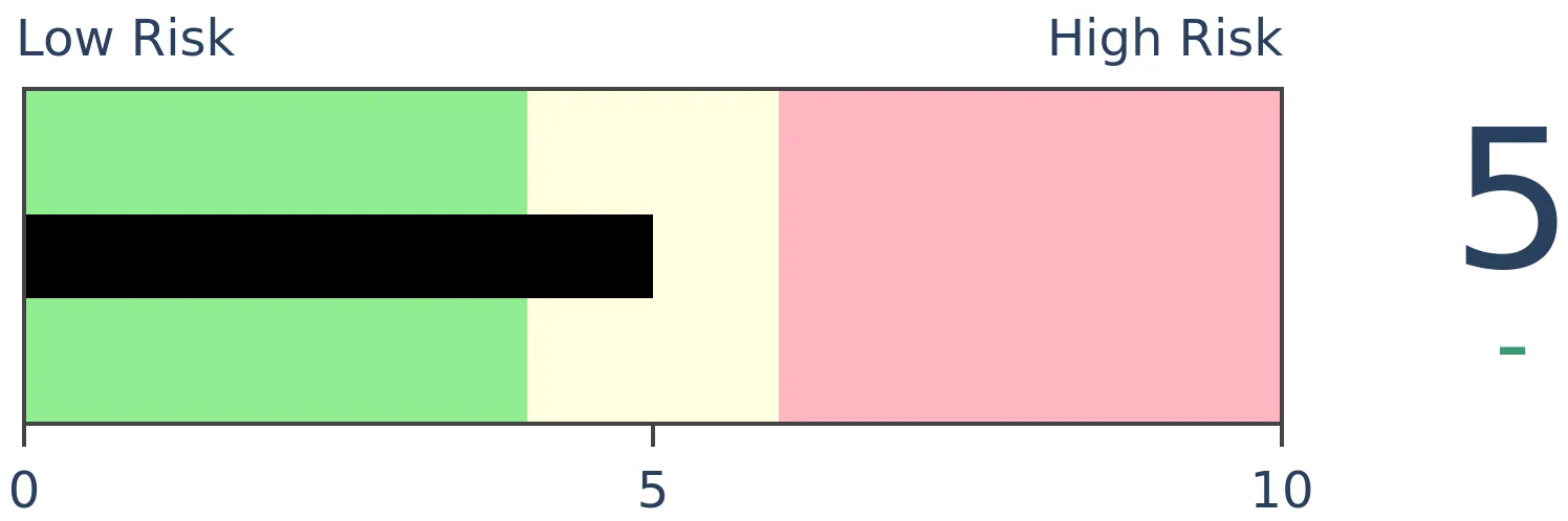
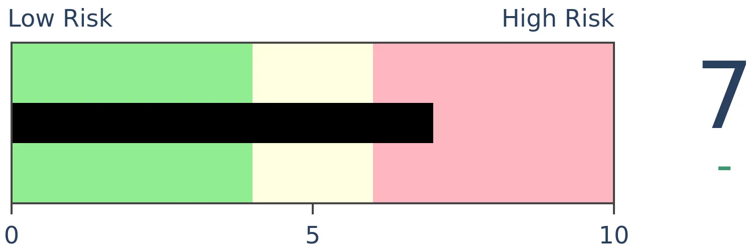
Risk Levels
Stocks Short-Term
|
Stocks Medium-Term
|
|
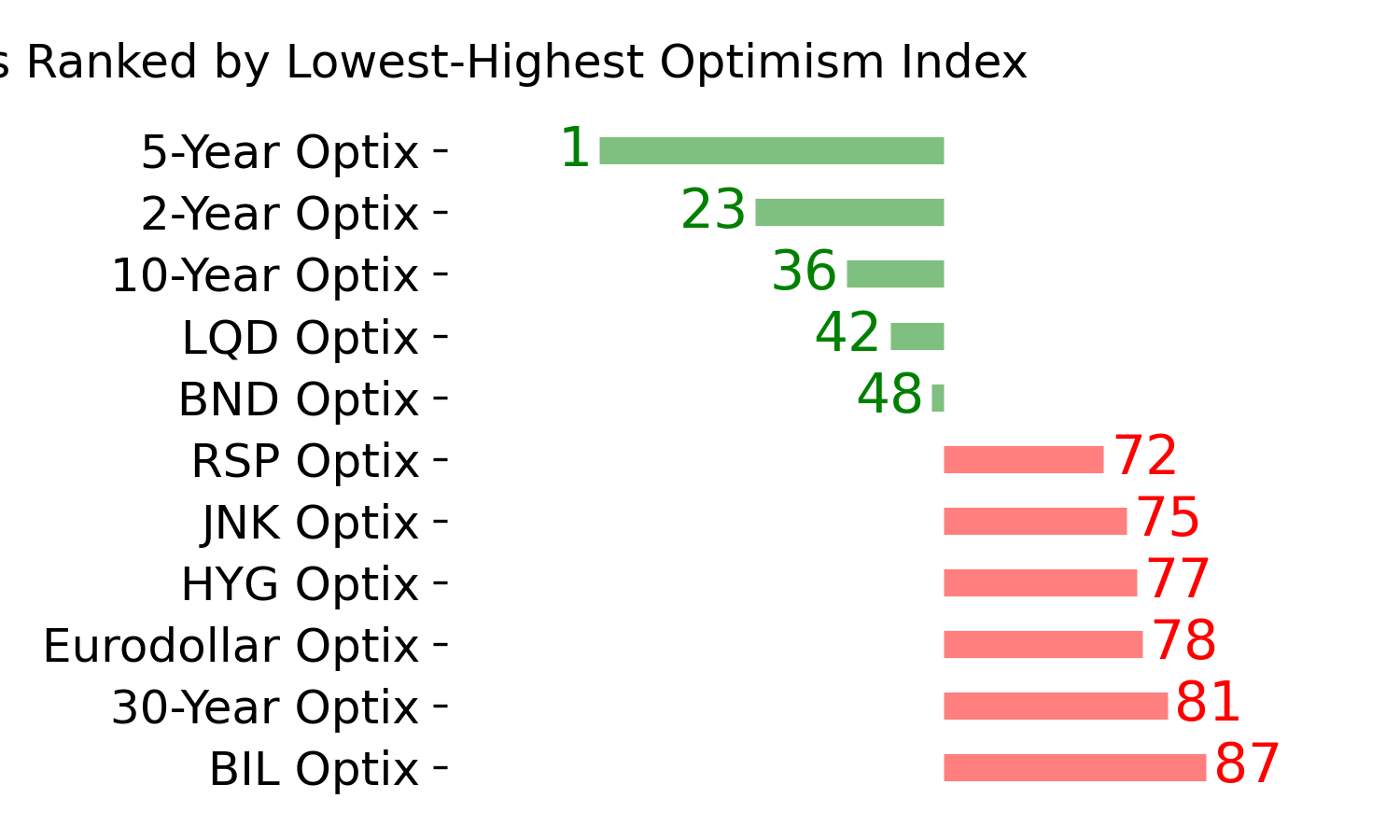
Bonds

|
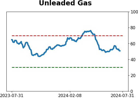
Crude Oil
|
|
Gold
|
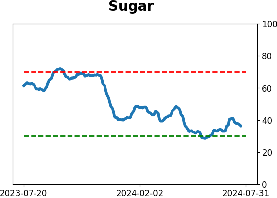
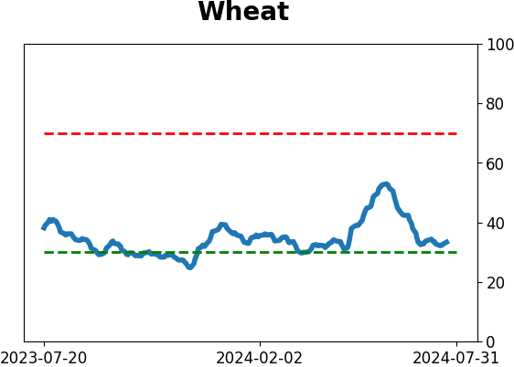
Agriculture

|
|
Research
By Jason Goepfert
BOTTOM LINE
Over the past month, gold and corn have taken opposite paths. Traders have piled into gold and shucked corn. There is now a historically wide spread in optimism between the two markets. That doesn't tell us much about gold, but it tended to trigger near major multi-year troughs in corn prices.
FORECAST / TIMEFRAME
CORN -- Up, Long-Term
|
Key points:
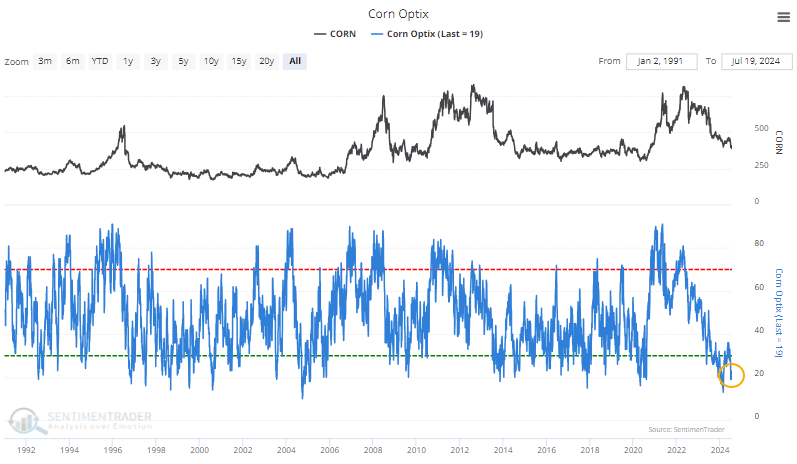
- Optimism on gold has jumped to one of the highest levels in more than 30 years
- At the same time, they've given up on corn, where optimism has dropped to near-record lows
- Extreme spreads in optimism between the two markets tended to trigger near significant long-term troughs in corn
Traders love gold, hate corn
It's been an excellent year for the most widely-followed yellow commodity. It's been a tremendously disappointing year for the other one.
Gold has returned more than 16% so far in 2024. Over the past month, corn has taken an opposite path and is staring at a 13% loss for the year. Commodity traders tend to strongly favor trend-following strategies, so it's no wonder that optimism on gold is historically high.
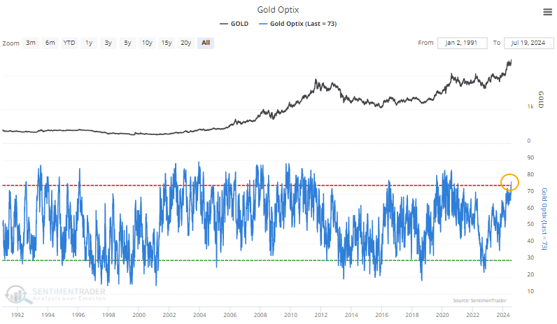
At the same time, they've pretty much given up on corn prices for the year, with the Optimism Index falling below 20 again.
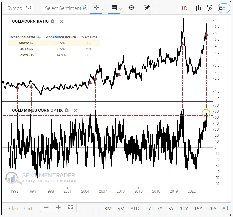
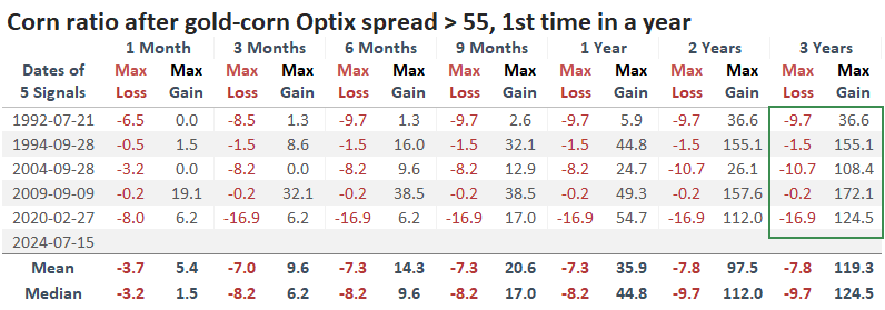
Using the My Indicator function, we can easily create a price ratio of gold to corn and an indicator spread of gold's Optimism Index minus corn's.
When we do that, it looks like when optimism on gold outpaces optimism on corn by 55% or more, as it just did, it roughly coincided with peaks in the ratio of gold to corn.
Nearing a corn trough
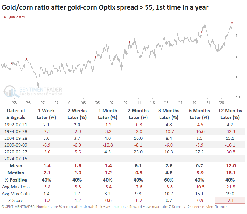
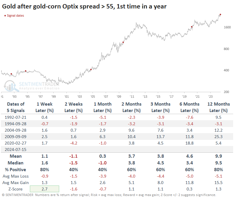
Charts can be deceiving, especially when they are zoomed out, and we lose some of the detail. The table below shows precisely how gold performed relative to corn after the indicator spread exceeded 55% for the first time in a year. And it mostly confirmed the chart, though gold did manage double-digit relative gains twice before rolling over.
Looking at each commodity, it's not like gold was terrible. It suffered modest losses a few times and double-digit gains a few times.
The main driver of the ratio was corn. These extremes tended to occur near major troughs in the grain, though "near" didn't necessarily mean "now." Four of the five times, it slid over the next two months or so before bottoming. When it did bottom, though - whoa boy, what a ride.
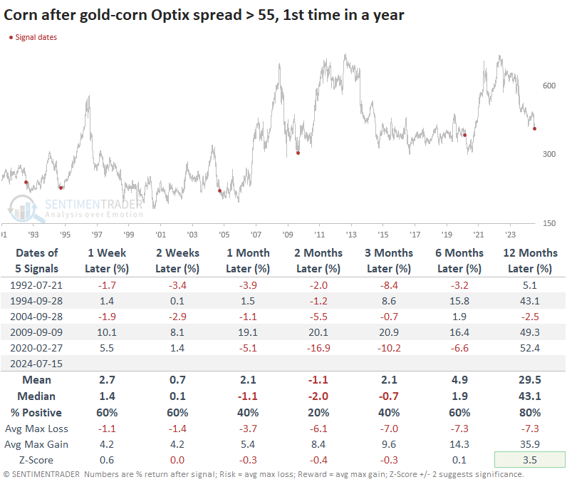
The table of maximum gains and losses below takes a longer-term view, going out as long as three years. It shows that three of the five times, the risk/reward was poor in corn up to three months later. But in the following months and years, the risk had been squeezed out, and it was nothing but upside, going into the triple digits four out of five times.
What the research tells us...
Commodity investing is not for the faint of heart, especially those who venture into using futures contracts or other derivatives. This is one area where the explosion of ETFs and ETNs has helped the average investor gain easy access to a non-traditional market. Funds like CORN do an admirable job tracking corn futures, while, of course, GLD is an option for gold traders.
When traders have had extreme differences in opinion between the two yellow commodities, it doesn't tell us much about gold's prospects. Corn, however, showed a strong tendency to be near a major trough. The "near" part is a problem because this has triggered during the puke phase of declines, and that can carry for a while. However, for those looking to add some long-term commodity exposure, further declines in corn in the weeks ahead should prove to be a way to potentially add diversified returns.
Indicators at Extremes
Phase Table
Ranks
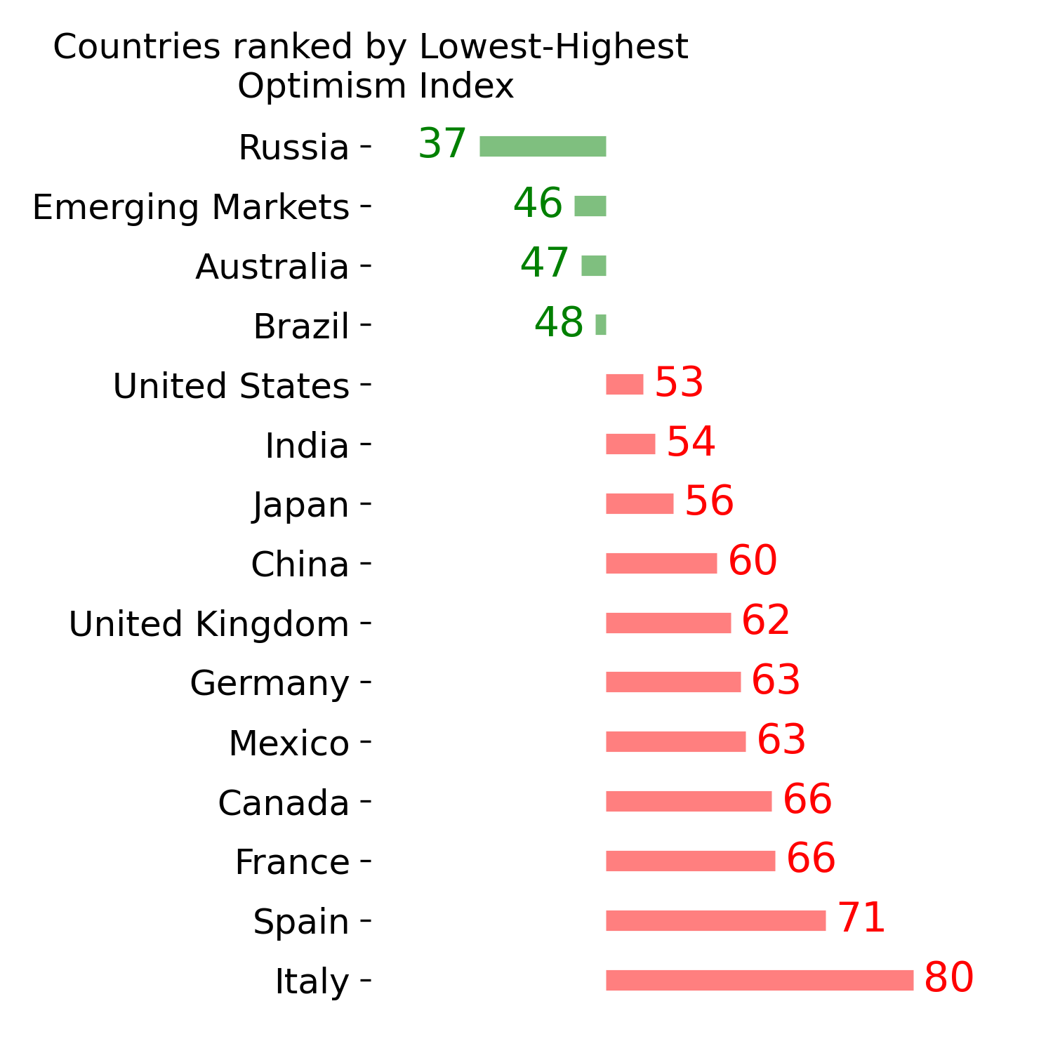
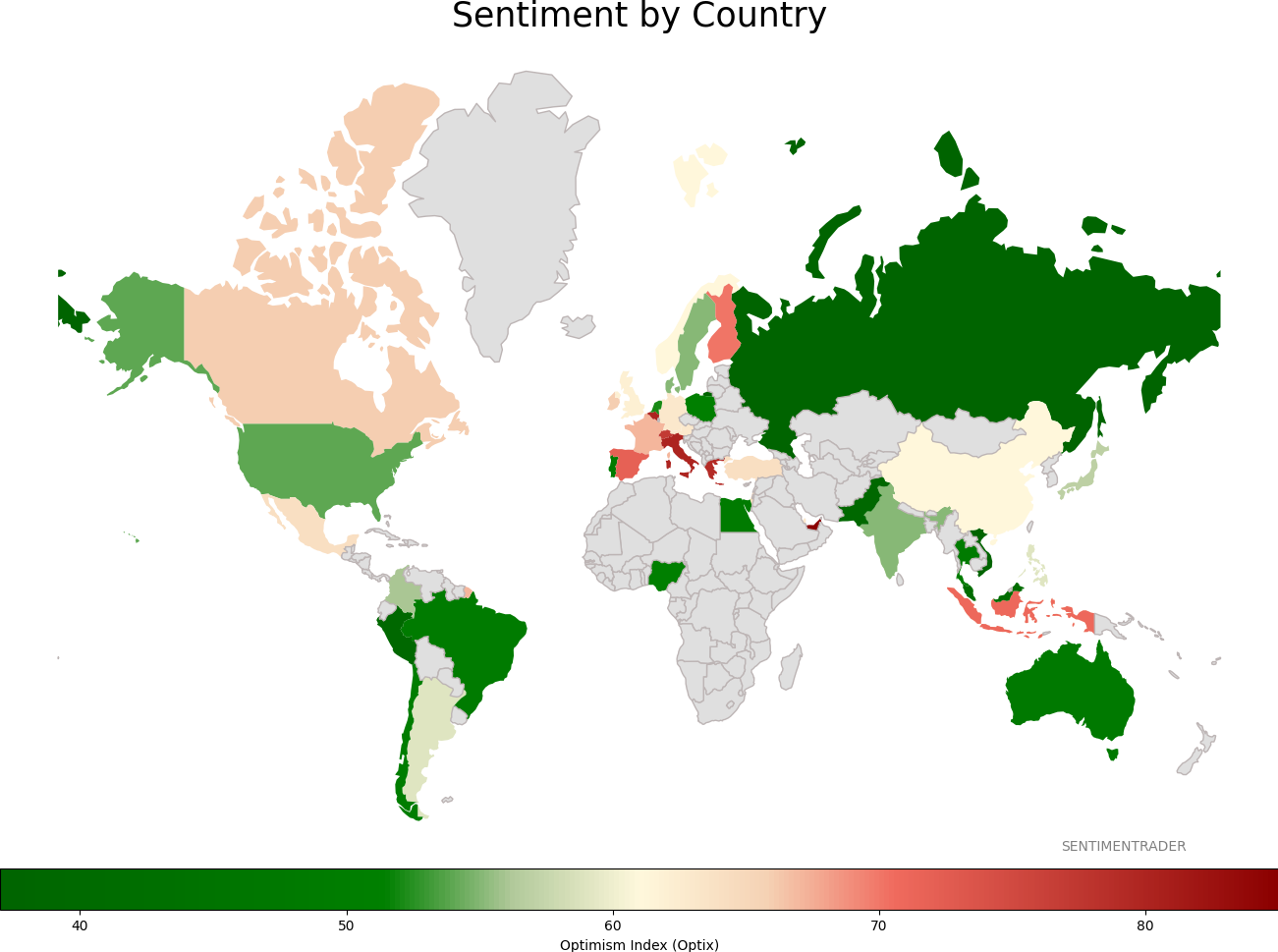
Sentiment Around The World
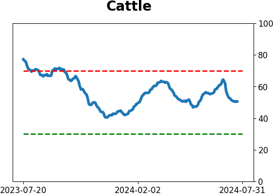
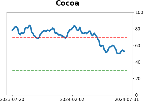
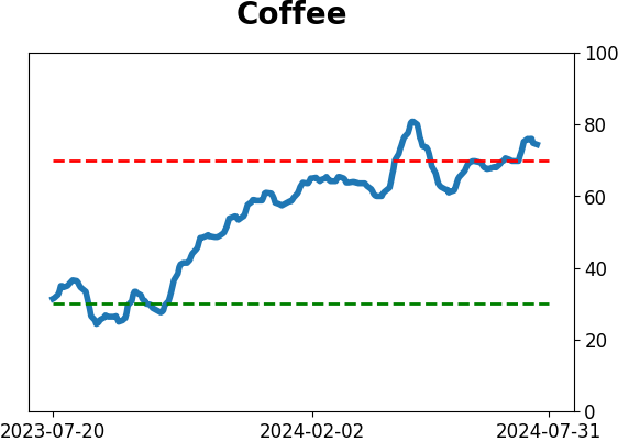
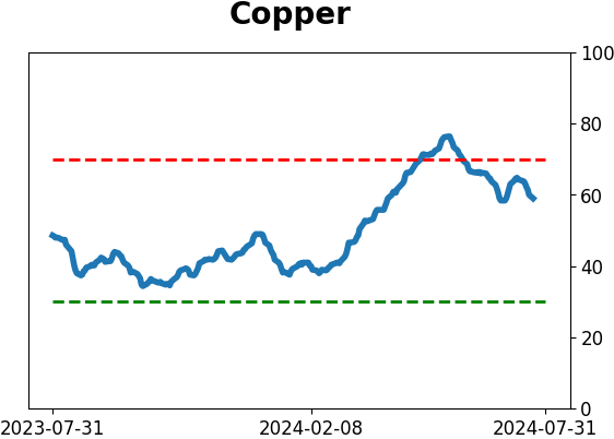
Optimism Index Thumbnails
|
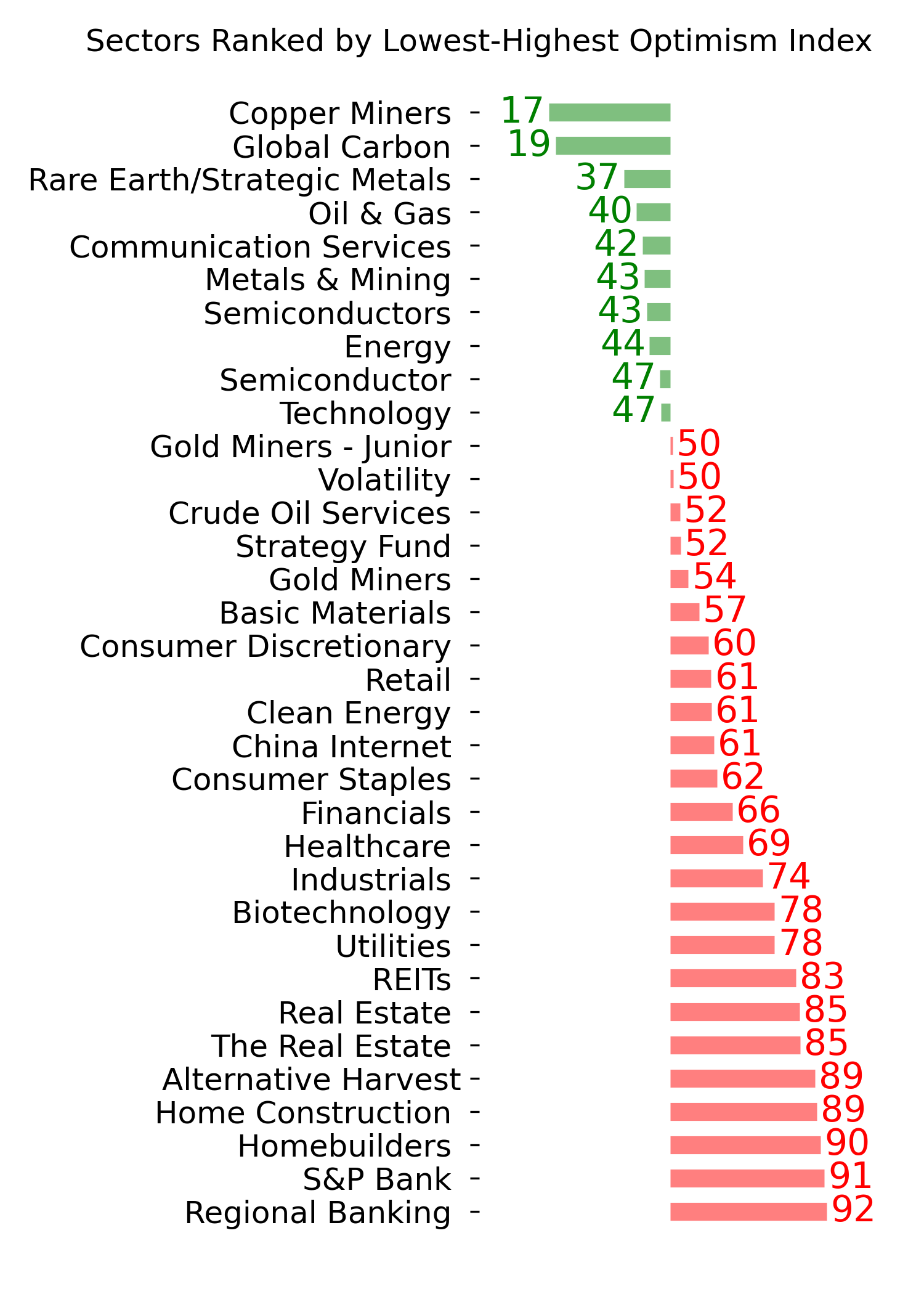
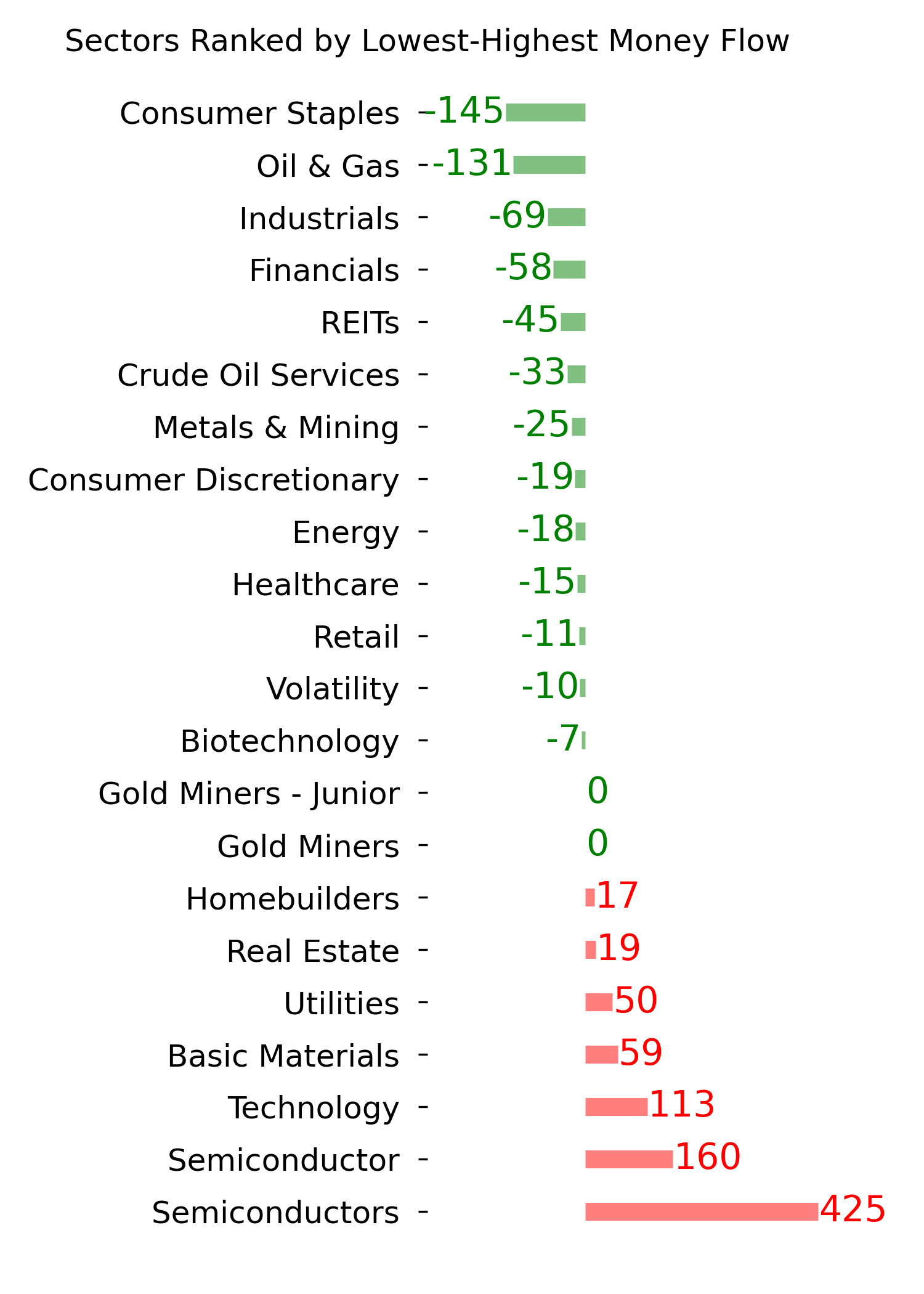
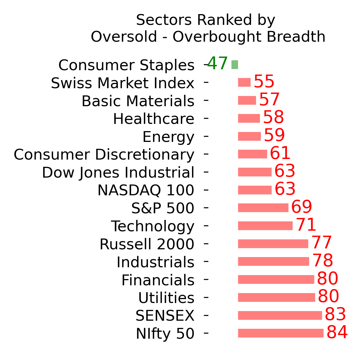
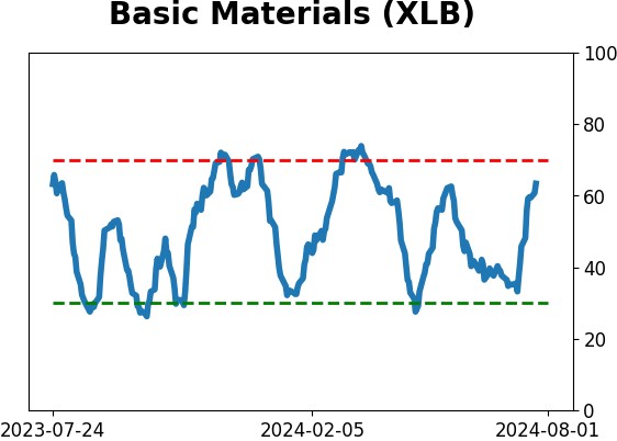
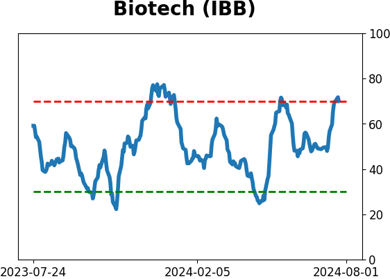
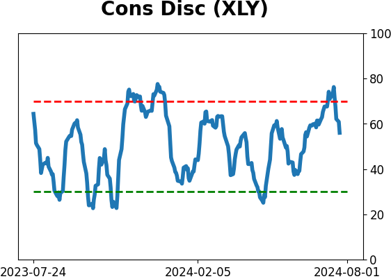
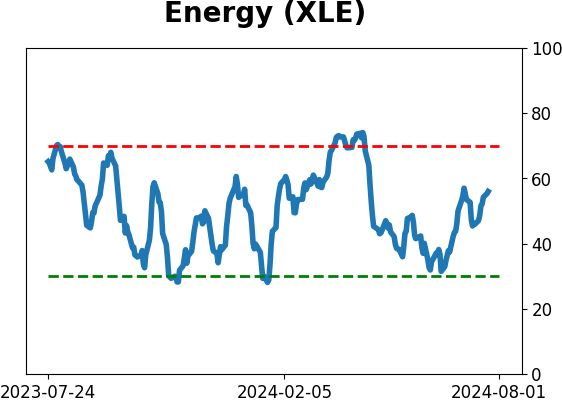
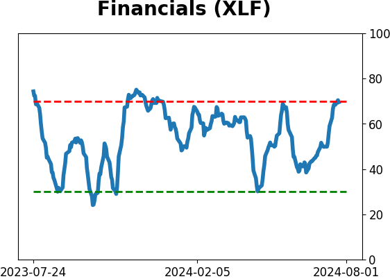
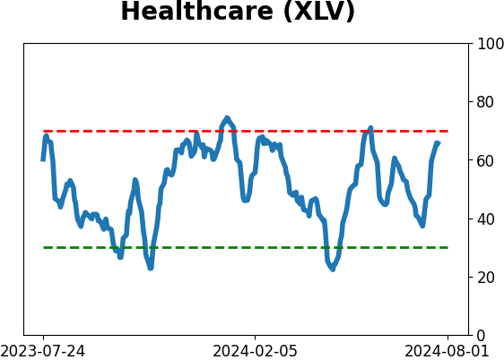
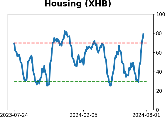
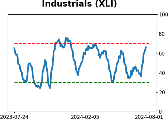
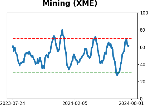
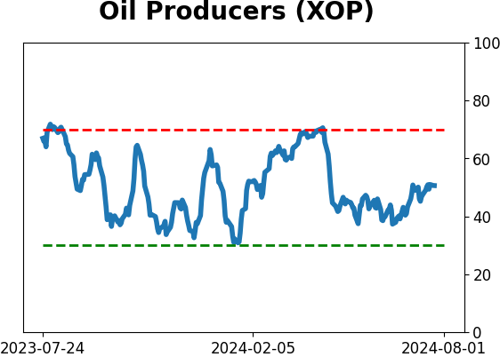
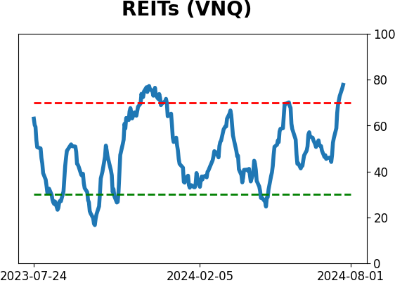
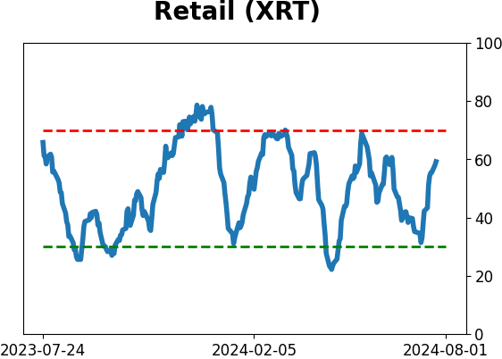
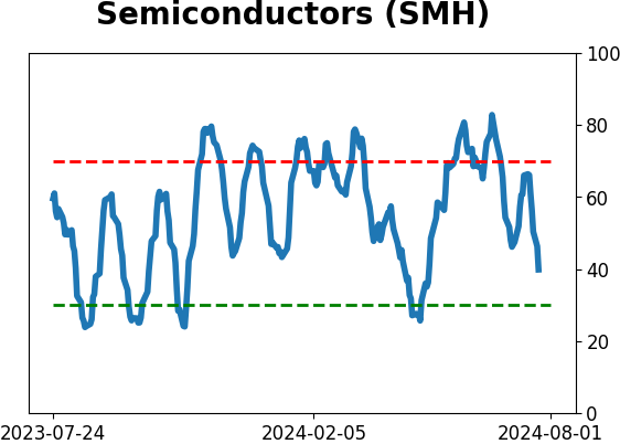
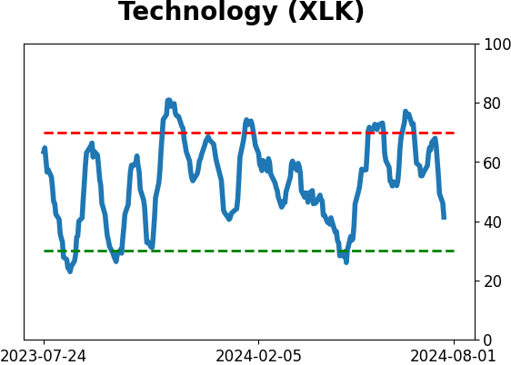
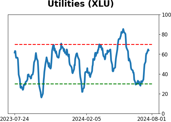
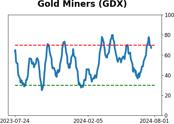
Sector ETF's - 10-Day Moving Average
|
|
|
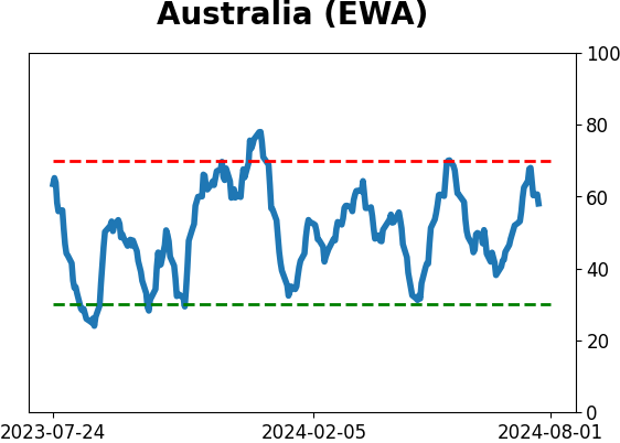
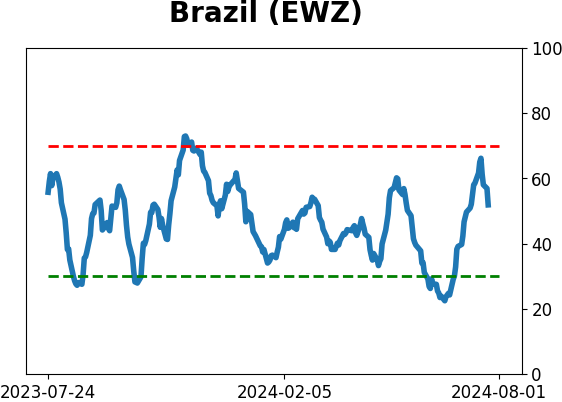
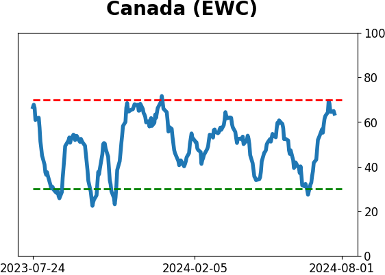
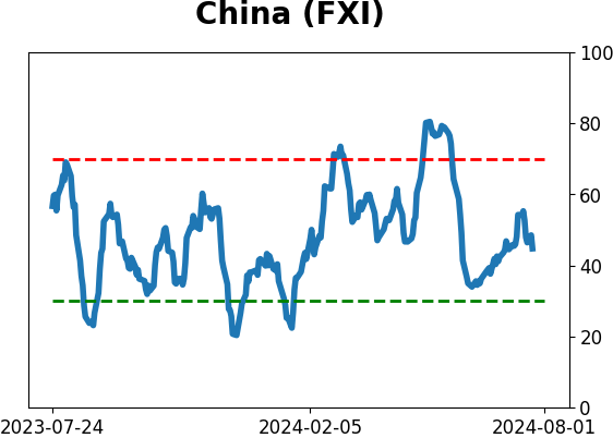
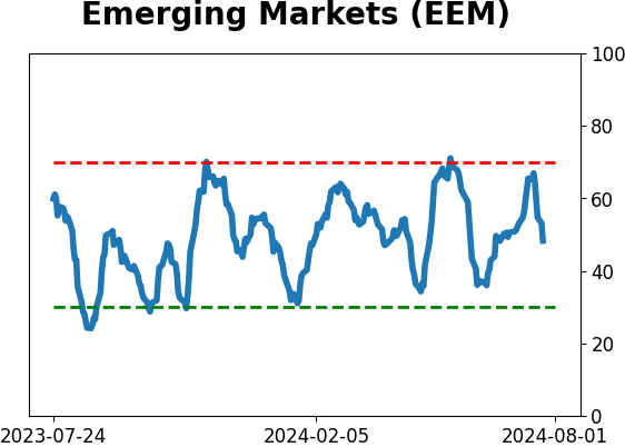
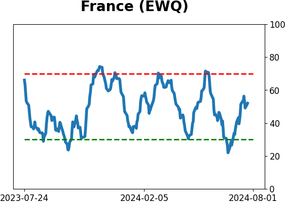
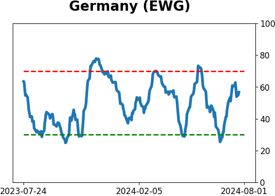
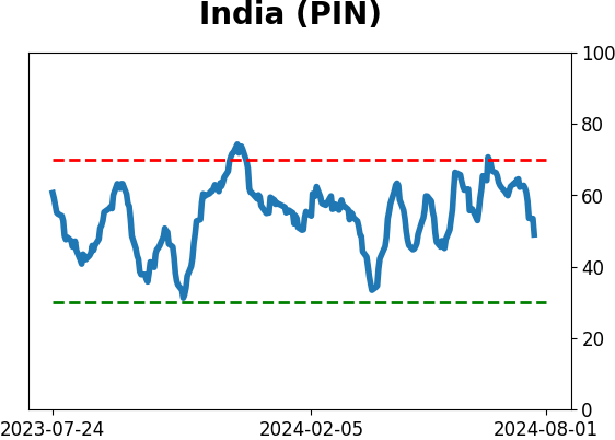
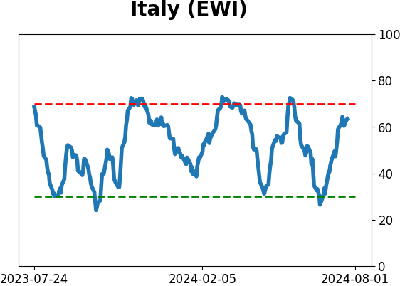
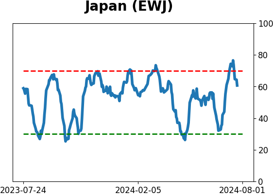
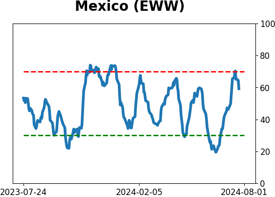
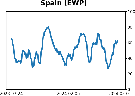
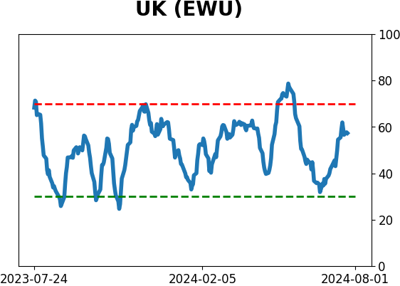
Country ETF's - 10-Day Moving Average
|
|
|
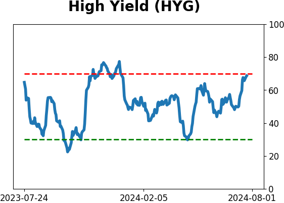
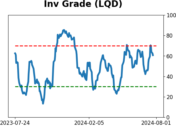
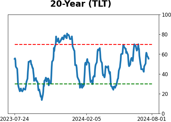
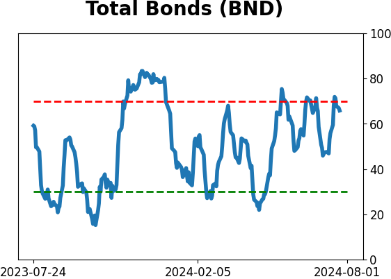
Bond ETF's - 10-Day Moving Average
|
|
|
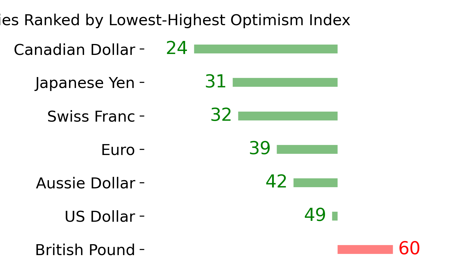
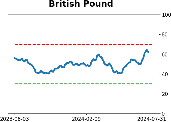
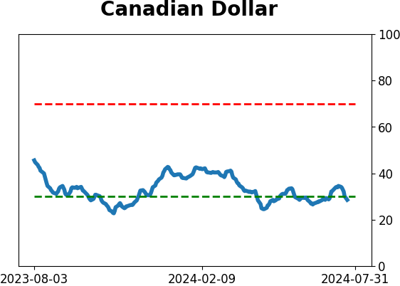
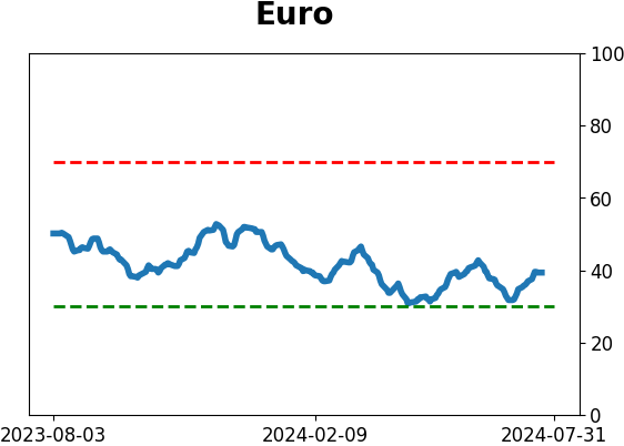
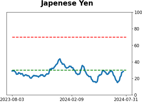
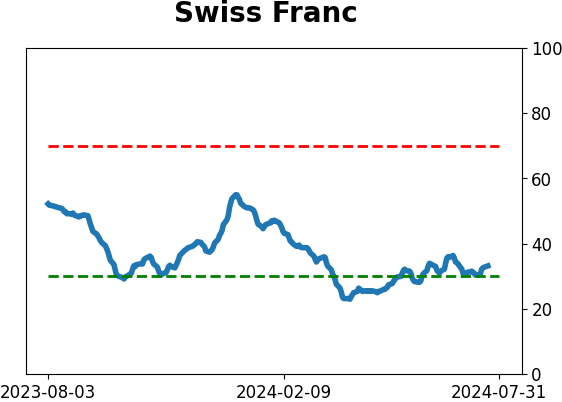
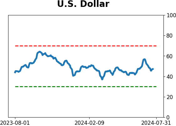
Currency ETF's - 5-Day Moving Average
|
|
|
Commodity ETF's - 5-Day Moving Average
|
|