Daily Report : TradingEdge Weekly for Jul 19 - A thrusty market, flying financials, seismic shift to smalls

| View/Print a PDF version of this Report |
Headlines
|
TradingEdge Weekly for Jul 19 - A thrusty market, flying financials, seismic shift to smalls: This week, we saw that markets have enjoyed a rare multi-day breadth thrust, which eliminated many existing breadth divergences. It pushed the S&P 500 into overbought territory on 5 time frames at the same time. Over a week, there was a historic shift from large to small stocks, which pushed more than half of the latter to new highs. Natural gas is finally entering a positive stretch of the year. |
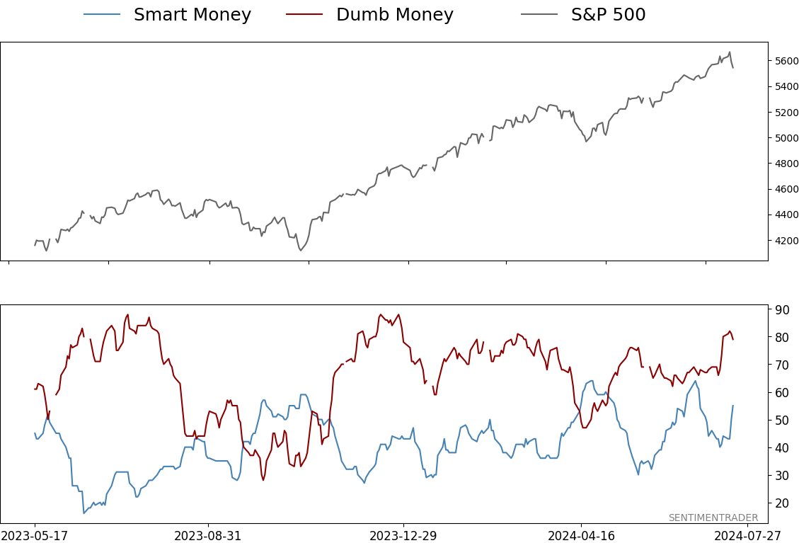
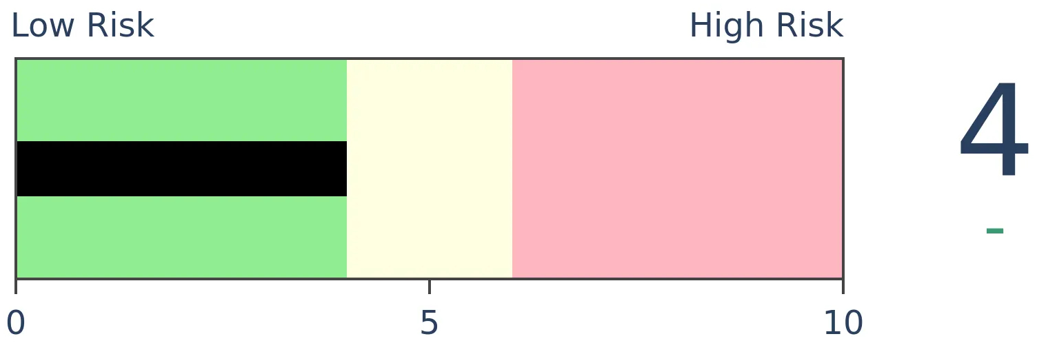
Smart / Dumb Money Confidence
|
|
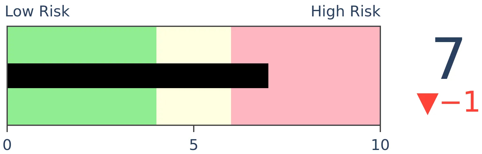
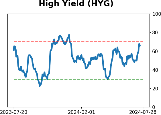
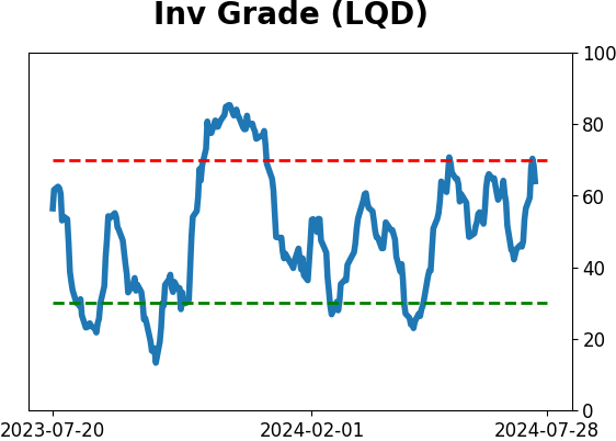
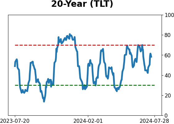
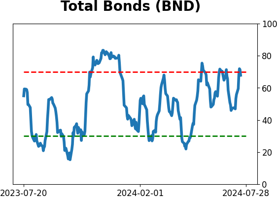
Risk Levels
|
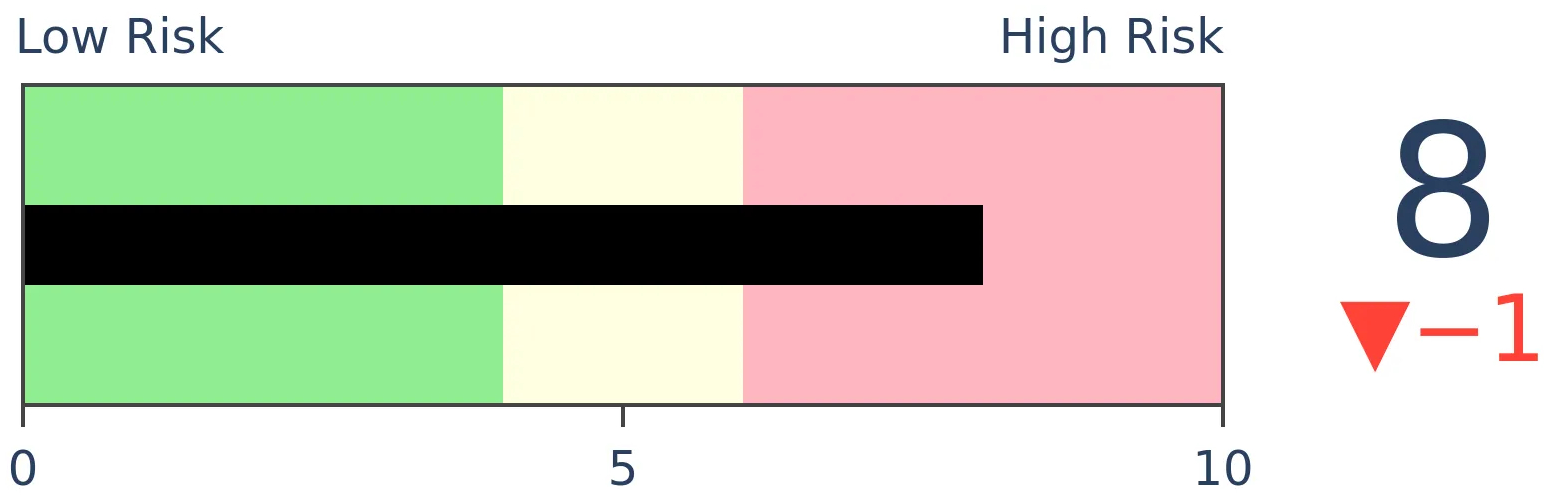
|
|

Research
TradingEdge Weekly for Jul 19 - A thrusty market, flying financials, seismic shift to smallsBy Jason GoepfertBOTTOM LINEThis week, we saw that markets have enjoyed a rare multi-day breadth thrust, which eliminated many existing breadth divergences. It pushed the S&P 500 into overbought territory on 5 time frames at the same time. Over a week, there was a historic shift from large to small stocks, which pushed more than half of the latter to new highs. Natural gas is finally entering a positive stretch of the year. FORECAST / TIMEFRAME |
Key points:
- Markets enjoyed a rare multi-day breadth thrust
- Advancing issues in the Nasdaq 100 recently gave a rare and bullish signal
- The recovery eliminated many divergences that had built up
- The rally pushed the S&P 500 into overbought territory on 5 time frames simultaneously
- Over a week, investors shifted historically from large to small stocks
- A sudden preference for small caps pushed more than half of them to new highs
- Financial stocks are flying, with a jump in new highs
- Gold miners face another momentum test
- Natural gas is entering a positive seasonal window
- A relatively low-risk way to use options in a volatile market
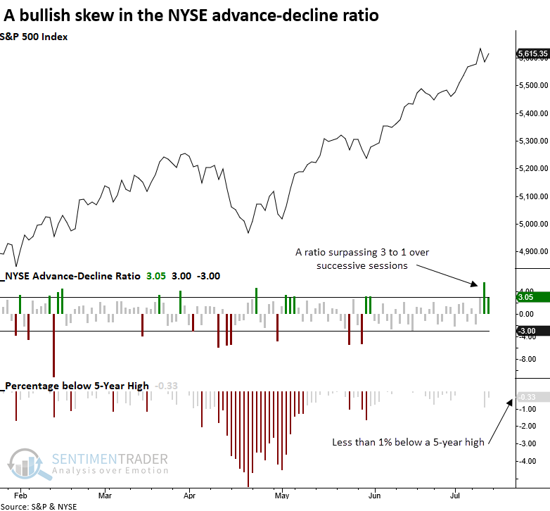
Breadth boost
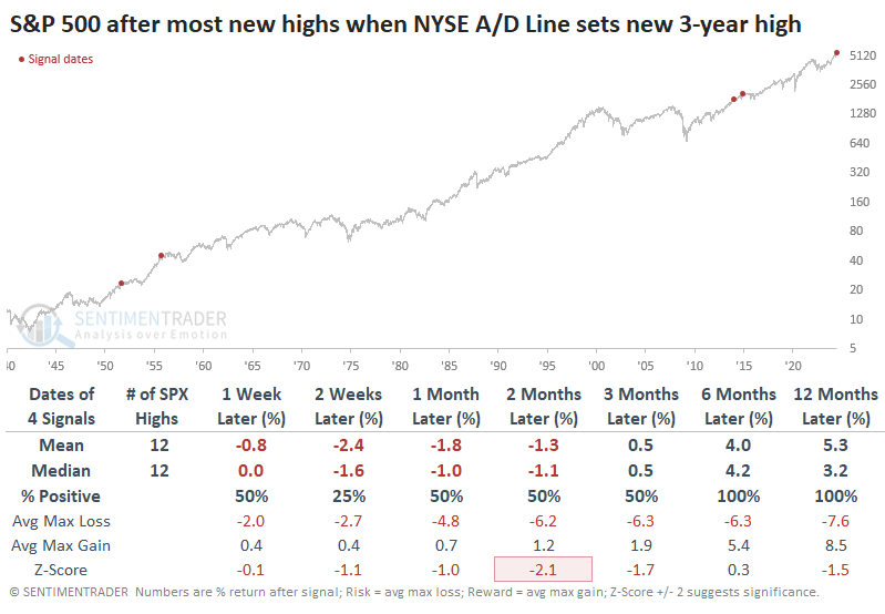
The NYSE advance-decline ratio increased by a significant amount over consecutive sessions near a high. Dean showed that similar breadth skews preceded outstanding returns for the S&P 500 over the subsequent six months.
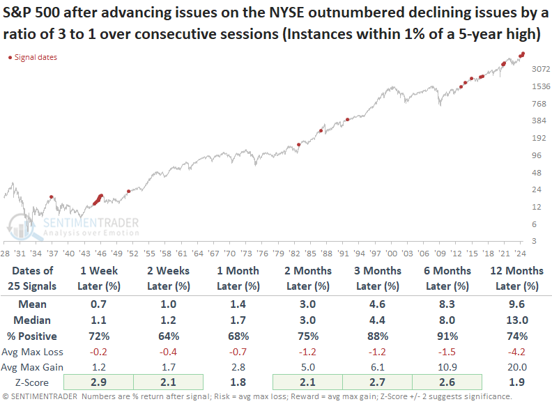
For only the 26th time since 1936, advancing issues on the NYSE outpaced declining issues by a ratio of 3 to 1 over successive trading sessions, with the S&P 500 hovering within 1% of a 5-year high.
After similar thrusts, the S&P 500 displayed outstanding returns and consistency over the following six months. The outlook has been increasingly bullish since 1951, with several periods demonstrating a perfect 100% win rate.
Over the next six months, the equal-weighted S&P 500 outperformed the cap-weighted version 82% of the time.
On July 5th, the percentage of S&P 500 stocks outperforming the S&P 500 Index over a rolling 21-day period fell to the lowest in history. In the past, whenever this indicator drops under 30%, the equal-weighted S&P 500 index has generated an annualized return of 23%, exceeding the cap-weighted return of 21%.
Even more oomph
Jay noted that a variety of typically highly reliable indicators suggest that longer-term investors continue to give the bullish case the benefit of the doubt in the year ahead.
The Nasdaq 100 Index enjoyed a decisive move up before finally breaking down hard for a couple of days later in the week. On a strictly objective basis, the Nasdaq Zweig Breadth Thrust indicator just flashed another sign of bullish momentum that higher prices have almost invariably followed. The indicator calculates a 10-day exponential moving average of advancing issues as a percentage of total issues.
The chart below highlights all dates when the Nasdaq Zweig Breadth Thrust indicator crossed above 0.60. The most recent signal occurred on 2024-07-16.
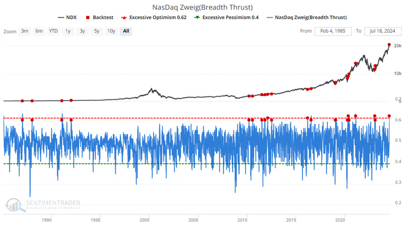
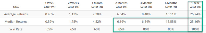
The critical thing to note is the 80%+ Win Rates for all time frames, two months and out.
Jay also looked at the percentage of S&P 1500 stocks in overbought territory, which surged last week. While many people are inclined to think of high readings as a negative, in the long run, such readings have more often than not highlighted a period of market thrust that ultimately propels the stock market higher.
Divergences no more
Thanks to a historic couple of days, many of the divergences we've highlighted for weeks were mostly resolved. At the very least, they're less compelling than they were a short time ago.
The overwhelming rush into smaller-cap stocks late last week had a monumental impact on many breadth measures. It was enough to push the NYSE Cumulative Advance/Decline Line to a record high.
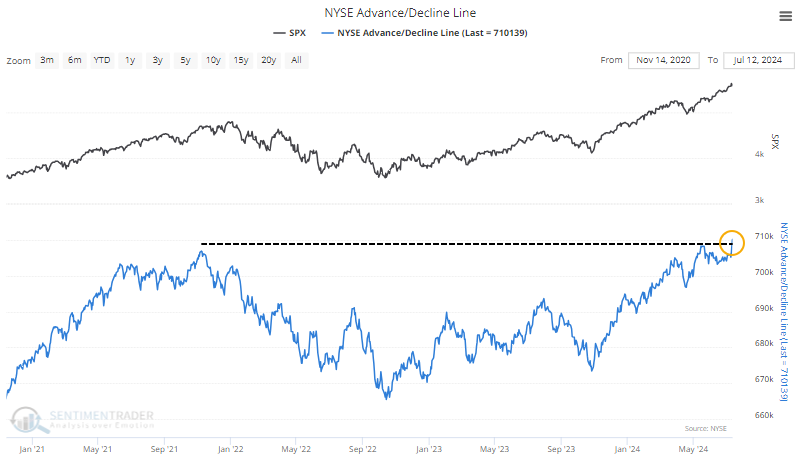
The interesting part of the new high in the A/D Line is that the S&P 500 has been leading it for over a month.
The S&P 500 didn't just set a new high; it set more than a dozen over the past 30 days while the A/D Line diverged. When we look at the times when the S&P outpaced the A/D Line to the most significant degree, we see that its forward returns were considerably less compelling, though we also have a minuscule sample size.
The Advance/Decline Line version that includes only common stocks (and not other issues like preferred shares) still hasn't made a new high.
When the main A/D Line set a fresh 52-week high for the first time in at least 30 days, but the stock-only version was at least 1% off its own high, the other instances showed relatively weak returns up to a month later and strong returns over the next 3-12 months.
Overbought on all time frames
For the stock market, it has been a very good few days. And weeks. And months. And quarters. And years. So good that the S&P 500 is overbought across each of those time frames.
The 14-period Relative Strength Index (RSI) is now above 70 on all those time frames for the first time in three years. The chart below clarifies how powerful this momentum is by only showing the minimum RSI value across all five time frames. For the indicator to be above 70, the RSI on the daily, weekly, monthly, quarterly, and yearly time frames all have to be above 70.
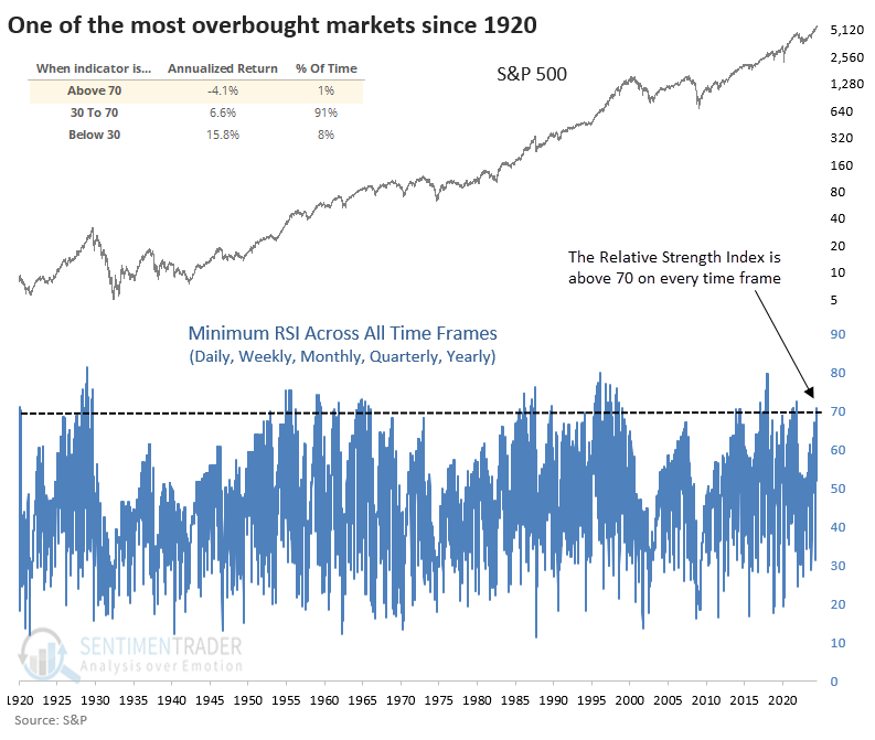
The S&P 500's annualized return was -4.1% when the minimum RSI was 70 or greater. That's far below a non-extreme return. The table below shows how the S&P performed after the minimum RSI across all time frames exceeded 70 for the first time in at least a year.
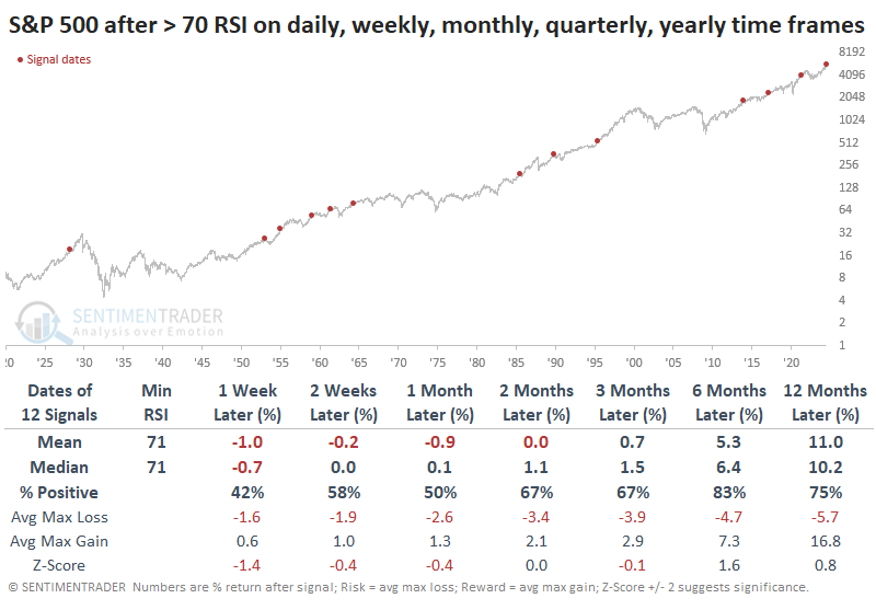
Even though the risk/reward ratio over the next few months was poor, it was rare to see a significant decline, which is consistent with most momentum-based extremes. Within the next three months, there were no declines larger than -10%; of course, there were no gains larger than +10%, either.
The win rates for major sectors were starkly different. Three months later, staples gained 91% of the time, versus only 45% for discretionary stocks.
Seismic shift to small stocks
A benign inflation reading drastically changed investors' outlooks. When combined with offsides positioning, the report triggered a massive shift out of large stocks and into smaller ones.
Over five days, the ratio of small-cap total return to large-cap total return jumped by nearly 10%. That's one of the largest shifts in nearly 100 years, especially considering more recent history, as the ratio was very volatile in the 1930s.
The chart below starts in 1950 and highlights the dates when the ratio shifted toward small caps by at least 7.5% over a week.
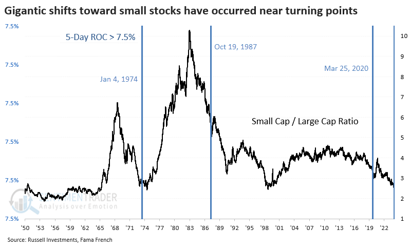
The ratio suffered some volatility in the weeks after the dramatic shift. However, all three preceded months (at least) of investors finding a renewed preference for smaller stocks.
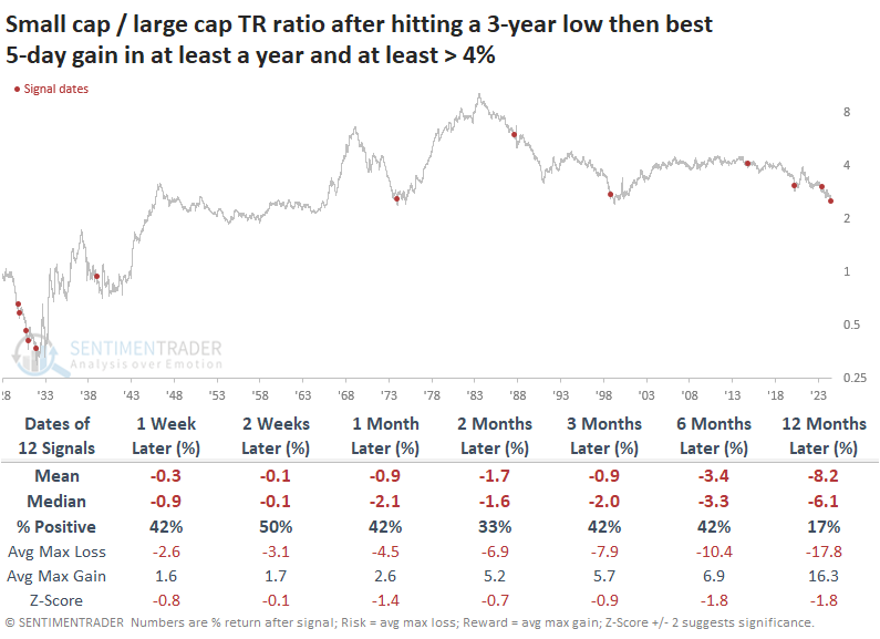
It's hard to have much confidence in a sample size of three, so the table below expands the sample by relaxing the parameters. It shows how the small cap / large cap ratio fared after it fell to a multi-year low. Then, there was a 5-day shift of at least 4%, which was the largest in at least a year.
These were mostly fake-outs. In the weeks and months ahead, a sustained shift toward smaller stocks was rare.
Federal Reserve easing cycles have generally helped smaller stocks over larger ones, with peaks in the Fed Funds Rate roughly coinciding with some crucial bottoms in the ratio of small caps to large caps. As investors anticipate the next easing cycle, they have kick-started this shift dramatically. The adjustment was so substantial that there are few precedents, but from what we can draw from them, there seems to be a good chance that it can last for several months at least.
Many new highs among smaller stocks
The percentage of Russell 2000 stocks registering a 21-day high surged above 50%, which Dean noted produces a favorable outlook for the Russell 2000 over the subsequent year.
On Monday, more than 50% of Russell 2000 stocks reached a 21-day high, a feat achieved only 24 times since 1979. The last occurrence was in December 2023, resulting in notable gains over the next three months.
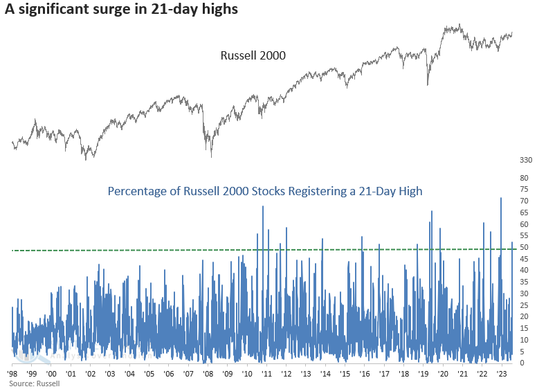
Following instances when the percentage of Russell 2000 stocks that registered a 21-day high surpassed 50%, the small-cap index displayed solid returns and consistency over the subsequent year, rising 82% of the time.
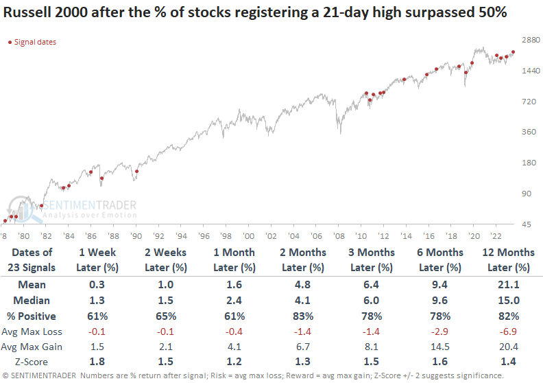
Over the subsequent year, the S&P 500 was higher 95% of the time, with the lone loss occurring due to the 1987 crash.
While the sample size is small (four other instances), whenever the percentage of Russell 2000 stocks registering a 21-day high coincided with a 2-year high in the index, the Russell 2000 and the S&P 500 displayed a 100% win rate from two weeks to twelve months later, with the Russell outperforming.
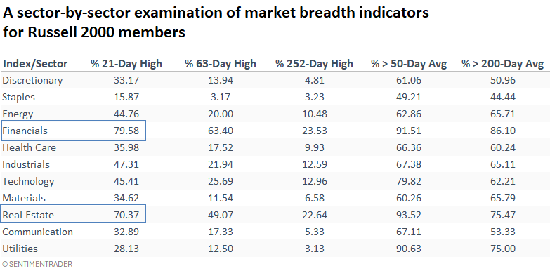
New highs across all time frames were most prevalent in Financials and Real Estate. Within the Russell 2000 Financials, banks comprise a significant proportion of the constituents.
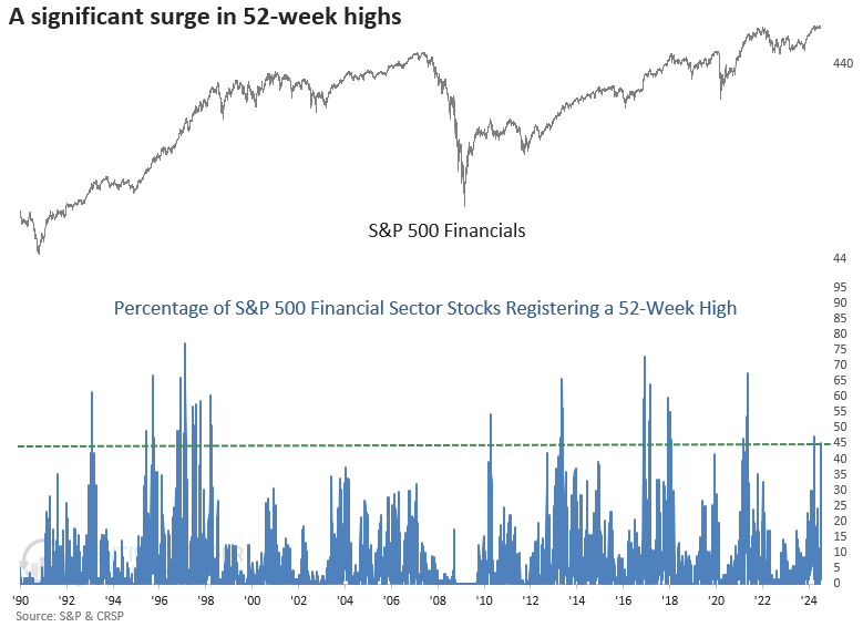
Financials are flying
More than 45% of S&P 500 Financial sector stocks registered a 52-week high. Dean showed that comparable surges in new highs with the sector at a 5-year high preceded a bullish outlook for Financials and what's good for Financials is good for the broad market, with the S&P 500 rising 85% of the time a year later.
Financials are a systemically important sector that typically provides a warning in advance of significant market peaks. Therefore, with 52-week highs increasing, the stock market is less likely to be on the brink of a credit-driven risk-off period.
Following precedents when more than 45% of S&P 500 Financial sector stocks registered a 52-week high as the sector closed at a 5-year high, the S&P 500 Financials displayed solid returns and consistency, especially over a medium to long-term horizon where several time frames showed significance relative to random returns.
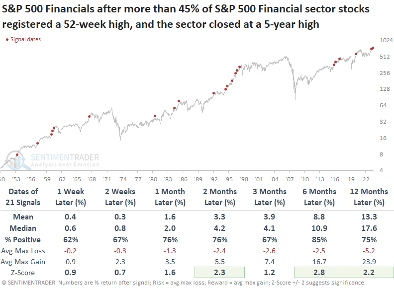
When 52-week highs for financial sector stocks surge, like now, the S&P 500's returns and consistency were outstanding over the following year. Over the subsequent three and six months, the maximum loss surpassed -5% on only three occasions.
Following similar precedents, the S&P 500 Financials tended to struggle compared to the S&P 500 over the ensuing month. Since 1981, the tendency has been even more pronounced, with the group underperforming the S&P 500 at some point in 13 out of 15 cases.
Once Financials settled in, they outperformed from two to six months later.
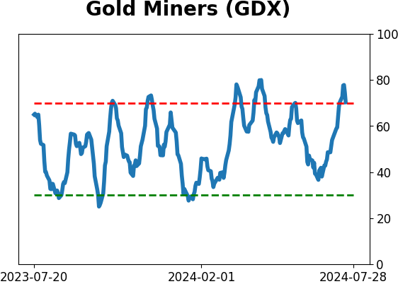
Gold miners face a test
One line of argument now says that gold is bullish, that gold stocks are undervalued, and that gold stocks could have tremendous upside. However, in the near term, many warning signs are flashing for gold stocks.
If we are indeed in a new "bullish era" for precious metals, gold stocks could ignore everything that follows and still manage to power higher. But our job is only to report the facts on the ground.
The chart below highlights those dates when more than 94% of gold miners were above their 200-day moving averages, and the table summarizes subsequent GDX performance. It was difficult for them to maintain such positive performance, especially from 2-12 months later.
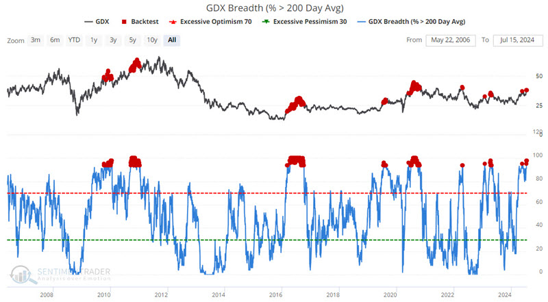
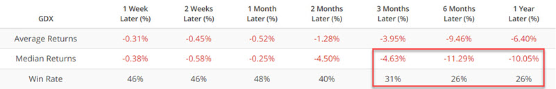
Jay showed that miners had an even more difficult road ahead when fewer than 5% of miners were in bear markets, which just triggered. Six months later, GDX was positive only 17% of the time.
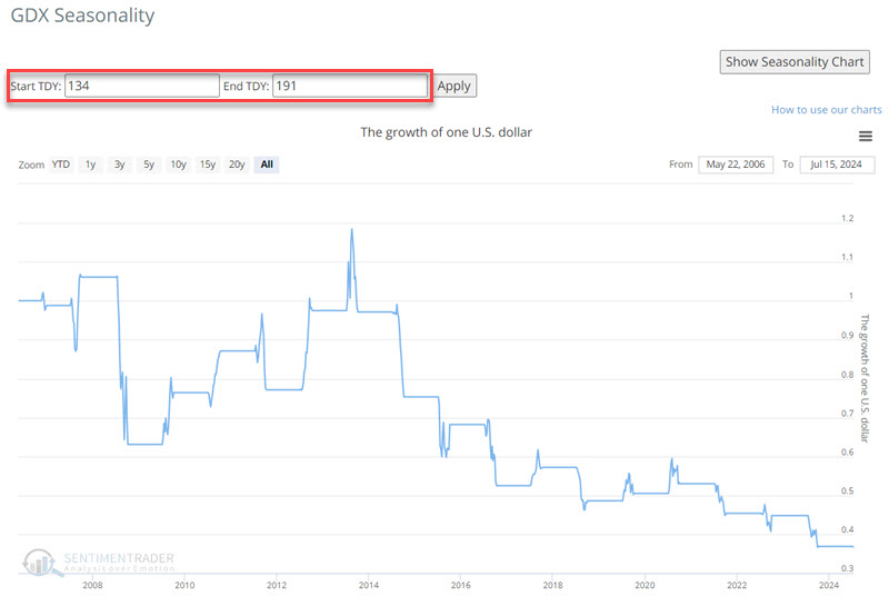
Also, GDX is soon entering an unfavorable period that extends from Trading Day of Year (TDY) #139 through #191. The chart below displays the hypothetical growth of $1 invested in GDX only during this period since GDX started trading.
The HUI Gold Bugs Index shows a similar pattern. Results can vary widely from year to year, but there is an unmistakable long-term downside bias.
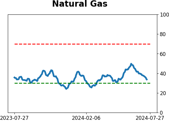
Positive natty window
Jay warned of potential weakness for natural gas in early June. Prices plunged almost 30% afterward, however, this key energy market is now entering its most favorable seasonal period of the year.
In this case, the natural gas market followed the seasonal script. But remember that seasonality is an average of historical results and NOT a roadmap to the future.
The chart below displays the annual seasonal trend for natural gas. We are entering the period from Trading Day of Year (TDY) #139 through TDY #196. For 2024, this period extends from the close on 07-15-2024 through 2024-10-02.
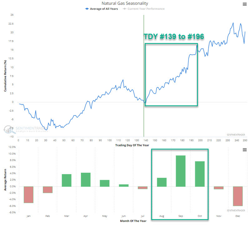
It is worth noting that so far in 2024, natural gas has followed its annual seasonal trend relatively closely. If it continues to do so, the months ahead will witness a rebound in natural gas prices. The chart below displays the hypothetical cumulative $ +(-) from holding a long position in natural gas futures only from the close on TDY #139 through TDY #196 every year since natural gas futures started trading in 1990.
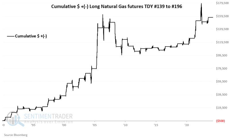
These windows showed a gain 74% of the time, with a larger average gain than loss. The contract gained more than +$8,000 eight times while losing more than -$8,000 only twice.
An options example
A decent time to trade seasonality is when it is turning favorable, and the market in question is deeply oversold and theoretically due for a bounce.
The problem is that this action can be tantamount to trying to catch a falling safe. Hence, limiting risk as much as possible is key in these cases.
The United States Natural Gas LP ETF (ticker UNG) is intended to track the price of natural gas futures. Options are traded on ticker UNG. In this piece, we will highlight one example of trade.
The chart below (and all charts below) is courtesy of www.Optionsanalysis.com. This chart shows UNG price action over the last five years and the action of implied volatility for UNG options.
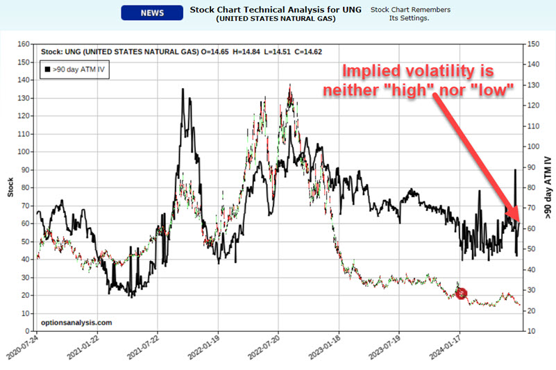
The lower the implied volatility, the less time premium is built in, and the more "cheap" the options are. A close look at the black line in the chart above reveals that implied volatility for UNG options is somewhere in between. UNG options are not cheap, but they are also not terribly expensive.
To play a potentially bullish scenario, we will use a modified bull call spread.
For our example trade, we will buy some UNG call options with a strike price close to the price of UNG shares and sell fewer UNG call options with a strike price that is further out of the money. The purpose is to use the proceeds from the options we sell to help pay for the options we buy.
Our example trade involves:
- Buying 4 UNG Oct18 2024 15 strike price calls @ $1.82
- Selling 3 UNG Oct18 2024 20 strike price calls @ $0.52
The chart below displays the risk curves (i.e., the expected $ P/L based on the price of UNG shares as of four different dates leading up to option expiration. Note that the position has unlimited profit potential, but limited downside risk.
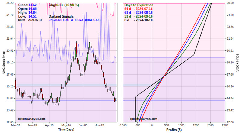
The cost to enter this trade is $572, which is the maximum risk on the trade, while profit potential is unlimited as we hold more long calls than short calls. It is roughly the equivalent of holding long 149 shares of UNG.
About TradingEdge Weekly...
The goal of TradingEdge Weekly is to summarize some of the research published to SentimenTrader over the past week. Sometimes there is a lot to digest, and this summary highlights the highest conviction or most compelling ideas we discussed. This is NOT the published research; rather, it pulls out some of the most relevant parts. It includes links to the published research for convenience, and if you don't subscribe to those products, it will present the options for access.
Indicators at Extremes
|
|
|
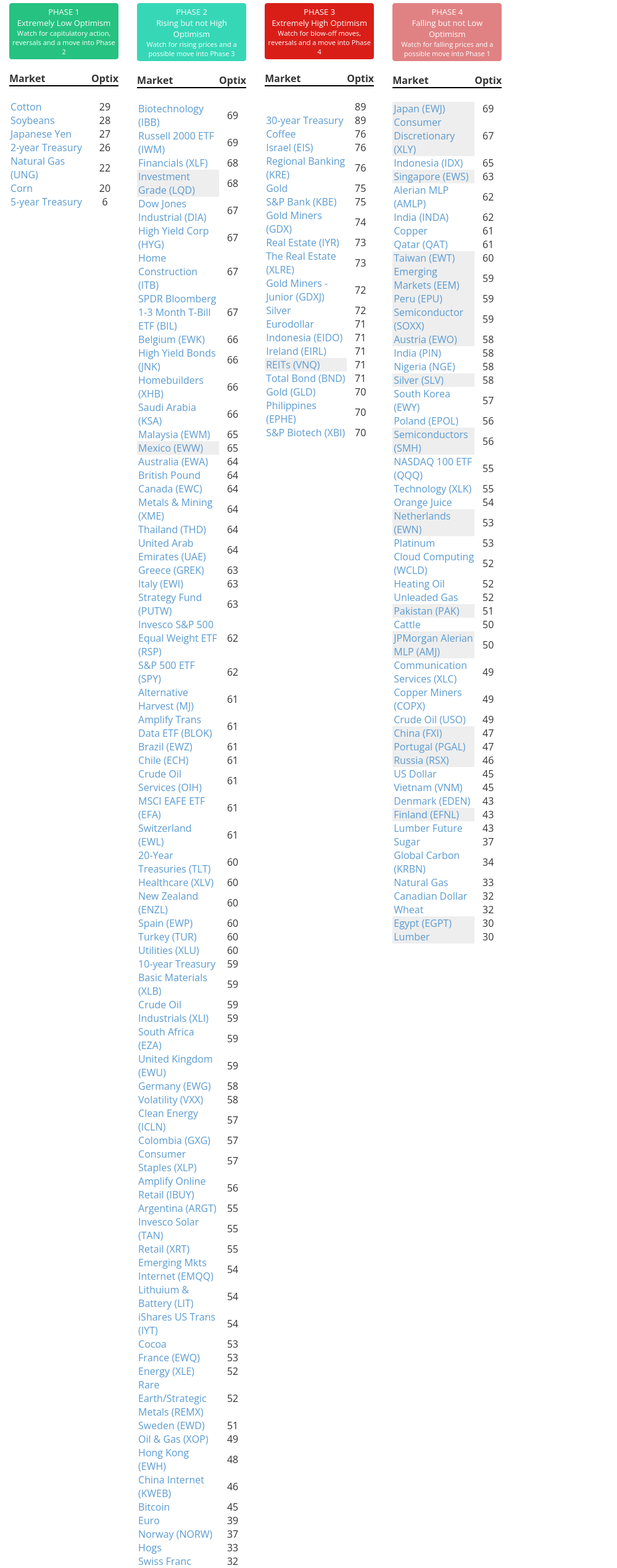
Phase Table
|
|
|
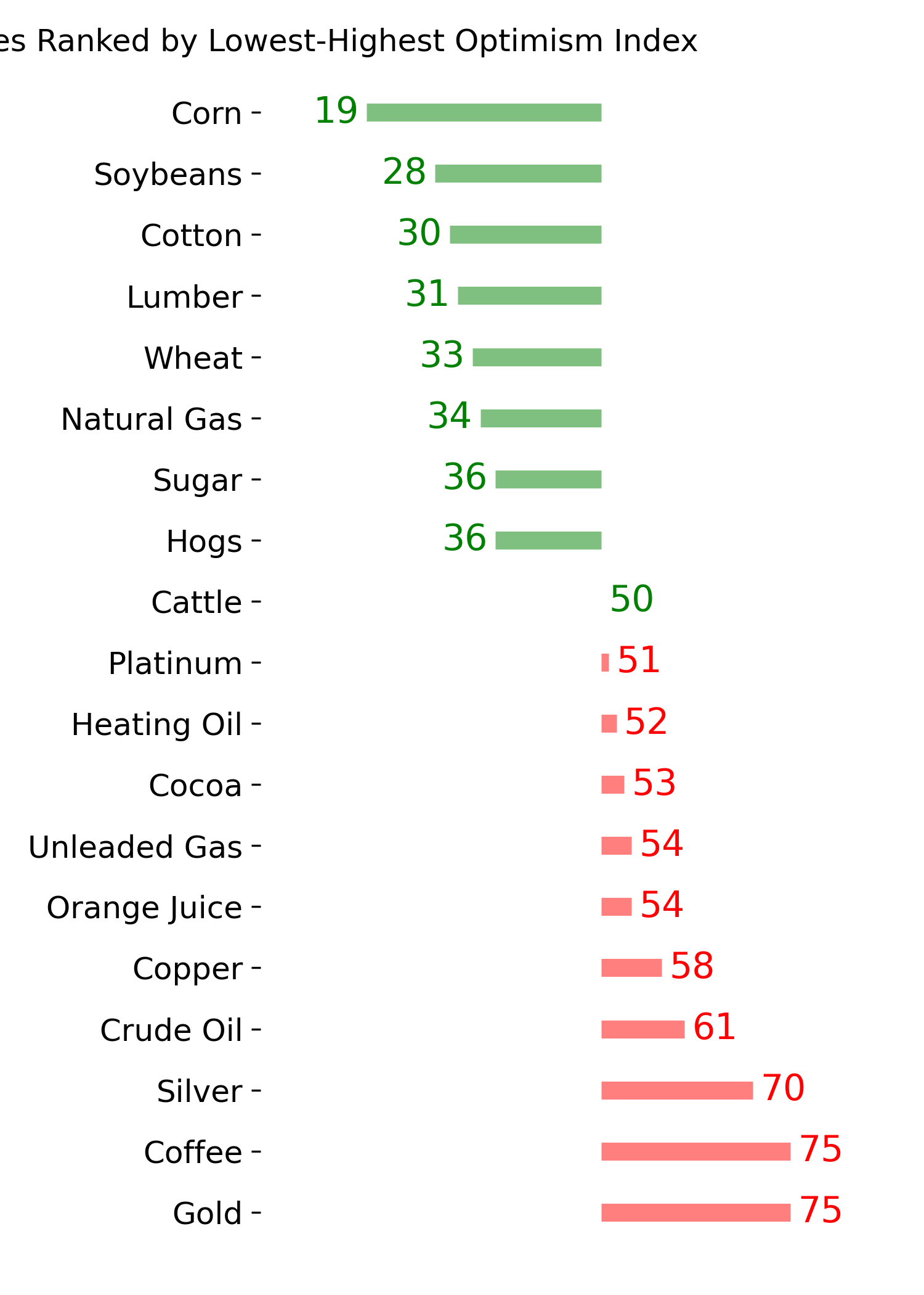
Ranks
|
|
|
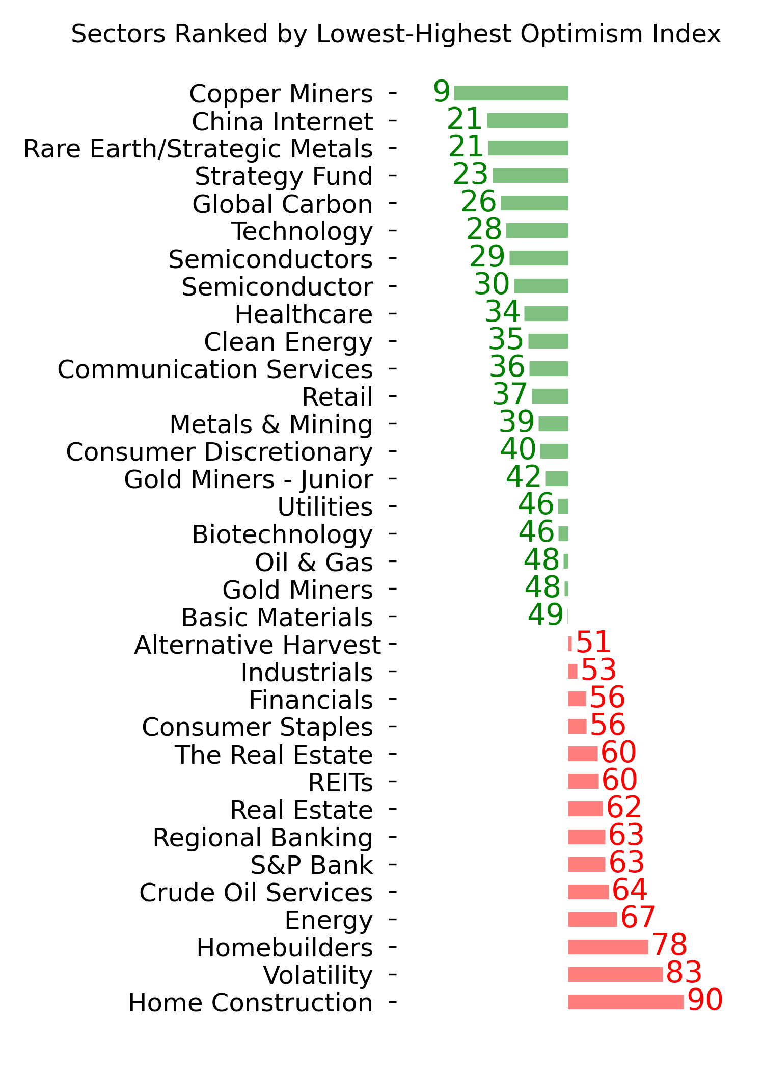
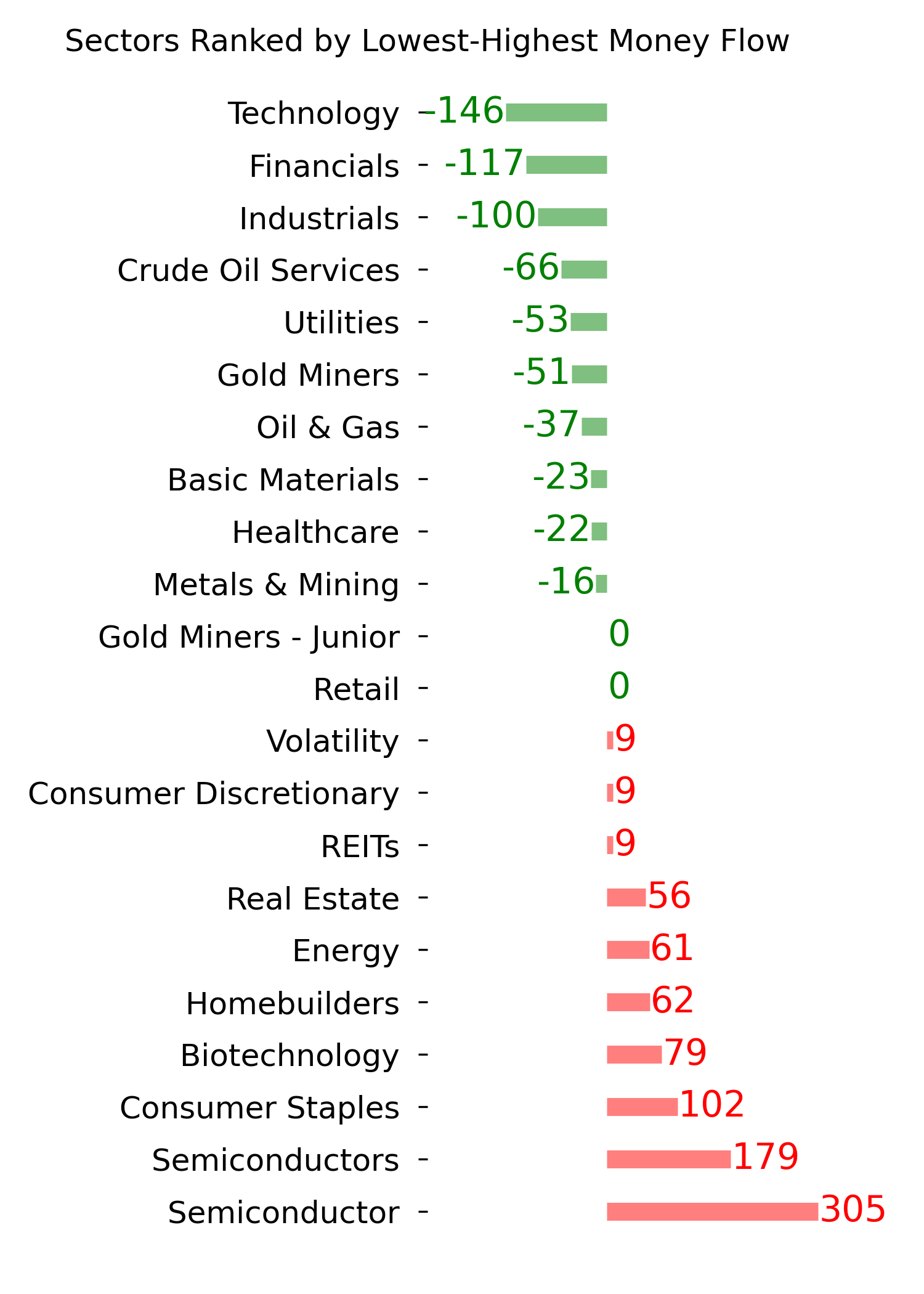
|
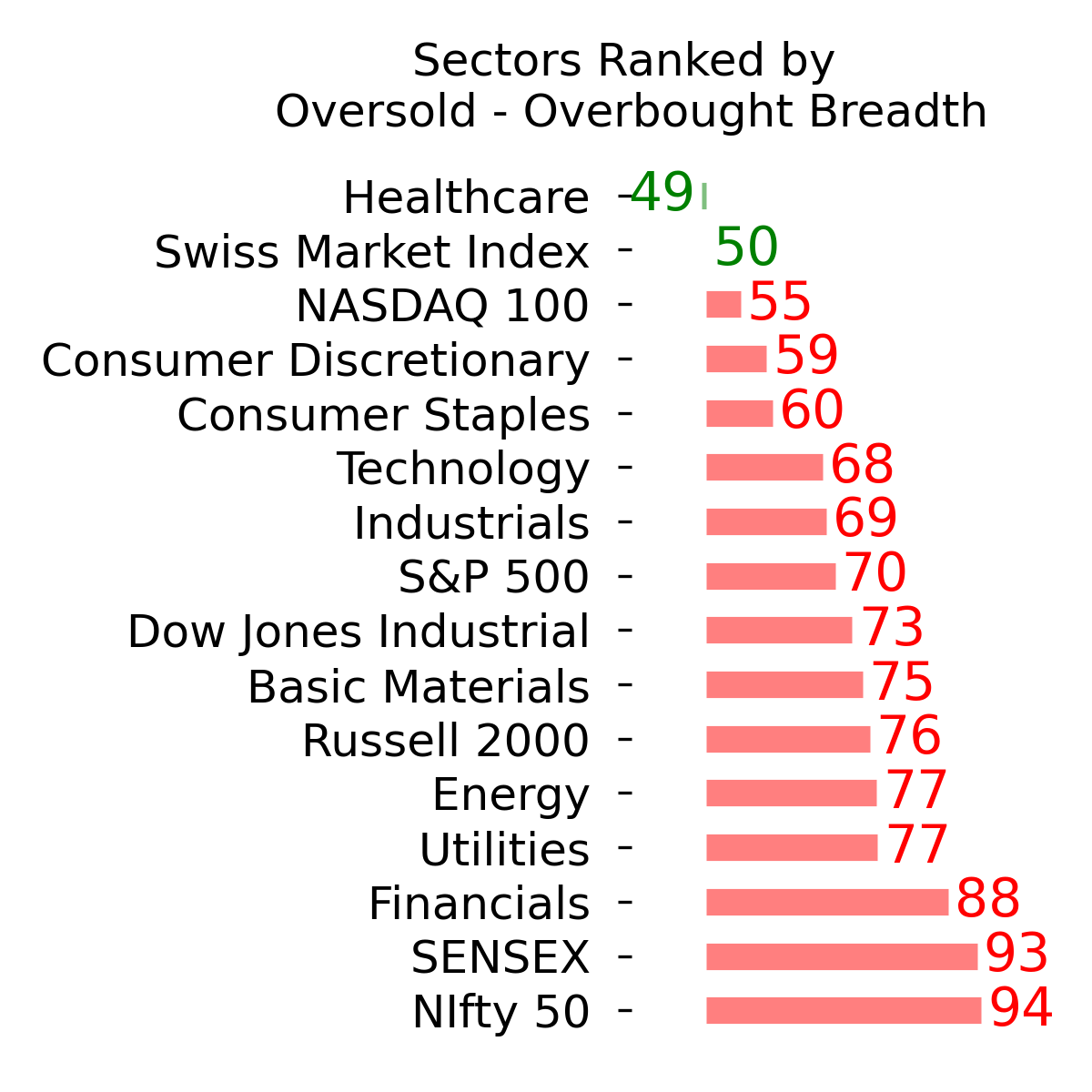
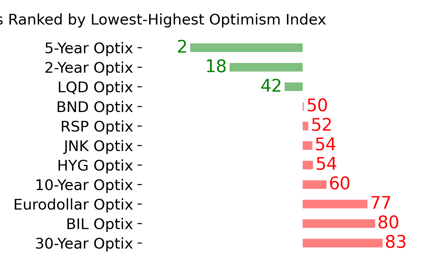
|
|
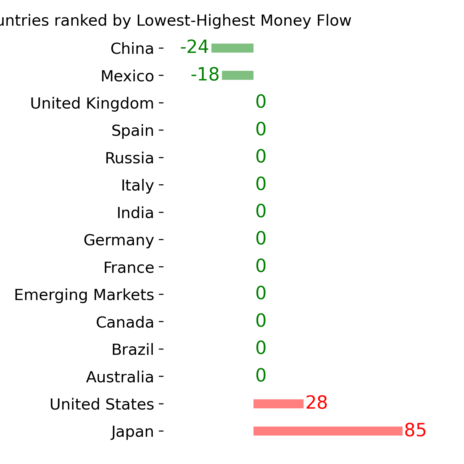
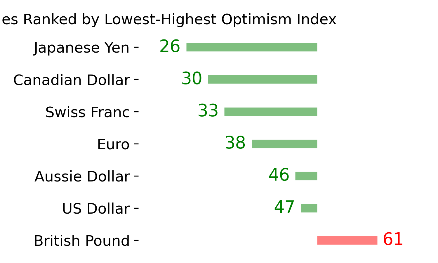
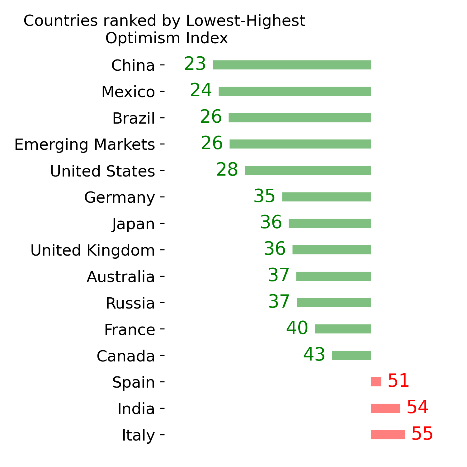
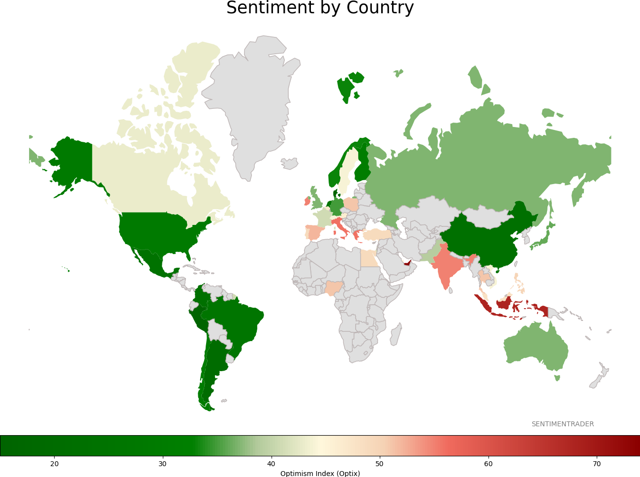
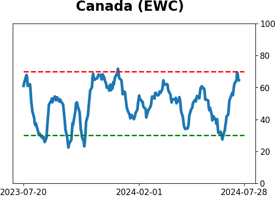
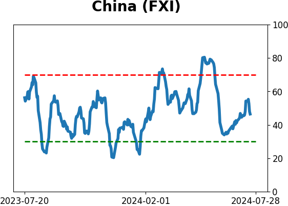
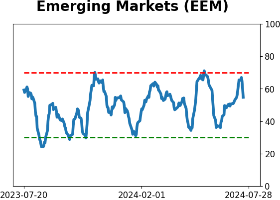
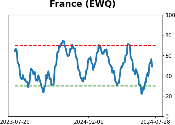
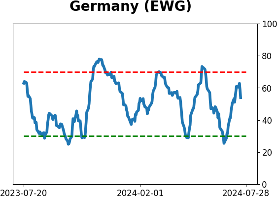
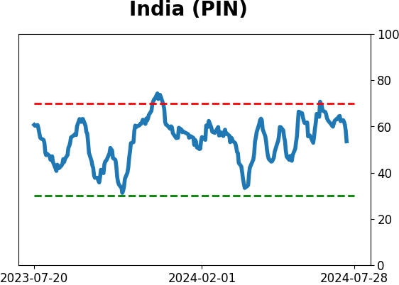
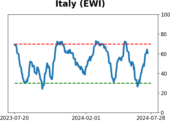
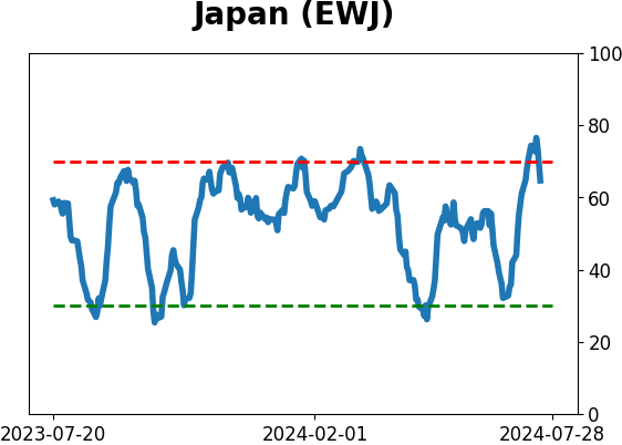
Sentiment Around The World
|
|
|
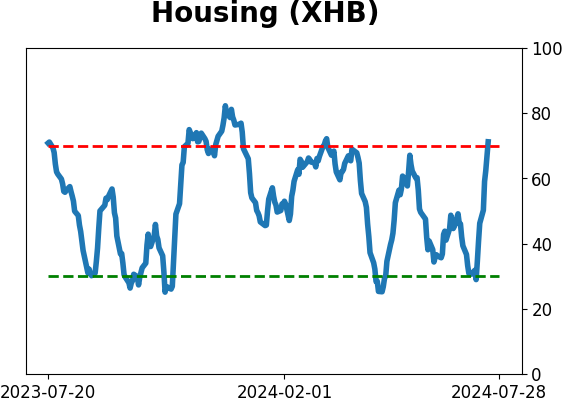
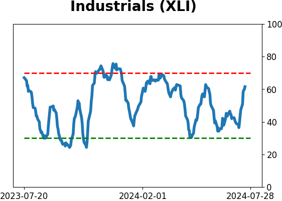
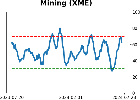
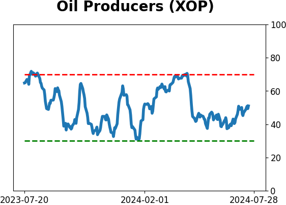
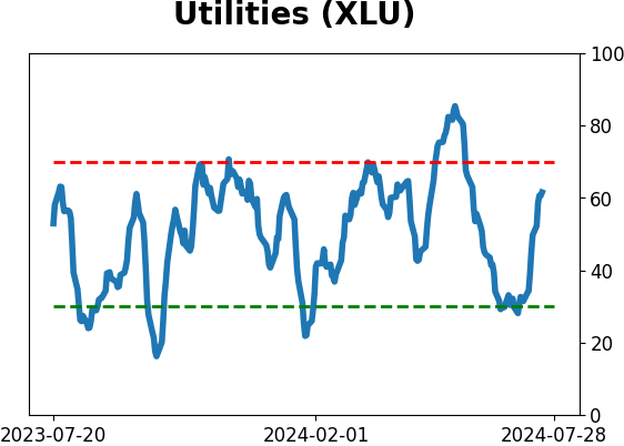
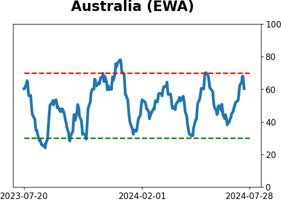
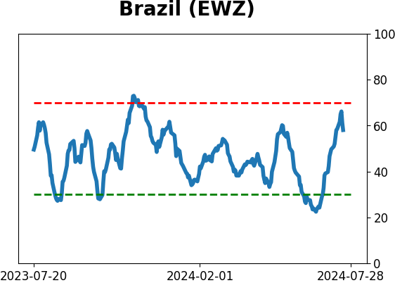
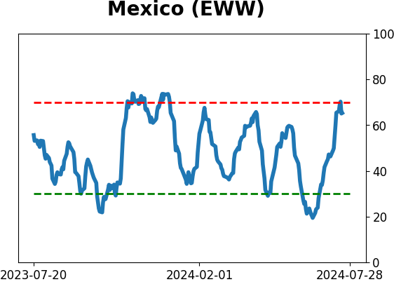
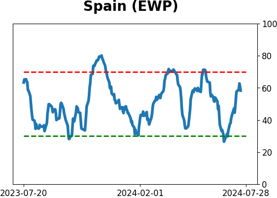
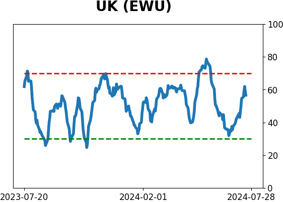
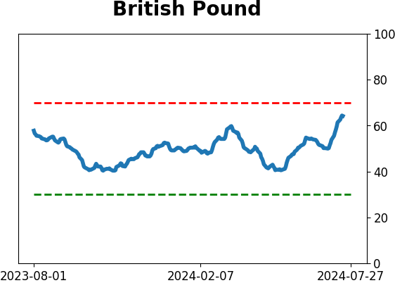
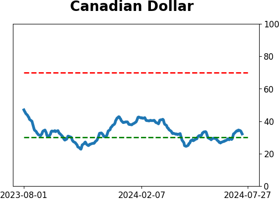
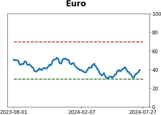
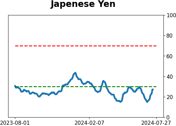
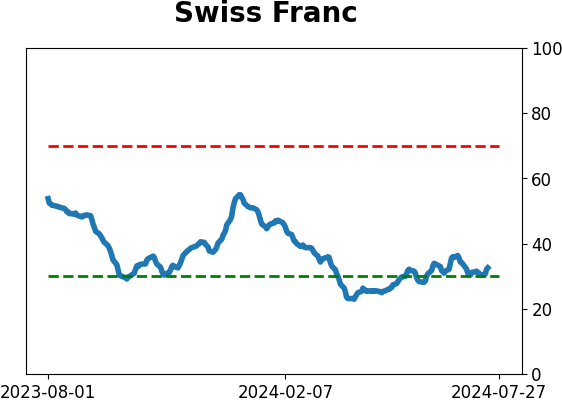
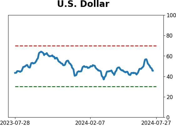
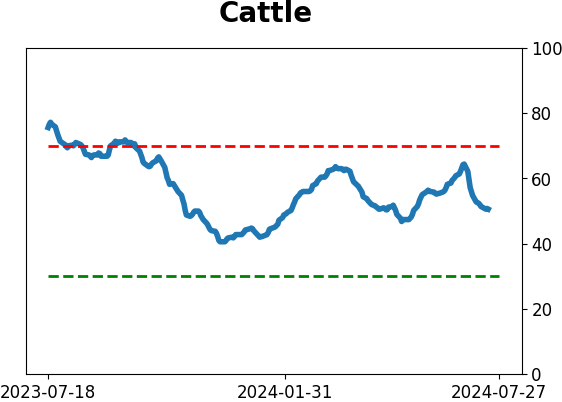
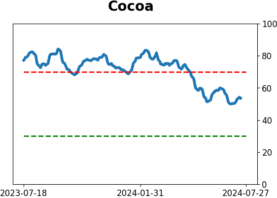
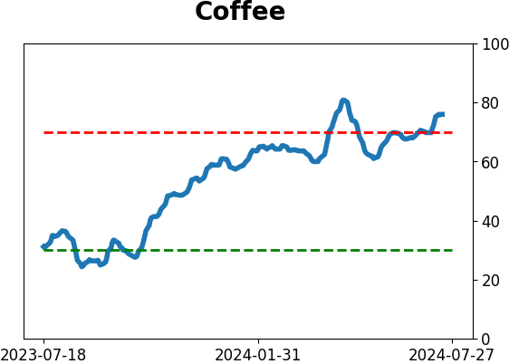
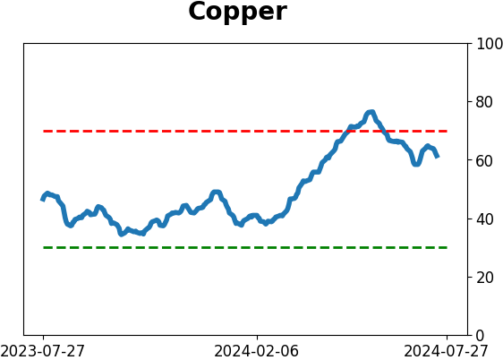
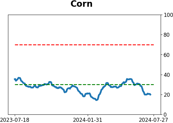
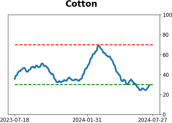
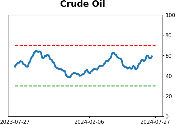
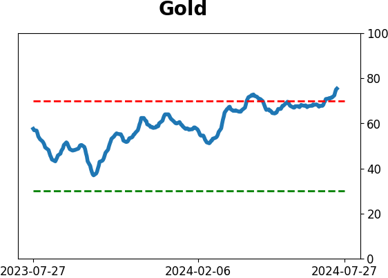
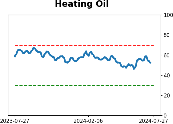
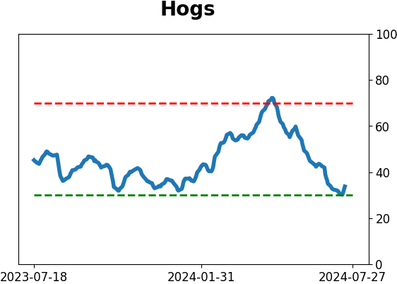
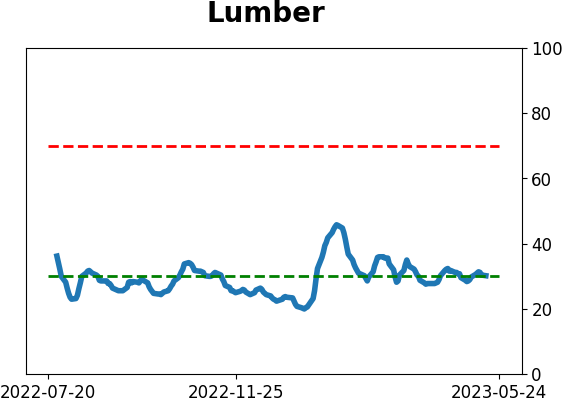
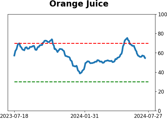
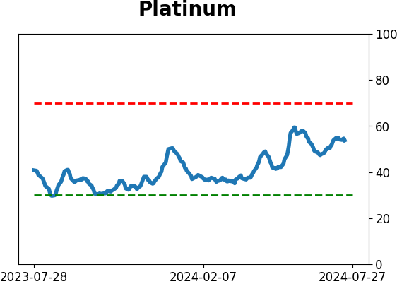
Optimism Index Thumbnails
|
|
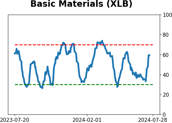
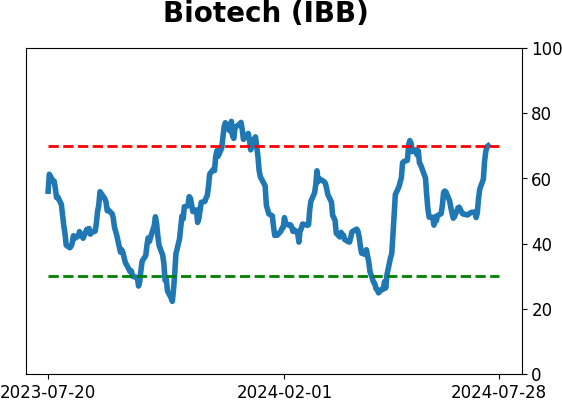
|
|
|
|
|
|
|
|
|
|
|
|
|
|
|
|
|
|
|