Daily Report : TradingEdge Weekly for Jul 8 - More volatility, deteriorating fundamentals, plunging commodities

| View/Print a PDF version of this Report |
Headlines
|
TradingEdge Weekly for Jul 8 - More volatility, deteriorating fundamentals, plunging commodities: This week, we saw more volatility, with another 2% intraday decline in the S&P 500. The volatility is causing the Panic / Euphoria model to move into Panic mode. Credit markets have been stressed, with spread widening and high-yield bonds declining. The Panic Button has been high but not spiking yet. Macro conditions are deteriorating quickly, and gold and copper have plunged. |
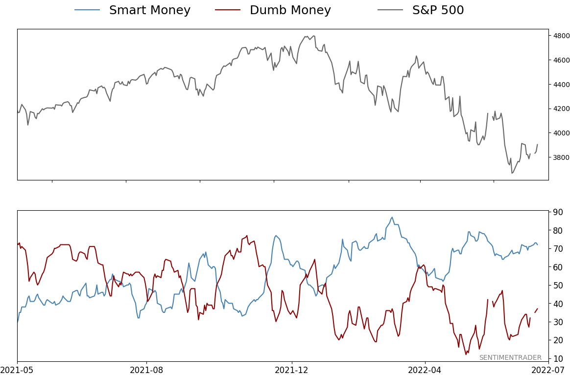
Smart / Dumb Money Confidence
|
|
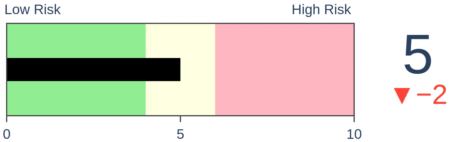
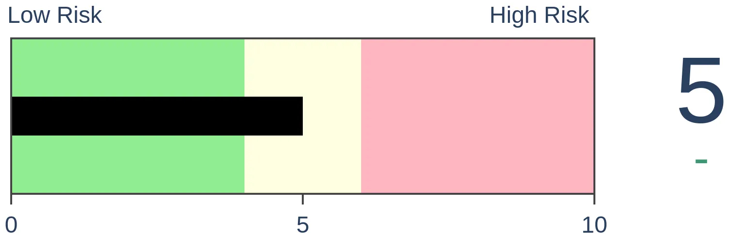
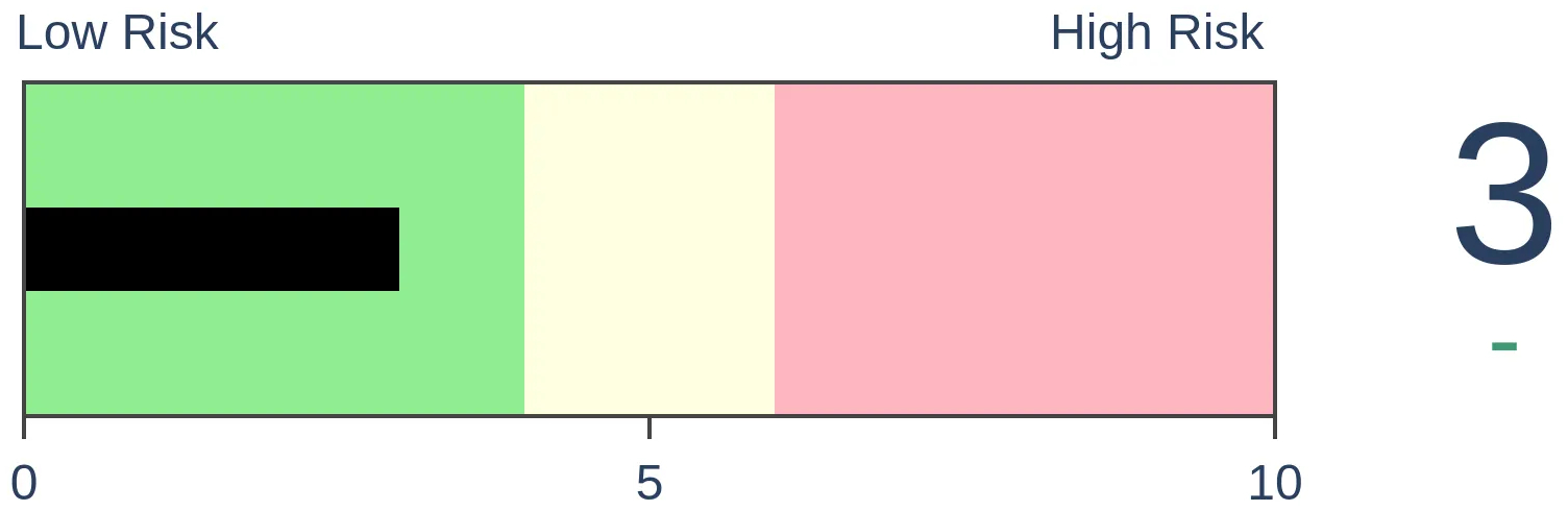
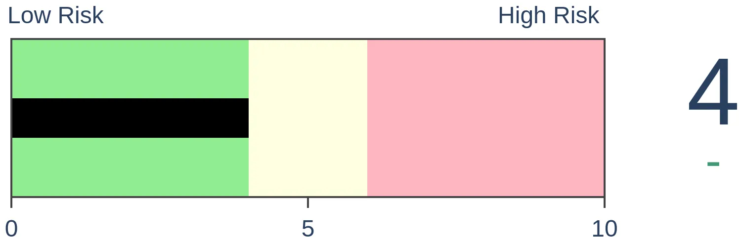
Risk Levels
|

|

|
Research
TradingEdge Weekly for Jul 8 - More volatility, deteriorating fundamentals, plunging commoditiesBy Jason GoepfertBOTTOM LINEThis week, we saw more volatility, with another 2% intraday decline in the S&P 500. The volatility is causing the Panic / Euphoria model to move into Panic mode. Credit markets have been stressed, with spread widening and high-yield bonds declining. The Panic Button has been high but not spiking yet. Macro conditions are deteriorating quickly, and gold and copper have plunged. FORECAST / TIMEFRAME |
Key points:
- The S&P 500 has suffered an unusually large number of 2% declines over the past 50 days
- Volatility is causing the Panic/Euphoria model to move into Panic territory
- Signs of stress in credit markets have been building, like a rise in the BAA yield
- High-yield bonds have been struggling, too, with a consistently declining advance/decline line
- Indicators like these have caused the credit market Panic Button to stay elevated for a month
- The yield curve has plunged (one of them, anyway)
- Our Macro Index Model plunged this month
- There are signs of panic among gold bugs
- Copper is crashing, too
- Soybeans have plunged and more may be in store
Investors keep getting a chance to buy the (big) dip
Buy-the-dip is dead, but investors keep getting their chances.
Two months ago, we saw that 2022 was the 2nd-worst buy-the-dip year since 1974. It hasn't gotten much better, and the dips are getting deeper. The S&P 500 has declined at least 2% intraday during more than two dozen days in the past 50 sessions. Tuesday was the latest example, continuing a cluster that started in April.
Going back to 1962, a cluster of 15 or more days with a 2% intraday loss is rare; it's happened only a dozen distinct times in 60 years. The clusters read like a who's who of major geopolitical and financial crises.
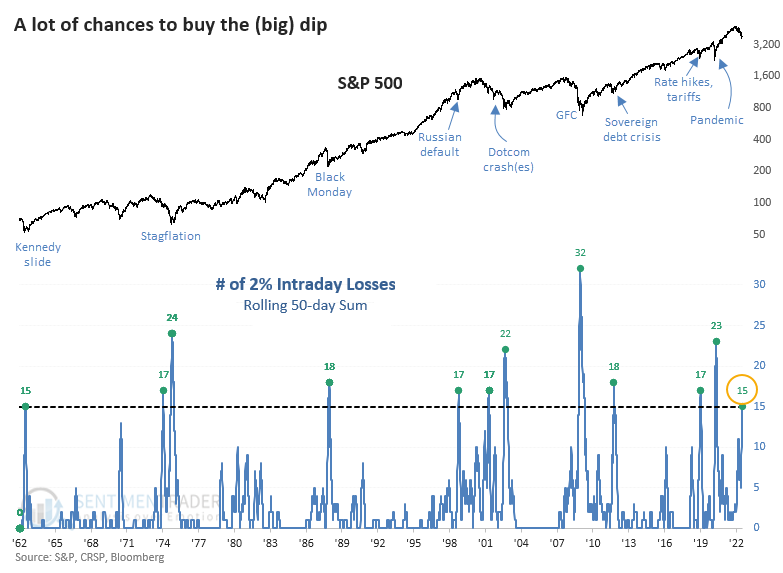
Of the 12 precedents, 10 preceded double-digit one-year gains, averaging more than +21%. The only one that didn't precede a double-digit gain at some point in the next six months was in 1973.
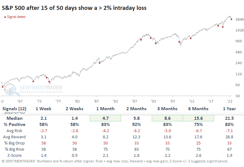
The Risk/Reward Table shows six signals suffered a maximum drawdown during the next three months worse than -5%. But all but one of them enjoyed a maximum gain of more than +5%.
The volatility is causing sentiment to turn from Euphoria to Panic
The Panic/Euphoria Model is a valuable measure of extremes in investor sentiment and quite useful on a contrarian basis. Jay showed that the model is especially useful when combined with price direction and gave a signal in mod-June, which suggests the possibility of a tradable low in the months ahead.
This weekly model is based on the Citi Panic / Euphoria model published in Barron's magazine. It does not reflect those published values. Instead, it is our interpretation of the model inputs and construction and differs modestly from the published figures. The higher the model, the more investors are in a euphoric mood, with lower expected stock returns going forward. Low values, particularly below zero, suggest investors have panicked, and higher forward returns are expected.
The chart below displays those times when the Panic/Euphoria Model was below -0.15, AND the S&P 500 Index was above its 200-week moving average. The table below displays a summary of S&P 500 results following these signals.
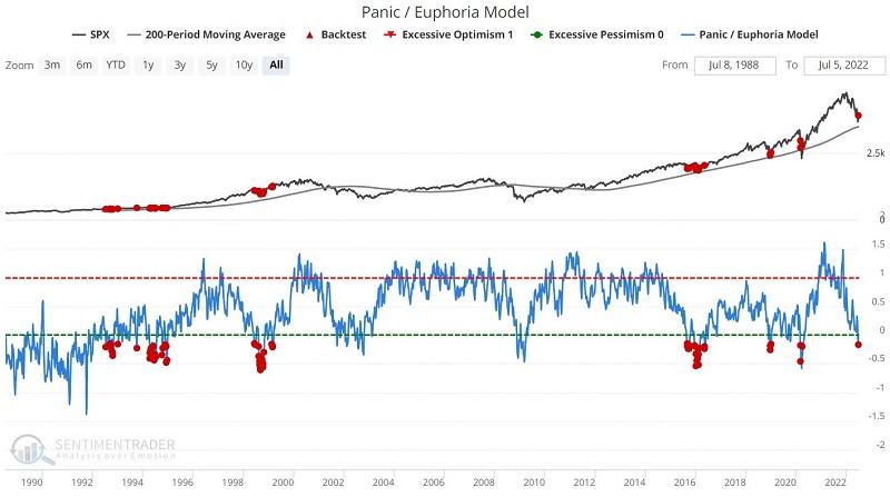
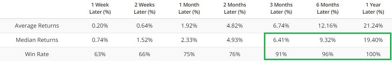
Over the past 30 years, readings as low as they are now have preceded consistent gains in the S&P 500 over the next 3-12 months.
Signs of stress in credit are troubling, though
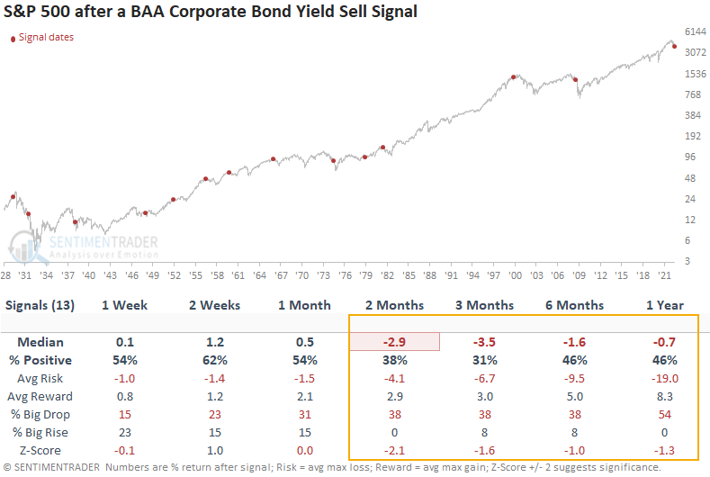
Dean noted that a new signal from a voting member in his TCTM Recession Composite Model registered an alert with the June update. The model identifies when the Baa corporate bond yield closes at an 18-month high in 5 out of the last 12 months.
A consistent monthly increase in corporate bond yields above an 18-month high has been rare since the peak in rates in the early 1980s. The last two instances occurred before or during significant recessionary bear markets in 2000-02 and 2007-08. The Baa bond yield signal has triggered before or during a recession in 11 out of 15 instances since 1929. Most alerts occur before a recession.
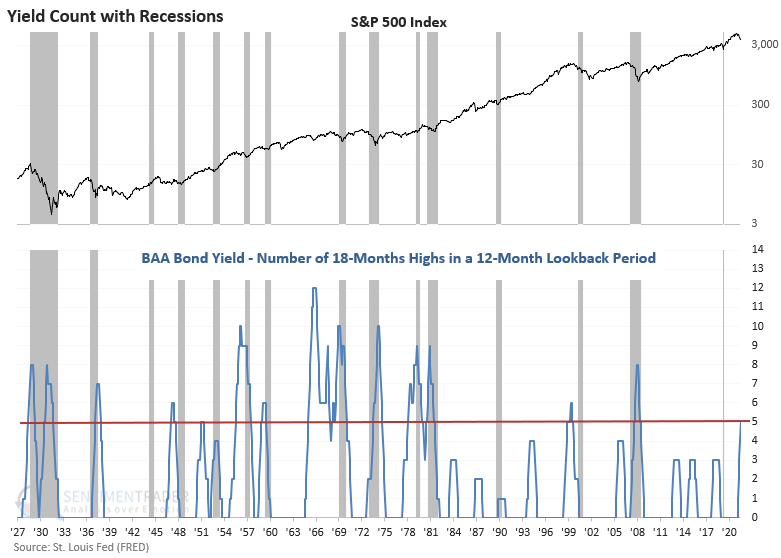
This model generated a signal 13 other times over the past 93 years. After the others, S&P 500 future returns, win rates, and risk/reward profiles were unfavorable across medium and long-term time frames. Returns were negative at some point in the first 6 months in 11 out of 13 instances. The 1999 signal was a bit early. However, we all know what happened after that one.
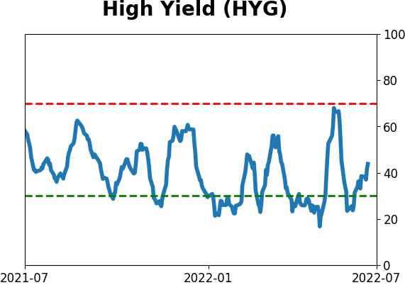
High-yield bonds are struggling, too
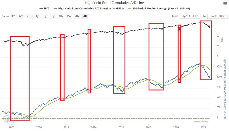
Jay showed that the cumulative advance/decline line for the high-yield bond market remains stuck in a downtrend.
This line will rise if more high-yield (junk) bonds are rising than falling and vice versa. Many traders look for divergences between this line and tickers, such as HYG (iShares iBoxx $ High Yield Corporate Bond ETF) and SPY (SPDR S&P 500 Trust), for advance signs of a potential reversal.
For longer-term investors, it does appear to be possible to use this indicator beneficially on a simple trend-following basis. The chart below displays the High Yield Bond's Cumulative A/D Line and its 200-day moving average.
The chart below displays the hypothetical cumulative % +(-) for the S&P 500 when the High Yield A/D line was below its 200-day moving average.
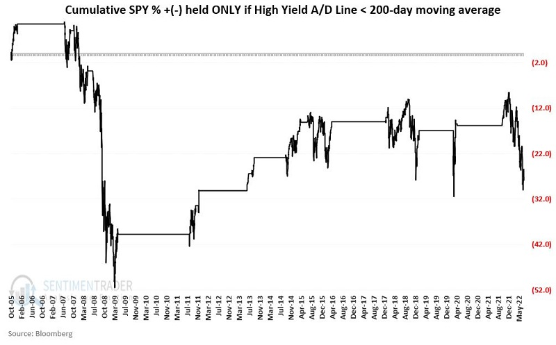
The cumulative % return was -28% versus +338% when the A/D line was above its 200-day average. Stock market bulls should want to see the junk bond market recover better than it has lately.
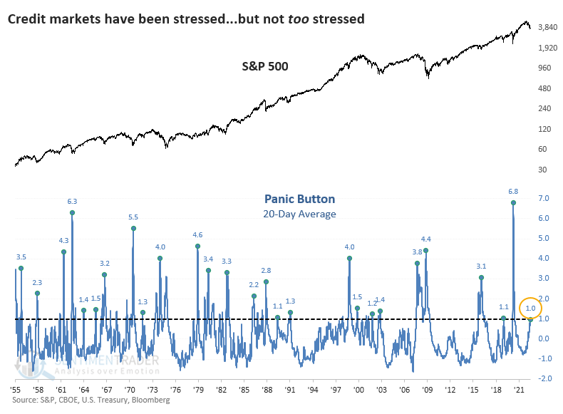
Signs of stress...but not outright panic
In May, we updated the Panic Button indicator, which monitors the credit markets for signs of systemic stress. At the time, it was high, which tends to be a modestly good sign...as long as it doesn't get much higher.
As a reminder, the indicator incorporates four distinct credit market measures that tend to spike higher when uncertainty about the economy, corporate outlooks, and stock prices are high. They reach extreme levels only during times of outright panic across markets.
With some spreads continuing to widen, it's a good time to revisit the Panic Button. Surprisingly, it still hasn't jumped above 1.5, which is when things tend to get hairy. The highest it got was 1.28 on June 30. Still, it has been relatively high for weeks, so the 20-day average has now climbed above 1.0 for the first time in two years.
Looking at the handful of precedents, investors didn't panic at these signs of modest but persistent stresses in credit. Over the next 2-3 months, the S&P 500 managed to show a positive return every time, with an impressive risk/reward ratio.
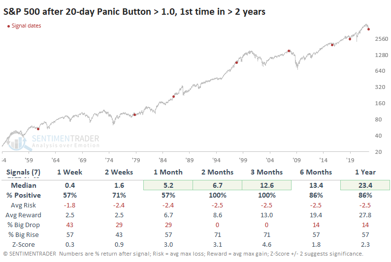
As always, it's harder to rely on precedents the smaller the sample size, so if we relax the parameters to the first 20-day reading above 1.0 in one year (instead of two years), returns dipped a bit. Even so, the next two months tended to be more positive than we saw from the one in May because these use a 20-day average, so the declines were more mature and more likely to reverse.
Since the inception of Bloomberg Barclays U.S. Aggregate Bond Total Return data, these signals preceded gains every time. This is with the usual caveat that bonds have had a 40-year tailwind. High-yield bonds were more volatile, but that also meant higher returns on average.
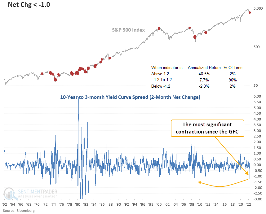
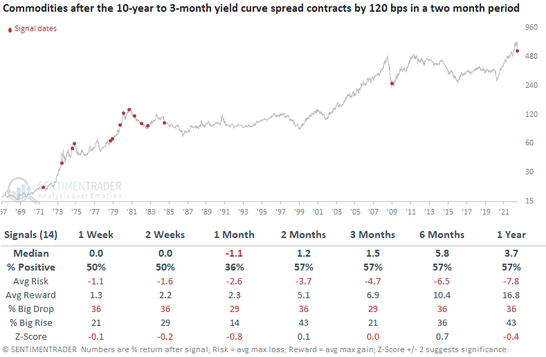
The worsening economic outlook triggered a plunging curve
Dean assessed the outlook for stocks, commodities, and the yield curve when the 2-month net change for the yield curve spread declines by 120 basis points.
For the first time since the GFC and the 15th time since 1971, the 2-month net change for the yield curve spread has fallen by over 120 bps. Significant contractions of this magnitude have been rare in the last 3 decades. However, they were more prevalent during the inflationary 1970-80 period.
This study generated a signal 14 other times over the past 51 years. After the others, the S&P 500 tends to struggle in the 1 & 2-month time frames. The 3-12 month windows look better, especially the 1-year stats.
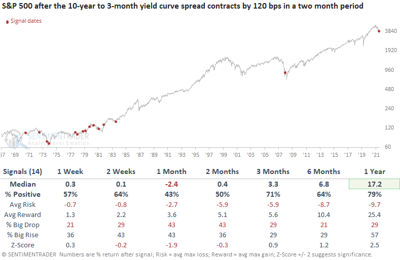
Commodity performance is flat to slightly negative in the first month. A yield curve crash signal shows a loss in 11 out of 14 cases at some point in the first three months.
The fundamental picture continues to deteriorate quickly
Jay noted that our Macro Index Model (MIM) combines 11 various economic indicators to determine the state of the U.S. economy right now.
This model has plunged during the past several months, suggesting a potentially severe weakening of the economy. The chart below displays times when the MIM dropped below 0.46, and the table shows a summary of S&P 500 Index performance following all signals. The most recent signal just occurred at the start of this month.
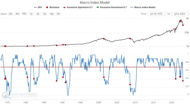
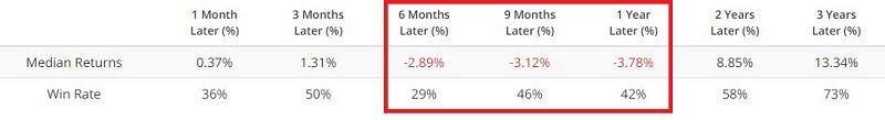
The results are very much of a mixed bag. One-year returns showed a gain only 42% of the time. However, on several occasions, some gains were quite significant (1979, 1987, 1990, and 2020). Other times a significant bear market ensued (1969, 1973, 2000, and 2008).
But things get worse when the S&P 500 was in a downtrend at the time, defined as being below its 10-month moving average.
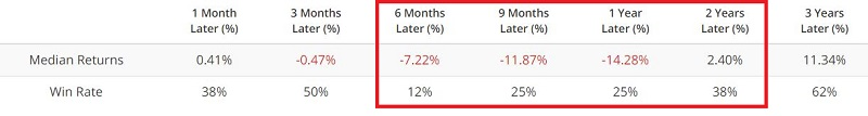
Historically, results have been highly subpar and all time frames from 6 months to 2 years have a Win Rate of less than 50%. Both the 1987 and 1990 signals shrugged off this negative MIM/Price combination but the major bear markets (1969, 1973, 2000, 2008) were all marked by this signal. It's not a good sign for bulls here.
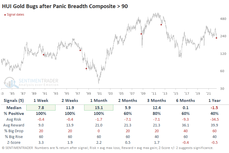
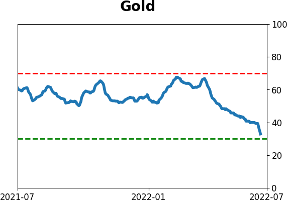
Gold bugs just can't catch a break
Gold miners enjoy a huge upside run maybe once a decade. All other times, short-term rallies get sold almost immediately. That's what we're seeing now.
Using the same inputs and calculations for the Panic Breadth Composite that we did in May, the latest bout of selling surpassed anything from then. Or any other date in almost a decade.
On June 30, the Composite jumped above 90, suggesting the kind of overwhelming and broad-based selling of an entire sector that we don't see too often. For gold miners, that day ranked in the top 20 all-time, going back nearly 40 years.
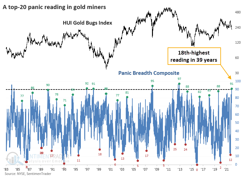
When dealing with a true historic extreme, by its nature, there aren't a lot of precedents to use as guides. This was no exception. Since our data begins in 1983, there have been only five comparable bouts of panic. The good news? Gold miners rallied over the next several weeks every time, showing significant gains. The bad news? Those rallies fizzled out and led to lower lows every time.
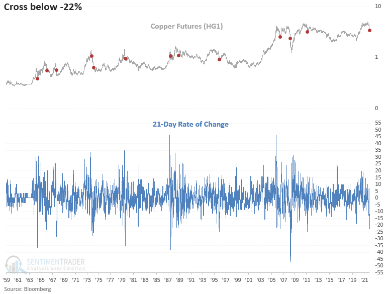
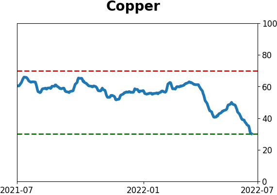
Copper is getting hit hard, too
Dean showed that for the first time in a decade and the 13th time since 1959, copper futures have fallen by over 22% in a month. The previous instance in 2011 led to a multi-year bear market for the commodity.
Significant downward momentum shifts in copper similar to today show a mixed record at best when signaling a recession. And, in the cases where it did trigger around a recession, it was coincidental versus leading.
This study generated a signal 12 other times over the past 58 years. After the others, copper returns, win rates, and z-scores look unfavorable across almost all short and medium-term time frames. The first month shows a loss at some point in 11 out of 12 cases.
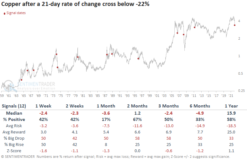
Commodities show somewhat flat results in the next 6 months, with a loss in 10 out of 12 cases at some point.
The S&P 500 shows slightly favorable results across short and medium-term time frames. However, the 1-year return, win rate, and z-score suggest better days ahead. The 1974 and 2008 instances should act as a reminder that the path to a bullish long-term outlook can be rocky.
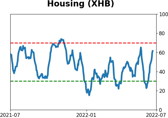
Given coppers utilization in housing, let's look at the builders. The stocks and ETFs like ITB have had a nice relief rally as the 10-year bond yield has fallen 67 bps in a brief period. However, the downside momentum in copper shows a cautious outlook for homebuilding stocks across short and medium time frames.
Semiconductor stocks, apparently the new transports, show weak results across short and medium-term time frames. The first month shows a loss at some point in 9 out of 12 cases.
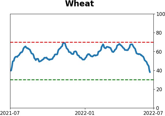
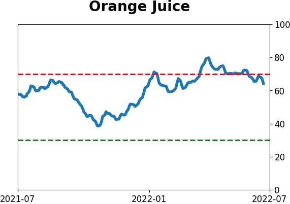
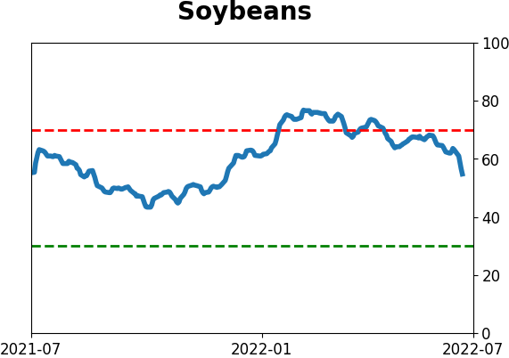
Soybeans look rough, even after being roughed up
Soybeans enjoyed a terrific run from May 2020 into June 2022. A recent -27% plunge has traders wondering what will come next, and Jay showed that seasonality and sentiment are presently arguing that more weakness is in store in the months ahead.
The chart below displays the annual seasonal trend for soybean futures. The implication of the red box is pretty apparent.
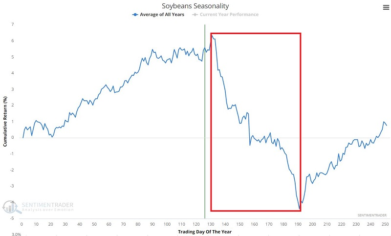
For 2022, this period extends from the close on 7/12/2022 through the close on 10/5/2022.
It is not surprising to learn that trader sentiment towards soybeans turned very bullish during the run-up in early to mid-2022. But what does this significantly bullish sentiment suggest for beans as we advance?
The chart below displays those times when the 100-day moving average for our Soybean Optimism Index (Optix) dropped below 70%. This test looks for a period when soybean Optix is high for an extended time, and then "the bloom comes off the rose" (or the crop, in this case).
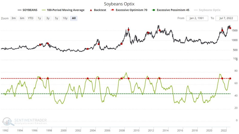
The "Not So Sweet Spot" is between two and six months after a signal, when soybeans gained only 22% of the time. The latest signal dovetails closely with the seasonally unfavorable period discussed earlier. Jay then put the sentiment and seasonality together into a simple trading system and showed how difficult it was for the grain to rally during similar conditions.
About TradingEdge Weekly...
The goal of TradingEdge Weekly is to summarize the research published to SentimenTrader over the past week. Sometimes there is a lot to digest and this summary is meant to highlight the highest conviction or most compelling ideas we discussed. This is NOT the full research that's published, rather it pulls out some of the most relevant parts. It includes links to the published research for convenience; if you don't subscribe to those products it will present the options for access.
Indicators at Extremes
|
|
|
Phase Table
|
|
|
Ranks
|
|
|
|
|
|
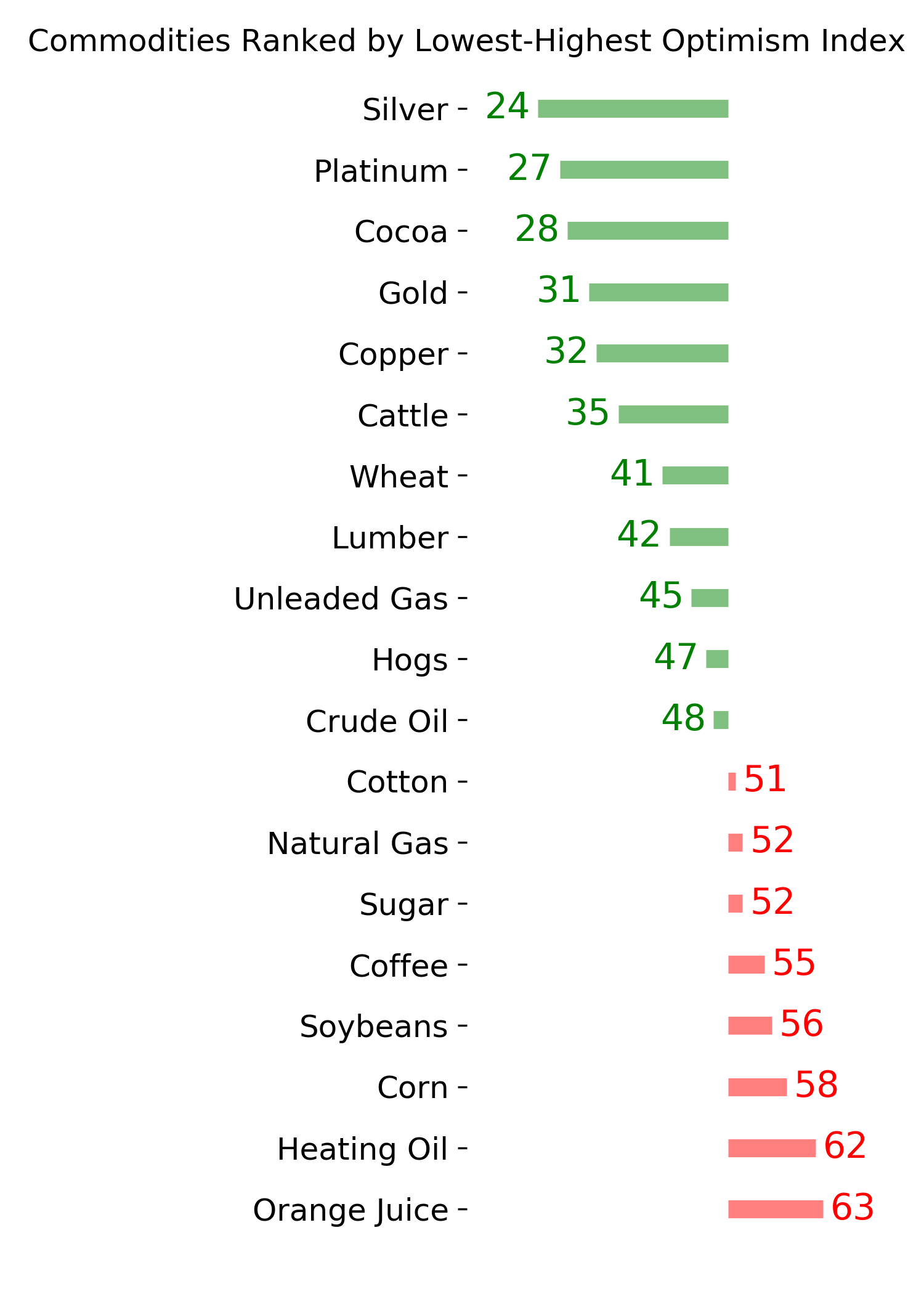
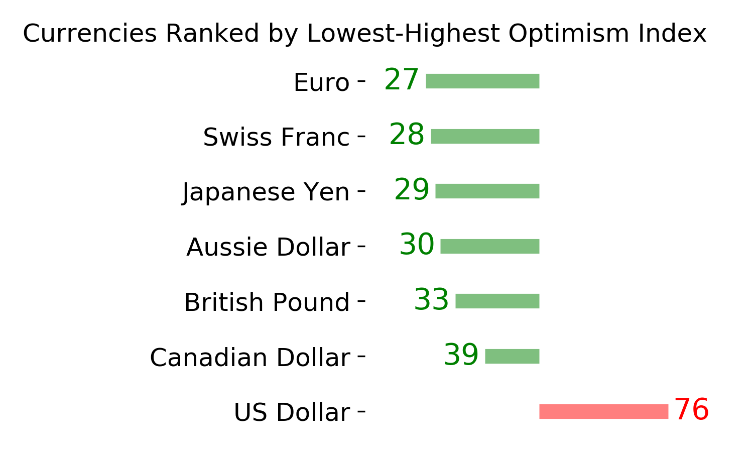
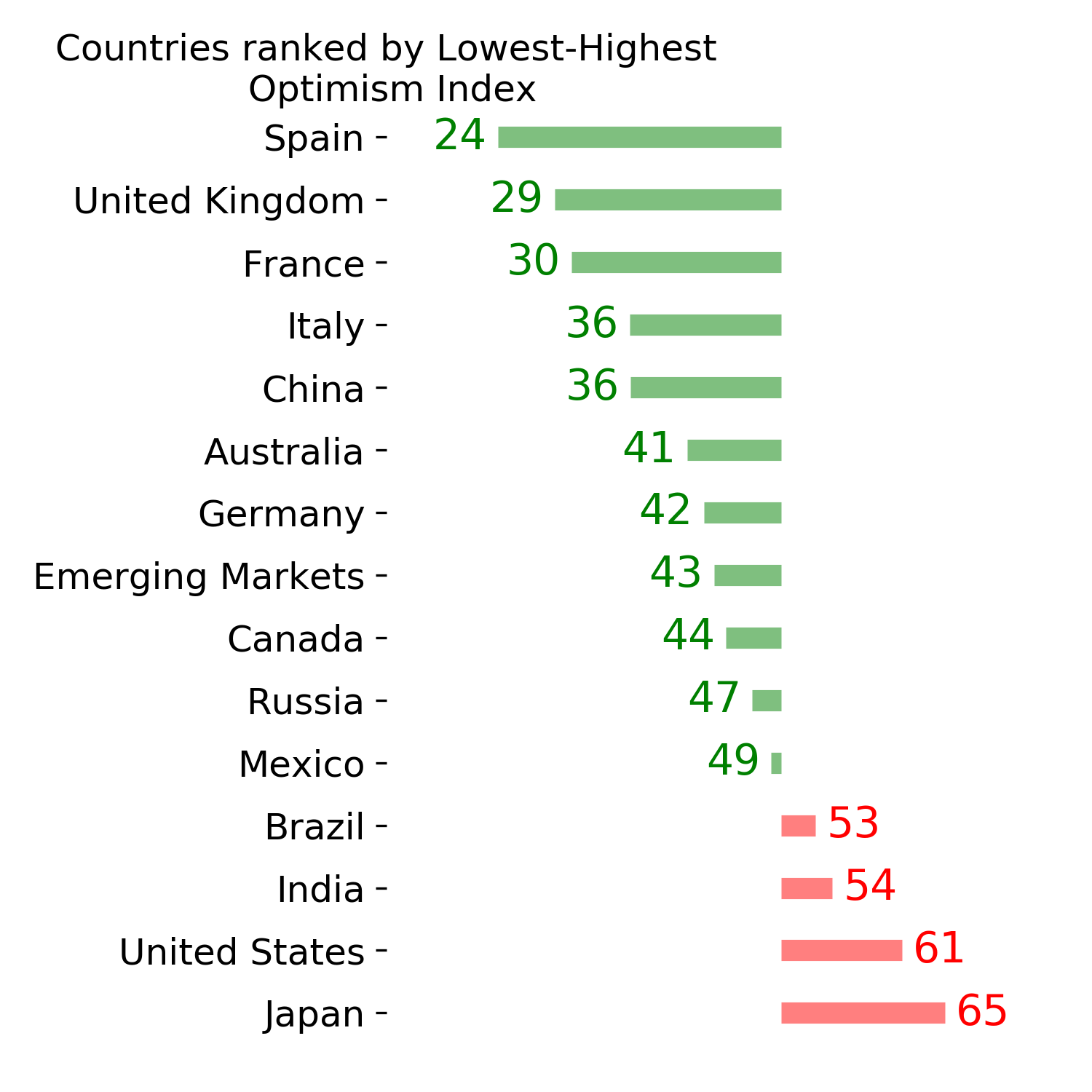
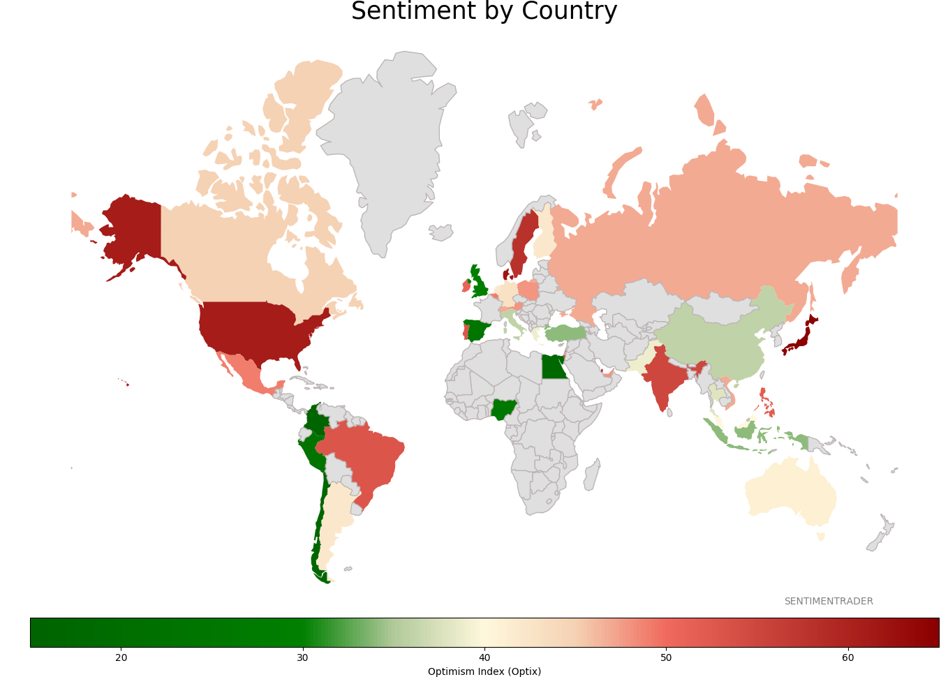
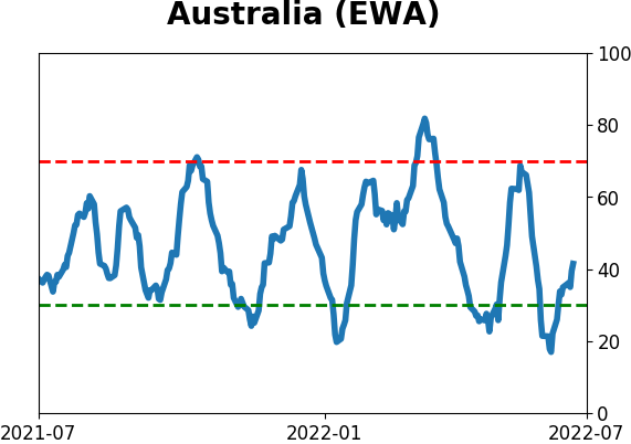
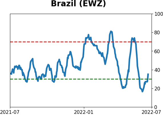
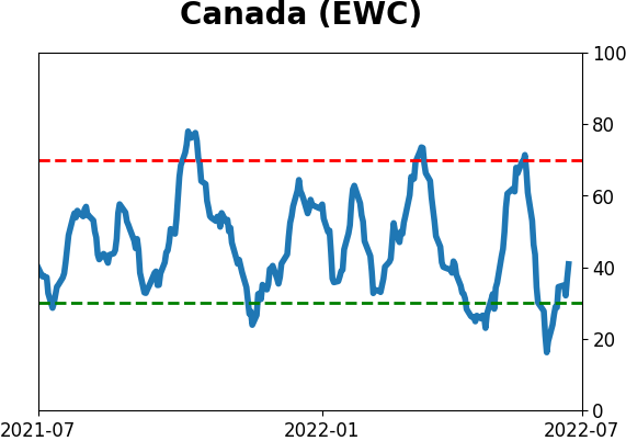
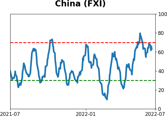
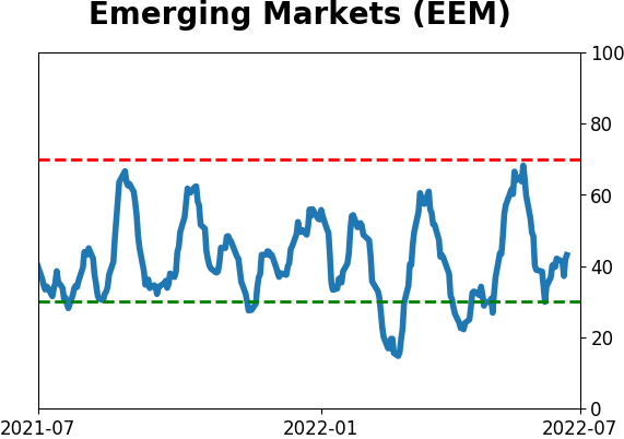
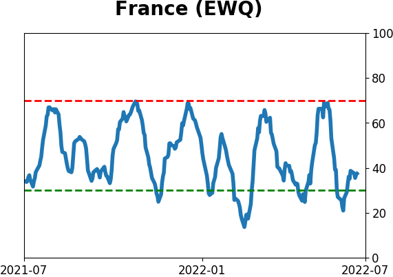
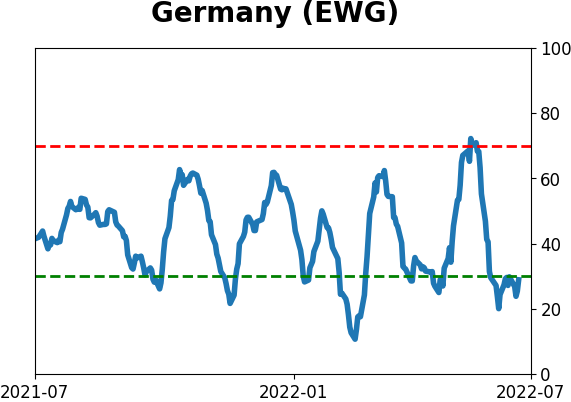
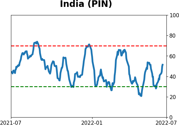
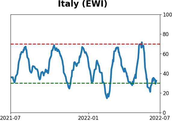
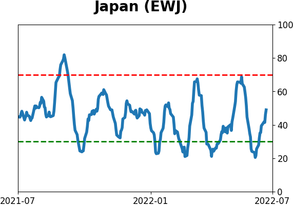
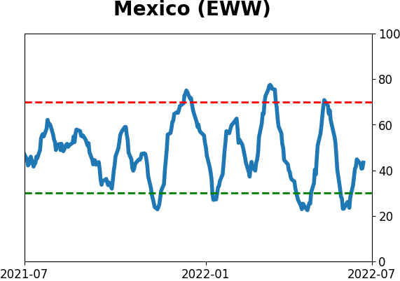
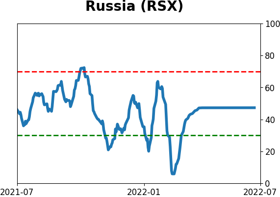
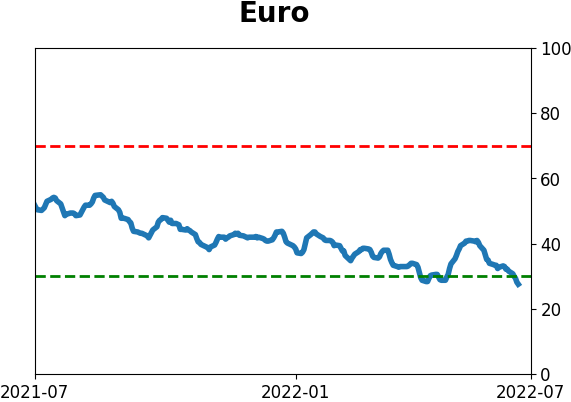
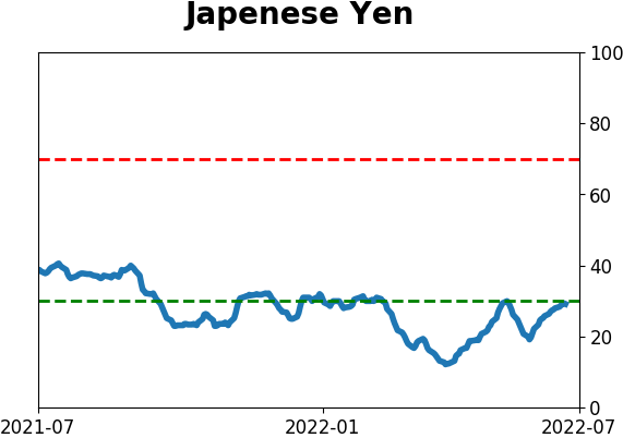
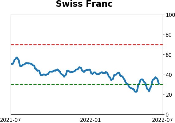
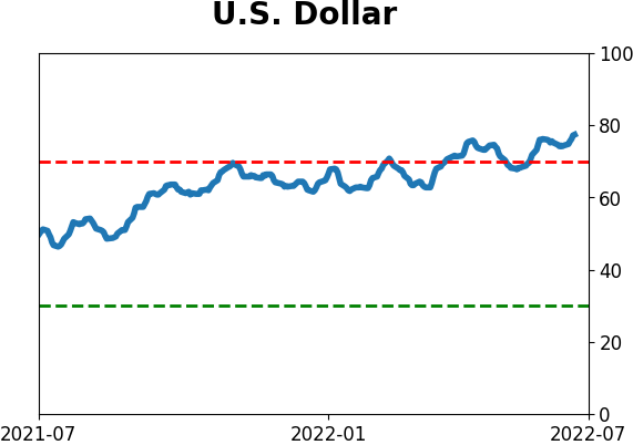
Sentiment Around The World
|
|
|
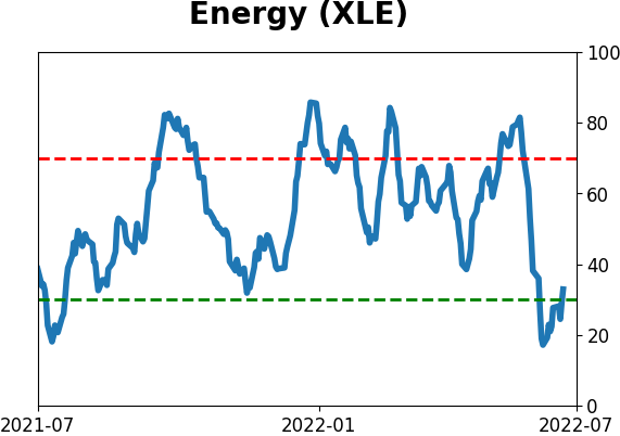
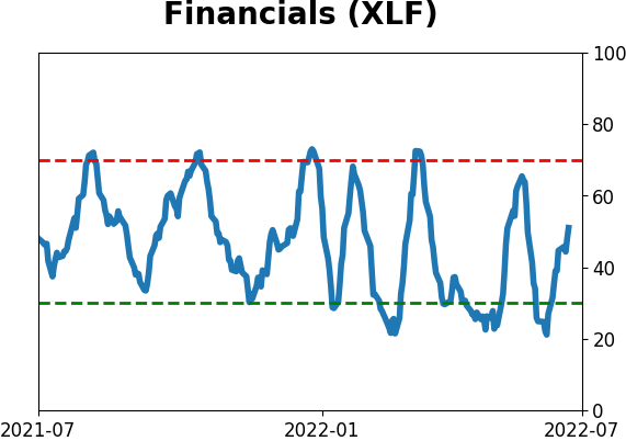
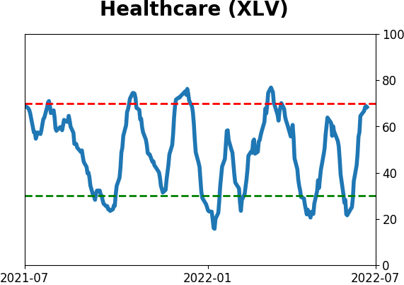
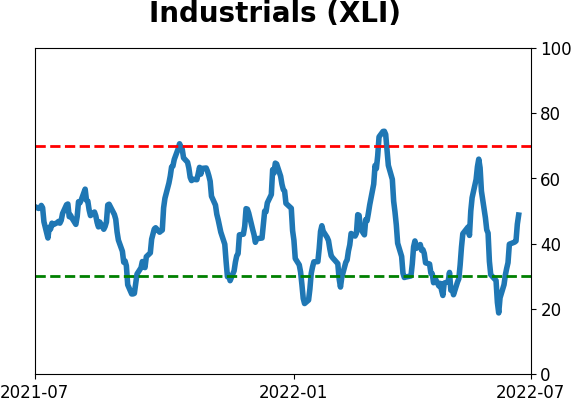
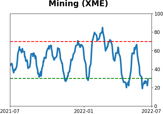
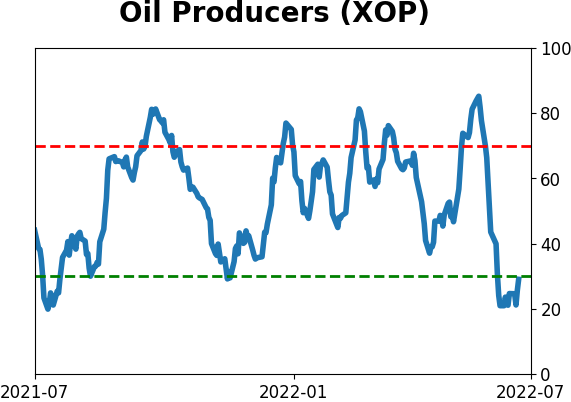
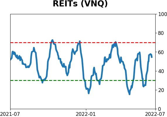
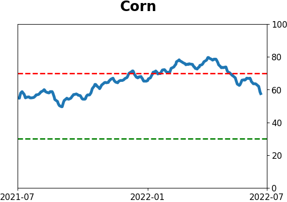
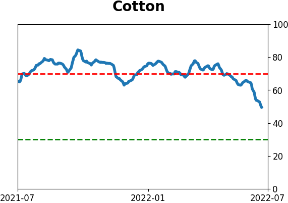
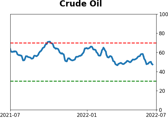
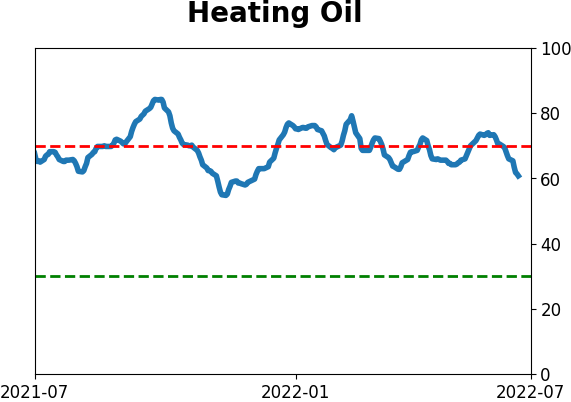
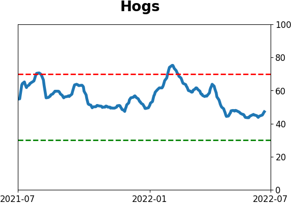
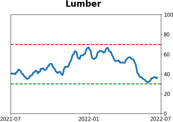
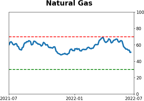
Optimism Index Thumbnails
|
|
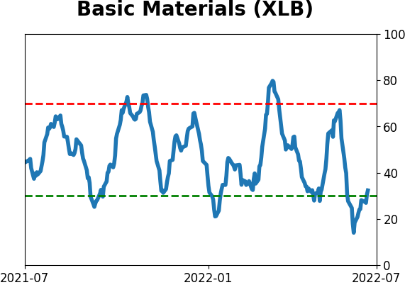
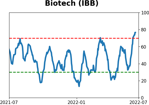
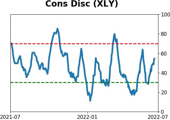
|
|
|
|
|
|
|
|
|
|
|
|
|
|
|
|
|
|
|