Daily Report : TradingEdge Weekly for Jun 30 - Fewer jobless, more call buying, stocks vs commodities

| View/Print a PDF version of this Report |
Headlines
|
TradingEdge Weekly for Jun 30 - Fewer jobless, more call buying, stocks vs commodities: This week, we saw that small options traders have been aggressively buying call options again...but also a lot of puts. Rising call option volume is pushing Gamma Exposure above a key level, but Wall Street strategists still aren't raising their price targets. A breakout in the average Industrial stock. Looking at long-term cycles in stocks versus commodities. |
Smart / Dumb Money Confidence
|
|
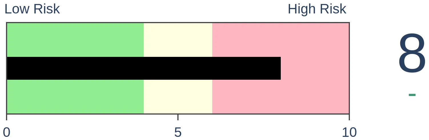
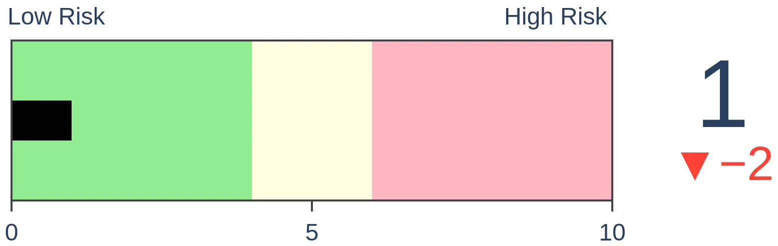
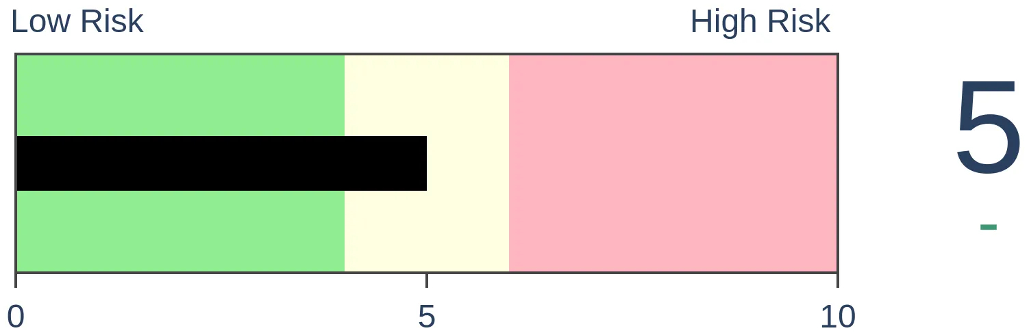
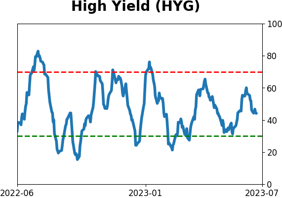
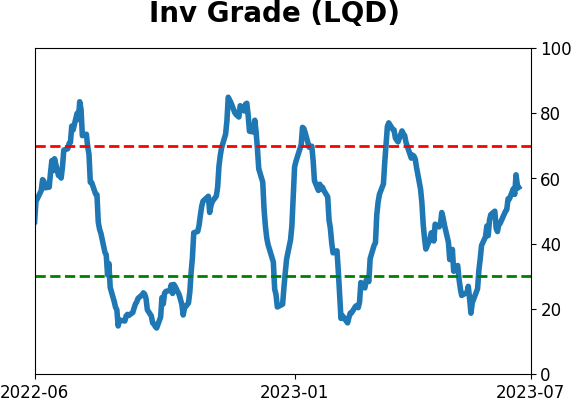
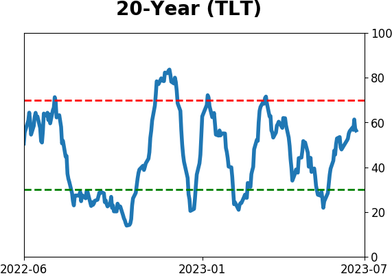
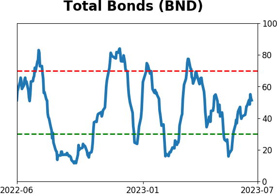
Risk Levels
|

|

|

Research
TradingEdge Weekly for Jun 30 - Fewer jobless, more call buying, stocks vs commoditiesBy Jason GoepfertBOTTOM LINEThis week, we saw that small options traders have been aggressively buying call options again...but also a lot of puts. Rising call option volume is pushing Gamma Exposure above a key level, but Wall Street strategists still aren't raising their price targets. A breakout in the average Industrial stock. Looking at long-term cycles in stocks versus commodities. FORECAST / TIMEFRAME |
Key points:
- Fewer jobless claims trigger a bullish signal for stocks
- Small options traders are buying call again...but also a lot of puts
- Rising call option buying is pushing a long-term average of Gamma Exposure above a key level
- The S&P 500 declined 5 out of 6 days right after hitting a 52-week high
- Market gains haven't persuaded Wall Street strategists to raise their S&P 500 price targets
- The average Industrial stock has registered a new high
- The Shanghai Composite recently suffered an intermediate-term breakdown
- A detailed look at 15-year cycles in stocks versus commodities
- Within commodities, grains surged as positioning remains offsides
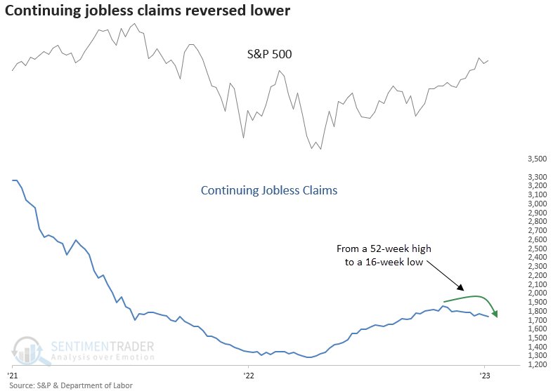
Fewer jobless claims trigger a bullish signal
People seem to be finding work, and that has helped to fuel optimism about a rebounding economy and stock market.
Dean showed that continuing jobless claims cycled from a 52-week high to a 16-week low. Similar reversals in continuing claims resulted in excellent returns for the S&P 500, with cyclical sectors outperforming defensive ones.
The presence of elevated continuing claims can be a sign of sluggish employment and economic growth. So, the reversal to a 16-week low is an interesting development in the debate over a soft or hard landing for the economy.
The S&P 500 demonstrates excellent returns and win rates when the continuing claims cycle like this, particularly over medium and long-term horizons. The only notable drawdown occurred in 1975, representing a correction following a substantial rally from the 1974 bottom. Dates used in the study are as of the release date.
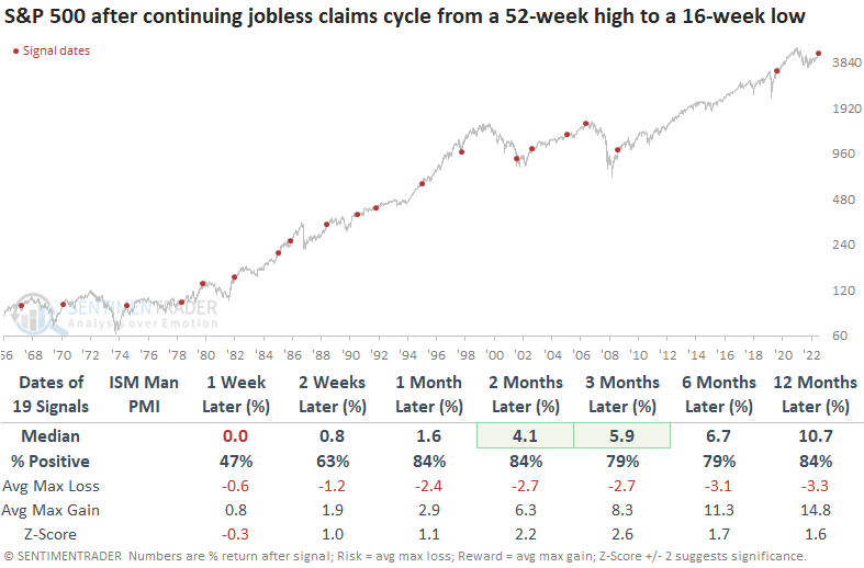
When Dean isolated the signals associated with a contraction in the ISM Manufacturing PMI, like now, the S&P 500 was higher a year later every time.
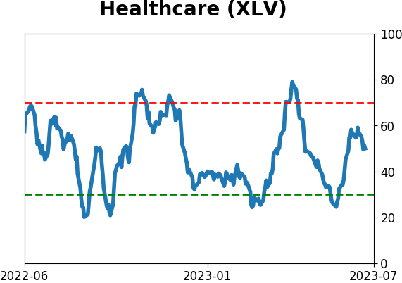
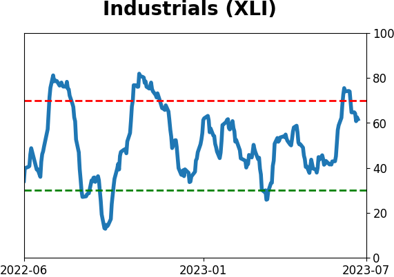
An improvement in the continuing claims suggests one should favor cyclical groups over defensive ones. The Industrial sector showed among the strongest one-year returns, while Health Care showed the weakest.
Applying the continuing claims signals to the ISM Manufacturing PMI data reveals a positive correlation, indicating that an improvement in employment data tends to lift the manufacturing survey.
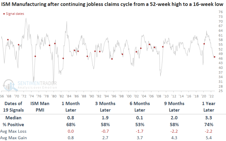
In cases where the continuing claims reverse with the ISM Manufacturing PMI in contraction territory, the manufacturing survey has increased every time in the subsequent six, nine, and twelve-month periods.
Options traders are coming back
Options traders are coming back and betting heavily on the idea of a new bull market. Kind of.
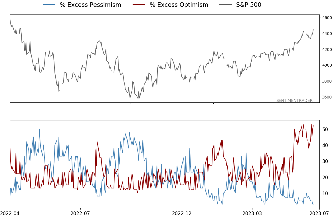
When looking at options trades as an indicator of sentiment, the most effective population we've found is small traders, buying or selling ten or fewer contracts at a time. They recently spent 45% of their volume buying call options to open on equities and ETFs, among the most in 23 years outside of the stimmy-fueled option-buying spurts in 2020 and 2021.
This looks...not good. However, last week small traders also spent about 24% of their volume buying put options to open. That's more than during most of the panics of the past 23 years. If stocks peaked here, it would be with the most put buying of any major peak since 2000.
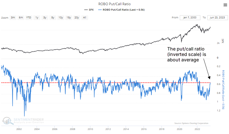
Combining the two indicators gives us the ROBO Put/Call Ratio. The chart below, with an inverted scale to better align with price peaks and troughs, shows that the current reading is only about average historically. It is not showing excessive speculative activity.
Another way of looking at this is through the net premiums that small traders spend on calls versus puts. But the Small Trader Put/Call Premium is also not showing any extreme. It's even more neutral than the measure using contract volume we saw above (the chart below uses an inverted scale).
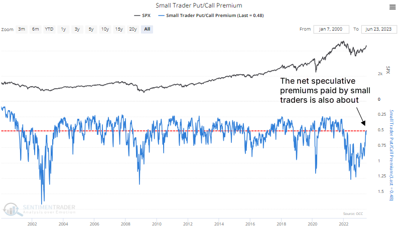
We looked at this in January and saw how extreme it was even months after the October price bottom. While that historic extreme has been largely alleviated, the current level is exactly average relative to the past 1,226 weeks of history.
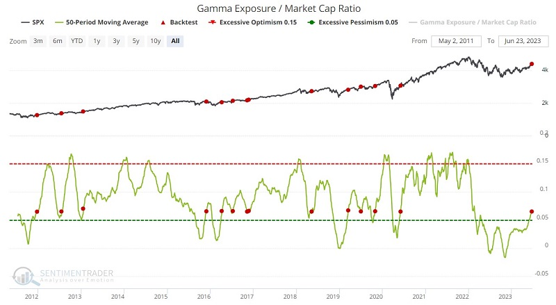
Increased call buying is pushing long-term Gamma Exposure higher
Jay showed that Gamma Exposure as a percentage of market capitalization has crossed a significant level recently.
Gamma Exposure refers to the sensitivity of existing options contracts to changes in the underlying price of the S&P 500. A raw gamma exposure value of 6 billion implies that if the price moves +/-1%, 6 billion shares will come to market to push price in the opposite of the prevailing direction. The Gamma Exposure / Market Cap Ratio indicator expresses the raw gamma exposure value as a percentage of total stock market capitalization.
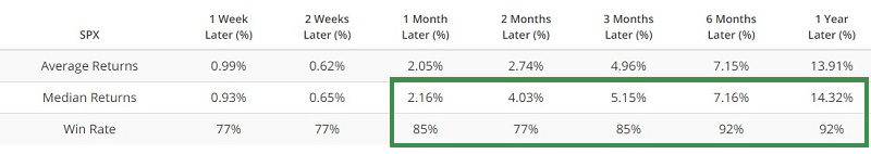
The 50-day average for our Gamma Exposure / Market Cap Ration indicator has continued to rise. In so doing, it has crossed a significant threshold that has generated useful signals for both the S&P 500 and the Nasdaq 100. The red dots in the chart below highlight those dates when the 50-day average of the Gamma Exposure / Market Cap Ratio indicator crossed above 0.065. From one month and beyond, the S&P's returns were abnormally positive.
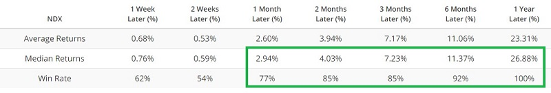
The chart and table below highlight performance for the Nasdaq 100 Index following signals from the above iteration of the Gamma Exposure / Market Cap Ratio indicator. Returns for this more volatile index were even more positive.
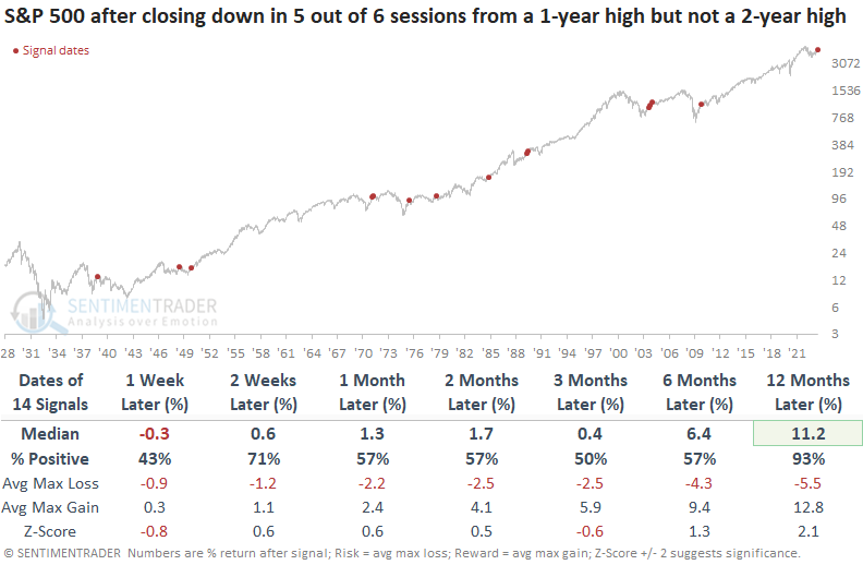
The S&P's pullback from a high
Dean noted that the S&P 500 declined in 5 out of 6 sessions after closing at a 1-year high. When the signal occurred below a multi-year high, the S&P 500 was higher 93% of the time a year later.
The S&P 500 has fallen in five out of the last six sessions after closing at a 1-year high on 2023-06-15. The natural assumption would be to infer that the selling pressure so soon after a high is an ominous sign for the market.
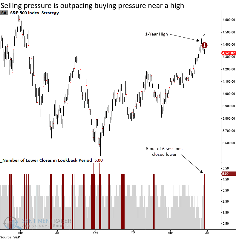
When the S&P 500 declines in 5 out of 6 sessions after closing at a 1-year, the large-cap index tends to perform in line with historical results for the next few months. From three to twelve months later, returns are slightly better than average. There were only 13 occasions out of 111 precedents where a maximum loss of -5% or more occurred within the next month, suggesting this is not the start of a more meaningful correction.
Suppose we include a new condition to the original study, specifically focusing on identifying signals when the S&P 500 remains below a 2-year high as it is currently. In that case, the S&P 500 struggled in the first week but tended to bounce back nicely the following week. A year later, the index was higher in all but one case.
Despite a rising market, strategists aren't raising price targets
Stocks have been going gangbusters, but some folks aren't eager to hop on board. Like Wall Street strategists.
Despite what has been a runaway market, strategists haven't been upgrading their year-end price targets much at all for the S&P 500. As a result, the index is more than 8% higher than what strategists, on average, guessed it would be six months from now. That's the 2nd-largest overshoot in 24 years.
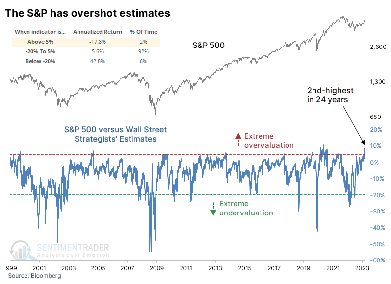
The S&P has tended to show poor annualized returns after the small number of days when it gets so far ahead of the strategists. The table below shows how it has offered weak returns in the short term following a 5% overshoot. It did so this time around early in June and shows the best two-week return out of all the signals. This is also the earliest in any year - by a lot - that the S&P overshot strategists by so much.
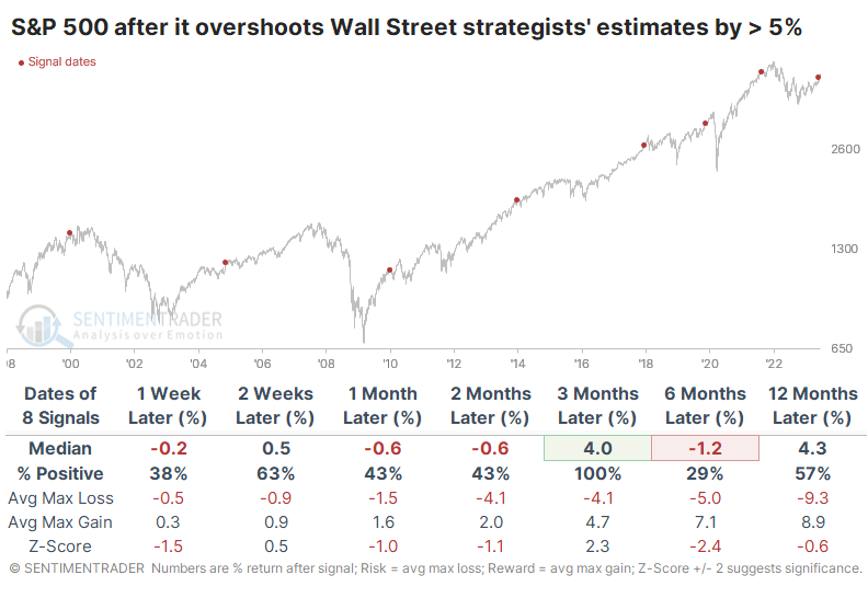
Even though the S&P sported a positive six-month return every time, the time frames surrounding that were weak. Over the next six months, there was only a single double-digit return either way.
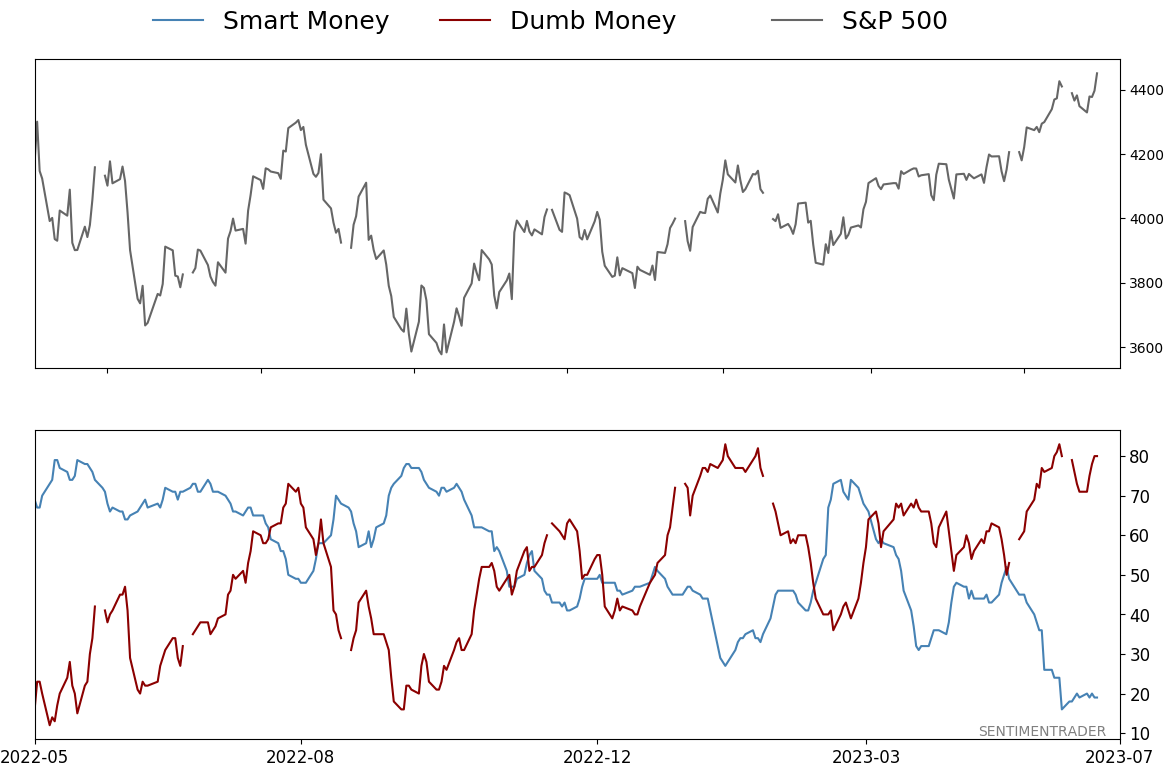
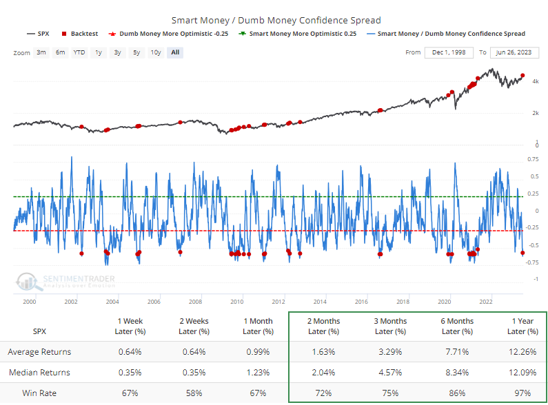
Strategists seem to be some of the few who aren't buying into the rally's longevity. The spread between Smart and Dumb Money Confidence reached rarified air last week before reversing a bit with a few minor down days.
When the spread reached the type of level it recently hit, the S&P's annualized return was poor. But here's the thing about sentiment - it doesn't tend to get this stretched during ongoing bear markets. The Backtest Engine shows that when the spread reverses from such a wide extreme, it occurred only once during a protracted bear, in 2002. All the others were triggered during bull cycles when investors are more willing to take risks and keep doing so.
A new high for the average Industrial stock
The S&P 500 equal-weighted Industrials sector closed at a new all-time high on Tuesday. Dean showed that Industrials and the S&P 500 performed slightly better than average over the next year.
The S&P 500 Industrials recovery continued this week, culminating in a new all-time high for the equal-weighted index on Tuesday, making it the first large-cap index or sector to achieve this milestone. When cyclical sectors like Industrials are behaving well, more often than not, it's a bullish sign for the broad market.
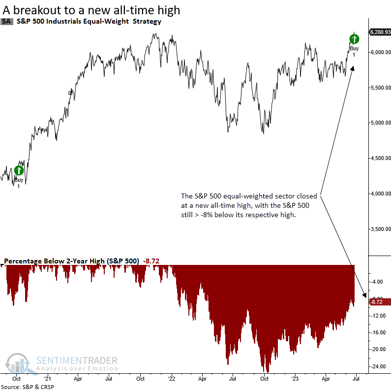
The equal and cap-weighted S&P 500 Industrial sectors occupy the two top spots when measuring the distance below a 2-year high. So opportunities exist outside of Technology.
Historically, whenever the ISM Manufacturing PMI has been in contraction territory, such as now, the S&P 500 has consistently recorded positive returns over the subsequent three-month period. The sole exception occurred in 1989.
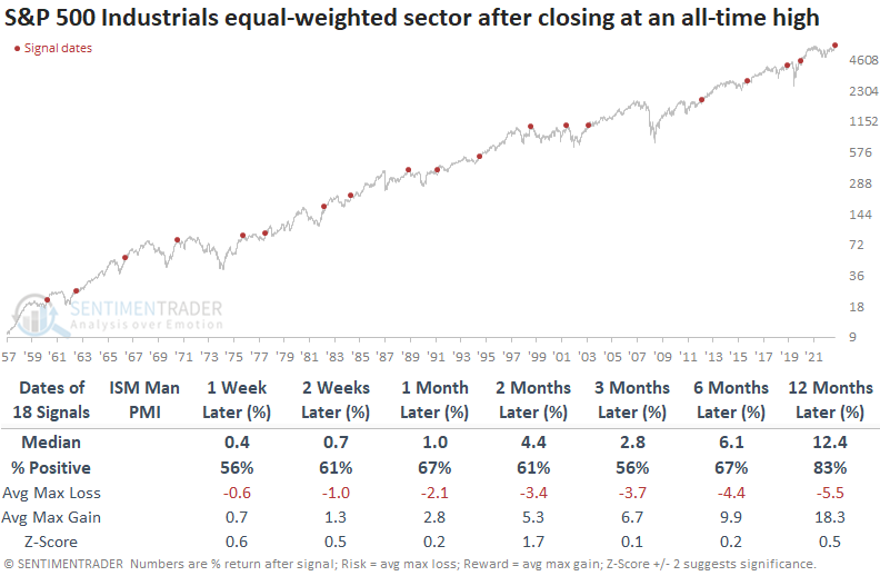
Returns and win rates are slightly less favorable across short and medium-term time frames when compared to the industrial results, particularly within the 1-month horizon. Relative to history, S&P 500 returns are marginally better than average from two to twelve months later.
The Technology and Consumer Discretionary sectors outperform all other groups over the next year. So, what's good for one cyclical group tends to be bullish for others.
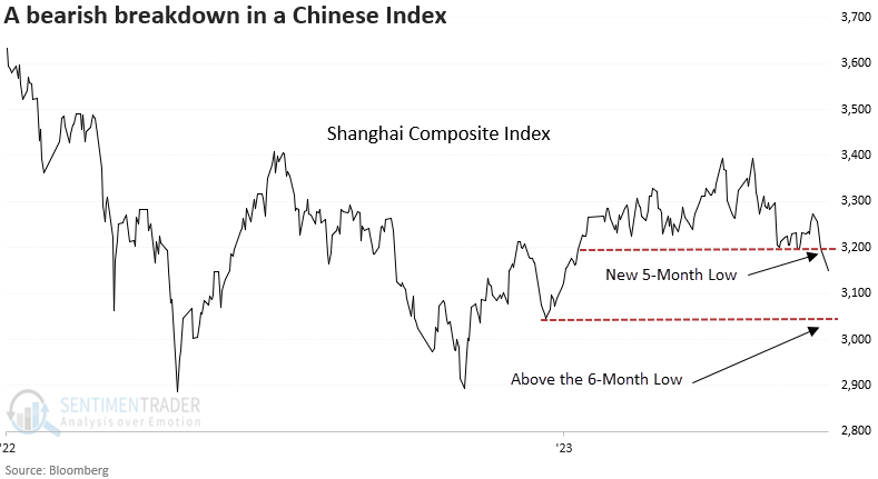
A bad five months for the Shanghai
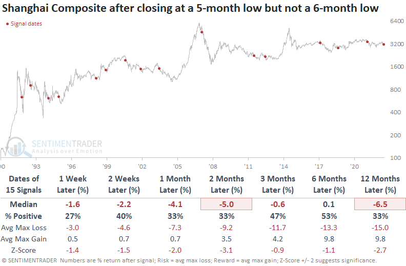
Dean noted that the Shanghai Composite closed at a 5-month low but not a 6-month low. The base breakdown signal represents the first instance after a 5-month high.
After a ten-month hiatus, China's central bank lowered its one and five-year main benchmark lending rates. When markets react negatively to positive stimulus, pay attention as it typically signals something is wrong from a big-picture perspective.
When the Shanghai Composite Index reaches a 5-month low but not a 6-month low, the Chinese Index displays a negative return in all time frames except for one over the next year. And that medium return was barely positive. At some point over the next two months, the index was negative every time.
For context, the table below identifies the first instance after a 5-month high, similar to now. A week later, the max loss exceeded the max gain in every precedent.
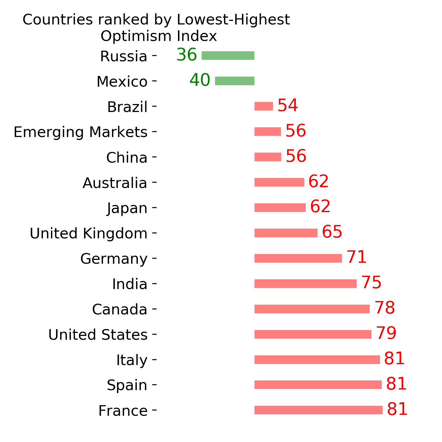
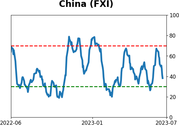
Dean further showed that the Backtest Engine, which we are upgrading with more features, is an excellent tool for generating trade ideas. For example, website subscribers can create a scan for the iShares China Large-Cap ETF (FXI) to identify precedents when the Optimism Index (Optix) for China falls below a threshold of 1, a condition associated with extreme pessimism.
The Optix Index for the China ETF (FXI) currently stands at 12.73, so it hasn't reached total wipeout conditions just yet, but the Engine can store your favorite tests and provide a simple way to keep tabs on them going forward.
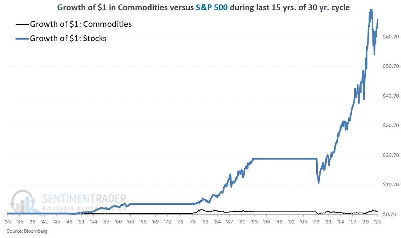
A long-term cycle in stocks vs. commodities
Over the past 90 years, stocks have outperformed commodities by roughly 4-to-1. However, Jay noted that a unique long-term cycle suggests that investors and traders should open their minds to the possibility of taking a closer look at commodities, particularly over the next 15 years.
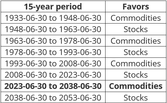
A new cycle begins at today's close (June 30, 2023).
The idea is that there is a 30-year cycle in the commodities markets. During the first 15 years, commodities perform significantly better on an absolute basis and significantly outperform the stock market on a relative basis. During the second 15 years, commodities perform nowhere near as well on an absolute basis and significantly underperform the stock market on a relative basis.
Starting on 1933-06-30, performance favored commodities for the next 15 years and then stocks during the 15 years after that. The pattern and period dates appear in the table below.
How has theory worked in reality to now? The table below displays returns for commodities and stocks only during the first 15 years of each 30-year period.
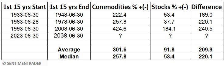
The table above shows that commodities significantly outperformed stocks on each previous occasion. The average 15-year gain for commodities was over +300% versus less than +100% for stocks.
During the second 15 years, the average gain for stocks was over +300% versus just +20.4% for commodities. By the end of each of the 15-year periods above - including right now - most traders and investors have entirely dismissed the idea of ever putting money into commodities. This wholesale dismissal sets the stage for the start of the next cycle.
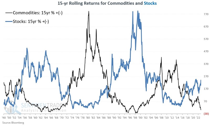
Note the stark difference in rolling 15-year percentage returns for commodities and stocks in the chart below. The correlation coefficient is -0.64 (-1.00 would mean they are precisely inverse).
While historical results have been relatively consistent, the implication of the information above is NOT that everyone should sell all their stocks and pile into commodities for the next fifteen years on July 1st. The real purpose is to open investors' minds to potential opportunities.
Jay further detailed the differences in returns between stocks and commodities during these 15-year cycles in Part II.
He showed that a closer look revealed that there is no guarantee that commodities will enjoy smooth sailing just because the calendar falls within a particular time period but the long-term "lower left to upper right" nature of returns is unmistakable - and when commodities "go," they really "go."
As for stocks, in the past 40 years, investors have gotten used to decent stock market returns. Nevertheless, the returns during the first 15 years of each previous 30-year cycle have been historically subpar.
- From June 1933 to June 1948, the compounded rate of return was +2.9%
- From June 1963 to June 1978, the compounded rate of return was +2.2%
- From June 2008 to June 2023, the compounded rate of return was +7.2%
The chart below displays the growth of $1 in commodities (black line) versus $1 in stocks (blue line) if held only during the first 15 years of each previous 30-year cycle.
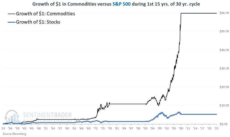
The bias toward commodities over stocks was clear during these ultra-long stretches, though it wasn't without some large swings in fortunes along the way.
In Part III of his notes, Jay went into more detail about the last 15 years of each 30-year cycle.
The critical thing to note is that during the last 15 years of these 30-year cycles, stocks outperformed commodities by better than 15-to-1 on average (the difference is almost 45-to-1 if using median returns instead of average returns).
The chart below displays the growth of $1 in commodities (black line) versus $1 in stocks (blue line) if held only during the last 15 years of each previous 30-year cycle, including the one that ends on 2023-06-30.
NOTE: For more of Jay's thoughts on stock market performance during the summer months, a bullish two-day window for a specific single country ETF, the long-term trend in bonds, and the current conundrum in gold, see this interview with Negocios TV.
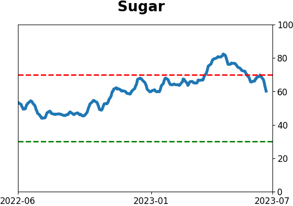
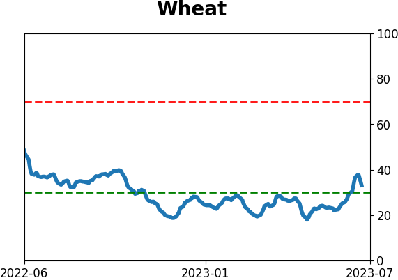
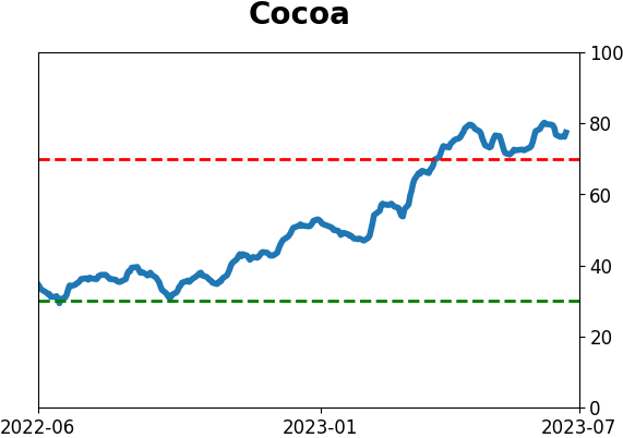
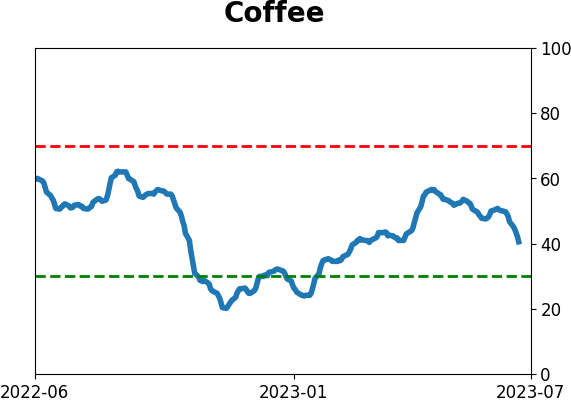
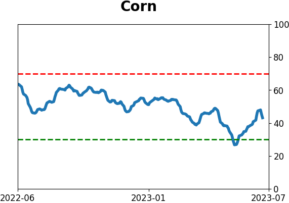
Within commodities, grains jump as speculators remain offsides
It was a tremendous couple of weeks for stuff that farmers grow. According to news reports, droughts across the Midwest recently triggered concerns about crops, and prices surged-supply and demand in action.
Even though prices for several contracts pulled back in recent sessions, the Bloomberg Grains Index jumped more than 15% over two weeks. The last two times we witnessed this kind of panic, traders' enthusiasm didn't last much longer.
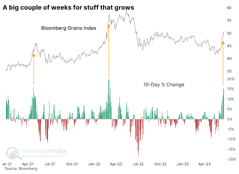
The recent performance after such parabolic moves were fairly representative of the more extended history. The table below shows how the Grains index performed after any 15% two-week gain. Other than two signals in the leadup to the 1973 blow-off top, only one instance sported a double-digit gain six months later, while there were six double-digit losses.
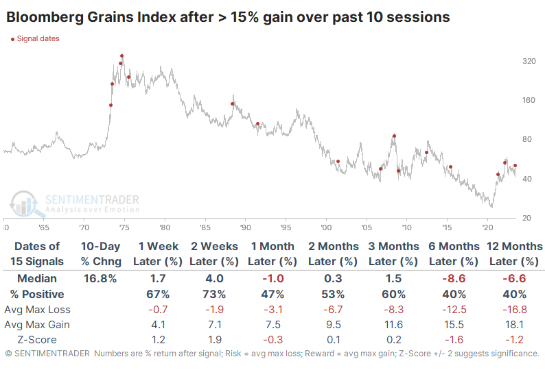
When the Grains index cycled from a 200-day low to a 200-day high in fewer than three months, its medium- to long-term returns were still mediocre to poor. It did capture some sustained gains several times, but there were a handful of false dawns in the 2010s.
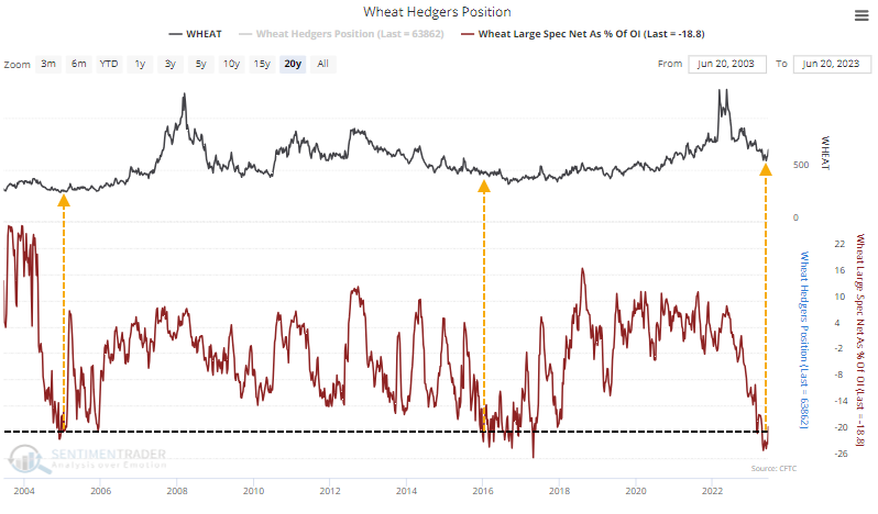
One thing going for grain bulls is positioning. During the steep decline last year, speculators built up massive short positions in several contracts, and they've only recently begun to reverse those.
Large speculators recently held more than 5% of open interest net short in corn futures. They pressed their bets even further in wheat futures, holding more than 20% of open interest net short. There were only two distinct times in the past 20 years when they were so heavily short that market and both preceded multi-year runs.
About TradingEdge Weekly...
The goal of TradingEdge Weekly is to summarize some of the research published to SentimenTrader over the past week. Sometimes there is a lot to digest, and this summary highlights the highest conviction or most compelling ideas we discussed. This is NOT the published research; rather, it pulls out some of the most relevant parts. It includes links to the published research for convenience, and if you don't subscribe to those products, it will present the options for access.
Indicators at Extremes
|
|
|
Phase Table
|
|
|
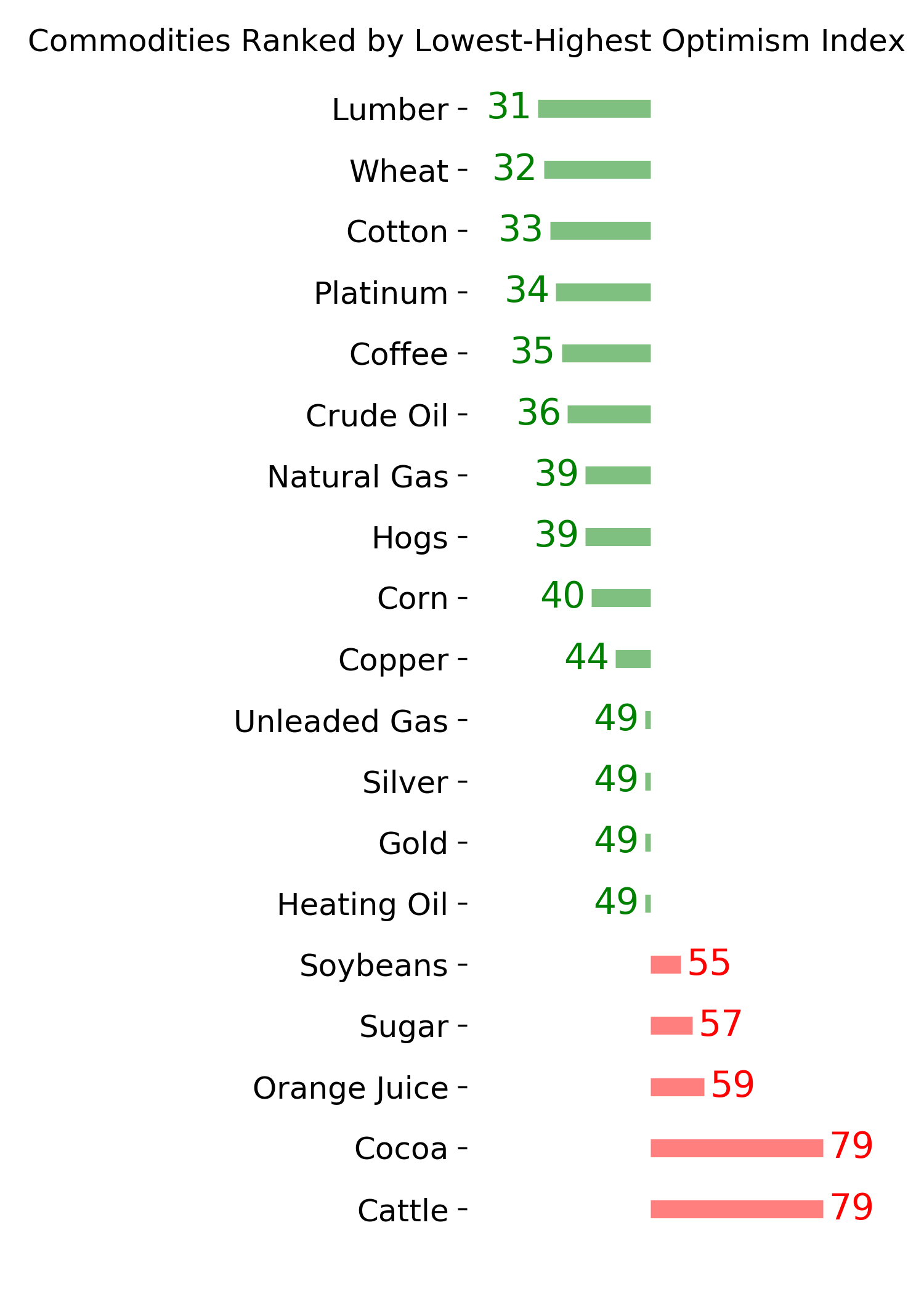
Ranks
|
|
|
|
|
|
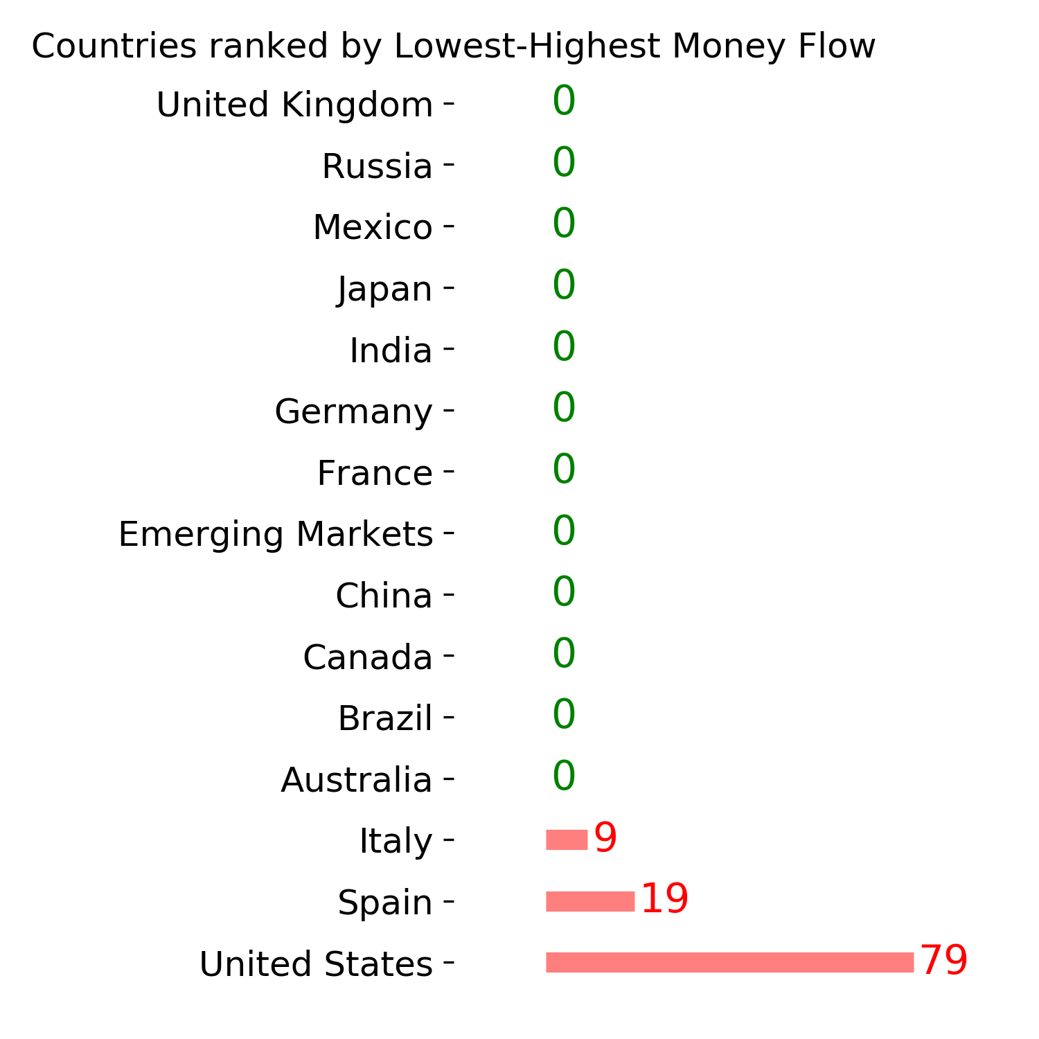
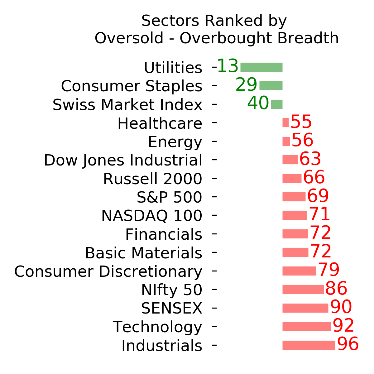
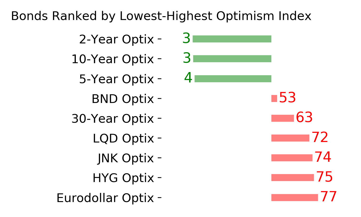
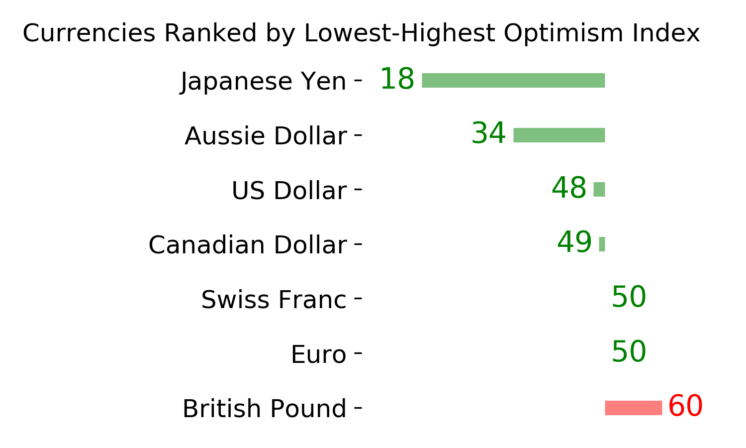
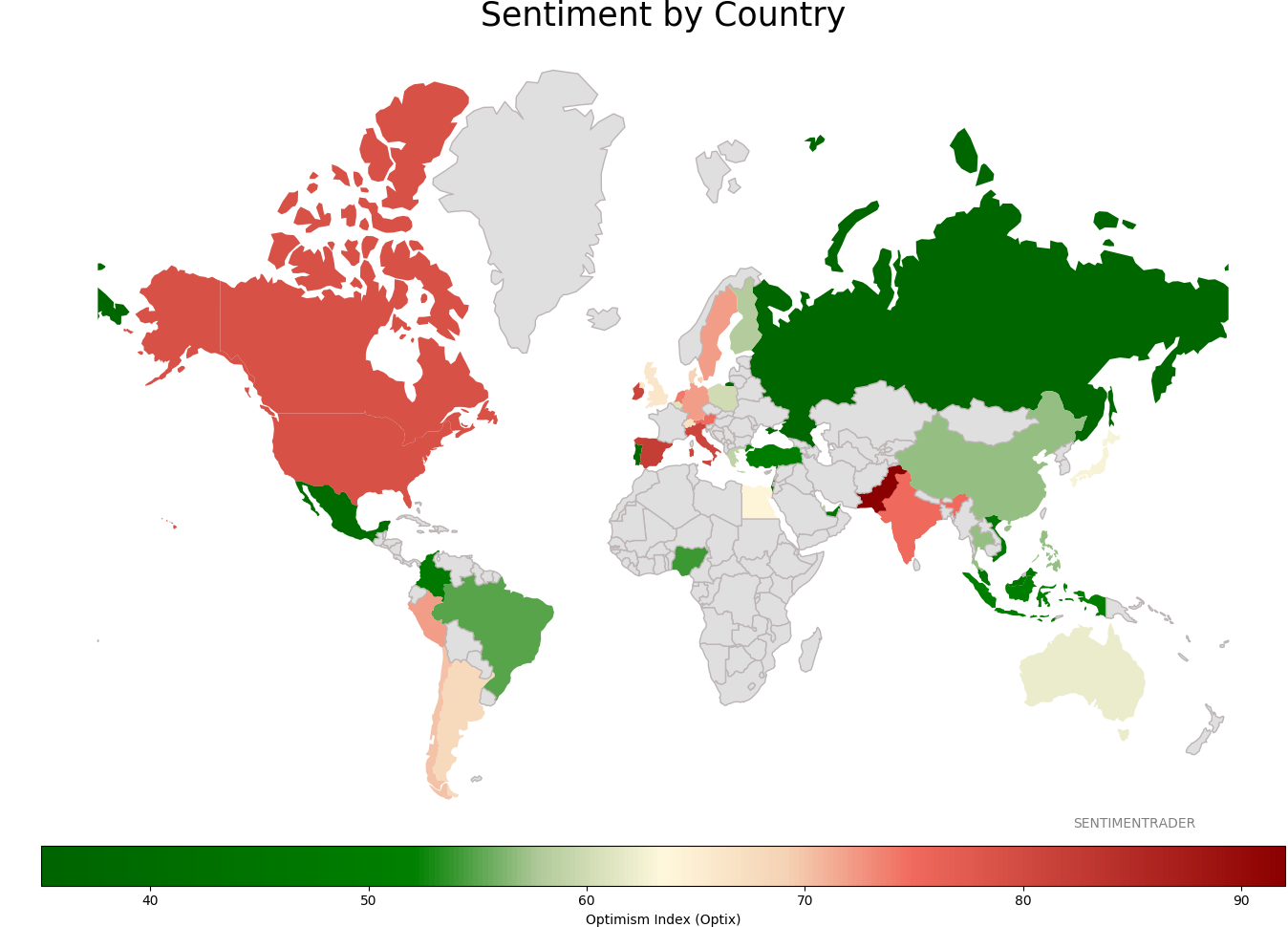
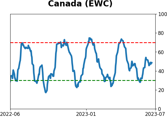
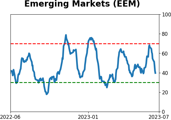
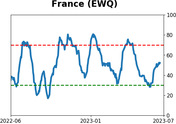
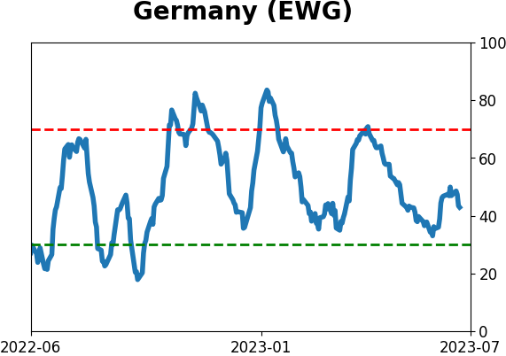
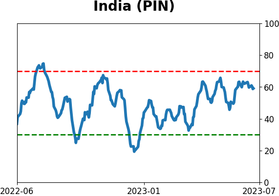
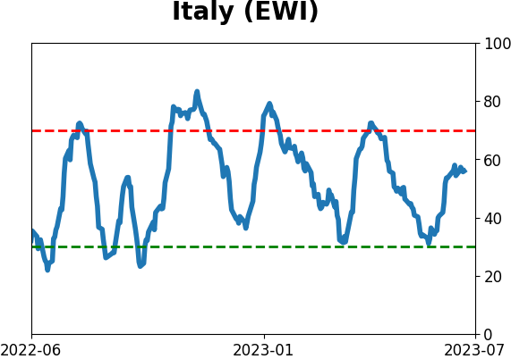
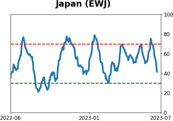
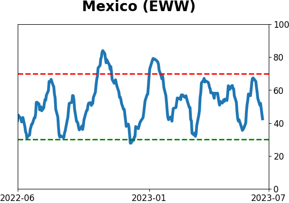
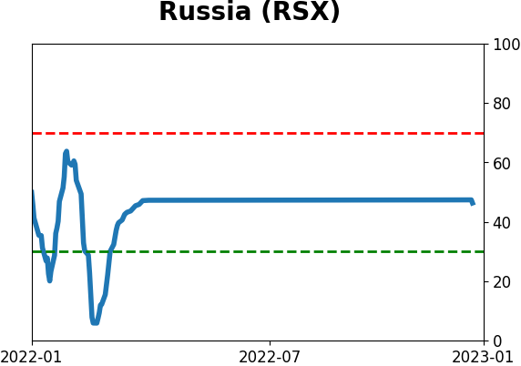
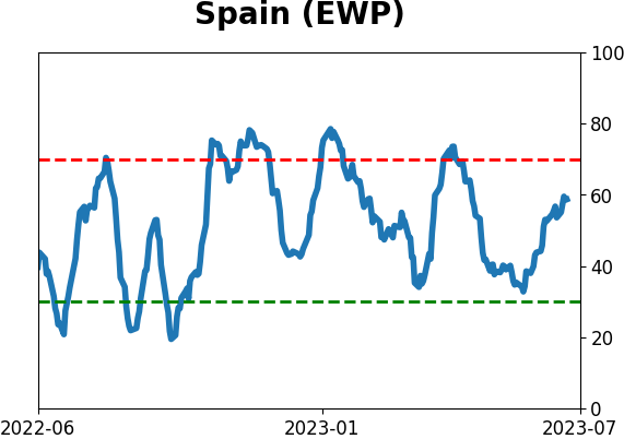
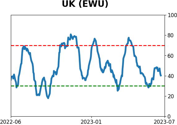
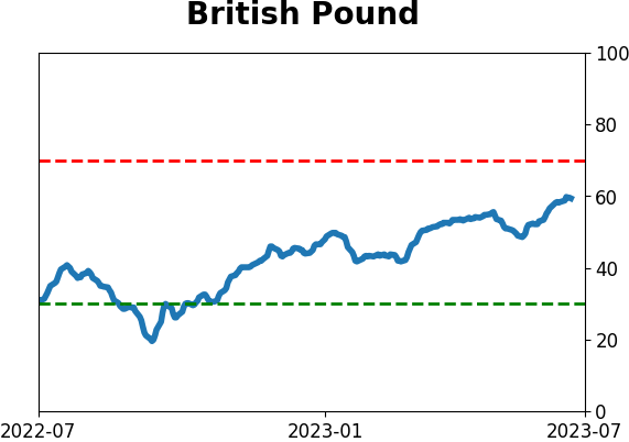
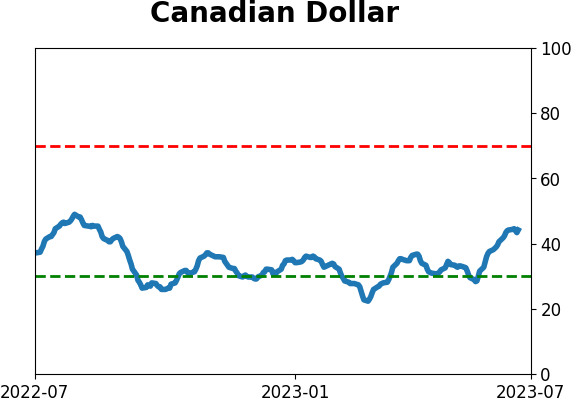
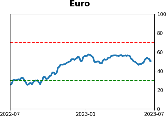
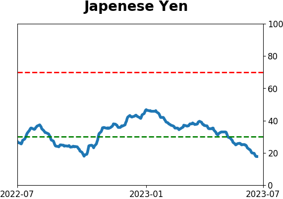
Sentiment Around The World
|
|
|
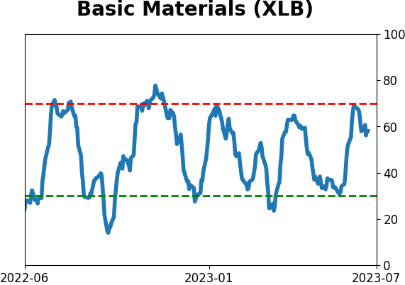
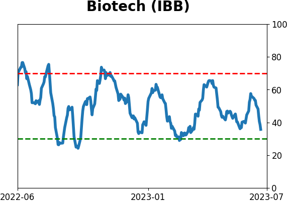
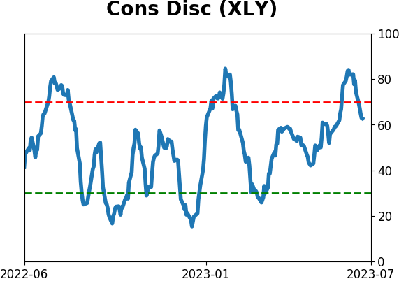
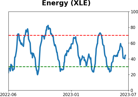
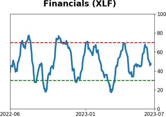
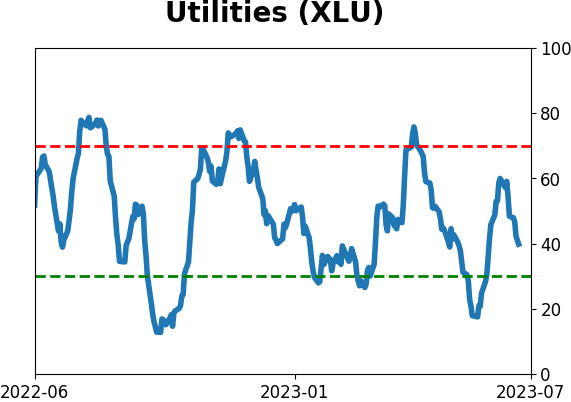
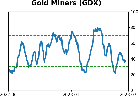
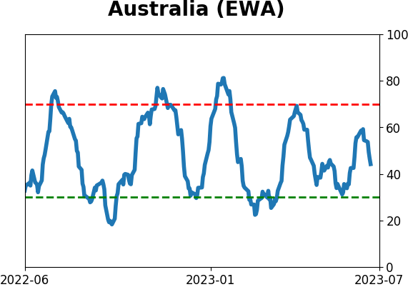
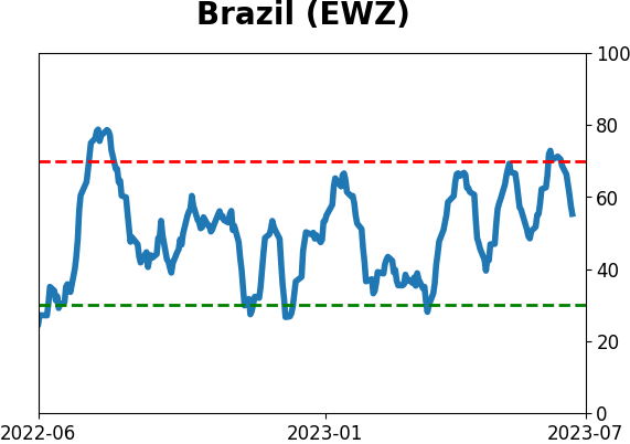
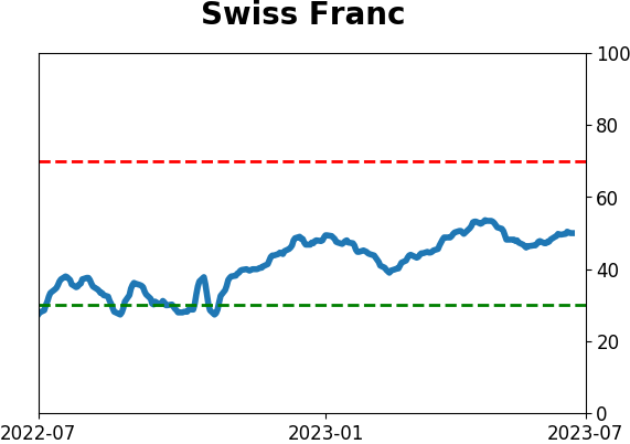
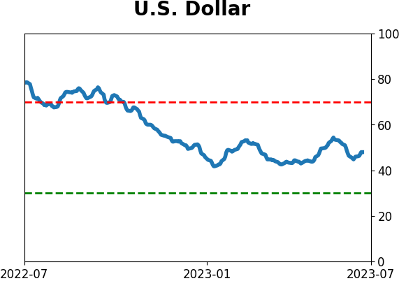
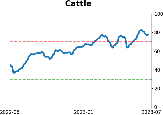
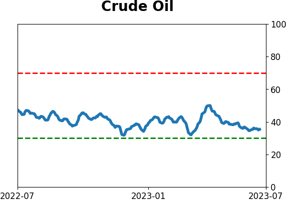
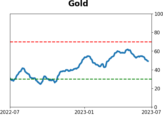
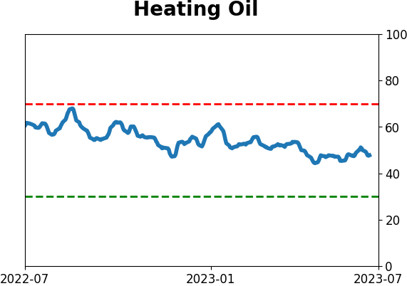
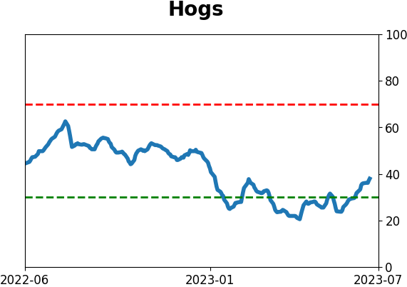
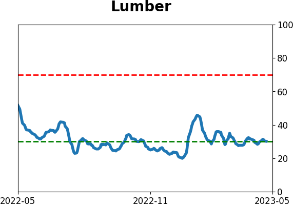
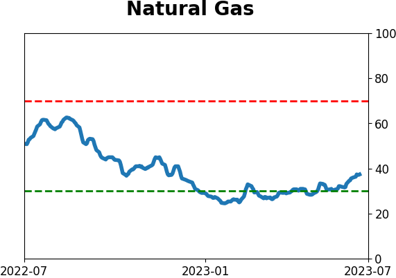
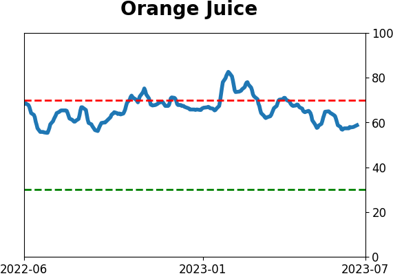
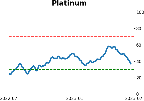
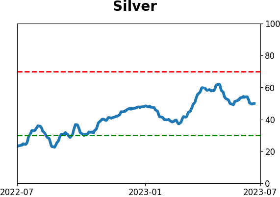
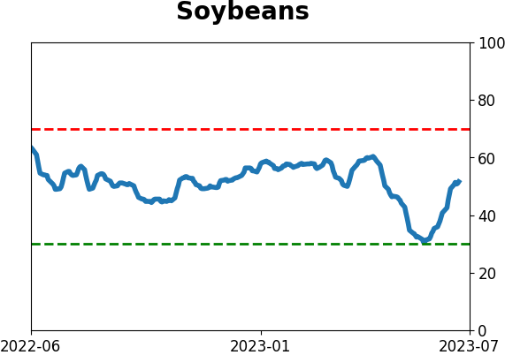
Optimism Index Thumbnails
|
|
|
|

|
|
|
|
|
|
|
|
|
|
|
|
|
|
|
|
|