Daily Report : TradingEdge Weekly for Jun 28 - Ebbing optimism, relative tech trends, gas headwinds

| View/Print a PDF version of this Report |
Headlines
|
TradingEdge Weekly for Jun 28 - Ebbing optimism, relative tech trends, gas headwinds: This week, we saw that breadth is struggling to turn positive after weeks being negative. The lagging nature of the average stock has put a cap on sentiment, as optimism ebbs. Maybe a brief positive seasonal window will help. Tech stocks have far outpaced the broader market, which has been a double-edged sword. Transports are in a correction. Unleaded gas has a double headwind. |
Smart / Dumb Money Confidence
|
|
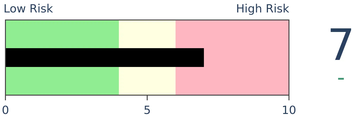
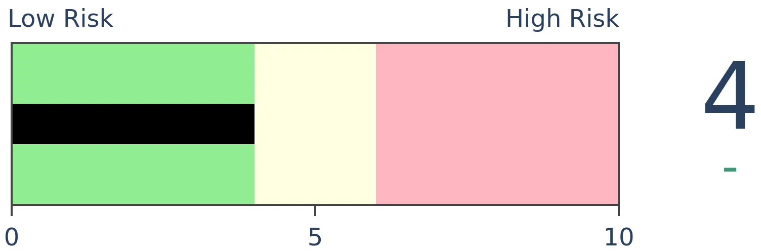
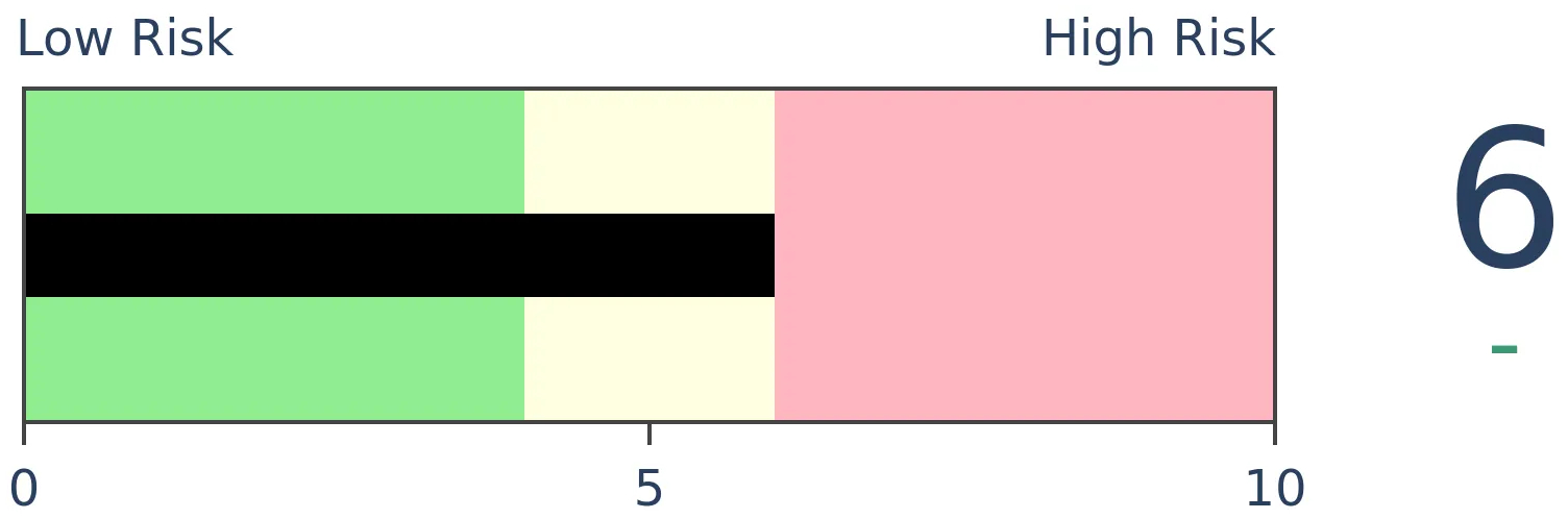
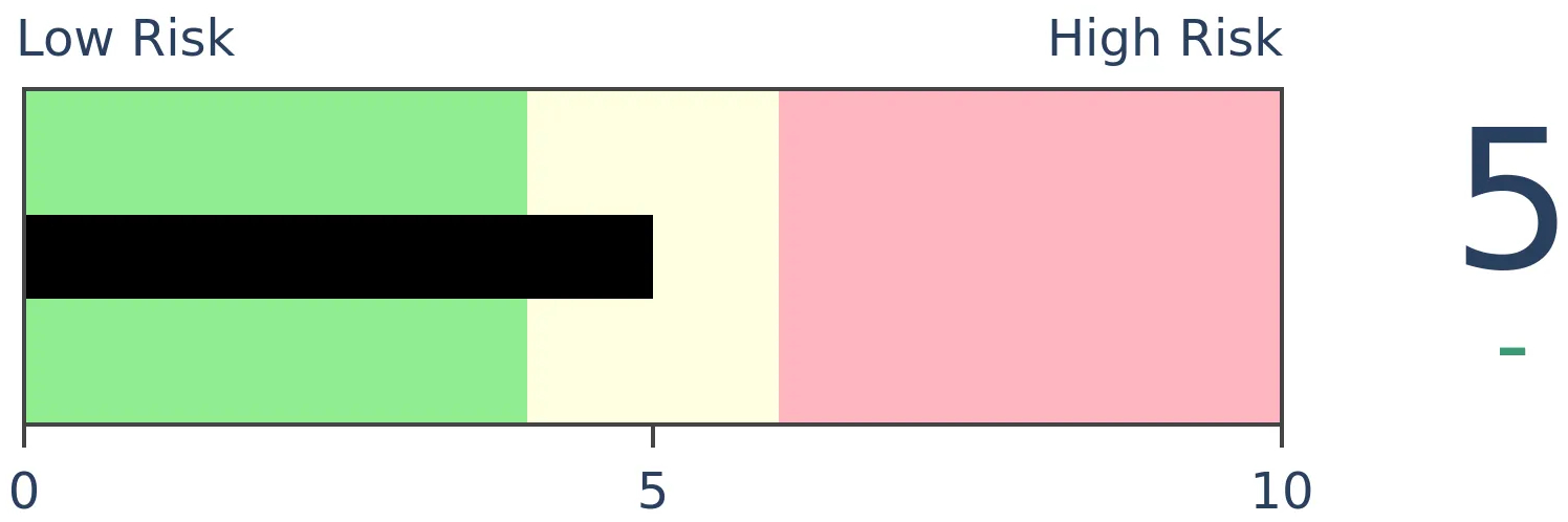
Risk Levels
|

|

|
Research
TradingEdge Weekly for Jun 28 - Ebbing optimism, relative tech trends, gas headwindsBy Jason GoepfertBOTTOM LINEThis week, we saw that breadth is struggling to turn positive after weeks being negative. The lagging nature of the average stock has put a cap on sentiment, as optimism ebbs. Maybe a brief positive seasonal window will help. Tech stocks have far outpaced the broader market, which has been a double-edged sword. Transports are in a correction. Unleaded gas has a double headwind. FORECAST / TIMEFRAME |
Key points:
- A popular breadth measure poked into positive territory after a month being negative
- Optimism is ebbing even as indexes hover near record highs
- There is a brief positive summer seasonal window in stocks
- Tech stocks have done better than the overall market for many (maybe too many) days
- The average S&P 500 stock is holding up much better than the average Nasdaq stock
- A way to trade the Amazon breakout
- The Dow Transports are in correction territory even as the S&P 500 is near record highs
- Biotech stocks often enjoy a summer seasonal boost
- More than half of commodities are back in bear markets
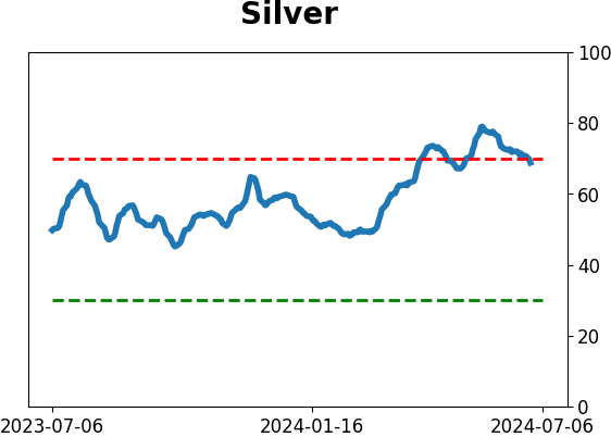
- July has been kind to silver
- Unleaded gas is facing poor seasonality and an unfavorable term structure in crude oil
Poor, but mildly improving, breadth
The McClellan Oscillator for the S&P 500 closed below zero for 20 straight sessions before shifting higher. Dean showed that similar breadth-based reversals near a high saw the S&P 500 rise over the next three months.
The McClellan Oscillator is a breadth-based indicator developed by Sherman and Marian McClellan. According to the McClellan's, "When the Oscillator is positive, it generally portrays money coming into the market; conversely, when it is negative, it reflects money leaving the market."
For only the eighth time since 1928, the McClellan Oscillator closed below zero for 20 successive sessions or more and reversed above zero as the S&P 500 resided within 1% of a 3-year high.
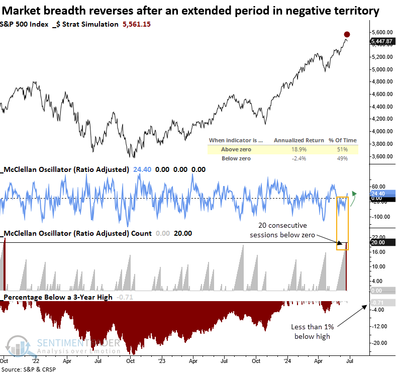
While the sample size is small, after similar conditions, the world's most benchmarked index showed mixed results over the following month. At some point over the next three months, the S&P 500 achieved a gain every time. More importantly, the month-long period with negative breadth did not foreshadow an imminent market peak. Most likely, it represented sector rotation under the surface of the index.
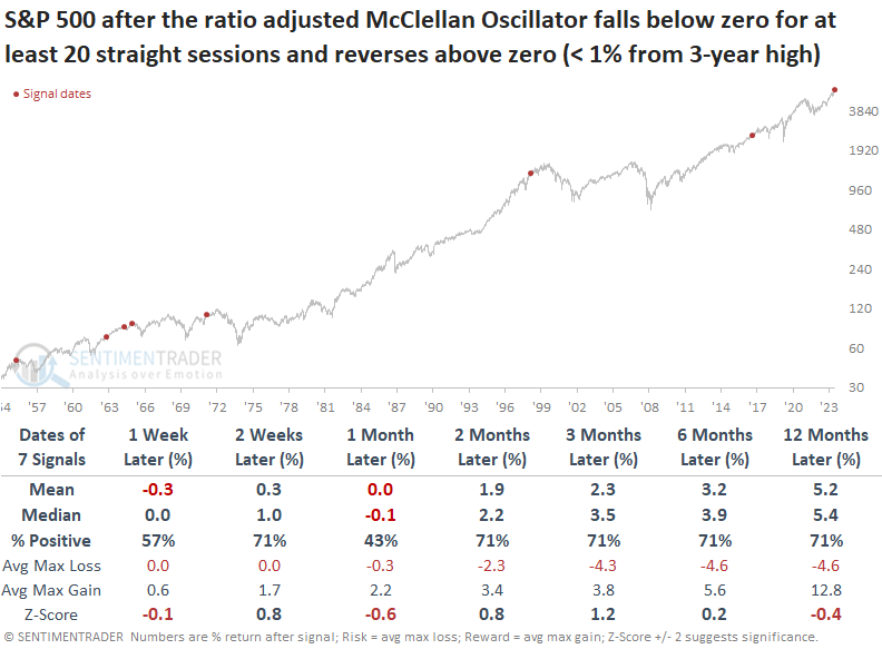
Despite one less signal due to data limitations, the S&P 500 Equal-Weighted Index, which weights each stock equally, displayed a consistent bullish upward trajectory over the following six months.
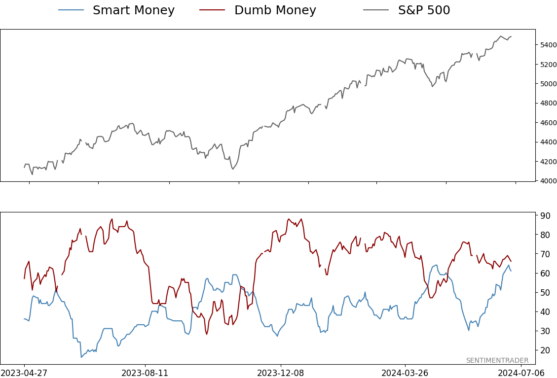
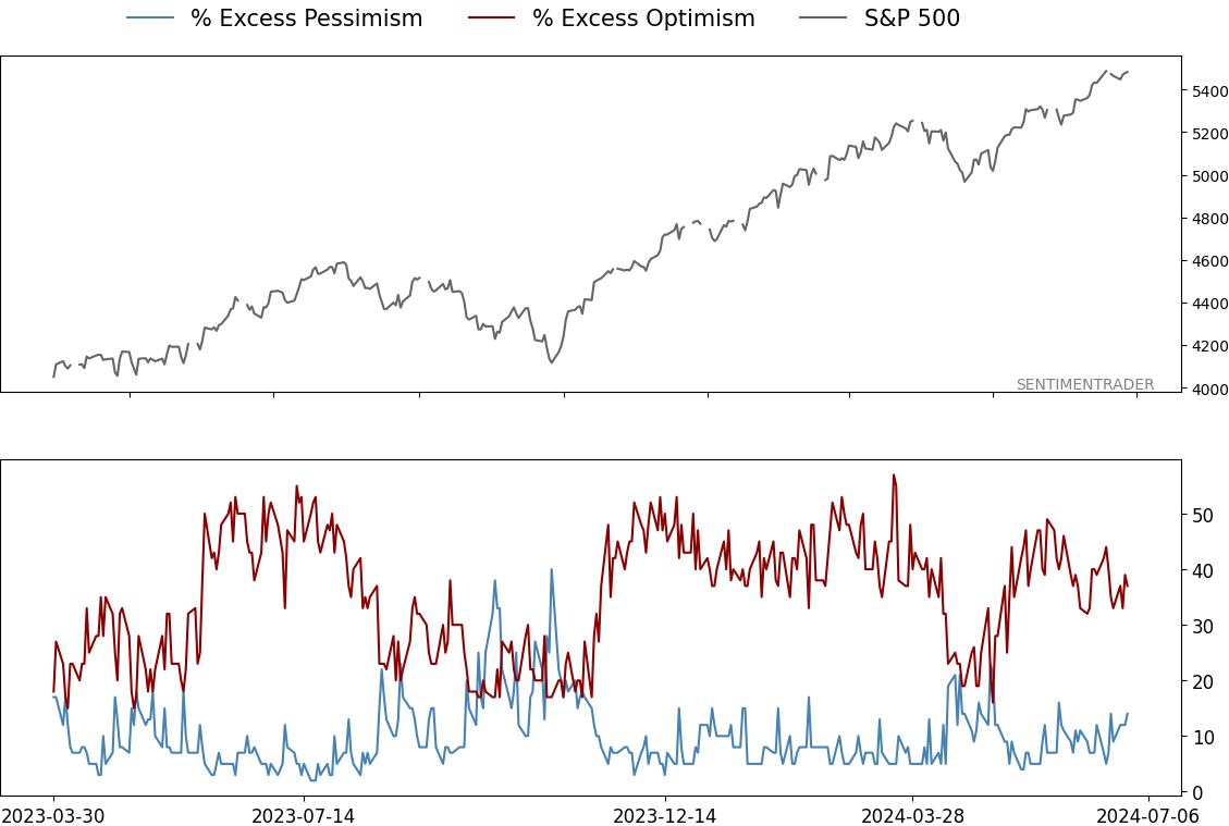
Optimism is ebbing
Bull markets can continue as long as investors remain bullish, especially if they are getting increasingly bullish. At some point, that optimism climaxes, but up until then, rising optimism is a feature, not a bug, of sustained bull markets.
That's why it's a bit disturbing that we're not seeing more bullishness now. As the major indexes have climbed, Dumb Money Confidence has become less enthusiastic. That's what we saw preceding the peak in 2021, though that divergence went on for many months before it mattered.
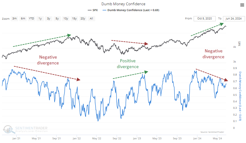
Since any divergence can persist for a long time, it's often beneficial to quantify them and identify clusters. That helps a little bit to judge when they might matter. And with the persistent one we're seeing now, there is the largest cluster since Dumb Money originated in 1998, other than the late summer and fall of 2021.
We can see a similar divergence with the Fear & Greed model. Despite the S&P 500 hovering near record highs, the model is dropping toward Fear level, which has usually only happened after a more significant price pullback. The table below shows every date when the S&P 500 closed at a 52-week high, Dumb Money Confidence was below 70%, and the Fear and Greed model was below 50.
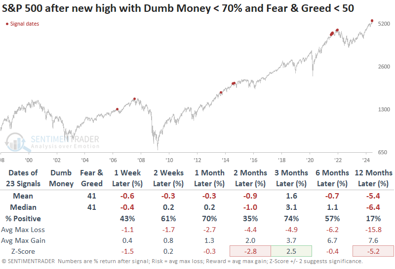
One reason for the poor results is the large number of dates clustered in 2021. After filtering the table only to include the first instance in at least a month, a table of maximum gains and losses across time frames shows that the skew was heavily skewed toward risk over the next three months. There were only two signals when the reward was greater than the risk, and those were both just barely.
A brief positive window before chop
The stock market has shown a long-term tendency to perform less well during the summer months of June/July/August than during the rest of the year. However, Jay noted that one summer month period tends to shine.
The chart below displays the Annual Seasonal Trend for the S&P 500 Index. Note that the average performance during the June/July/August period is a sideways affair.
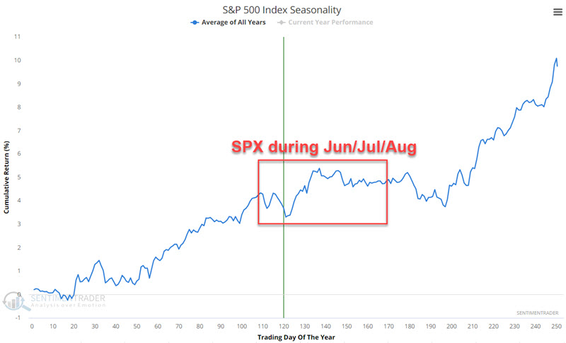
The period we will focus on incorporates 12 trading days by combining the last three trading days of June and first nine trading days of July. For 2024, this period extends from the close on 2024-06-25 through the closing on 2024-07-12.
In the chart below, starting in 1940:
- The black line displays the growth of $1 for SPX during the "Summer Rally Days"
- The blue line shows the growth of $1 for SPX during "All Other Summer Days"
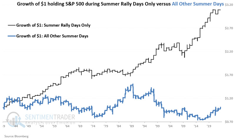
During summer rally periods, the S&P 500 has gained +209.2%, while during all other summer days combined, the S&P 500 has gained just +0.5%.
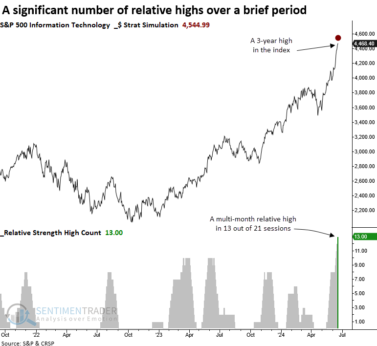
An impressive tech run
Over the last month, the S&P 500 Technology sector has registered 13 multi-month relative highs. Dean showed that similar periods with a significant number of relative highs suggest near-term exhaustion for the sector.
Over the last month, the S&P 500 Technology sector registered a multi-month relative high versus the S&P 500 in 13 out of 21 sessions, a phenomenon that has only occurred 13 other times since 1957 when including a condition requiring a 3-year absolute high for the sector.
Whenever the S&P 500 Technology sector registered 13 or more multi-month relative highs versus the S&P 500 in 21 sessions and simultaneously closed at a 3-year high, it tended to struggle over the following month, with 11 out of 13 instances showing a loss at some point during that period. Additionally, over the subsequent three months, the median maximum loss exceeded the maximum gain in each time horizon.
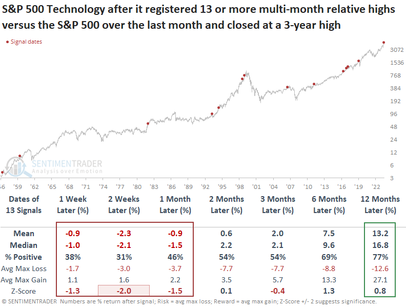
While Technology faced challenges over the ensuing month after hitting numerous relative highs in quick succession, defensive sectors such as Staples, Health Care, and Utilities displayed gains and relative outperformance versus cyclical sectors.
The average S&P 500 stock versus the average Nasdaq one
We have discussed poor breadth readings multiple times in recent weeks. Those divergences are across time frames, with the percentage of stocks holding above their 200-day averages consistently holding above 70% in the S&P 500, while on the Nasdaq, it is dipping to 40%.
Using the My Indicator function, a user can examine the spread between these two measures and test what it means for stocks going forward. Below, we can see that a spread of 30% has been rare over the past decade and generally coincided with markets in broad topping formations.
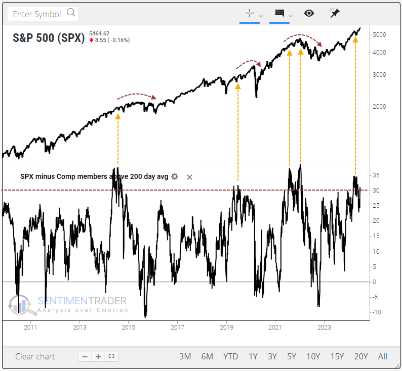
The table below shows future returns in the S&P 500 when it and the Nasdaq Composite were both within 1% of 52-week highs. At the time, at least 30% more stocks in the S&P were above their 200-day averages than those in the Nasdaq.
For the S&P, it wasn't a great sign up to two months later, with a negative mean return. The risk/reward ratio was skewed to the downside up to three months later. Even though the win rate wasn't too bad after a few months, these conditions preceded some nasty spills.
Despite terribly lagging internal uptrends, the Nasdaq Composite index held up significantly better than the S&P across time frames. That's not to say it did well - returns were about in line with random, with some large losses - but at least the returns were better than the S&P.
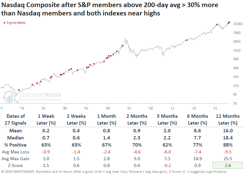
We can see the difference in returns more clearly by looking at the ratio between the S&P and Nasdaq after these signals. Even though the secular trend is down (meaning the S&P tended to underperform the Nasdaq over time), the trend was even worse after these signals, especially up to two months later when the risk was more than double the reward.
Amazon breakout
Amazon just broke out to a new all-time high. Jay considered one way to play for follow-through to higher levels while simultaneously limiting dollar risk to a low level.
An Out-of-the-Money (OTM) call calendar spread involves buying a longer-dated call option with a strike price above the underlying stock's current price and simultaneously selling a shorter-dated call option at the same strike price.
This strategy is best used when implied option volatility is low, i.e., when options are "cheap." The chart below displays AMZN price action and the implied volatility for AMZN options (black line). As you can see, implied volatility is near the low end of the historical range.
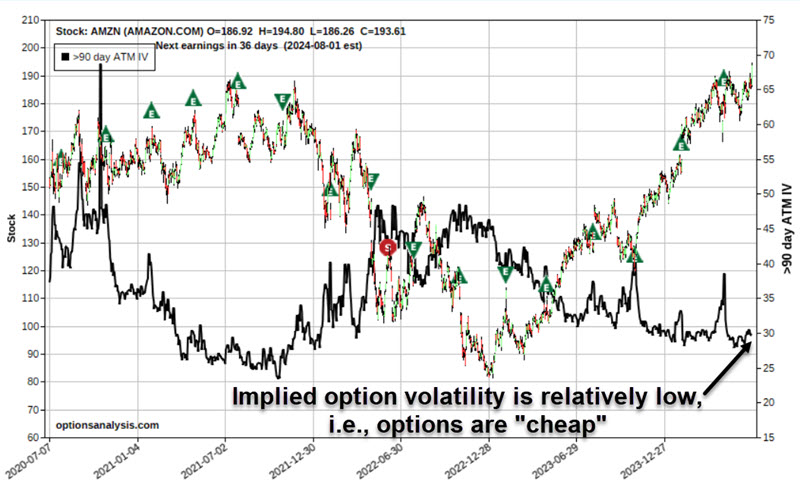
In simplest terms, the lower the IV, the less time premium is built into the price of that security's options. Buying a calendar spread when IV is low:
- Allows us to buy options as cheaply as possible
- Offers the potential for gains if IV subsequently rises (thus inflating the amount of time premium)
- May insulate from the risk of a volatility crush - whereby the position loses time premium if implied volatility collapses
It is essential to point out that the example trade below is presented as an example and not as a recommended trade. The trade we will examine involves:
- Buying 1 AMZN Oct18 2024 220 Call @ $4.93
- Selling 1 AMZN Aug16 2024 220 Call @ $2.40
The risk curves (i.e., the expected $ profit or loss based on the price of AMZN shares as of a given date) appear in the chart below. The trade offers significant potential percentage profit if the stock rises in price and limited dollar risk if the stock declines in price.
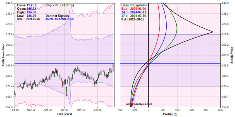
Things to note:
- The total cost to enter this trade (using a 1-lot) is $253. This also represents the maximum worst-case dollar loss
- Based on current IV levels, this position will generate a profit at August expiration if AMZN is between $195.71 and $266.53
- Note that the risk curves "roll over" if the price exceeds the strike price of $220 a share
- The position has a Delta of 8.33. The implication is that this position will gain or lose $8.33 for each $1 change in the price of AMZN
- The position has a Vega of $16.34. For each one-point change in implied volatility, the position will gain $16.34 in value
- The position has a Theta of $1.78. The position will gain $1.78 in value due solely to the passage of one day
If AMZN shares were to reach the strike price of $220, this option position could generate an open profit of $150 to roughly $900, depending on whether the move is immediate or takes longer to play out.
Jay also went over some ways to manage an option position like this under different scenarios.
Transports cannot get in gear
Adding to potential concerns, and in line with the delineation between winners and losers, the Dow Jones Transportation Average has not only not kept up with the S&P 500, it has been mired in correction territory.
The divergence is easy to spot. As the S&P 500 has soared to ever greater heights, the Transports have gone in the opposite direction.
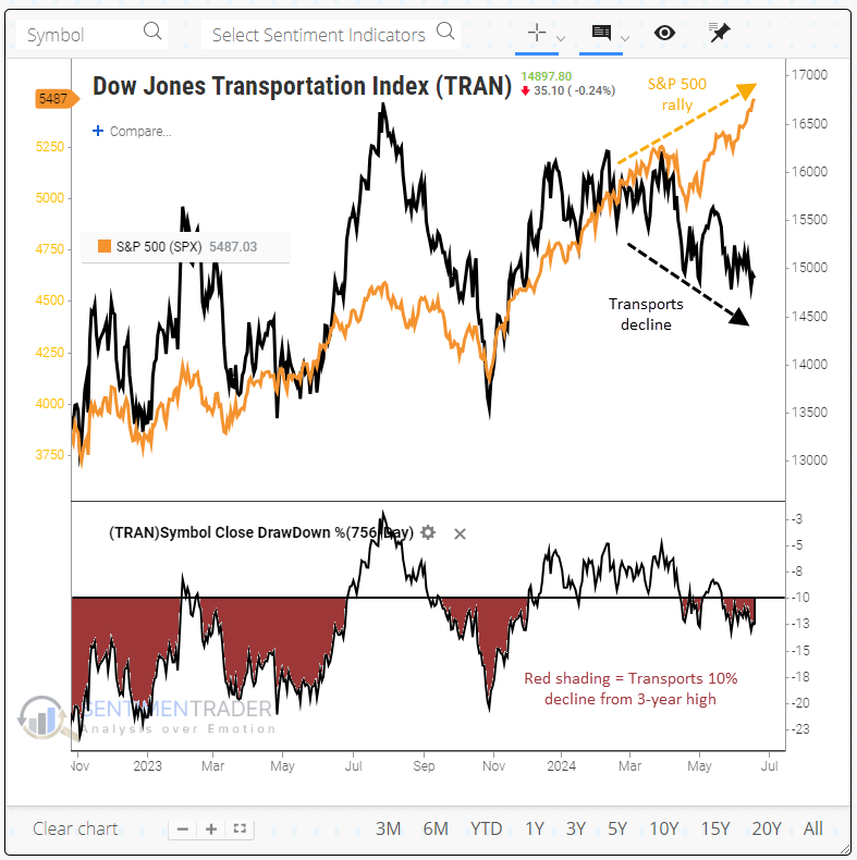
While there are numerous reasons to be cautious about stocks over the coming month(s), we haven't seen much that has been a long-term concern. We can add the lagging Transports to that list. Returns in the S&P 500 any time it reached a 3-year high, while the Transports were at least 10% below their own 3-year high, were fine. There was only one loss of note heading into the 1990 recession.
For the Transports, it was more positive as a shorter-term mean reversion signal, as the index popped higher over the next couple of weeks every time except once. It tended to keep the gains coming, but its returns weren't exceptional.
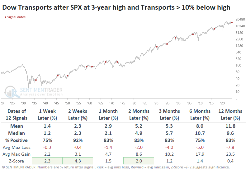
Relative to the S&P 500, Transports showed some grit over the next couple of months, regaining some ground most of the time. Only three signals were outright failures, with virtually no bounce in the ratio.
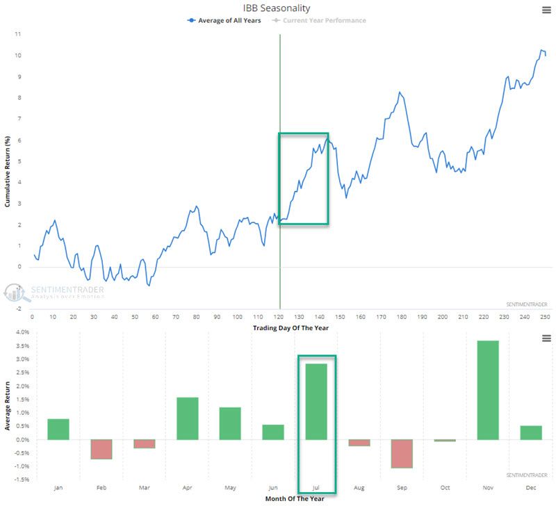
Biotech boost
Jay noted that the iShares Biotechnology ETF (ticker IBB) was entering a favorable seasonal period in early May. The good news is that the price trend is presently favorable, and July has historically been a good month for the biotech sector.
The chart below shows that the Annual Seasonal Trend for IBB remains favorable through Trading Day of Year (TDY) #144, or 2024-07-29. July has been the second-best month of the year for IBB.
IBB started trading in 2001. The chart below displays the hypothetical growth of $1 invested in IBB only during the TDY #121 through TDY #144 period every year since then.
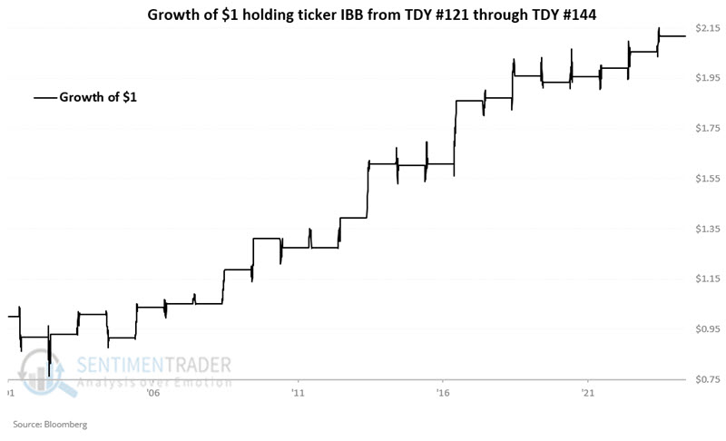
These windows showed a gain 74% of the time, with an average gain well above the average loss. It rallied more than +10% five times, versus no losses larger than -10%.
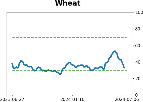
Commodities are rolling over again
The percentage of commodities in a bear market cycled from less than 25% to greater than 50%. Dean showed that similar shifts preceded unfavorable returns and win rates for a commodity index over the subsequent year.
As the chart below shows, when more than 50% of commodities are in a bear market, the Bloomberg Spot Commodity Index produces an annualized return of -1.7%, a stark contrast from periods when the indicator resided below 25%.
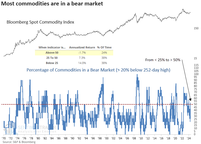
Following precedents when the percentage of commodities in a bear market shifted from under 25% to over 50%, the Bloomberg Spot Commodity Index struggled over the subsequent year. Commodities like crude oil can influence the Bloomberg Spot Commodity Index.
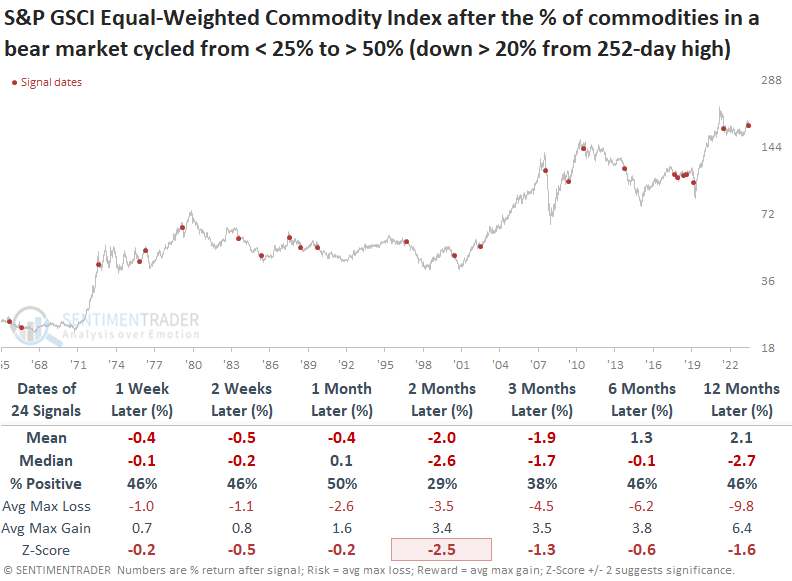
To provide an unbiased perspective, Dean applied the signals to the equal-weighted S&P GSCI Commodity Index. Returns and win rates for the equal-weighted S&P GSCI Commodity Index demonstrate a similar negative outlook over the following year, especially two months in, with negative returns 71% of the time.
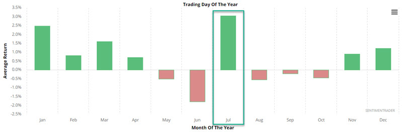
A time for silver to shine
Historically, July has been the best month of the year for Silver, Jay notes.
In just over four months, Silver rallied 45% before pulling back over 10% in the last month. Price remains well above it's 200-day moving average, however, MACD remains in a downtrend. Still, there does appear to be good reason to be highly vigilant and to give the bullish case the benefit of the doubt during July.
The chart below displays the average monthly return for Silver. Note that the top-performing month has been July.
The chart below displays the hypothetical cumulative performance from holding a long position in silver futures only during the month of July starting in 1970.
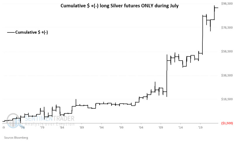
The month showed a gain 80% of the time, with an average gain about double the average loss. A silver contract rallied more than +$8,000 during four years, while no years suffered a loss more than -$8,000.
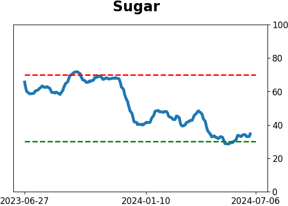
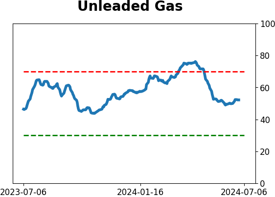
Gas isn't looking too hot
While price has been trying recently to work higher, Unleaded Gas is entering its weakest time of year. Jay also highlighted a development in crude oil that is also flashing a yellow flag for Gas.
The chart below displays the annual seasonal trend for Unleaded Gas futures.
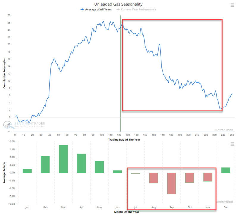
Trading Day of the Year (TDY) #124 through TDY #238 is highlighted in the red box in the upper click. For 2024, this period extends from the close on 2024-06-24 through 2024-12-02.
To illustrate the typical nature of Unleaded Gas performance during this period, the chart below displays the hypothetical cumulative $ +(-) achieved by holding a long position in unleaded gas futures only from TDY #124 through TDY #238 since 2007.
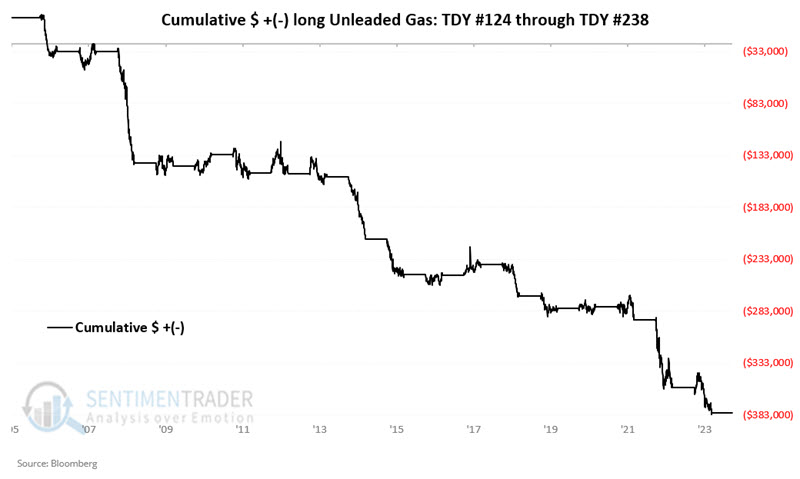
The overall results have been decidedly unfavorable - with a 17% Win Rate and moves of $10K or more skewing to the downside by a factor of 10 to 2.
The term structure of crude oil futures shows the relationship of the near-term futures contract to a further-out contract. If it is above 1.0, the near-term contract is priced higher than the further-out contract, called backwardation.
So, what does this have to do with Unleaded Gas? Crude and unleaded typically trade with a correlation of somewhere in the 80 to 85% range. The chart below uses Unleaded Gas futures as the index and again shows the dates when the Crude Oil Term Structure crossed above 1.05 for the first time in 21 days in the last 15 years.
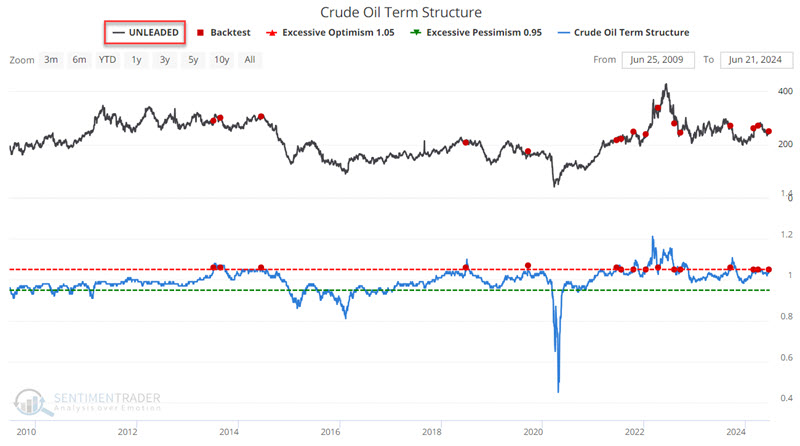
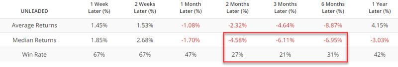
Jay combined seasonality and the crude oil term structure to develop a simple trading model. That model is currently at its most negative possible reading, which has preceded consistently negative returns in gas.
About TradingEdge Weekly...
The goal of TradingEdge Weekly is to summarize some of the research published to SentimenTrader over the past week. Sometimes there is a lot to digest, and this summary highlights the highest conviction or most compelling ideas we discussed. This is NOT the published research; rather, it pulls out some of the most relevant parts. It includes links to the published research for convenience, and if you don't subscribe to those products, it will present the options for access.
Indicators at Extremes
|
|
|
Phase Table
|
|
|
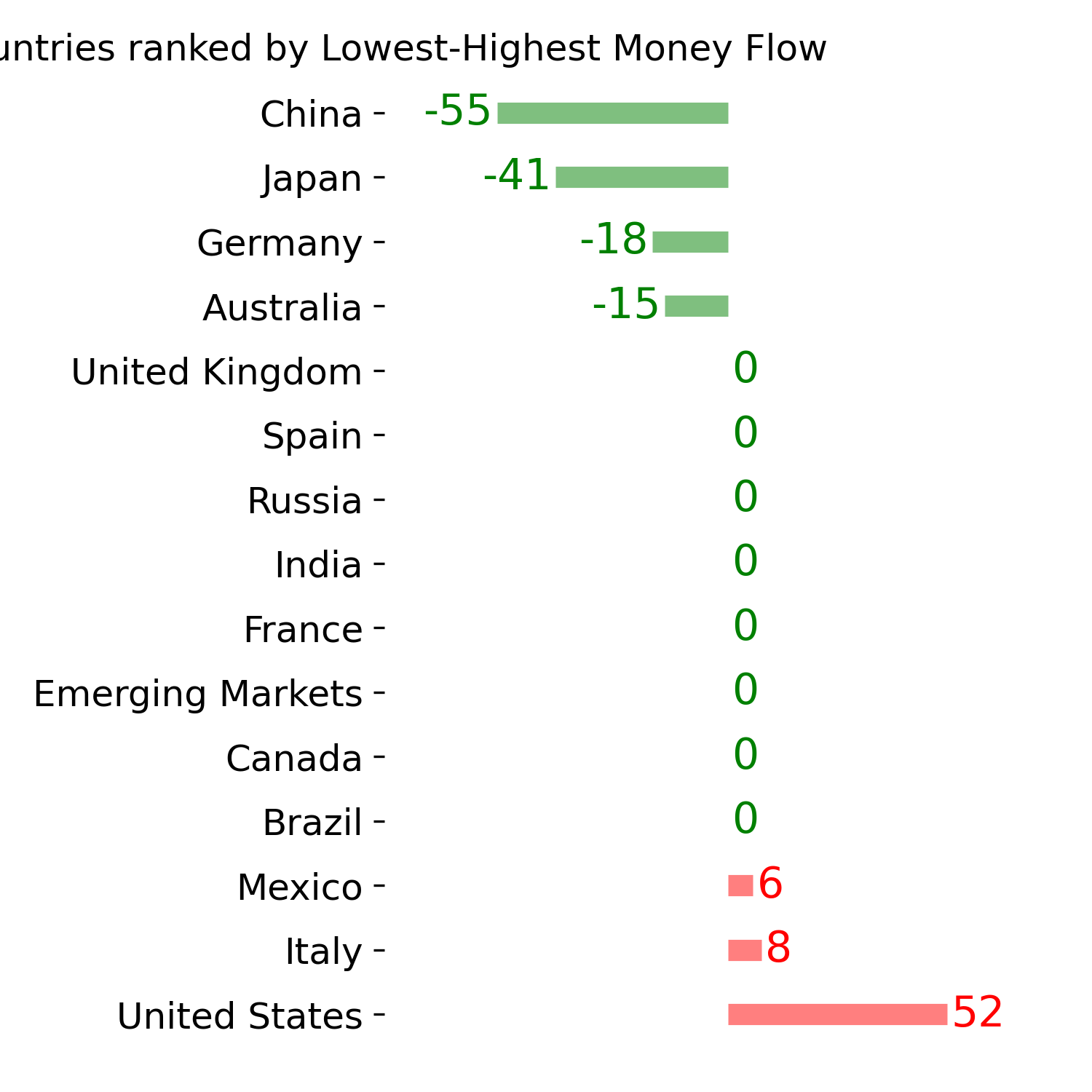
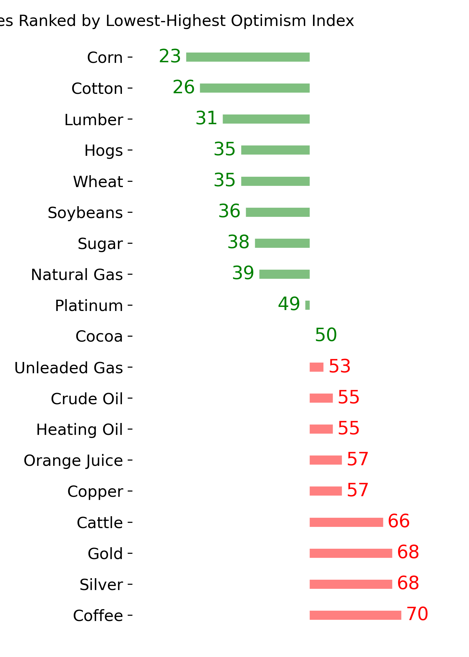
Ranks
|
|
|
|
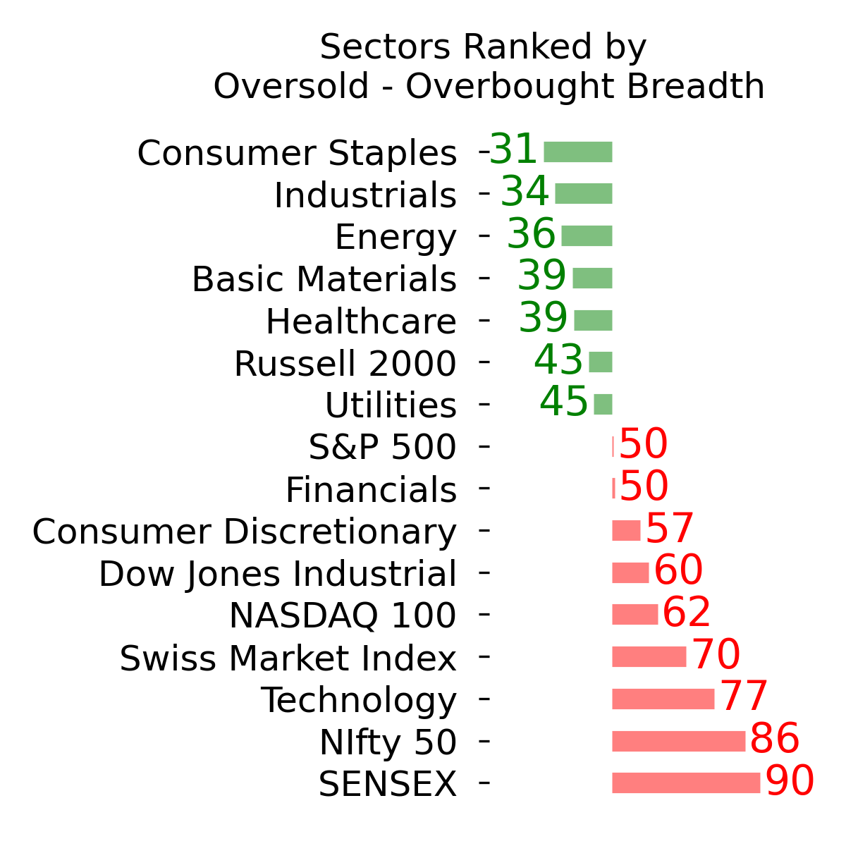
|
|
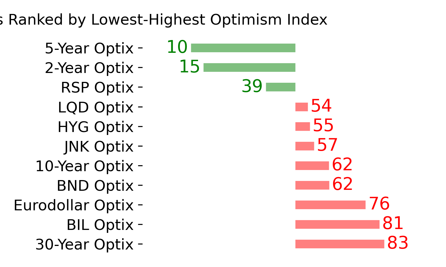
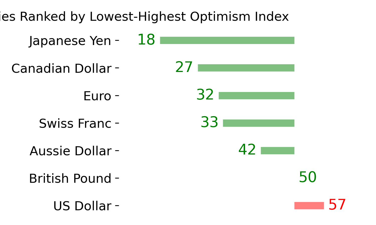
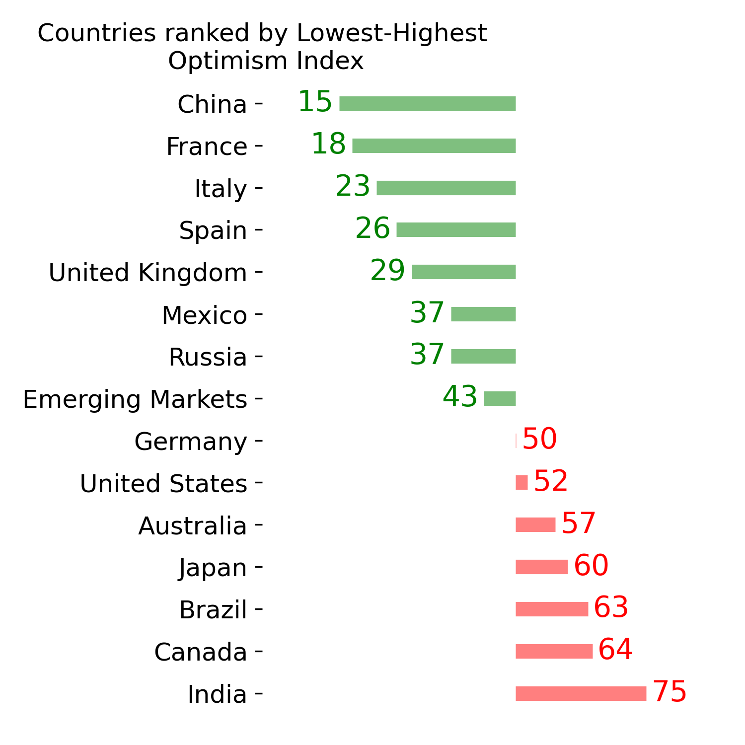
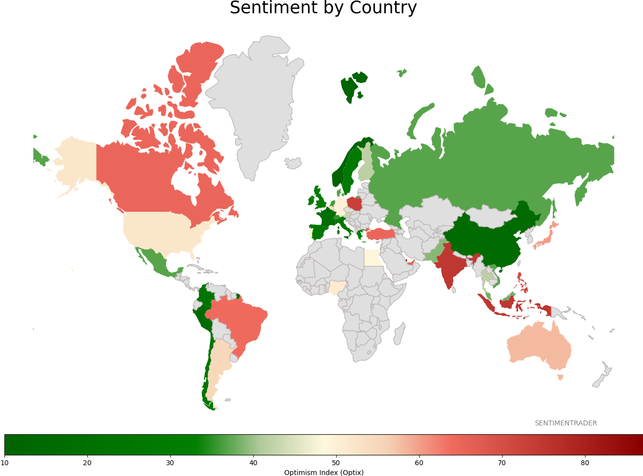
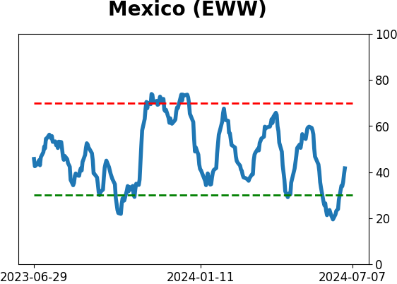
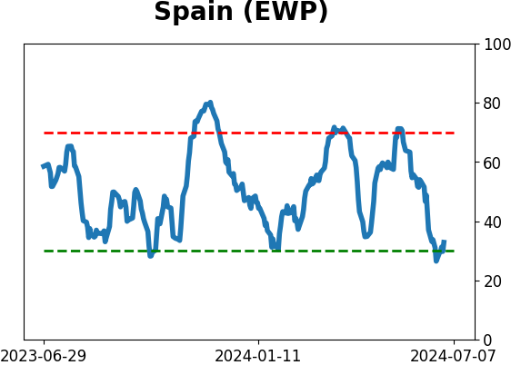
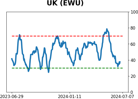
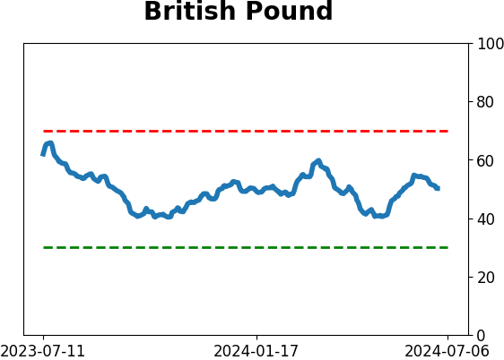
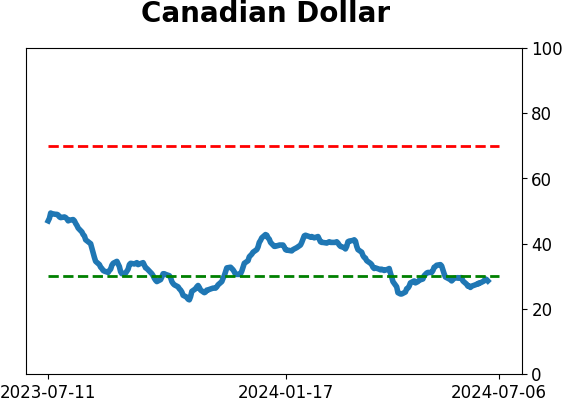
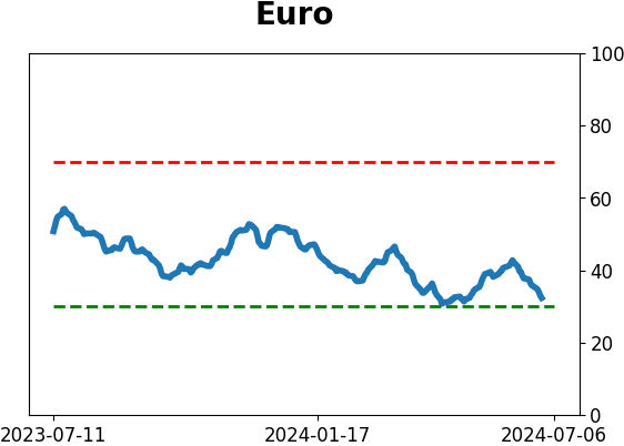
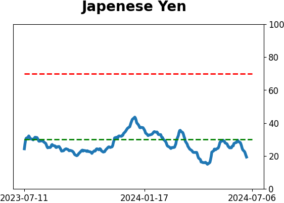
Sentiment Around The World
|
|
|
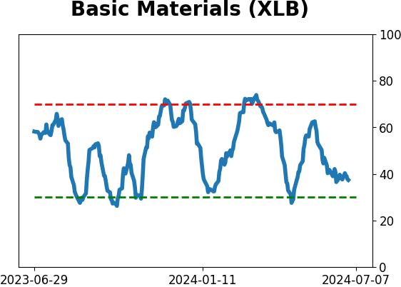
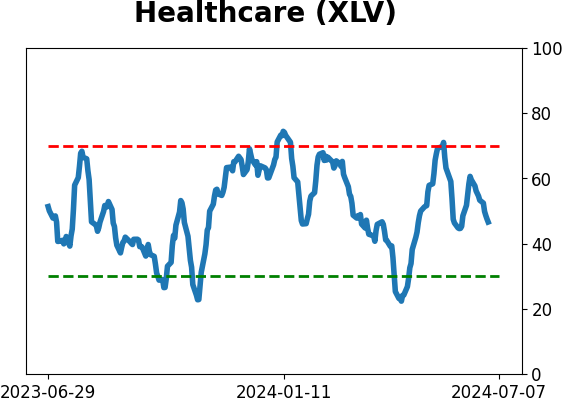
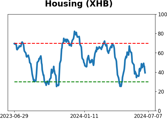
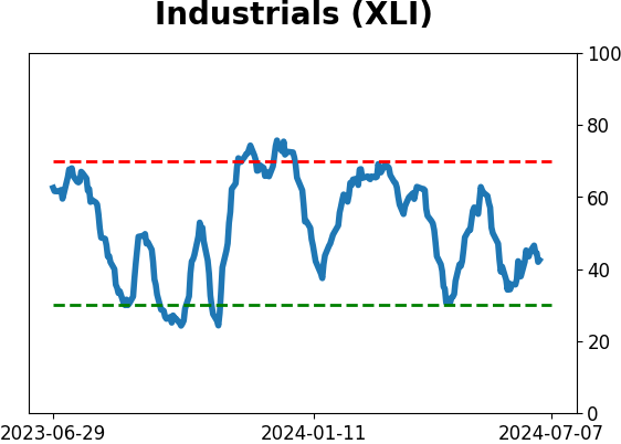
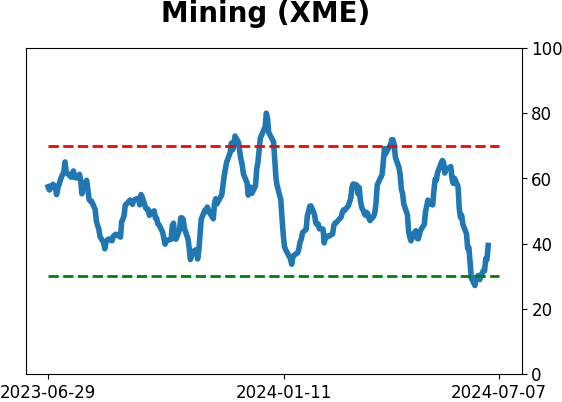
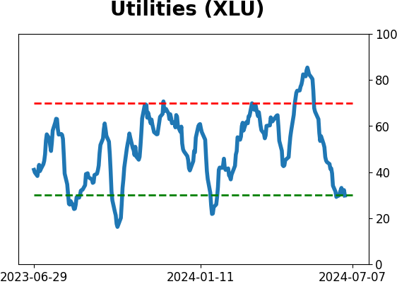
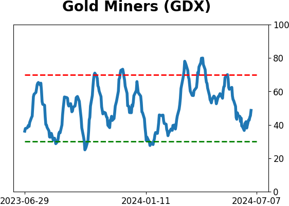
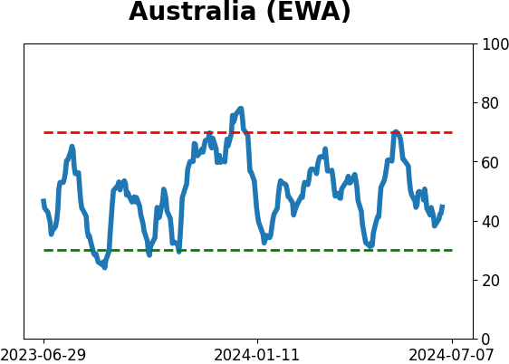
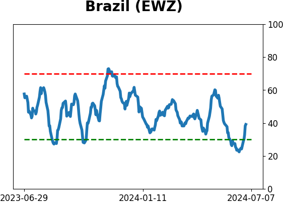
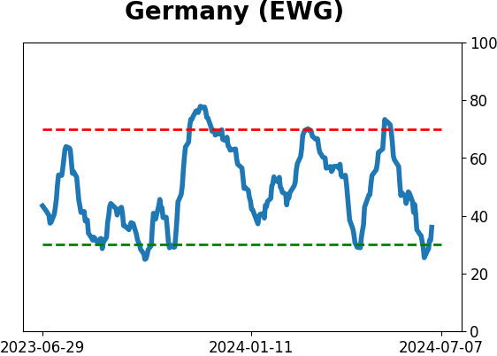
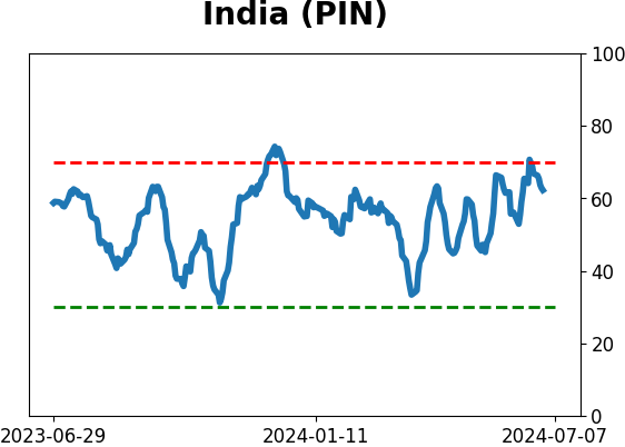
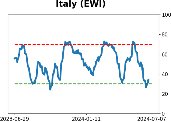
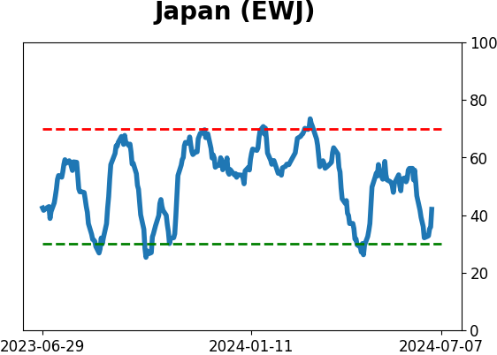
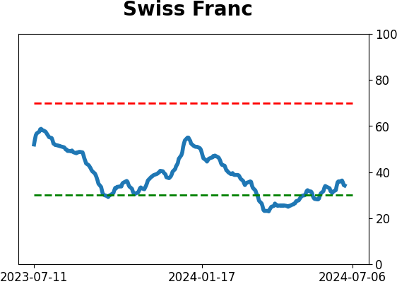
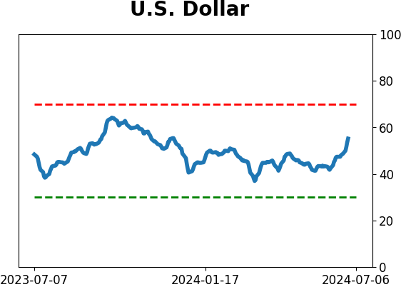
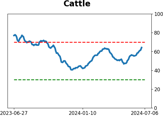
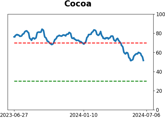
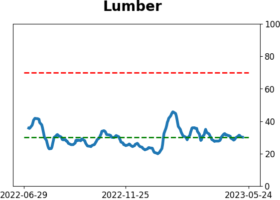
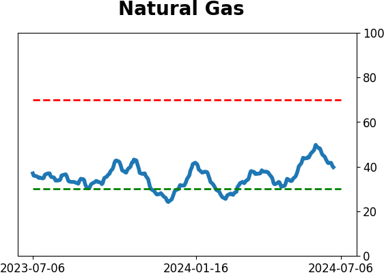
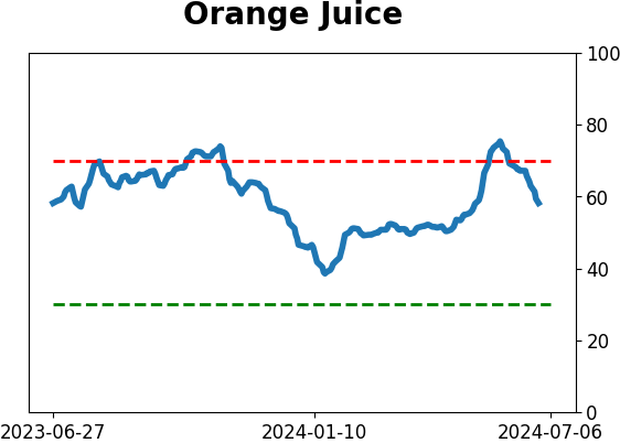
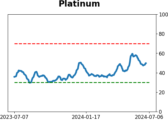
Optimism Index Thumbnails
|
|
|
|
|

|
|
|
|
|
|
|
|
|
|
|
|
|
|
|
|