Headlines
|
|
The S&P's volatile breakout:
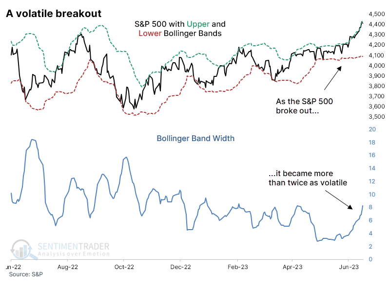
Bucking the usual pattern of low-volatility breakouts, the S&P 500 scored fresh 52-week highs as the index became more volatile. The width between its Bollinger Bands has more than doubled in the past month. After similarly volatile breakouts, the index tended to keep rising in the months ahead.
|
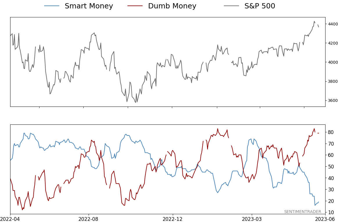
Smart / Dumb Money Confidence
|
Smart Money Confidence: 19%
Dumb Money Confidence: 79%
|
|
Risk Levels
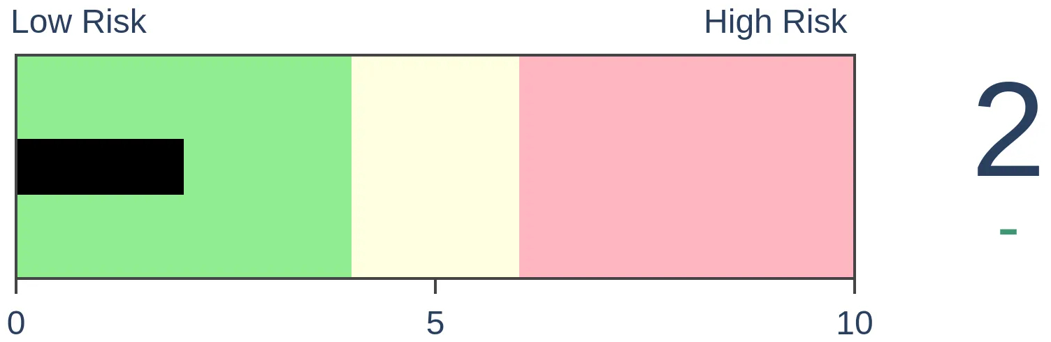
Stocks Short-Term
|
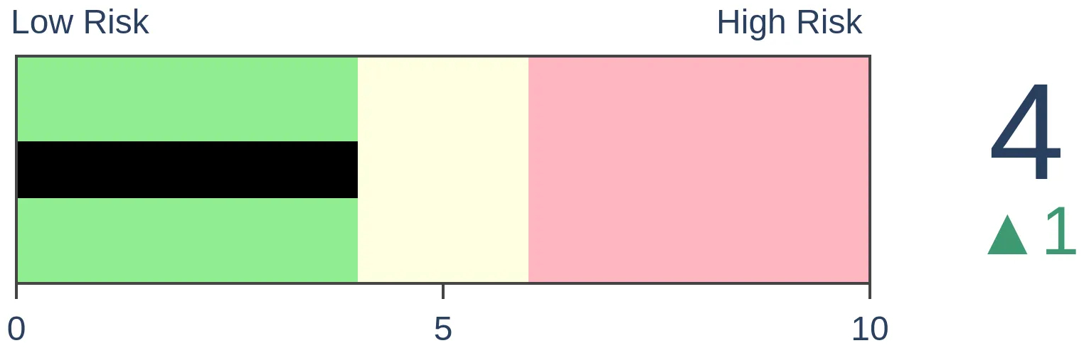
Stocks Medium-Term
|
|
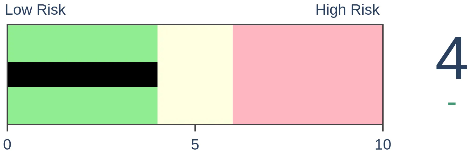
Bonds
|
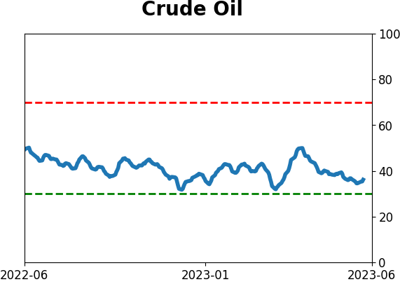
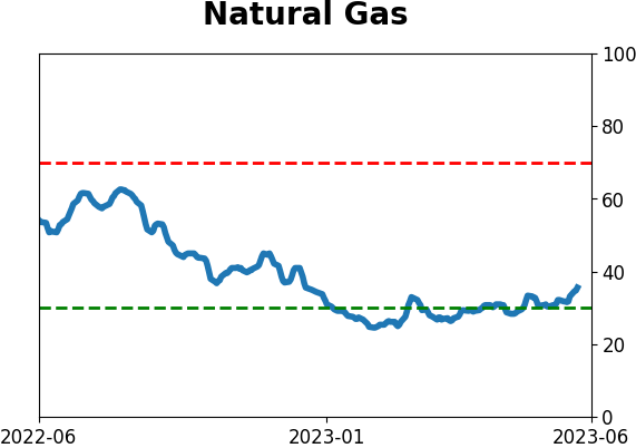
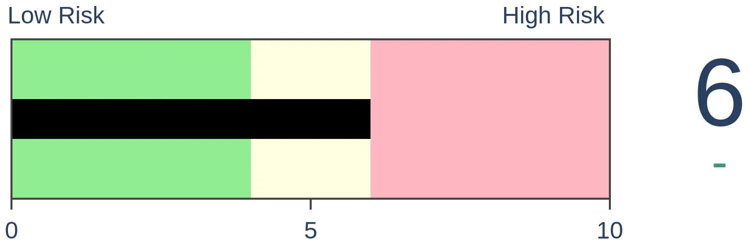
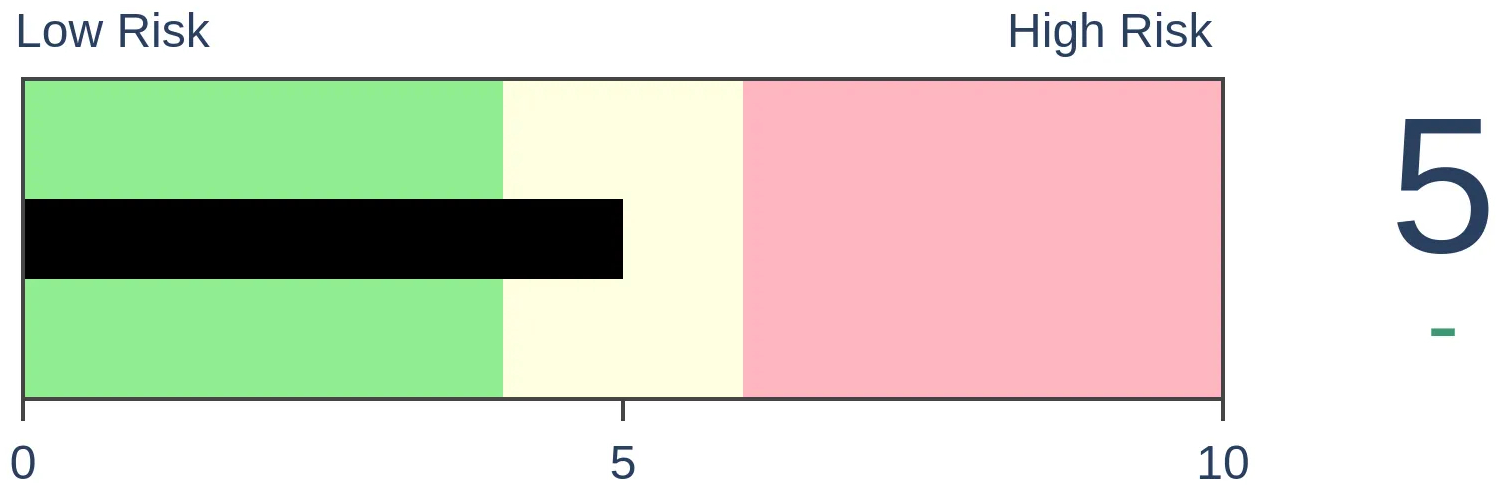
Crude Oil
|
|
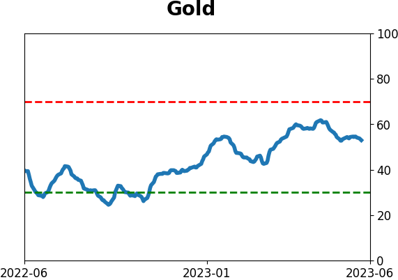
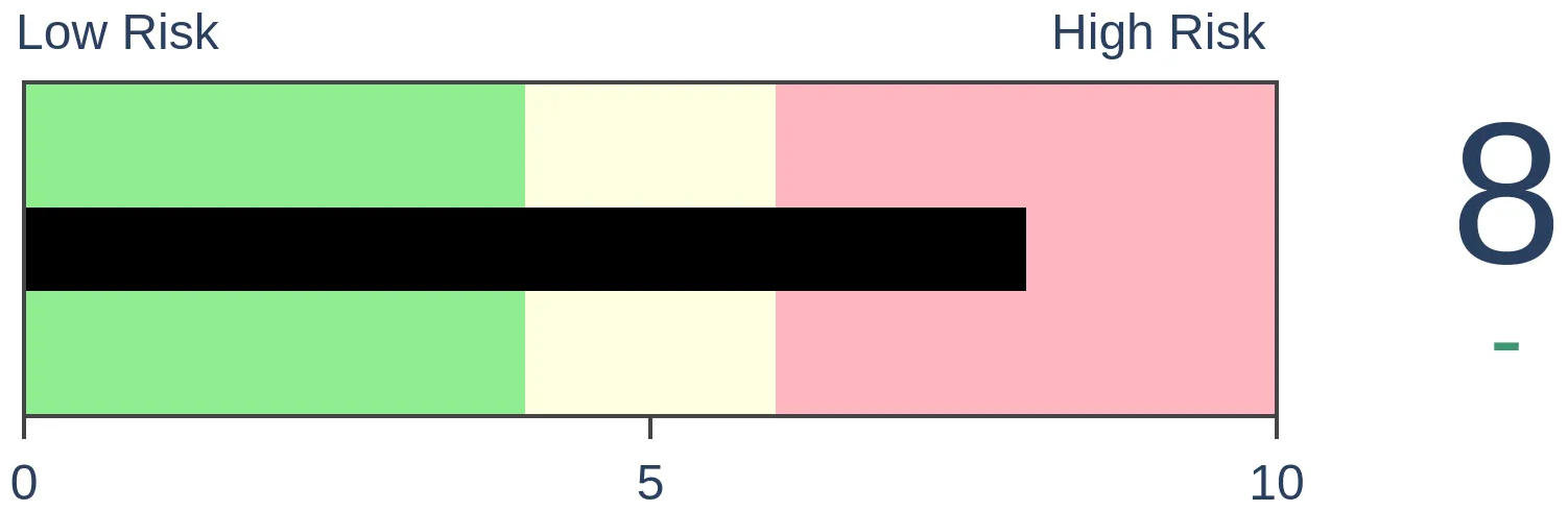
Gold
|
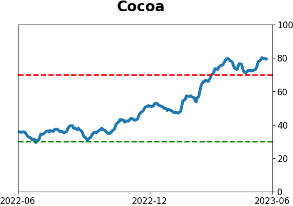
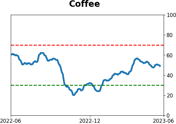
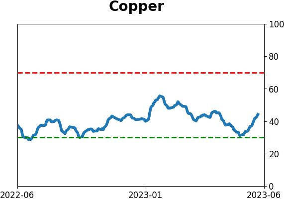
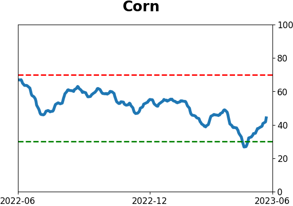
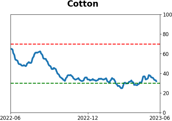
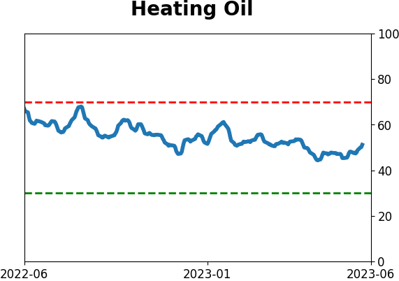
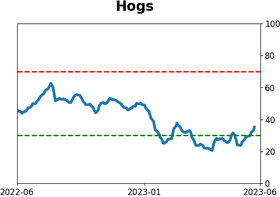
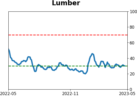
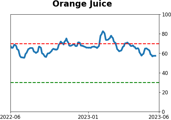
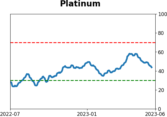
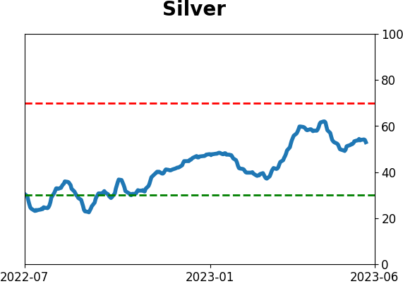
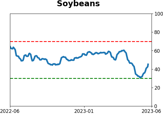
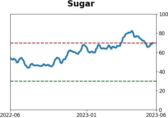
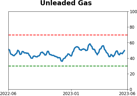
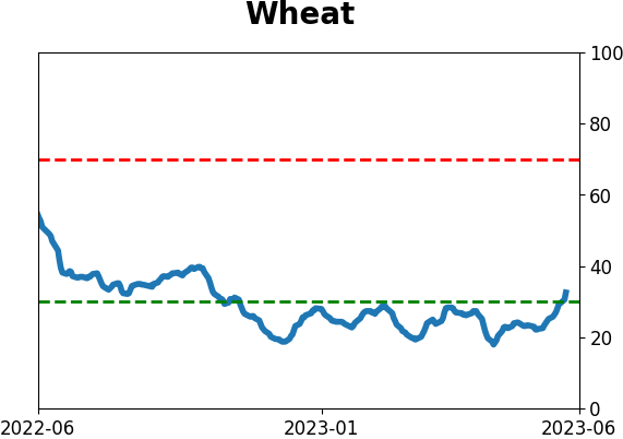
Agriculture
|
|
Research
By Jason Goepfert
BOTTOM LINE
Bucking the usual pattern of low-volatility breakouts, the S&P 500 scored fresh 52-week highs as the index became more volatile. The width between its Bollinger Bands has more than doubled in the past month. After similarly volatile breakouts, the index tended to keep rising in the months ahead.
FORECAST / TIMEFRAME
None
|
Key points:
- The S&P 500 broke out to 52-week highs with more volatility than it typically does
- The width between its volatility bands has doubled within the past month, an unusual condition
- After similarly volatile, momentum-led breakouts, the index showed a strong tendency to rise
Stocks have broken out, and it's been more volatile than usual
The most benchmarked index in the world broke out to new highs last week and became more volatile in the process. Unlike in most commodities and some currencies, this behavior is atypical - normally, stocks get less volatile as they rise.
Using standard settings for the popular Bollinger Band indicator, we can see how the S&P 500 rose above its upper Band and traded at fresh 52-week highs while the width between those Bands got twice as wide as a few weeks ago. We are more likely to see the distance between upper and lower Bands widen as stocks decline and get more volatile.
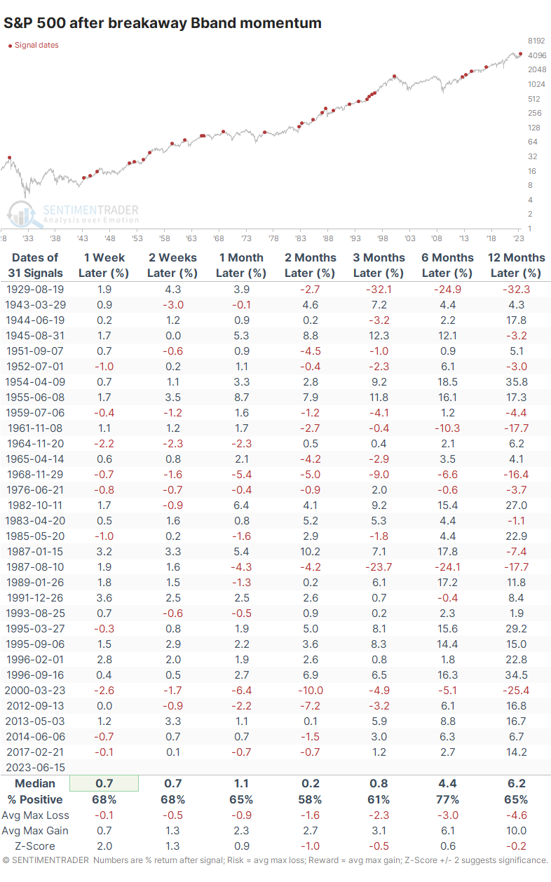
The table below shows how the S&P performed after it reached a 52-week high with Bands that doubled in width within the past month. These are volatile momentum-led types of breakouts. For the most part, it was a good sign for stocks, as the index rose across all time frames. But its returns weren't special, and the risk/reward was uninspiring.
The first volatile breakaway in months preceded further gains
We like to incorporate a broader context as much as possible. That helps us see how behavior tended to unfold under circumstances similar to our current situation, though with the necessary side effect that our sample size will be reduced.
The table below shows S&P returns after the same types of momentum using Bollinger Bands, but with the added condition that it's the first set of 52-week highs in the index in at least three months. This prevents us from comparing the recent breakout to something like 1929 or 2000, when stocks had been hitting new highs for months.
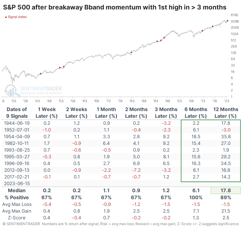
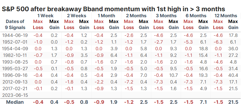
After these precedents, the S&P never showed a loss over the next six months, and losses across any time frame were rare and limited in scope. We can see that even more clearly in the table of maximum losses and gains across each time frame. Even up to a year later, the largest drawdown was a very modest -7.3%, while the maximum gain averaged more than +21%.
What the research tells us...
Several times, Dean has noted that stocks have become quite "overbought." That term is in quotes because many investors equate overbought with bad. That can certainly be the case, but typically not when it's an abnormally strong overbought condition, specifically when it's the first one after a prolonged decline. More often than not, those coincide with a renewed sense of investor optimism, which tends to persist for months afterward. That's what we see with volatile momentum types of breakouts as we witnessed recently.
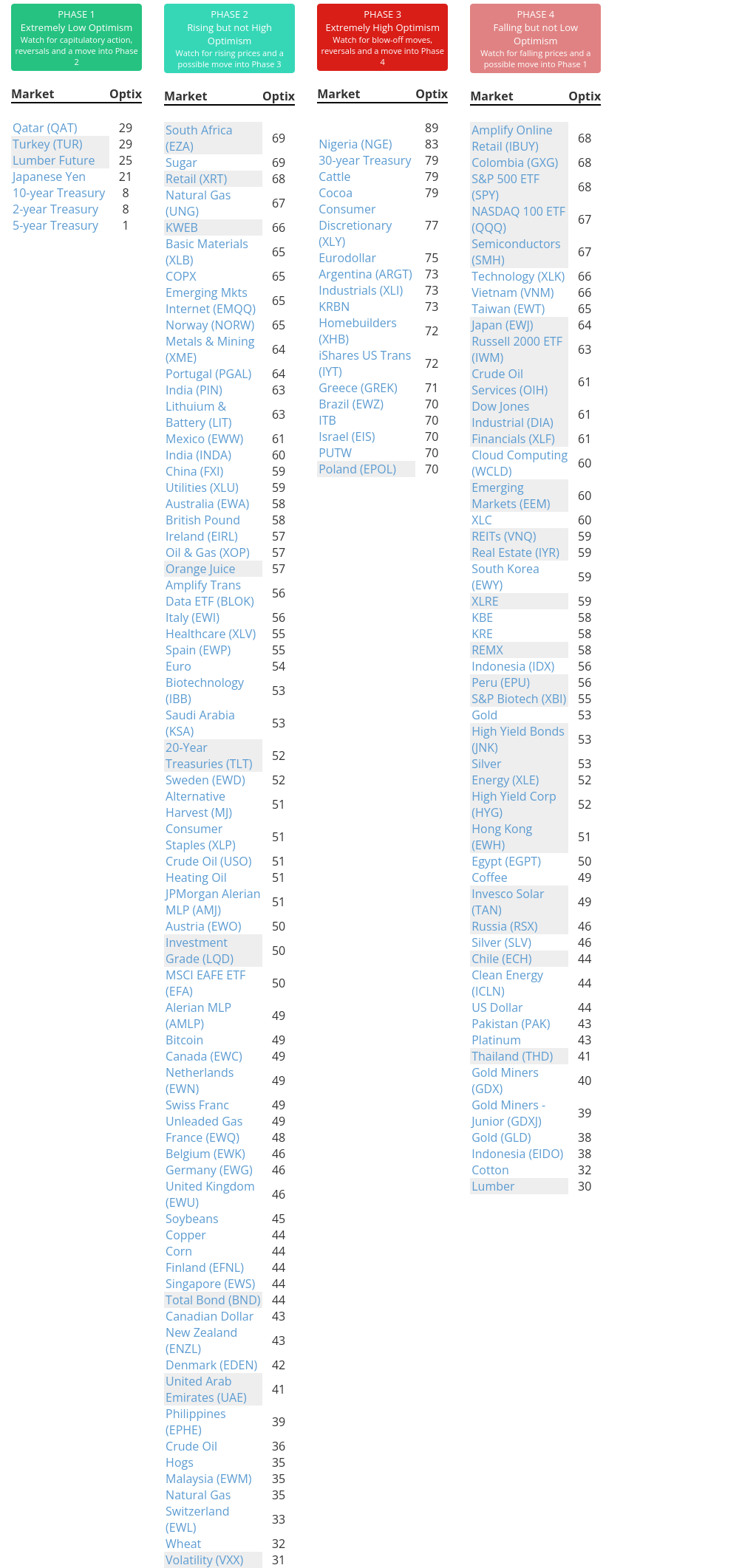
Indicators at Extremes
Phase Table
Ranks
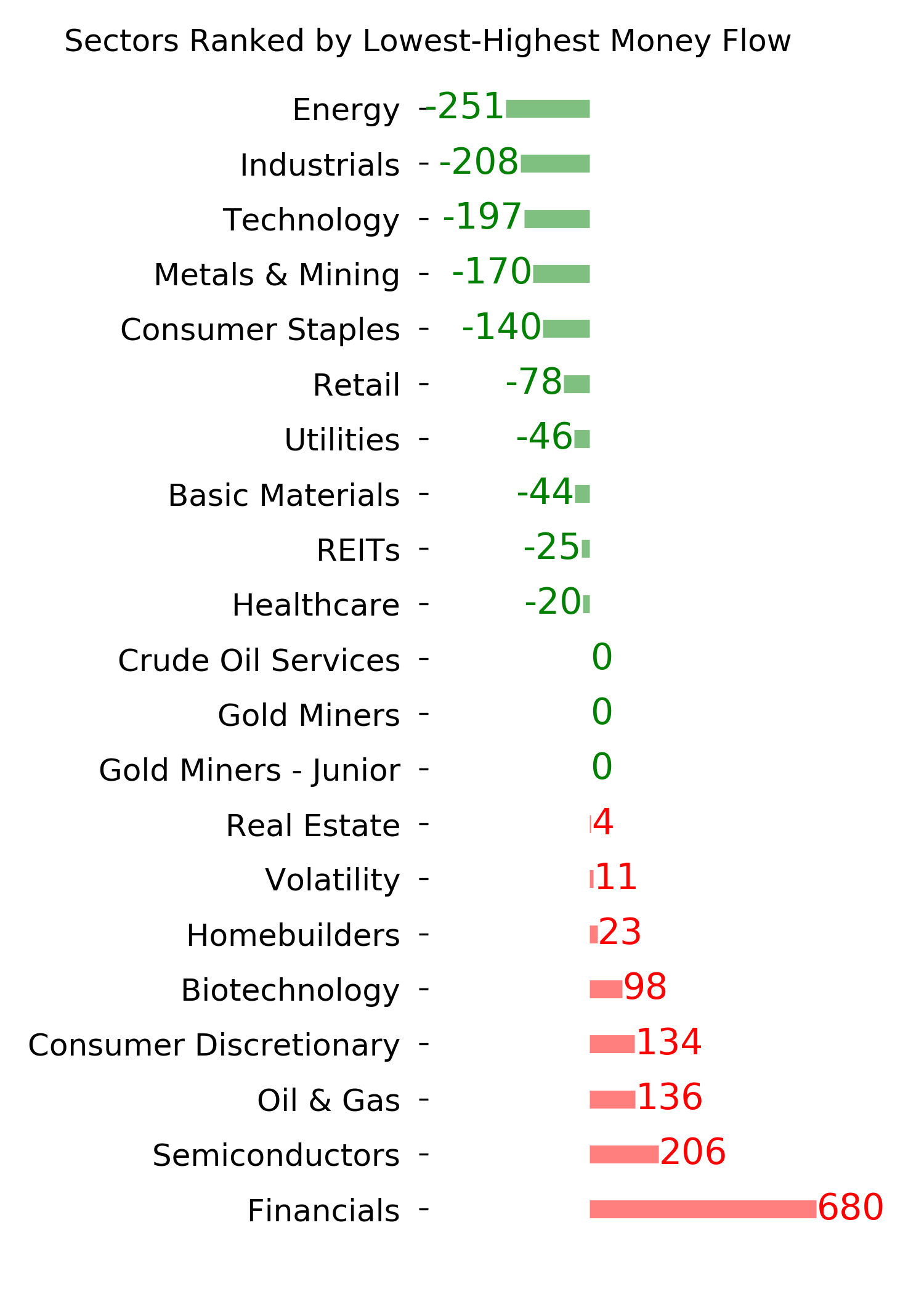
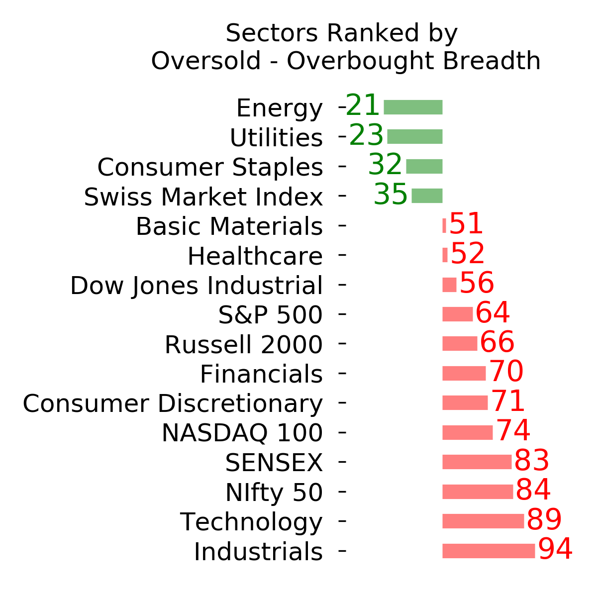
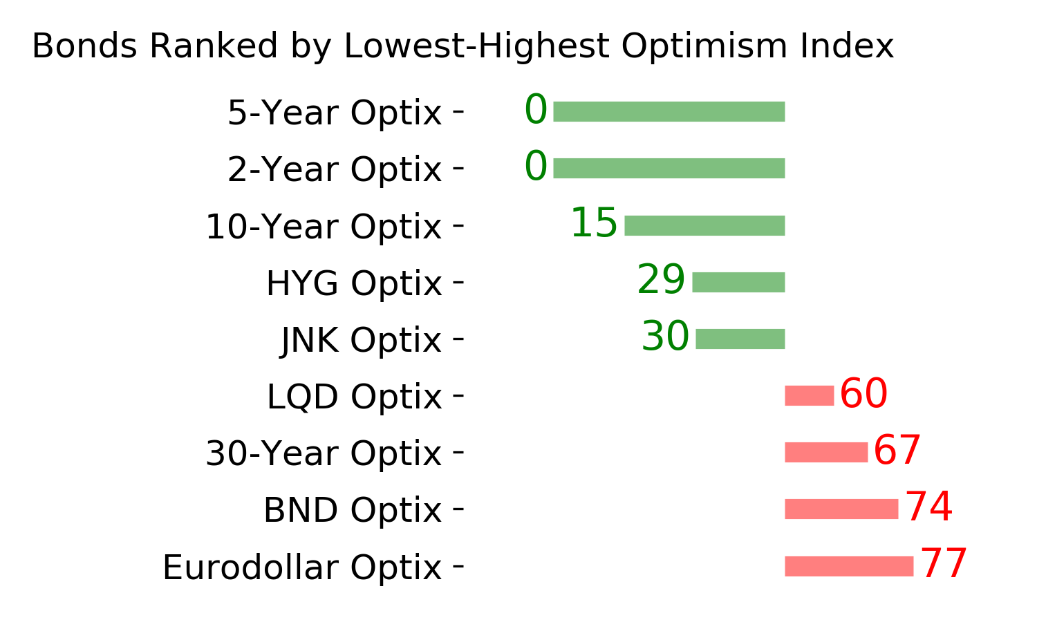
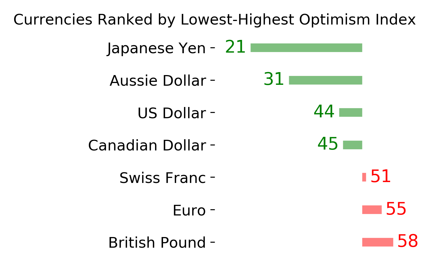
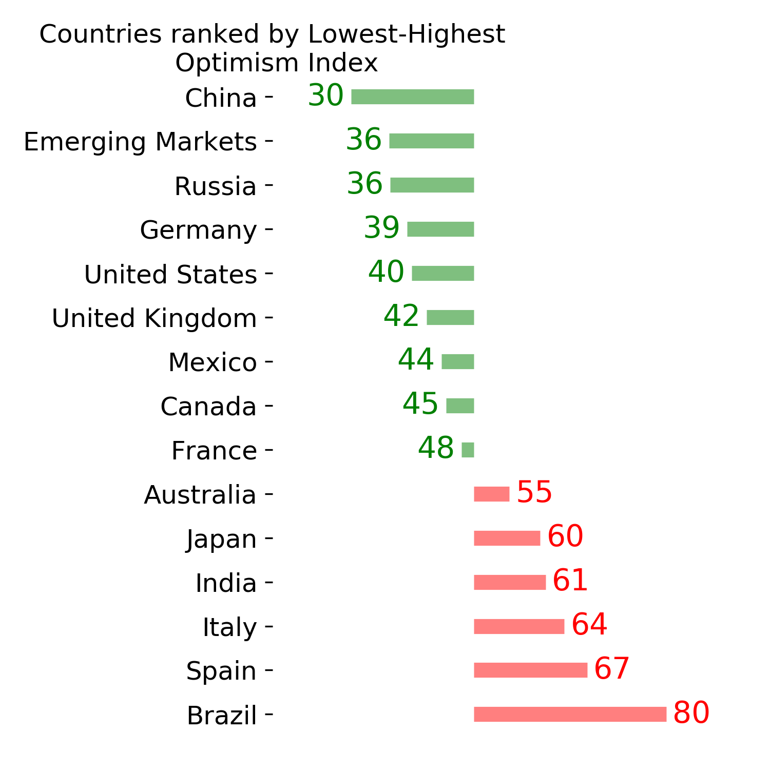
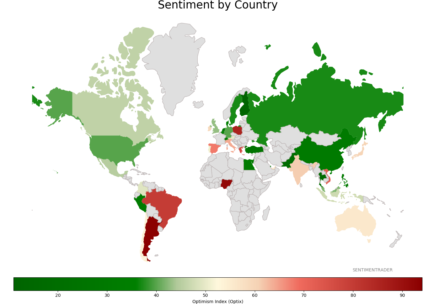
Sentiment Around The World
Optimism Index Thumbnails
|
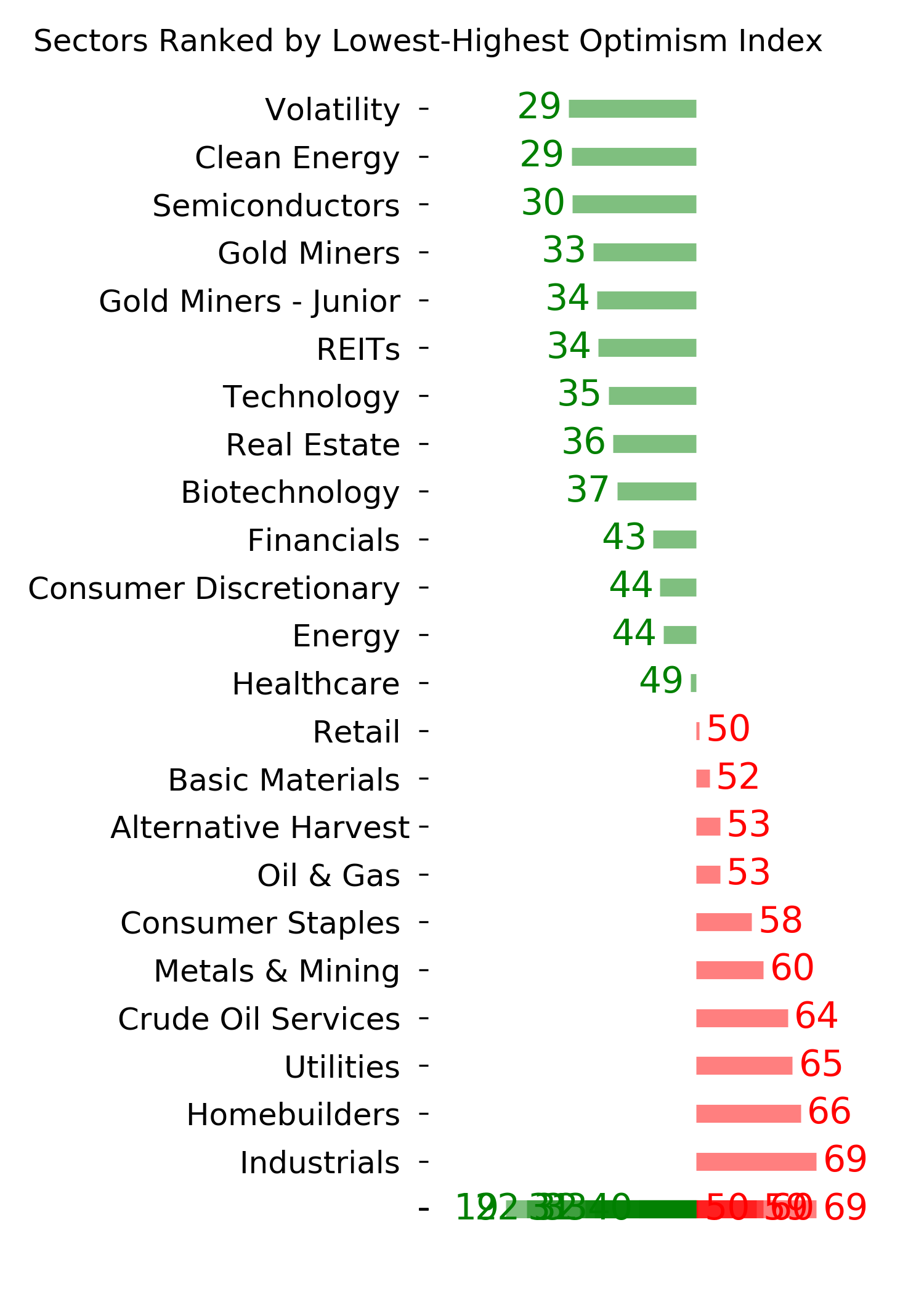
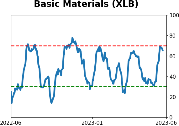
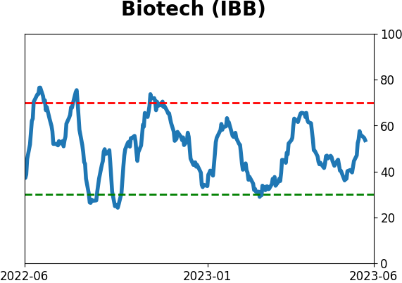
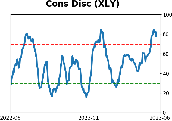
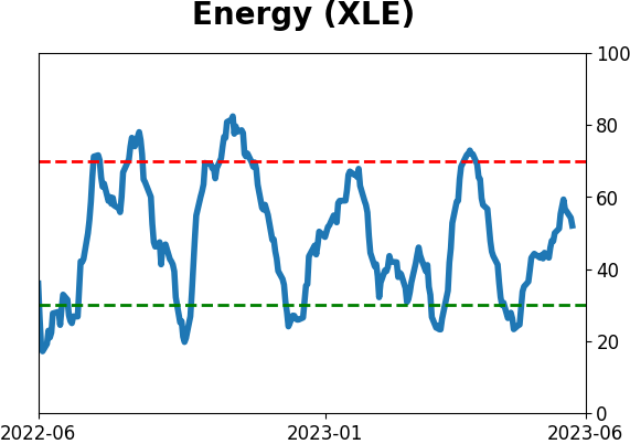
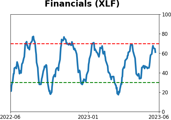
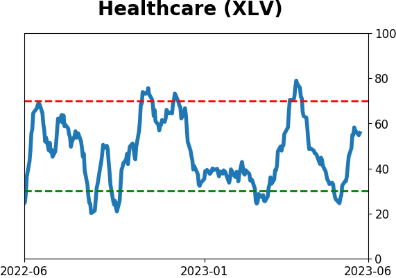
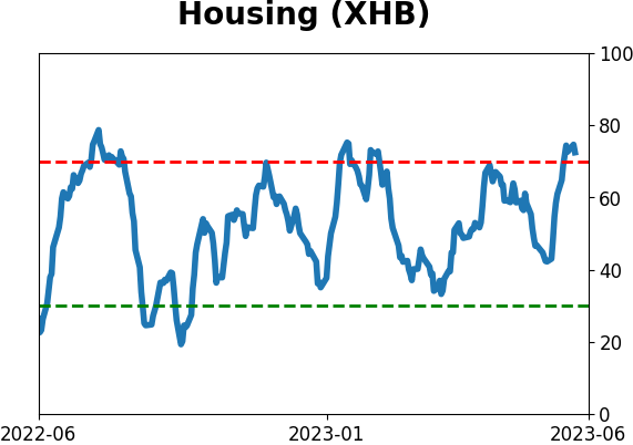
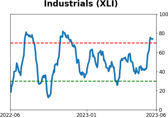
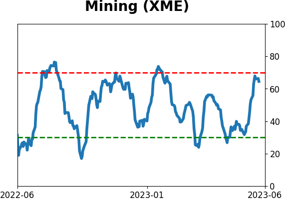
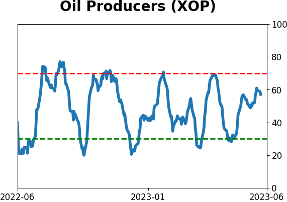
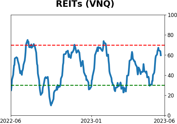
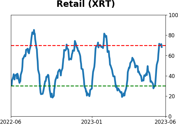
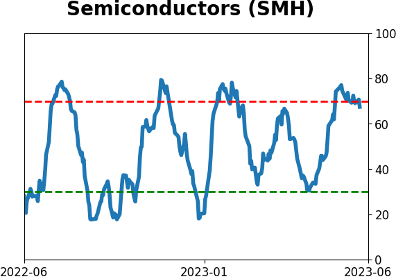
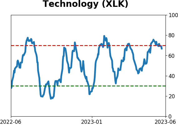
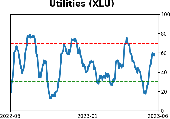
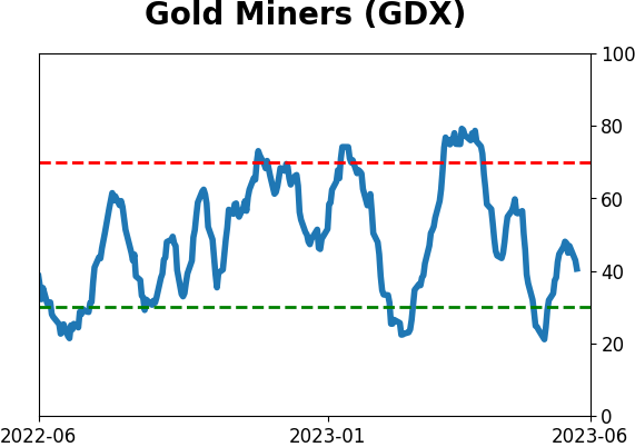
Sector ETF's - 10-Day Moving Average
|
|
|
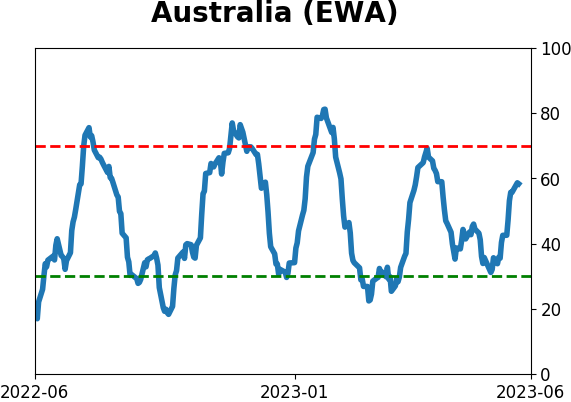
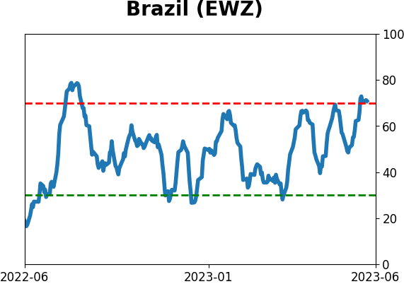
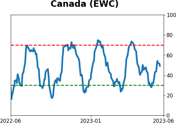
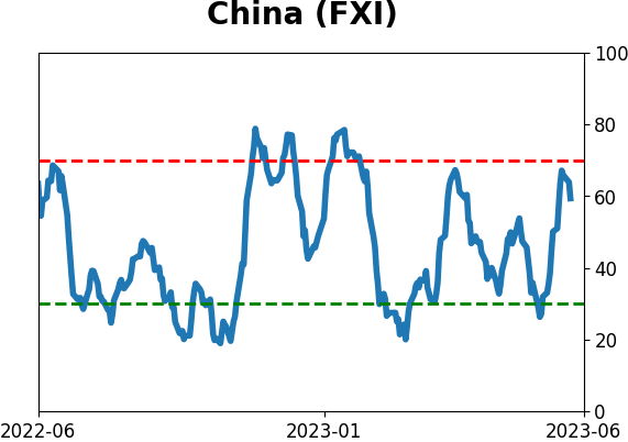
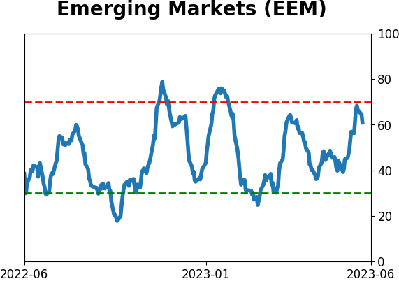
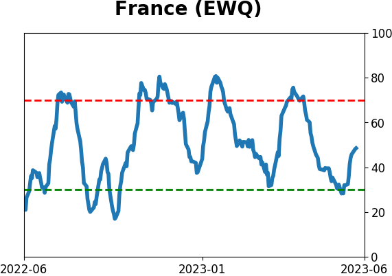
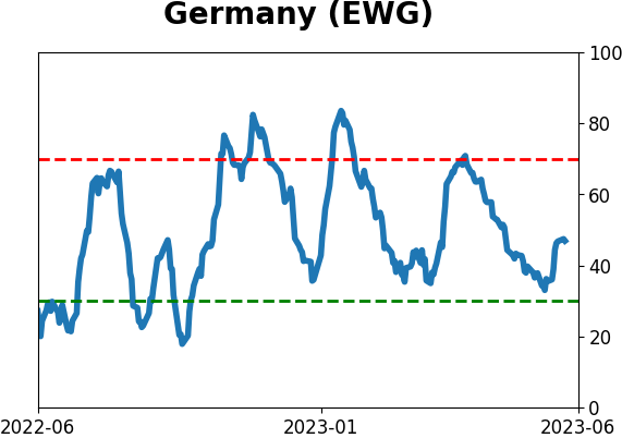
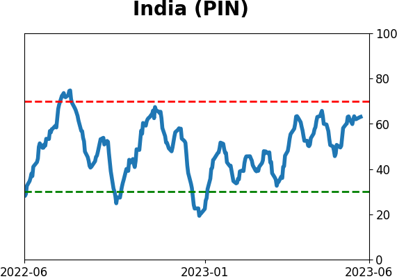
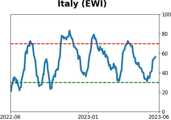
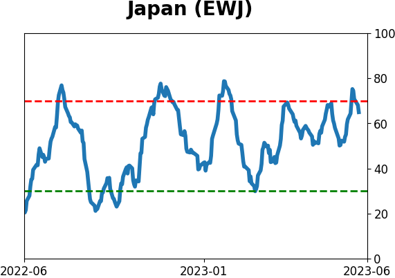
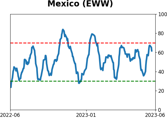
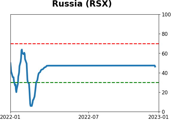
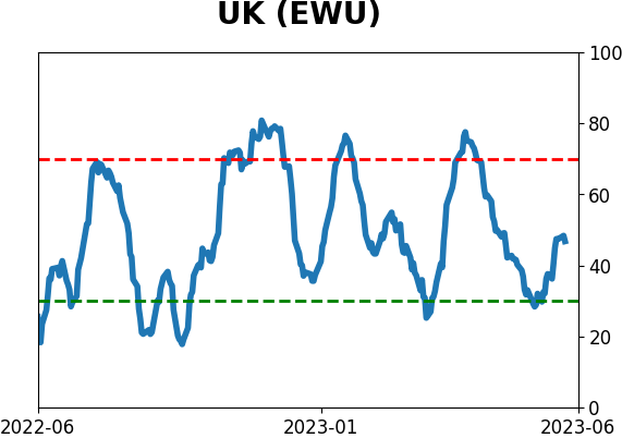
Country ETF's - 10-Day Moving Average
|
|
|
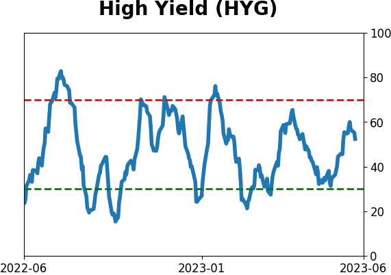
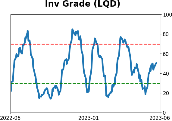
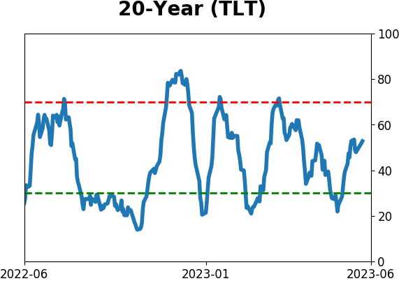
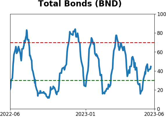
Bond ETF's - 10-Day Moving Average
|
|
|
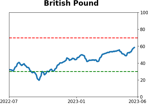
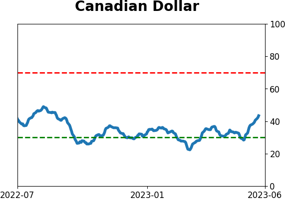
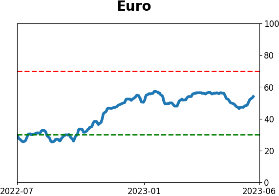
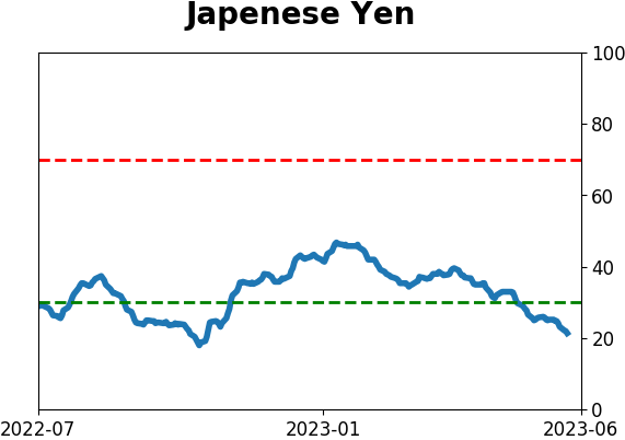
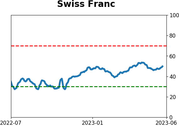
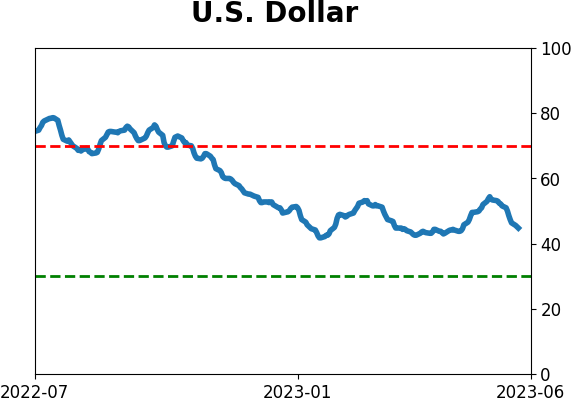
Currency ETF's - 5-Day Moving Average
|
|
|
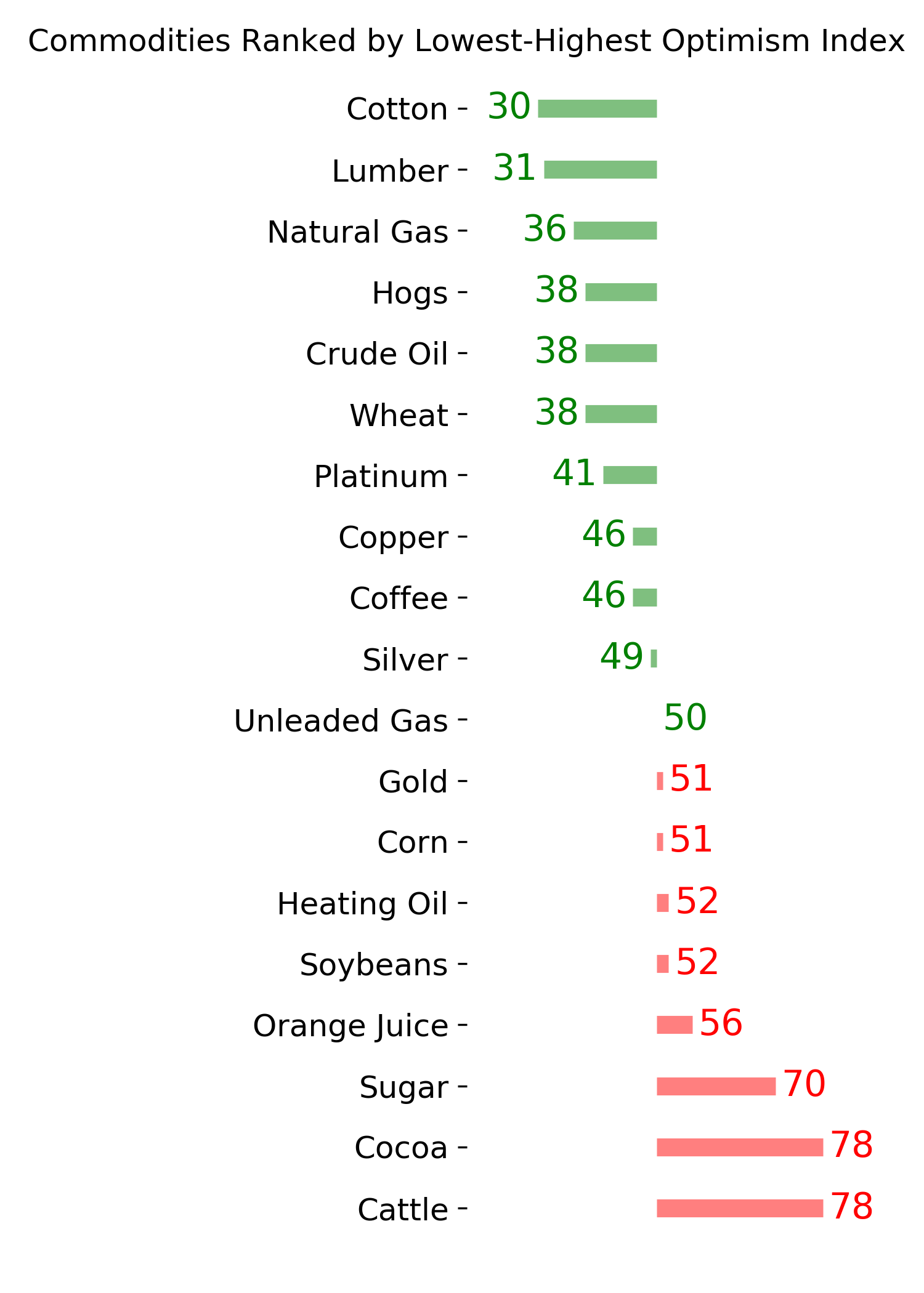
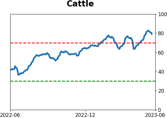
Commodity ETF's - 5-Day Moving Average
|
|