Daily Report : TradingEdge Weekly for Jun 7 - More tech participation problems, summer seasonality, bitcoin and economics

| View/Print a PDF version of this Report |
Headlines
|
TradingEdge Weekly for Jun 7 - More tech participation problems, summer seasonality, bitcoin and economics: This week, we saw that there are some concerns with participation among big tech stocks. Participation in the Nasdaq 100 is waning and more stocks are falling into bear markets. Potential tailwinds include summer seasonality during election years and impressive momentum through May. Platinum is facing some issues. It may be possible to use the PMI survey to gauge risk in bitcoin. |
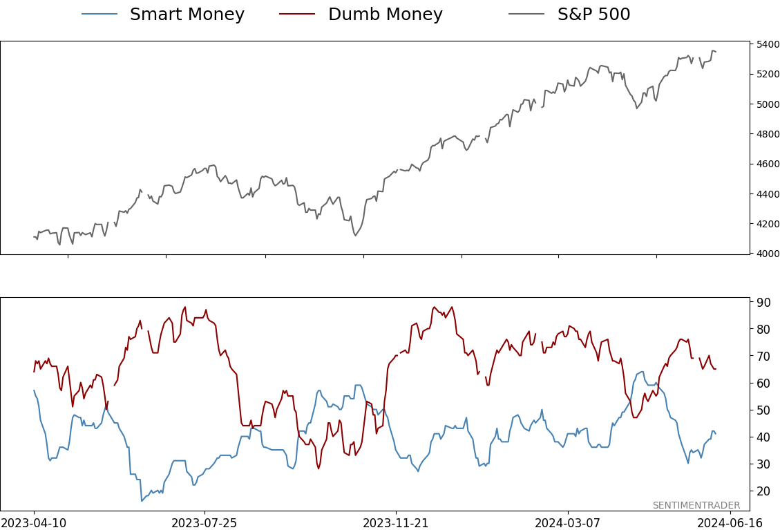
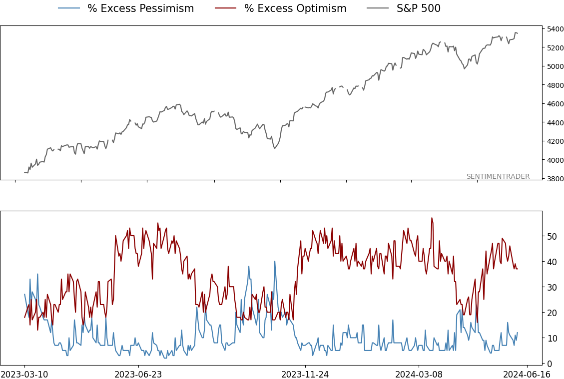
Smart / Dumb Money Confidence
|
|
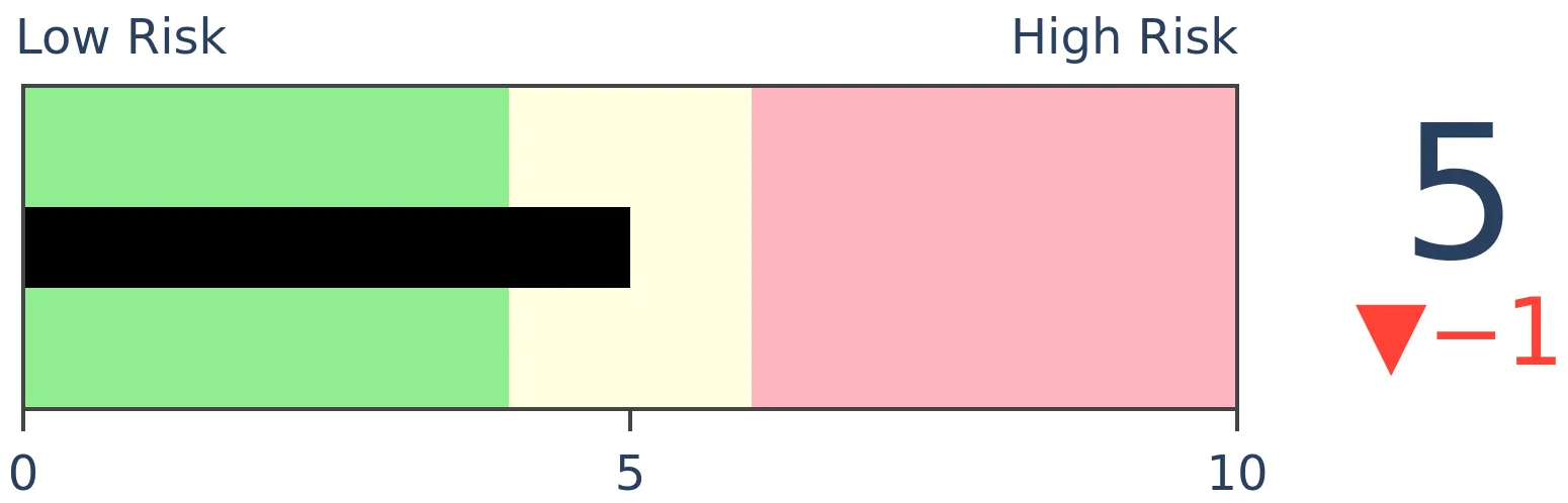
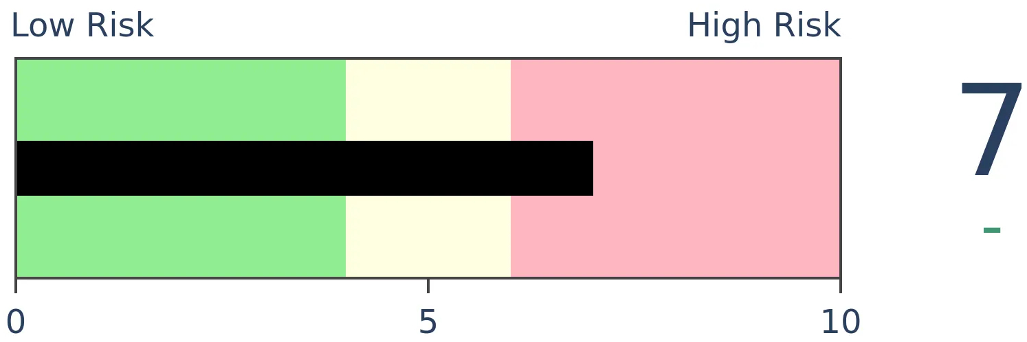
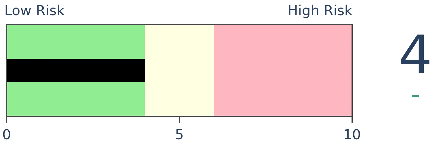
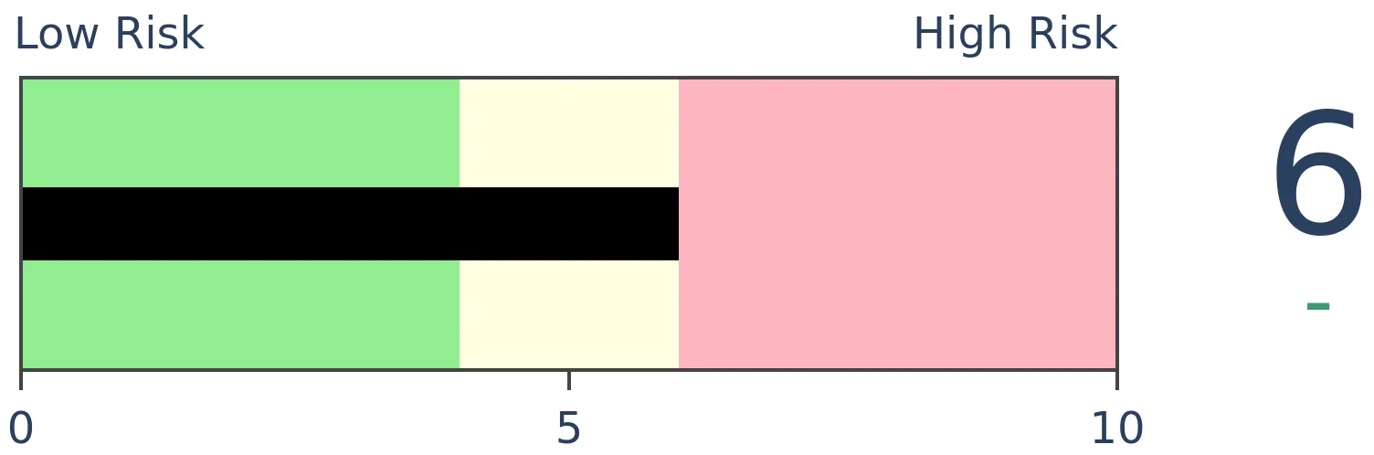
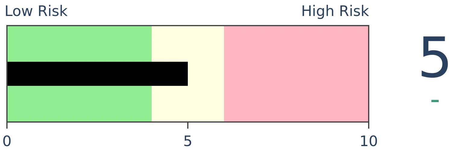
Risk Levels
|
|

|
Research
TradingEdge Weekly for Jun 7 - More tech participation problems, summer seasonality, bitcoin and economicsBy Jason GoepfertBOTTOM LINEThis week, we saw that there are some concerns with participation among big tech stocks. Participation in the Nasdaq 100 is waning and more stocks are falling into bear markets. Potential tailwinds include summer seasonality during election years and impressive momentum through May. Platinum is facing some issues. It may be possible to use the PMI survey to gauge risk in bitcoin. FORECAST / TIMEFRAME |
Key points:
- Big tech stocks are having some trouble holding their medium-term uptrends
- More and more of the stocks are falling into individual bear markets
- The S&P 500 has often enjoyed a summer reprieve during election years
- Momentum through May has also proved a good tailwind for the rest of the year
- Another tailwind is the drop in oil prices and rise in bond prices
- Growth stocks broke out again relative to value
- Many more utility stocks are holding up relative to staples, unusual for defensive sectors
- Bonds are facing a positive seasonal window for the summer
- Using the PMI survey to assess bitcoin's outlook
- Platinum has some seasonality and sentiment issues
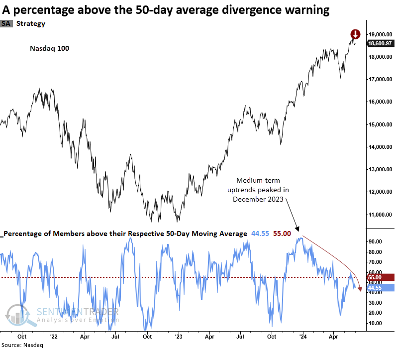
Poor big tech participation
The Nasdaq 100 triggered a warning when stocks in medium-term uptrends diverged from the index. Dean showed that similar precedents suggest the popular Nasdaq index could struggle over the next few weeks.
The Nasdaq 100's percentage of stocks above their 50-day average last eclipsed 90% in December 2023. Therefore, its five-month momentum window expired in May. On Monday, the 50-day average divergence model triggered a new warning for the Nasdaq 100, the first precedent since October 2018.
Following a percentage above the 50-day average divergence warning, the Nasdaq 100 tended to struggle over a medium-term basis with negative returns and unfavorable win rates in 3 out of 5 horizons. Over the following three months, the maximum loss exceeded the maximum gain in all periods.
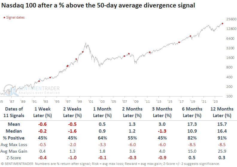
Once the corrective phase ended, the popular Nasdaq index rallied over longer time frames, displaying excellent returns and consistency, especially a year later.
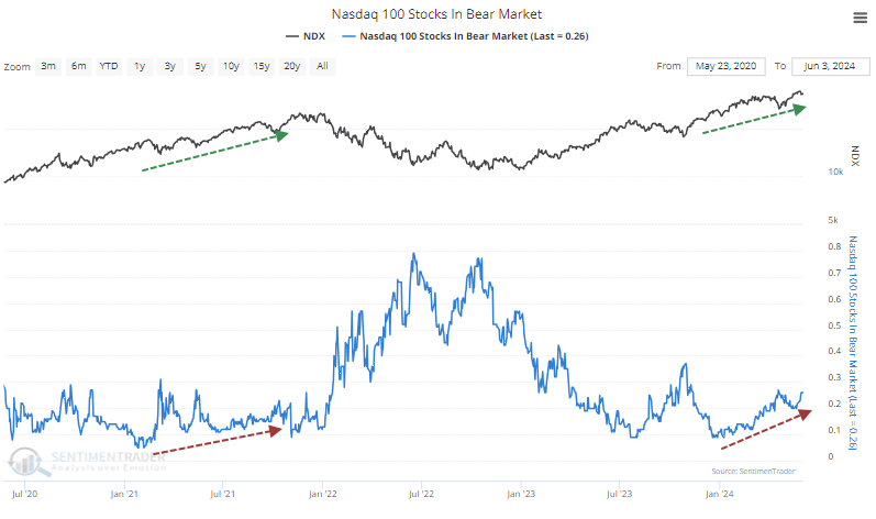
More severe drawdowns in tech
The concern isn't just that fewer stocks are holding above their medium- and long-term moving averages. Maybe they're just a bit below, or maybe the averages are still rising. One metric that can't be explained away is the number of stocks in bear markets. We use the common definition of a 20% drawdown from the most recent 52-week high as a bear market.
Oddly, more and more NDX stocks are falling into that definition. This is a change from the initial phase of the rally and is quite similar to the rally in the fall of 2021 when the index rose while more of its stocks fell into bear markets.
Over the past 25 years, there have been more than 100 trading days when a divergence like this was in effect. These were not necessarily reasons to sell tech stocks.
The NDX's returns in the weeks and months ahead were fine and well above random up to six months later. However, much of that was due to 1998-1999. During the final blow-off phase of the rally, divergences galore occurred, and the index continued to soar for months on end.
If we assume that we're not on the cusp of a repeat and cut out that time frame, the table below shows a much less sanguine outlook. Even though the NDX continued to rally most of the time over the next couple of weeks, the rallies tended to sputter and by three months later, showed mostly losses. The only signals that didn't show a loss were the ones from the beginning of 2012, when the NDX managed to rally for another couple of months before erasing all the gains in a subsequent correction.
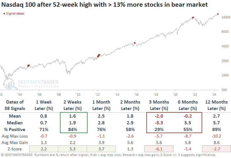
These returns are significantly below those when the NDX had reached a high with no divergence in the percentage of its stocks that were in bear markets at the time.
An election-year summer reprieve
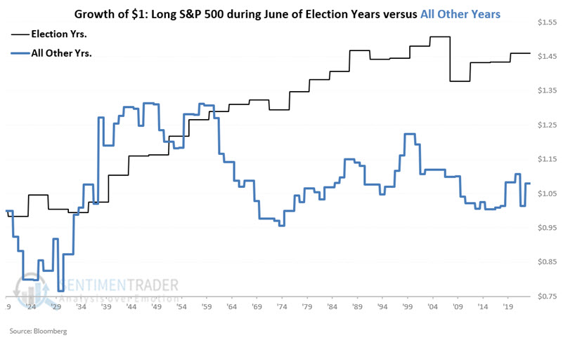
As we enter June, Jay asked whether we should expect a "summer rally" or "the summer doldrums". History offers some relevant clues, as summer months generally tend to perform better during presidential election years.
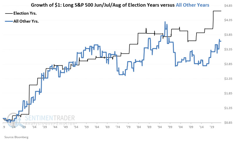
Since we are in a presidential election year, we will focus on historical stock market performance during June, July, and August of presidential election years.
The chart below displays the growth of $1 invested in the S&P 500 only during June of election years and compares its performance during June during the other three years of the election cycle. June of election years outperformed all other years combined.
Now, let's combine the three months into one combined three-month period. The chart below displays the growth of $1 invested in the S&P 500 only during June, July, and August of election years and compares its performance during the other three years of the election cycle. Historically, the summer months during the election year have performed better and more consistently than the summer months of all other years.
Momentum continues to provide a tailwind
Jay also pointed out that the S&P 500 Index closed May with a year-to-date gain of +10.6%. Historically, a strong first five months of the year bodes well for the last seven months of the year.
We will focus specifically on the performance of the S&P 500 Index during the last seven months of the year only if the index showed a year-to-date gain of +5% or more as of the end of May.
The columns in the table below display the following information:
- The year if the S&P 500 Index closed May with a year-to-date gain of 5% or more
- The cumulative percentage gain or loss for the S&P from the end of May through the end of December
- The most significant decline during June through December from the closing price at the end of May
- The most significant peak-to-valley drawdown from any peak during June through December
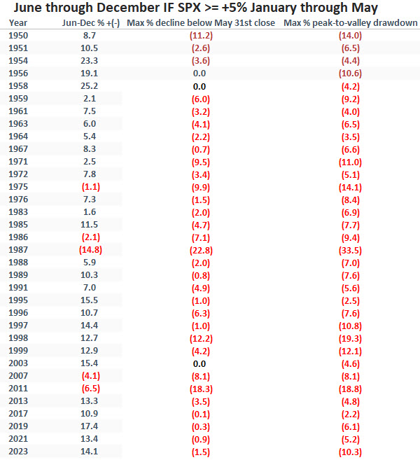
The chart below displays the hypothetical growth of $1 invested in the S&P 500 Index only during Jund through December of the years listed in the table above. The equity curve's favorable long-term "lower left to upper right" nature is unmistakable. That said, a closer examination reveals some significantly sharp declines along the way.
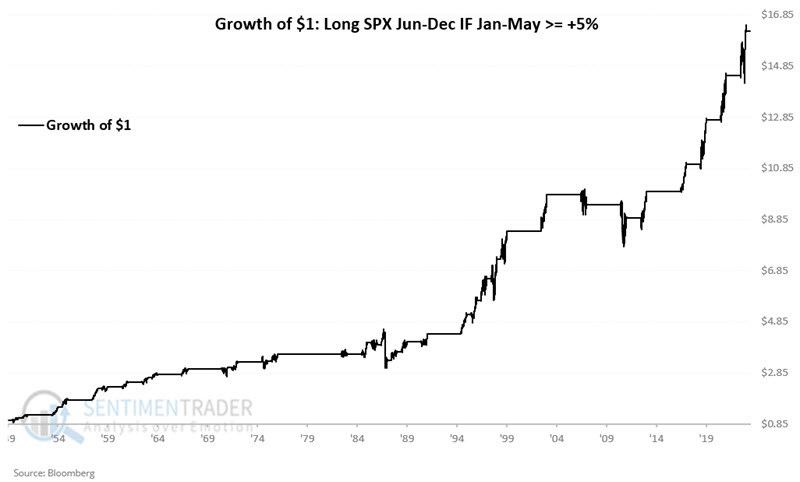
The key things to note are an 85% Win Rate and that moves larger than +/- 10% from June through December skewed to the positive side by a factor of 17-to-1.
While the results above appear compelling, to get a true sense of performance, Jay compared it to the average performance for the S&P 500 Index over all rolling seven-month periods starting at the end of 1949. He noted that years with positive momentum, like 2024, significantly outperformed other 7-month periods.
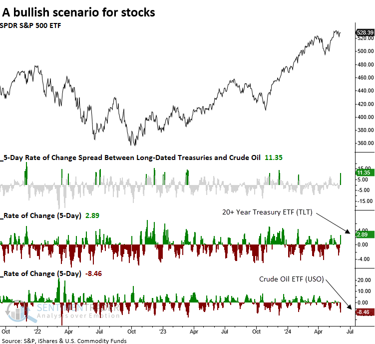
Oil down, Treasuries up
Over the last five sessions, crude oil has fallen over 8%, and long-dated Treasuries have risen almost 3%. Dean showed that similar precedents produced outstanding returns and consistency for the S&P 500 regardless of the environment.
If you're searching for an explanation for the rally in stocks in the last few days, the 8% drop in crude oil prices is likely a factor. The decline has sparked a chain reaction, causing long-term Treasury prices to soar (yields to fall). This, in turn, has driven investors to snap up stocks, as the combination of lower oil prices and yields presents a favorable situation.
On Tuesday, the 5-day rate of change spread between the two surged above 11%, marking the highest reading since December 2023, a favorable time to own stocks.
Whenever the 5-day rate of change spread between the 20+ Year Treasury ETF (TLT) and the Crude Oil ETF (USO) exceeded 10%, the world's most benchmarked index displayed outstanding returns and consistency. At some point over the following month, the S&P 500 ETF (SPY) was higher in 44 out of 49 instances, which includes most of the 2007-09 bear market.
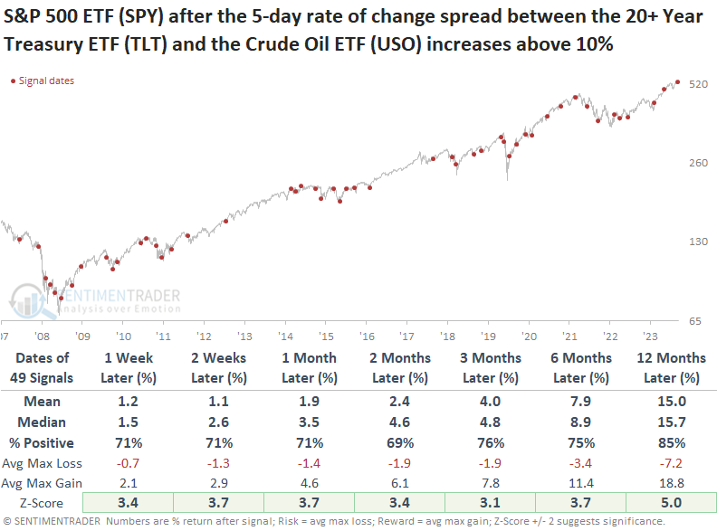
When the S&P 500 traded above its 200-day average, returns were slightly less favorable across all horizons. However, win rates from one to four weeks later were higher, particularly in the first week, which saw an impressive 81% increase.
Unsurprisingly, Consumer Discretionary and Technology, two growth-oriented sectors, outperformed the S&P 500 and all other sectors over the following year.
Growth continues to...well, grow
Growth stocks enjoyed another spurt in May, to the long-suffering envy of value investors. A ratio of the total return in Russell 3000 growth stocks relative to Russell 3000 value stocks reached a new multi-year high last week.
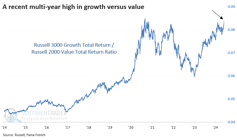
The ratio between these two factors bottomed in 2006, marking the most substantial shift in nearly 100 years. Prior to the past 20 years, growth stocks had consistently underperformed value over longer periods.
The problem is that these breakouts tended to fail. We can see below that the ratio of growth to value tended to recede after these new highs, which was a headwind for further gains in the broader market.
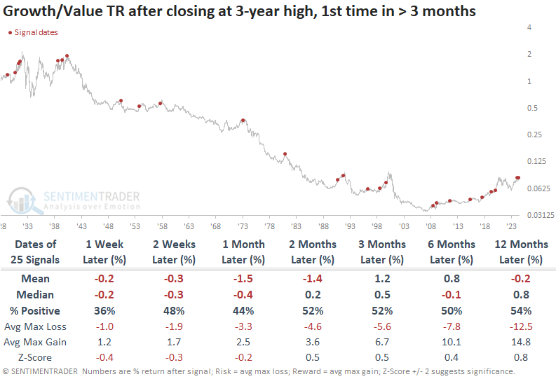
If we want to focus on the past 20 years - hey, maybe things have changed permanently - then short-term results were still poor. After the first month or so, growth resumed its outperformance most of the time (again, only over the past 20 years).
Value stocks tended to hold up better, but that's a relative victory. Absolute returns in these stocks weren't all that great, and risk was still too high compared to reward to consider this any kind of compelling argument for value stocks.
Utility stocks holding much better than staples
Defensive stocks tend to travel together more or less. Of course, they all have their quirks, but generally, they ebb and flow in the same broad directions. However, that hasn't been the case lately with a couple of them.
Almost all utility stocks are holding above their medium-term trends, while relatively few staples are doing so. As of last week, more than 93% of utilities were trading above their 50-day moving averages. Around the same time, fewer than 30% of staples were trading above their 50-day averages.
Historically, a spread of more than 55% in the percentage of utility stocks above their 50-day averages minus staples above their averages is very wide. Over the past 30 years, it has happened fewer than 20 times.
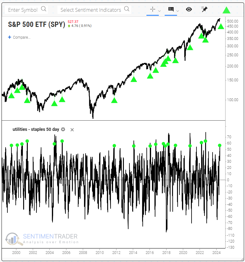
Users of Backtest Engine 2.0 may notice a new tab, Major Sectors. It's a useful addition that allows you to see how the S&P's sectors performed after signals in the backtest.
Focusing on those two sectors shows that utilities outperformed staples over the next 2-4 weeks, with a (mostly) higher average return and better consistency. However, staples outperformed over the next 6-12 months, especially in consistency.
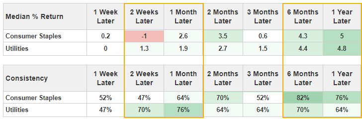
Bond booster
Jay suggested that longer-term models remain unfavorable. However, speculators and short-term traders might presently be looking for an opportunity to play the long side due to positive seasonality.
TLT is entering arguably its most favorable seasonal time of year. The chart below displays the annual seasonal trend for TLT. Note that this ETF will soon enter a significantly favorable seasonal period that extends from TDY #110 through TDY #167. For 2024, this period began at the close on 2024-06-07 through 2024-08-29.
An annual seasonal trend chart such as the one above is merely an average of past performance and is not a roadmap of what will happen during any given year.
The chart below displays the hypothetical growth of $1 achieved by holding a long position in TLT only during the end of TDY #110 through the end of TDY #167 every year since 2003.
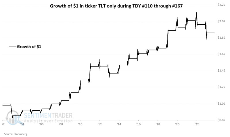
These windows showed a gain 76% of the time, with TLT gaining more than +6% seven times while losing more than -6% only once.
On a short-term basis, ticker TLT is slightly technically overbought, with the 4-day RSI recently reaching 82. Likewise, for 30-year treasury bond futures - which have a longer history than TLT - the favorable cycle does not begin until TDY #120 (i.e., 2024-06-24). The bottom line: a slightly better buying opportunity may emerge if TLT cools off in the short term.
Bitcoin and economic sentiment
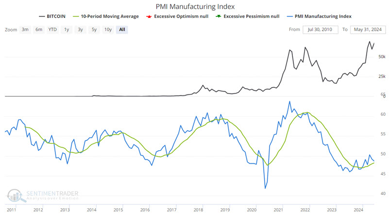
There appears to be a correlation between Bitcoin price movements and the trend of the PMI Index. Jay highlighted a simple application of rudimentary trading rules that may help traders identify favorable times to hold Bitcoin.
The PMI Index attempts to measure economic trends, according to Investopedia.com. We use the latest available index value for the PMI Index at the end of each calendar month. For Bitcoin, we use the reported closing price at the closing of trading on the month's last trading day. Note that there is no guarantee that a trader could have bought or sold Bitcoin at exactly that price. Thus, a caveat exists that all results are entirely hypothetical.
We will look at the latest PMI value available at the end of the month and compare that value to the 10-month moving average of month-end PMI readings. The chart below displays the price for Bitcoin at the top, the PMI Index value (blue line), and its 10-month moving average (green line) in the bottom clip.
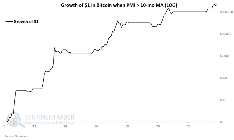
We will apply the following rules:
- If PMI closes a month above its 10-month moving average, we will assume a long position is entered in Bitcoin at its monthly closing price
- If PMI closes a month below its 10-month moving average, we will assume a flat position
That's it.
The chart below (log scale) displays the hypothetical growth of $1 invested in Bitcoin only if the PMI closed the previous month above its 10-month moving average. Note that this simple rule captured several of Bitcoin's most significant price surges.
Conversely, the chart below displays the hypothetical growth of $1 invested in Bitcoin only if the PMI closed the previous month below its 10-month moving average. While holding during these periods technically shows a significant gain (over 500% from start to finish), the results are extremely volatile - potentially to the point that many individuals might have trouble riding out the declines.
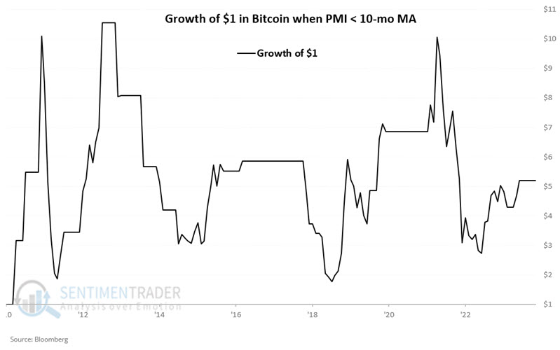
In addition, Jay showed that drawdowns were smaller (but still large) when the PMI was above average versus when it was below.
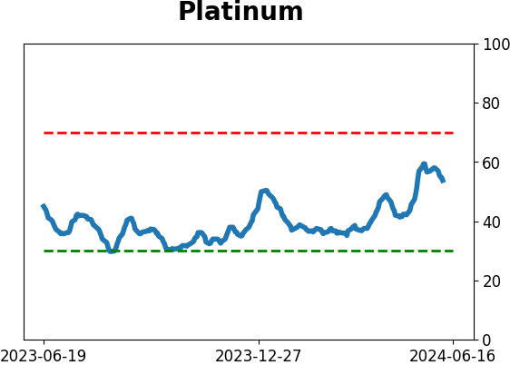
Platinum problems
In the last two weeks, platinum has sold off 10%. Jay noted that seasonality and sentiment strongly suggest caution for traders hoping for a quick rebound.
The chart below displays the annual seasonal trend for platinum futures. Note that this market will soon enter a significantly unfavorable seasonal period that extends from TDY #113 through TDY #128. For 2024, this period began at the close on 2024-06-06 through 2024-06-27.
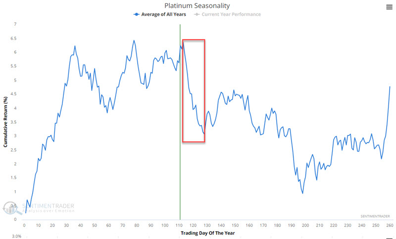
An annual seasonal trend chart such as the one above is merely an average of past performance and is not a roadmap of what will happen during any given year.
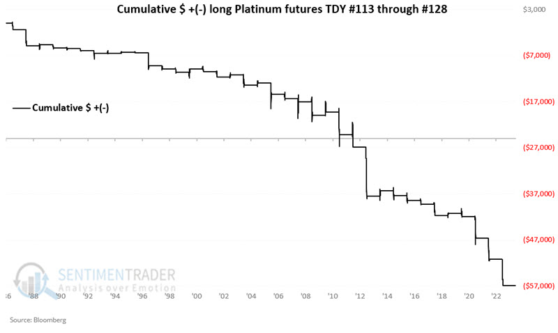
The chart below displays the hypothetical cumulative $ +(-) achieved by holding a long position in platinum futures only during the end of TDY #113 through the end of TDY #128 every year since 1987.
As weight of the evidence, the current status dovetails nicely with a cautious approach towards platinum. The chart below highlights with a red dot those dates in the last ten years when Platinum Hedger's Position dropped below -32,000 while platinum futures were trading above their 10-week moving average.
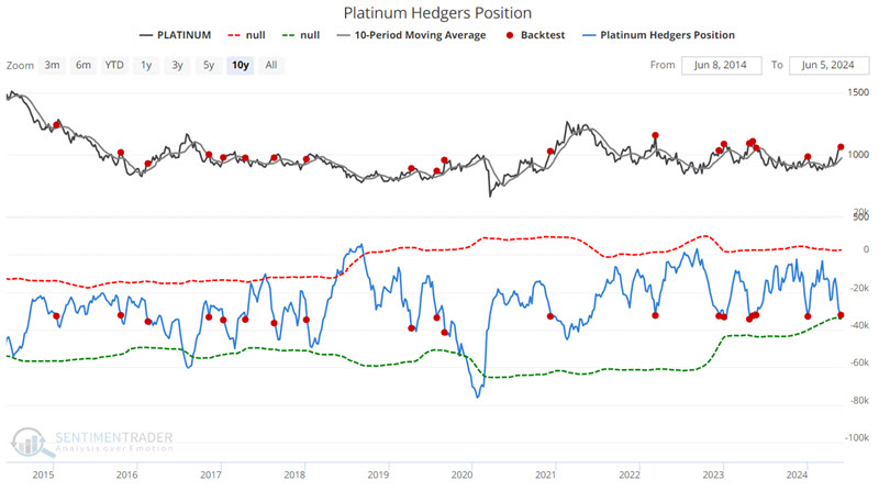
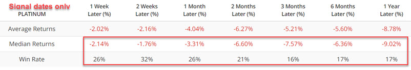
The combination of poor returns and seasonality headwinds suggests caution.
About TradingEdge Weekly...
The goal of TradingEdge Weekly is to summarize some of the research published to SentimenTrader over the past week. Sometimes there is a lot to digest, and this summary highlights the highest conviction or most compelling ideas we discussed. This is NOT the published research; rather, it pulls out some of the most relevant parts. It includes links to the published research for convenience, and if you don't subscribe to those products, it will present the options for access.
Indicators at Extremes
|
|
|
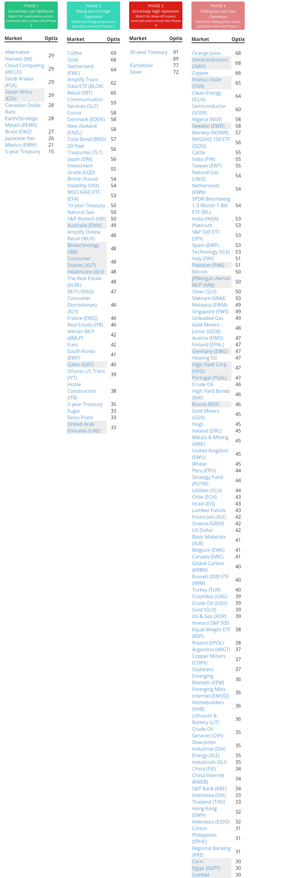
Phase Table
|
|
|
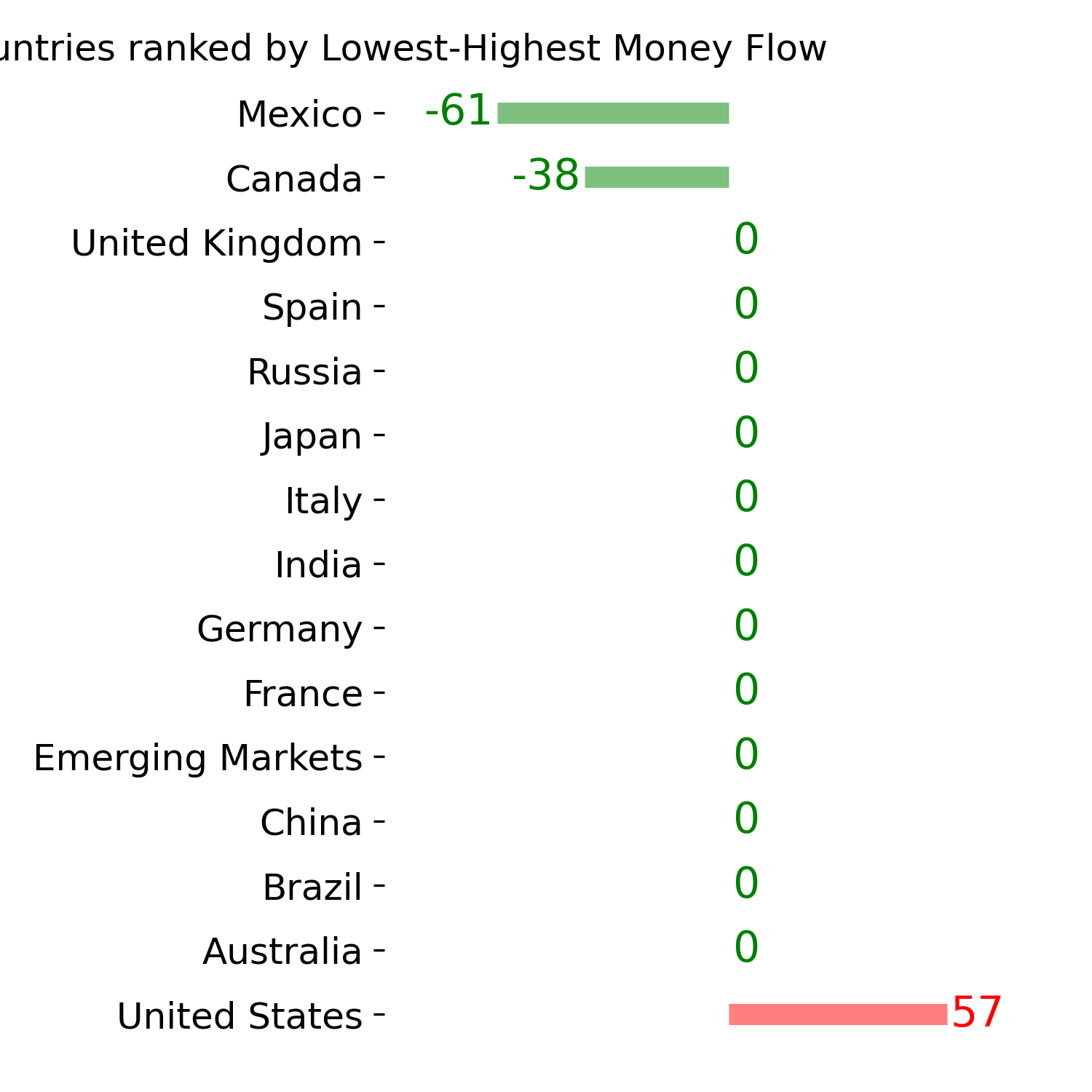
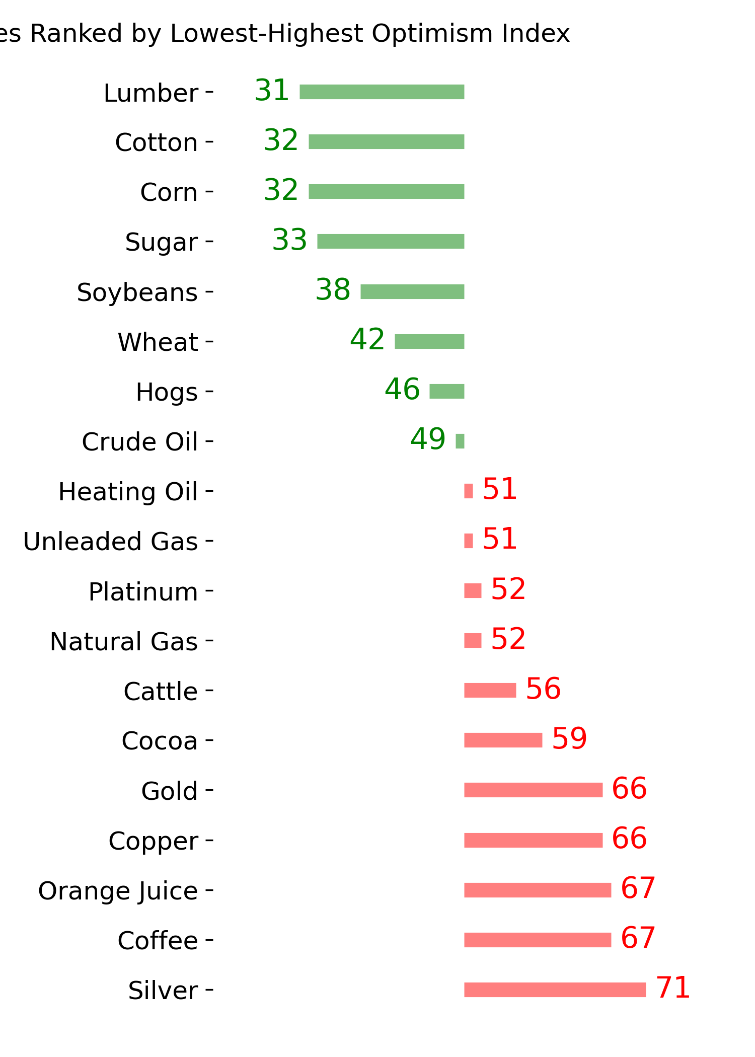
Ranks
|
|
|
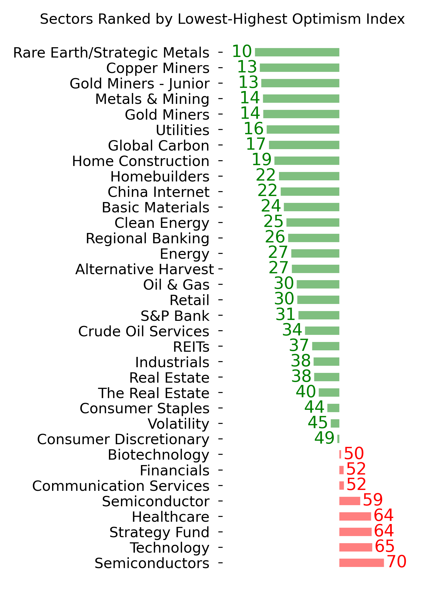
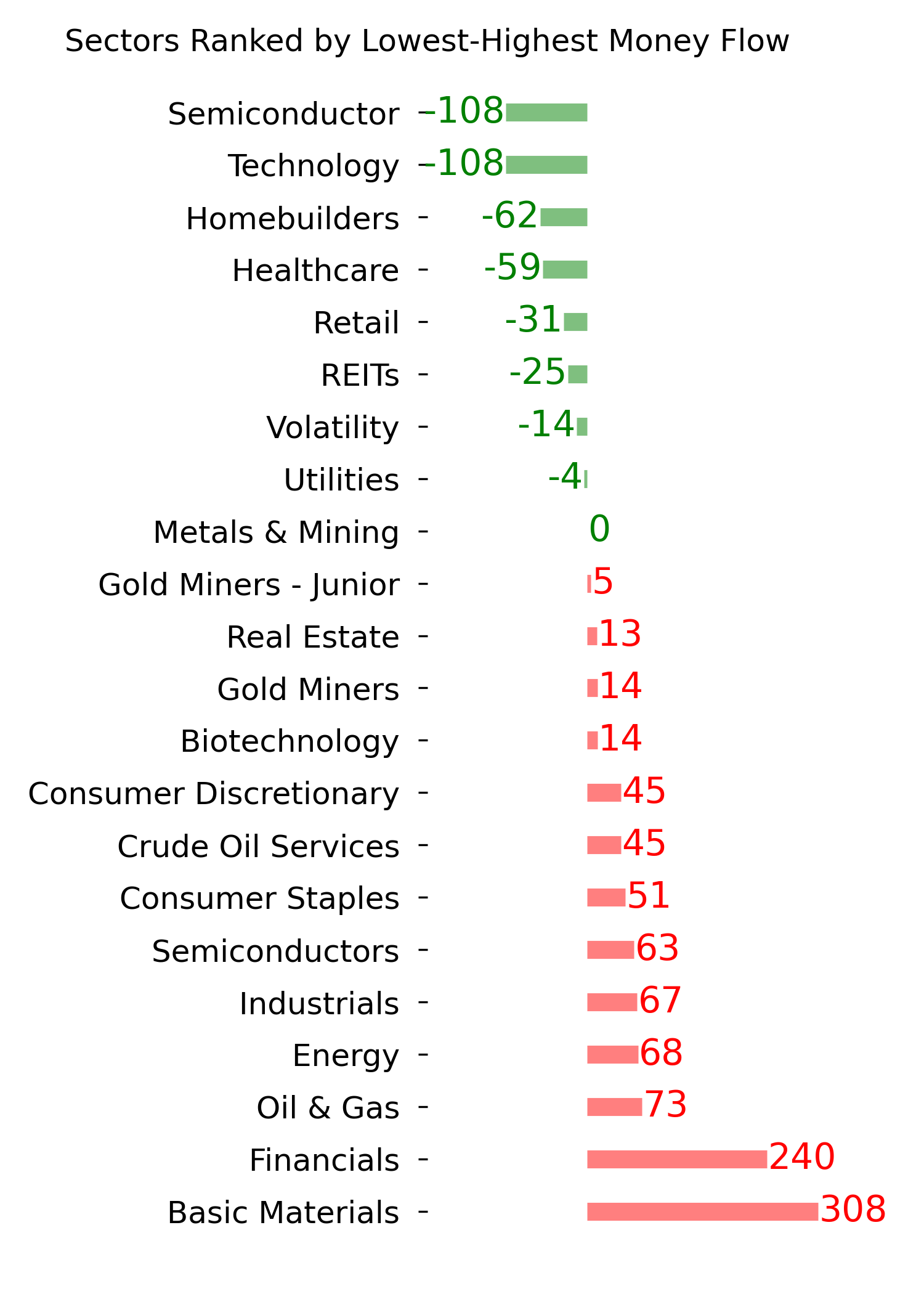
|
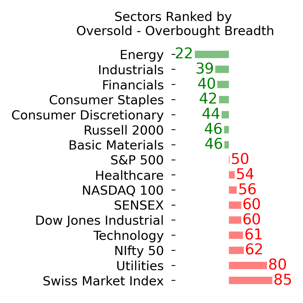
|
|
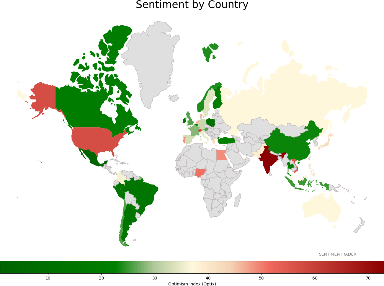
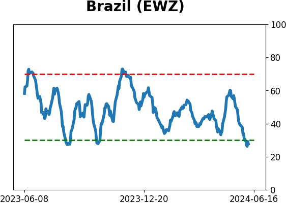
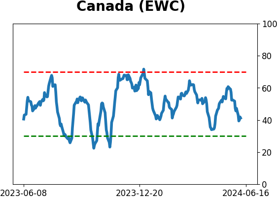
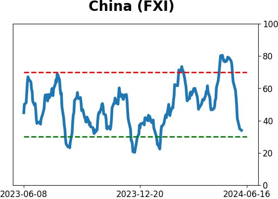
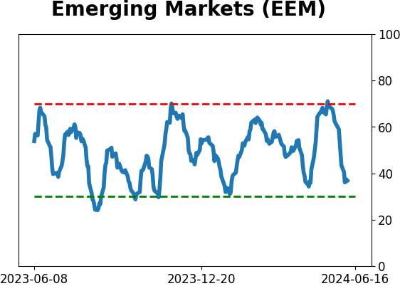
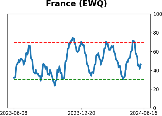
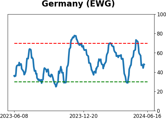
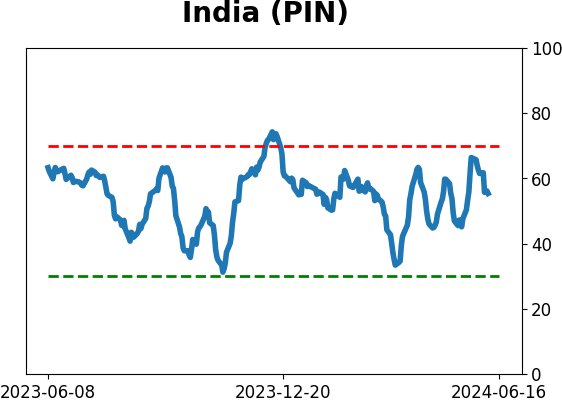
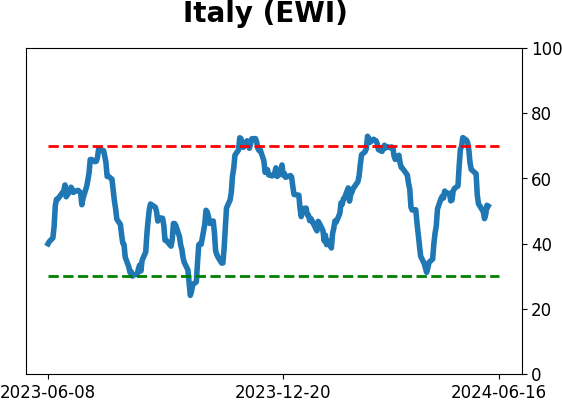
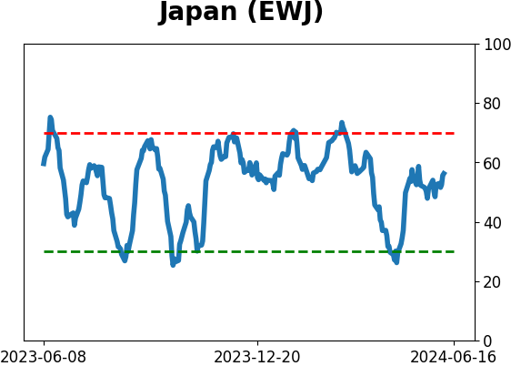
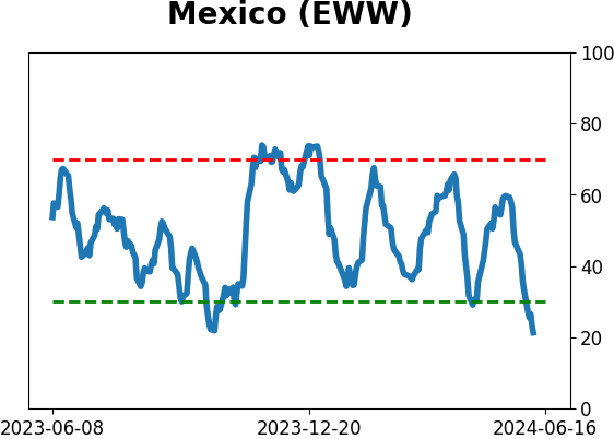
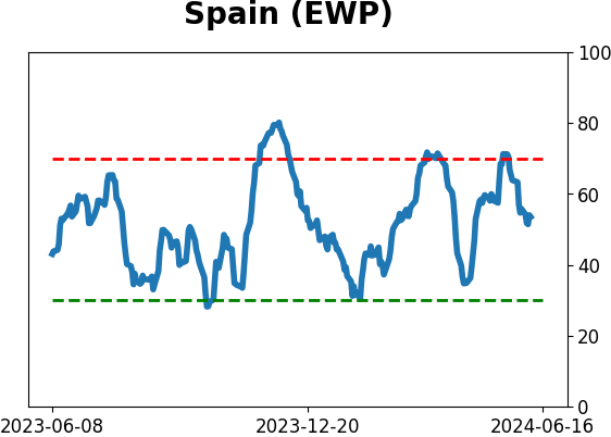
Sentiment Around The World
|
|
|
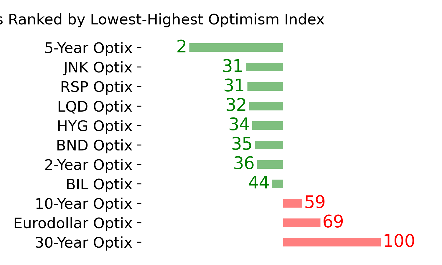
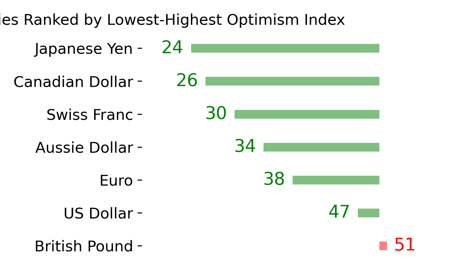
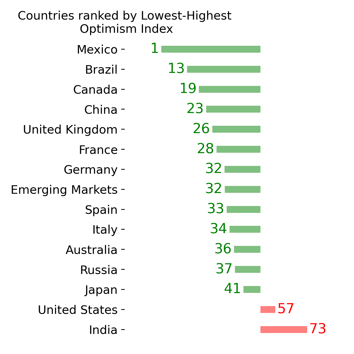
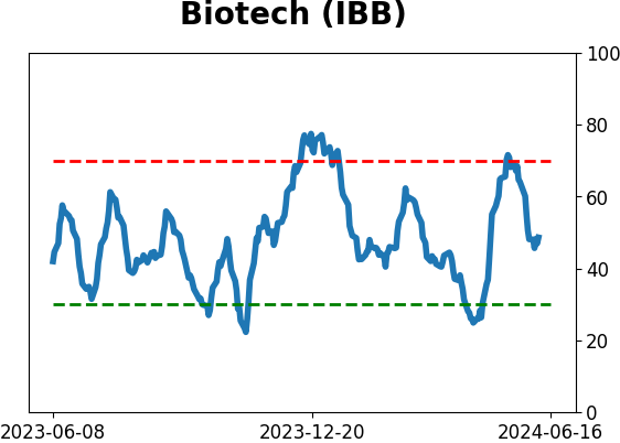
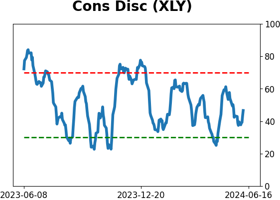
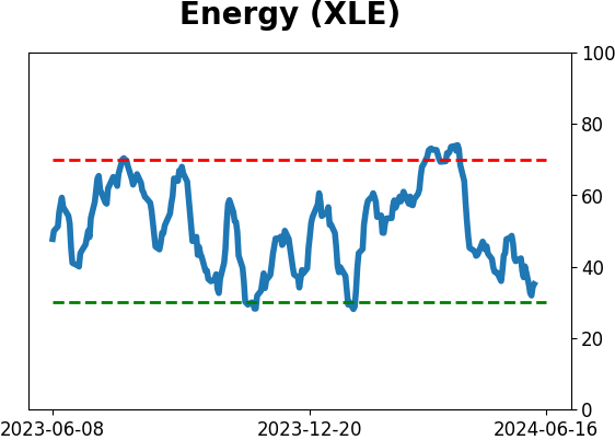
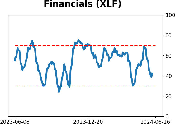
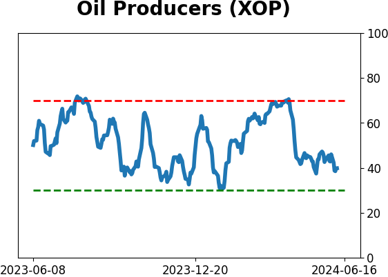
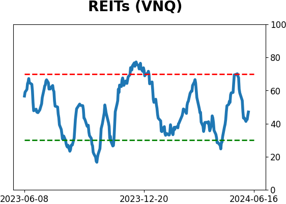
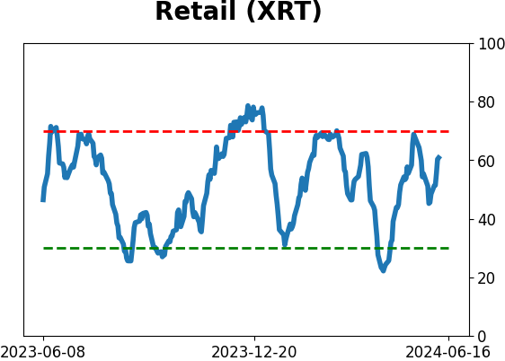
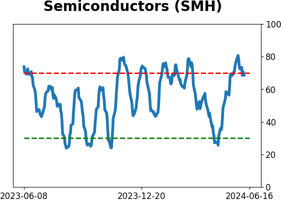
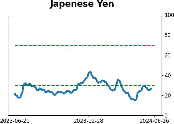
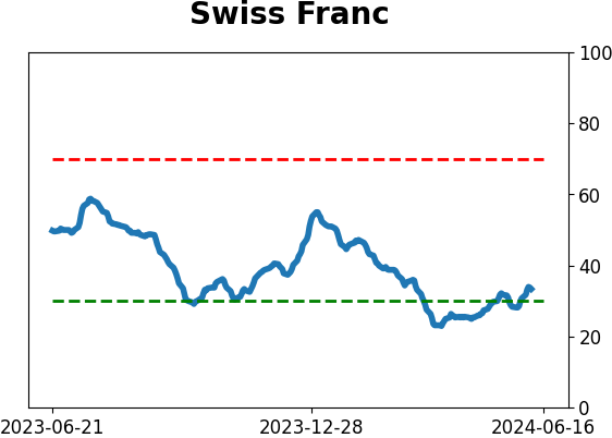
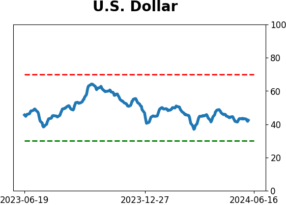
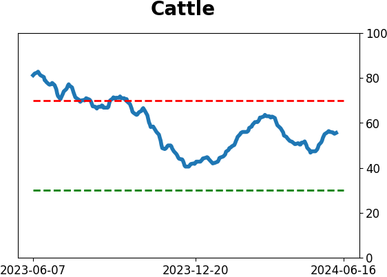
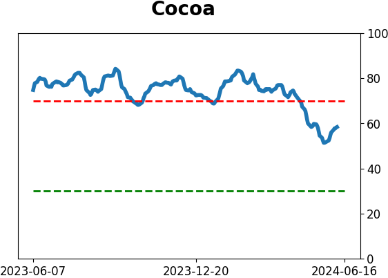
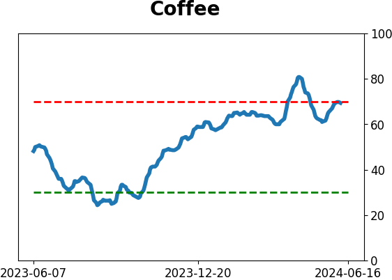
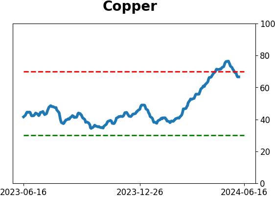
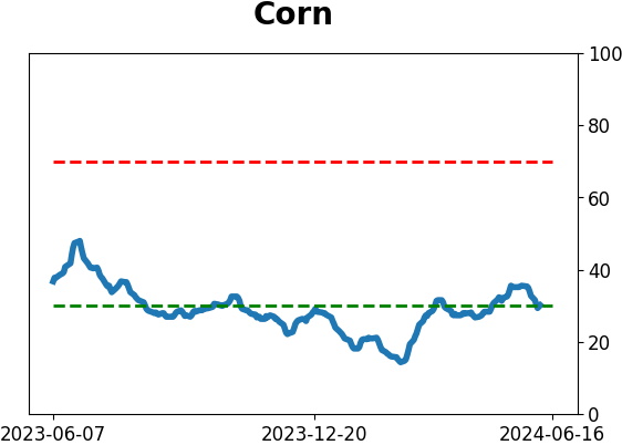
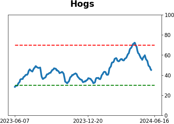
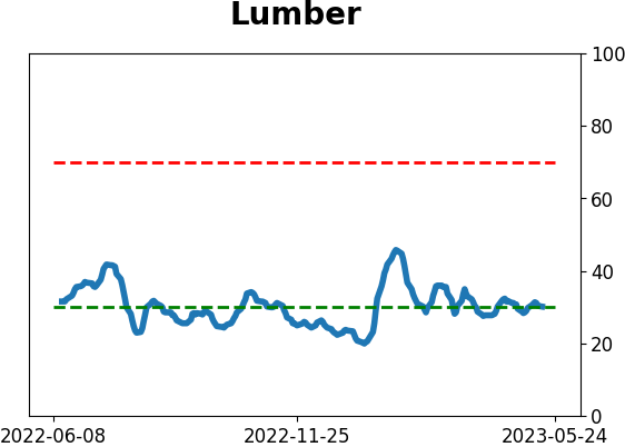
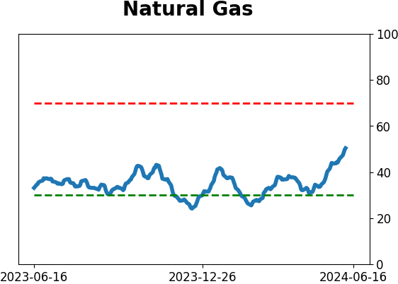
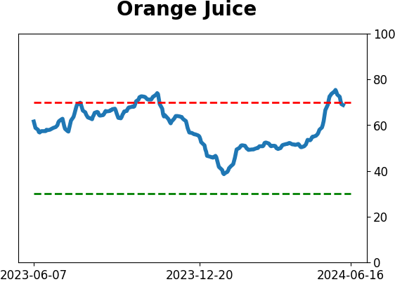
Optimism Index Thumbnails
|
|
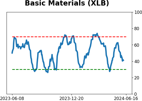
|
|
|
|
|
|
|
|
|
|
|
|
|
|
|
|
|
|
|